All well and good but does anyone really say otherwise? “I prefer seat-of-the-pants guesswork” doesn’t typically impress investors. So of course, people claim to be data-driven, even when they aren’t.
Worse, you can sincerely think you are data-driven while looking at data that’s incomplete, distorted, or just plain wrong. We live in a complex world. The kind of measurements that lead to good decisions aren’t easy even when everyone involved means well. Add in the fact that we’re all biased in different ways, and it all gets very complicated, very fast.
Today I want to follow up on last week’s Assumptions Have Consequences letter, in which we discussed the way economic projections assume things about the future. As I said, these assumptions are necessary but we should understand what they are and why we’re making them.
Similarly, we need to understand the adjustments often made to raw data before we see it. These, too, can be helpful. But you need to understand them if you rely on adjusted data to make important decisions… as you probably do.
First, let me alert you to a new video we will post shortly: Keith Fitz-Gerald’s interview with Ed D’Agostino. We received hundreds of reader questions, and Keith answered as many as he could in the time available. Here’s a brief rundown of the topics and names Keith covered.
Keith described his investing framework in detail, including the tools he uses to weigh one opportunity vs. another.
He also covered the reason why, among 600,000+ tradable securities worldwide, only 50 truly matter for most portfolios.
Keith gave his thoughts on Apple, Tesla, Microsoft, Peloton, Goldman Sachs, defense tech names… cybersecurity… AI… and more.
He discussed position sizing, allocation, his thoughts on modern portfolio diversification, as well as how to improve your “mental game” when making portfolio decisions.
Keith’s passionate about markets—witty, to the point, and able to see through the fog of chatter and headlines. It was a wide-ranging conversation, and I’m sure you’ll enjoy watching it.
Many of the monthly and quarterly data points we follow—employment, GDP, etc.—are “seasonally adjusted.” What you see isn’t an actual number of new jobs found in the surveys. That’s just the starting point. The raw number is then adjusted to remove “seasonal” effects.
Seasonal effects are real and actually quite common. Retail sales go up around the holidays. Farmers buy more seed at planting time and hire more help at harvest time. Theme parks that cater to families with children get more visitors in the summer. Here in sunny Puerto Rico, our resorts are busier in the winter. Home prices typically rise in summer. All this is normal and expected. But it’s a problem if you are trying to monitor trends over time.
If, for instance, the jobs data shows retailers hired 100,000 new workers last month, what does it mean? Are consumers spending more? Is the economy booming? Maybe, maybe not. We need more context.
If we see that in this same calendar month of recent years, the retail industry added an average of 70,000 new workers, then 100,000 is 30,000 more than “normal.” That’s significant, especially if we see it continue over several months.
In that example, we would say that retail employment grew 100,000, or was up by a seasonally adjusted 30,000. The adjustment highlights the change. (Note: This is a simplified example. The math is actually far more advanced.)
Now, seasonal adjustments have limitations, particularly when things like COVID-19 create huge but temporary distortions. These affect the baseline and can show up in weird seasonal adjustments years later. Statisticians can adjust for that, too, but they can only adjust so much before the numbers become meaningless. That’s one reason data has been so hard to interpret since 2020.
I have said this before, and it bears repeating: Backward-looking data that includes 2020 is going to be skewed for several years, until the extreme volatility of 2020 is basically baked into the long-term cake. We are seeing that in many data releases, not to mention earnings comparisons, and it can make the situation look worse or better than it actually is.
Even in normal times, though, seasonality can obscure underlying trends. That’s important in economic analysis because trends are more important than individual data points. Any given month or quarter can be abnormal for all kinds of reasons. Several abnormal months in a row are more significant. We would be less likely to notice them without seasonal adjustments.
The government agencies that publish economic data normally highlight the seasonally adjusted data for exactly that reason, but they provide unadjusted data, too. Sometimes it helps to look at the numbers both ways.
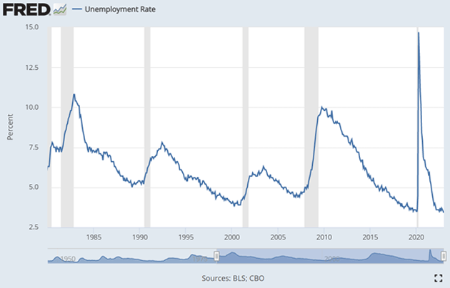
Let's look at something as “straightforward” as the unemployment rate (note sarcasm). This first graph shows unemployment since 1980. This is the seasonally adjusted graph and as we mentioned above, it is pretty easy to go back and look at trends.

Source: FRED
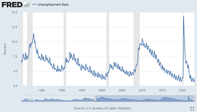
Now let's look at the non-seasonally adjusted rate. I chose to start in 1980 because it makes the volatility clearer. These are fairly wide swings. Can you imagine these large swings in the middle of a roaring economic boom being part of the monthly release? It's crazy enough now. The seasonal adjustments give us context without the extraordinary “noise.”

Source: FRED
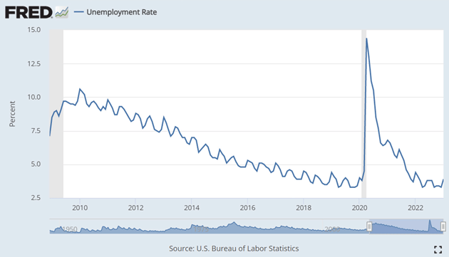
What if we started in 2008? The data looks even more volatile!

Source: FRED
For the curious, you can go to the FRED database and play with the data yourself.
Inflation is another common adjustment. You know about “real” interest rates. That’s simply the nominal interest rate minus the inflation rate. If your mortgage is 5% and inflation is 3%, the real rate is 2%. (I get that for new readers this can be confusing. When they look at their monthly mortgage bill that 5% seems very real to them. But we use the same word, for whatever reason, to describe the effect of inflation on interest rates.)
That adjustment, however, can vary depending on the inflation benchmark you use, of which there are many. And inflation itself is kind of a slippery concept. An inflationary economy has generally rising prices but not everything rises at the same pace. Some prices may even fall (like we have seen for many electronic items over the past few decades). Inflation is a highly personalized phenomenon based on your spending patterns.
The Consumer Price Index measures a “basket” of goods and services thought to represent a typical household’s spending: percentages spent on housing (more on that below), food, furniture, clothing, utilities, and so on. This was in the news recently when the BLS made a methodology change. They used to update the basket weightings every two years; now it will be every year. That makes sense, given that people do change their spending preferences over time, and perhaps more frequently now than in the past. But it further complicates an already complex measurement.
CPI also has its own seasonal adjustments because some prices vary with the calendar. Some food prices fall at harvest time when they become more plentiful—but maybe not always if, for instance, bad weather reduced crop yields. Heating oil typically gets more costly in the winter. The CPI adjusts for these to try and show underlying trends. It is an imperfect but necessary process unless you want to deal with all that noise in the headline data. Here again, the non-seasonally adjusted data is available if you want it.
More controversial are so-called “hedonic” adjustments to account for quality improvements. The new car or computer you buy today is probably better than the one you could have bought 10 years ago. Maybe the price rose, but you also get more for your money. Is that inflation or not? I’ve noticed since the 1980s how prices always seem the same for the typically top-of-the-line computers I buy, no matter how much better and faster. But the BLS assured me that computer prices were dropping like rocks. It has only been in the last few years that sticker prices dropped significantly.
The opposite can happen, too, as in the “shrinkflation” you may notice in your favorite food products. Your preferred brand of cereal has the same price, but the box is smaller. That’s a price increase which should show up in CPI, but making sure it does is hard. (My wife and I typically get shishito peppers when we go to the local sushi restaurant at the Ritz. On Valentine’s Day, I noted that portion size was down by almost 50% while the price was up.)
Then we can add a whole new layer to this by moving beyond CPI to other measures, like the Commerce Department’s Personal Consumption Expenditures (PCE) price index. It is constructed differently from CPI because it’s part of the larger GDP calculation. But even if you stick with CPI, there’s plenty of room to slice and dice the data for different purposes.
You see reports of “core” inflation excluding food and energy. That sounds funny on the surface. Who gets to exclude food and energy from their spending? No one, of course. But food and energy prices are volatile, and they feed into every other price. Excluding their direct impact can help reveal the underlying trends we really want to observe.
Then there’s perhaps the king of adjustments: housing prices. CPI measures the price of housing, not the price of houses. It considers housing a service; you pay someone to put a roof over your head. If you own your home, you’re paying yourself for that service. CPI measures something called “owners’ equivalent rent” (OER), which is basically the amount you could theoretically get by renting your home to a third party, based on market rates in your area. It may or may not match your house payments, and it involves all kinds of adjustments.
We criticize OER but the concept has a kind of logic. When you buy a house, you’re doing two different things. First, you’re buying an asset that will hopefully appreciate, and which you can sell later or leave to your heirs. Separately, you get a place to live without paying rent to someone else. OER isolates that benefit from the investment part of the transaction. Or tries to; as noted, it’s an imperfect science.
Let’s walk down housing price history lane. In 1981 the BLS shifted the measure of housing inflation from home prices to current owners’ equivalent rent. It based the data on 1978 actual rent data and then began to modify it. Because CPI was used to compute wages at that time, it delayed changing the way clerical and regular wage earners calculated inflation until 1985.
And then came the adjustments. The BLS made adjustments the first year, 1983, then in 1987 and 1998.
I have written about this process. You can make arguments either way. But playing “what if,” if actual housing prices were used to calculate inflation, would Greenspan have ignored the significant housing price increases even as OER said there was little housing inflation in terms of rent? What if he had leaned into housing price inflation? The same with Powell in 2021. Housing inflation showed up late in 2021 in terms of OER.
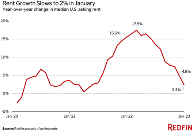
OER is a lagging number. It tells you what housing inflation has been over the last 12 months, not what it is doing in real time today. My friend David Bahnsen sent me this chart showing rental prices are now rising just 2.4% a month. If more current data were used, inflation would almost certainly be in 3% territory, and getting closer to the Fed's 2% target. Would Powell be aggressively raising rates if that were the case?

Source: David Bahnsen
This shouldn’t be just an academic exercise, though it actually is. Economists fiercely debate these topics, and changes happen slowly. You and I rarely see the actual sausage-producing process, but we have to live with it. Assumptions and adjustments have significant real-world implications to every business in the US.
The assumptions and adjustments that go into CPI don’t just give us data; they have an actual, real-money effect. A CPI sub-index sets the annual “cost of living adjustment” for Social Security recipients, many government employees, some private pension plans, and even some commercial business contracts.
Remember what I said: Inflation is highly individualized. Everyone feels it to different degrees. But everyone in those groups gets the same COLA percentage. This year’s increase was 8.7%, starting in January.
For seniors on fixed incomes, that adjustment was probably a big relief after having to spend more on living expenses in 2022. Others who receive Social Security but don’t depend on it (like me), it’s just a nice bonus. But this adjustment has a giant economic effect. It probably helps explain the surprisingly strong 3% jump in January’s retail sales data. That 3% is not adjusted for inflation, by the way. CPI rose 0.5% from December to January, so in real terms this was a 2.5% jump in retail sales. It was highest in restaurants, bars, auto dealers, and furniture stores.
My friend Samuel Rines pointed to some interesting history. Back in the 2009 recession, Congress passed a stimulus plan which, among other things, gave all Social Security recipients a one-time $250 payment. It was about $13 billion in total. Later studies showed that relatively small amount (in government spending terms) boosted GDP by 0.5% in Q2 2009, creating or saving roughly 125,000 jobs.
Adjusting for inflation, that’s equal to about $340 today. The COLA adjustment that just took effect will give about 70 million people an additional $140 a month ($1,680 a year). Not one time, but every month of 2023. So, other things being equal (and they may not be), it could have roughly 5X the stimulative impact of that 2009 special payment.
But here again your mileage may vary. I have a friend whose lifetime job earnings were at the lower end. She also started taking her Social Security at 62. Her COLA was roughly $60, less than half the average.
(I am personally at the other extreme. I started paying into Social Security in the late ’60s. I have paid the maximum amount since about 1980, and as a self-employed person paid both the employee and the employer portion. I waited until I was 72 to begin to take my Social Security. My COLA was $368, which frankly blew me away. I had no idea. I remember not believing that I would ever get Social Security in the ’80s and ’90s. Now I’m getting $50,000 a year. If my contributions over 52+ years had been put into a simple private plan, 50% stocks and 50% long bonds, the resulting number would afford me a great deal more than $50,000 a year.
I still think that when we get to The Great Reset, they will means test Social Security, as that is one of the few ways to really bring the costs down. There will be a lot of weeping and wailing and gnashing of teeth when those discussions happen.
Now, we could have a separate discussion about whether such stimulus programs are the best way to help both individual Americans and the economy in general. But regardless, they have an effect. In 2009 inflation was very low (in fact, it was below zero for a while) and unemployment very high. That’s the environment in which stimulus payments might make sense.
Now we have the opposite: high inflation and low unemployment. Stimulating consumer demand in this kind of economy isn’t what the doctor ordered. In fact, if you wanted to push inflation up then something like this COLA would probably be part of the plan. It gives cash to people with high propensity to spend.
Again, many Social Security recipients suffered as living costs rose sharply last year. I’m glad they will get some relief. They deserve it. But the structure of this adjustment will give some people more than they need and others not enough. And it may well push inflation higher for everyone, causing the Fed to keep interest rates higher for longer, raising mortgage rates and housing prices.
If so, it would mean the inflation adjustment—much of which is simply statistical inference—will have caused even more inflation. These statistical things aren’t just numbers. They matter and can even take on a life of their own.
I remain convinced the Fed is going to raise short-term rates to at least 5%, if not more, and they are going to stay higher for longer. Unless something seriously untoward happens, rates will be above 5% at the end of the year. While many think that is unconscionably high, looking fondly back on the era of cheap money, the world progressed just fine in the ’80s and ’90s with 5% or higher rates.
We will get back to the disinflationary/deflationary forces as the primary driver in the economy. Just not this year, at least in the data.
It seems like my days are filled with projects. I have to keep up on my reading, of course, and there seems to be more every month that I want to read. I'm finishing the first section of my energy report. SIC is shaping up to be great but it requires a lot of preparation time. By the way, if anybody can get me into touch with Stanley Druckenmiller, he is one of my fantasy interviews. I try to read everything he writes or speaks. And thankfully, Shane seems to be focused on the house projects, of which there seems to be no end, giving me time to spend elsewhere.
It was good to have Tiffani spend last weekend with us. She is in a good place and I really am happy with the way things have developed over the last few years. I need to take more time to visit with my kids and not just over the phone. They have all grown up so fast. And now my grandchildren are becoming teenagers. That seems way too soon!
One of those other projects has been working with my partners developing completely new social media strategies. Who knows? I may end up on TikTok. Trying to keep up with all the changes in technology and society is another project in and of itself.
And with that, let me hit the send button. Have a great week and I hope you can find family and friends to share it with you. And of course, don't forget to follow me on Twitter.
Your needing to exercise more analyst,


