To investors,
Below is the weekly write-up from bitcoin analyst Will Clemente, where he uses on-chain metrics to explain what is happening in the bitcoin ecosystem. Hope you enjoy it.
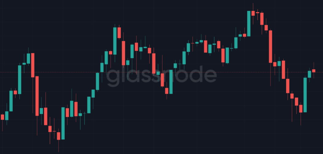
Happy Friday, hope you all had a great week. At the time of writing, Bitcoin currently sits just above $53,600. Last week we described how price was either at a bottom or within days of reaching one based on the metrics that we looked at. Two days after the newsletter was sent out, price reached a local bottom on Sunday, retesting the key on-chain volume support zone of $47,000 before aggressively shooting back up. Let us take a look at the latest developments in on-chain data structure to develop an understanding of market participants’ behavior.
Leverage Wipeout/Price Correction Recap
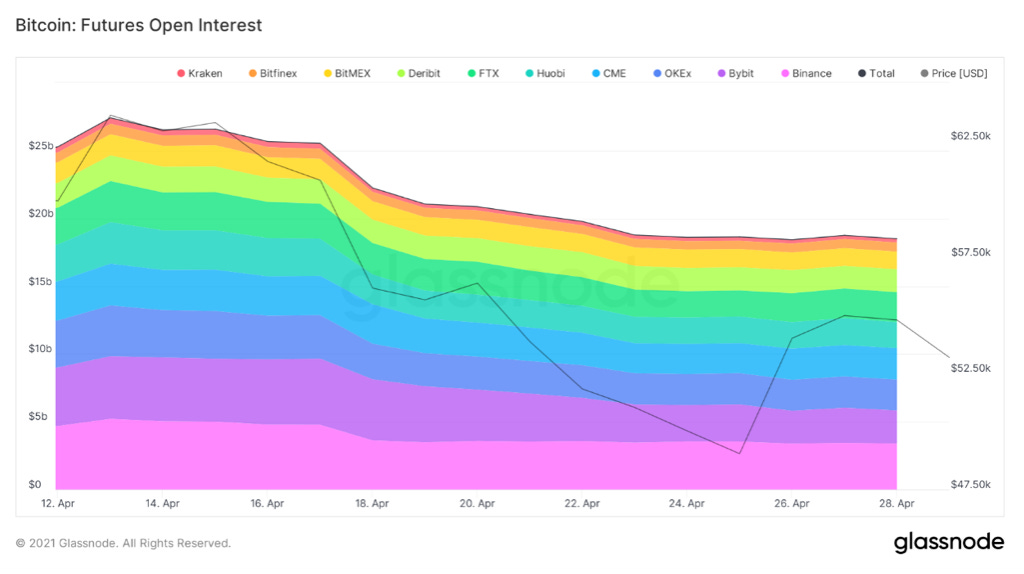
Throughout the last week we have seen a total wipeout of leverage from the Bitcoin derivatives markets. (Something also discussed in the podcast Pomp and I recently put out on Wednesday) Since all-time highs two weeks ago, futures open interest has declined by $8,912,806,107 across all major exchanges.
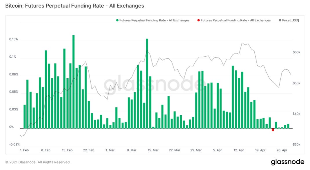
In addition, we have seen a huge decline in funding rates. Funding rates are used to peg the perpetual swap to Bitcoin spot price. The perpetual swap is unique to Bitcoin, as it is a non-expiring future’s contract. The ease of access to leverage for these contracts make them very attractive to speculative traders. The way these contracts are pegged to Bitcoin price is through funding rates. When the majority of traders go long, funding rates rise, meaning longs are paying shorts to take the other side of the trade. This works the other way around as well, meaning when funding rates go negative, shorts are paying longs. In last week’s newsletter we discussed how funding rates going negative was a buy signal. Interestingly, throughout the recent price rally since Sunday’s bottom, funding rates have remained low. This means that the rally is likely driven from spot markets and not by speculators. In other words, this price rally has come from organic spot buying, making it very healthy. This is also supported by massive stable-coin flows seen on-chain.
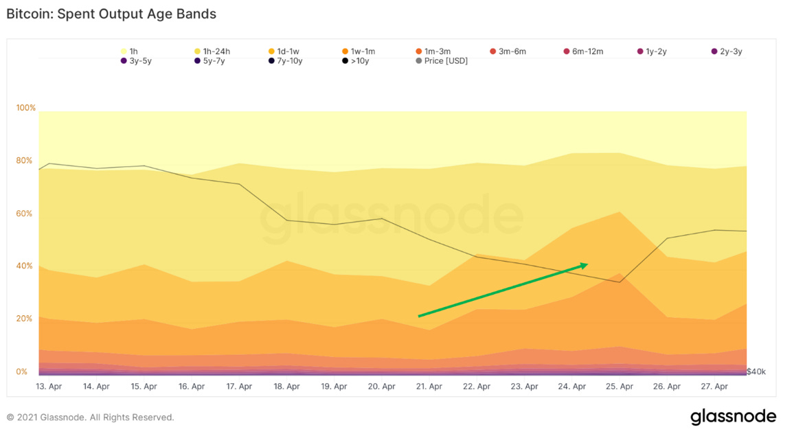
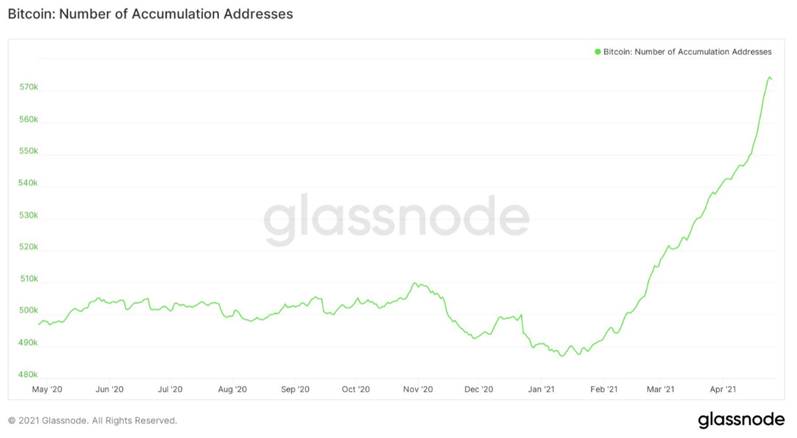
The sell-off was also healthy for the market for another reason aside from the leverage wipeout; coins were washed from weak-hands to strong-hands. This can be illustrated by looking at metrics that describe the age of the coins being sold. These metrics showed a pattern of young-coins, AKA new market participants selling, as older market participants held strong throughout the dip and continued to accumulate.
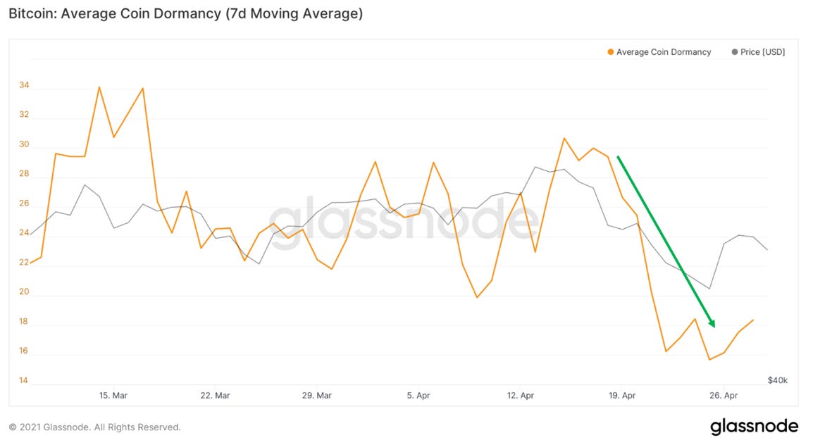
One metric to illustrate this is dormancy. Simplified, older coins hold more dormancy and as they are sold, dormancy rises. Throughout the drop in price, we actually saw dormancy go down, meaning old coins were not being sold and more experienced market participants held tight as they are accustomed to these huge price corrections in Bitcoin bull markets.
Another metric to visualize this is Glassnode’s Spent Output Age Band metric. This clusters coins together by age and stacks these cohorts together to understand which types of market participants are driving selling. Throughout the drop in price, we saw a sharp spike from younger cohorts, with minimal movement in older cohorts. In this regard, the sell off was bullish, as coins were moved to stronger hands.
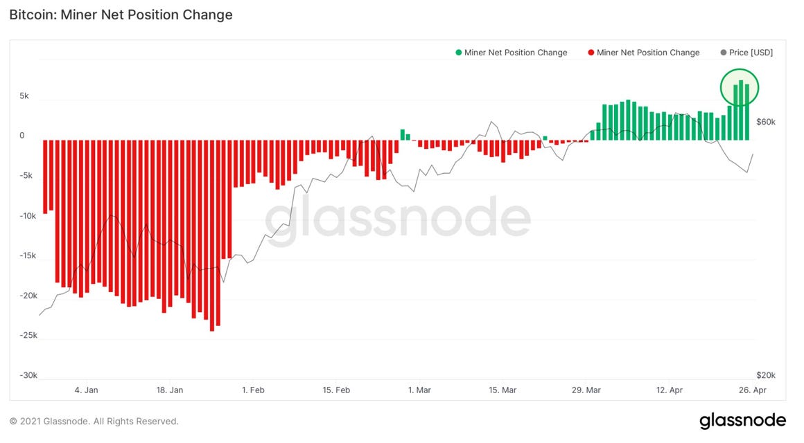
Throughout the sell-off we also saw miners accumulate very heavily, scooping up cheap coins and taking advantage of the dip.
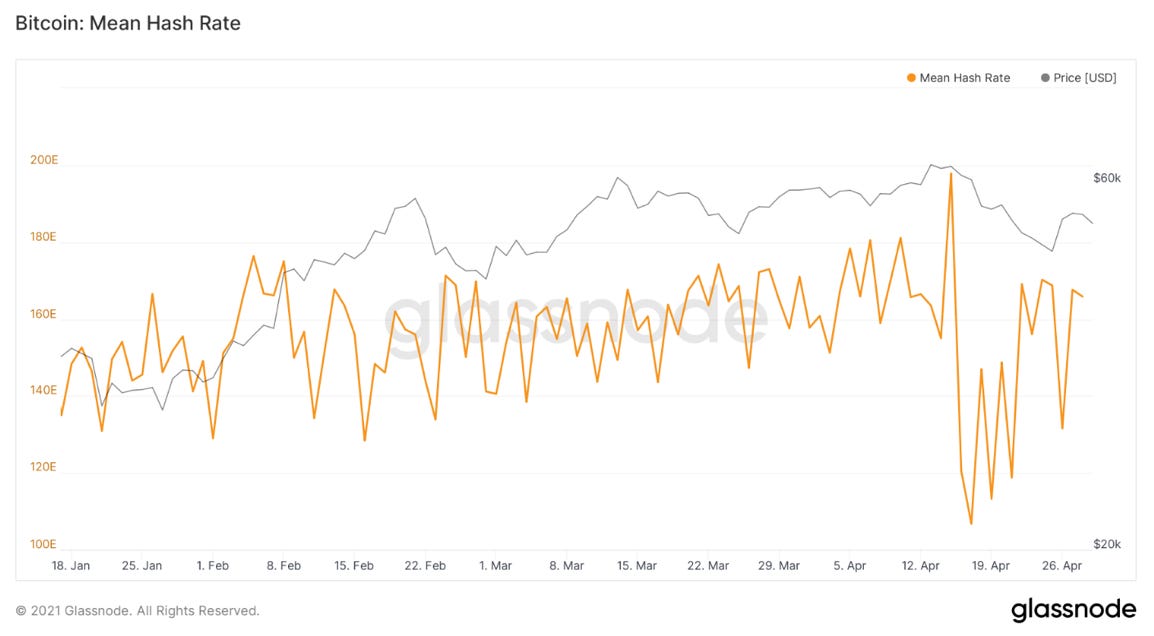
On a final note regarding the sell-off, we have seen hash rate rebound dramatically, showing the resiliency of the Bitcoin network.
Broader Metrics:
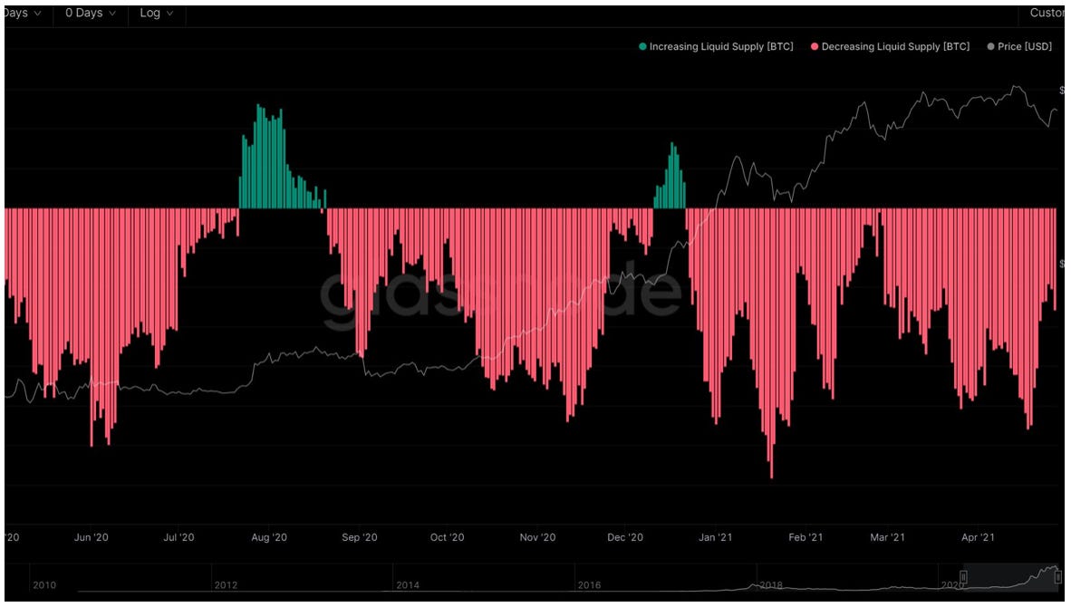
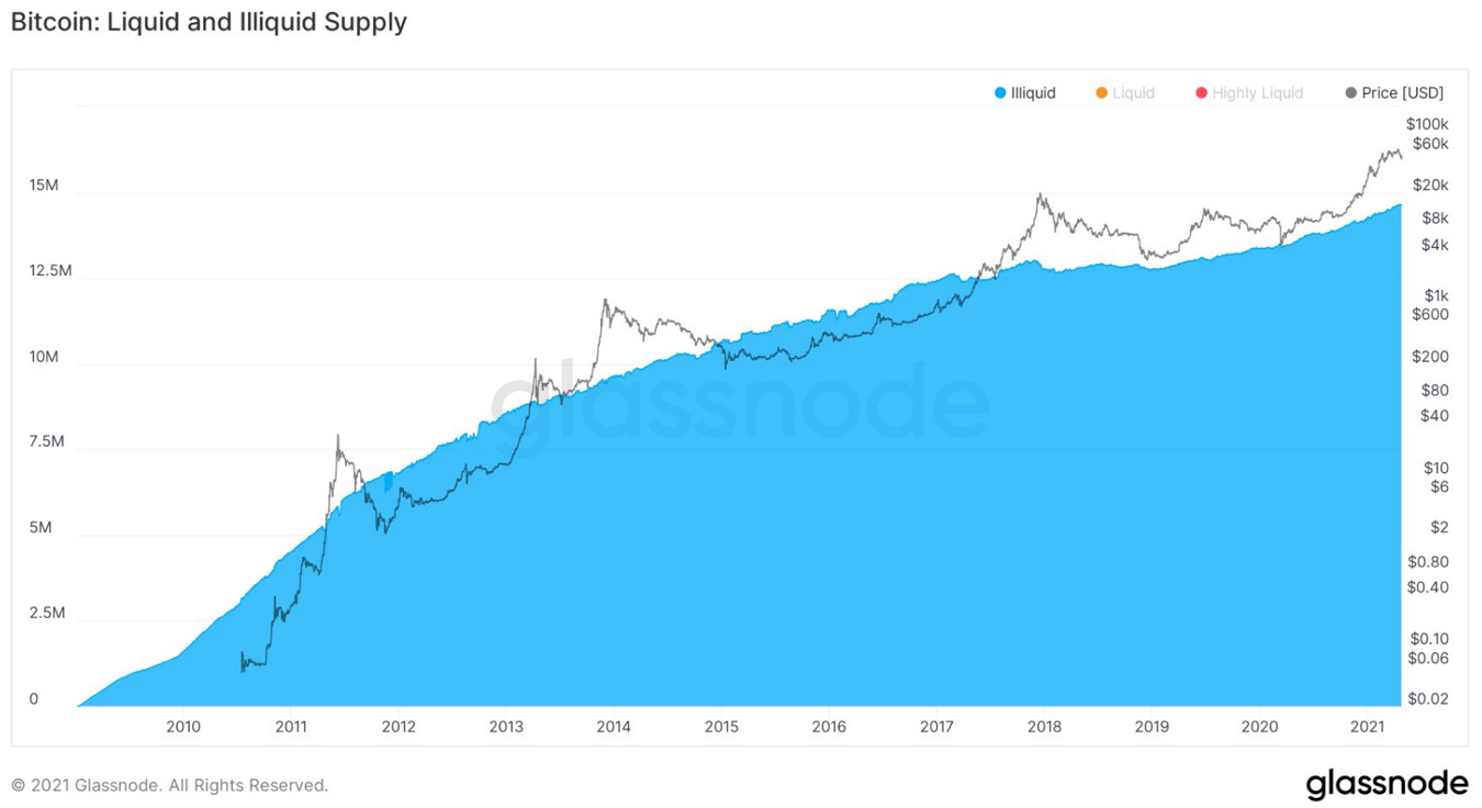
More and more of Bitcoin’s supply is being locked up every day in the hands of investors that have no history of selling. This can be illustrated by Glassnode’s liquid supply metric. Glassnode clusters together addresses through blockchain forensics to determine different entities. They are then able to evaluate the selling behavior of these entities and separate them into 3 cohorts: highly liquid, liquid, and illiquid. Since the March liquidity crisis last year, there has been a strong trend of coins becoming illiquid, AKA being scooped up by strong-hands with no history of selling.
In fact, 78.3% of Bitcoin’s supply is now considered illiquid by Glassnode, a number which has steadily increased throughout the asset’s lifespan.
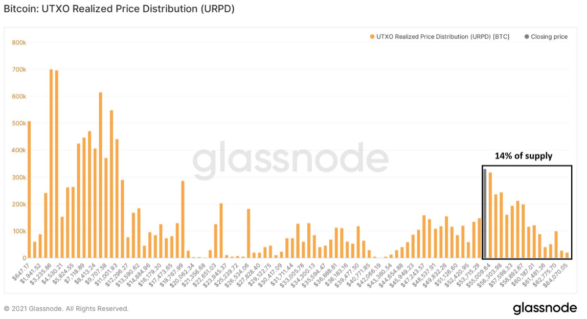
The final metric I would like to present this week is URPD (UTXO Realized Price Distribution). This metric determines on-chain volume at different price levels. After rallying back above the trillion-dollar market cap threshold, (currently $53,500 but increasing as supply grows) over 14% of Bitcoin’s money supply has now moved at these levels. This shows strong validation of BTC as a legitimate macro asset and that is here to stay. This is also the strongest zone of volume seen on-chain since $11,000 last year.
Hope this was helpful. Enjoy!
You can follow Will on Twitter: Click here
-Pomp
Do you want to work in the Bitcoin and crypto industry? Do you run a business that has open roles to fill? I recently launched the industry-leading job board focused on our industry. We have hundreds of open roles at companies like Coinbase, Gemini, BlockFi, and many others.
Get a Job or Post a Job here: http://www.pompcryptojobs.com
Podcast Sponsors
These companies make the podcast possible, so go check them out and thank them for their support!
Remote makes it easy for companies of all sizes to employ global teams. We take care of international payroll, benefits, taxes, company stock options, and local compliance, so you can focus on growing your business. Learn more about Remote and their new Remote for Startups program at remote.com.
Exodus is an absolute game changer in the crypto wallet space, and we’ve teamed up to offer an exclusive discount for you, as listeners of the podcast. Sign up for Exodus today using my promo code http://get.exodus.com/pomp This is a no brainer for both newcomers and crypto heavyweights - go sign up today.
Polymarket is the world’s leading information markets platform where you can trade on the most pressing global questions and see unbiased, real-time data on what the market thinks will happen. Will Trump launch a new social media platform? Will NFT trading volume continue to skyrocket? Head over to polymarket.com and make an account today with the referral code “Pomp.” Every Monday until May 10th, you can win $500 by participating in the #PolyWhale Twitter giveaway. Click on the link for more info.
OKEx is a leading crypto exchange known for providing the most options for crypto traders and investors. Whether you want to trade spot, futures, options or swaps, OKEx gives you institutional-grade tools and a best-in-class trading engine. The platform offers credit and debit card funding options and supports 40 different fiat currencies, including EUR, CAD, GBP, TRY, INR and RUB, to name just a few. You can invest, trade, and earn yield, all within one place at okex.com. OKEx is not available to customers in the United States.
Choice is a new self-directed IRA product that allows you to buy Bitcoin with tax-advantaged dollars, while still holding your private keys. You can go to retirewithchoice.com/pomp to sign up today.
Unstoppable Domains makes crypto easier by replacing your address with [AnyName].crypto. They allow you to send and receive over 70 cryptocurrencies, including BTC, ETH, and LINK with a single blockchain domain. Go to unstoppabledomains.com and get [YourName].crypto to make your crypto life easier.
BlockFi provides financial products for crypto investors. Products include high-yield interest accounts, USD loans, and no fee trading. To start earning today visit: http://www.blockfi.com/Pomp
Crypto.com allows you to buy, sell, store, earn, loan, and invest various cryptocurrencies in an user friendly mobile app. Join over one million users today. You can download and earn $50 USD with my code “pomp2020” when you sign up for one of their metal cards today.
Public Rec is where indoor comfort meets outdoor style. Their best-selling All Day Every Day Pant is a more stylish alternative to sweatpants, and a more comfortable alternative to jeans. From the couch to the gym to the grocery store, and everywhere in between, Public Rec has you covered. Comfort starts with a better fit. Free shipping. Free returns. Visit www.publicrec.com/pomp and use POMP10 at checkout to get 10% off.
Circle is a global financial technology firm that enables businesses of all sizes to harness the power of stablecoins and public blockchains for payments, commerce and financial applications worldwide. Circle is also a principal developer of USD Coin (USDC), the fastest growing, fully reserved and regulated dollar stablecoin in the world. The free Circle Account and suite of platform API services bridge the gap between traditional payments and crypto for trading, DeFi, and NFT marketplaces. Create seamless, user-friendly, mainstream customer experiences with crypto-native infrastructure under the hood with Circle. Learn more at circle.com.
Gemini is a leading regulated cryptocurrency exchange, wallet, and custodian that makes it simple and secure to buy bitcoin, ether, and over 30 other cryptocurrencies. Offering industry-leading security, insurance and uptime, Gemini is the go-to trusted platform for beginner and sophisticated investors alike. Open a free account in under 3 minutes at gemini.com/pomp and get $20 of bitcoin after you trade $100 or more within 30 days.
You are receiving The Pomp Letter because you either signed up or you attended one of the events that I spoke at. Feel free to unsubscribe if you aren’t finding this valuable.
Nothing in this email is intended to serve as financial advice. Do your own research.
You’re on the free list for The Pomp Letter. For the full experience, become a paying subscriber.


