Currently it shows most prices moving back toward “normal” with one prominent exception: housing, which happens to be the biggest single expense in most households. It’s really hard to say inflation is under control when rent and home prices are high and rising. And as we will see, there is no medium- or long-term reason to expect that to change.
The Federal Reserve recently entered rate-cutting mode on the grounds that inflation is in a sustainable downtrend. That reasoning holds only if housing prices fall quite a bit from here.
In other words, housing prices matter to everyone, even if you aren’t trying to buy, sell, or rent a home. They are the key to inflation, which drives Fed policy and interest rates, which drive financial markets. We’re all part of this, like it or not. Today we’ll review what is happening.
But first, I want to both thank you and commend you for being an awesome group of readers! It looks like you donated around $100,000 to the relief effort for Hurricane Helene in the Western North Carolina area. Every penny is going to the overwhelming need for food relief. That will feed 2,500 families of four for a few days. And the lines are long at the warehouse. The need is desperate.
I highlighted how you can help in last week’s letter. The summary? I could spend an entire letter writing about this, but I asked my generous readers to make a donation to Anchor Baptist Relief. You can see some of the work they do here. 100% of your donations will go to relief supplies and food. Join me in helping!
The need now is shifting to housing as there is simply not enough shelter available when temperatures are already down into the 30s at night. Remember the thousands of mobile homes that were put up for Katrina? More are desperately needed now. I will report tomorrow and next week, but let’s look at housing around the nation.
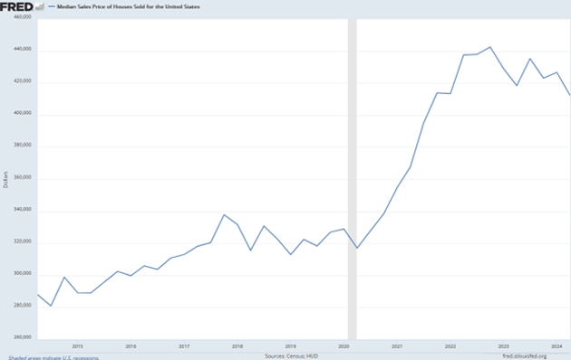
First, let’s look at how home prices changed. The chart below shows quarterly HUD data for actual selling prices (larger image here). Note this is a national average; your local conditions could have been quite different.

Source: FRED
For sales in Q2 2014, the average price was $288,000. Ten years later in Q2 2024 it was $426,800, a 48.2% increase. That was actually down a bit from the Q4 2022 peak, when the average selling price was $442,600, a 53.7% increase in 8½ years. This far exceeds CPI inflation over these periods.
Notice, however, when most of the gains occurred. Home prices zoomed higher in the COVID era, gaining 39.6% in the 2½ years from Q2 2020. Why? That period’s general uncertainty led many Americans to seek safer, more comfortable surroundings, particularly those whose jobs could be done remotely.
Yet I think the COVID-driven monetary and fiscal stimulus was a much bigger factor. The Fed’s easy policy made borrowing cheap while other programs put cash in people’s pockets. Consumer goods spending boosted profits at many businesses. This led to higher salaries, bonuses, and stock prices. A small number of business owners and executives ended up with a lot of extra money, some of which went to buying new homes. Naturally, prices rose.
Those are “demand” factors. Things were happening on the supply side, too. Building materials became scarcer and more expensive due to shipping delays, etc. Even when materials were available, labor shortages and public health rules often slowed construction progress.
That period was a perfect storm of rising demand and lower supply. And remember, some areas had much more dramatic changes than the national averages.
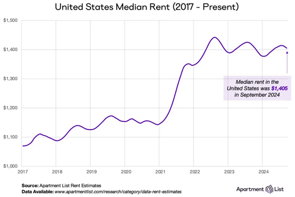
A similar trend unfolded in rental properties. Here’s the latest data from Apartment List.

Source: Apartment List
This is median rent, not average, which means it is probably less affected by super-expensive properties than the home price data. But it still shows apartment rent jumping 20–25% in less than two years from the 2020 level, then mostly holding those gains. Six of my eight kids rent their homes, and I can tell you they are not happy with apartment/house rent increases which in their cases were a lot more than 20%.
As of last month, the median US apartment rent was $1,405 per month. That means someone who wants to prudently spend only 30% of their income on rent would need an annual household income of around $56,000. Not a problem for many, as median household income is roughly $80,000... but a big problem for some. And if you have kids or need an extra bedroom? (Just a note, but I am told that apartments in Asheville, North Carolina were in the $2,000-a-month range before Helene.)
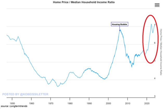
Let’s go deeper on this affordability question. Homeownership became “the American Dream” in the post-WW2 period. Giant housing developments appeared in the suburbs surrounding major cities, with ample supply and a growing economy making those houses affordable to most families. You can see it in the ratio of home prices to household income.

Source: The Kobeissi Letter
The period spanning roughly 1960–2000 was a golden era of home affordability, with the average home priced around 4X the typical family’s income. The economy had its ups and downs, but most people could afford to put a roof over their heads. This provided a sense of stability and confidence.
Something changed in the early 2000s, and I’m not sure we fully understand what happened. My study tells me it relates to Fed interventions causing a mispricing of risk combined with mortgage bankers (especially the subprime markets) and investment banking sales desks making huge profits on mortgage-backed securities. Plus, the rising market increased on demand and got out of control. In any case, it produced a housing bubble that exploded into the 2008 financial crisis.
Home prices (relative to income) fell after 2008 but, as you see in the above chart, never approached the level seen in that golden era. Now they are even higher than they were at the previous bubble peak. That’s not to say another 2008-style breakdown is near; history rarely repeats itself so neatly. But conditions are in extreme territory.
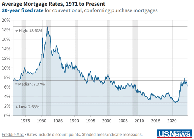
Mortgage rates are a part of this, but not necessarily key. Here’s a graph showing 30-year fixed rates since 1971.

Source: US News
Today’s mortgage rates are the same or lower than at any point in the 1970s, 1980s, or 1990s. So higher financing costs are a hurdle to homeownership, but price seems to matter far more.
When home prices rise faster than incomes, at some point the pool of potential buyers shrinks. In theory, prices should adjust lower to clear the market. That’s happening only slowly, if at all. One reason is that current homeowners have to move when they sell. Where? They face the same difficulties as buyers.
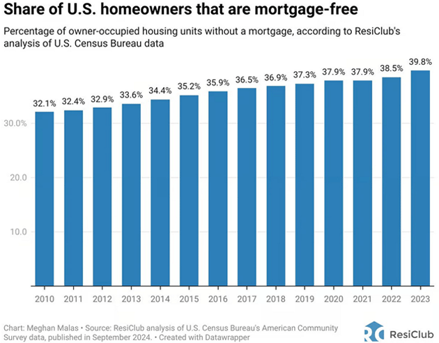
Selling is particularly unpleasant if, like almost 40% of current homeowners, the sellers have grown accustomed to having no mortgage at all. Maybe they’ve reached retirement age and want to downsize, but their income is lower now. They need to sell at a price high enough to pay for their new home. If they can’t get it, they wait.

Source: Anthony Pompliano
In addition to the no-mortgage people, a large group of low-mortgage homeowners bought or refinanced in that short window when you could get a 3% fixed rate or even less. Selling now would mean buying something else at a much higher rate. When we moved to Puerto Rico, I gave up a 2.375% mortgage for a 6% mortgage here. While Shane and I have substantial equity in our home we really can’t sell because there is nothing to buy that hasn’t also increased in price. (Plus, I think she would either divorce or shoot me, neither of which is a good outcome.)
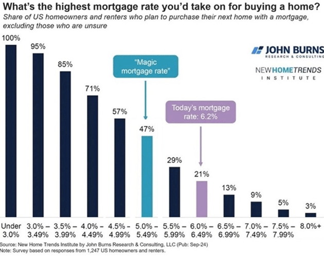
My friend John Burns, who does some amazing real estate research, runs a survey asking prospective buyers the highest rate they would pay. More than half draw the line at 5.5%, a level that is currently unattainable. Might they pay more if they found a home they really like? Sure. But the knowledge they can’t get their desired rate probably keeps them from even looking.

Source: John Burns
Add all that together and you get the current standoff. Buyers can’t afford to buy while sellers can’t afford to sell. It’s a classic “frozen market” and could stay this way for a long time.
The real answer isn’t lower rates, but more supply of the kind of homes buyers want. A change in development-discouraging “NIMBY” (Not in My Back Yard) policies would help. Local regulations often make it practically impossible for market forces to produce the housing supply that would bring down prices.
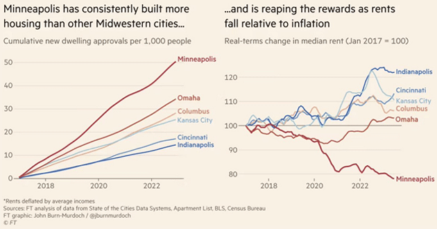
It is happening in some places, though. The generally more flexible rules in the Sunbelt states are a prime reason (in addition to weather) so many people moved there in recent years. Housing is simply more abundant and more affordable. Other states are moving in this direction. You can see in the chart below a close connection between housing supply and rental rates in the Midwest. Housing prices fall relative to inflation in places that allow more construction.

Source: Financial Times
It turns out the law of supply and demand works pretty well, if we let it.
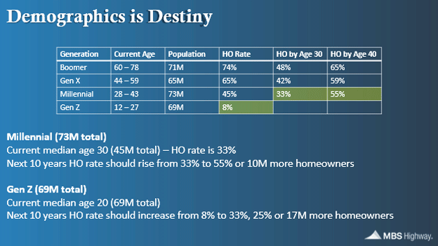
My friend Barry Habib sent me an excellent chart this week which illustrates the problem. It is a well-known phenomenon that our tendency to buy a home increases with age. As the chart below shows, 48% of the Boomer generation were homeowners by age 30. Remember, those were the golden years of home ownership. Today, 74% of Boomers own their homes.
But as each succeeding generation reached the age of 30 and 40, the percentage of the generation owning a home decreased. Homeownership for the Millennial generation by age 30 is only about 33%. If this rises to the Gen X rate, by the time they’re 40 it would be 55%, meaning 10 million additional homeowners. (Note that couples would count as two homeowners.)

Source: Barry Habib
You can do that same calculation for Gen Z. Barry told me he estimates that between both the millennial and Gen Z demand, and adjusting for couples, the demand for homes will increase by about 21 million homes over the next 10 years. But we are generally only producing about 1.3 million net new homes a year (as we lose 100,000 homes a year for various reasons).
I think you can see the problem. The desire to own a home will still be there, but there will be 8 million fewer homes available than previous generations would typically desire. That will keep a bid under home prices.
But it will also create demand for apartments as people have to live somewhere. There is a reason the stock prices of well-managed homebuilding companies are generally high. Yes, they are responding to the market by trying to build more affordable homes, but the demand is going to stay elevated.
Since inflation is a function of Owner’s Equivalent Rent (OER) and not actual house prices, it is very possible that OER, which has an outsized proportion of the inflation number, will stay well above the targeted 2%. Not to mention insurance and all the other things that go along with owning a home.
Now let’s swing back to how all this relates to inflation. Fed officials agreed to cut rates last month because they think inflation is heading back to their target, which is 2% on the core PCE index. Yet it is very clear they will not reach that target unless housing prices break. How likely is that?
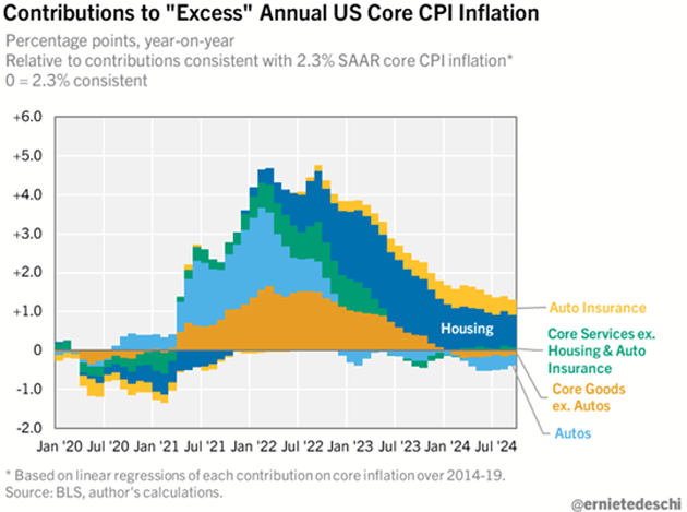
Here’s another interesting way to look at the situation. This chart resets core CPI inflation so that 2.3% (which is roughly equivalent to the Fed’s 2% PCE target) is the zero line. What’s left is “excess” inflation.

Source: Ernie Tedeschi
Currently, year-over-year CPI has about 1 percentage point of excess inflation. Most of it (0.8pp) comes from housing. Auto insurance accounts for most of the rest, offset further by lower core goods prices.
The September CPI report showed that housing (blending both rent and owner’s equivalent rent) rose 0.32% month over month. That is almost (assuming it continues) down to the pace needed to put housing inflation in the Fed’s range. It’s tantalizingly close. But I’m still not sure it can happen, at least in the next 12 months.
Even if housing prices soften, consider what else would be happening. Inflation declining to the Fed’s target and staying there probably means weaker economic growth. Not necessarily a recession, but certainly more unemployment along with lower wage growth and consumer confidence. Those aren’t great conditions for home buyers or home sellers.
At the same time, inflation fear and continuing federal debt growth will probably put a floor on long-term interest rates, including mortgage rates. Reaching that 5.5% level the John Burns survey says buyers want may be difficult, considering that the economy is pretty much running on all eight cylinders right now. Second-quarter real GDP growth was running at +3.0% and the Atlanta Fed’s GDPNow forecast says the third quarter will be 3.4%. Not exactly an environment where the Fed will want to cut as much as the market expects. But even slightly lower short-term rates mean many retirees will see lower interest income, making them less motivated to sell their homes.
As noted, it will likely take new supply to solve this. Hurricanes Helene and Milton make this harder. Repairing the many thousands of damaged/destroyed homes will consume giant amounts of materials and labor without adding any new supply. It will simply let the people who are now in some kind of temporary housing return to their previous homes. That’s important, of course, but it complicates the economic outlook.
Finally, let’s note that “core” inflation, while analytically useful, omits food and energy prices that could also rise. I don’t know what will happen in the Middle East but an interruption to oil shipments is certainly possible. It wouldn’t help food prices, either.
What does the Fed do then? They might elect to ride it out as long as the core indexes stayed put. But that would ignite fears inflation could get out of control, sending long-term rates higher, including mortgage rates.
Scroll up and look again at that chart of the housing price/income ratio—the one that’s currently above the previous 2008 peak. It is difficult to believe it will stay here. But for it to normalize back to the pre-COVID level would require lower home prices, higher nominal incomes, or both.
It’s also difficult to see how this ends leaving everybody happy, especially given the nearly $2.3 trillion deficit the government is running. It reminds me of the old saying about how did you go bankrupt? Slowly, and then all at once.
I cannot remember the last time I didn’t have a scheduled trip in my future. I know I have to be in Dallas, I need to get to New York, and there are some places it would be convenient to be, but no actual schedules as of yet.
Side thought. I listened to a presentation this week from one of the nation’s most celebrated rocket scientists. It turns out that Puerto Rico has a massive old unused Navy base and airport that would be perfect geographically for launching rockets. He thinks he can build an actual horizontal takeoff and landing space plane while launching rockets in the meantime. He’s got a team and they are doing it. He has moved here.
I asked from the audience how long would it take to actually launch a rocket from this facility? “Two years,” was his answer, “except that it will take 3 to 5 years to get all the permits done.”
Think about that. After that first launch within five years Puerto Rico would be one of the three or four largest spaceports in the world. 50,000 total new jobs? That, with other big projects on the drawing table, could propel Puerto Rico to a new level of prosperity.
A friend sent me this quote: “When small men (and women) begin to cast big shadows, it means that the sun is about to set.” There is some history to that quote and it has evolved over time.
It brought to mind the recent ruling by the California Coastal Commission rejecting the Air Force’s request for SpaceX to launch 50 rockets from Vandenberg Air Force Base, which they have been doing for decades. The main reason they cited were Musk’s political views. There is NO environmental reason. Never mind that this will have a negative military and defense impact. Or all of the economic benefits. Musk must be stopped because, well…
The US has been a country for almost 250 years and we have almost twice as many regulatory agencies, just at the federal level. Regulations are important and I wholeheartedly endorse a thoughtful regulatory environment. But using your power to make a political statement? Not only is that morally wrong, it is illegal.
Small men, big shadows. If it was just this one instance maybe you shrug your shoulders. But we all have seen this type of thing in our businesses and lives.
You want to know why there is a pushback against elites? Small men and women with big shadows are a very big reason.
I remain a Rational Optimist. And with that, I will hit the send button and wish you a great week! And don’t forget to follow me on X.
Your wanting to see rockets launched from Puerto Rico analyst,


