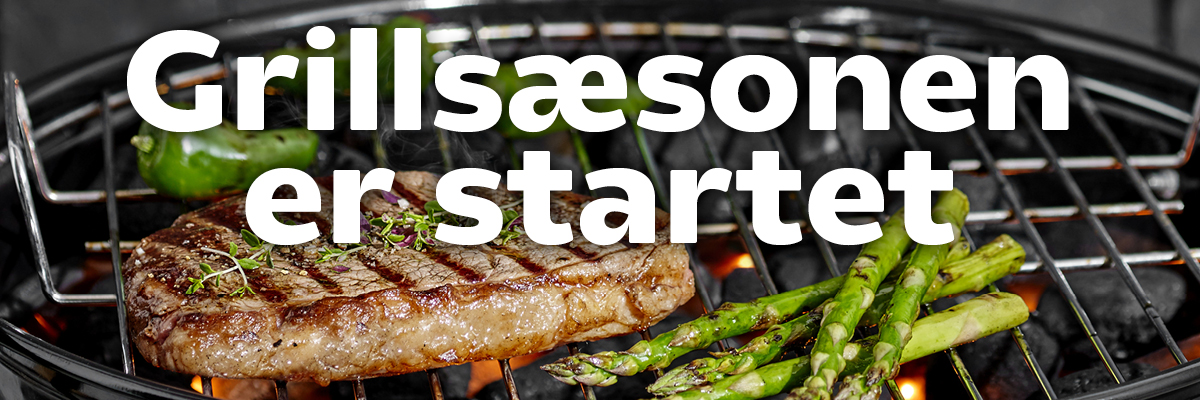
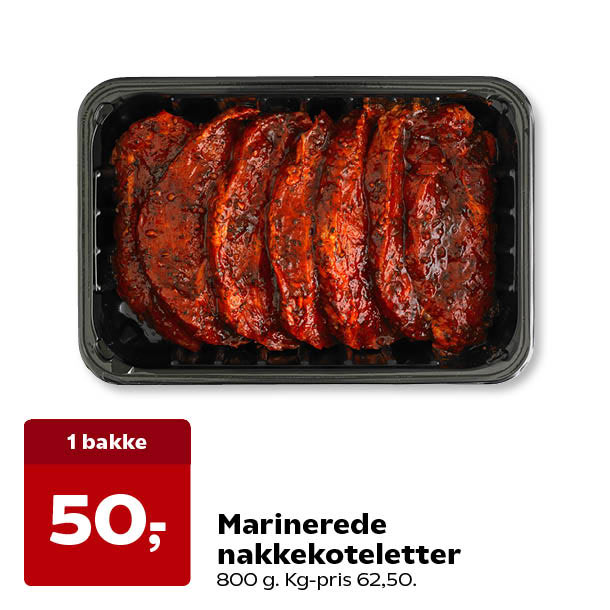
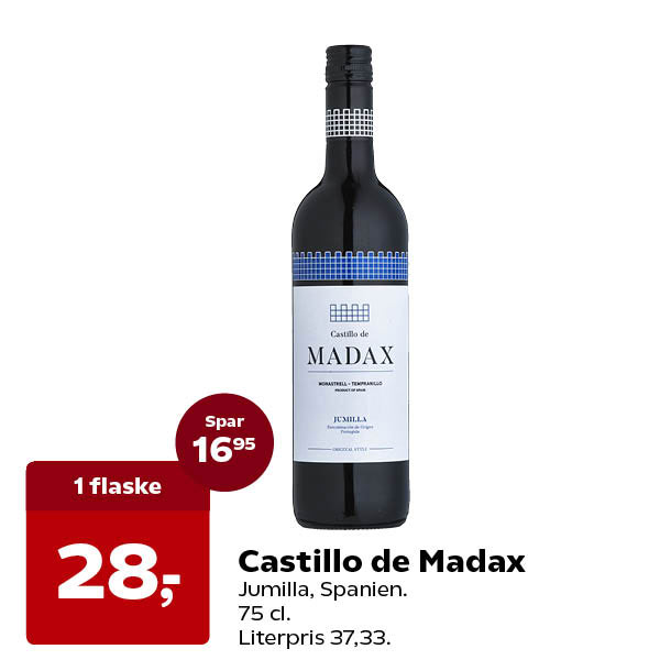
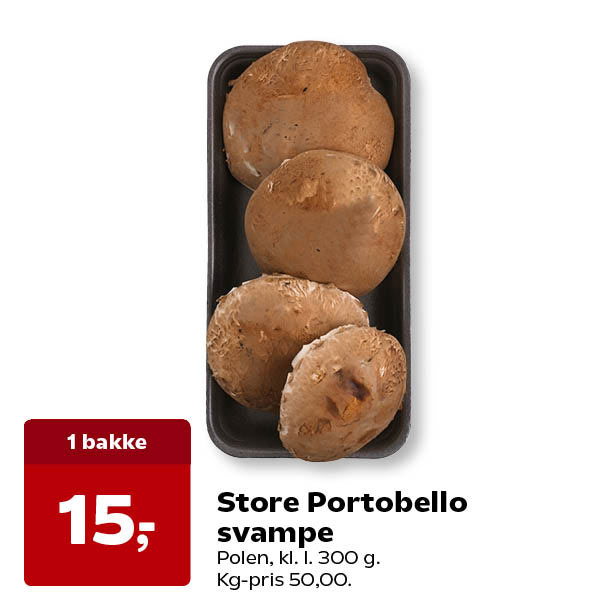
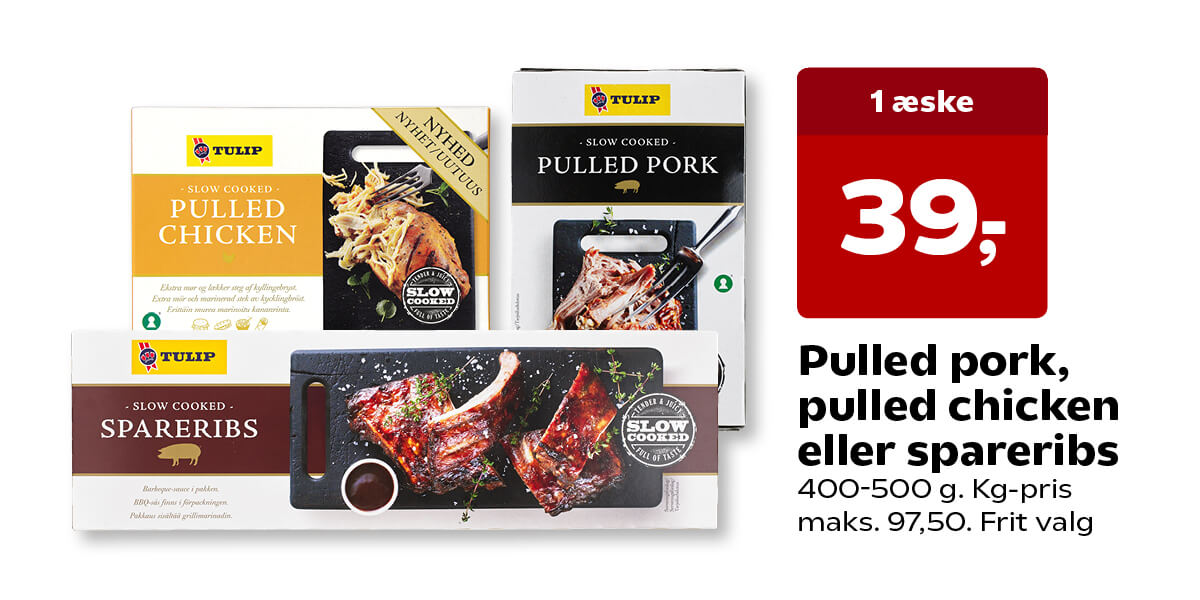
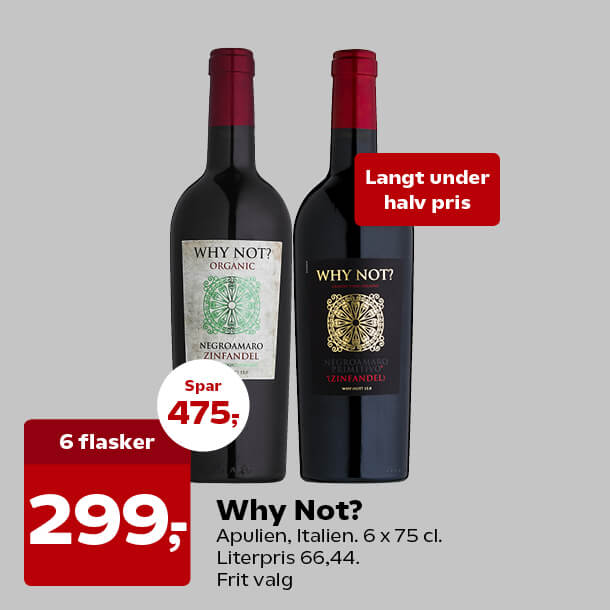
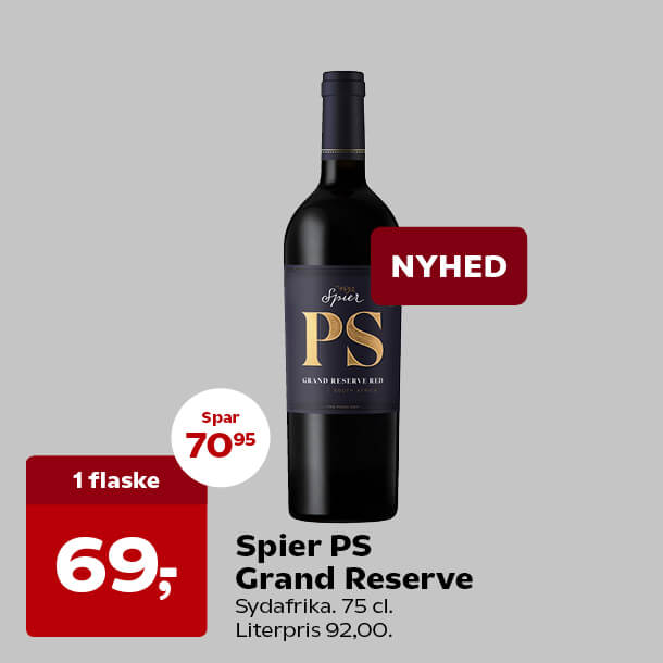
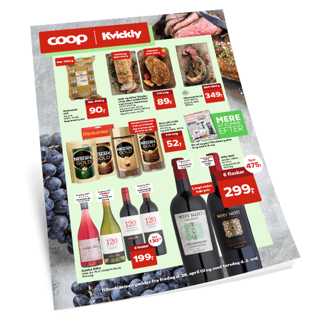
Kvickly Tilbuddene i mailen glder fra fredag d. 26. april til og med torsdag d. 2. maj 2019 i Coop Kvickly.
Flg os og f gode tilbud
Kontakt os | Afmeld | Registreringsvilkr Vi tager forbehold for skrivefejl, prisndringer, afgiftsndringer og udsolgte varer. Kvickly bytter gerne eller giver pengene retur inden for 14 dage fra kbstidspunktet mod fremvisning af bon. Varen skal vre i ubrudt original emballage. Glder ikke fdevarer. Er du utilfreds med en vare, du har kbt i Coop, s henvend dig i butikken hvor du har kbt varen eller til Forbrugerservice tlf. 4386 4386.
-Regular.woff') format('woff'), /* Pretty Modern Browsers */ url('https://coopcdnpro.blob.core.windows.net/brands/general_assets/fonts/Coop_Typeface/TTF/COOP-Regular.ttf') format('truetype'); /* Legacy iOS/Android */ } @font-face { font-family: 'Coop Light'; font-style: normal; font-weight: 400; src: url('https://coopcdnpro.blob.core.windows.net/brands/general_assets/fonts/Coop_Typeface/WOFF-2-TT/COOPWeb-Light.woff2') format('woff2'), /* Super Modern Browsers */ url('https://coopcdnpro.blob.core.windows.net/brands/general_assets/fonts/Coop_Typeface/WOFF-TT/COOPWeb-Light.woff') format('woff'), /* Pretty Modern Browsers */ url('https://coopcdnpro.blob.core.windows.net/brands/general_assets/fonts/Coop_Typeface/TTF/COOP-Light.ttf') format('truetype'); /* Legacy iOS/Android */ } @font-face { font-family: 'Coop Bold'; font-style: normal; font-weight: 400; src: url('https://coopcdnpro.blob.core.windows.net/brands/general_assets/fonts/Coop_Typeface/WOFF-2-TT/COOPWeb-Bold.woff2') format('woff2'), /* Super Modern Browsers */ url('https://coopcdnpro.blob.core.windows.net/brands/general_assets/fonts/Coop_Typeface/WOFF-TT/COOPWeb-Bold.woff') format('woff'), /* Pretty Modern Browsers */ url('https://coopcdnpro.blob.core.windows.net/brands/general_assets/fonts/Coop_Typeface/TTF/COOP-Bold.ttf') format('truetype'); /* Legacy iOS/Android */ } @import url('https://fonts.googleapis.com/css?family=Montserrat'); b { font-family: Coop Bold, 'Arial Black', Arial, sans-serif; ? } strong { font-family: Coop Bold, 'Arial Black', Arial, sans-serif; } span.MsoHyperlink { mso-style-priority: 99; color: inherit; } span.MsoHyperlinkFollowed { mso-style-priority: 99; color: inherit; } /* CLIENT-SPECIFIC STYLES */ #outlook a { padding: 0; } /* Force Outlook to provide a "view in browser" message */ .ReadMsgBody { width: 100%; } .ExternalClass { width: 100%; } /* Force Hotmail to display emails at full width */ .ExternalClass, .ExternalClass p, .ExternalClass span, .ExternalClass font, .ExternalClass td, .ExternalClass div { line-height: 100%; } /* Force Hotmail to display normal line spacing */ body, table, td, a { -webkit-text-size-adjust: 100%; -ms-text-size-adjust: 100%; } /* Prevent WebKit and Windows mobile changing default text sizes */ table, td { mso-table-lspace: 0pt !important; mso-table-rspace: 0pt !important; } /* Remove spacing between tables in Outlook 2007 and up */ img { -ms-interpolation-mode: bicubic; } /* Allow smoother rendering of resized image in Internet Explorer */ /* RESET STYLES */ div[style*="margin: 16px 0"] { margin: 0 !important; } img { border: 0; height: auto; line-height: 100%; outline: none; text-decoration: none; } table { border-collapse: collapse !important; } body { height: 100% !important; margin: 0 !important; padding: 0; width: 100% !important; } /* iOS BLUE LINKS */ .appleLinksWhite a { color: #ffffff; text-decoration: none; } .appleLinksGrey a { color: #949494; text-decoration: none; } .preheader { display: none !important; visibility: hidden; opacity: 0; color: transparent; height: 0; width: 0; } /* CSS for hiding content in desktop/webmail clients */ .mobileOnly { max-height: 0px; min-height: 0px; /*Gmail seems to add min-height by itself*/ font-size: 0; display: none; max-width: 0px; overflow: hidden; } .desktopOnly { max-height: none !important; min-height: none !important; font-size: 12px !important; display: visible !important; max-width: none !important; overflow: visible !important; } /* Mobile styles */ @media only screen and (max-width: 500px) { .show { display: block !important; width: 394px !important; height: auto !important; max-width: none !important; max-height: none !important; overflow: visible !important; font-size: 14px !important; line-height: 19px !important; } .break { display: block !important; width: 100% !important; } .hide { display: none !important; } .w394 { width: 394px !important; } .w360 { width: 360px !important; } .w394-bg { background-size: 394px 394px !important; } .h394 { height: 394px !important; } .w155-500 { width: 155px !important; } .w280 { width: 280px !important; } .w200 { width: 200px !important; } .w95 { width: 95px !important; } .w80 { width: 80px !important; } .w56 { width: 56px !important; } .w52 { width: 52px !important; } .h40 { height: 40px !important; } .h30 { height: 30px !important; } .h20 { height: 20px !important; } .f20 { font-size: 20px !important; line-height: 24px !important; } .p20 { padding: 20px !important; } .p20-20-0 { padding: 20px 20px 0 !important; } .p20-5-0 { padding: 20px 5px 0 !important; } .p0-20-20 { padding: 0 20px 20px !important; } .p5-20 { padding: 5px 20px !important; } .p20-40-20-20 { padding: 20px 40px 20px 20px !important; } .p20-20-0-20 { padding: 20px 20px 0px 20px !important; } .p30 { padding: 30px !important; } .p30-30-0-30 { padding: 30px 30px 0px 30px !important; } .p30-20-0 { padding: 30px 20px 0px !important; } .bg-size { background-size: 400px 800px !important; } .center { text-align: center !important; } .button_center { margin: 0 auto !important; } .f14 { font-size: 14px !important; } } @media only screen and (max-width: 414px) { .show { display: block !important; width: 355px !important; height: auto !important; max-width: none !important; max-height: none !important; overflow: visible !important; font-size: 14px !important; line-height: 19px !important; } .w355-413 { width: 355px !important; } .w310 { width: 310px !important; } .w355-413-bg { background-size: 355px 355px !important; } .h355-413 { height: 355px !important; } .w140-413 { width: 140px !important; } .w115-414 { width: 125px !important; } .w65-413 { width: 65px !important; } .f12 { font-size: 12px !important; } } @media only screen and (max-width: 375px) { .show { display: block !important; width: 300px !important; height: auto !important; max-width: none !important; max-height: none !important; overflow: visible !important; font-size: 14px !important; line-height: 19px !important; } .w300-374 { width: 300px !important; } .w270 { width: 270px !important; } .w300-374-bg { background-size: 300px 300px !important; } .h300-374 { height: 300px !important; } .hide-374 { display: none !important; } .f16-374 { font-size: 16px !important; line-height: 20px !important; } .w115-375 { width: 125px !important; } .w52-374 { width: 52px !important; } .w40-374 { width: 40px !important; } .f10 { font-size: 10px !important; } } /**** BURGERMENU ****/ @media only screen and (max-width: 600px) { .p15-20 { padding: 15px 0px !important; width: 120px !important; } .p10-20 { padding: 10px 20px !important; } .p10-10-10-20 { padding: 10px 10px 10px 20px !important; } .hide600 { display: none !important; } .w50procent600 { width: 50% !important; } .main-table, .main-content img { width: 100% !important; } #navcontainer { position: relative; } #navcontainer th { display: block; width: 100%; height: 18px; padding: 10px 0px; text-align: right; } #navcontainer th.firstNav, #navcontainer th.secondNav { border-bottom: 2px solid #575757; } #navcontainer th, a { width: 100%; } #menucontainer { position: relative; overflow: hidden; } #navcontainer table { margin-top: -500px; -ms-transition: margin-top .5s ease-in-out; -webkit-transition: margin-top .5s ease-in-out; } /* checkbox mechanism */ #navcheckbox:checked+table { margin-top: 0%; } /* fallback hover mechanism */ .nav-over, .nav-under { display: block !important; max-height: none !important; padding-top: 19px; padding-bottom: 20px; } .nav-over img, .nav-under img { display: block; float: right; margin-right: 0px; } /* to deal with quirks in windows 8.1 and Outlook iOS */ .nav-over { -ms-transition-delay: 1.5s; -webkit-transition-delay: 1.5s; } #navcontainer>.nav-over:hover+div table { margin-top: 0% !important; } #navcontainer>.nav-over:hover { visibility: hidden; } .logo-position { position: absolute !important; display: block !important; z-index: 4 !important; } .show-logo { overflow: visible !important; float: none !important; line-height: 100% !important; display: block !important; width: 140px !important; } .p0-600 { padding: 0 !important; } } /**** BURGERMENU ****/
Tilbuddene i mailen glder fra fredag d. 26. april til og med torsdag d. 2. maj 2019 i Coop Kvickly.
Flg os og f gode tilbud
Kontakt os | Afmeld | Registreringsvilkr Vi tager forbehold for skrivefejl, prisndringer, afgiftsndringer og udsolgte varer. Kvickly bytter gerne eller giver pengene retur inden for 14 dage fra kbstidspunktet mod fremvisning af bon. Varen skal vre i ubrudt original emballage. Glder ikke fdevarer. Er du utilfreds med en vare, du har kbt i Coop, s henvend dig i butikken hvor du har kbt varen eller til Forbrugerservice tlf. 4386 4386.