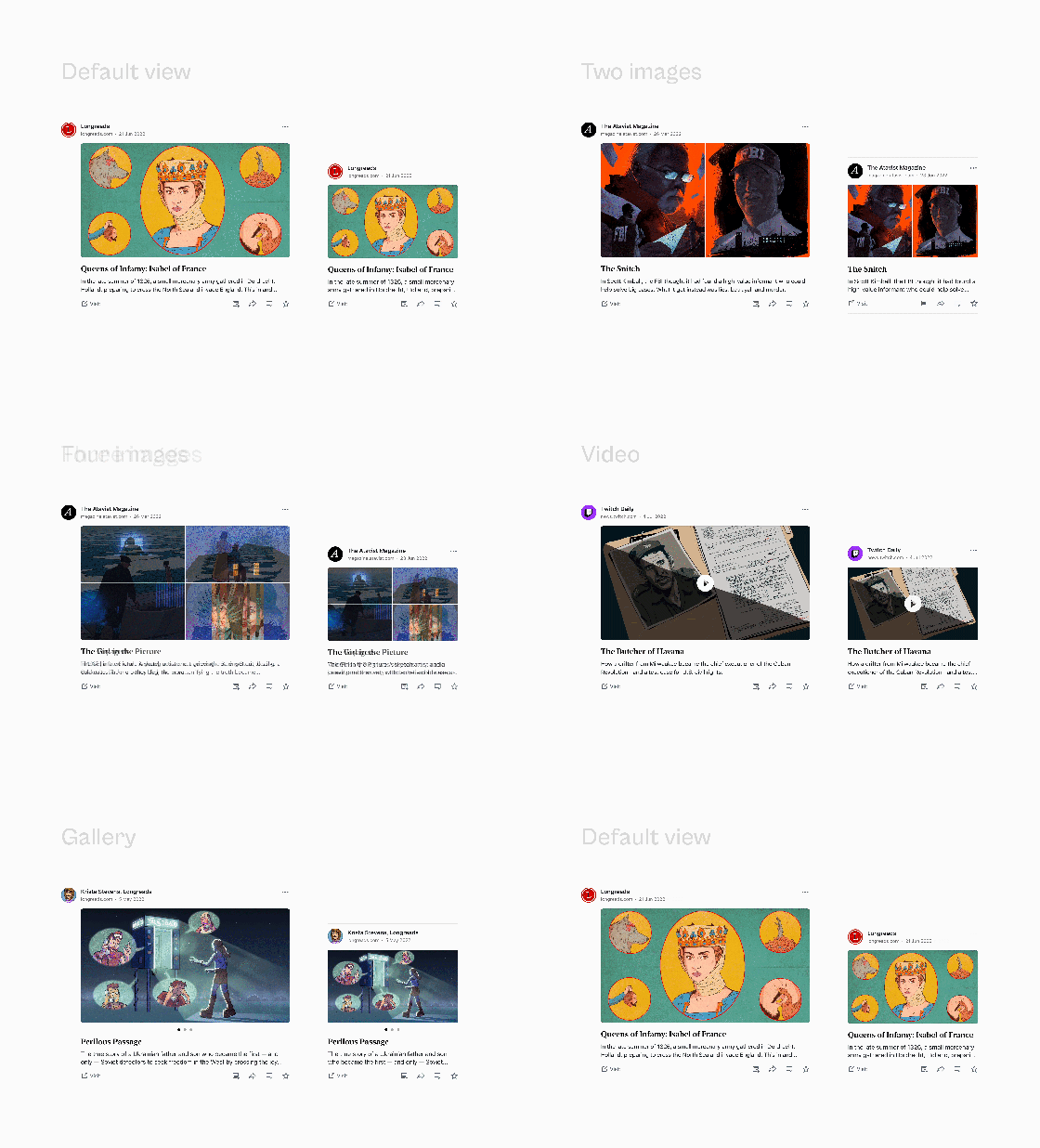
If you've recently visited the WordPress.com Reader, you may have noticed some aesthetic improvements. Today we're giving you a quick visual tour of those changes and inviting you to check out our new and improved Reader if it's been a while. Let's jump in!
Streamlined Consistency
Each of the individual cards within the reader have been redesigned to better highlight the content you’re sharing with your audience. Images and videos have been enlarged, padding and margins have been improved, and the general layout has been adjusted across all content types to provide a consistent reading experience.
Updated Layouts
A number of the layouts within the WordPress.com reader have been streamlined on desktop and mobile web to make browsing and discovering new content easier.
Grid Aligned
You might not notice this at first glance, but a consistent grid has been applied to the entire layout to make it easier for your eyes to scan content and scroll through your entire feed.
First of Many Improvements
This is the first of many improvements that we hope to make to the reader over the next year. If you have additional feedback on improvements we might make, please share them in the comments below and stay tuned for additional updates.


