The Misunderstood Flattening Yield Curve By John Mauldin | Dec 15, 2018 Everybody is suddenly talking about the inverted yield curve. They’re right to do so, too, but alarm bells may be premature. Inversion is a historically reliable but early recession indicator. The yield curve isn’t saying recession is imminent, even if it were fully inverted, which it is not. What we see now is really more of a flattened yield curve, with a smaller but still positive spread between short-term and long-term interest rates. That’s not normal, but it’s also not a recession guarantee. However, when we combine this with assorted other events, it adds to the concerns. I’ve been writing in this letter about negative yield curve since 2000, when the inverted yield curve said there was a recession in our future and I called a bear market in equities. Ditto for 2006, though that time the yield curve inverted long before the stock market turned. Today, we’ll look at what the yield curve is really telling us. Before we go on, let me give you a special invitation. Next week we’re opening up Alpha Society membership for a very limited time. If you don’t know, the Alpha Society gives you the best, most exclusive access to me and all our Mauldin Economics research. For one low price, you get lifetime subscriptions to all our premium services, plus some very attractive additional benefits. To keep it exclusive, we open Alpha Society membership only occasionally. This year I want to reward our most loyal readers with something different: the Alpha Society Priority List. Signing up doesn’t obligate you to do anything. We’ll just notify you when membership opens next week and give you a special Priority List discount that will save you hundreds of dollars. I love meeting Alpha Society members as I travel around the world. I’ve made some strong relationships and even business deals this way, so I really urge you to consider joining. But please act now because Priority List registration closes at midnight Sunday, December 16. Click here to learn more. Now let’s dive into the Great Flattening Yield Curve and what it really means. In July 2017 I wrote a letter called Happiness Is a Normal Yield Curve and now it seems like about 10 years ago. The Fed was still in tightening mode at that point and short-term rates were rising faster than long-term rates, producing a flatter but not inverted yield curve. (Quick explanation for the uninitiated: The yield curve is simply a graph showing current interest rates for various maturity periods, with rates on the vertical axis and time on the horizontal. Normally it slopes upward from left to right. All the discussion and drama are about the angle of that line.) Here is the latest view, via GuruFocus. 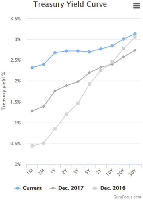 The light gray line is the yield curve two years ago, the medium gray is one year ago, and the blue is now. You can see the curve went from very steep to much less so in this period. That is what we mean by “flattening.” It isn’t fully flat yet, but is moving in that direction. Notice also in the blue line, the area between 3Y and 5Y actually angles slightly downward. That is the “inversion” the media is reporting so breathlessly. It is really more of a bump, if that. As I write, the 3Y is actually 2.84% and the 5Y is 2.83%. So the mainstream media, business media, and writers are getting all breathless about 0.01% on just one part of the curve. Which is kind of, sort of important to watch but it doesn’t really mean anything in terms of the economy, at least yet. That said, it is still remarkable that 1-year Treasury and 5-year Treasury securities, and everything in between, all have almost exactly the same yields. You don’t see any such plateau in the 2016 or 2017 curves. For the record, here’s a chart of interest rates for the last two weeks directly from the US Treasury. What you can notice is the fact that short-term rates are rising and long-term rates are falling. This is what you would see ahead of a full inversion but the process can go on for a long time. 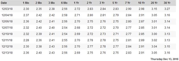
Source: US Treasury Yields are supposed to reflect risk, and risk grows with time. The chance something bad will happen in the next five years is higher than the chance something equally bad will happen in the next year. Lenders, i.e. bond investors, should demand a higher yield as compensation for that higher risk. Presently they aren’t. I show all this to clarify a point the media is obscuring: The full yield curve is not inverted. Only a small part of it is inverted, which is unusual but no reason to panic. It is nowhere near the kind of inversion that might signal recession. And even if it were, it wouldn’t mean recession is right around the corner. I’ve been using an analogy in my speeches recently that has received excellent feedback, so I want to share it with you. Many media sources and writers seem to indicate that an inverted yield curve causes recession. That is simply not true. Think of an inverted yield curve as a fever. When your body gets a fever, the fever is not the cause of the sickness. It just says something’s wrong with your body. You have the flu, appendicitis, or some other ailment. The fever indicates you are sick but not necessarily what the sickness is. And typically, the higher the fever the more serious the condition. It is the same with the yield curve. The more inverted the yield curve is and the longer it stays that way, the more confident we are that something is economically wrong that may show up as a recession sometime in the future. More on that timing below. In a true inversion we would see the entire curve angled down from left to right. That last happened in 2005. Were we in recession then? No, not at all. The economy was booming. In fact, the yield curve stayed inverted until mid-2007. Some of us saw cracks forming in the economy, and said so at the time. But the actual recession would not begin until December 2007. That’s a longstanding pattern. The inverted yield curve has been a pretty reliable recession indicator but it shows up far in advance—months or even more than a year. We might better think of it as signaling the cycle’s “blowout” stage. People see the inversion, observe nothing bad happening, then throw caution to the wind. Another way to illustrate this is with a yield spread, i.e., a long-term yield minus a short-term yield. You can graph the difference and it goes below zero when the short-term yield is higher, meaning an inversion exists between those two points on the yield curve. This chart shows the spread between 10-year and one-year Treasury yields. 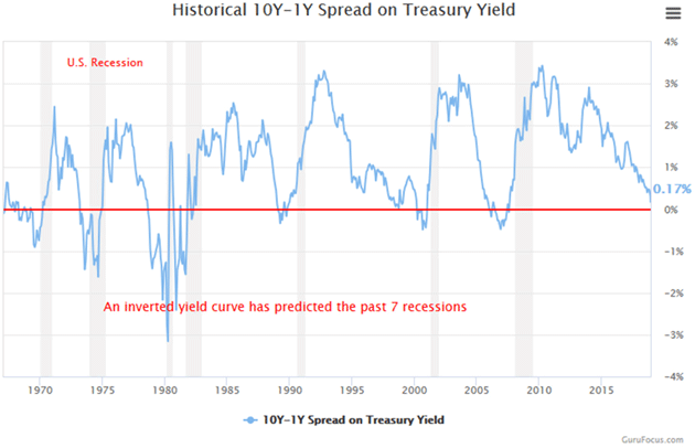
Source: GuruFocus The gray vertical bars are recessions. You can see how the spread dropped below the 0% line right before each one, and is now close to that point again. But notice also how long it stayed inverted before the last recession, and how far in advance. The 10Y-1Y spread dropped below zero in January 2006, came back above for a little bit, stayed there and was moving higher when the recession finally began. The same happened in 2000. In fact, by the time actual recession arrives the yield curve can resume a normal pattern. Here’s a slightly different chart from FRED (the St. Louis Federal Reserve all things economic database), using the 10Y-2Y yields. This is the “tens and twos” spread traders usually watch. 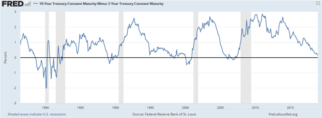
Source: FRED We again see the same pattern. You can vary the parameters but the broad principle holds pretty well. Yield curve inversions precede recessions by anywhere from a few months up to two years. This awareness that an inverted yield curve signals recession isn’t new, nor did it appear from thin air. My first economic mentor, Dr. Gary North, was teaching me about inverted yield curves in the early 1980s. To my knowledge, there was no real research, just anecdotal observational analysis, but it still held. Then my friend and economist Campbell Harvey, now at Duke University, first proved its forecasting accuracy in his 1986 University of Chicago doctoral dissertation. Others quickly confirmed and expanded on his conclusions. In 1996, New York Fed economists Arturo Estrella and Frederic S. Mishkin authored a paper comparing the yield curve to 19 other indicators and, importantly, finding a connection between the yield spread and recession probability. To summarize, Estrella and Mishkin found the yield curve is most predictive of recession a year or so ahead of time. In fact, they concluded an inverted yield curve was the only useful predictor of recessions. Examining all the data from 1960-1995, they calculated the probability a recession would occur four quarters ahead, based on the spread between three-month and 10-year Treasury securities. They summarized it in this table. 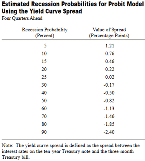
Source: New York Federal Reserve Bank Again, the yield curve is inverted when the spread is negative. Estrella and Mishkin found recession probability begins rising as the spread drops toward and then below zero. But notice how long it takes. Even when the curve mildly inverts with the spread at -0.17%, the odds of a recession in the next year are still only 30%. But from a practical standpoint, by the time their model shows a 30 or 40% probability of recession, there has always been a recession following that point. Your next question, of course, is where are we now. The 3M/10Y spread is about 0.48%. The table suggests this is consistent with about a 15% recession probability four quarters from now. Not so bad, if you are a bull. It means odds are good we’ll get through 2019 without recession. Maybe longer, if the Fed pauses tightening next year and long-term yields stay where they are. We are not out of the woods, though. We may just be entering them. Here is the 3M/10Y spread, the one Estrella and Mishkin used in their study, since the last recession ended. 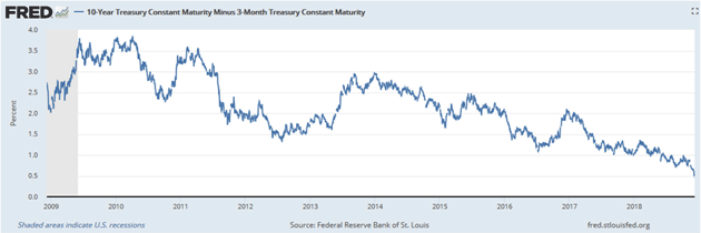
Source: FRED The spread peaked almost coincident with the last recession’s end (the gray area at left) and has been dropping ever since. The ride down was smoother since mid-2017. Another two years like the last two will put the spread around -1.0%, meaning a recession is likely in 2020. The decline could also steepen and bring recession sooner. After they wrote this paper, Mishkin went on to be a Fed Governor from 2006-2008 and is now at Columbia University. Estrella is still at the New York Fed and has been keeping these numbers updated. Here’s his latest chart showing recession probability. 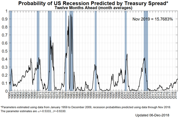
Source: New York Fed As you see in the lower right of the chart, recession probability has been rising and is now around 15%, consistent with their earlier work. It is not rising as quickly as it did ahead of the last recession. A little history: In September 2000 the yield curve was seriously inverting. I called Estrella to talk about the importance of the curve. I wrote then: First, he told me he had done another study in 1998 comparing even more predictors. The latest study involved 30 potential predictors of a recession. The conclusion of that study was that the 90-day average of the yield curve was still the most reliable predictor of the 30 they studied, so score one for taking this current situation more seriously. But he would not go so far as to say that he personally saw a recession coming. I would like to consign that reluctance to the fact that he was still at the Fed. In 2006, I called another Fed researcher and asked about recession probability. Again, there was great reluctance to actually predict a recession. This Federal Reserve economist actually went so far as to say (I swear, the person really said this): “There are reasons to believe it may be different this time.” Later in 2006, I was on my friend Larry Kudlow’s CNBC show with Nouriel Roubini and John Rutledge. Larry and John were both adamant the bull market was in no way over and no recession was on the horizon. Nouriel and I saw it different. Oddly, we were all correct. How can that be, you ask? A bear market began about six months after the show and recession six months later. But the stock market rose almost 20% after that show as well, so if you had exited the stock market, you would’ve missed a 20% rise (but still avoided a 50% bear market). Sidebar: That has now happened to me twice. I’ve called recessions early and missed some opportunities. That is one of the reasons that I now use money managers with quantitative timing models. At the beginning of 2017, the four managers I use were heavily invested in equities. This year they have slowly moved into cash and are now as a group holding a significant portion (over 70%) of cash and cash equivalents. But then again, their models could become bullish. I have come to the point that I simply trust their models. For me, it feels a lot better than trying to make a prediction based upon my own analysis. I haven’t found a way to predict the future accurately, and certainly not with anything close to precision timing. And so while I can watch the yield curve and begin to get an idea of when there might be a recession in our future, applying that in a portfolio is difficult at best. So pulling all this together, the flattening yield curve is a fair bit away from signaling a recession in the next year. That could change but it’s where we are now. But it is certainly something to watch. On the other hand, history never repeats itself quite so perfectly. Other things are different—all the European Threats I described last week, or the prospect of wider trade war as President Trump tries to make China change its ways. I would not conclude from the yield curve that recession is either imminent or impossible. It says what I already knew: A recession will strike at some point, but we probably have a little time. I suggest using that time to prepare. As I’ve been saying for the last few months, you should prepare to exit positions that may become illiquid, think of ways to hedge, and generally get ready for a volatile 2019. Think of cash as an option on the future. The high-yield bond market is also illustrative. Here is a chart from a webinar I just did with Steve Blumenthal. 
Source: CMG Capital Management (Click to enlarge chart) Steve has been timing high-yield bond markets since 1992. I was actually timing high-yield bond markets for clients in the early 2000s when Steve and I met and I realized his system was better than mine. He’s had three incredible runs since then in which he exited high-yield bonds and then his quantitative system said to get back in. He will tell you that he was extremely nervous every time but he did what the model told him to do. Extraordinary gains followed because as rates fell the bonds delivered both high yields and capital gains. Steve feels a similar opportunity is coming. But you’ll need some cash to participate when that time arrives. I think we’ll see a host of opportunities at the bottom of the next recession. Seizing them will take an iron stomach, but it’s at the bottom of the markets, when everybody else is panicking, that you find real life-changing opportunities. While cash may seem unattractive today, it is really an option on future opportunities. You may be reading this letter while Shane and I are on a plane on our way to cold Cleveland and the Cleveland Clinic to spend two days in their executive wellness program. The first week of January I will fly to San Francisco for the Biotech Showcase and then a Juvenescence seminar on antiaging and even age reversal. There is an amazing amount going on in this area. Then the third week of January Shane and I will be at the Tiger 21 conference in Boca Raton. If you are at the conference, drop me a note so that we can touch base. We are very close to opening registration for my Strategic Investment Conference which will be held in Dallas next May 13-16. This will be the 16th annual conference. I can unequivocally say that it will be the best conference we’ve ever done. I am extraordinarily pleased and proud of the lineup that we have already assembled and we will confirm more soon. You won’t want to miss this conference. There is nothing like being in the room to discuss the presentations with like-minded people. It is a completely different experience than listing to the audiotapes or reading the transcripts. The best testimony I can give you is that well more than half those present will be repeat attendees. There is a reason they keep coming back. Watch your email for the invitation, as the reduced early bird rate will not last long. And I would not be surprised if the conference sells out again this year. You don’t want to miss it. And with that, I will hit the send button. I hear a workout calling me. I hope you have a great week, and that the holiday season is full of friends, family, and good cheer. All the best… Your watching the yield curve for you analyst, 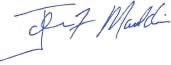  | John Mauldin
Chairman, Mauldin Economics |
P.S. Want even more great analysis from my worldwide network? With Over My Shoulder you'll see some of the exclusive economic research that goes into my letters. Click here to learn more.     | | Share Your Thoughts on This Article | | |
|