Yanko Design - Form Beyond Function |  |
- A Tasteful Basteful brush!
- Gotta Hymn ’em all!
- A Twist on the Outlet
- A Wild Half Copter, Half Plane Drone
- The Rubiks Cube of Organizers
- Mix It Up Lighting
- Get Up, Stand Up
| Posted: 25 Jul 2016 12:16 PM PDT
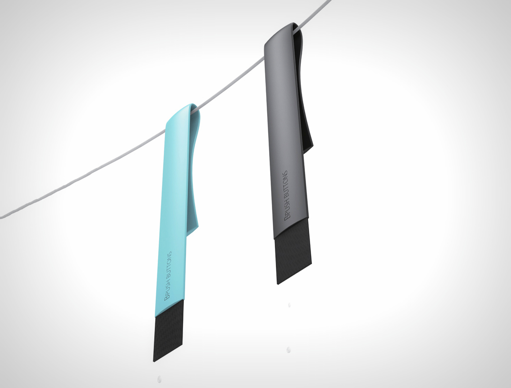
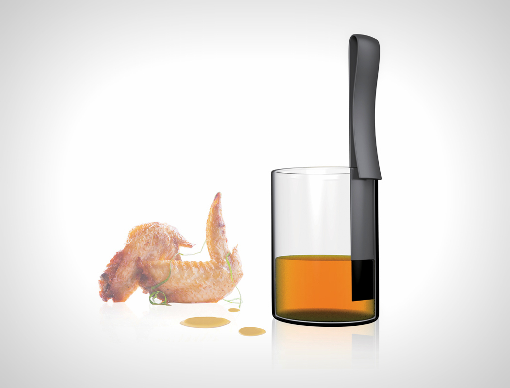
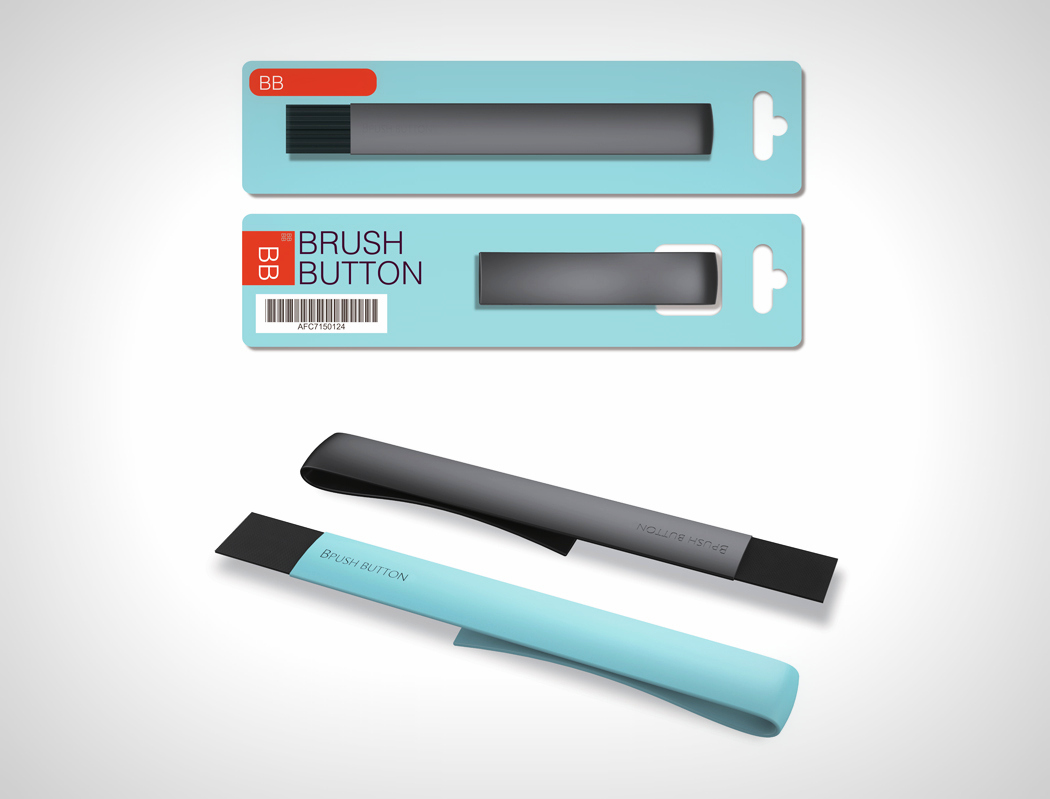
Sometimes even something as simple as a basting brush can use some design intervention. Brush Button by Li Weisi, is simple and effective and it still manages to look sleek! The brush is a slim piece of plastic that has bristles on one end, and does a u-bend on the other end. Not only does this make it easy to keep the brush in your basting liquid container (or even in your kitchen storage for that matter), its novel design allows it to be kept on a tabletop in a way where the bristles don’t touch the dirty kitchen counter… a problem most people have with their basting brushes. The little u-bend not only knocks two birds with one stone, it’s also ridiculously simple to injection mold. Howzzat! The Brush Button is a winner of the Red Dot Design Award for the year 2015. Designer: Li Weisi
|
| Posted: 25 Jul 2016 10:00 AM PDT
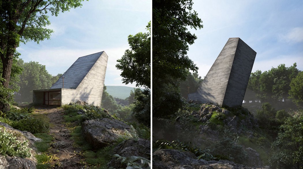
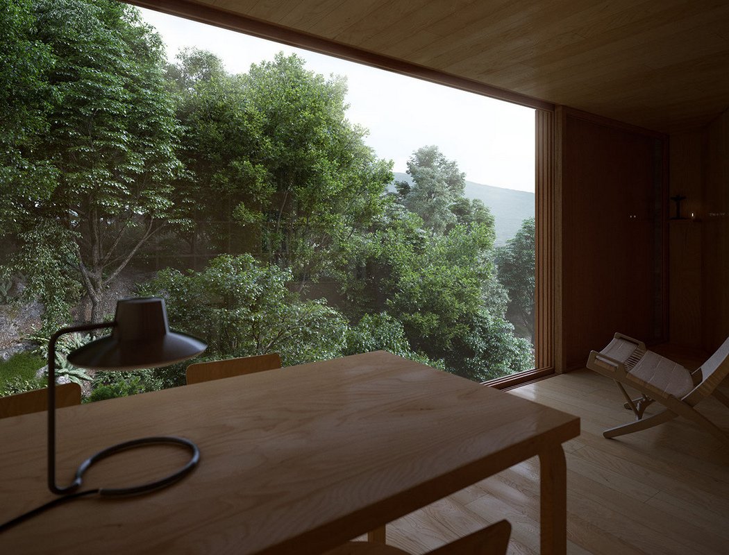
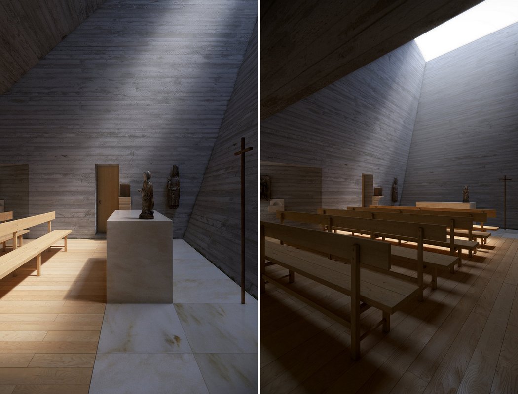
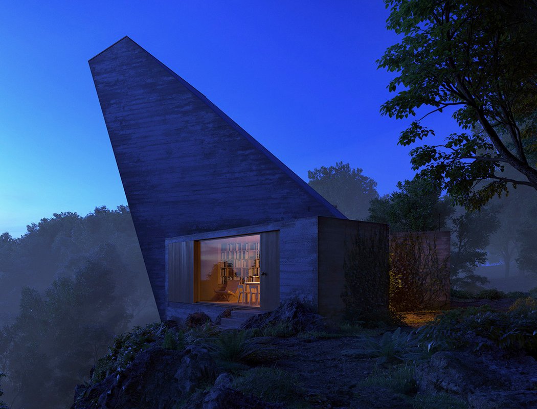
That’s one interesting Poke-stop! I mean chapel! I feel like I’ve gone on a pilgrimage to catch Pokemon given that each PokeStop is a religious building/monument. I’ve however noticed that there’s this signature style to churches, cathedrals, etc. They were probably made highly ornate, back in the day as an appeasement to the gods… but our sense of aesthetics has surely evolved in past few centuries, has it not? The Aurelios Chapel shows that a religious monument can look breath-taking without all the intricate marble carving and stained glass. It uses a beautiful blend of wood and stone with just a hint of marble to give the chapel an auspicious aura. I have to say that I absolutely love the way the skylight channels the rays of the sun inwards to make it look like a halo around the idol. This also gives the chapel an unusually eye-catching outer silhouette. I’d totally drop by everyday to get my share of blessings and Pokeballs! Designer: Metro Cúbico Digital
|
| Posted: 25 Jul 2016 07:15 AM PDT
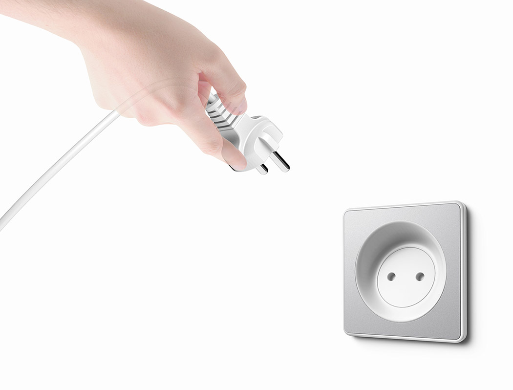
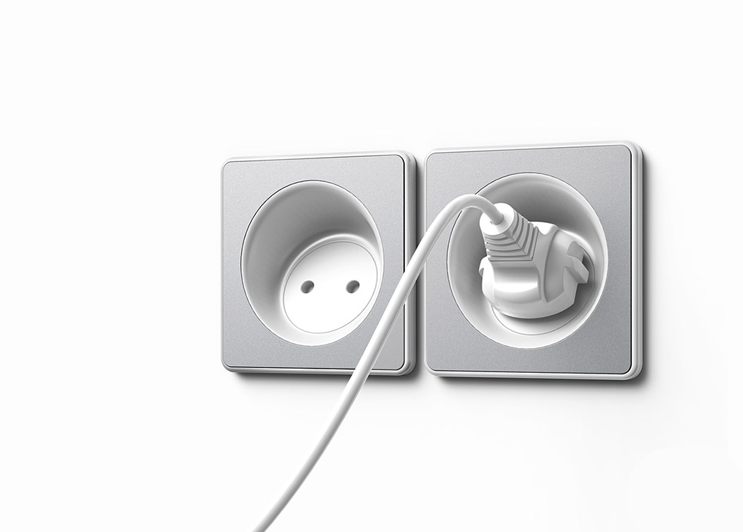
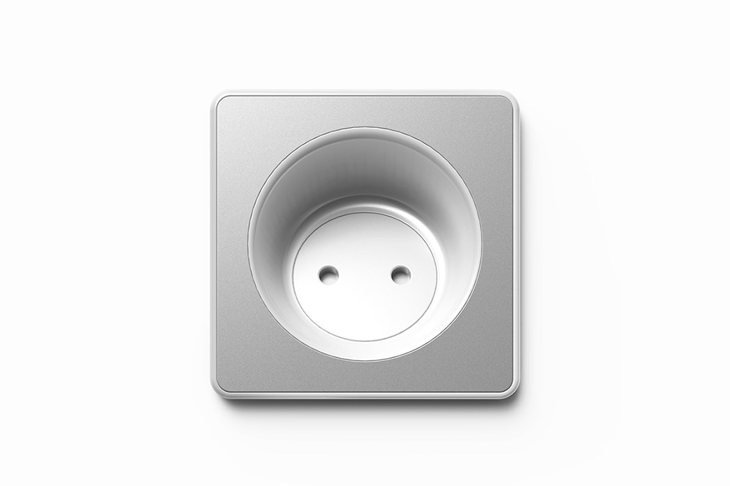
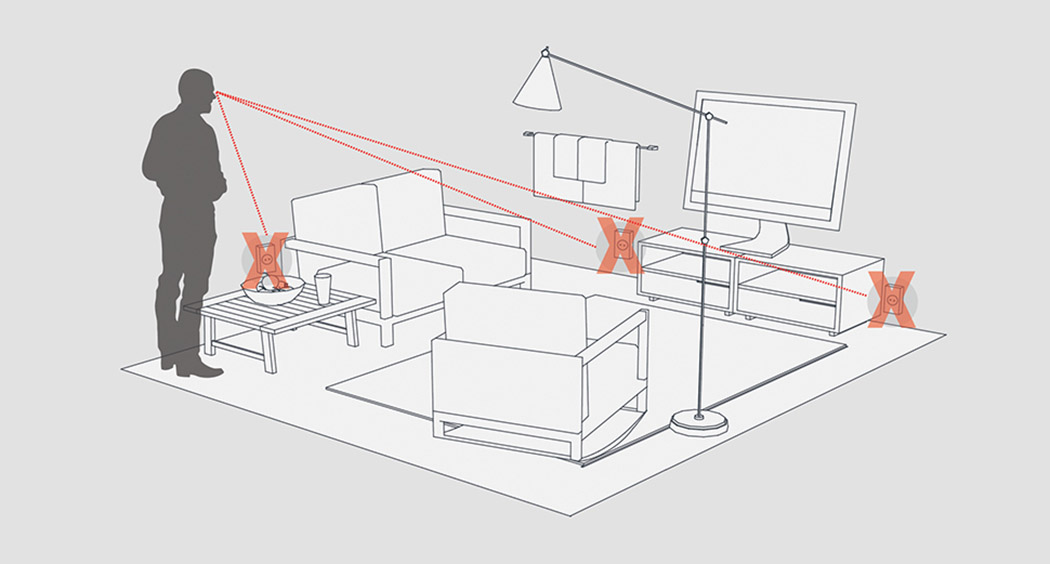
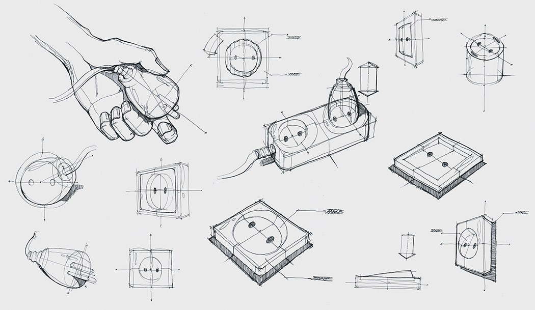
I, like many, am happy to hide my power outlets with furniture and other items but that only makes them harder to access. It also doesn’t help that they’re flush against the wall which makes aiming the plug a task in itself! The 33˚ Outlet takes on this problem by making a simple adjustment to the angle of the unit. The outlets diagonal form can still be mostly recessed into the wall, but it makes it a whole lot easier to see and aim. In those cases where you have to blindly reach behind a piece of furniture, it’s also easier to navigate without looking because the user can feel the slight incline of the outlet surface and determine the position of the holes from there! Designer: Yubin Choi
|
| A Wild Half Copter, Half Plane Drone Posted: 25 Jul 2016 02:20 AM PDT
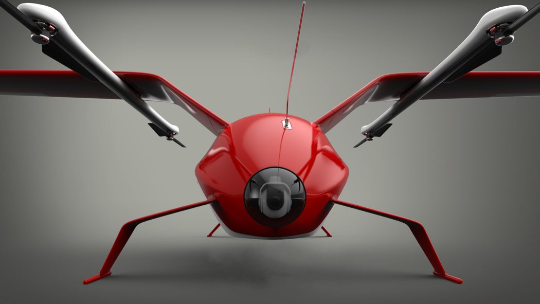
The Zelator-28 takes home first place in the Airbus Cargo Drone Challenge for its super-streamlined yet highly functional design. Conceptualized for both deliveries and reconnaissance, the service drone features a sleek cargo compartment and nose-mounted camera. It hovers like a copter, flies fast and efficient like an airplane, and is adapted for speed and not just vertical climbing. For vertical maneuvering, it uses four T-Motor U11s with 7.5 kg max thrust. Utilizing a high powered T-Motor U12 21×33 propeller system with 11 kg max thrust, it’s aim is to get where it needs to be FAST! Designer: Alexey Medvedev
|
| Posted: 24 Jul 2016 10:30 PM PDT
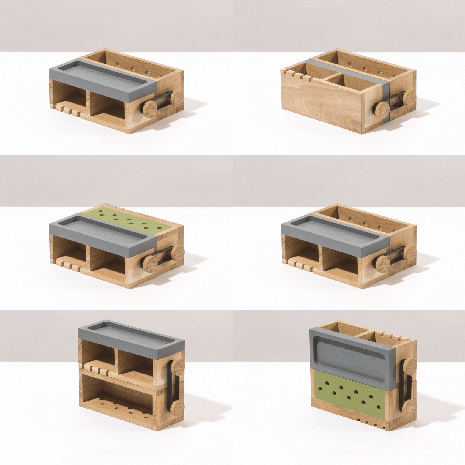
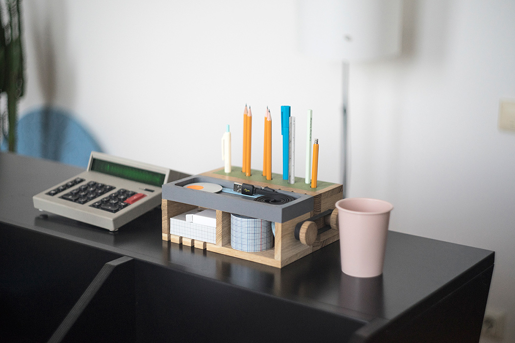
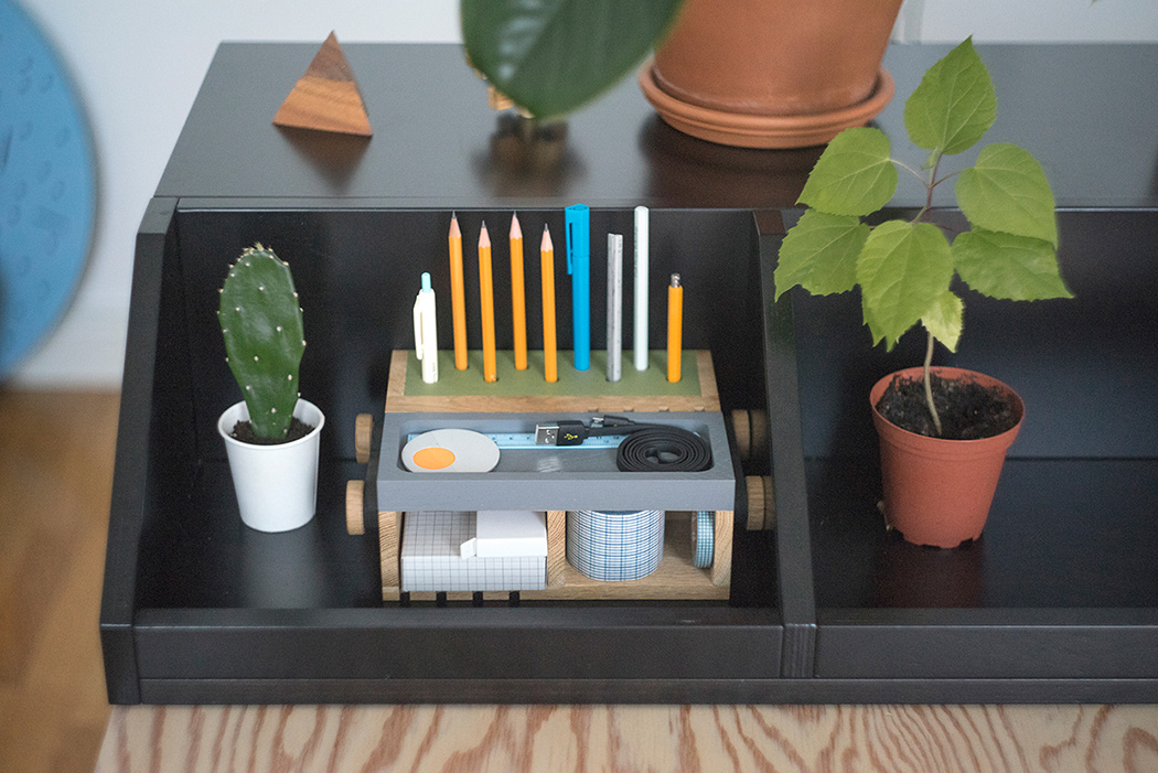
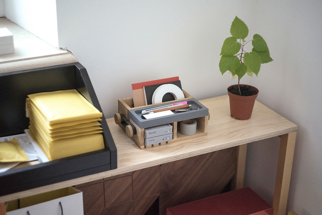
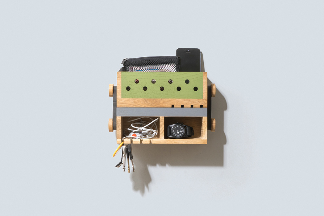
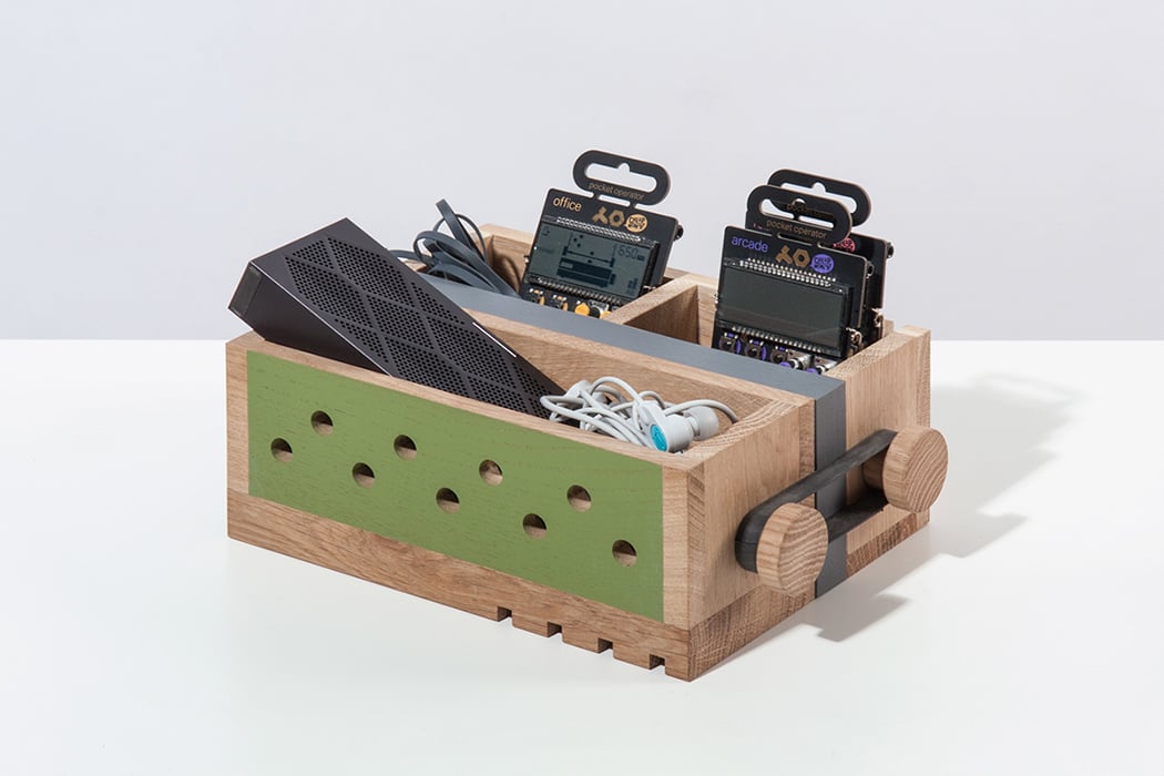
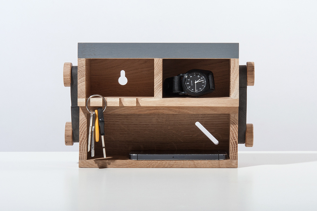
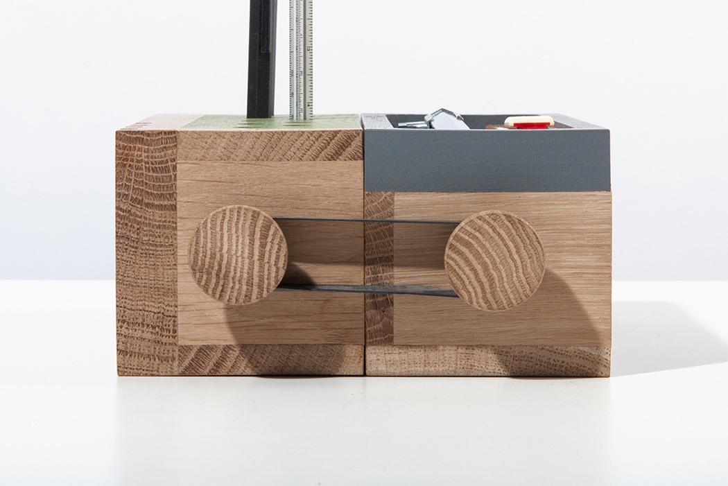
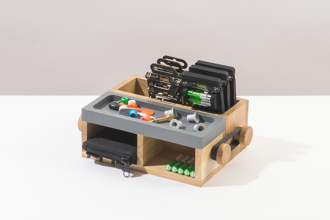
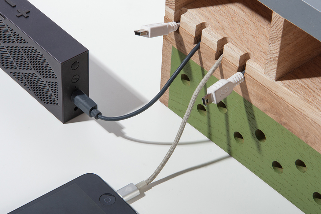
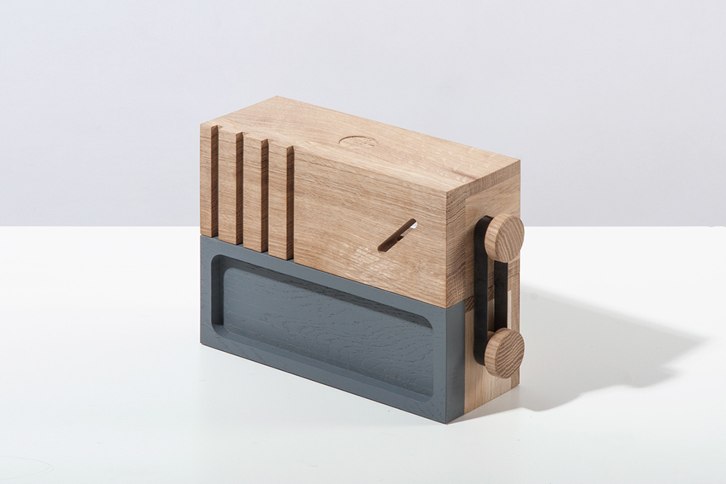
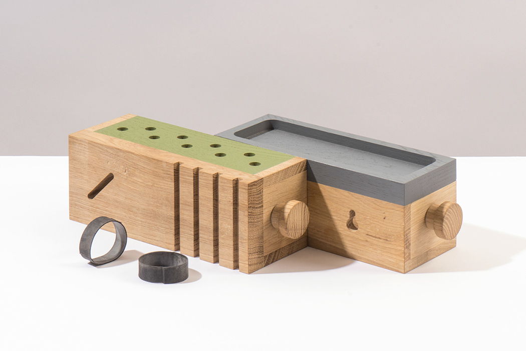
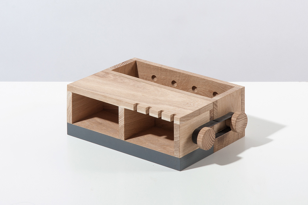
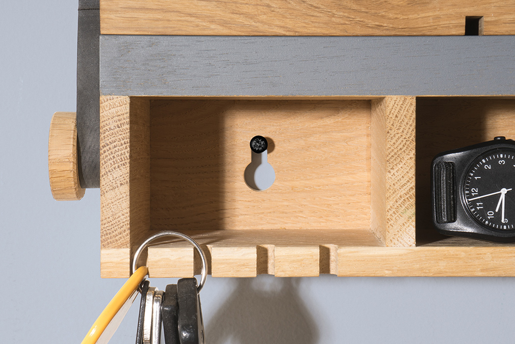
As you scroll through the photos of this design, called MTO, you’ll notice the most subtle differences. Take a closer look and you’ll see that these slight changes also serve vastly different purposes! That’s the beauty behind this multifunctional office organizer (get it? MTO!). A simple turn of the sides changes the functionality of the organizer, making it possible to customize it to your exact needs. Choose between different variations including money slot, key box, stationary kit, cable organizer and more! Handcrafted from solid wood, it maintains the same funky aesthetic no matter which combination you choose. Better yet, you can use it everywhere from your desktop to your entryway wall for instantaneous organization catered to your exact requirements. Designer: Alexander Kanygin as part of Robowood
|
| Posted: 24 Jul 2016 06:40 PM PDT
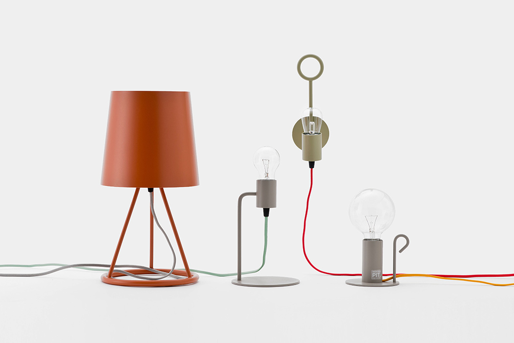
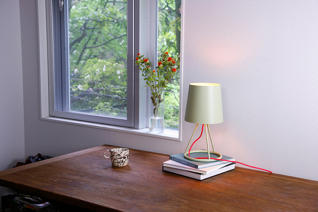
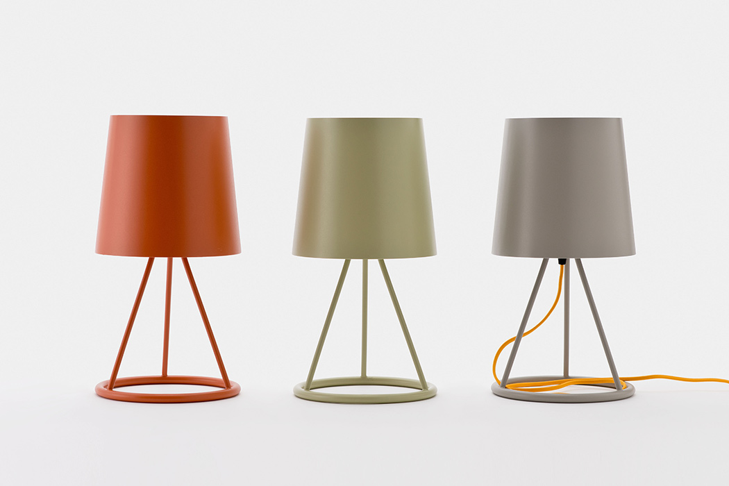
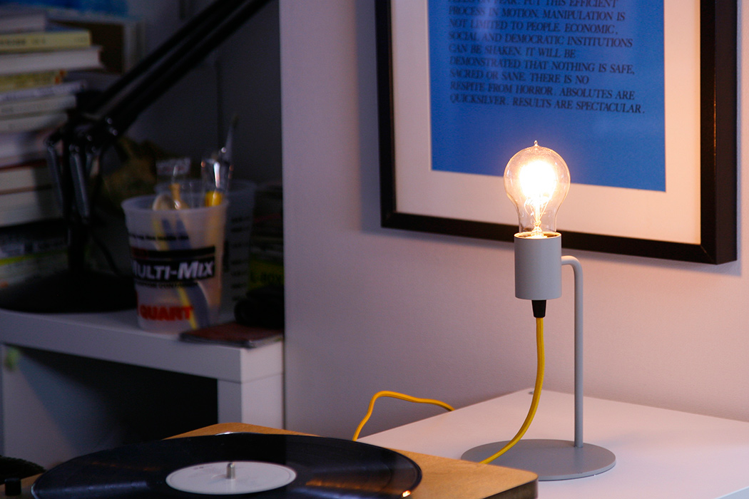
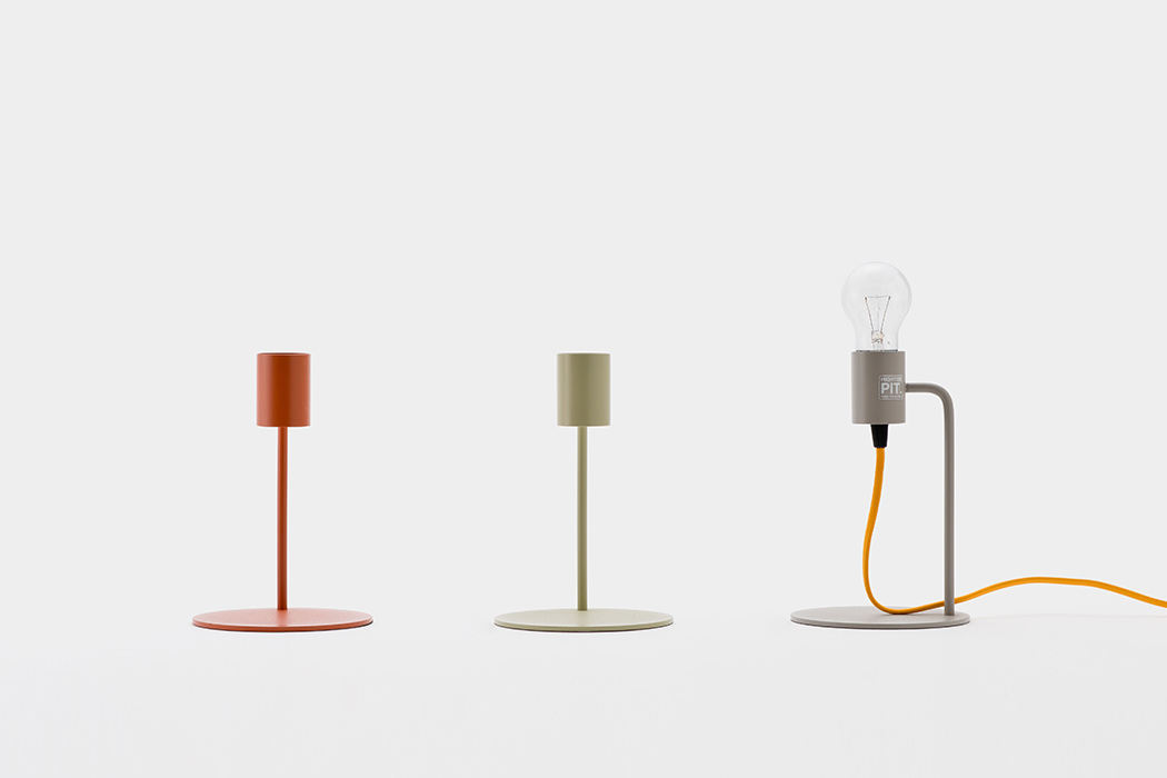
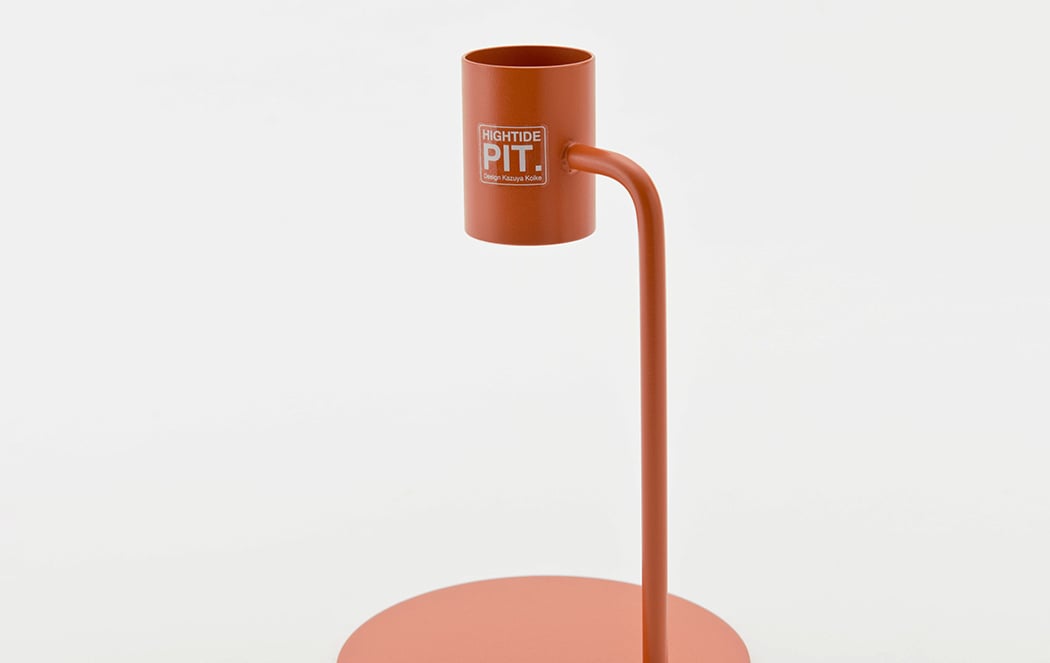
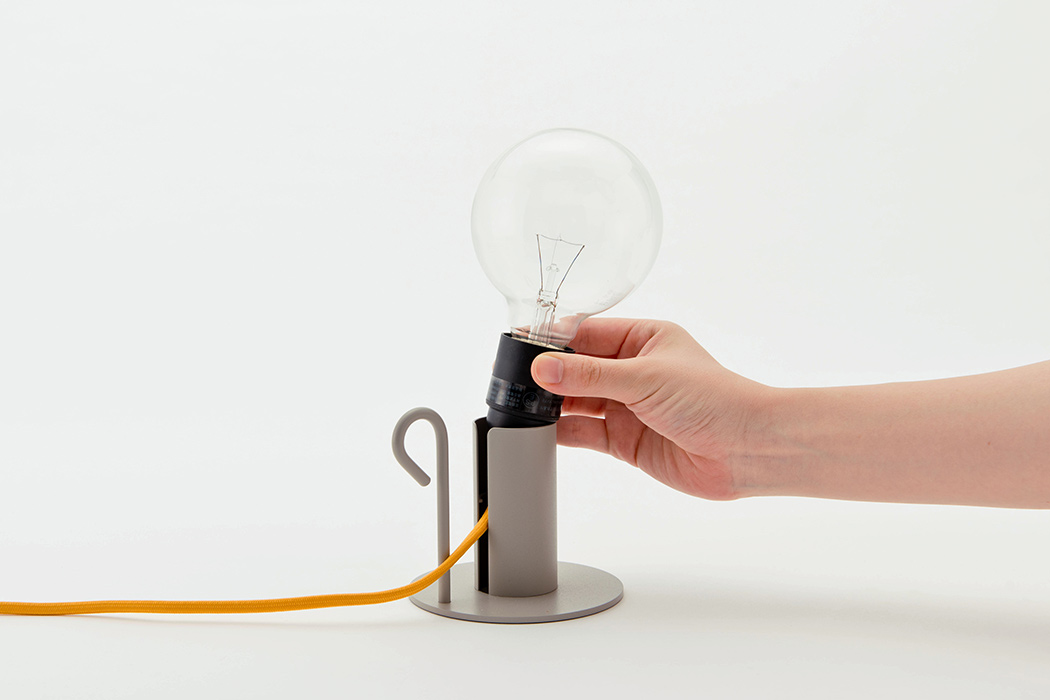
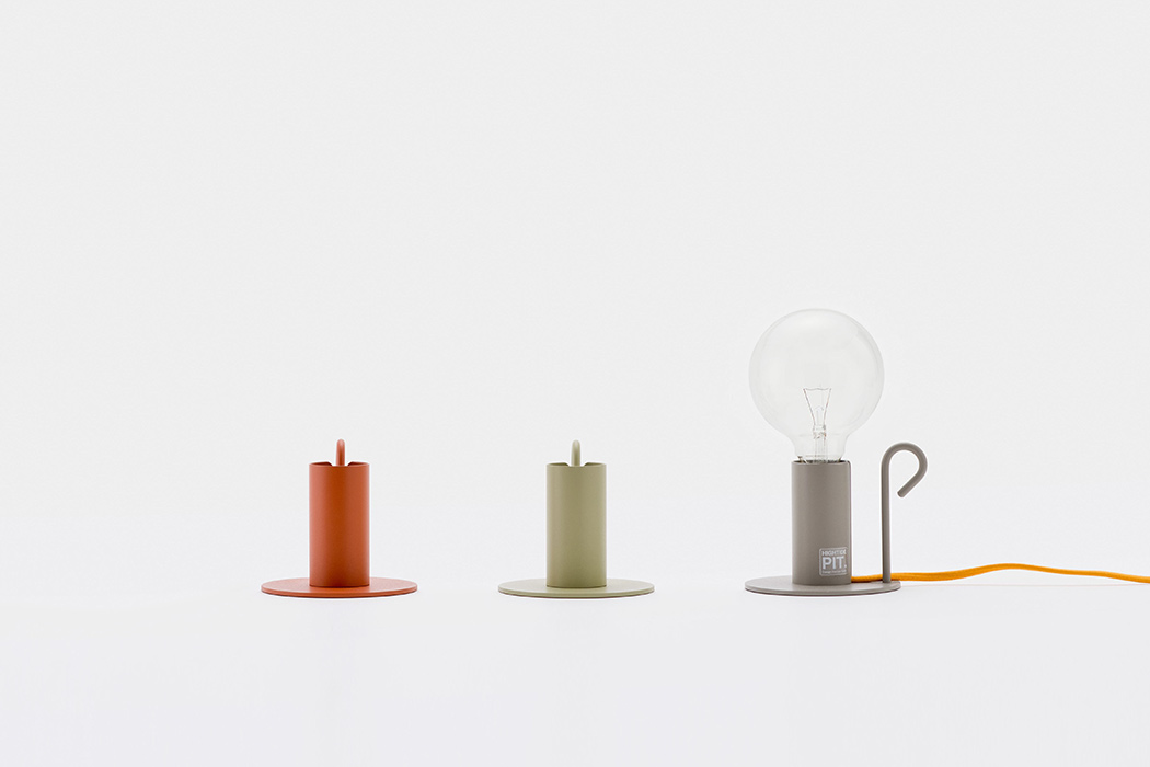
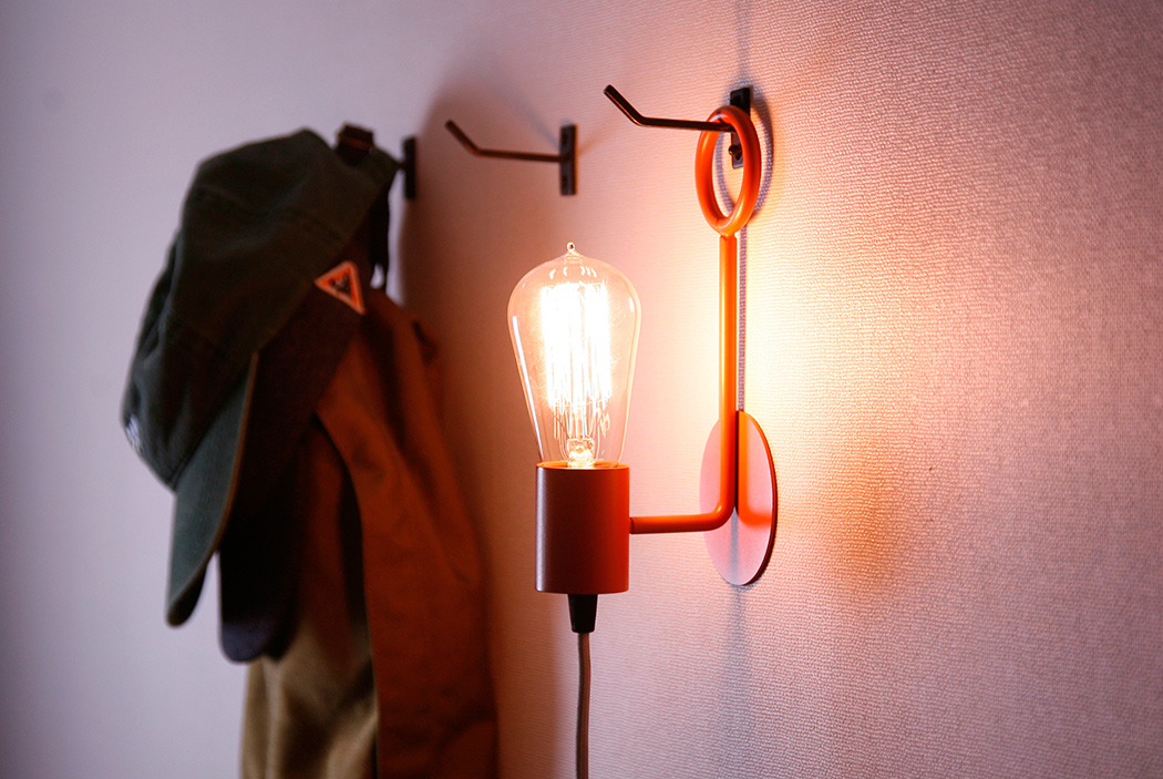
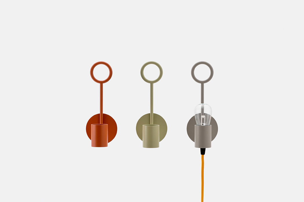
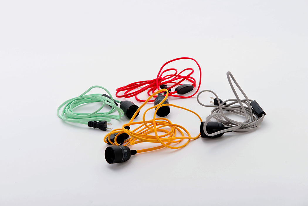
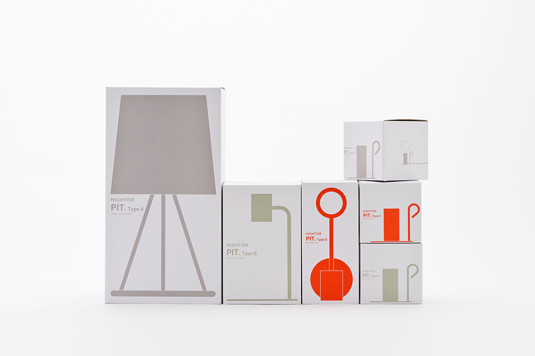
The Pit collection of lighting objects are a minimalist take on familiar fragments from the candle world! Stripped to the very basic necessities, each design has a simple silhouette that looks great in a variety of places, modern or classic, from the desk top to the wall. The cord is actually designed to be mixed and matched, so you can use different cords with different bases depending on your needs and desired aesthetic. Designated as type A, B, C or D, each is available in colors of rust, green and steel as well as paired with vibrant, interchangeable cords that complete the design’s modern, playful look. Designer: Kazuya Koike
Pit A features a shade for indirect lighting.
Pit B resembles a candlestick.
Pit C looks like a candleholder with its functional handle.
Pit D looks like a candle sconce and can be moved from wall to wall as long as there is a ring, nail or other hanger.
|
| Posted: 24 Jul 2016 05:02 PM PDT
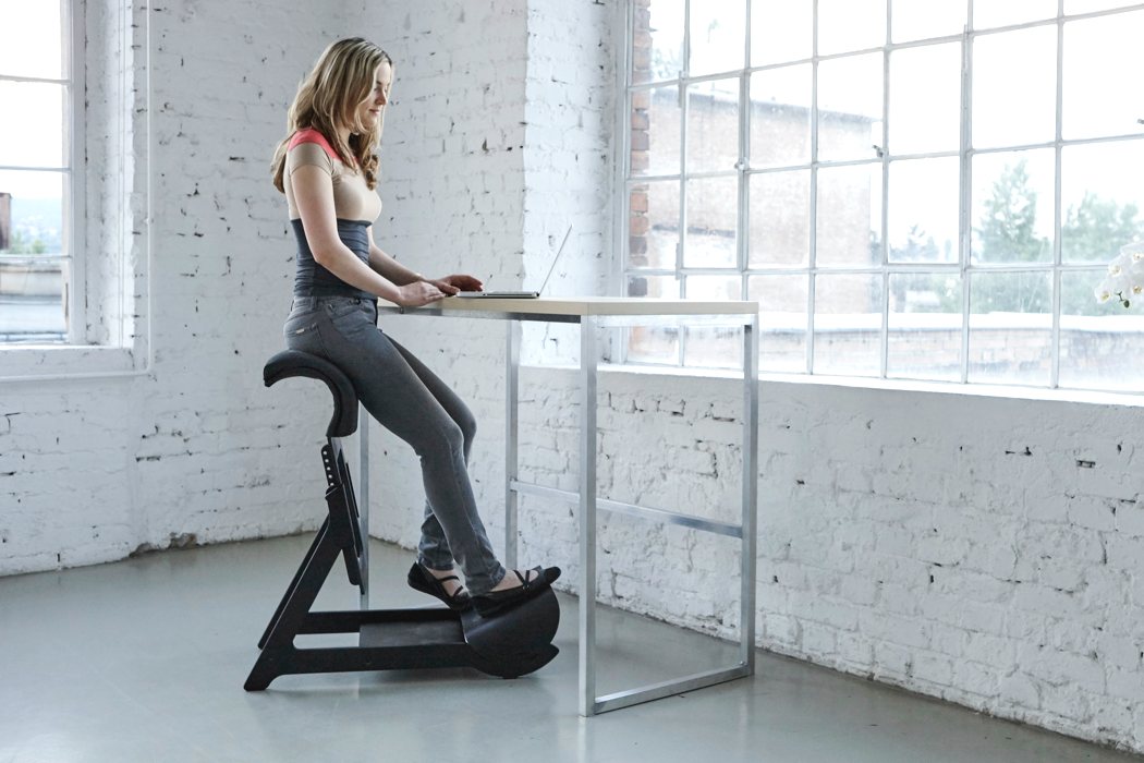
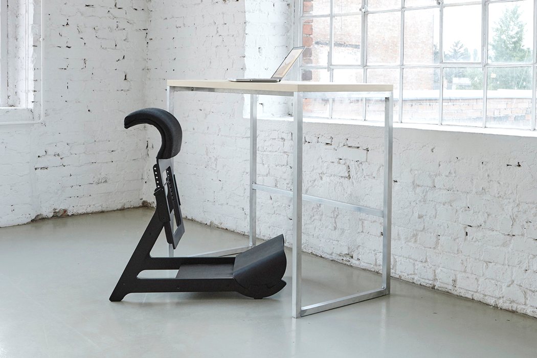
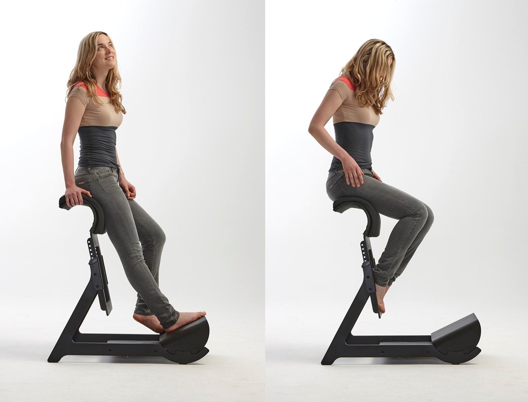
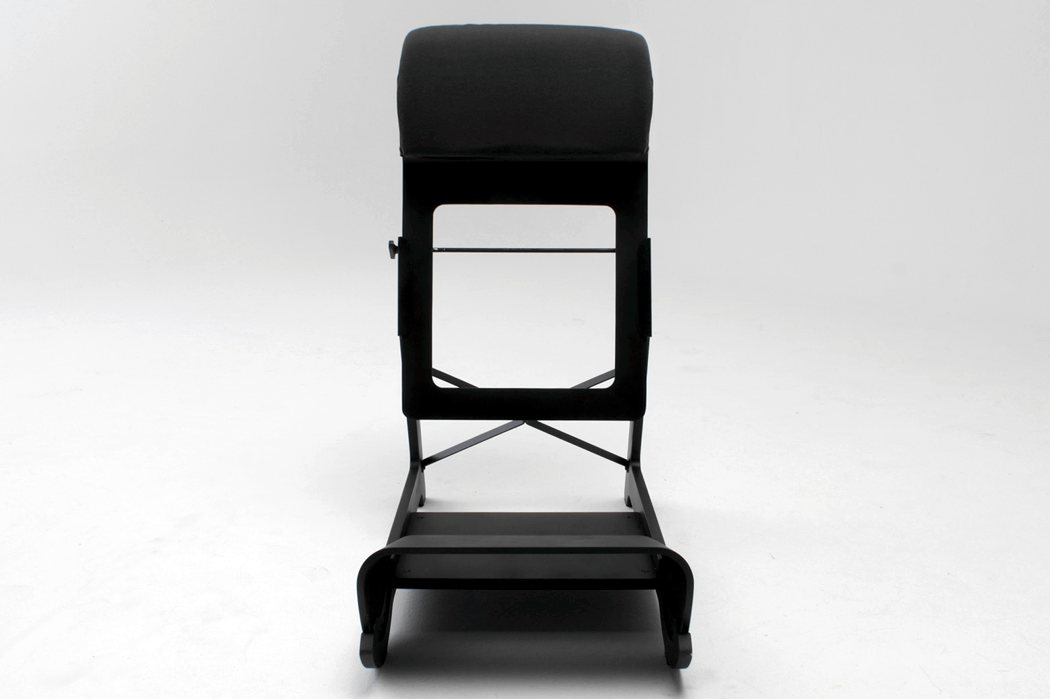
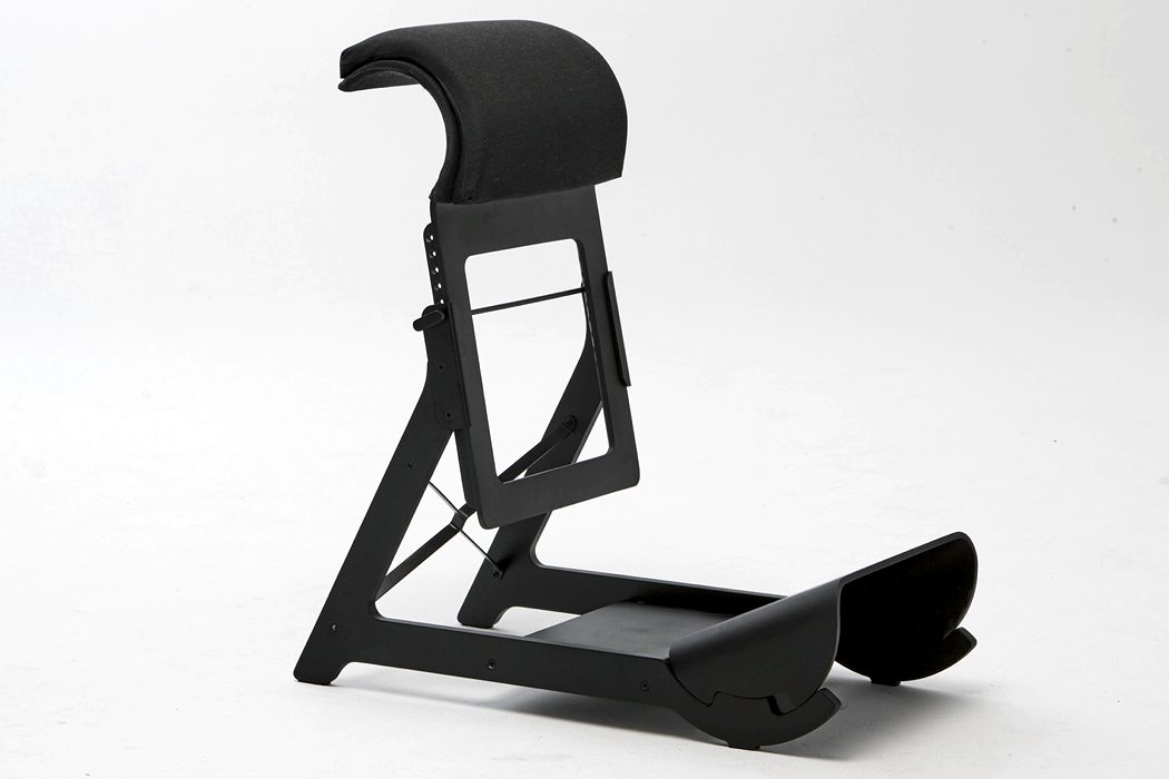
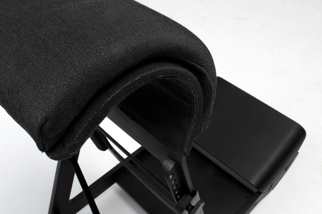
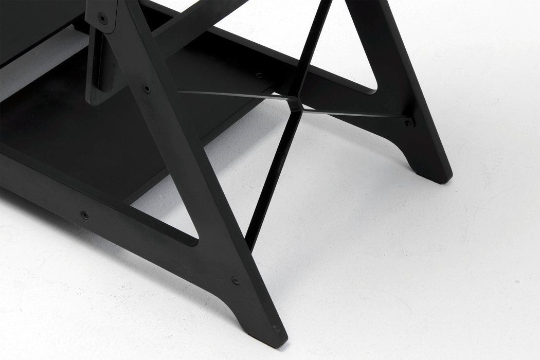
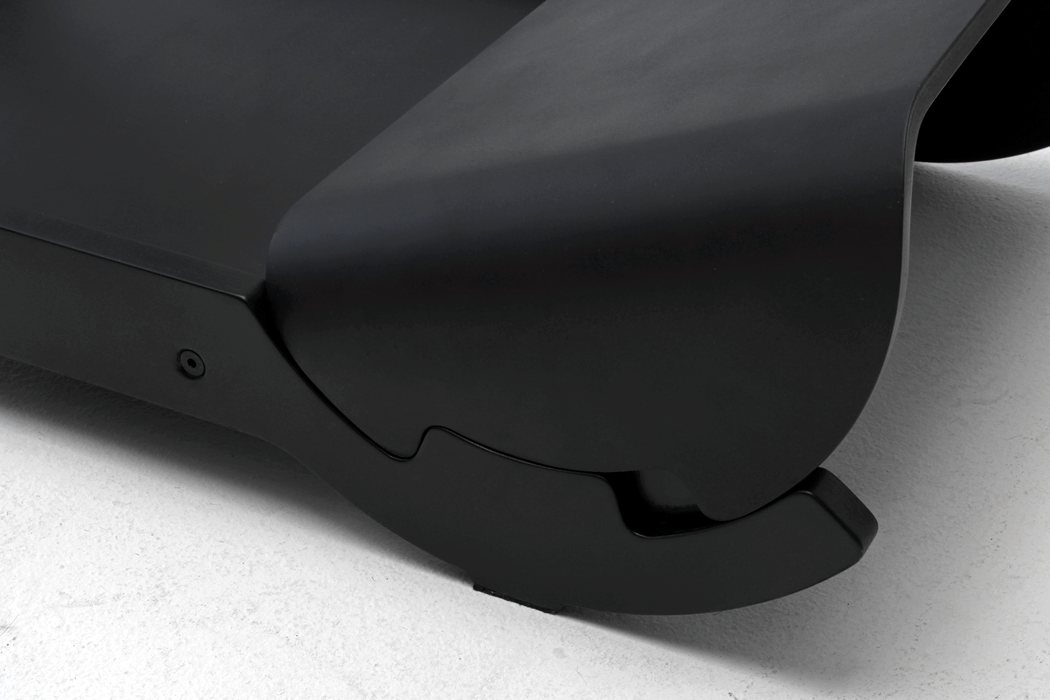
It’s so important now a days as we all are behind a computer screen for over 40 hours a week to get up and move around. It’s easy to fall into a sedentary lifestyle which is bad for our bodies, metabolism, spine and so much more. I personally just recently bought a stand up desk and the changes it has already caused in me are amazing. However, it’s hard to stand constantly without something to cushion or lean back on to take pressure off of my legs, feet and spine too. The Experimental Standing chair project, by Ariel Levay, looks like an incredible solution to the too much standing, too much sitting problem. The chair was designed to help the user to have a variety of posture changes. It will allow for leaning, but also a position to help take weight off the feet as well. The chair was designed to be sturdy, and really has an elegant design that would look good in any modern office environment. Designer: Ariel Levay
|
| You are subscribed to email updates from Yanko Design. To stop receiving these emails, you may unsubscribe now. | Email delivery powered by Google |
| Google Inc., 1600 Amphitheatre Parkway, Mountain View, CA 94043, United States | |
