Yanko Design - Form Beyond Function |  |
- Get an Earful of These
- Combine the Board, Catch the Wave
- Time You Can Touch
- Here’s my TV, Deal with it.
| Posted: 06 Oct 2017 07:42 AM PDT Yesterday saw the unveiling of the next generation Google Pixel smartphone and an array of interesting and never-before-seen gadgets and gizmos. It’s safe to say Google are clearly taking hardware seriously. Not only that, but it would appear Google are ready to begin taking on their rival giants Apple and Samsung. This appears to be most evidently clear with the surprising announcement of the Google Pixel Buds. Taking the world by storm, Google packed its Pixel Buds with the power to translate between 40 languages, literally in real- time. Let me start off with some negatives about the the Google Pixel Buds before I delve into what makes them truly great. Unlike the Apple Airpods, the Buds lack auto-detecting when they’re in your ear (not the end of the world). They’re not truly wireless like the Airpods or the Bose SoundSport – the Buds are connected by a cable with an outer fabric material, which definitely adds a level of convenience the former products don’t have, it also helps the buds fit inside your ear better by pushing the cord through the Bud itself, creating a comfortable loop. The pixel buds boast a nice 5 hours of battery life and comes with a stylish carrying case that doesn’t resemble a packet of dental floss. The Buds are a more open-air design and sit against your ear, instead of the increasingly popular in-ear design. Above all, the Google Pixel Buds have bragged the largest feature exposed this year, in the form of the real-time language translation ability of this tiny guys. The idea is that you can tap and hold on the Pixel Buds, speak, and then the translated speech will come out of your Pixel phone’s speakers – wow. There is no telling what the future holds for Google Hardware but if this is any indication on what is to come, ladies and gentlemen get ready, for an exciting road ahead. Designer: Google BUY NOW |
| Combine the Board, Catch the Wave Posted: 06 Oct 2017 05:42 AM PDT
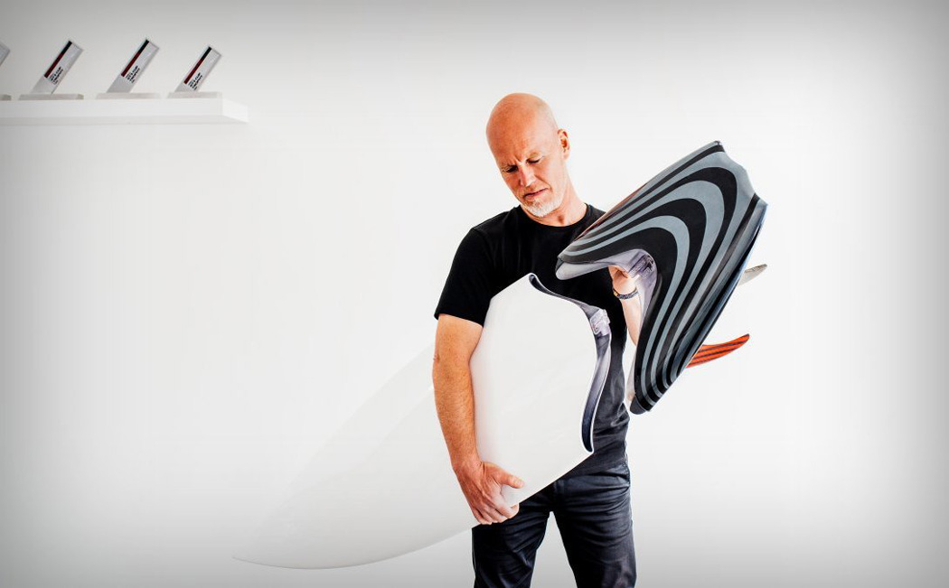
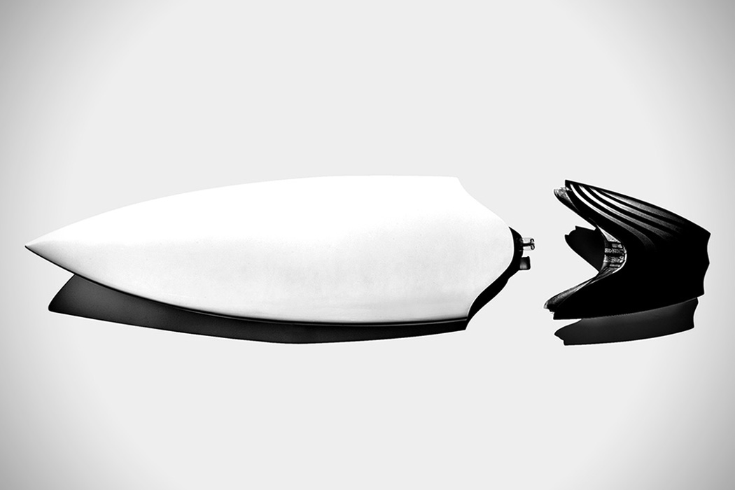
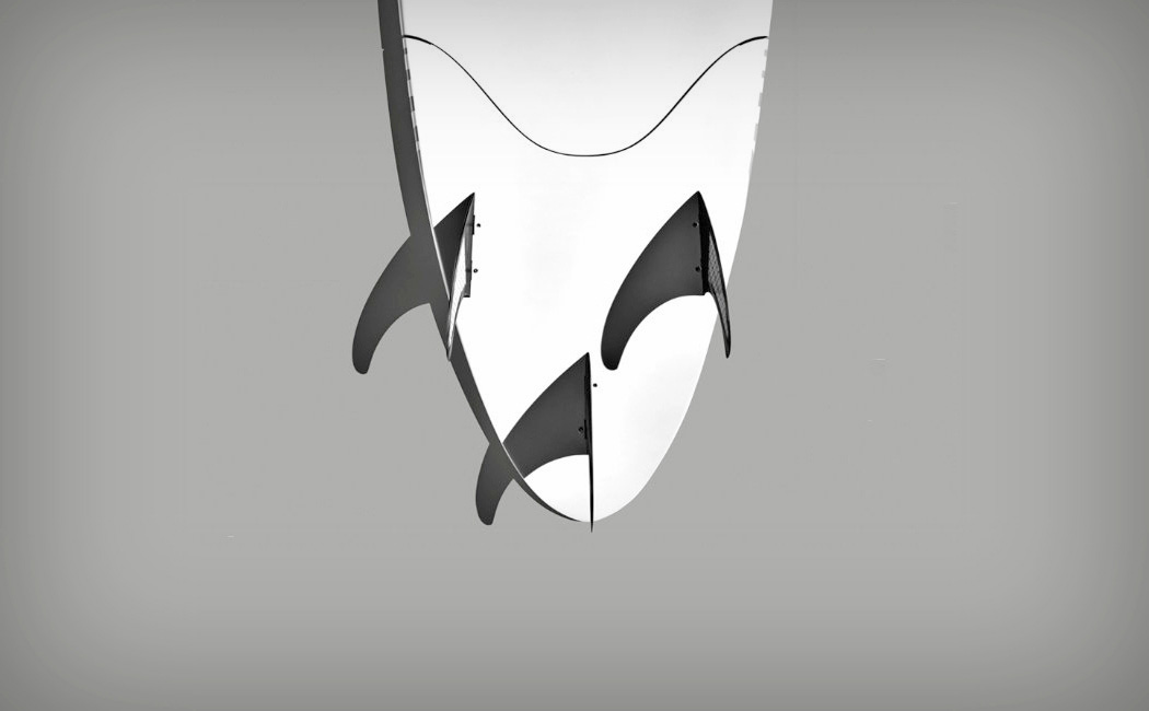
If you know anything about surfing, you’ll know that surf conditions can vary depending on your location, the time of year, the time of day, the weather, etc., etc – and considering there are specific board for specific conditions, this can play havoc when deciding what board to bring to the beach. This in turn can lead to bringing a few different boards to the beach. From my experience of terrible surfing, I used to believe that surfing was a matter of just grabbing a board, hitting the beach and killing it on the waves, ‘brah’. Knowing the varied sizes and fins actually needed, that’s what makes the 2PRT surfboard by Thomas Meyerhoffer even more interesting. Industrial designer Thomas Meyerhoffer, a former Senior Designer at Apple, all round cool dude, now the Co-founder & Chief Design Officer of Latch, has designed something that will truly revolutionise the surfboard game. With the ability to split the board into two parts, the user now has the ability to pack a much smaller board and turn that same board from a shortboard to a longboard to a gun (not an actually gun, it’s a type of board combination) in a matter of moments. Designer: Thomas Meyerhoffer
|
| Posted: 06 Oct 2017 03:46 AM PDT
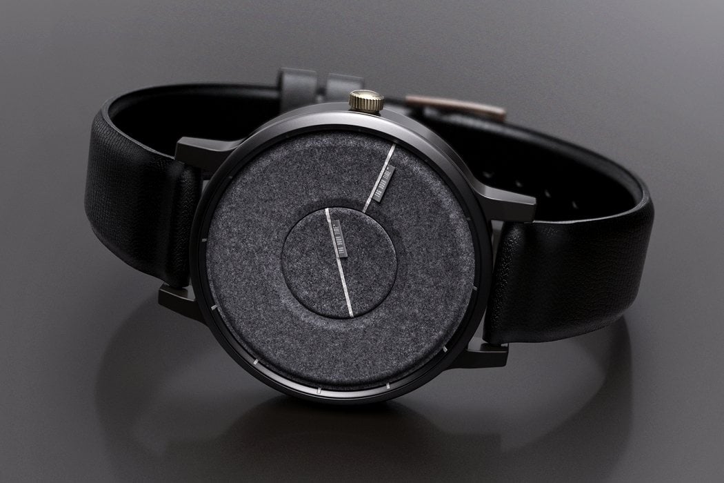
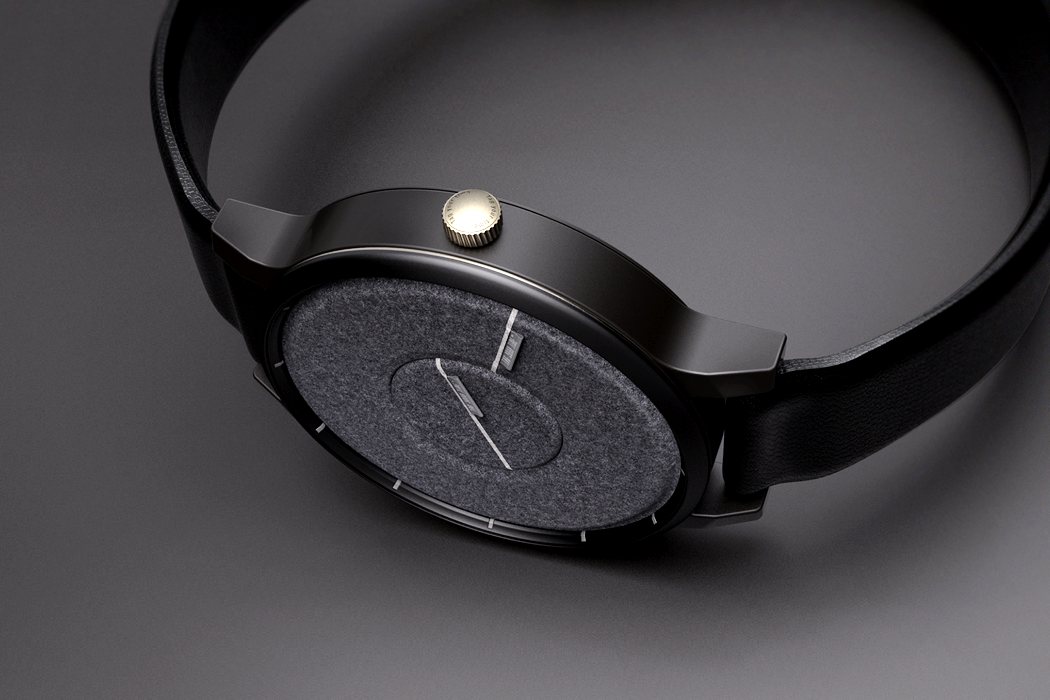
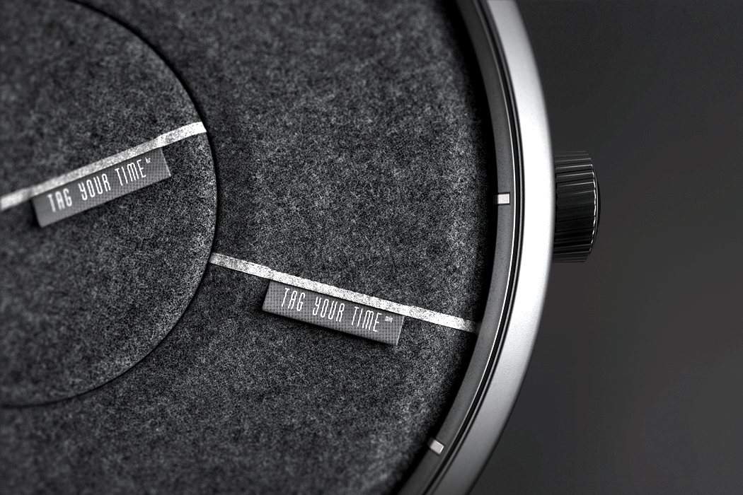
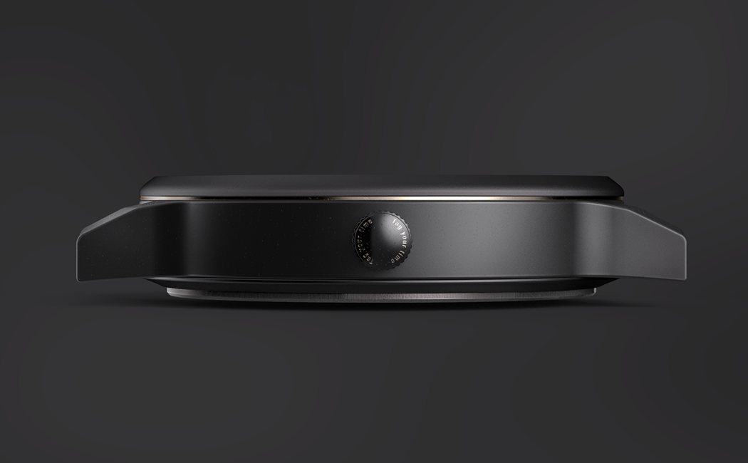
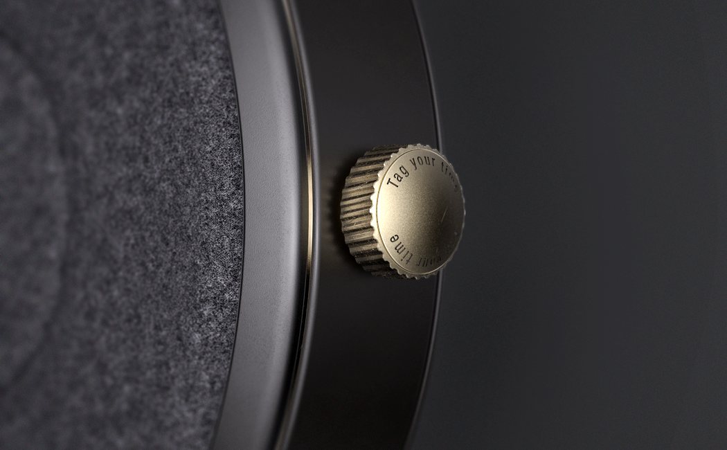
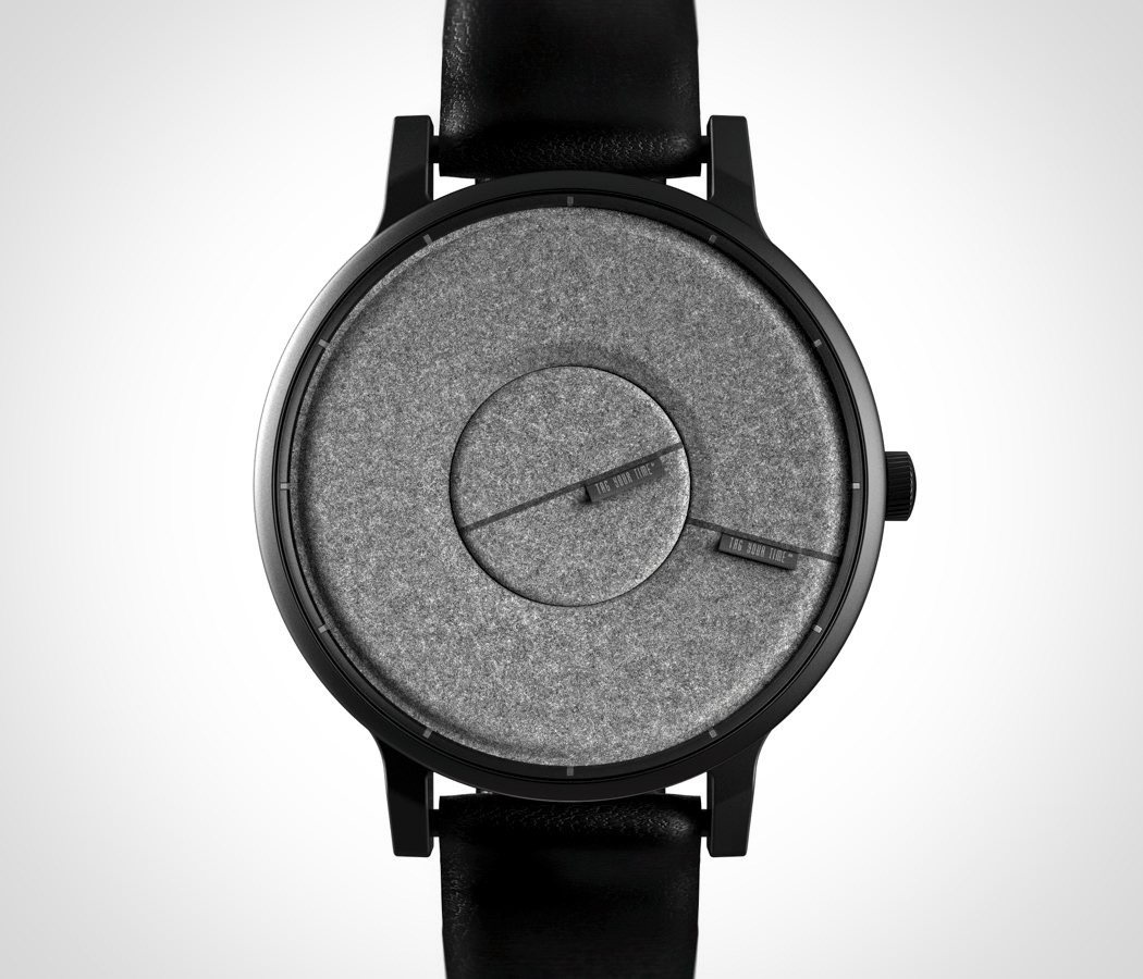
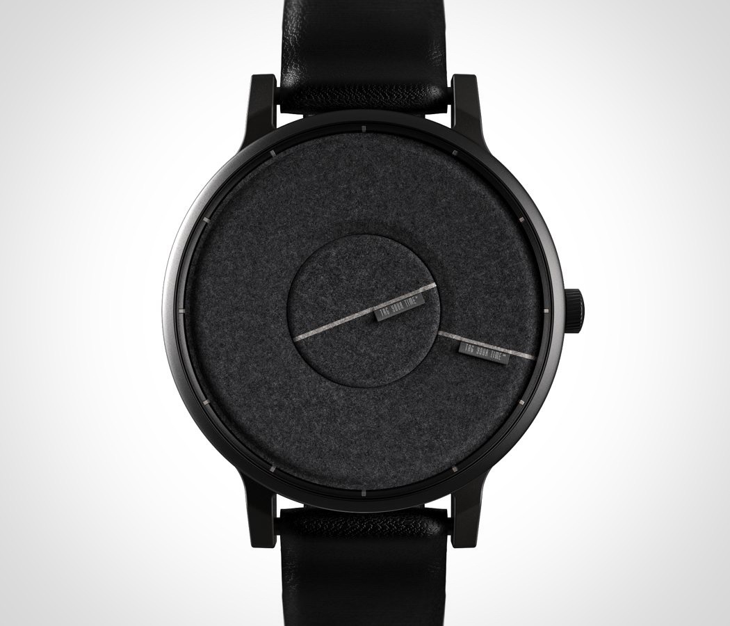
We’ve all been stuck in a meeting, on an bad date or in a number of other situations where you’re itching to check the time but don’t want to be rude! With Time Tag Watch you can check discretely without anyone noticing! The design features a felt face with a spinning center and outer ring. On each is a tag, similar to a clothing label, that falls in line with the hour and minute hands. To tell the hour and minute, simply graze a finger over the soft felt to feel the tag and determine the time! Designer: Seohee Lee
|
| Posted: 05 Oct 2017 02:06 PM PDT
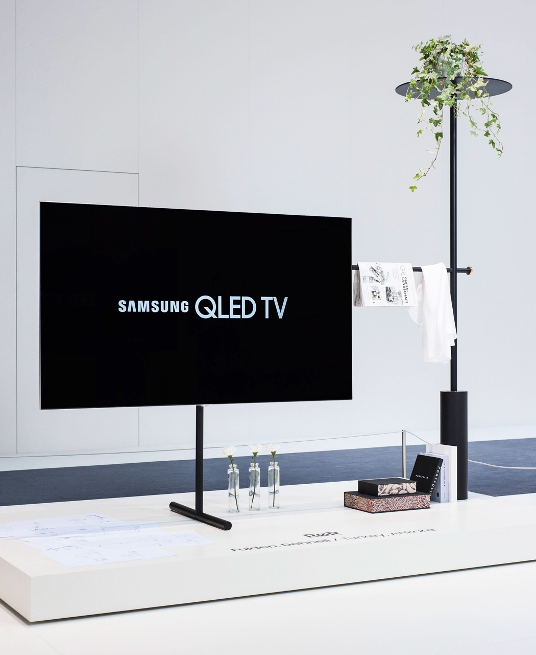
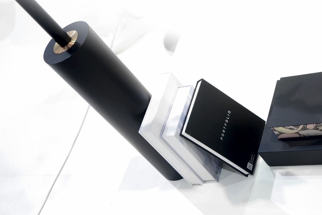
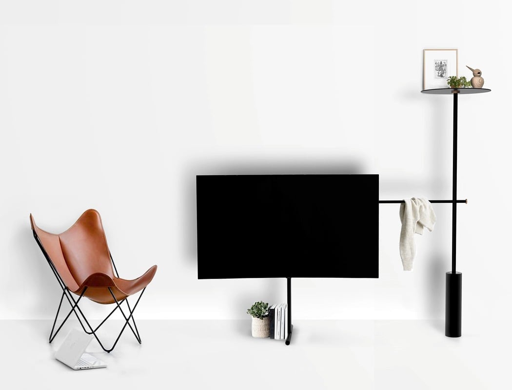
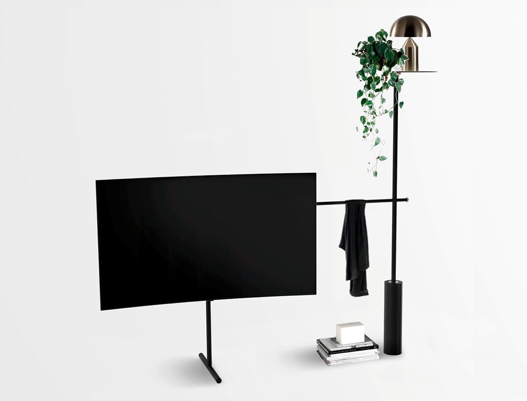
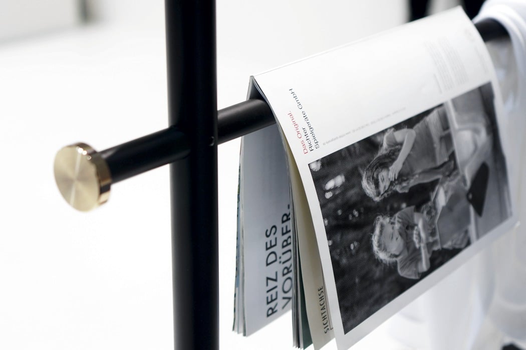
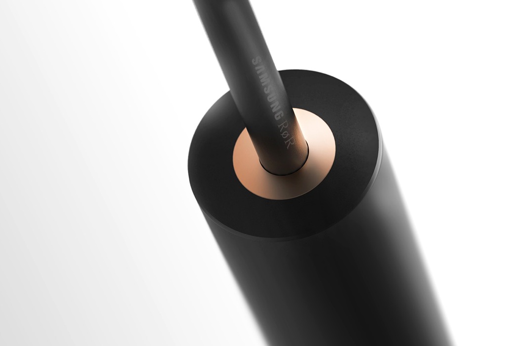
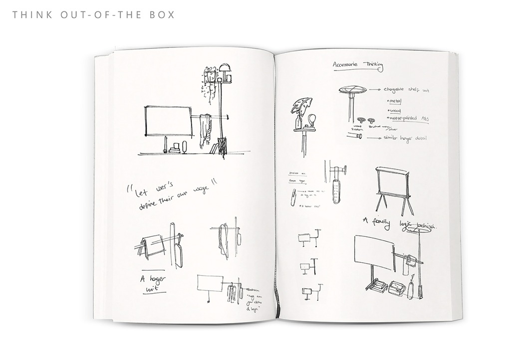
People are often perplexed by where to place a TV. Most design-conscious users would prefer to hide it or at least have it blend in with other interior elements unnoticeably which, if overdone, can be an eyesore in itself. One of YD’s favorite designers, Fulden Dehneli, has created RøR – an entirely new way to place your TV and it puts your device on full display. The minimalistic design is a bare-bones approach to TV mounting. Designed for the SamsungQLED TV Competition, it consists of a weighted structure that elegantly elevates your TV with a simplistic T frame. On the opposite end, a high, single shelf serves as a perfect perch for your favorite plant, picture frame, or lighting solution. It’s an aesthetically acceptable alternative to those TV-hiding-techniques that’s as sculptural as it is beautifully simplistic. Designer: Fulden Dehneli
|
| You are subscribed to email updates from Yanko Design. To stop receiving these emails, you may unsubscribe now. | Email delivery powered by Google |
| Google Inc., 1600 Amphitheatre Parkway, Mountain View, CA 94043, United States | |
