Yanko Design - Form Beyond Function |  |
- The ATV that Could Save You and Me
- Strictly for the Adventurer
- Be there in an e-Jiffy!
- Dell Release Jewelry Line
- TV with a Twist
- Red Dot Design Has A Swanky New Address In Singapore
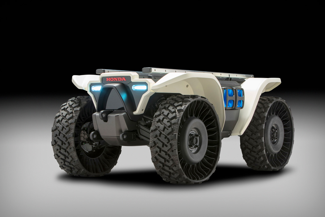
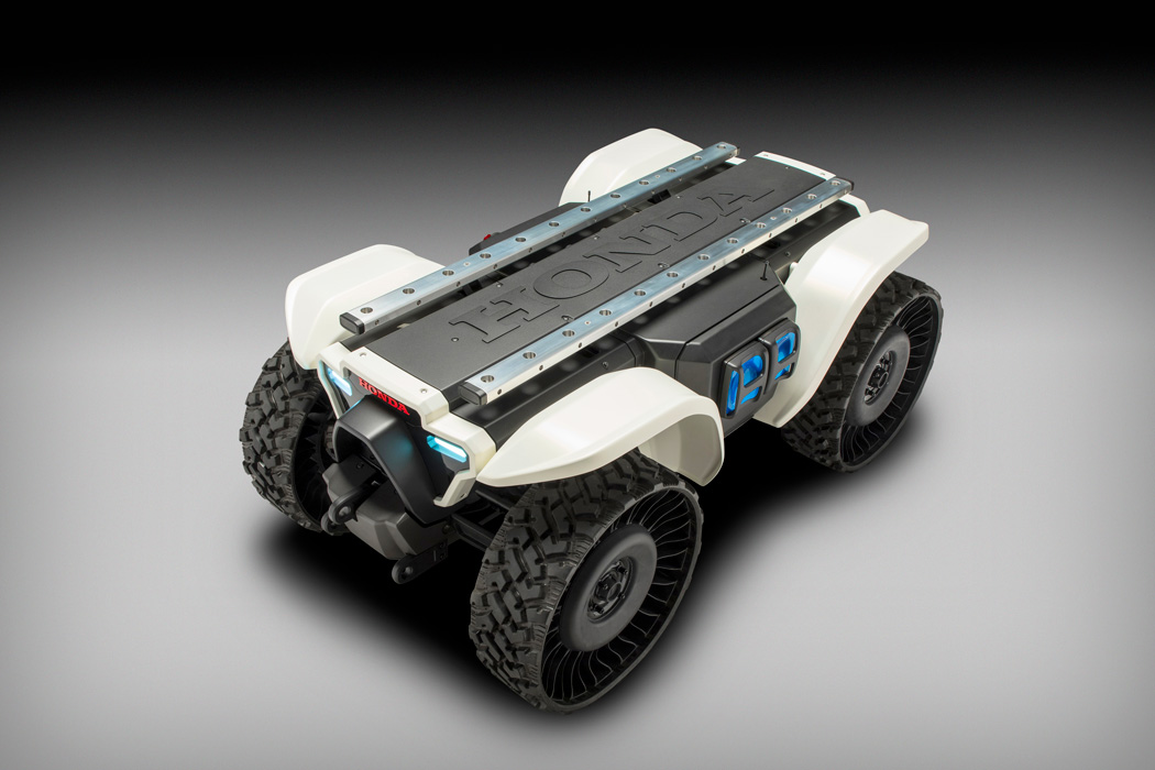
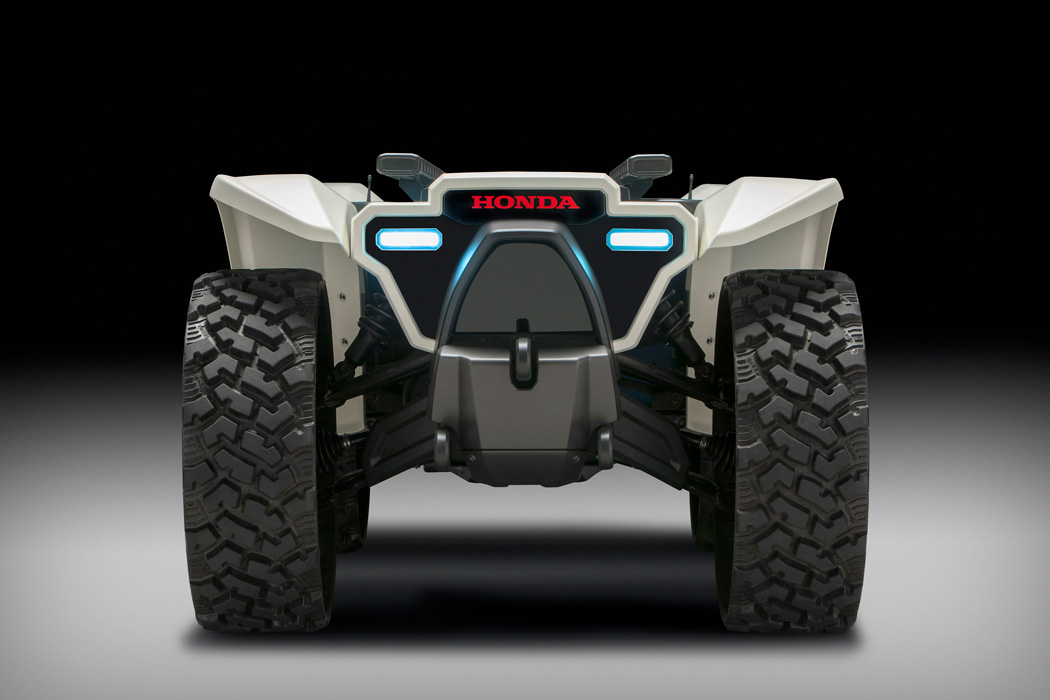
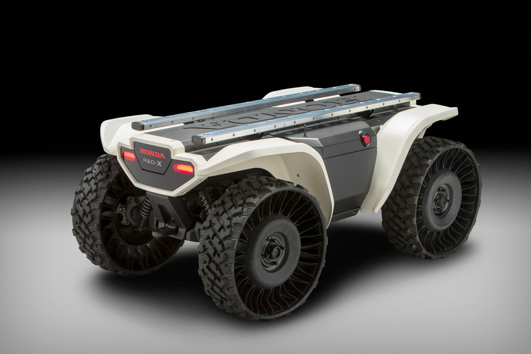
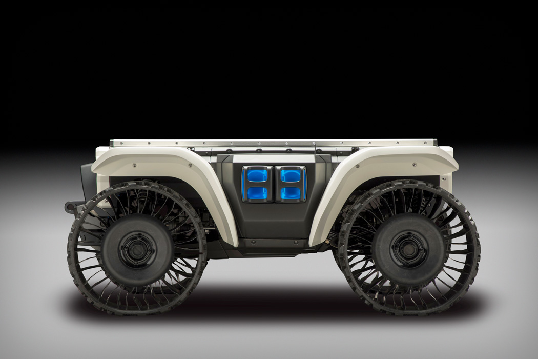
| The ATV that Could Save You and Me Posted: 15 Jan 2018 10:44 AM PST Amongst others, Honda has always been at the forefront of autonomous and all-electric vehicles. The showcase of their all-electric, four-wheel drive ATV 3E-D18 with airless tires (gasp) is undoubtedly setting a firm tone at CES. Honda introduced its new 3E (Empower, Experience, Empathy) Robotics Concept at CES 2018, demonstrating a range of experimental technologies engineered to understand people’s needs and make their lives better and the 3E-D18 is certainly built for that. Designed to withstand the ultimate bashing, this ATV can do all sorts of jobs, especially with the help of Honda’s built-in advanced artificial intelligence. Intended for search and rescue missions, the 3E-D18 robotic device has the potential to minimize human exposure to dangerous environments and can perform time-consuming chores or mundane tasks. With a vast range of attachments, this ATV can be transformed from people carrier to natural disaster ready in a matter of minutes. Designer: Honda
|
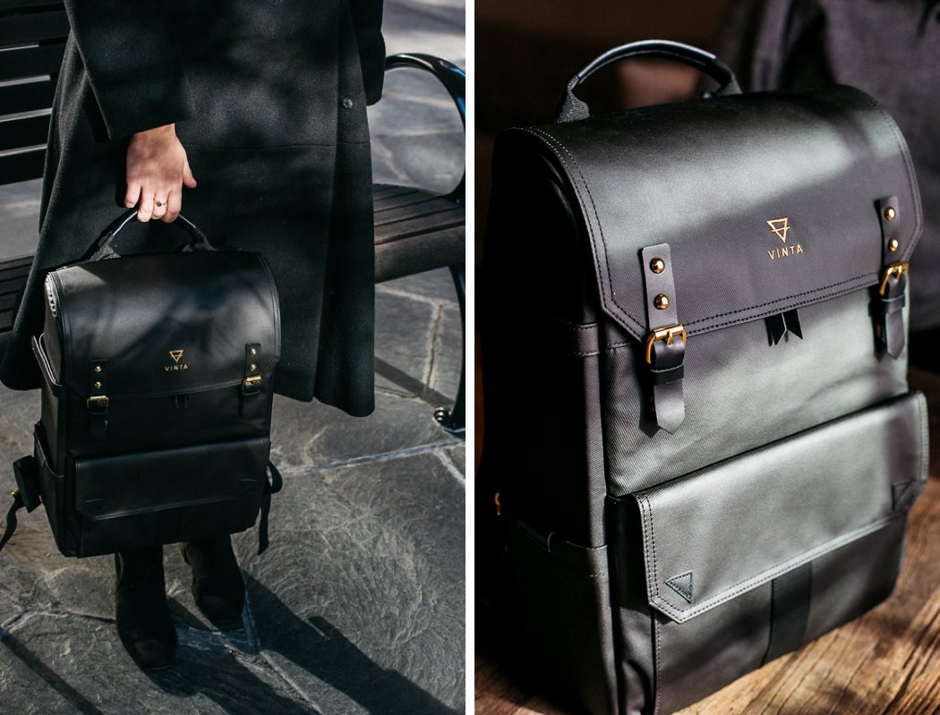
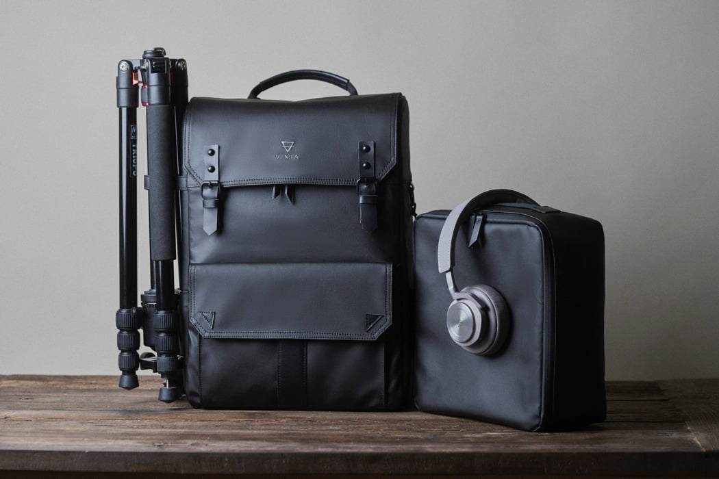
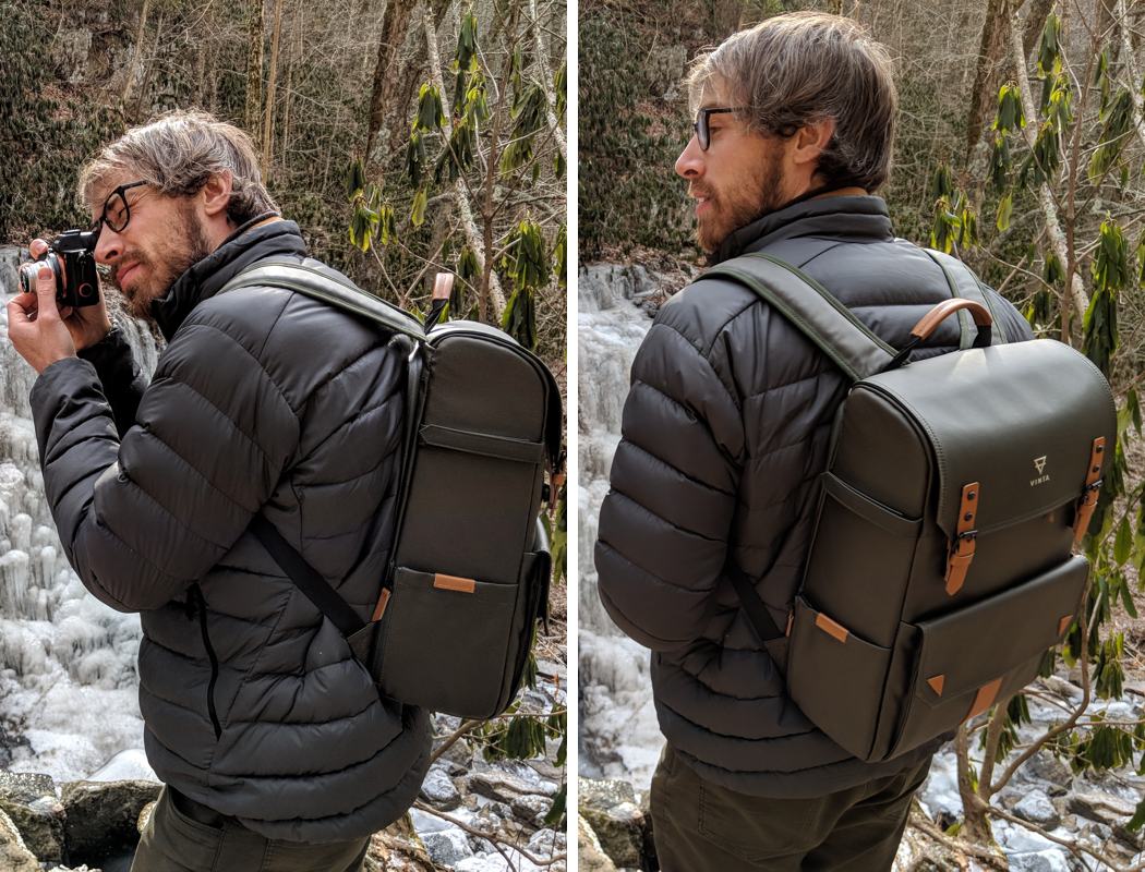
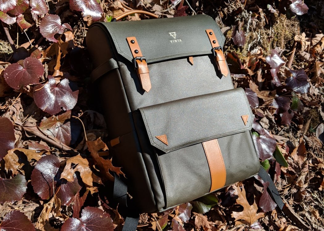
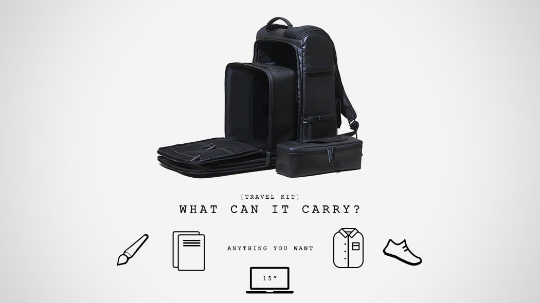
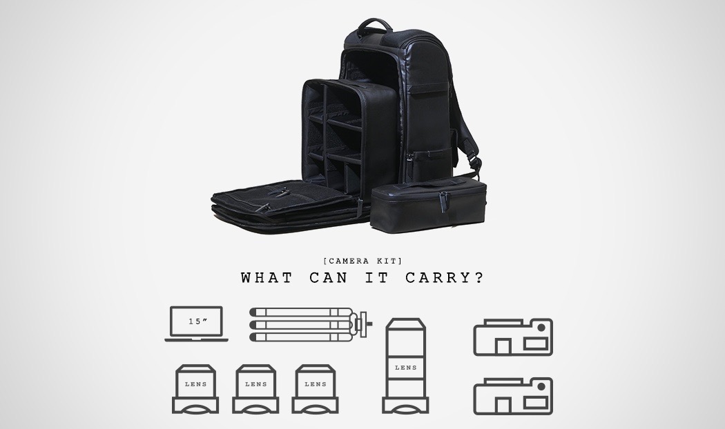
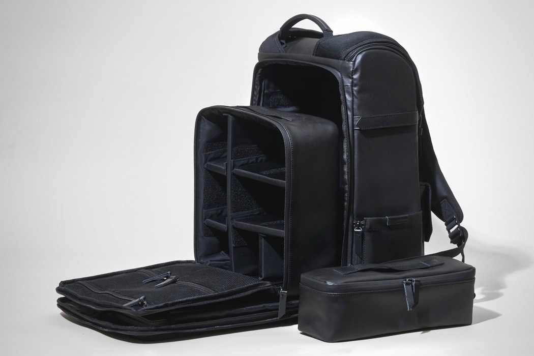
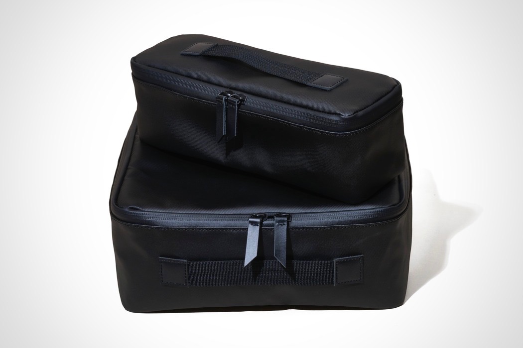
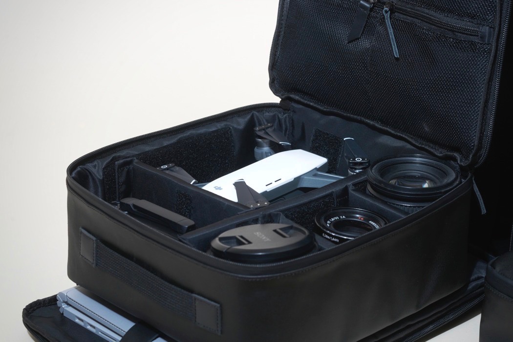
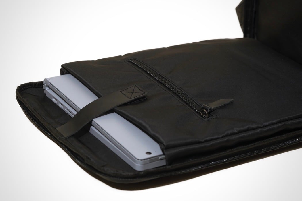
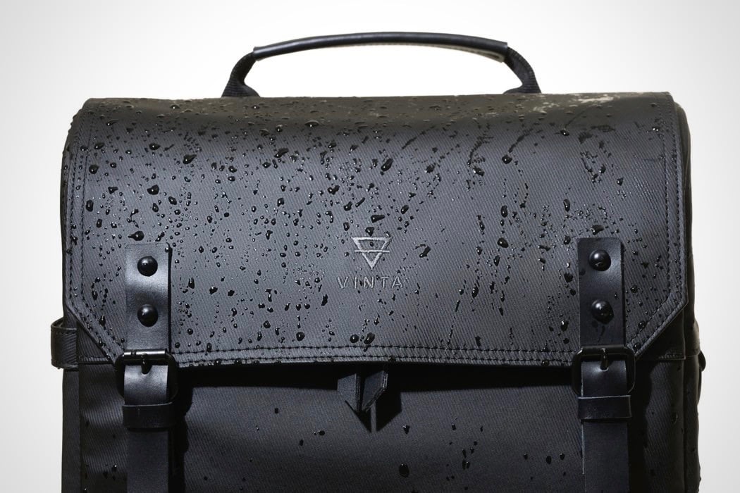
| Posted: 15 Jan 2018 07:12 AM PST Kickstarter has spawned a refreshing generation of companies/startups whose prime goal is to be able to design for demand. The products they make are solely driven by what the community is asking for, and aims at creating products that’s true purpose isn’t to turn a profit, but rather to delight consumers first. The Type II proves that VINTA is the kind of company to encourage community-driven innovation. After the success of their S-Series, the Type II builds on feedback, allowing users to do more and do better with their incredibly stylish, weather-proof bags. Made in the modular format, the bag is heaven-sent for photographers wishing to carry their gear around (safely). The padded modules allow you to segregate and protect your gear, and the ability to modify modules lets you build a bag that suits your needs, be they permanent or ever-changing. You can even ditch the modules for an empty space for your clothes, books, luggage, etc, or carry the removable modular unit as a separate auxiliary bag in itself, depending on the size and nature of your luggage. Along with the modular bag comes the longitudinal Field bag that’s ideal for those bulky telephoto lenses that never seem to fit into your regular camera bags. The modular bag and the longitudinal field bag both fit into the Type II, giving you one consolidated package to carry everything in. Moreover, the three bags can be even used as independent units built to carry any and everything you may need. Designed as an upgrade for the S-Series, the Type II features a larger size that allows it to hold any 15.6″ laptop in its dedicated, easy-to-access laptop sleeve. To secure your expensive gear on the inside, the bag opens only partially from the flap on the front, and has a zipper on the back that lets you fully access its contents, making it easy only for you to access your belongings. EDC pockets on the front and an additional attachment strap on the side lets you carry along accessories to your gear and your life. The bags come made in tightly woven twill with leather accents that add a dash of color to the bag’s sleek and subtly sexy style. The twill makes each bag waterproof and weatherproof, giving you the ability to go anywhere with your lenses and luggage. If you can survive it, your bag can survive it too! Designed for photographers, but made for everybody, the bags are perfect for a lifestyle of adventure, trekking to and from the studio, the office or the mountains. Designer: Victor Soto Click here to Buy Now: $188.00 Click here to Buy Now: $188.00 |
| Posted: 15 Jan 2018 05:00 AM PST
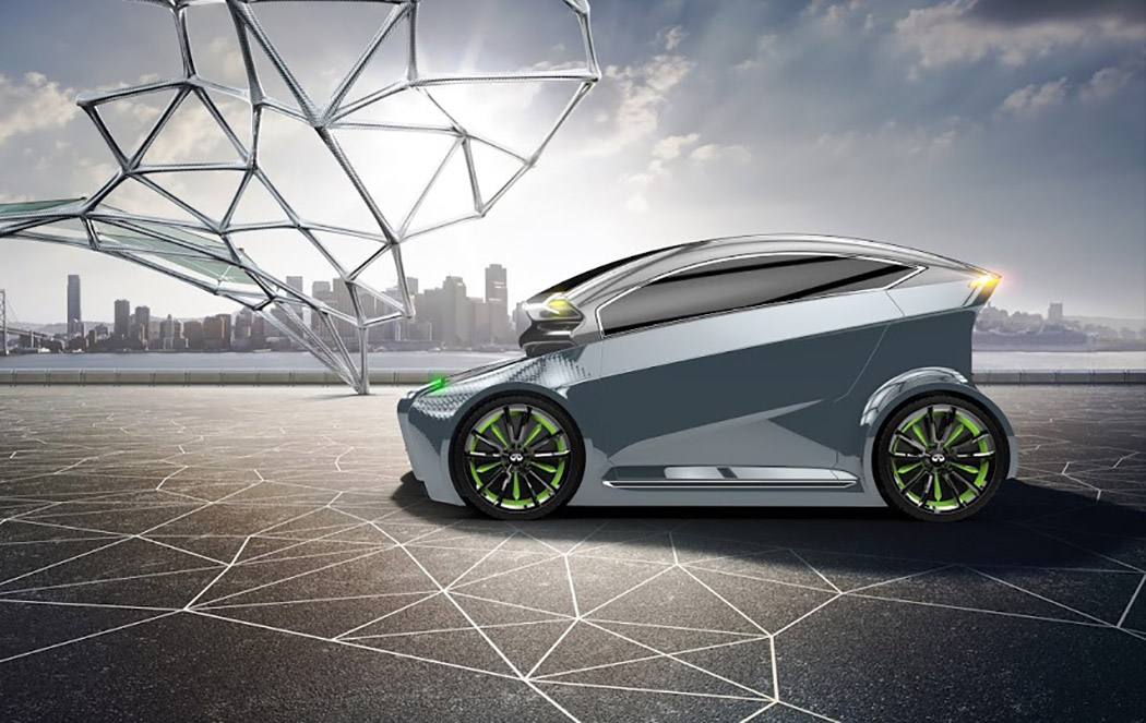
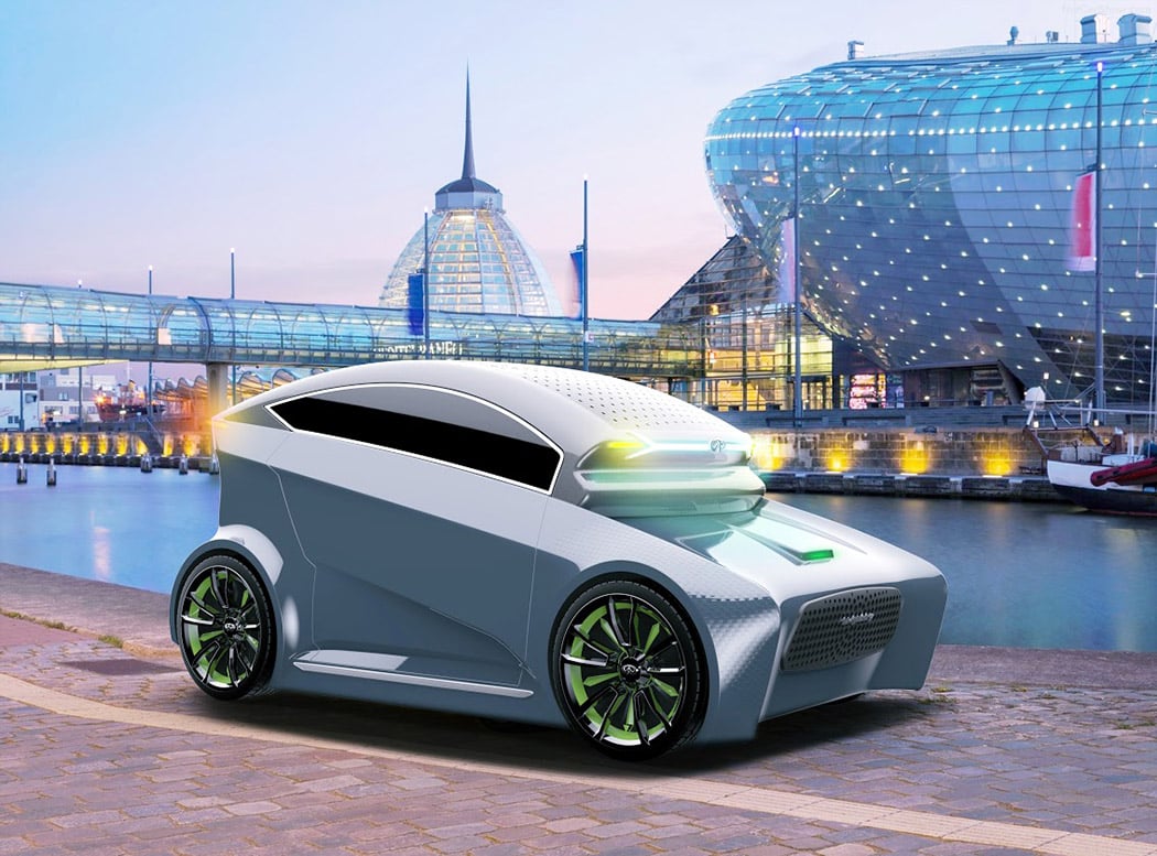
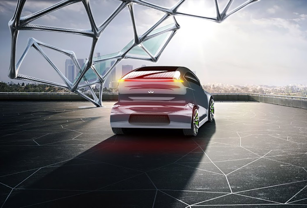
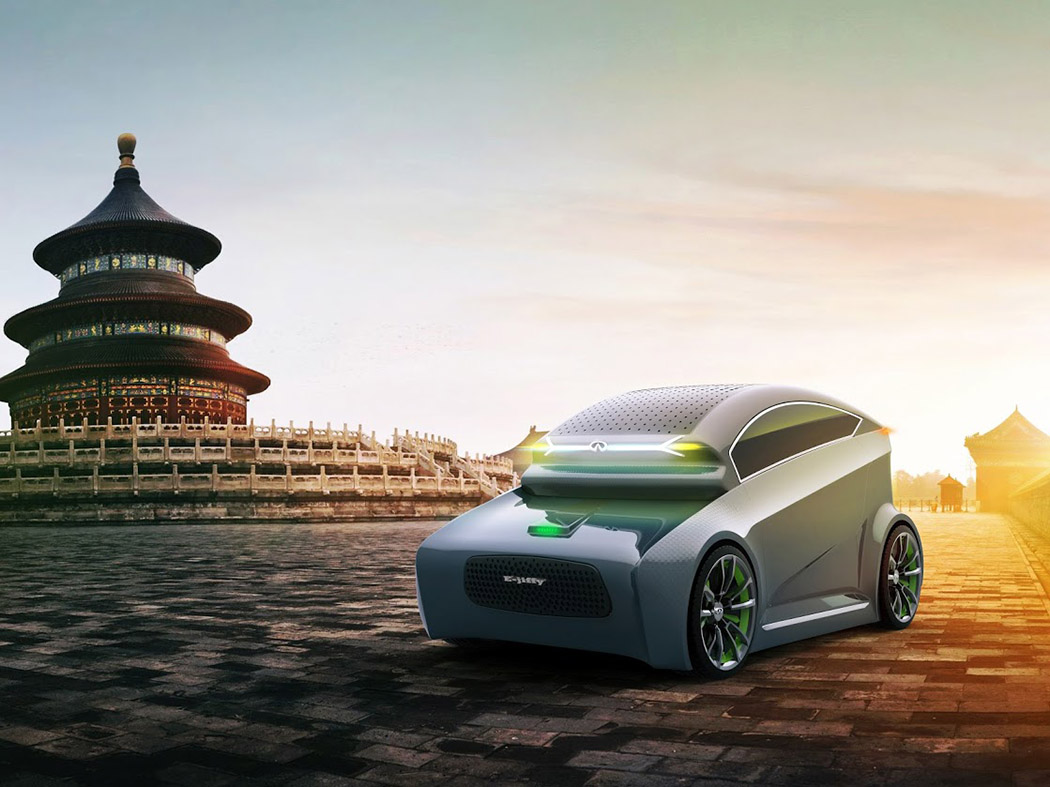
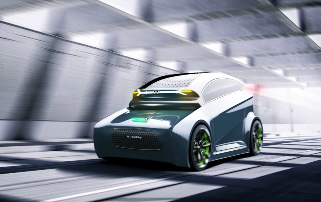
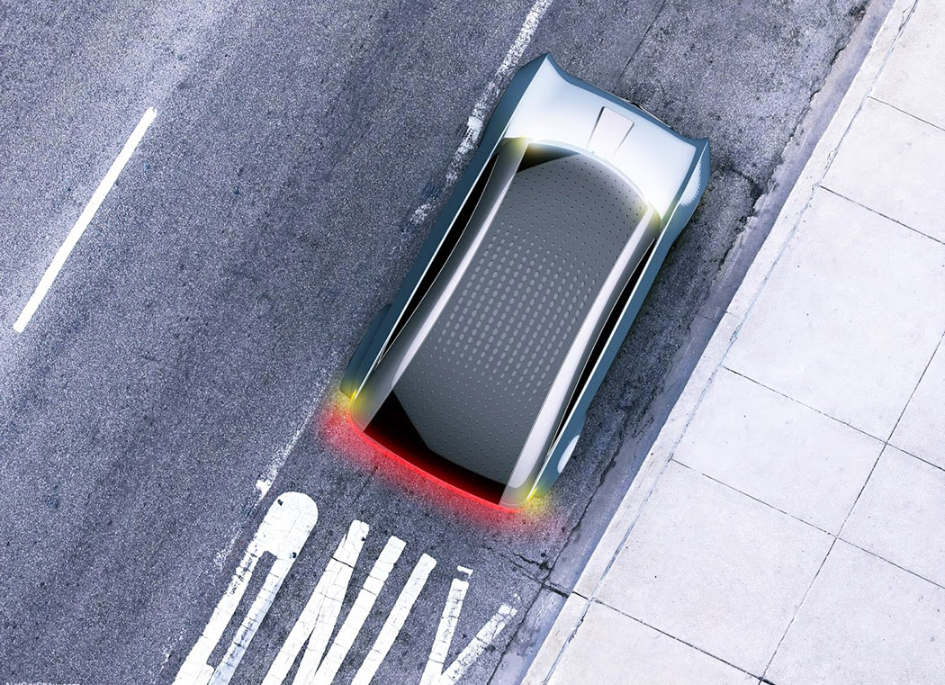
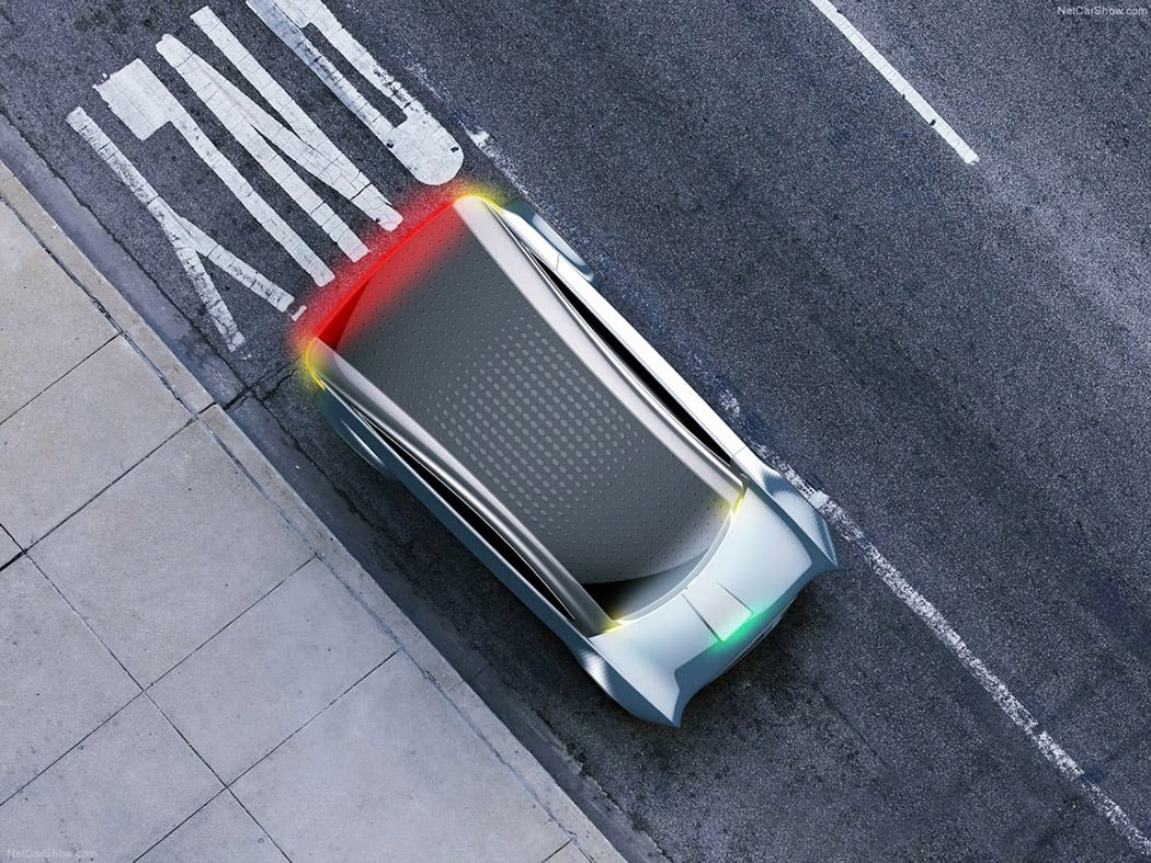
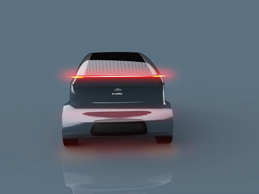
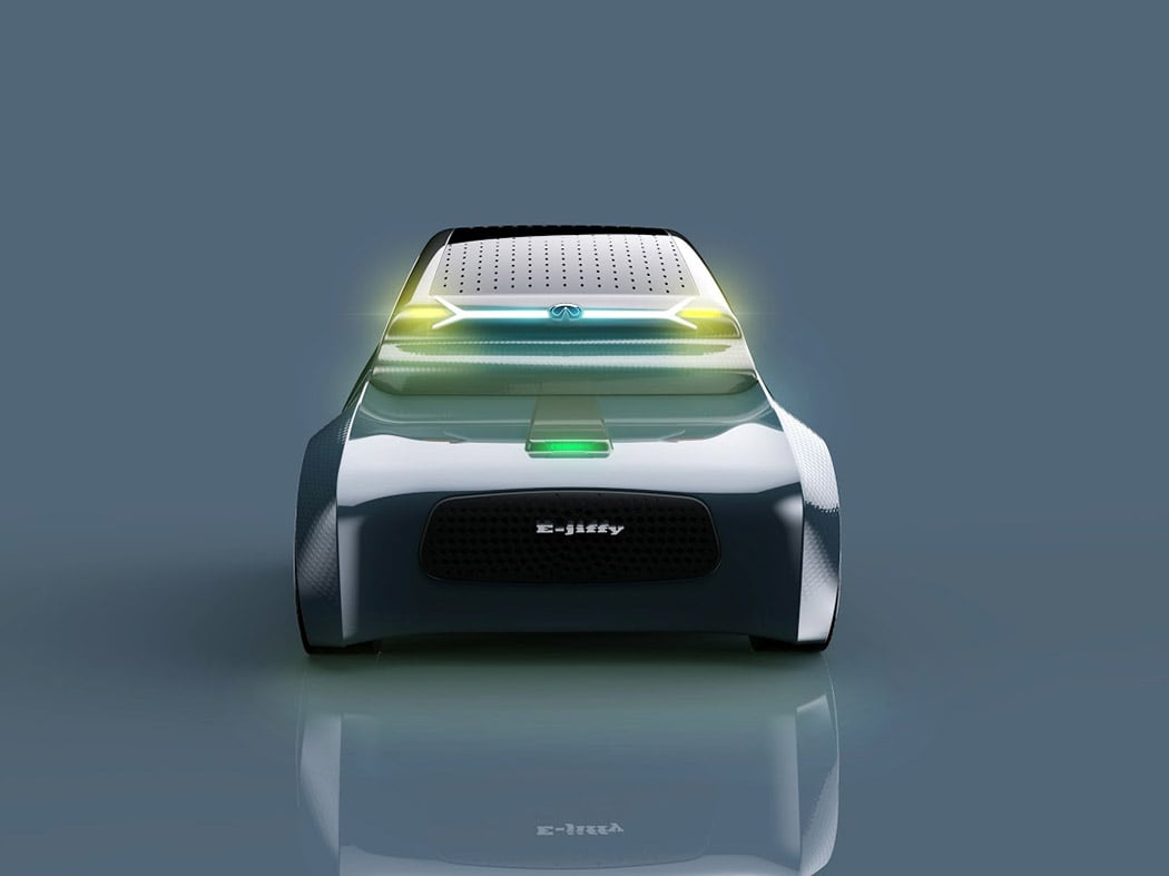
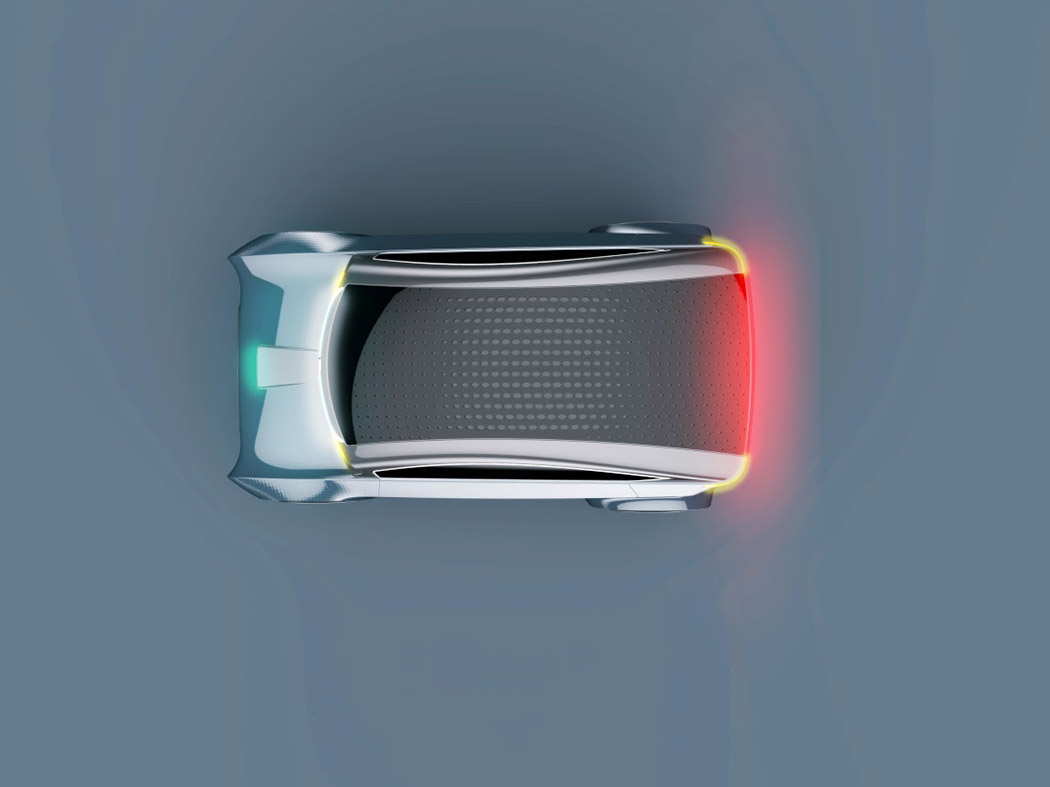
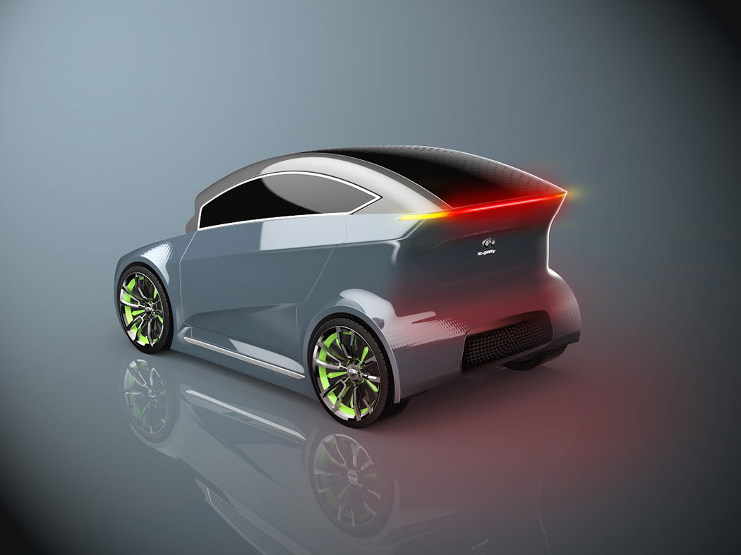
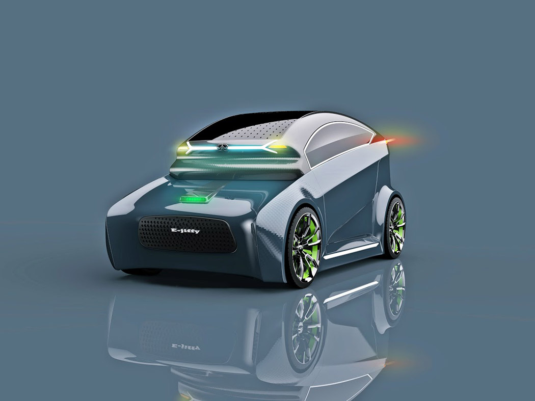
The E-Jiffy is just about as cute as it sounds! This Infiniti brand concept by Narendra Singh aims to get up to 2 passenger from points A to B in, well… a jiffy! All while minimizing its carbon footprint. Thanks to its compact size and entirely electric drive, this two seater concept is agile, quick and ideal for zipping around the city. Taking visual inspiration from the natural structures it aims to protect with its zero carbon footprint, its multi-tiered body is reminiscent of waves and sand dunes. The solar-panel top also harnesses solar energy to supplement electric power. No word on an autonomous drive feature, but it’s safe to assume this futuristic EV is entirely autonomous considering it has no front windshield! Designer: Narendra Singh
|
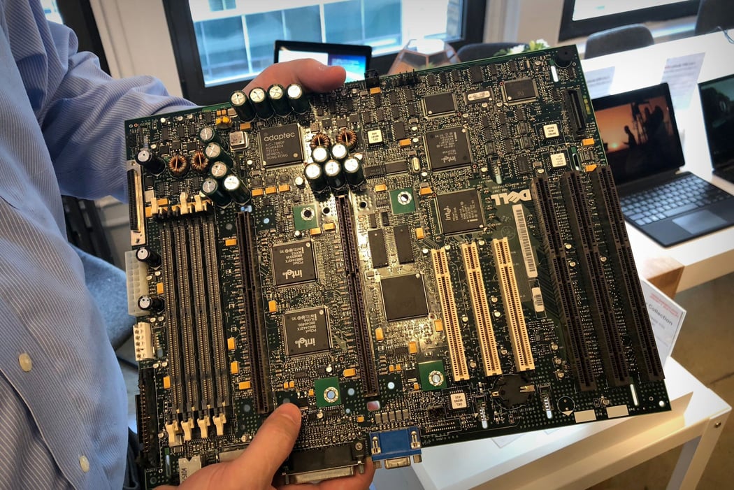
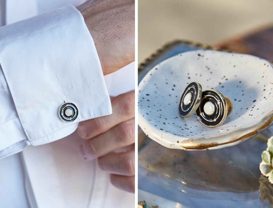
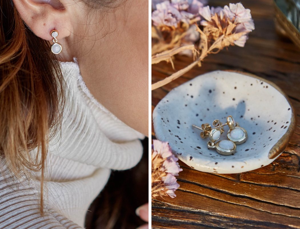
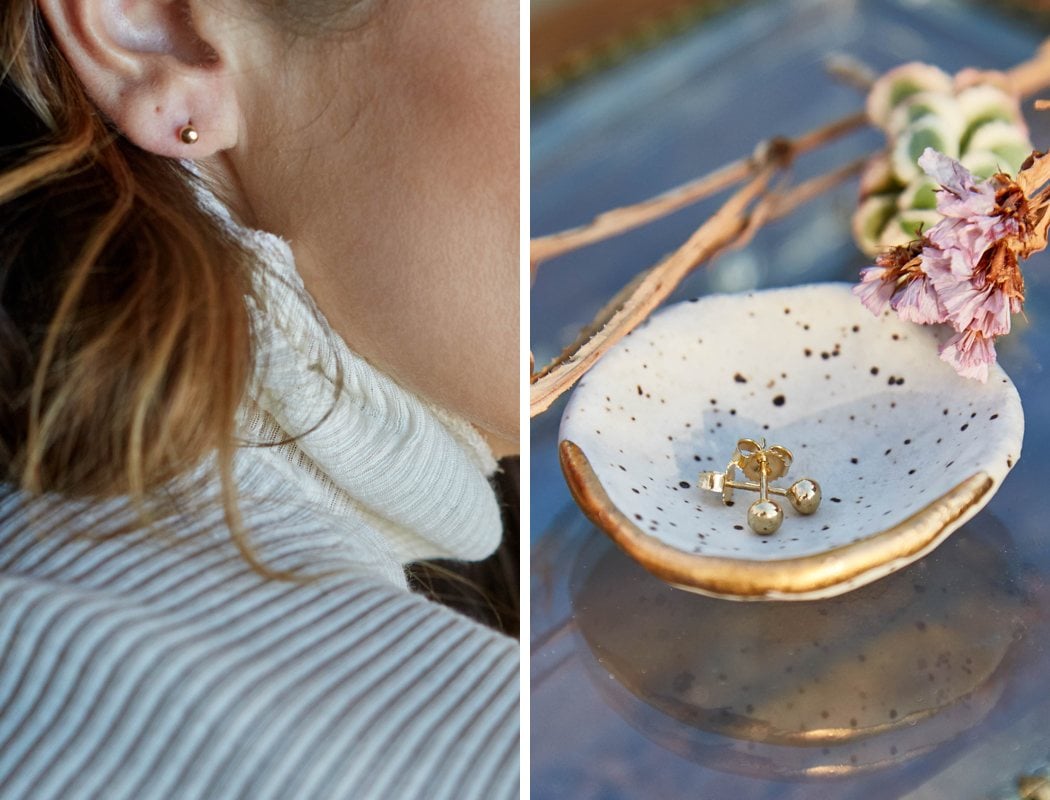
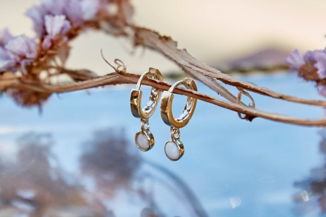
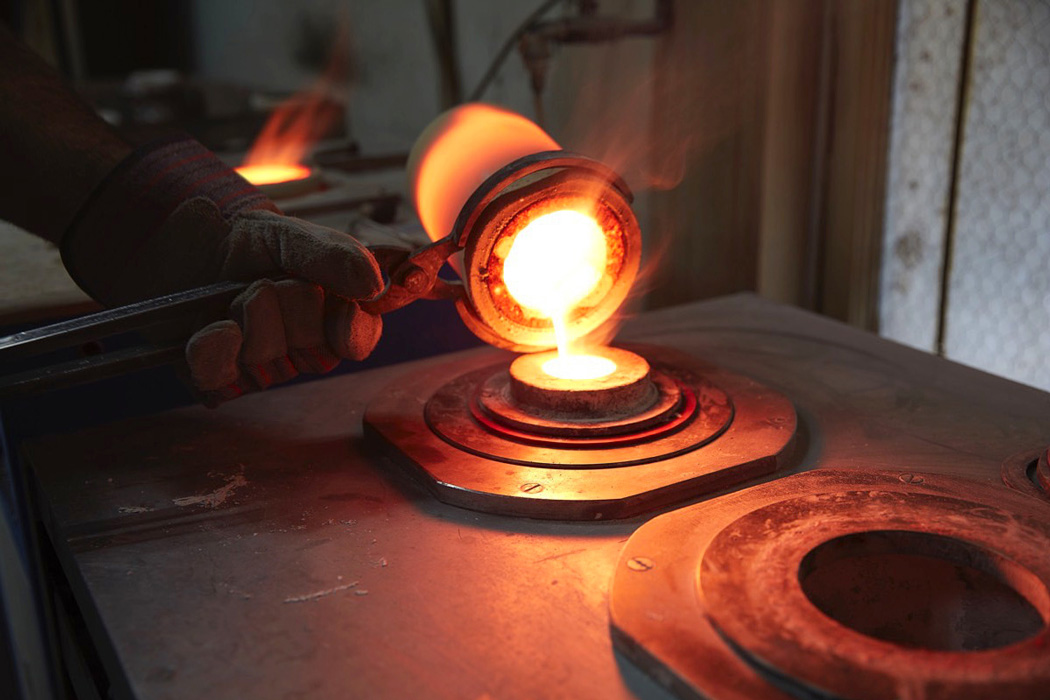
| Posted: 15 Jan 2018 03:33 AM PST I’ve seen many quirky backstories for jewelry and let me tell you; The Circular Collection has far exceeded that of any I’ve heard before. The Circular Collection by BaYou with Love and Dell is a 14 to 18-carat gold jewelry collection designed by Nikki Reed and made in Los Angeles from gold responsibly extracted from used technology recovered from Dell’s US recycling programs. According to Dell, around 12.5% of electronics are responsibly recycled globally. In phones alone, Americans throw away more than $60 million in gold and silver every year. Dell and their partners have a process for extracting gold from old computer motherboards that are 99% more environmentally friendly than removing gold from the earth. Aptly named ‘The Circular Collection,’ this collection of jewelry takes aim at treasuring the industry’s trash in the form of designing responsibly sourced gold jewelry. The jewelry produced is comprised of ethically sourced Opal and in some cases, ethically sourced diamonds too. These gorgeously designed rings not only have a fantastic backstory, but they’re also creating awareness and making a difference. Reasonably priced, these rings are a great way to express how you feel about that special someone and how you feel about the environment – sounds like a real win-win to me. Designers: Nikki Reed & Dell |
| Posted: 14 Jan 2018 11:36 PM PST
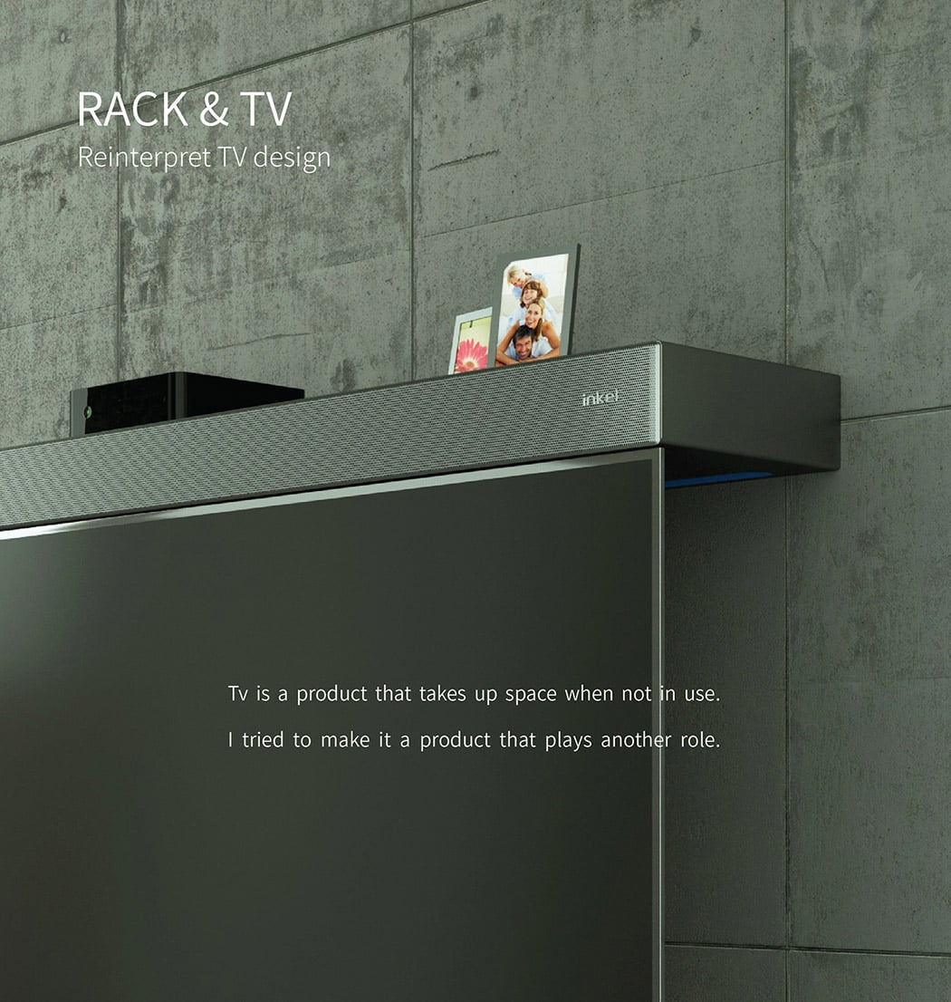
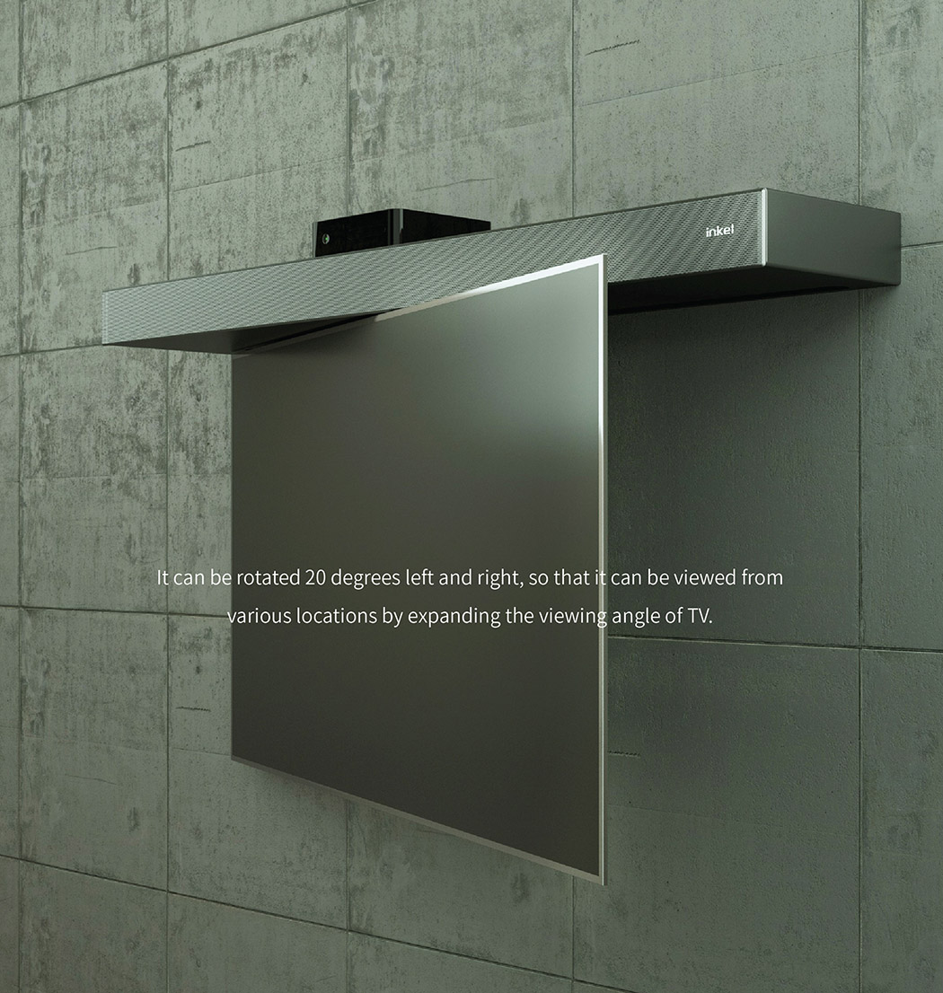
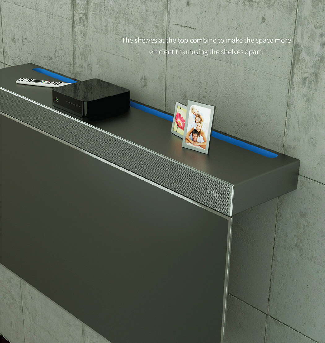
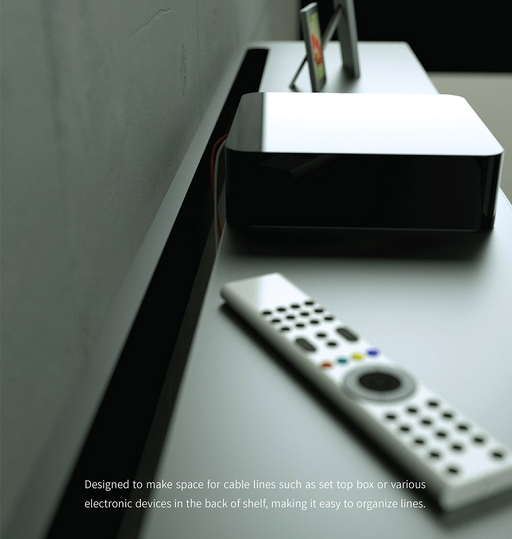
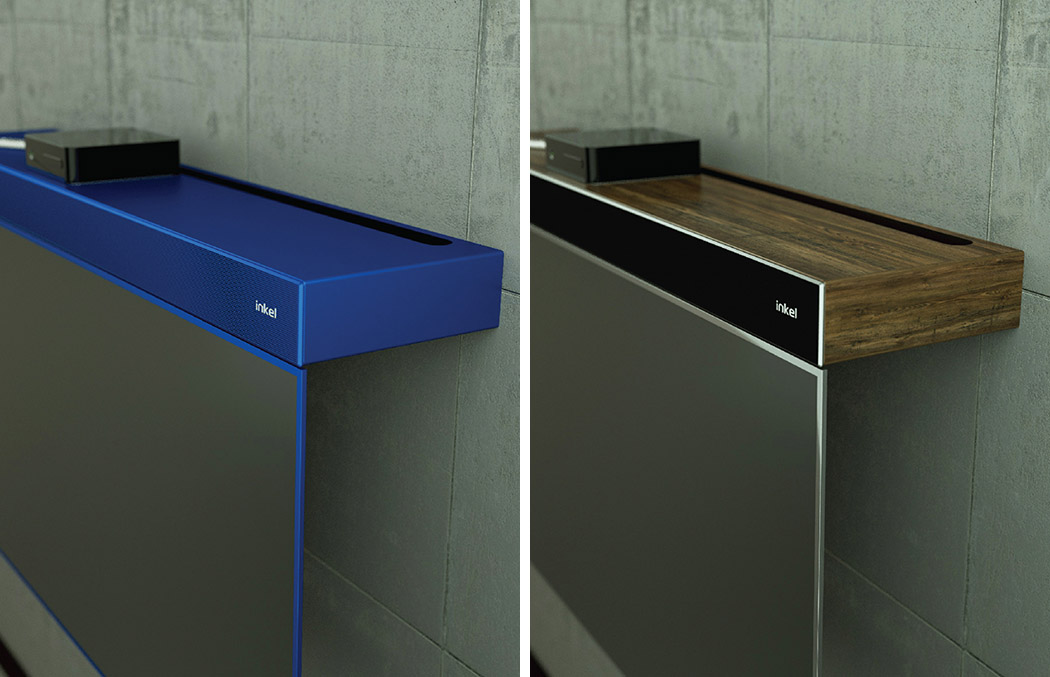
There’s no quicker way to kill your aesthetic vibe than with an unsightly TV and, unfortunately, that is most TVs. Next to “ceiling fan”, it’s one of the words interior designers hate to hear! We love a creative way of masking these entertainment appliances and the Inkel Reinterpret TV concept does just that. Instead of disappearing into the wall or disguising itself as something else, it simply doubles as a modern shelving unit. When it’s not in use, it looks more like a modern, perhaps even artistic and sculptural shelf, so you might not even notice that it’s a TV. The flat top-mounted surface (which is also a speaker unit) is the perfect place to perch your picture frames, remotes, books and more. The 20-degree swivel feature ensures you can view it from almost any angle in the room. Designers: Seo Joung Yu & Yea Seul Kim
|
| Red Dot Design Has A Swanky New Address In Singapore Posted: 14 Jan 2018 08:31 PM PST
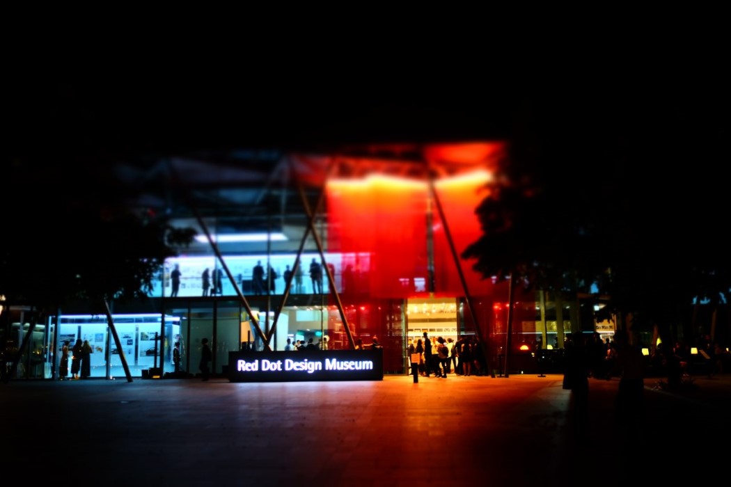
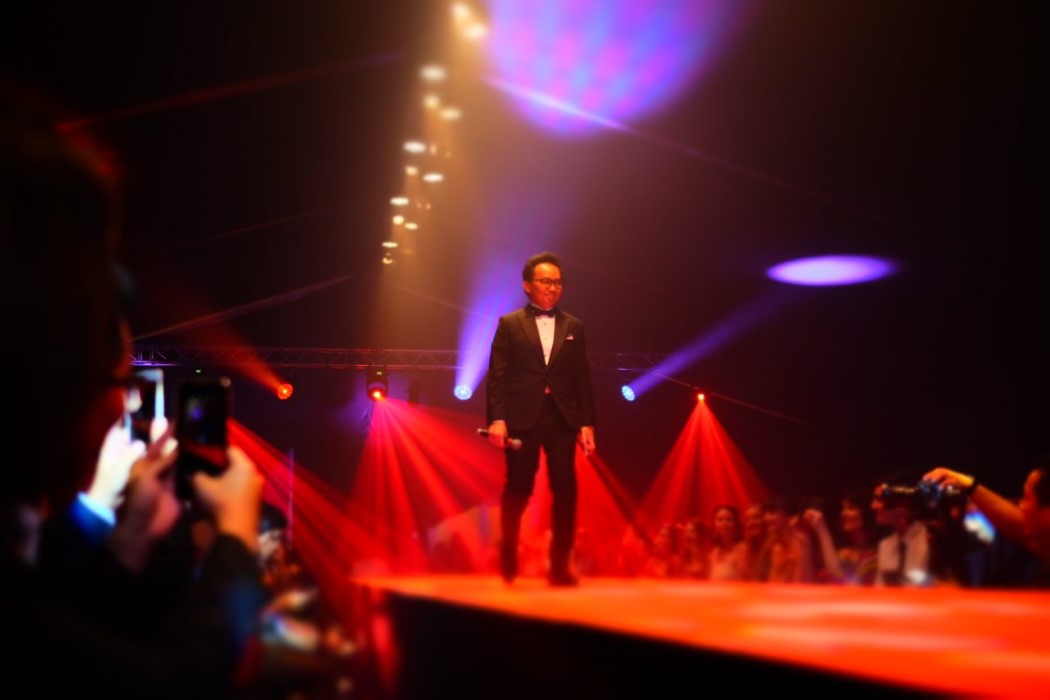
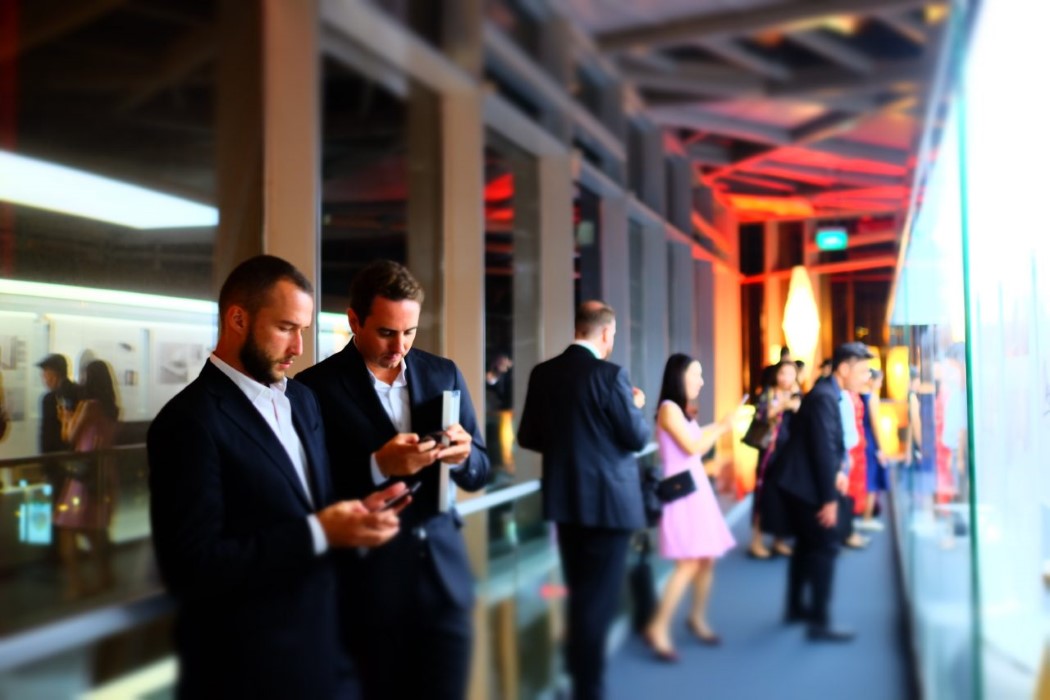
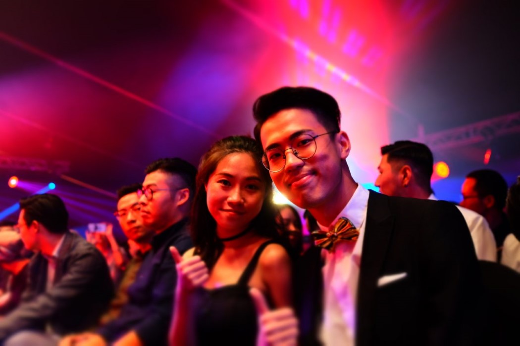
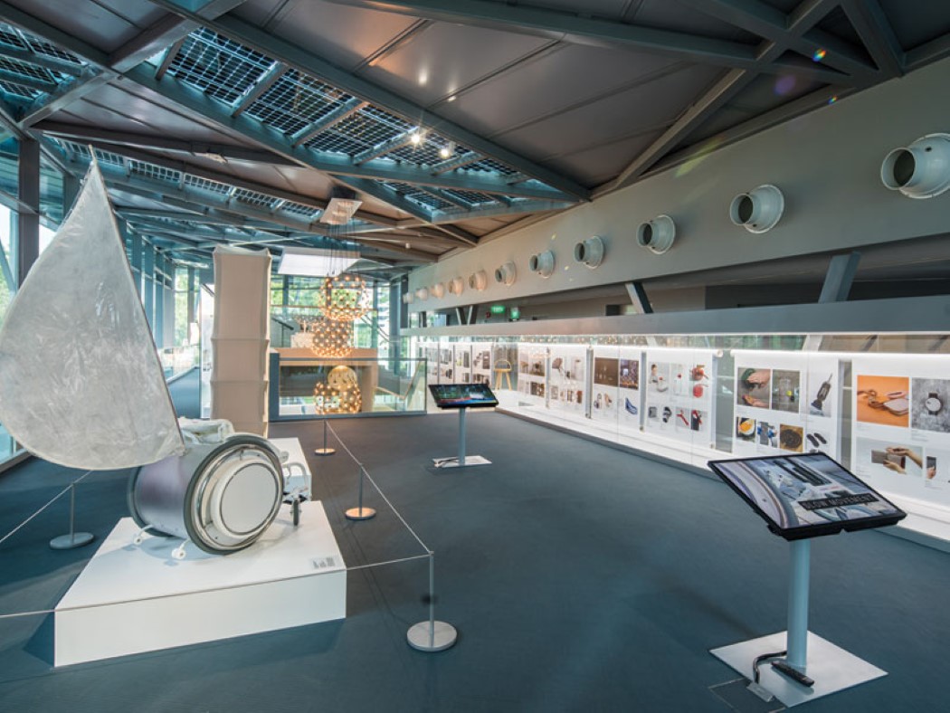
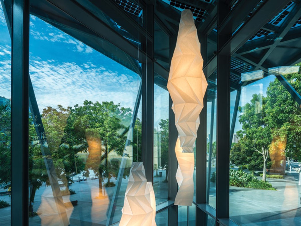
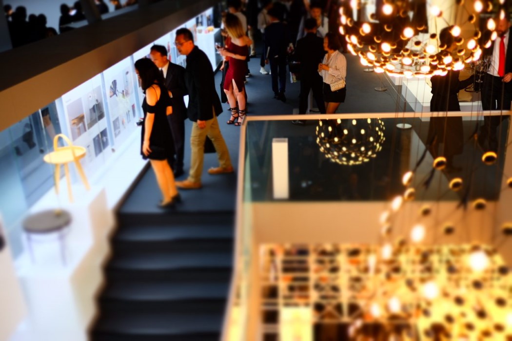
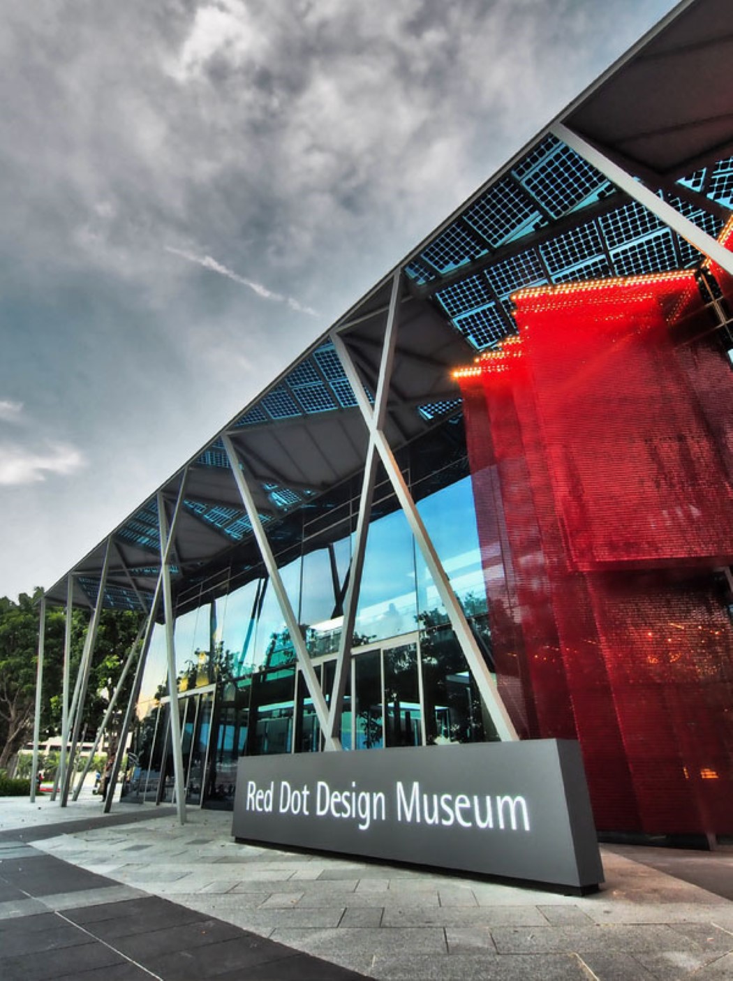
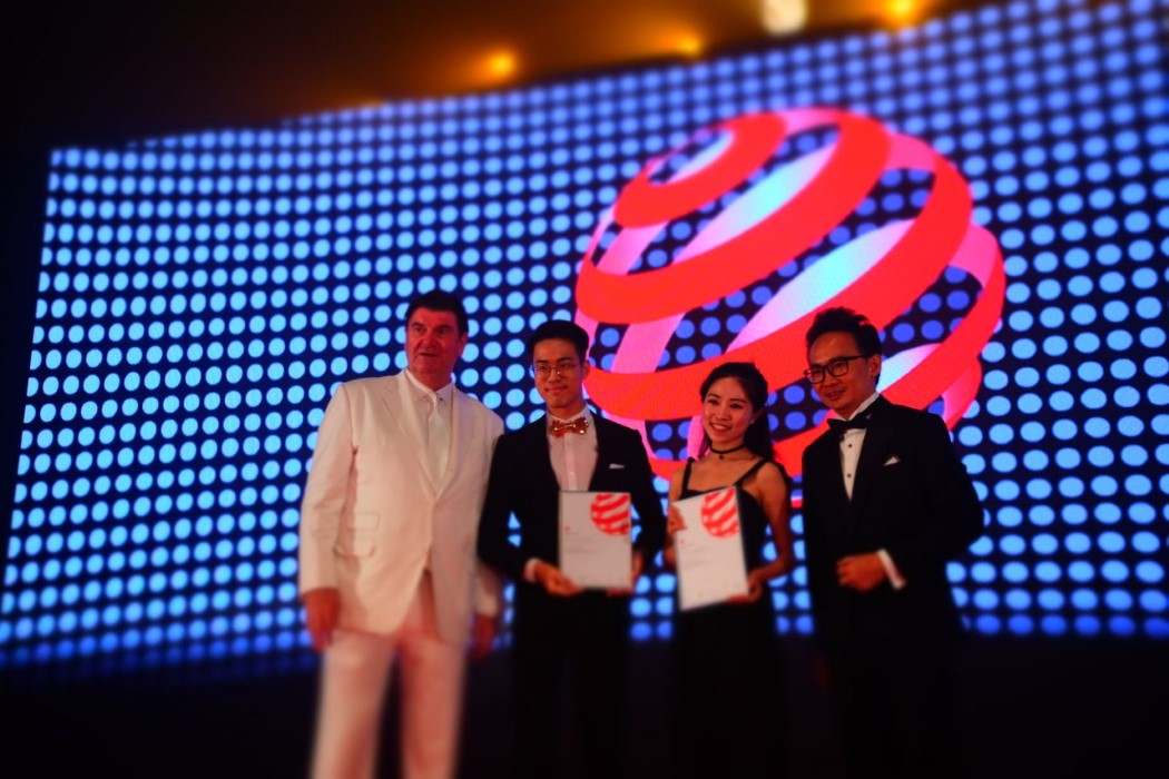
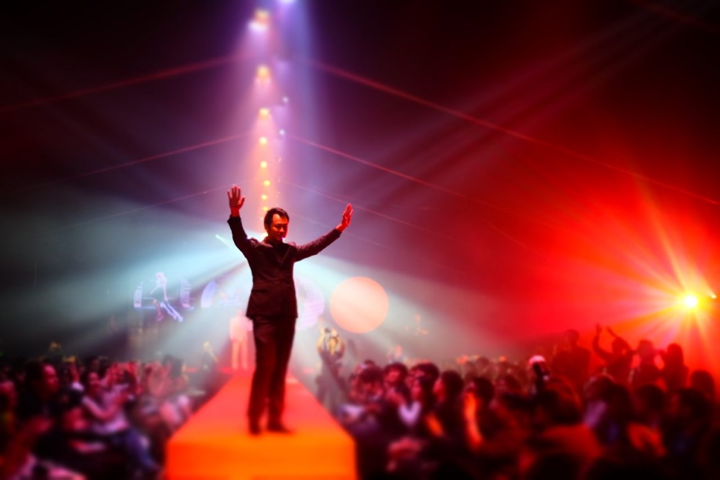
It’s the new year and we have exactly 365 new opportunities to make it the best year for us. One of these opportunities that you can have as a designer, is to showcase your talent by winning a Red Dot Award: Design Concept. We have spoken to Ken Koo on multiple occasions, however this time around, we learned a lot about how changes (of location) and transitions (of the museum) have helped Red Dot evolve into a collaborative unit that has been. In fact, some of the points he speaks about reiterate how change should be embraced as it challenges us to do our best. The glorious new location of the Red Dot Museum, right at the Marina Bay, was it just the moving of a building or was there any change in the way they are looking at things.
Ken Koo – there is a multi-level change that we have had to embrace. There is a location change along with the physical manifestation of the museum and mindset change. Today, there cannot be a better location than this in Singapore. An empowering place that has led to many new collaboration and partnerships. For example, we have collaborated with designers on uniform, installation, architecture and lighting of the museum.
Our mindset has changed because this new museum has raised the bar for us. The place has forced us to change our thinking and push our limits to do our best.
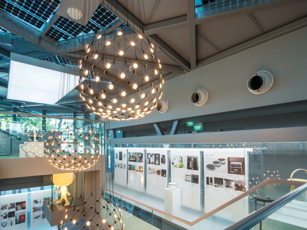
The museum has manifested into a modern new venue. Earlier we were in a heritage building, so there was little that we could do about the place and had to present everything to the best of limited space. But now, we have the liberty to put design first. This place was like a blank canvas and we could make architectural changes and present modern interiors.
We have more interweaving of space and the design exhibition. The only limitation we have now is budget. We have taken a modern and finished approach, akin to an Art Museum. As a result, we have elevated our award winners as well.
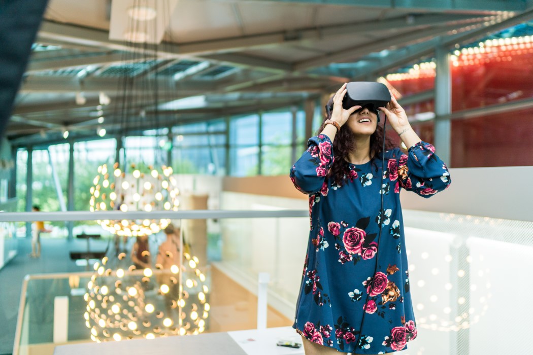
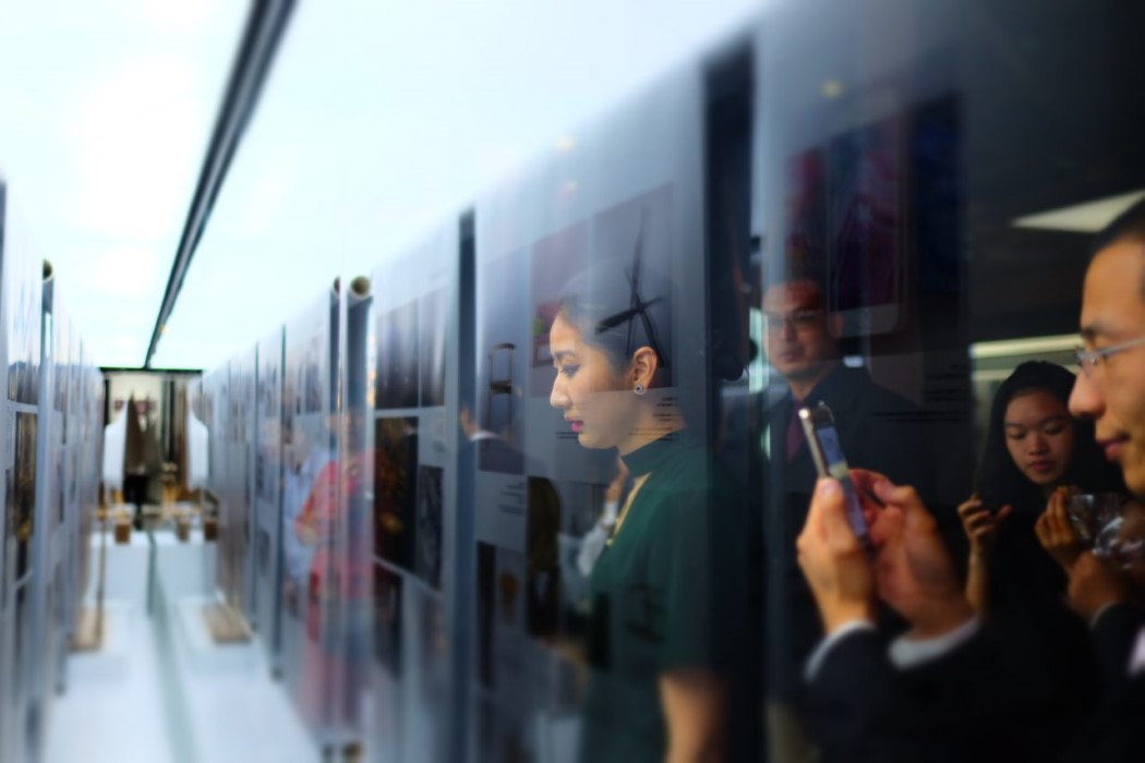
If you put good design amongst a heap of things, it will not shine. Now we are presenting our award winners in a much more sophisticated manner, hence they are being represented to their full potential. Every exhibit here gets better attention and presentation. Back in the days, we did everything ourselves, however with this new address, we have the responsibility to integrate the design community into the museum. So, right from the architecture to the designer ceramic plates used in the café, they are all locally sourced and collaborations or partnerships forged with the design community of Singapore – the uniform by a local fashion designer, the VR by a multimedia company, we have collaborated as much as we can. This kind of mindset will help us grow, for example collaborating for an installation at the façade. If we don’t do such collaborations, we will be under utilizing the potential of this modern museum. Are you going to limit to local designers or open up to international designers?
Ken – we will always be international as we are Red Dot. However, collaboration is not easy, there is a lot of chemistry that is involved. A lot of synergy is required and we have to see what the designers want to do and what the museum wants. Our goals have to be aligned.
My endeavor will be to first work with our own Red Dot winners. Every year there is some interesting installation that wins an award, so I would like to collaborate in that. With fashion, lighting and other avenues will be easier to work with international designers. Can we expect anything new for 2018?
Ken – every year we look at major trends, and lately methods of manufacturing is in the news. For example, the area of 3D printing; people ask me if we can start a category like this, however it’s like asking can we have injection molding as a category. Likewise, for Kickstarter or crowdfunding, these are platforms so they cannot become categories. These are financing platforms and not design categories. Over the years there is a lot of development in bionics, so we have interesting submissions in this section. I hope to see good work in this area. There is an increase in design companies winning awards in the concept design space, how is this affecting universities?
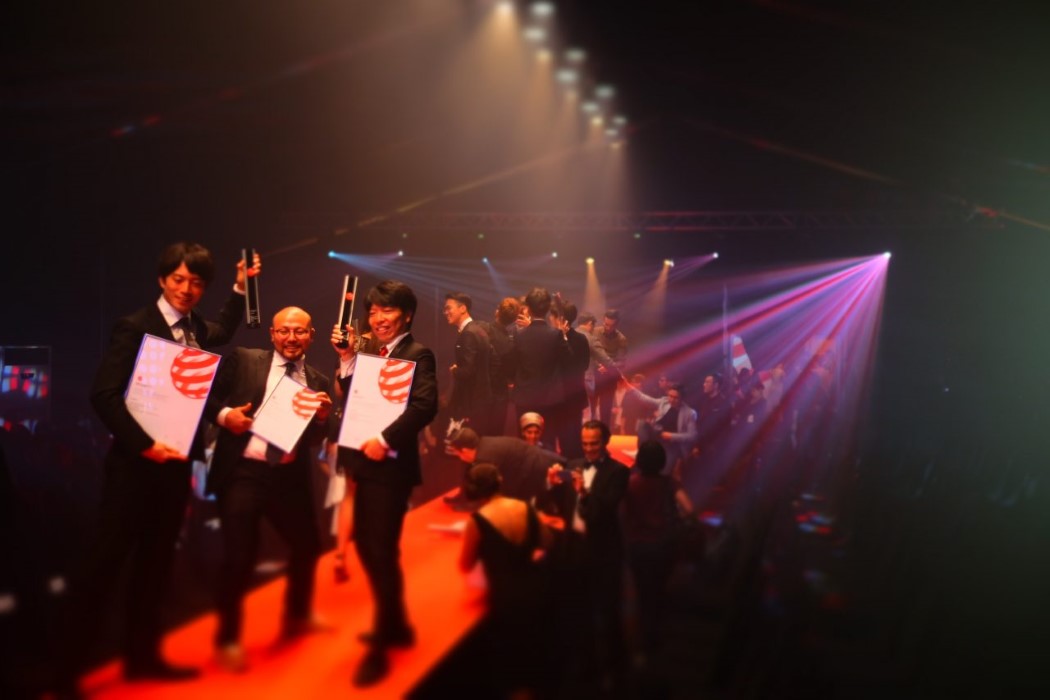
Ken – last year there was 23% entries by companies and this year 27% and they won 38% of the awards. This is good for designers because companies raise the benchmark. Professional teams and Independent designers are competing and this builds mutual respect for each other. Does this not put pressure on universities as most concept designs come from there.
Ken – From my experience it is the power of the platform that we provide, whether you are a student or a teacher or a big corporate – a good idea is a good idea, and that is what we all value. The day I started Concept Design it was very clear for me, that it doesn’t matter if you are a veteran or a newbie; it’s what you put on the table. Even when we do judging, you could have a big company’s idea placed next to a student concept. Only the more powerful idea will win the accolade. We do not reveal the designer details, so jury has no idea who they are judging. This is why a lot of students want to compete, because of the platform and recognition we provide. Now that you have moved to the new museum, why should a tourist come to the Red Dot Museum?
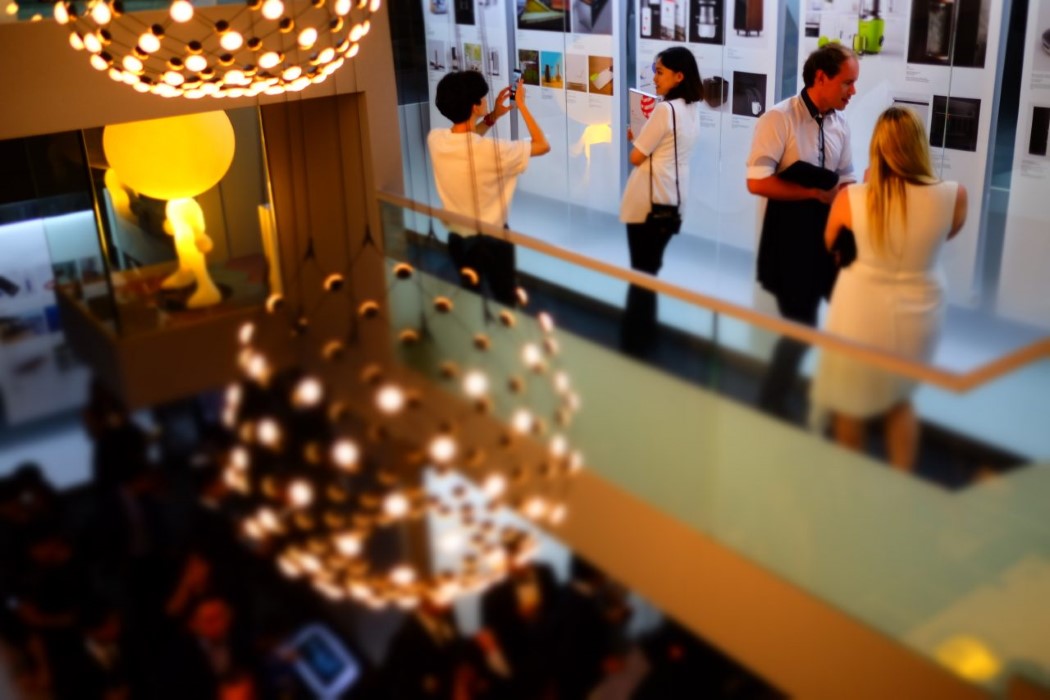
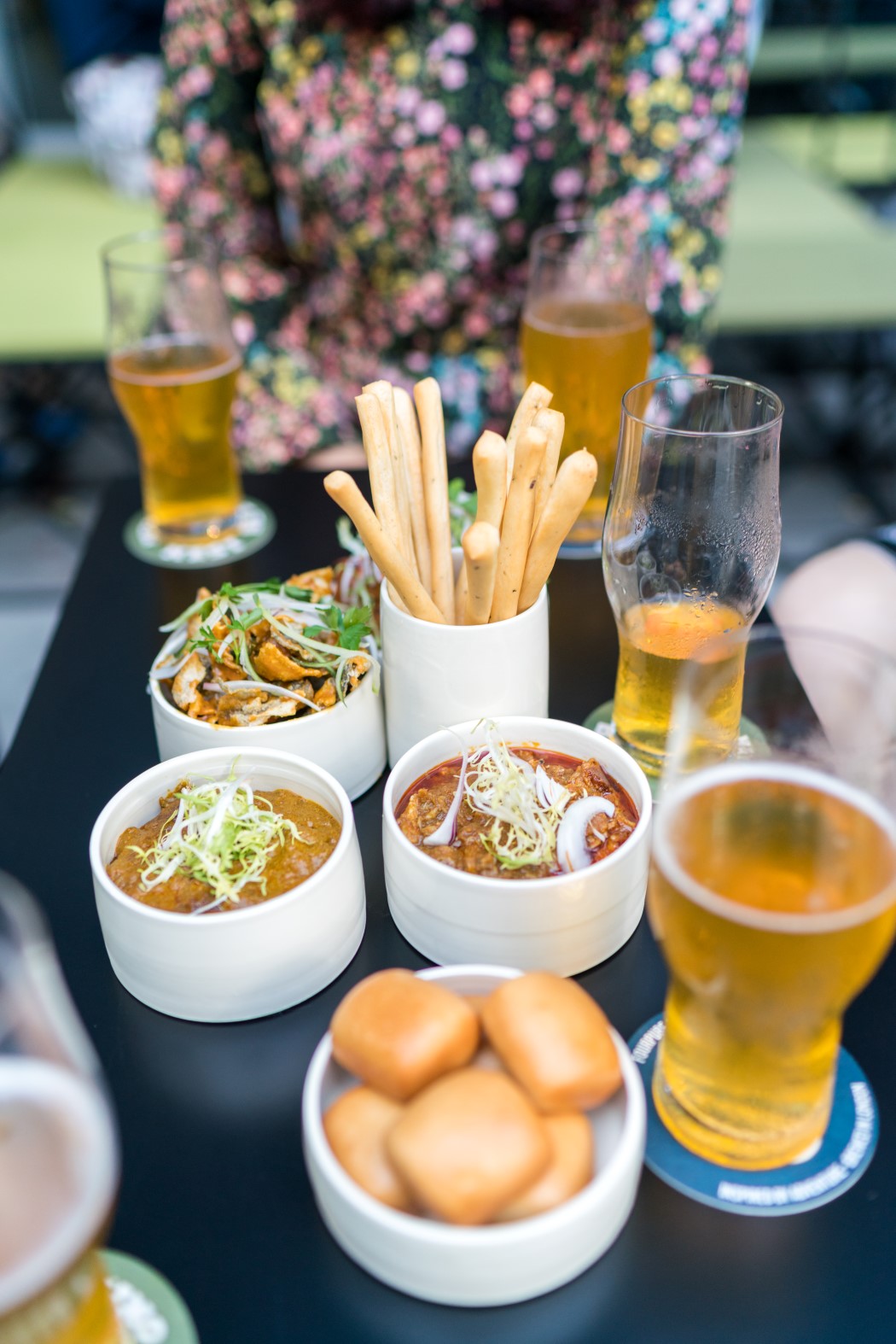
Ken – everybody benefits from better living and design is about enjoying life better. By coming here, it opens your eyes to what new design is all about and you can bring it home with you – if you buy something from the shop. You can enjoy the café where the food is crafted specially for the museum and is about award-winning designs. Hang out with friends. You will enjoy it here. Tell us more about the café. Ken – the café is important. With the exhibition you learn, with the shop you buy and bring design to your home. With the café you can consume and enjoy design on the spot. Drink from the award-winning Bodum Glass and have coffee or tea. We are visually stimulating you with food that looks very unique. I have worked with the team and helped set up the design for food. The square meals are specifically designed as signature dishes. We have created a form and play with the many layers. Food Anatomy are the people behind it.
The next time you are in Singapore, you should make a trip to the Red Dot Museum located at the Marina Bay waterfront. The museum also hosts a dedicated market called MAAD and there will be 72 events this year. The only criteria for participation is that your design should be original as the market curates it. It typically should get about 10,000 visitors for each show, so participate or visit it.
Red Dot Award: Design Concept Early discount submission period 2 Jan – 31 Jan 2018 Red Dot Design Museum Singapore is presented with the help of Singapore designers in the following: Red Dot Design Concept Exhibition: curatorial and presentation by Gustavo Maggio and Wendy Chua of Forest&Whale. Front of house crew vests: outfitted by Max Tan and Yuan Zhiying of MAX.TAN. Design cafe’s ceramic tableware: handcrafted by Ivan Lee of Modular Unit. Architecture works: provided by Lee May Anne of MAKK.
|
| You are subscribed to email updates from Yanko Design. To stop receiving these emails, you may unsubscribe now. | Email delivery powered by Google |
| Google, 1600 Amphitheatre Parkway, Mountain View, CA 94043, United States | |
