Yanko Design - Form Beyond Function |  |
- We’re Technolusting for this PSP
- Let the supermarket come to you…
- A Bottle Breakthrough
- When JBL met Google
- Geometric Art in an Accent Table
- Life Inside a Pipe Doesn’t Sound Too Shabby
- How someone designed the perfect router
- The most special children’s toy ever made
- LG’s TV lets the good times “roll”
| We’re Technolusting for this PSP Posted: 17 Jan 2018 12:00 PM PST
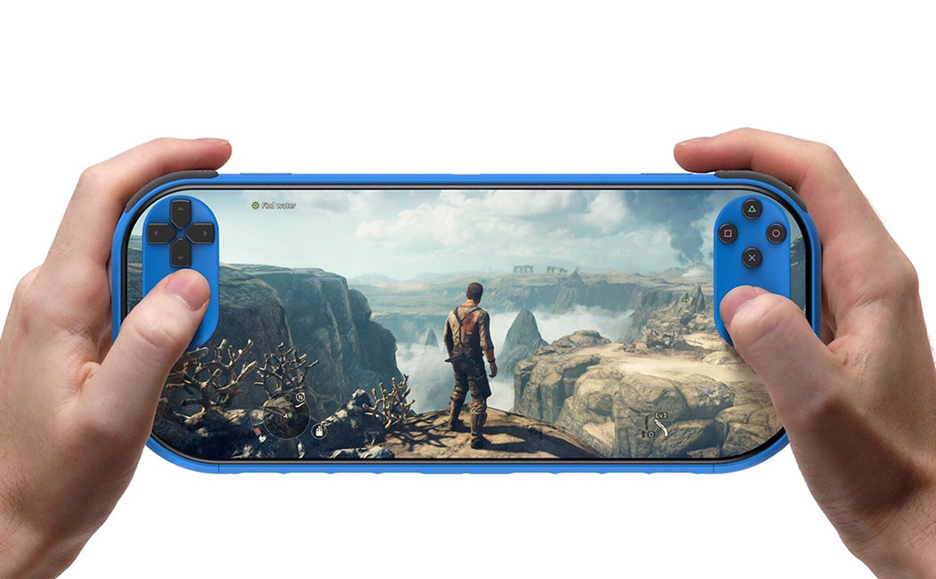
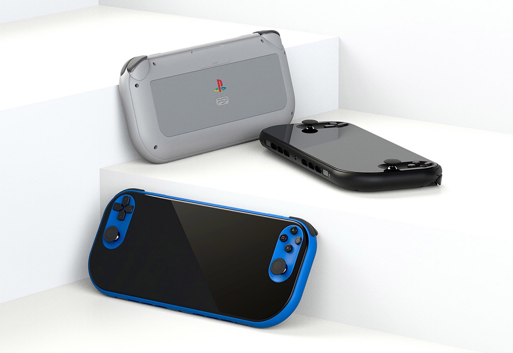
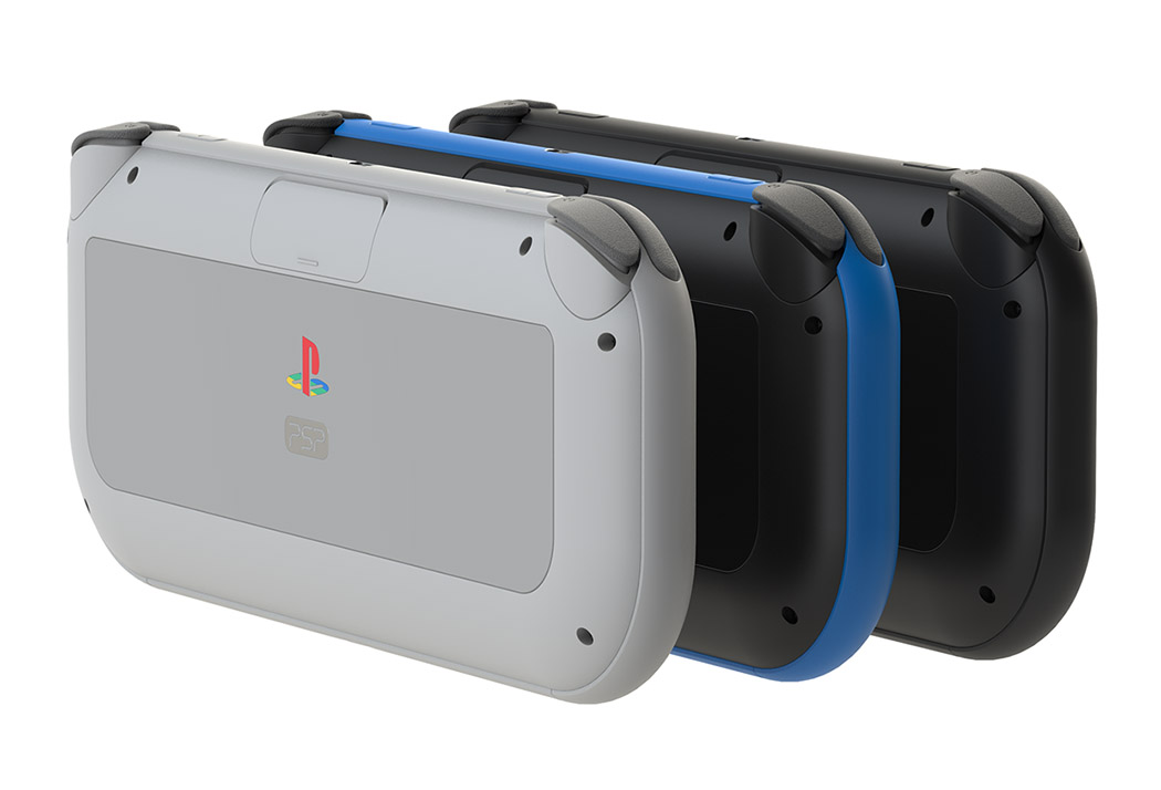
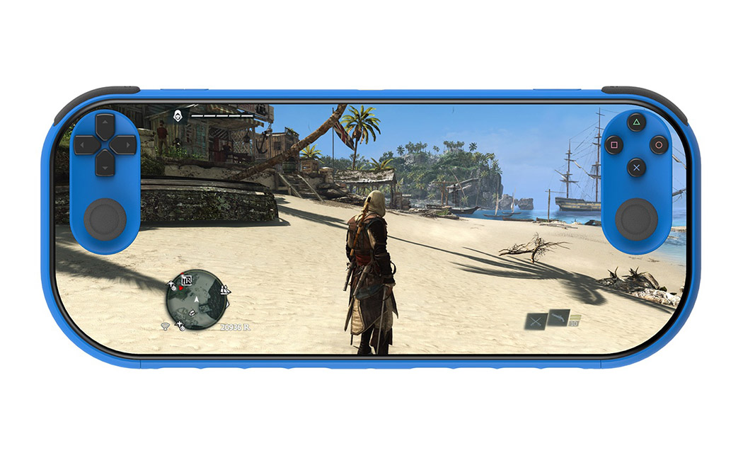
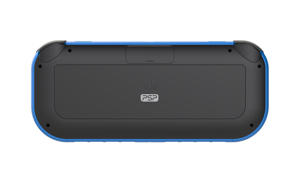
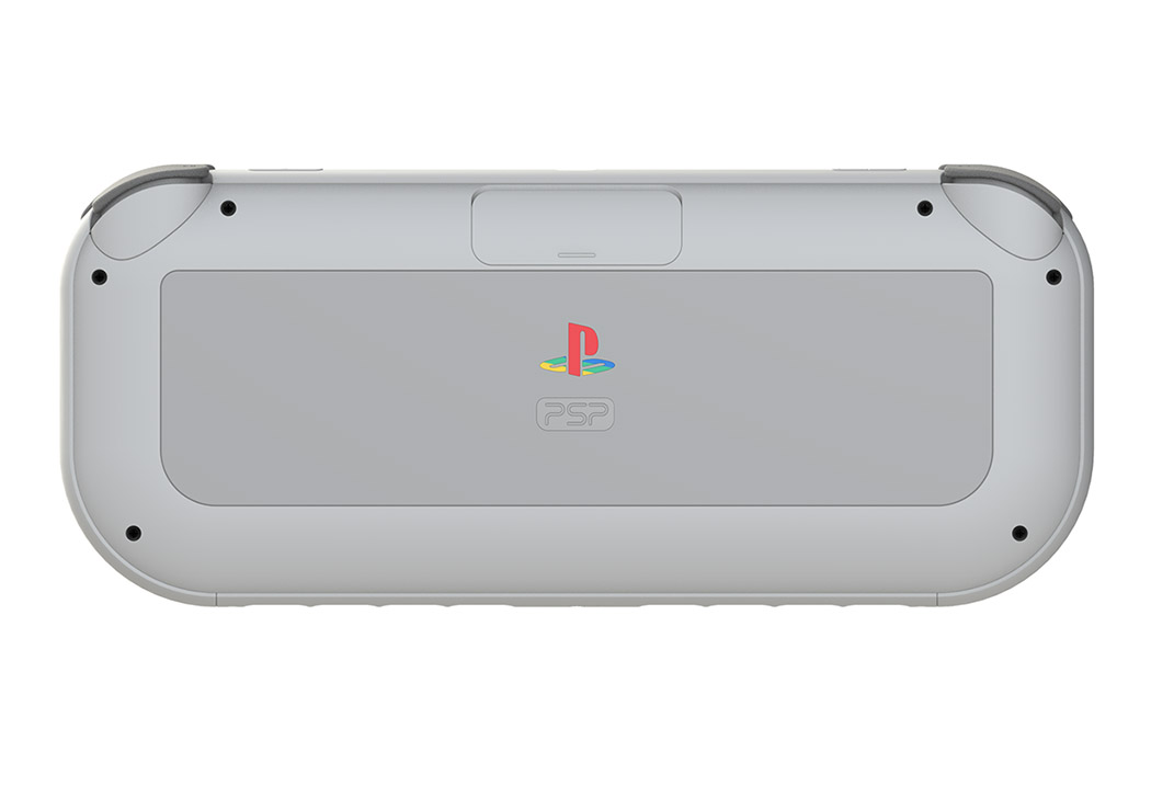
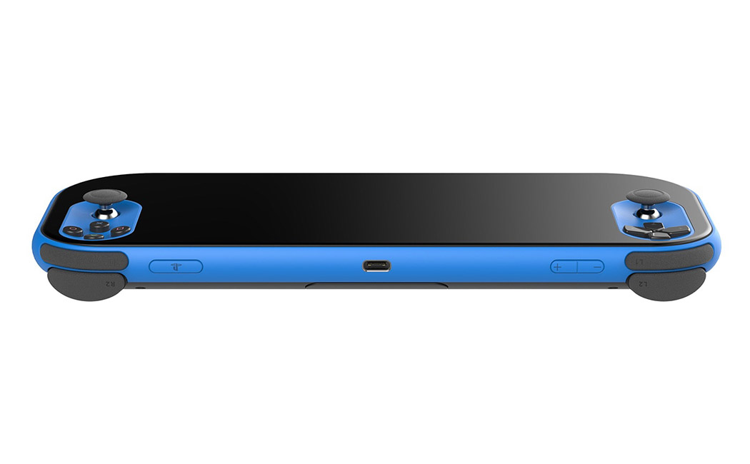
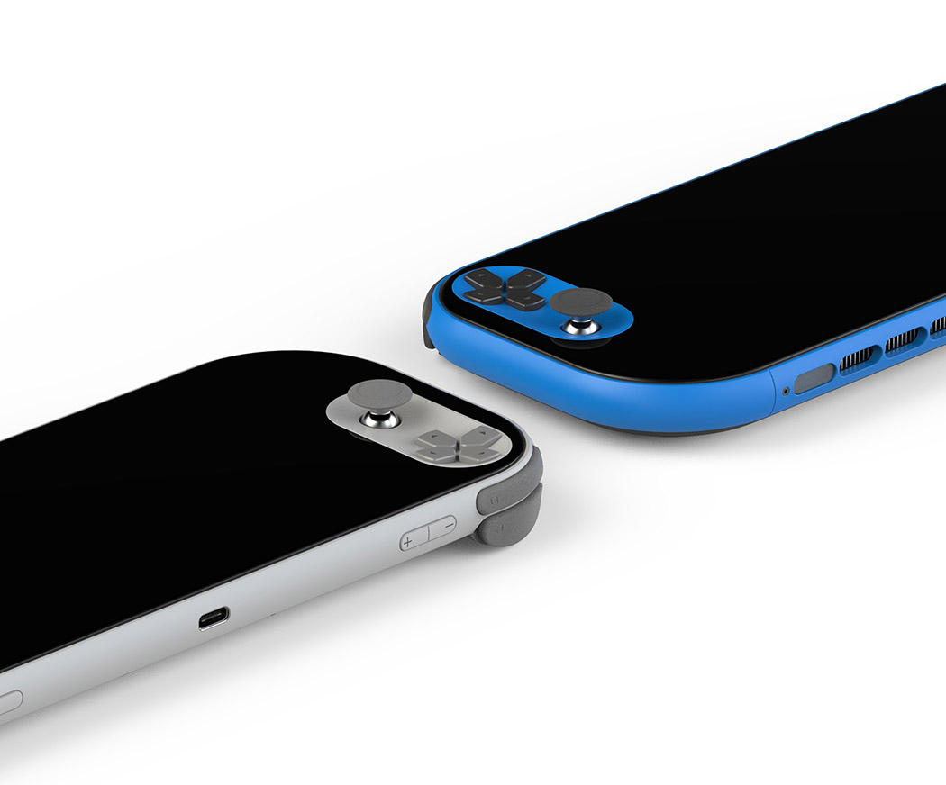
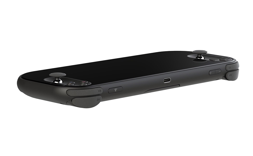
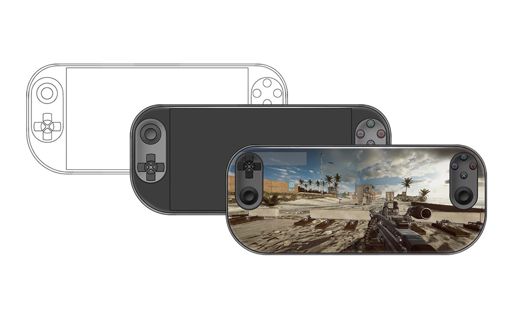
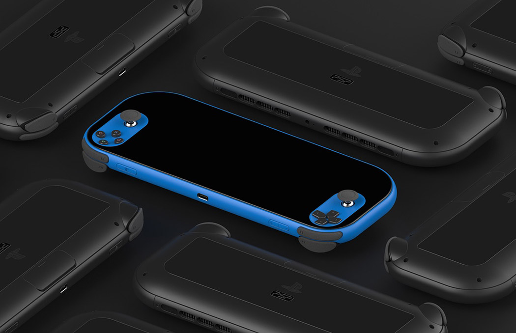
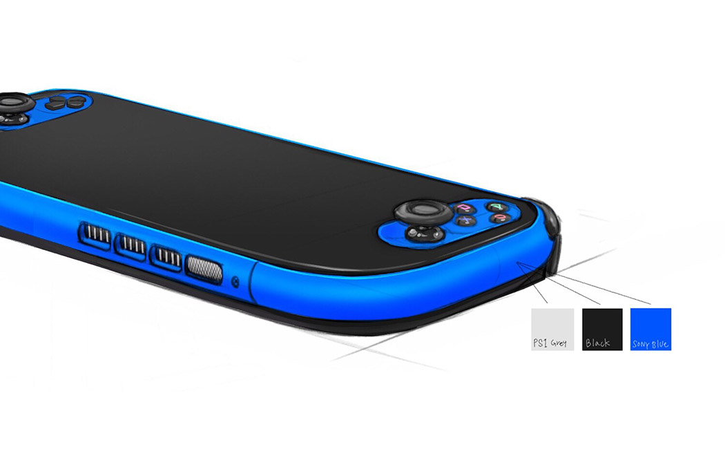
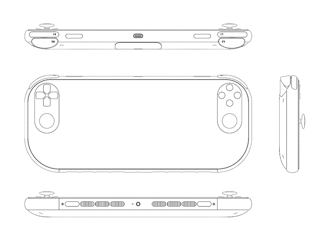
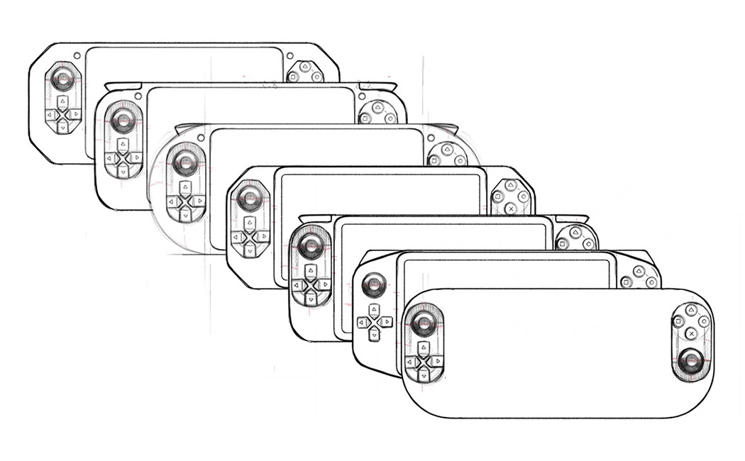
Inspired by his own love for Playstation, Hwan Kim’s take on the PSP (Playstation Portable) addresses some familiar gripes with the brand’s former handhelds. The original PSP lacked L2/R2 buttons and a right analogue stick while the PSVita supported two analogue sticks and an awkward touchpad instead of L2/R2 buttons. Kim’s PSP combines the best of both worlds! Despite being a minimalistic approach to the handheld, it features prominent analogue sticks and controls. The most noticeable feature is an edge-to-edge screen that the button platforms seem to float on almost like islands. Each control side, including L2/R2 buttons are oriented as far to the left and right as possible, expanding the already larger screen size so there’s more room for playing action. This new orientation is also more ergonomic and places the hands further apart so the rest of the arm and shoulders can relax into position. The only downside: it’s currently just a concept! Designer: Hwan Kim
|
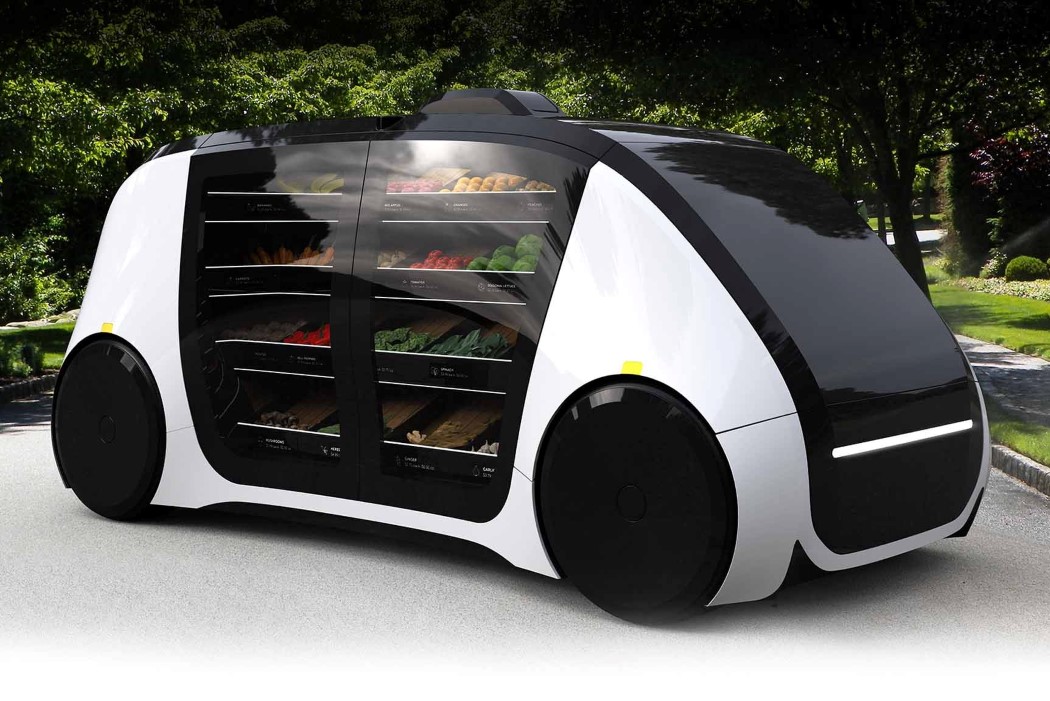
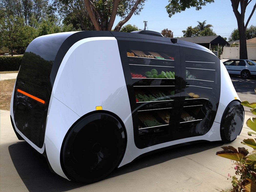
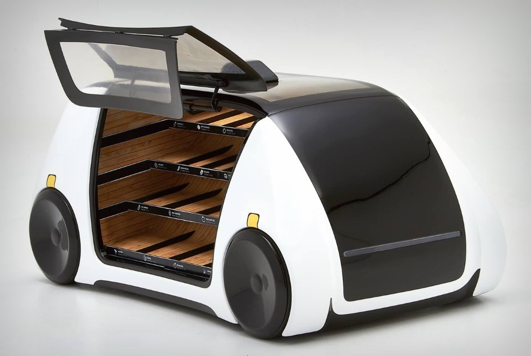
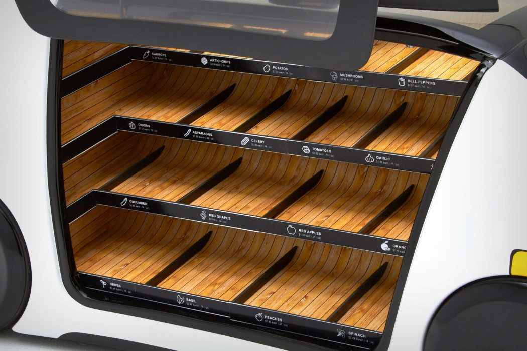
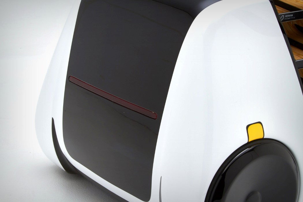
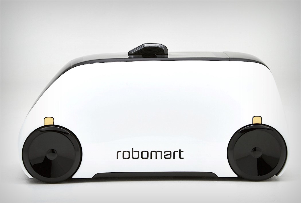
| Let the supermarket come to you… Posted: 17 Jan 2018 12:00 PM PST Very rarely do you see companies one-upping Amazon. There’s no messing with them, because they have the ability to cripple and then devour companies that come in their way. Having said that, Robomart becomes the David to the Amazon Goliath with their grocery/retail outlet drones. The autonomous vehicles are pretty simple. Businesses make use of these cars to send their goods/supplies/wares to consumers who need them. A consumer simply taps a button to request a Robomart which pulls up to the location. They pick up the items they wish to purchase and the Robomart intelligently tracks the inventory that’s been picked up, making an itemized invoice and sending it to the consumer. Think of it as an Amazon Go, but you don’t go anywhere. It comes to you. So an Amazon “Come”, if you will… The Robomarts work using NVidia’s Inception program to run their autonomous fleet. Using a combination of sensors and cameras, both inside and outside the car, the vehicle can move from place to place, allowing people to shop without the need of staff or even a cashier. The car itself can be customized to show off its partner company’s branding, while the shelves on the inside come with customizable tags, allowing you to display anything from baked goods, to fast food, to groceries, to even flowers. The car’s interiors stay refrigerated to make sure your food stays fresh. I hate to say this, but “Your move, Amazon”… Designer: Robomarts
|
| Posted: 17 Jan 2018 09:00 AM PST
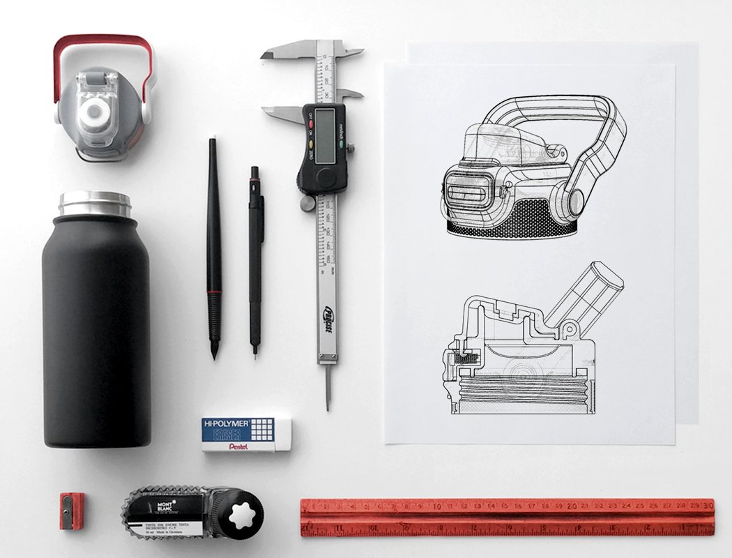
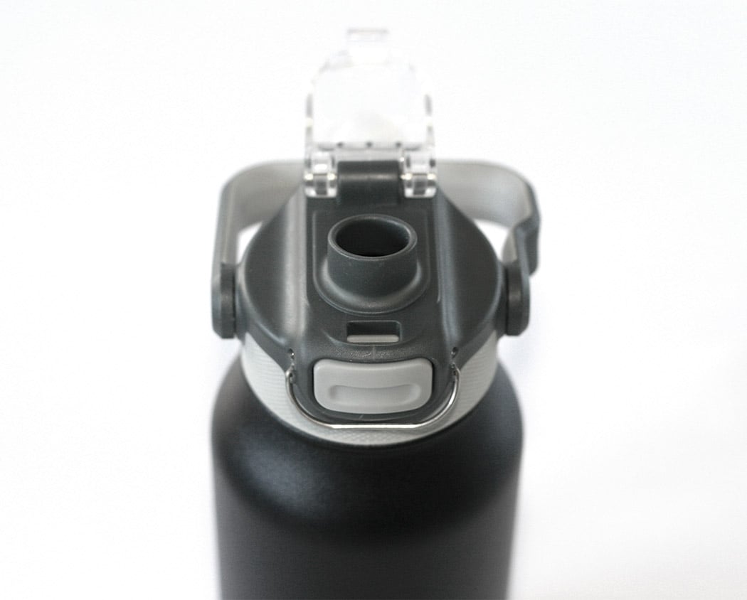
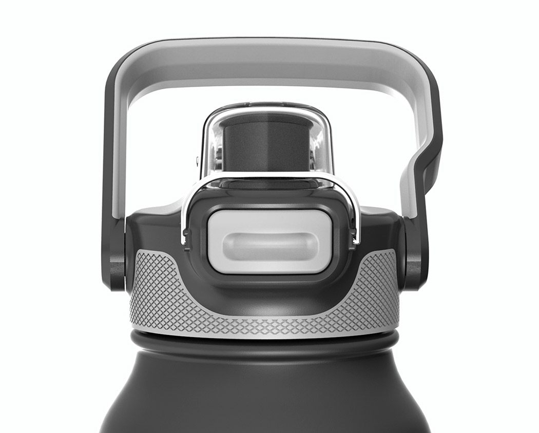
The Healthy Human Stein water bottle is the perfect go-anywhere companion no matter what you’re doing. In a variety of sizes, there’s always a perfect fit for the car cupholder, backpack side pocket, gym bag and more. Interchangeable sports nozzles or wide-mouth caps suit a myriad of adventures and activities. Each holds enough H20 or other beverages to keep you fueled throughout your activity. Better yet, these bottles boast Temp MaxTM insulation tech – an innovative design using a double-wall interior with all air suctioned out in between the walls of the product, preventing any air particles from transferring heat or cold to the outside wall. Aside from being completely sweat-free, this means your beverage will stay icy cold for up to 12 hours or hot for up to 6 hours! The only thing you need to worry about is what cool color to get! Designer: Gil Cohen for Healthy Human
|
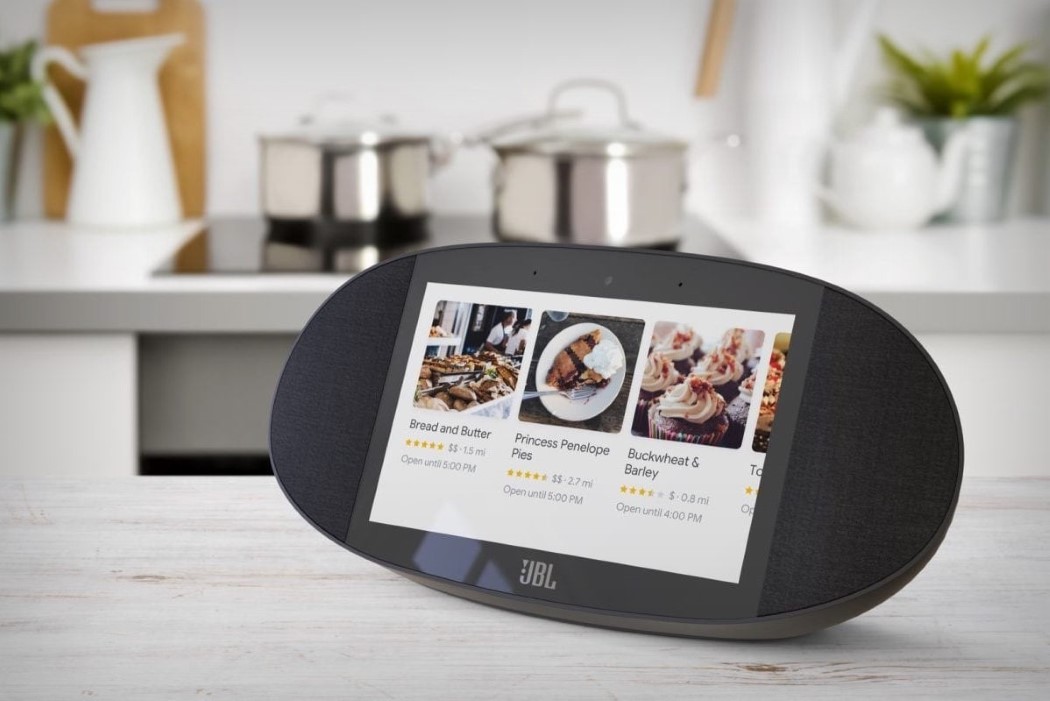
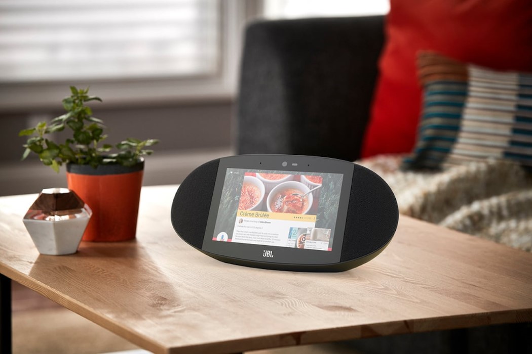
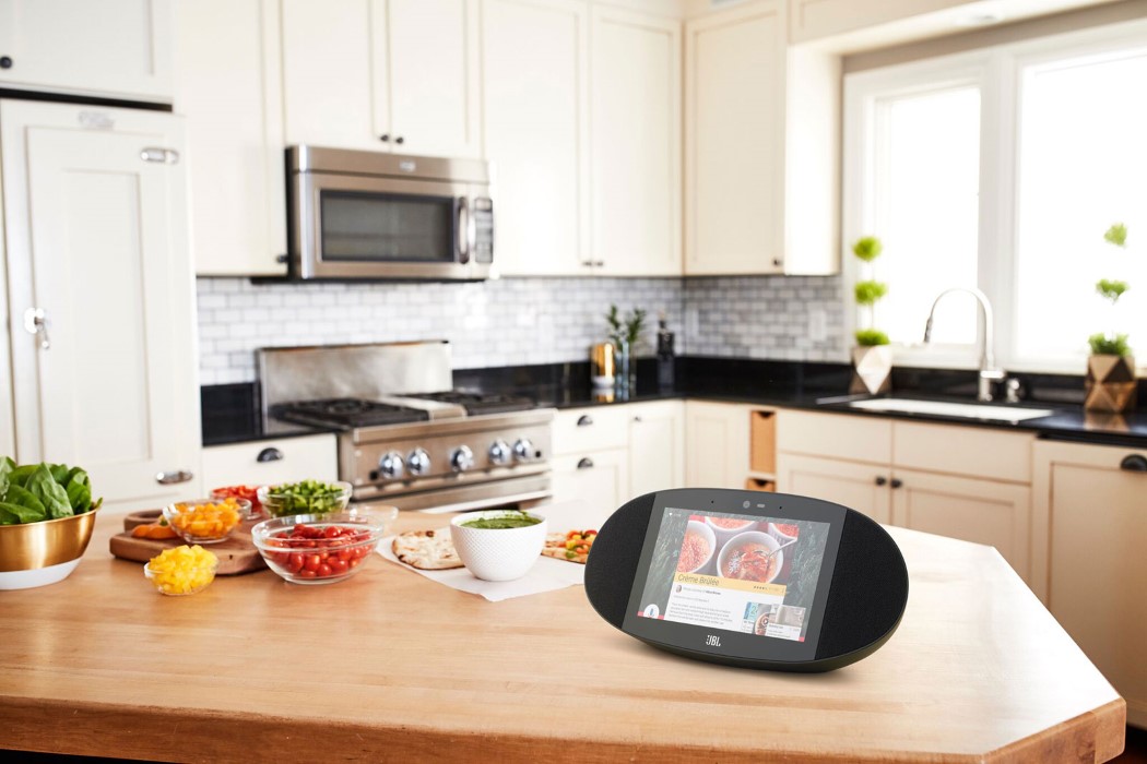
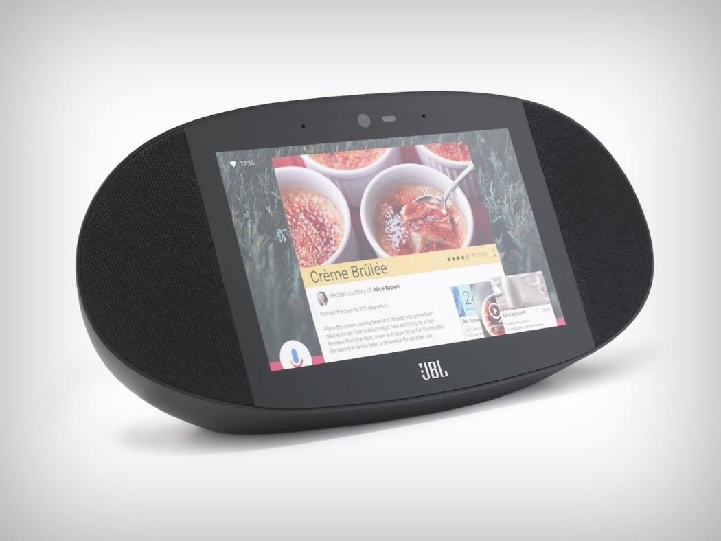
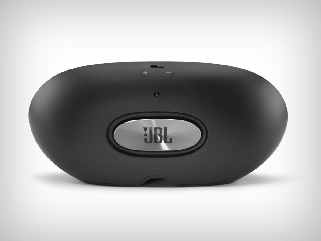
| Posted: 17 Jan 2018 06:00 AM PST The one thing that makes Apple so desirable is the one thing that will kill it. Exclusivity. While it tries hard to make everybody adopt its technology, the truth still remains that over 80% of smartphone users use Android, and that inclusive strategy is the one to beat. Google’s betting hard on that strategy by now making its AI assistant available to third parties to integrate into their hardware. Take for instance JBL’s Link View. It combines the best of both worlds… JBL’s heavy-hitting audio, along with Google’s incredibly integrated experience. The JBL Link View is basically JBL’s wireless audio with a screen that allows you to interact with Google’s Assistant, letting the speaker not just be an audio device, but something MUCH more useful. Google isn’t a hardware company. JBL is. Google doesn’t care whether you use the Google Home speaker, it just wants you to rely on its impeccable service… and JBL helps deliver on that! The Link View comes with a screen sitting between two 10W speakers. Flip it over and you see the JBL logo resting on a subwoofer that adds that heart-warming bass to your audio that the Google Home Mini isn’t capable of providing. The 8-inch HD screen itself lets you look at everything from album art, to your photos, to recipes, to google searches, to even your appointment schedule. Ah… life! Designer: JBL (with Google)
|
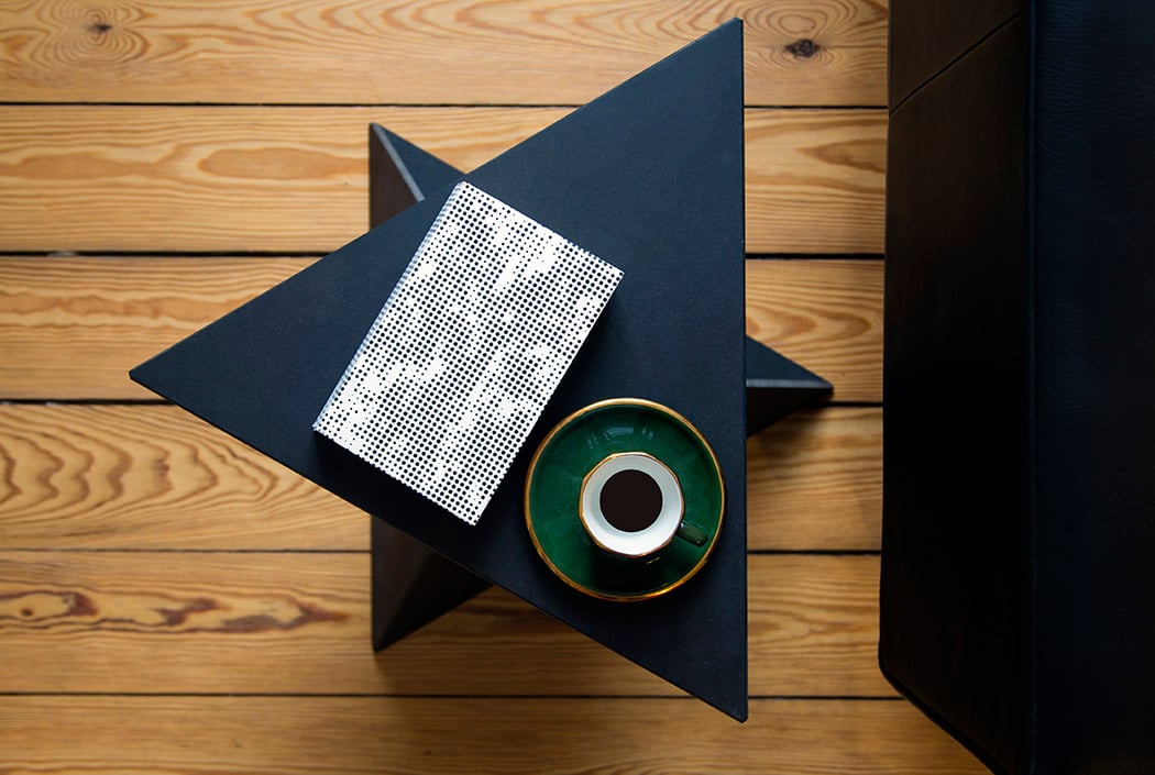
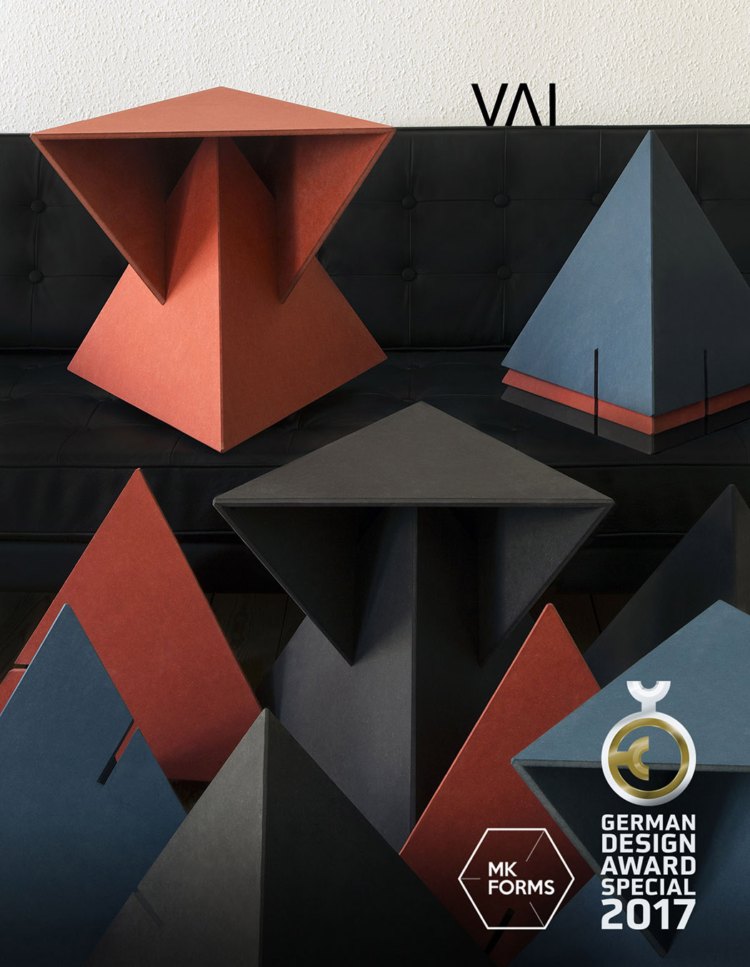
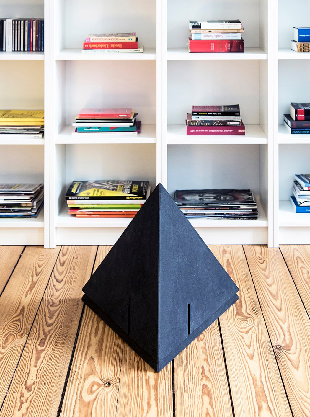
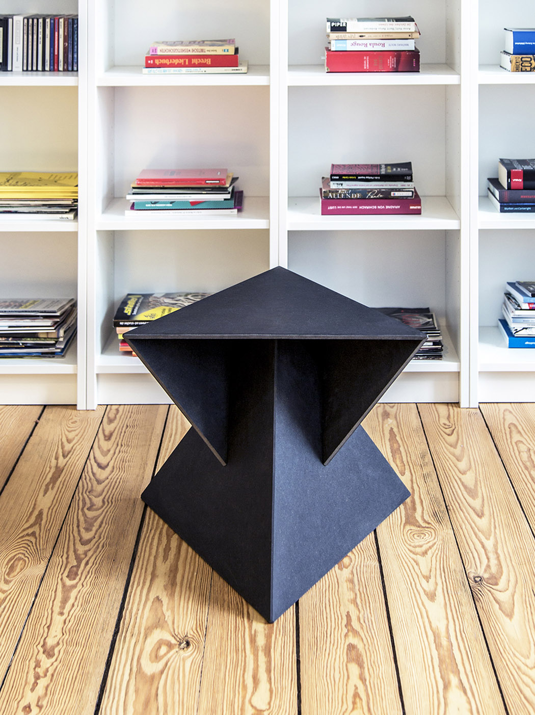
| Geometric Art in an Accent Table Posted: 17 Jan 2018 03:00 AM PST
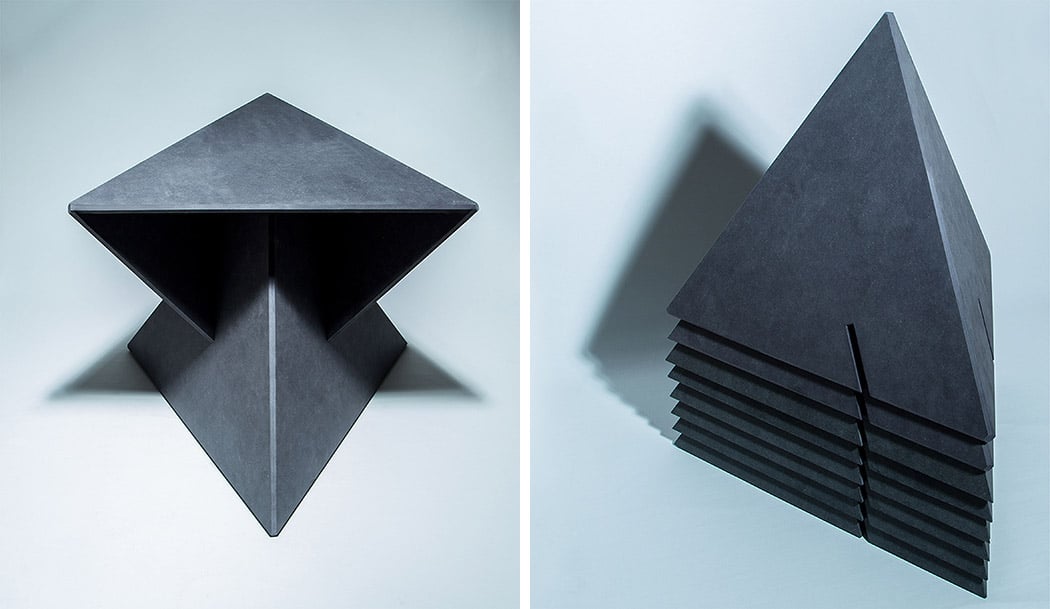
Constructed with geometric precision, VAI by designer Minseong Kim is a stealthy-looking side table solution rooted in mathematics. Its puzzling form is calculated using a standard tetrahedron formula to achieve a minimalistic aesthetic while maximizing stability. This pyramidal form is at once robust and light. The ability to nest reduces its footprint when storing and accommodates different spatial requirements. The resulting form is as sculptural as it is functional! Designer: Minseong Kim
|
| Life Inside a Pipe Doesn’t Sound Too Shabby Posted: 17 Jan 2018 12:07 AM PST
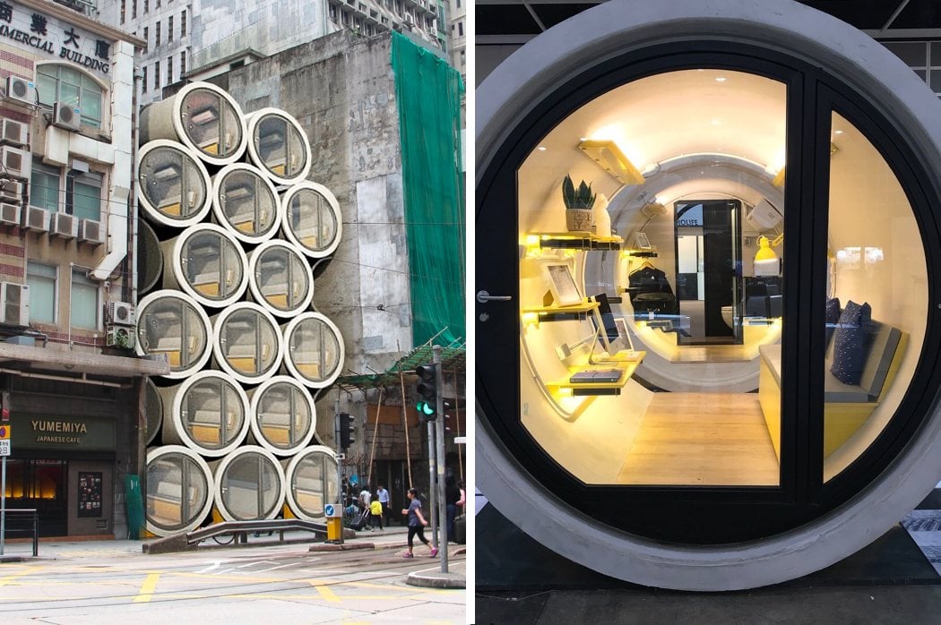
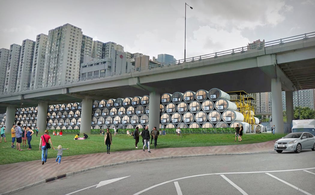
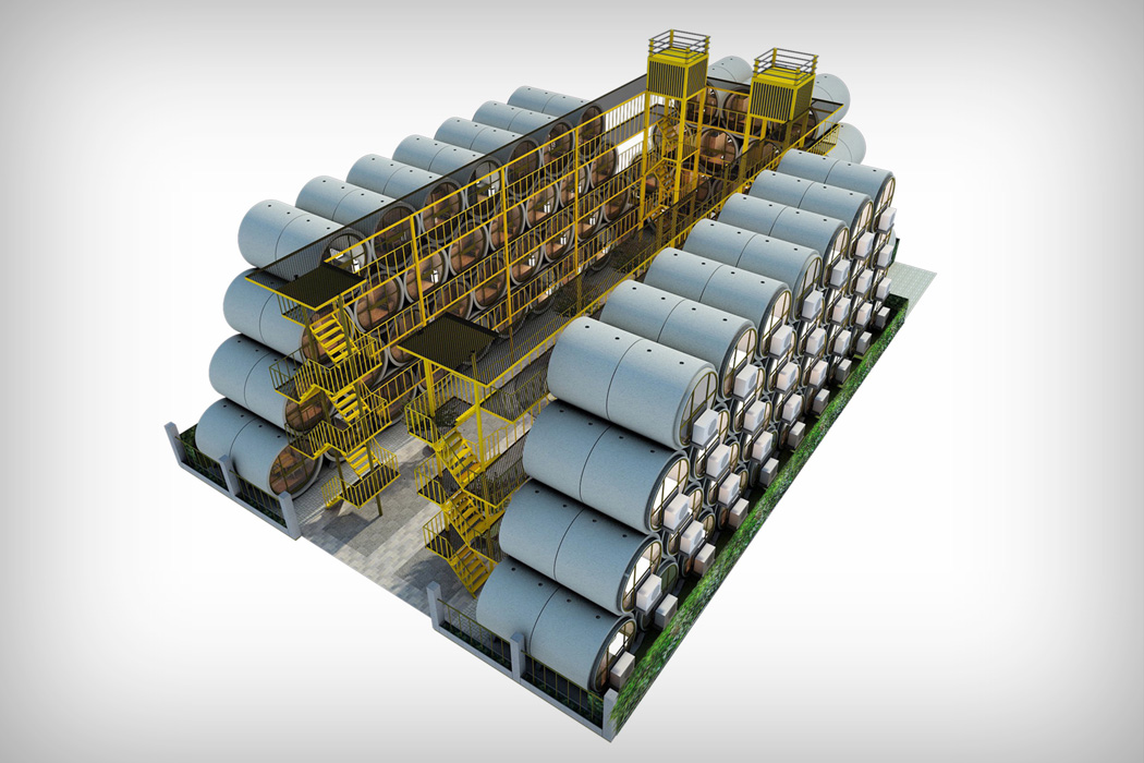
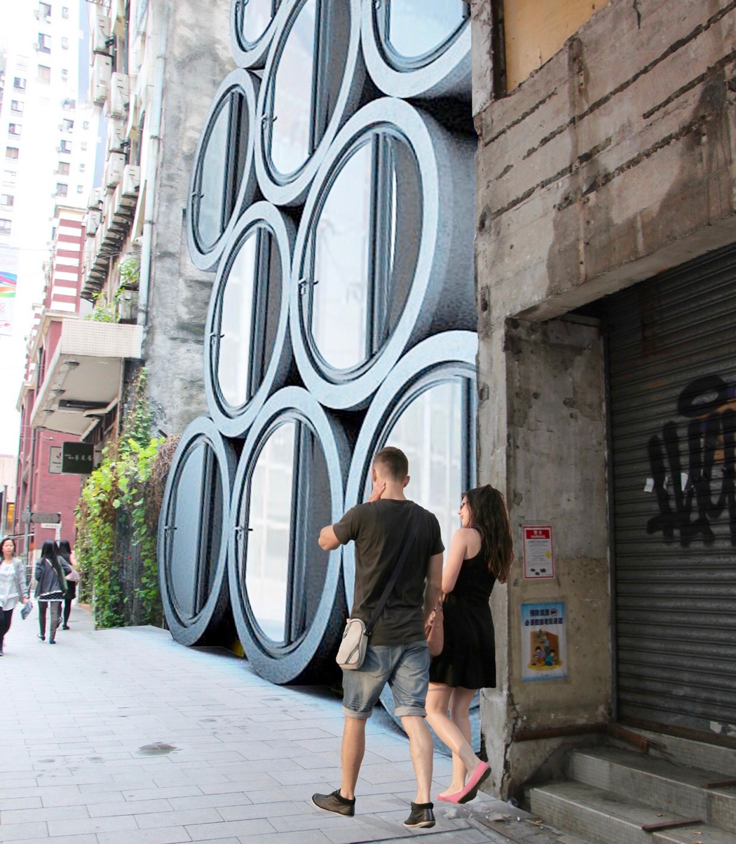
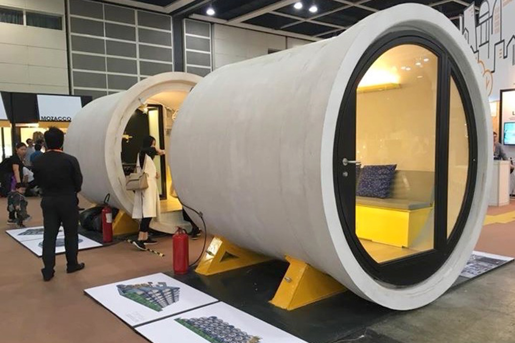
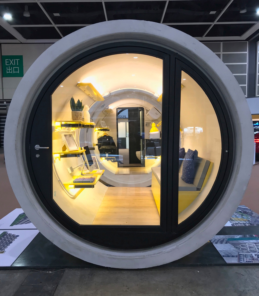
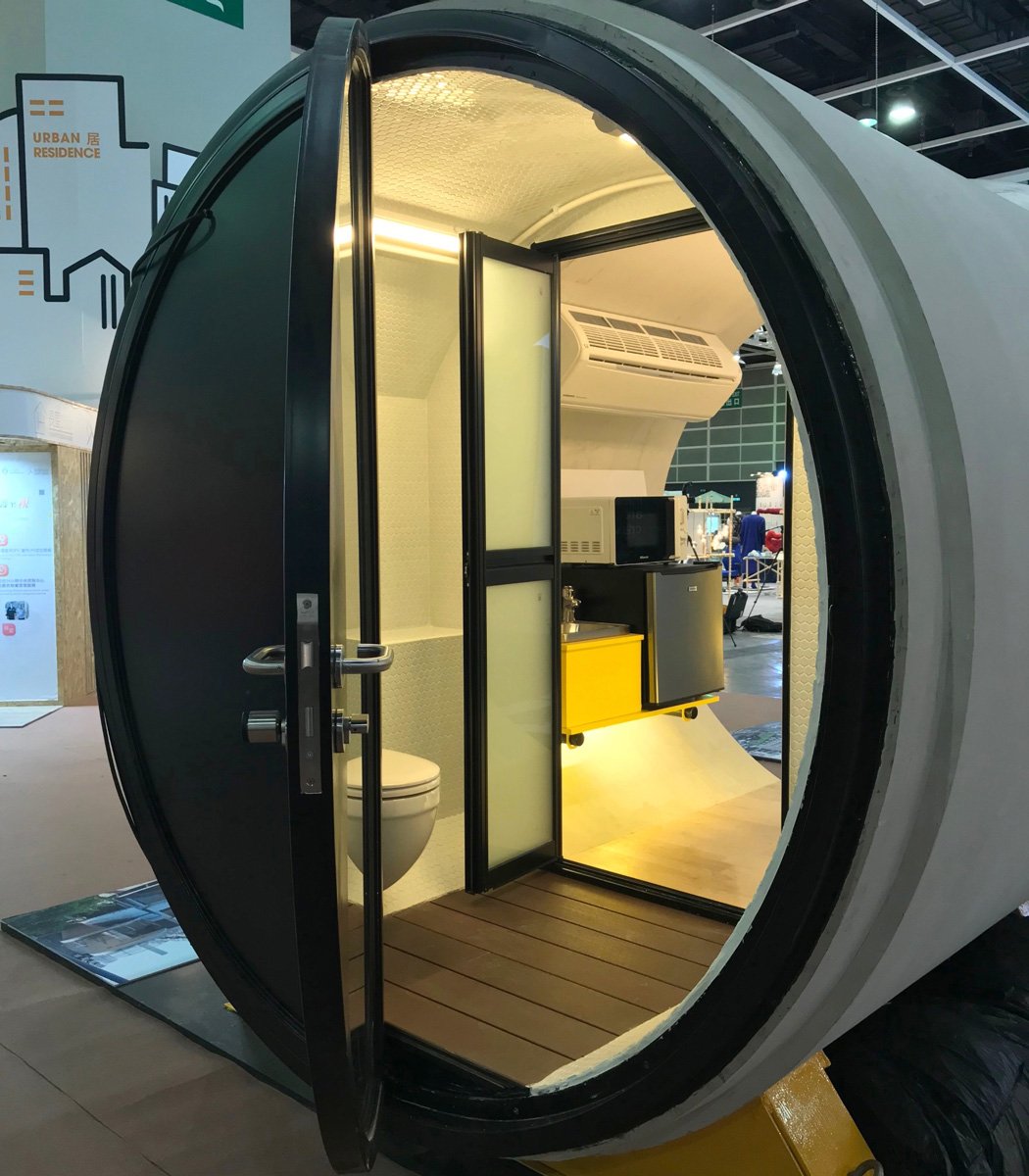
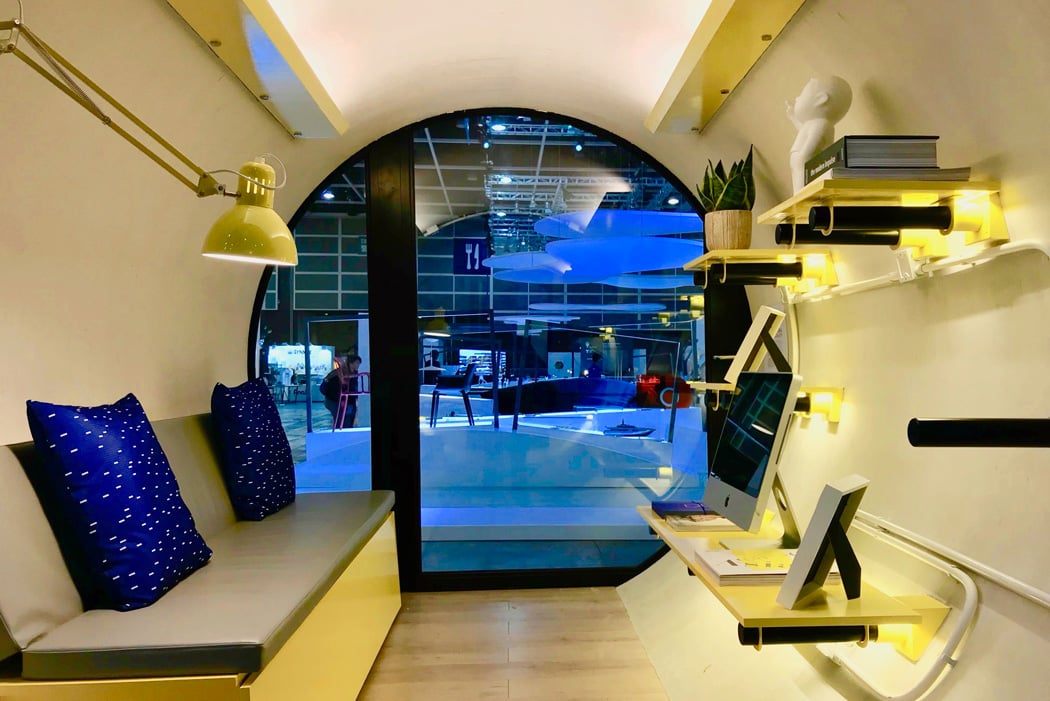
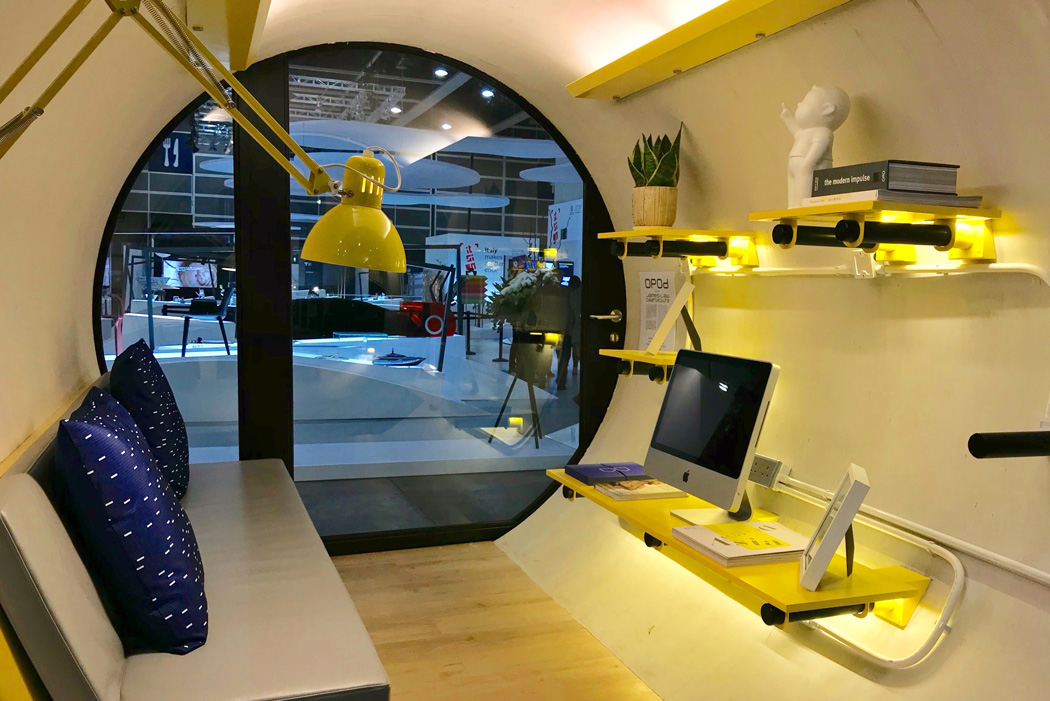
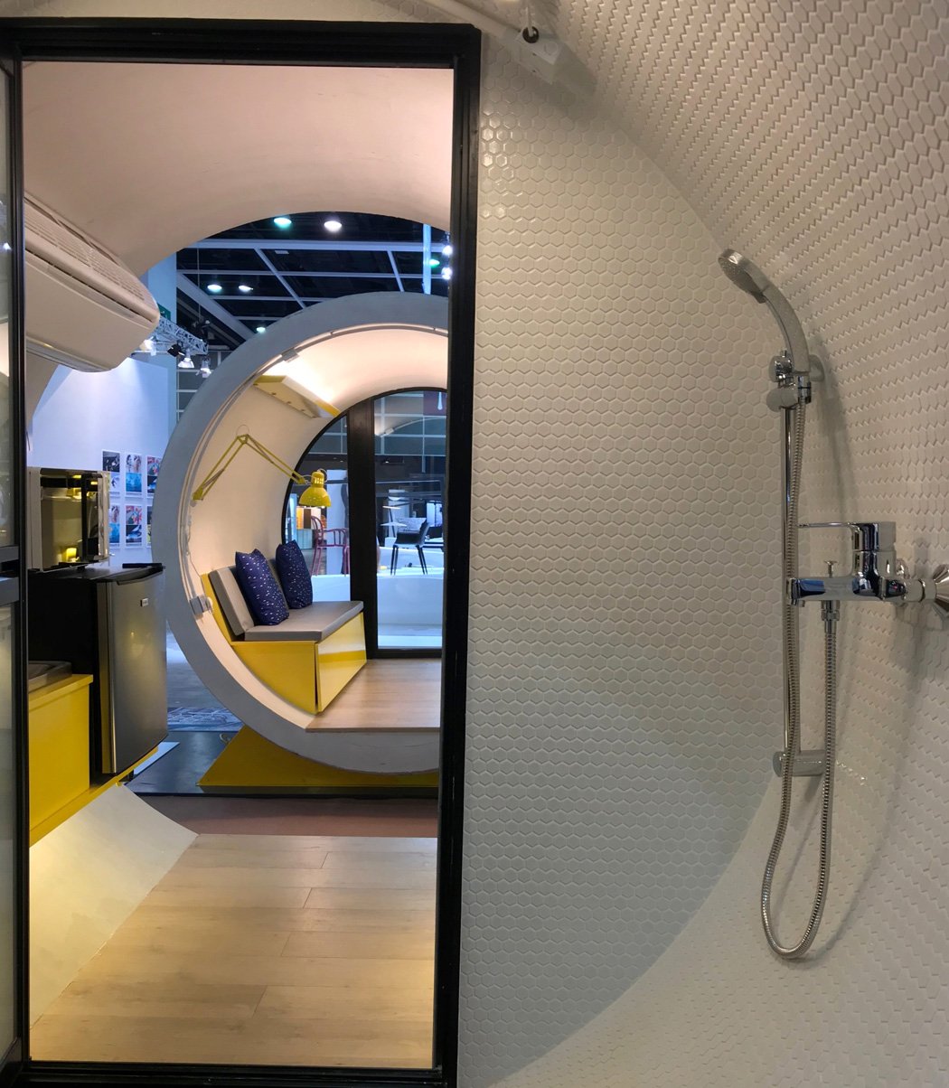
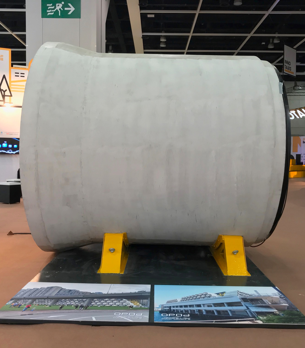
There are various iterations of how urban dwellers will live in times to come, and of course, this is edged on by sci-fi films and various other architectural cityscape concepts. Above all, the vision of the future whether it be utopian or dystopian in your eyes is seemingly micro. One example of this is the OPod Tube Housing by Hong Kong studio James Law Cybertecture. The OPod Tube Housing is low-cost, stackable micro-homes manufactured from concrete pipes. These pipes would be slotted in between building gaps rather similar to a game of Tetris. These concrete pipes are of course that of water pipes, transformed into a gorgeous 9.29 square meter home. “OPod Tube Housing is an experimental, low-cost, micro-living housing unit to ease Hong Kong’s affordable housing problems,” James Law said, envisioning that these adorable homes be aimed at “young people who can’t afford private housing.” Albeit this ‘apartment’ is somewhat of an underground water pipe at heart, it’s hard to knock the fun-loving industrial interior. Compiling everything a young city-dweller needs, the OPod Tubes comes complete with a fold out bed, shower, toilet, fridge, microwave, cooker, microwave, and more neat add-ons. Designer: James Law Cybertecture
|
| How someone designed the perfect router Posted: 16 Jan 2018 06:00 PM PST
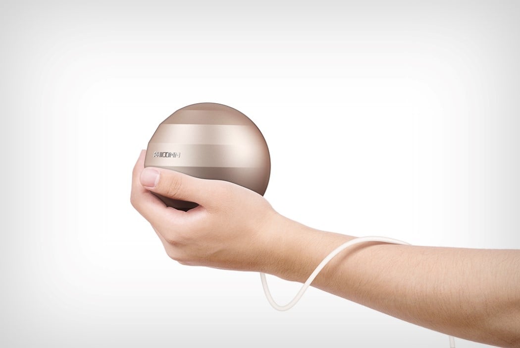
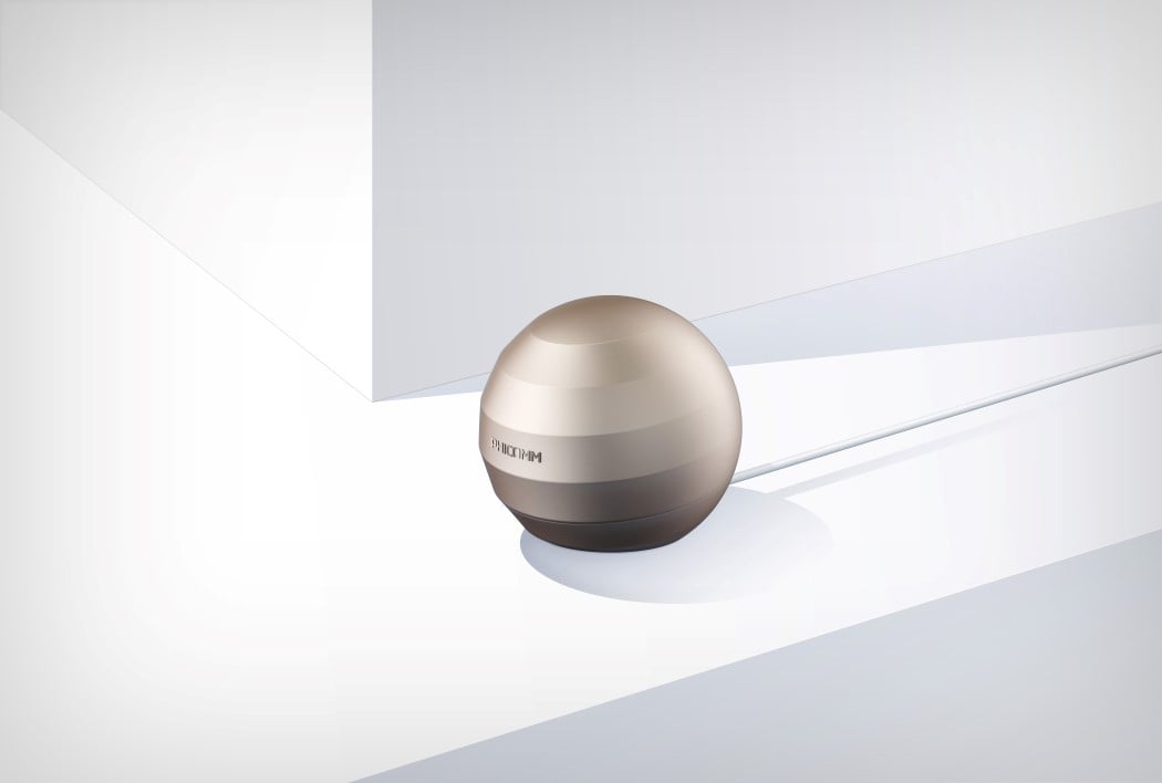
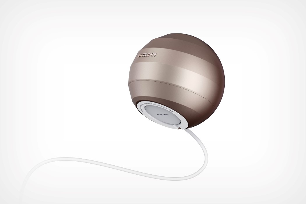
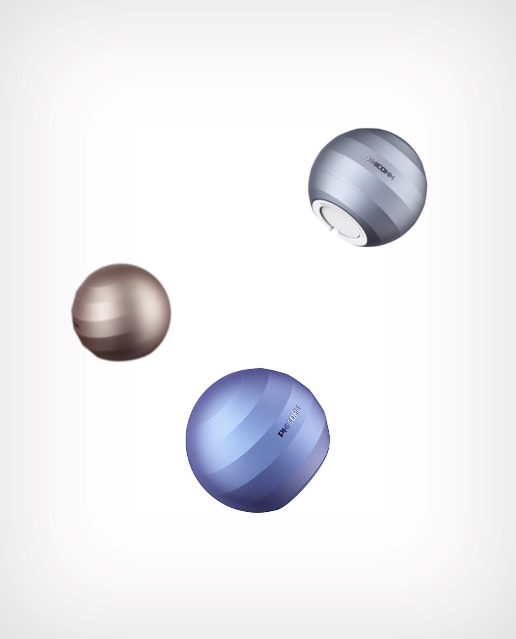
I use the term ‘perfect’ sparingly, reserving it for the rare occasions when something wows me and makes me realise that there’s nothing that I’d want to change about it. The Smart Router by Xia Kai is refreshingly different, but it’s perfect because it’s also strangely familiar. Look at it long enough and you’ll see it look almost like the icon of an internet browser! Its shape looks like a planet with the ridges being the paths of the satellites that revolve around it. Look at the Internet Explorer icon and you’ll notice the iconic yellow swirl that pretty much does the same thing. It’s clever, that the Smart Router makes that connection, and in doing so, designs a product that becomes an icon of the service it provides. Plus, look at the ridges from the top and you almost see them forming the Wi-Fi logo! Shrewd, and undoubtedly beautiful! I’ll take the metallic blue one for myself, please! Designer: Xia Kai
|
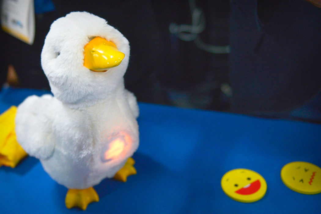
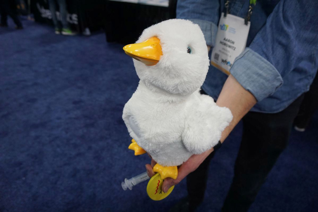
| The most special children’s toy ever made Posted: 16 Jan 2018 04:00 PM PST CES is full to the brim of awe-inspiring and excitable tech; it’s easy to lose sight of the lesser brands and the underdog products that get less attention. However, the feeling is most certainly mutual across all design articles and reporters of CES when I say my favorite product of the whole convention is My Special Aflac Duck – a robotic toy duck designed to help children diagnosed with cancer cope through their treatments. This duck is no ordinary duck, accompanied by an array of RFID tags; this guy can relay the emotions of the child by having them place an emoji disc to the chest of the duck. Depending on the disc chosen, the duck will communicate the feeling with a positive or negative chirp/groan. What’s truly remarkable is that My Special Aflac Duck comes with its own IV kit, allowing the child to administer meds to the duck, similar to that of chemotherapy, lessening the fear and anxiety around it. When the duck is in IV mode, it’s head will vibrate and pulse in a heartbeat-like pattern – alleviating stress and focusing the child on a steady breathing pattern. On top of this, the duck’s fur can be removed and washed to ensure optimal cleanliness throughout hospital trips. What’s really special about all of My Special Aflac Duck’s accessories, is the rocket ship. Using the accompanying app, the child can pick their happy place (whether it be the jungle, the sea, a rollercoaster) and once the rocket ship is placed against the duck’s chest, like the RFID disks, it will play a sound from this scene – transforming the hospital room into that special place within seconds. As if it couldn’t get any better, it does. My Special Aflac Duck isn’t available in the shops, not now, not ever. Aflac plans to give My Special Aflac Duck for free to kids diagnosed with cancer across the US, with the hopes of getting this special guy to thousands of kids by the end of this year. Designer: Aflac & Sproutel
|
| LG’s TV lets the good times “roll” Posted: 16 Jan 2018 02:00 PM PST
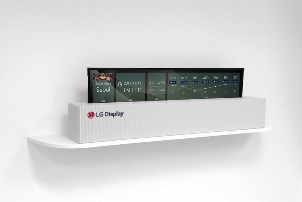
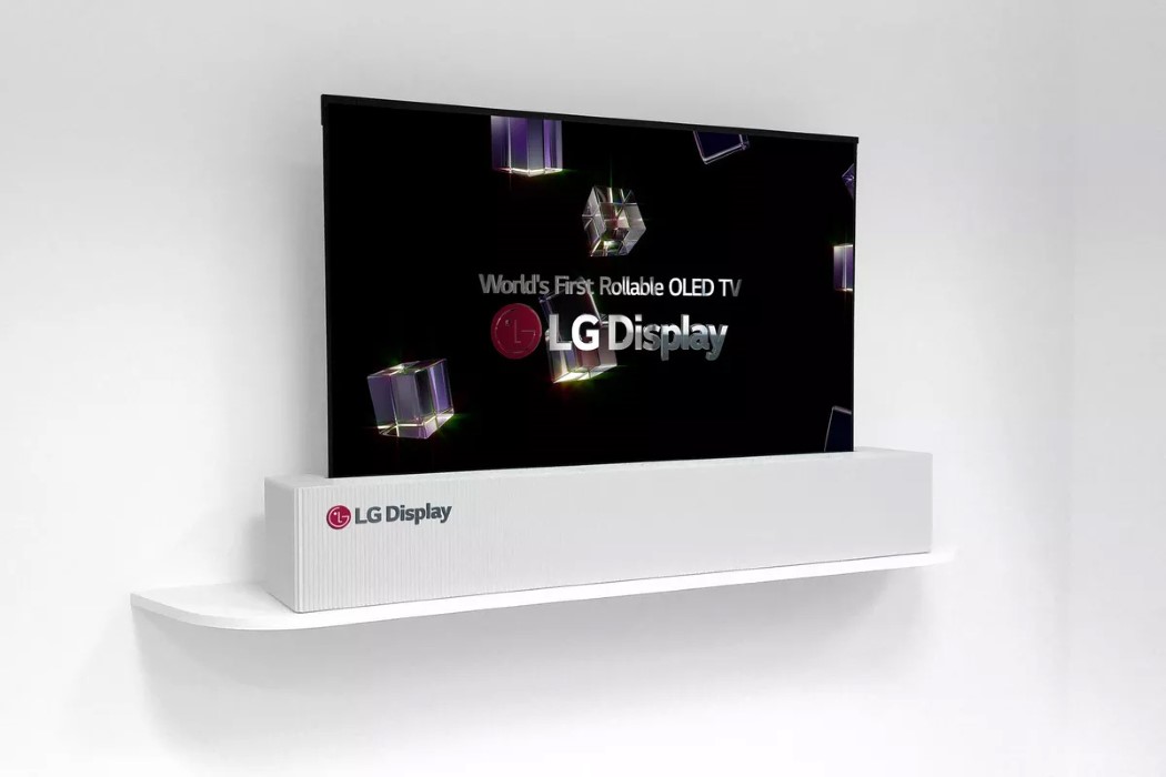
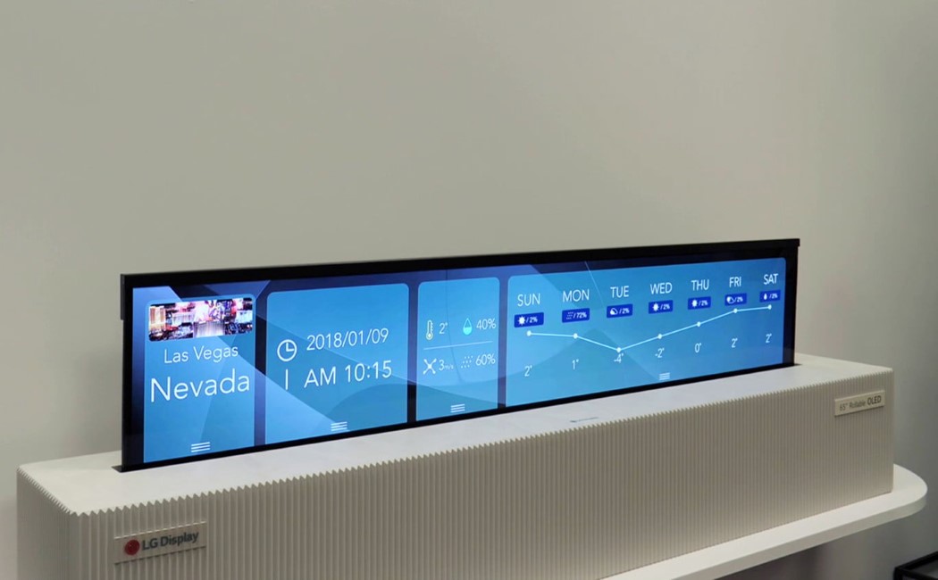
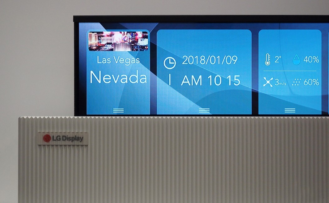
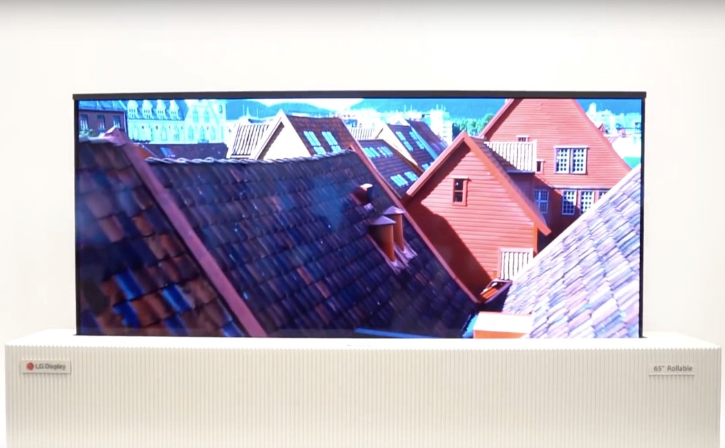
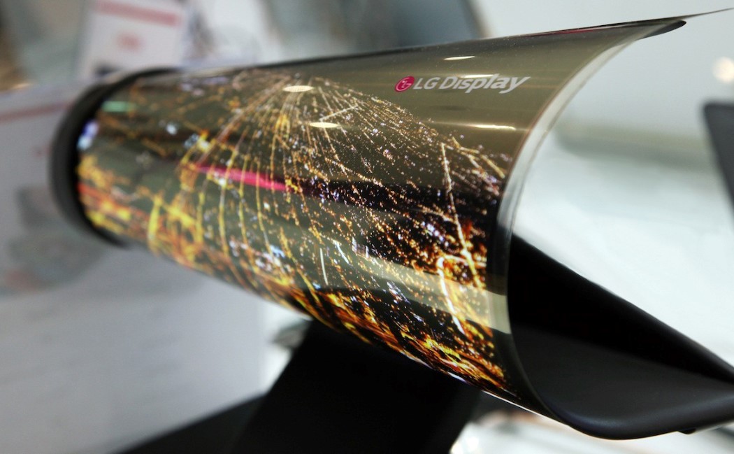
“Bigger is better” seems to be the common consensus with televisions, with Samsung literally making a television the size of a wall… but the ‘bigger’ question remains, when does size start becoming a hindrance? The large phone market stopped at around 6 inches because any bigger and the phone is literally too large to use, so the question remains, how big must a TV be to be the biggest it should be? LG doesn’t really have an answer to that question, but it has a solution. Flexible displays. LG’s Rollable TV concept features a 65-inch mammoth of a screen that’s actually as flexible as fabric (and as a result, super thin), as it rolls into a housing that’s a fraction of its size. What’s more interesting is that this ability doesn’t necessarily mean a compromise on quality because the Rollable TV features a 4K UHD display. Did I also mention, it rolls up into a cylinder?! Designer: LG Electronics
|
| You are subscribed to email updates from Yanko Design. To stop receiving these emails, you may unsubscribe now. | Email delivery powered by Google |
| Google, 1600 Amphitheatre Parkway, Mountain View, CA 94043, United States | |
