Yanko Design - Form Beyond Function |  |
- Fun, folding furniture!
- Using Condensate Creatively
- Your Namaz On-the-go!
- It’s About Time for a Clipper Redesign
- Lighting that Never Gets Old
- LG’s new ‘tablet’ has surround sound
- There’s no fighting this bull
- When your bookmark is also your reading light
| Posted: 24 Jan 2018 12:00 PM PST
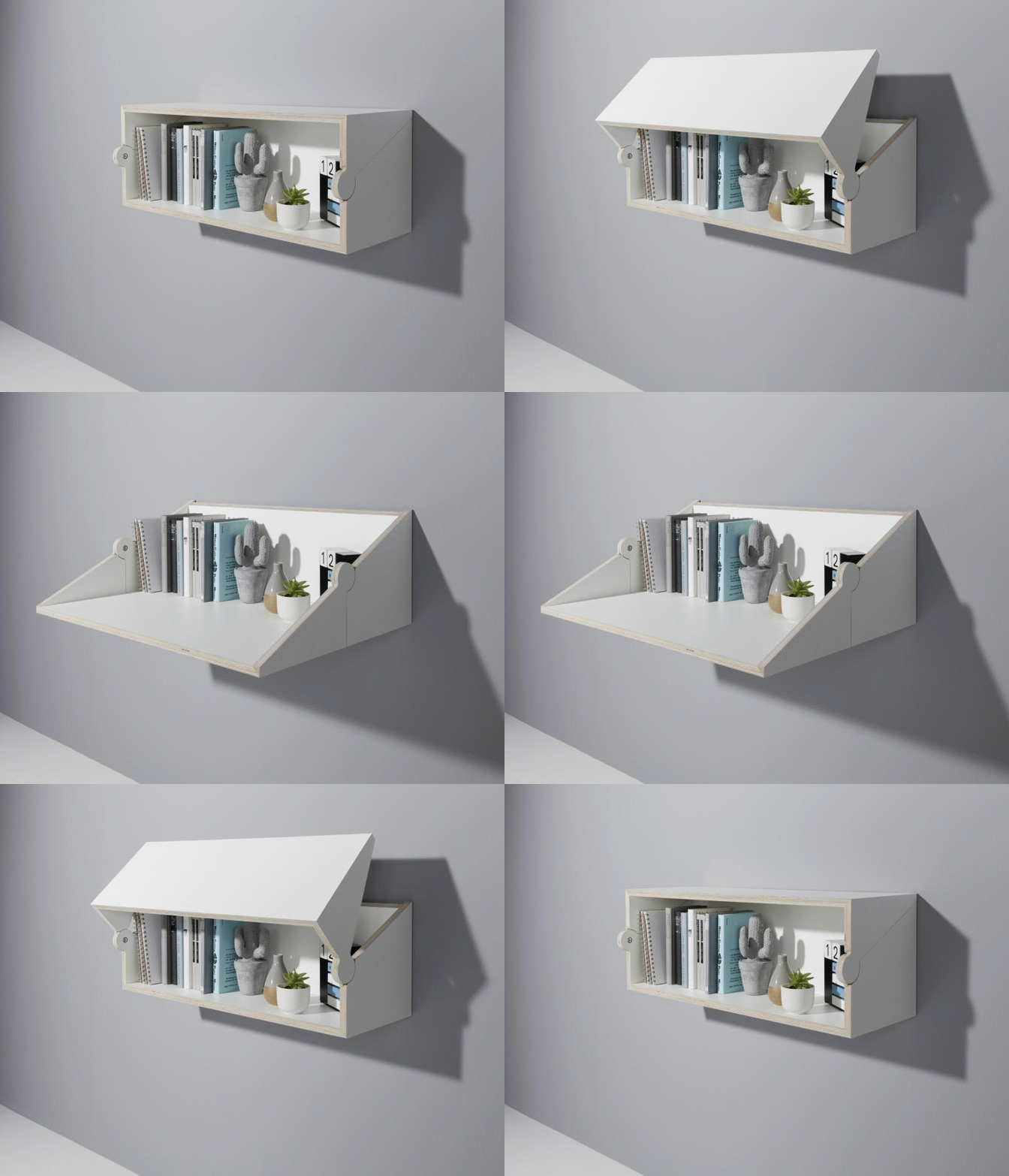
It’s a desk, but it’s also a shelf… but what is it more of? That’s the precise beauty of the Twofold. It can be both a wall-mounted shelf or a desk with such relative ease, it seems simple yet striking. Made completely out of wood, the Twofold reinterprets a traditional wooden connection, turning the product into a hinge itself. Made from plywood with a melamine coating, the Twofold can simply be mounted on any wall. Without any external fittings i.e., hinges, flap-holders, the Twofold opens and closes, turning into a neat bookshelf when you need it to be, and a rather comfortable work desk when you want it, without disrupting the arrangement of objects kept on your shelf. Elegant, isn’t it? Designer: Studio Michael Hilgers for Müller Möbelwerkstätten
|
| Posted: 24 Jan 2018 09:00 AM PST
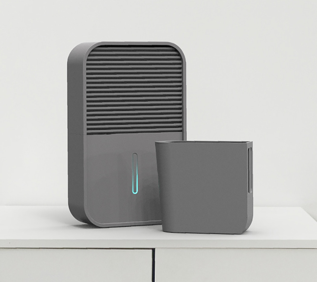
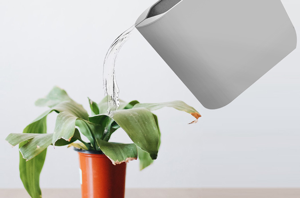
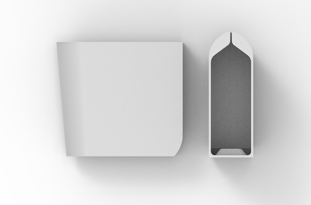
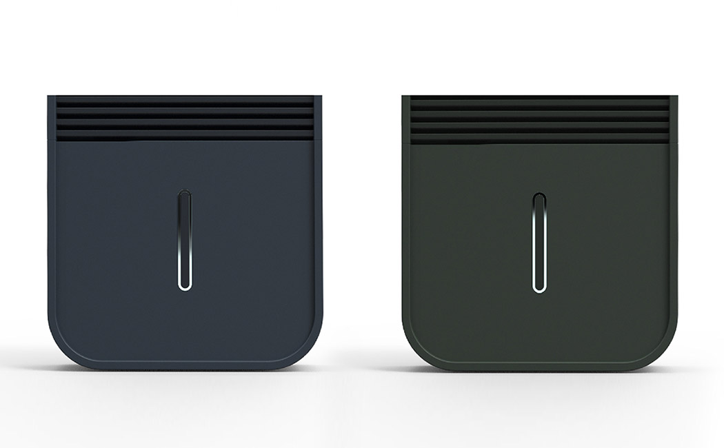
Whether it’s for health or comfort reasons, plenty of people implement dehumidifiers to reduce the level of humidity in the air and the same users often encounter a similar problem. The collected water generally goes to waste as it’s filtered directly back into a drain or disposal system. The Around dehumidifier addresses this issue with a simplistic design change. It incorporates a removable reservoir specially adapted for watering plants. The reservoir remains enclosed within the compact unit until the indicator light displays that it’s full. Then, the user can quickly remove it and use the water to hydrate their garden or indoor plants. A specialized lip funnels water exactly like a pitcher! Designer: Joonhyuk Ahn
The light indicates how much water is in the container. |
| Posted: 24 Jan 2018 06:45 AM PST Culture and tradition can have heavy influences on design, but it’s rare that things go the other way around. I see design as being a powerful tool to influence, update, and upgrade culture/tradition, but the sad reality is that it’s rarely used for that. The Pocket Sejadah was designed to allow people of the Islamic faith to engage in an active lifestyle, while giving them the tools to say their daily prayers without having to find a mosque. The foldable mat bases itself on a little something we’ve seen in the past, but brings a cultural dimension to it. The foldable prayer mat is smaller than an A5 notebook, therefore fitting comfortably inside purses and pockets, and comes in its own waterproof sleeve, letting you carry along with you the ability to find a spot anywhere you may be and recite your daily prayers. Made out of tightly woven polyester, the mat repels water, not letting rain deter you from prayers, while its graphical design truly pays ode to traditional Islamic and Arabesque geometric patterns, bringing aesthetics and cultural relevance to the mat’s design. What’s interesting about the Pocket Sejadah is not the fact that it’s a foldable prayer mat. It’s the fact that it gives one a sense of freedom, allowing them to travel, work, commute (just like everyone else) without having to worry about being around a mosque or having a prayer room handy. The Pocket Sejadah upgrades tradition, letting it not stand in the way of an active lifestyle, and that in my opinion is just beautiful! Design has the ability to change our culture for the better, and make this world much more inclusive, and the Pocket Sejadah does just that! Designer: Meryem Chin Click here to Buy Now: $30.00 *Free Shipping!* Click here to Buy Now: $30.00 *Free Shipping!* |
| It’s About Time for a Clipper Redesign Posted: 24 Jan 2018 04:00 AM PST
Nail clippers are just one of those ubiquitous things that go unchanged… but that doesn’t make it right! Clip your preconceptions about nail clippers right out of your memory because the Ego Clipper is like none you’ve seen before! Unlike the elongated design of classic clipper designs, the Ego Clipper sports a three-dimensional shape that’s unrecognizable from the original. Not just for looks, this twist on clippers is all about enhanced ergonomics. It features a comfortable rubber grip for your fingers so you’re never left with a metal imprint in your palm. With its unique finger positioning, it’s also more natural and relaxed to hold in between your fingers. This makes it more precise so you can fine-tune the shape of your nail. Designer: HsinWen Tsai
|
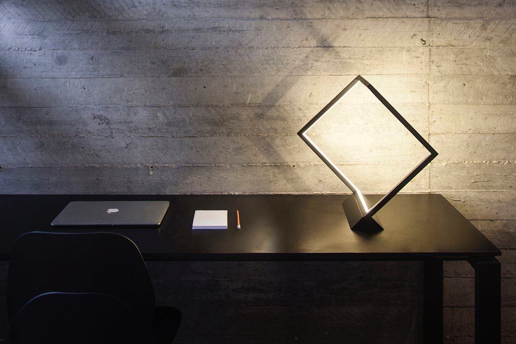
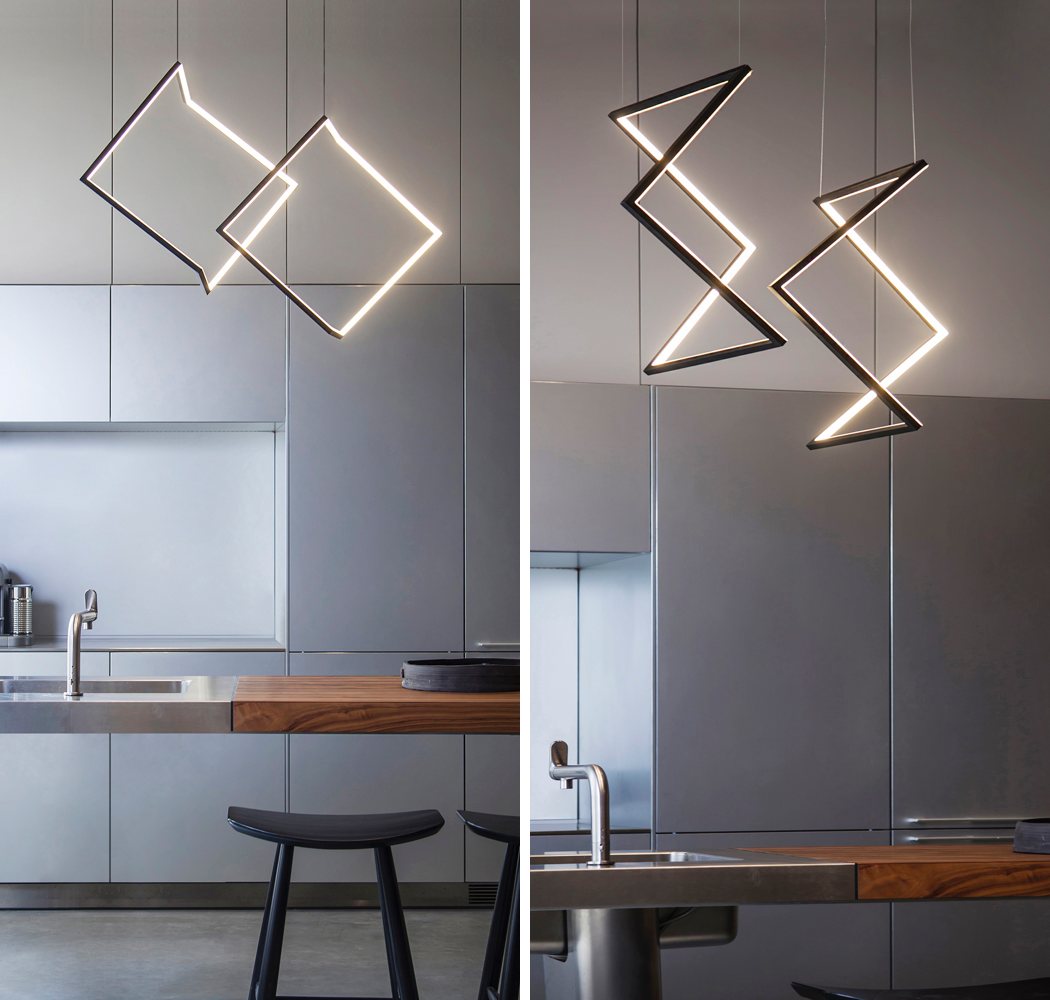
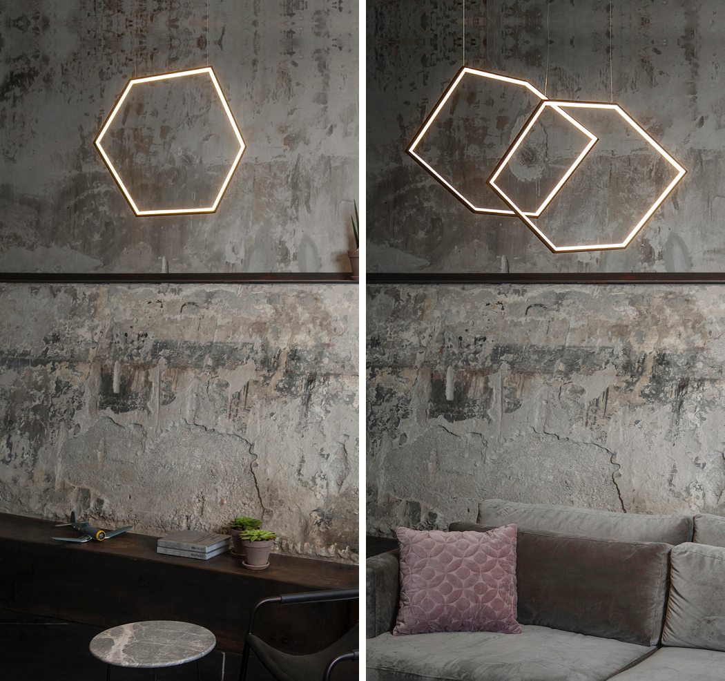
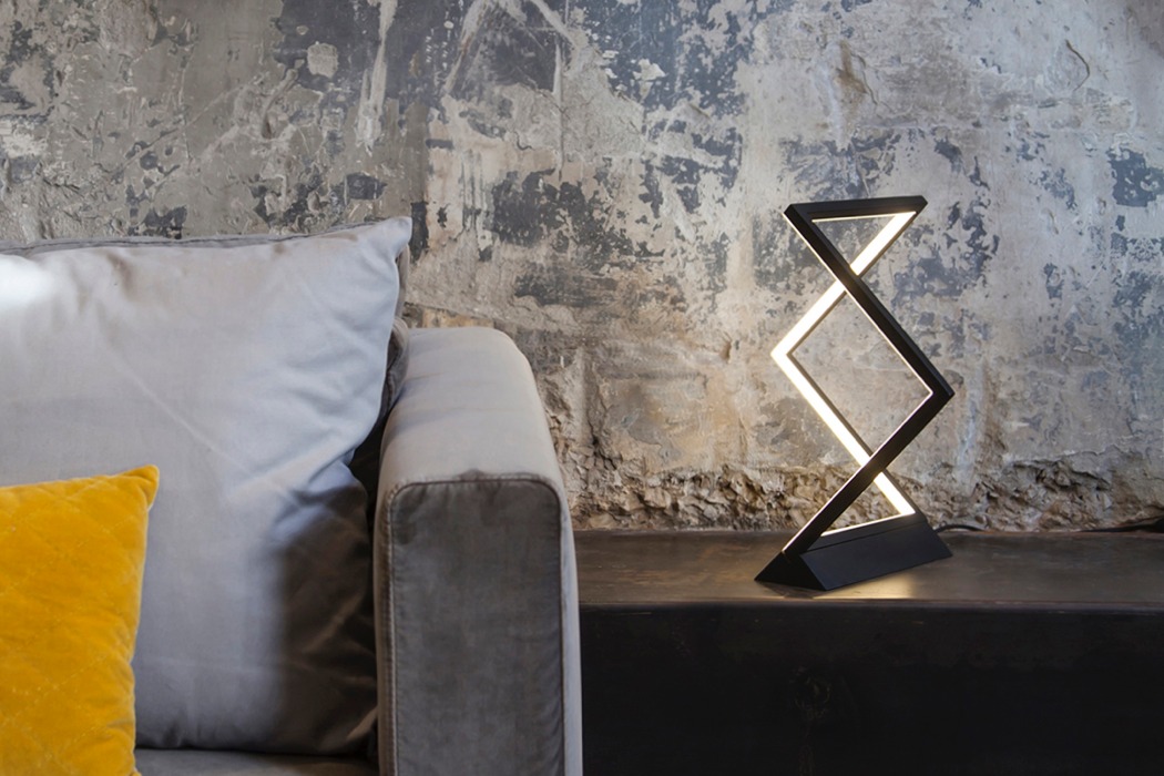
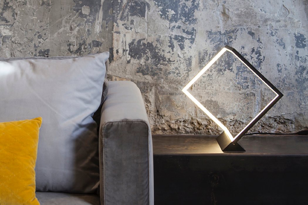
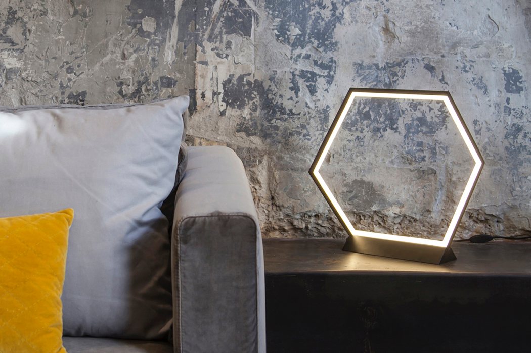
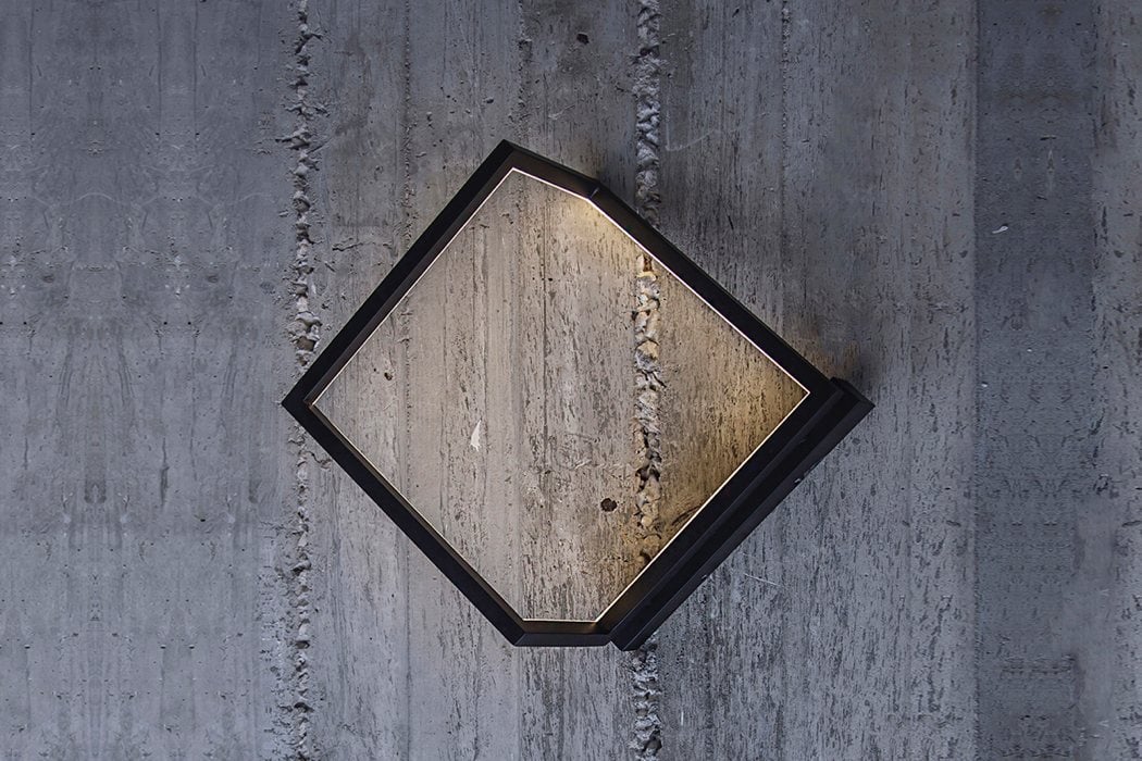
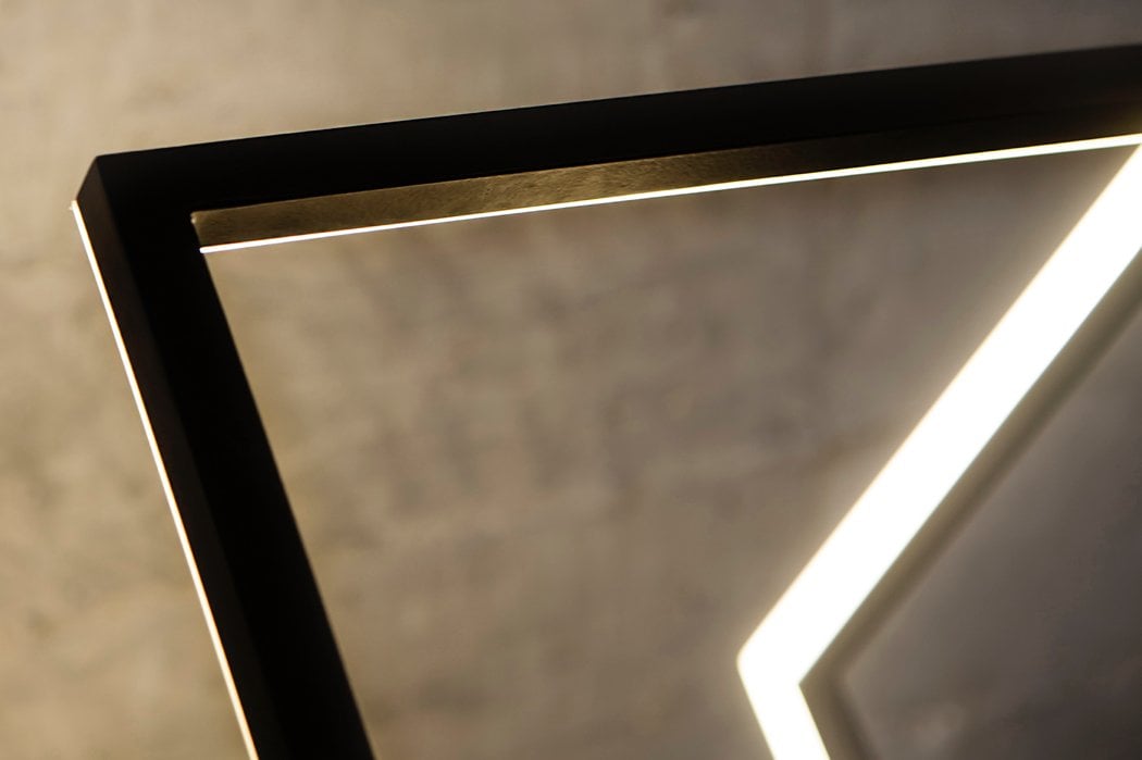
| Posted: 24 Jan 2018 01:33 AM PST I challenge you to look through the photos of the O/i lighting collection and then come back and read! Ready? GO… How many shape variations are there? If you guessed more than ONE, you’d be… wrong! The “collection” is based on an optical illusion in which a cube is displayed as a simple zigzag frame. Two of its faces are removed which makes the human eye perceive a variety of different shapes from various angles. Depending on your perspective, you’ll see an entirely different structure and light form! The minimalistic collection does include wall-mounted, table, and suspension versions. Whichever you choose, you’ll never grow tired of it because it’s always changing! Designer: Ariel Zuckerman
|
| LG’s new ‘tablet’ has surround sound Posted: 23 Jan 2018 09:00 PM PST
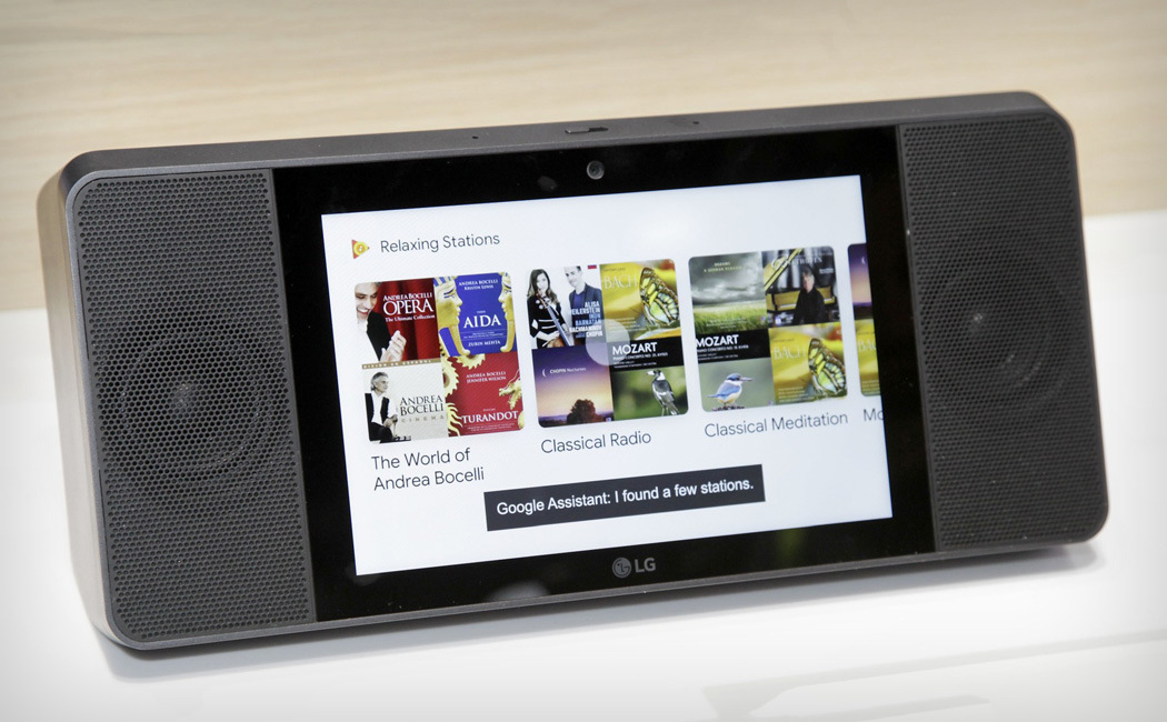
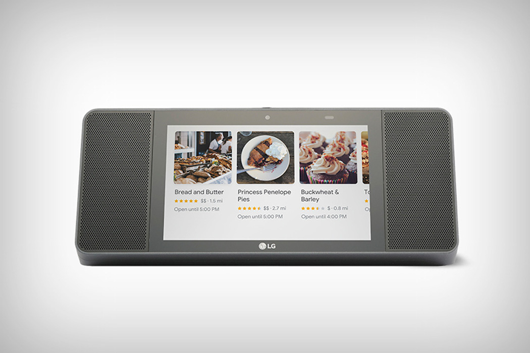
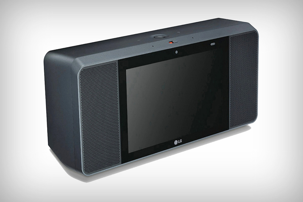
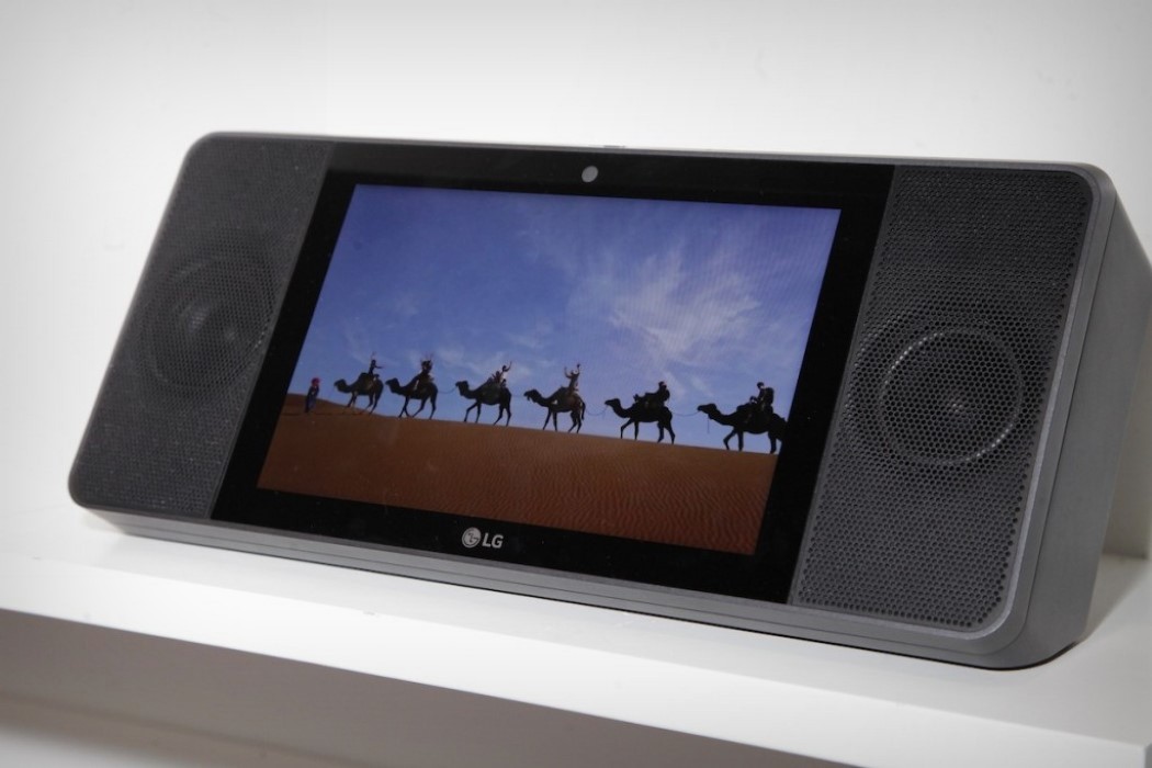
It appears as though the days of just walking into Best Buy and buying a simple speaker might just be up. Smart speakers are popping up all over the place, and this is no surprise with how advanced Google Assistant and Amazon Alexa are becoming. So what happens when the market for smart speakers becomes densely populated? Stick a screen on it. This may or may not be the design thought behind the LG ThinQ Google Assistant Touch Screen Speaker, but I kind of like it. The ThinQ boasts a high sound quality from Meridian Audio’s advanced technologies on either side of its 8-inch touch display (with built-in Chromecast) and accompanying front-facing camera. Ideal for video calls through Google Duo, this smart speaker’s functionality is really determined by the room/activity you need it for. For example, if you’re cooking and want to see the recipe step by step, the ThinQ would be perfect – it would be even more perfect if you needed to hear it at full blast in ultra high-quality sound… With pricing and a release date yet to be announced, it should be interesting to see where this will fall in regards to the competition. Designer: LG
|
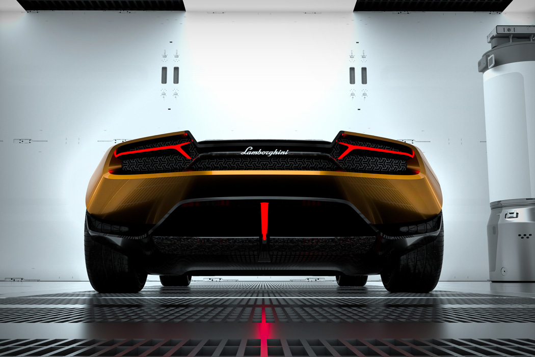
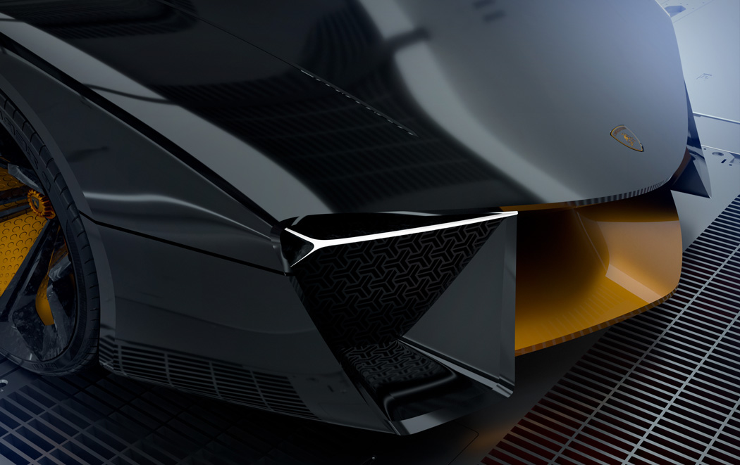
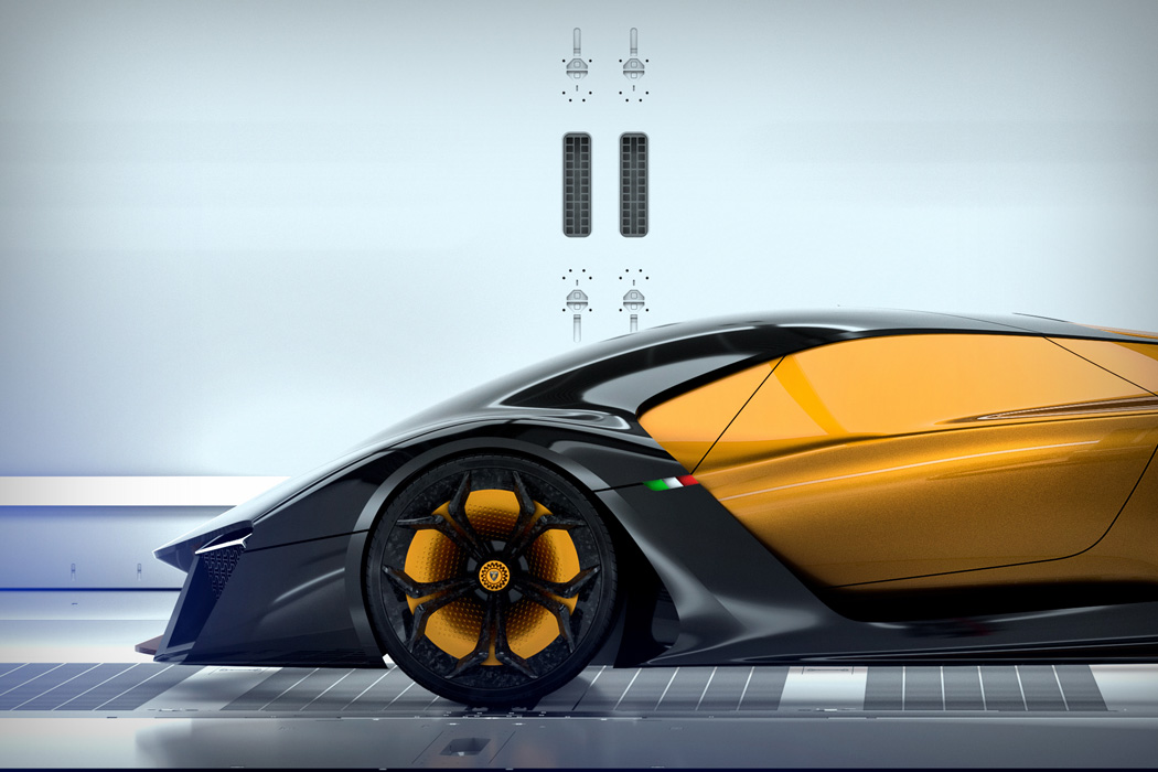
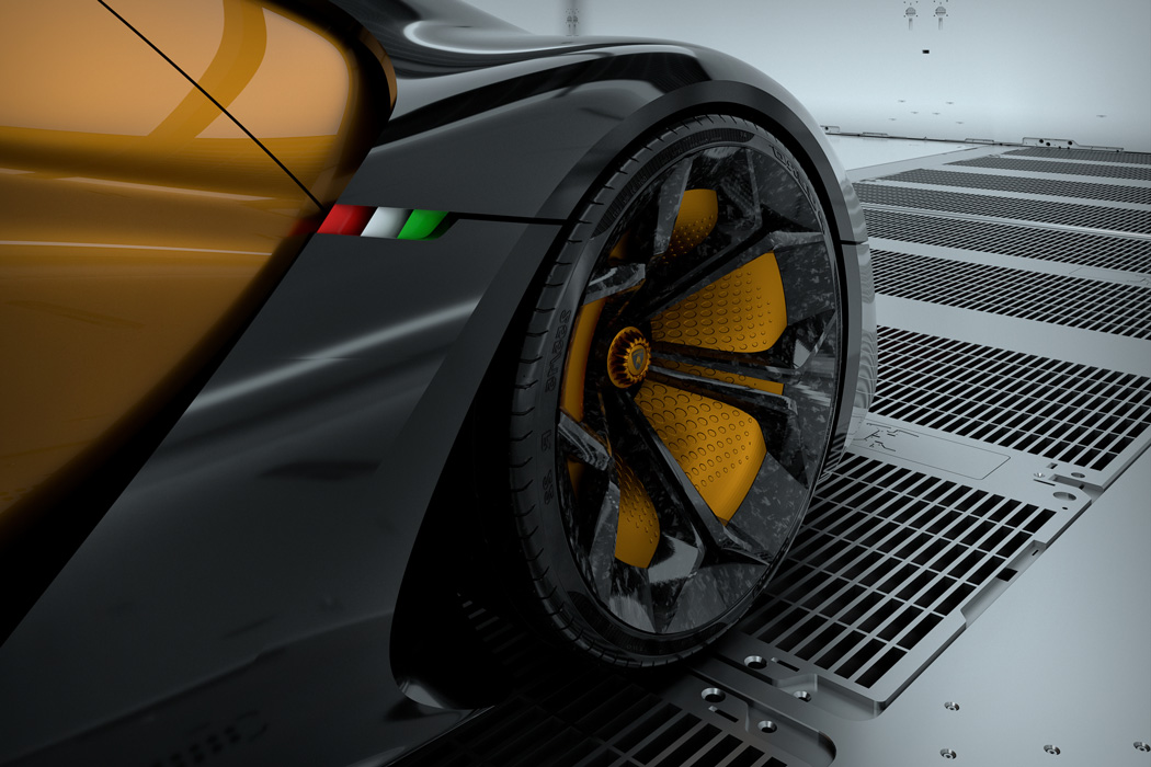
| Posted: 23 Jan 2018 04:00 PM PST
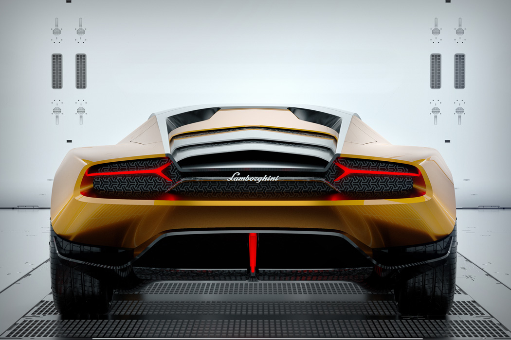
Named after the famous fighting bull, the Belador, the monster, is the perfect mix between the push and pull of power with control. A unique unity of technology and tradition come together to form this gorgeous concept, as imagined by Sergey Dvornytskyy. Powered by a hybrid engine, this animal is taking a step out of the dark and into a new age of brilliance and top performance. What is rather unique about this concept is its body sculpting – forming somewhat of a front ‘cap’ that encompasses the windshield and entire front body including the gracious wheel arches. The body itself edges slightly forward and lifts up in the rear, giving the impression that this car will always have a forward momentum both in design and in physical speed. I feel Dvornytskyy has toyed with the ratio of new design/technology and keeping the traditional design language of Lamborghini enough that he has executed an evenly futuristic yet still realistic concept here. Designer: Sergey Dvornytskyy
|
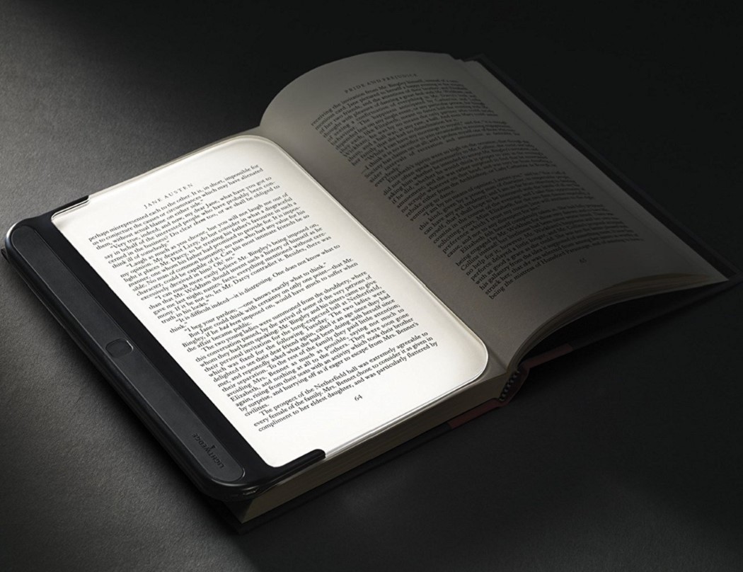
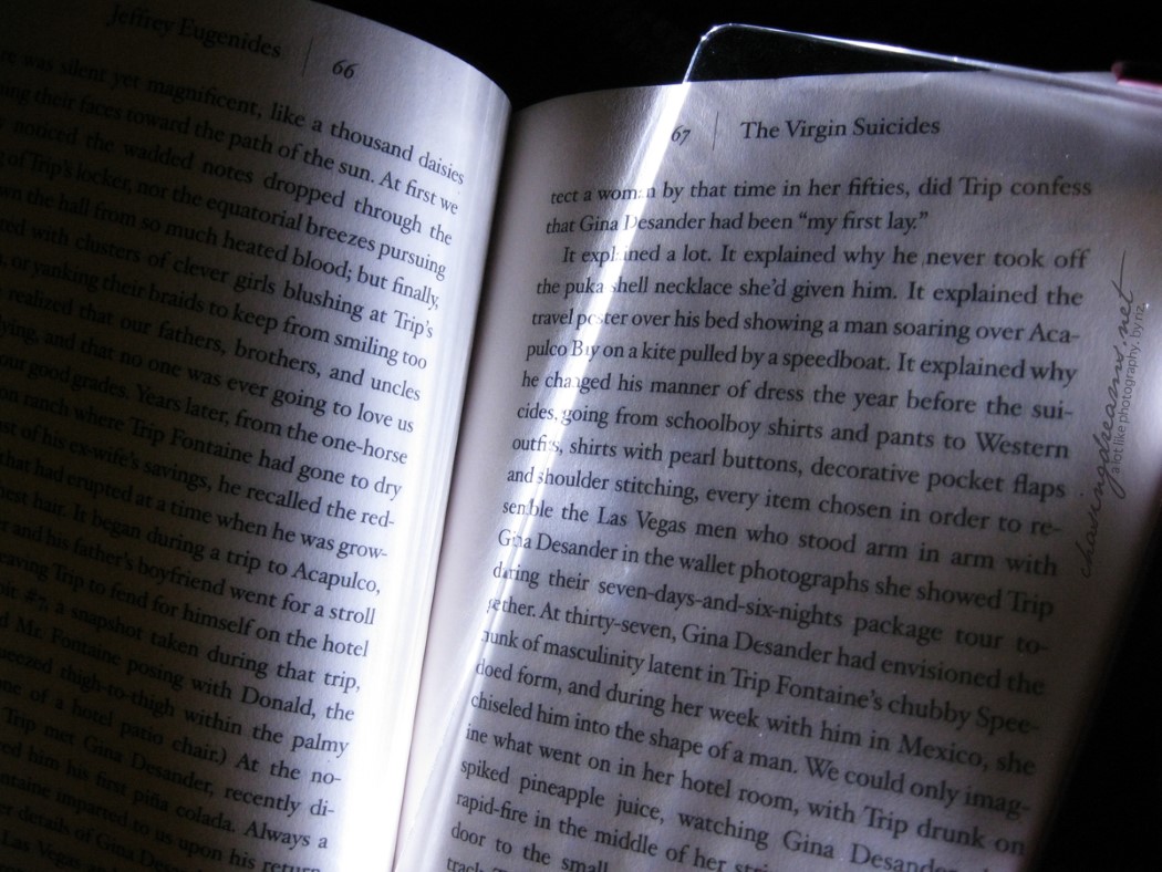
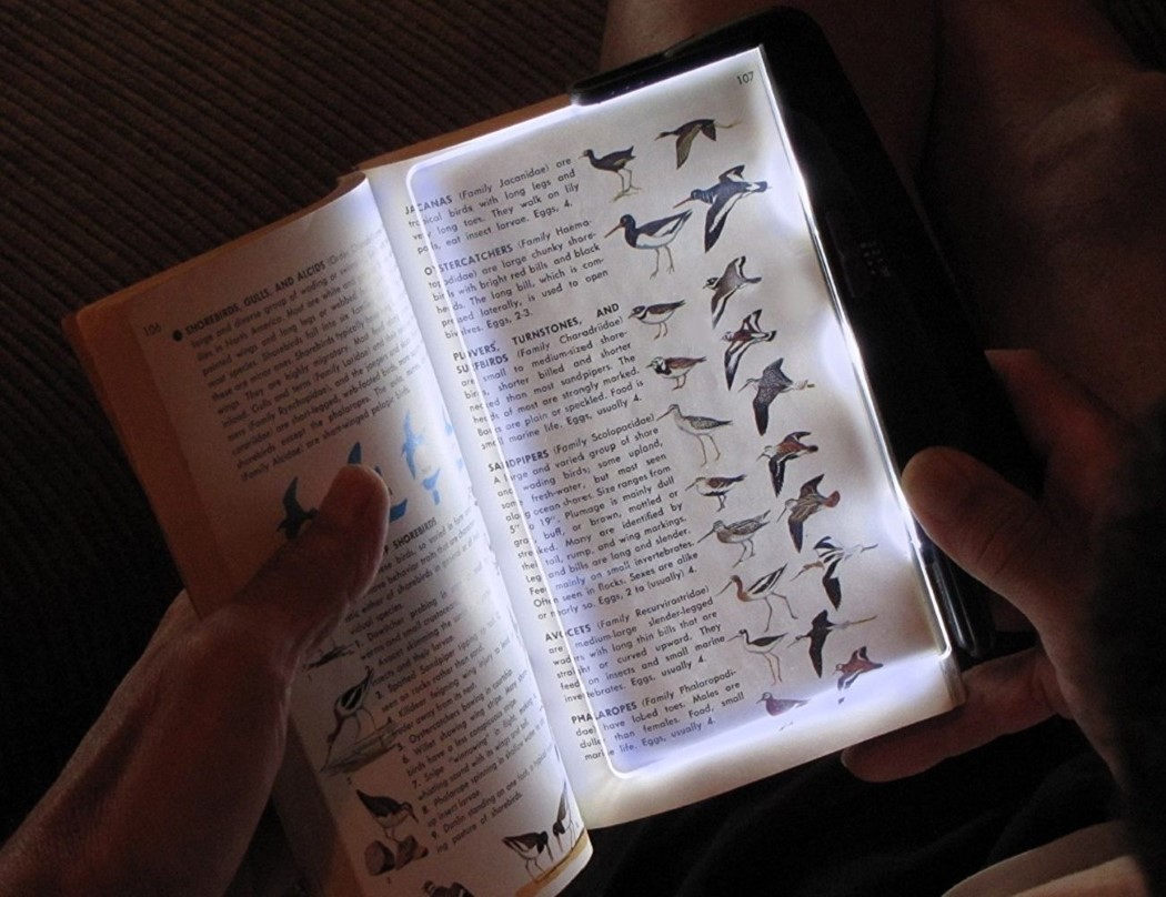
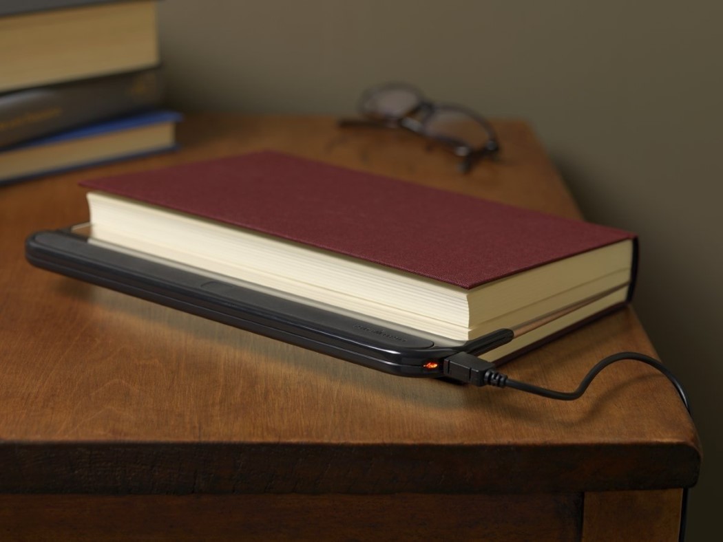
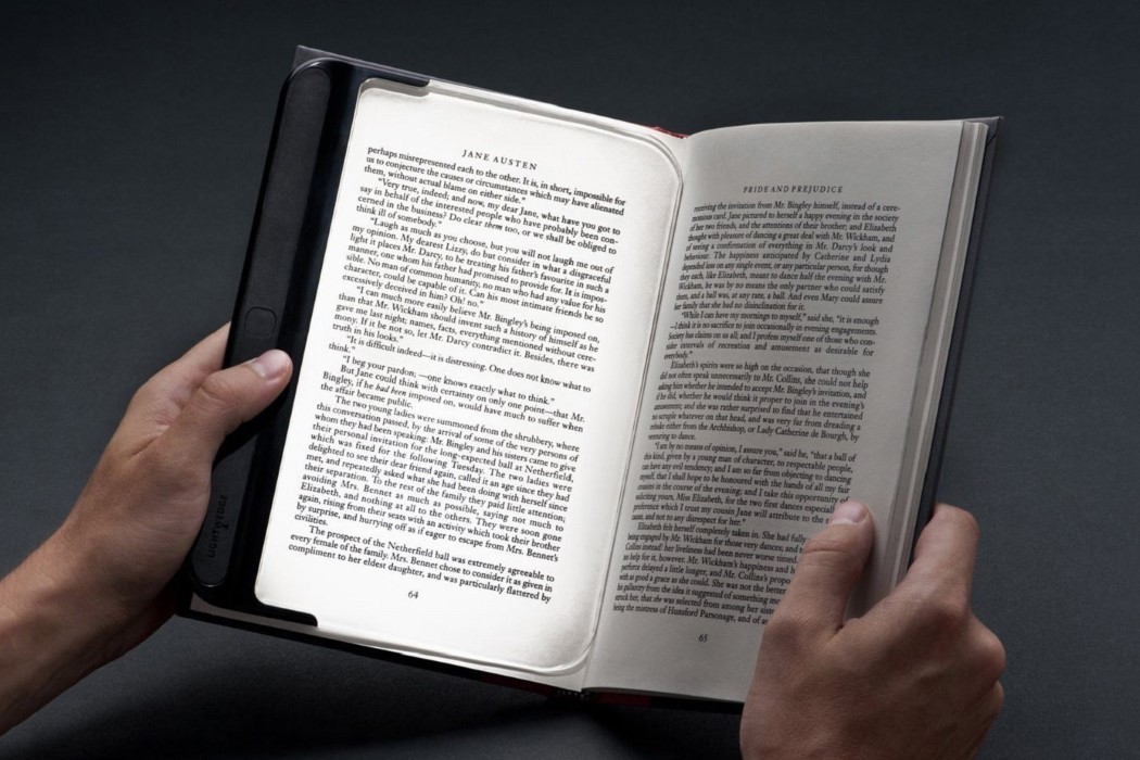
| When your bookmark is also your reading light Posted: 23 Jan 2018 02:00 PM PST Consider me a fan of the Lightwedge reading light. It does something rather brilliant, in that it A. illuminates just the page without illuminating the space (like other reading lights), and it also serves its purpose as a rather handy bookmark. The Lightwedge comprises one single piece of transparent plastic sheeting that has a strip of LEDs on one edge. Switch it on and the LEDs shine a light through the plastic, containing it so that you don’t end up illuminating the entire room (and disturbing potential sleepers), but rather just the page you’re reading. Just how LED screen displays have a backlight, think of the Lightwedge as a ‘frontlight’ for your book. But that’s not all! The Lightwedge’s inherent flat, sheet-ish design also helps it serve as a bookmark. Since it usually rests on the page you’re reading, all you do is flip the book shut and you’re done! The Lightwedge comes with an auto-shut-off feature, allowing you to simply shut your book and forget about it until you’re ready to pick it up again. Designer: Lightwedge |
| You are subscribed to email updates from Yanko Design. To stop receiving these emails, you may unsubscribe now. | Email delivery powered by Google |
| Google, 1600 Amphitheatre Parkway, Mountain View, CA 94043, United States | |
