Yanko Design - Form Beyond Function |  |
- By popular demand, an iPhone with an audio jack!
- A Contemporary Throwback
- How do you design for zero-gravity??
- One Popsicle That’s Not For Licking
- The Outdoorsman’s Coffee Grinder
- The wallet that’s smaller than your cards!
- More Wall, Less Clock
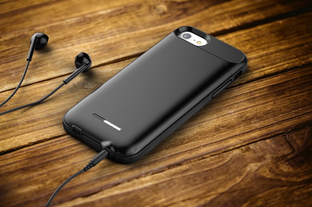
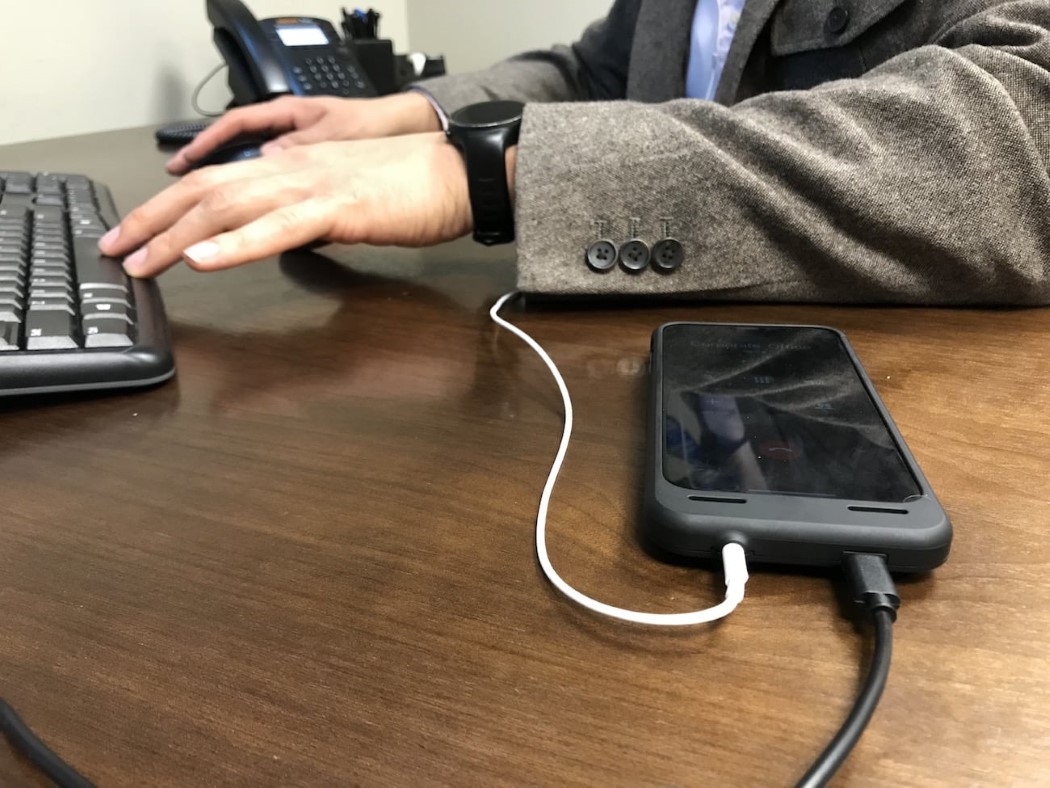
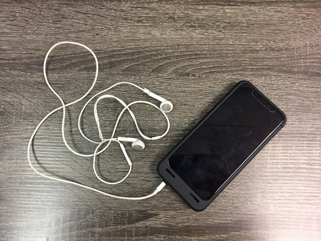
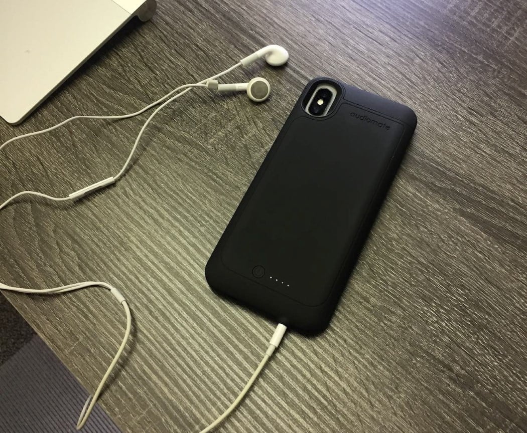
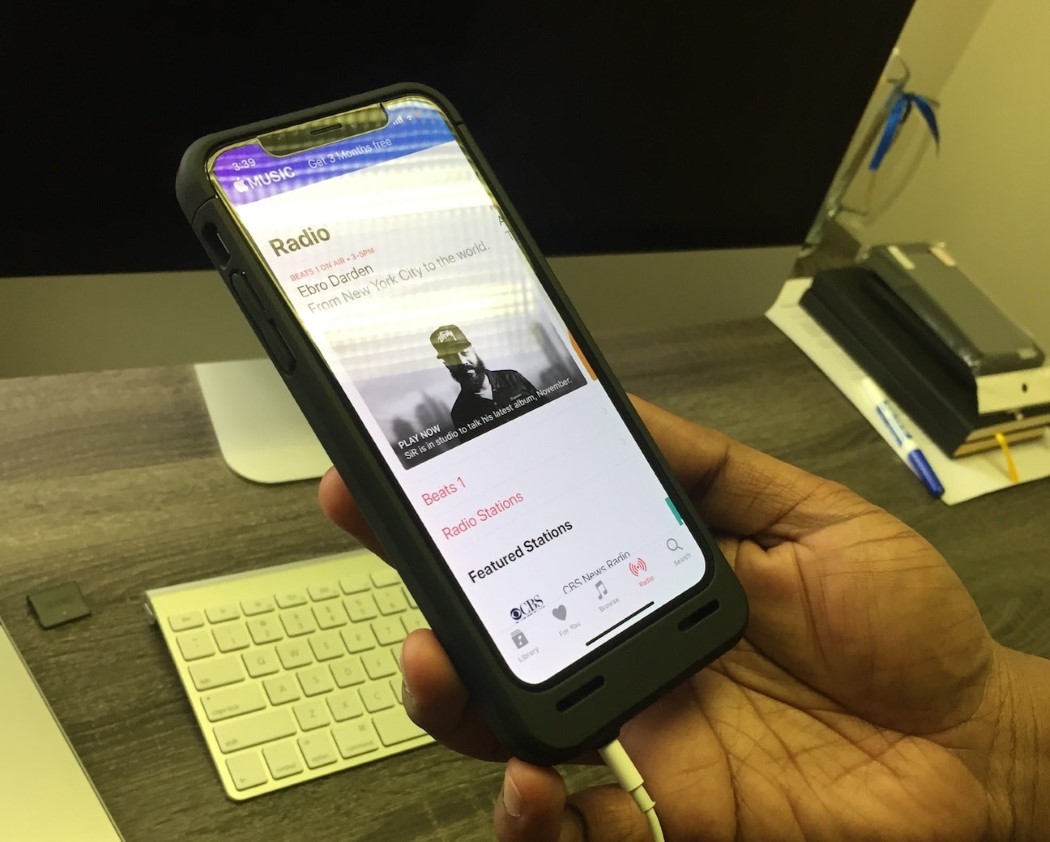
| By popular demand, an iPhone with an audio jack! Posted: 16 Feb 2018 12:12 PM PST I love my Google Pixel 2. I, however, hate the absence of the audio jack. I don’t understand why phones are embracing this absolutely unnecessary trend… well actually I do. It’s solely to boost wireless earphone sales. Unfortunately, I’m the person who’d rather spend 30 seconds untangling a wired earphone than 30 minutes charging a wireless one. The iPhone was the first to set the trend that every consumer hates but every manufacturer loves. Inconvenience the population into needing an expensive add-on… and undeniably, it’s the new status quo. Which is why I present to you the resistance, aka the Audiomod! The Audiomod is a case that snaps around the unfortunate, disabled iPhone, and gives it its 3.5mm port again. Not just that, it also acts as a secondary/external battery (doubling your iPhone’s battery life) and uses the same lightning connector your iPhone uses. The Audiomod comes with a 3200-4600mAh battery backup that automatically switches to power-saving mode once your phone reaches full charge, and begins using the external battery for power when it senses your phone needs a boost. What’s more, better than any dongle, the Audiomod offers a pretty remarkable 24-bit high-resolution audio quality. With its slick form factor and the much-needed 3.5mm jack, you won’t physically notice the difference, but you’ll experience the difference for sure! Designer: Encased
|
| Posted: 16 Feb 2018 11:00 AM PST
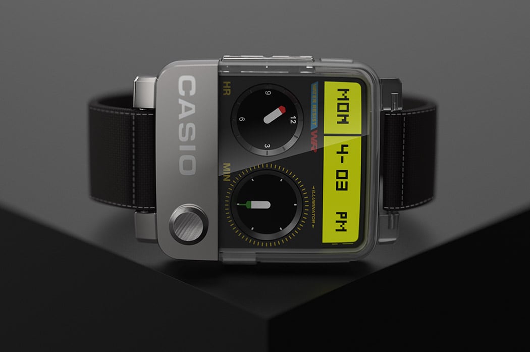
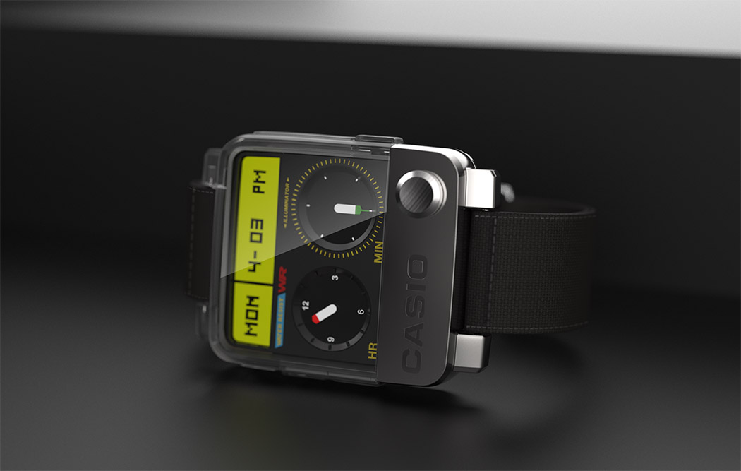
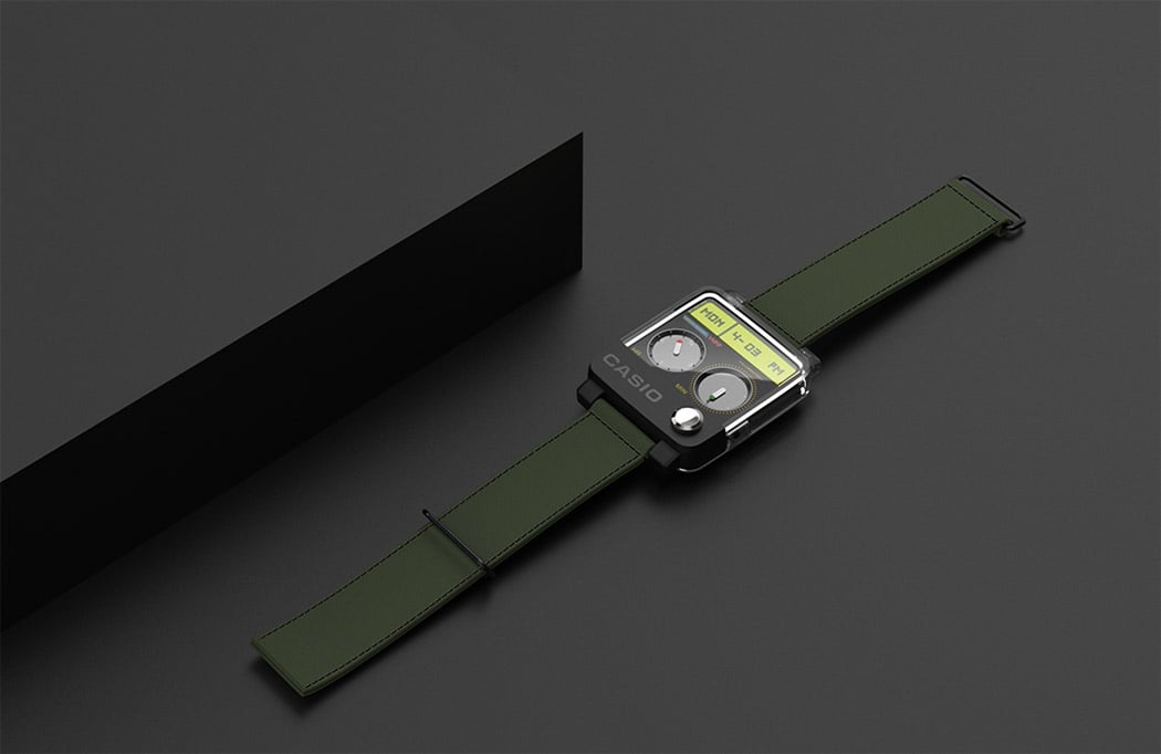
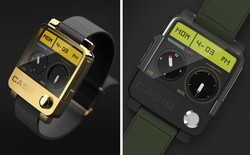
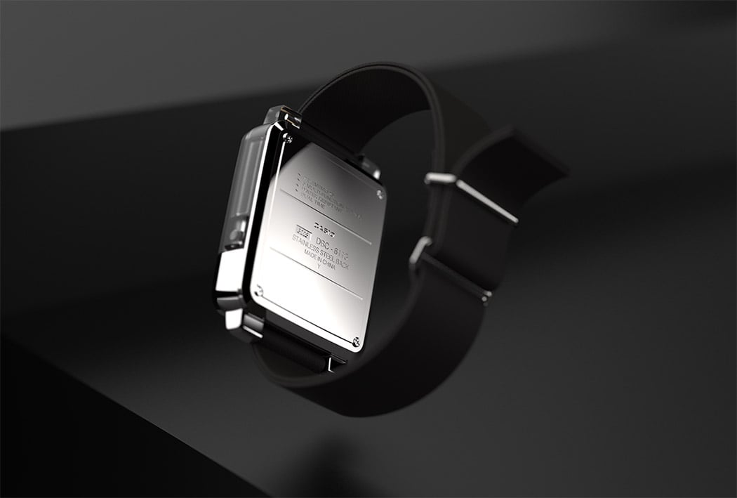
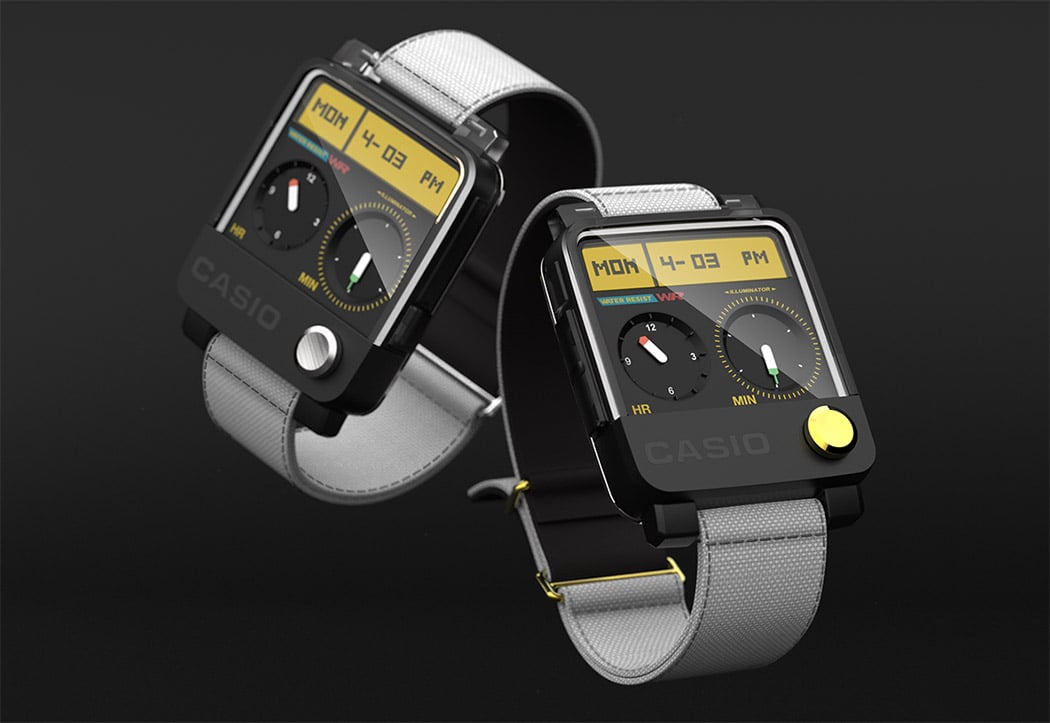
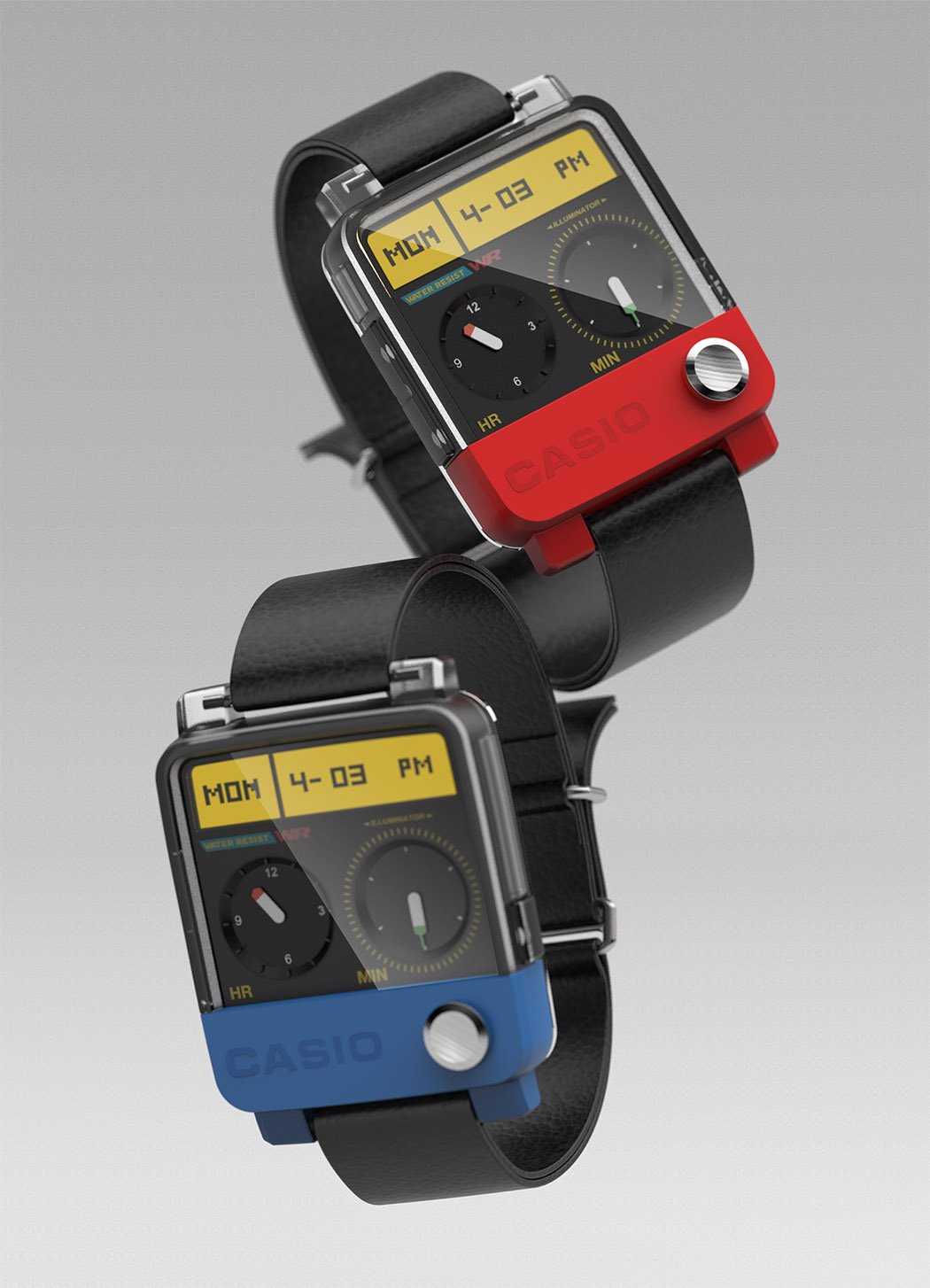
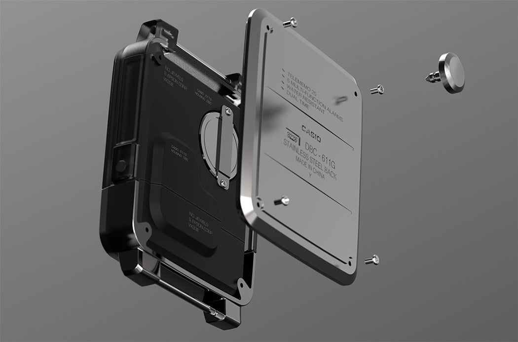
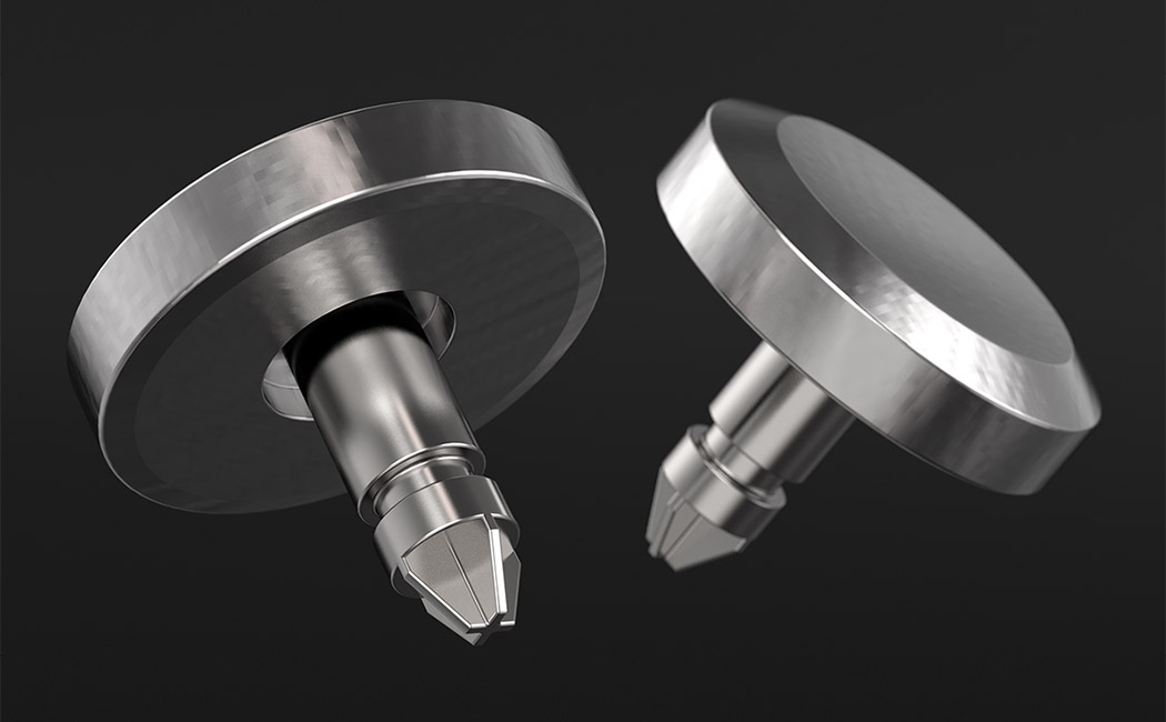
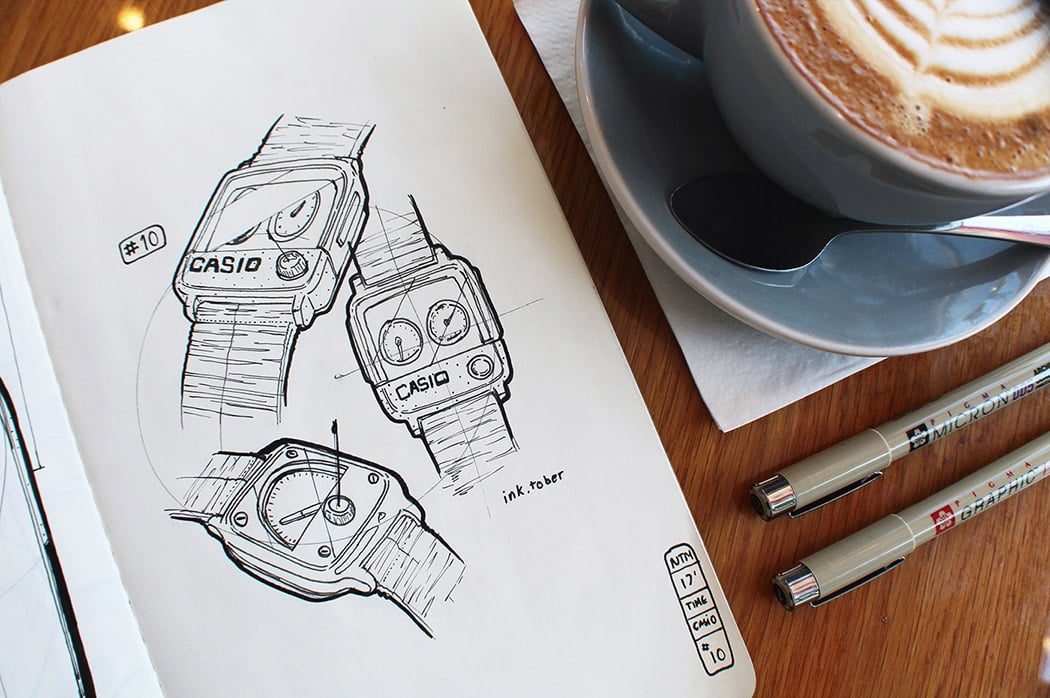
Before the smartwatch, there was Casio. Whether we knew it or not at the time, the iconic Japanese brand has spit out some of coolest timepieces of… well… our time. From weird to wacky, their’s was the first to sport a calculator, control your TV, play music and even track your fitness… and that was in the 1990s! Paying tribute to this legacy, Tyson Mai’s Casio concept combines familiar elements from over the years. It doesn’t appear to have any of the smart features mentioned, rather, it’s a fashion throwback that’s purely aesthetic in purpose. While it looks quite cousinly, one new feature is a removable face dial that doubles as a philips screwdriver for removing the back plate when it’s time to switch out the battery. Designer: Tyson Mai
|
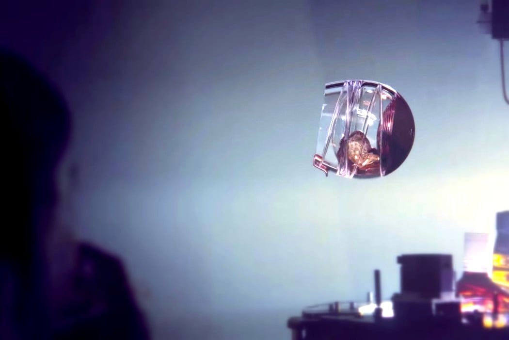
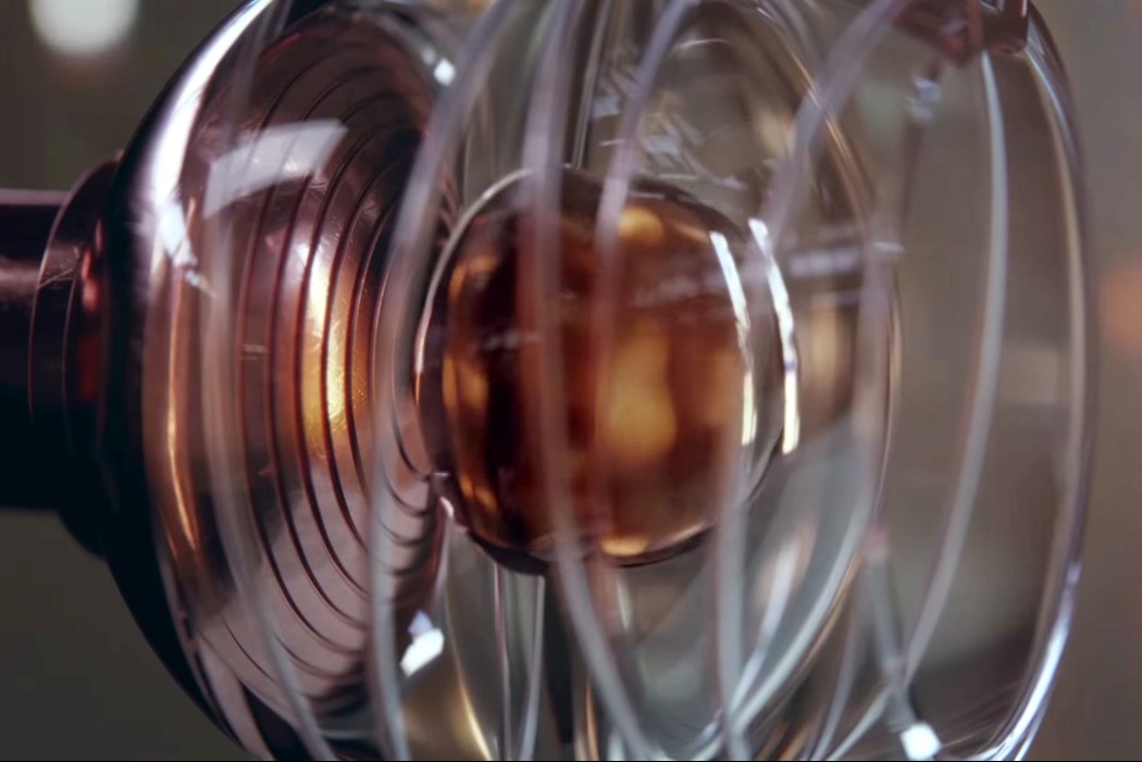
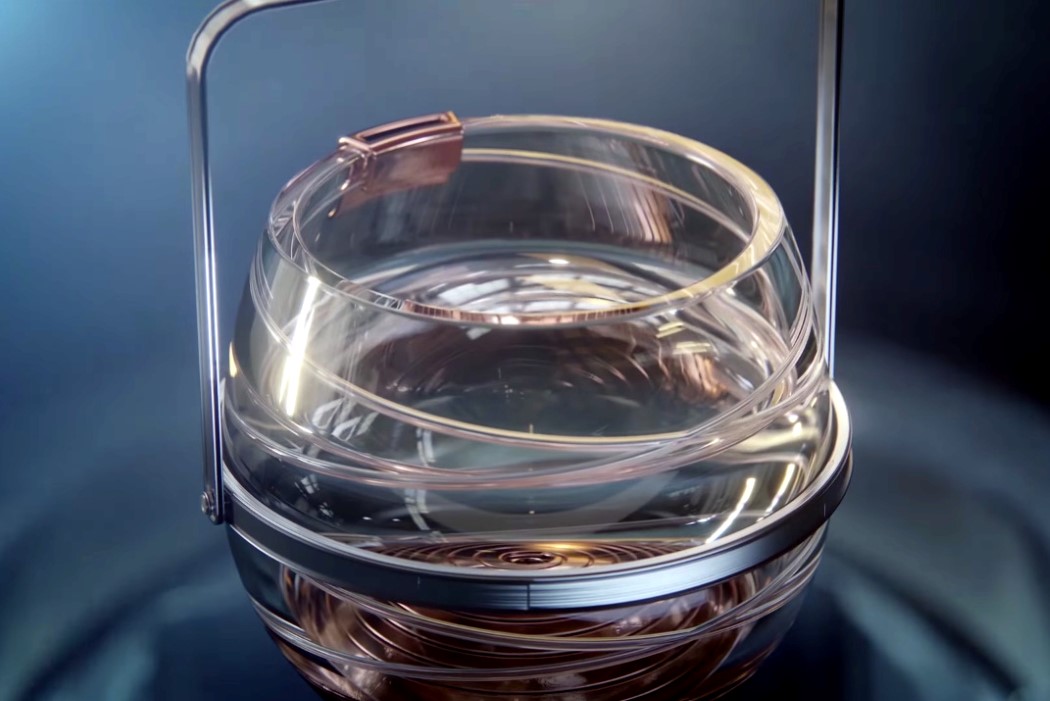
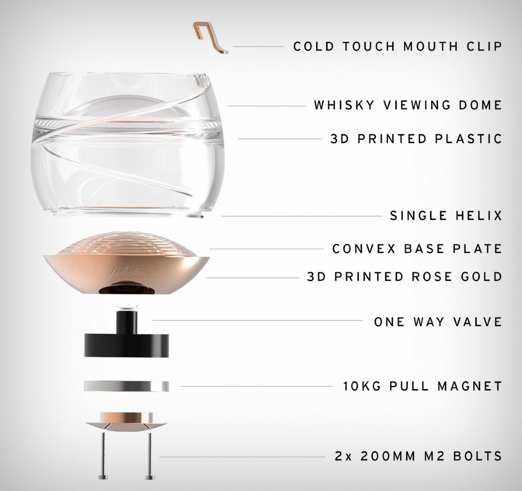
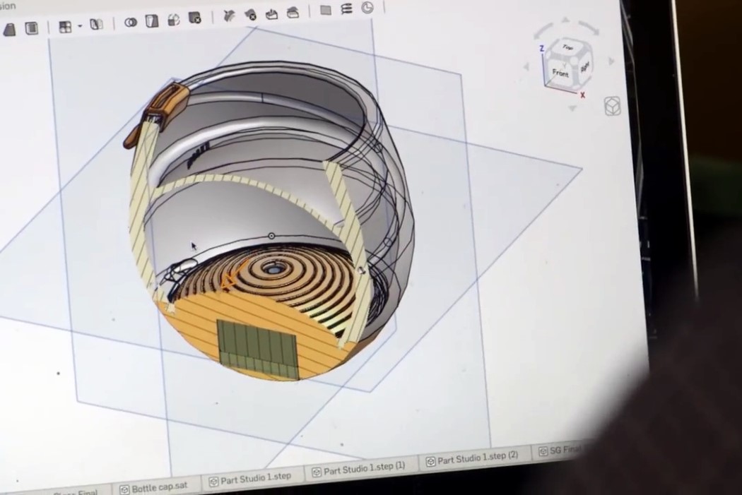
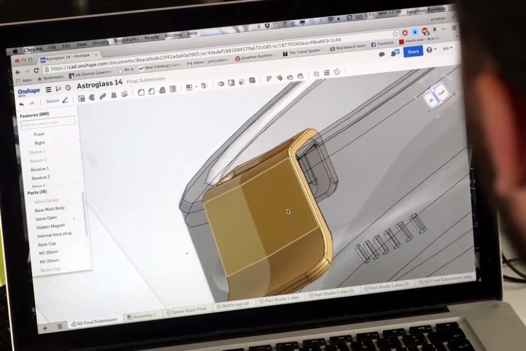
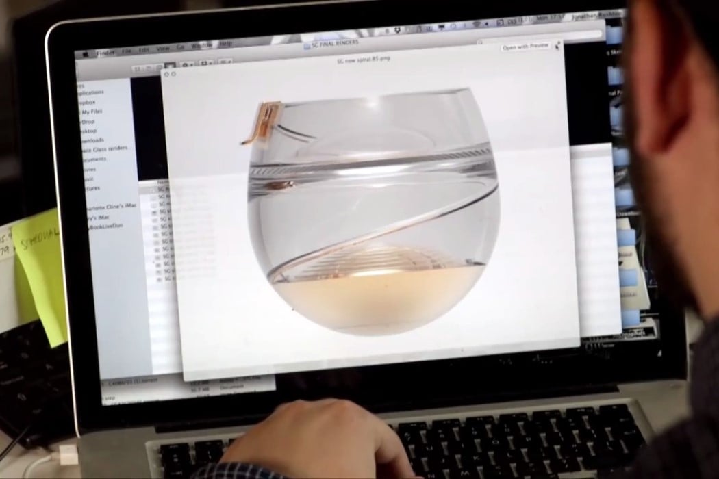
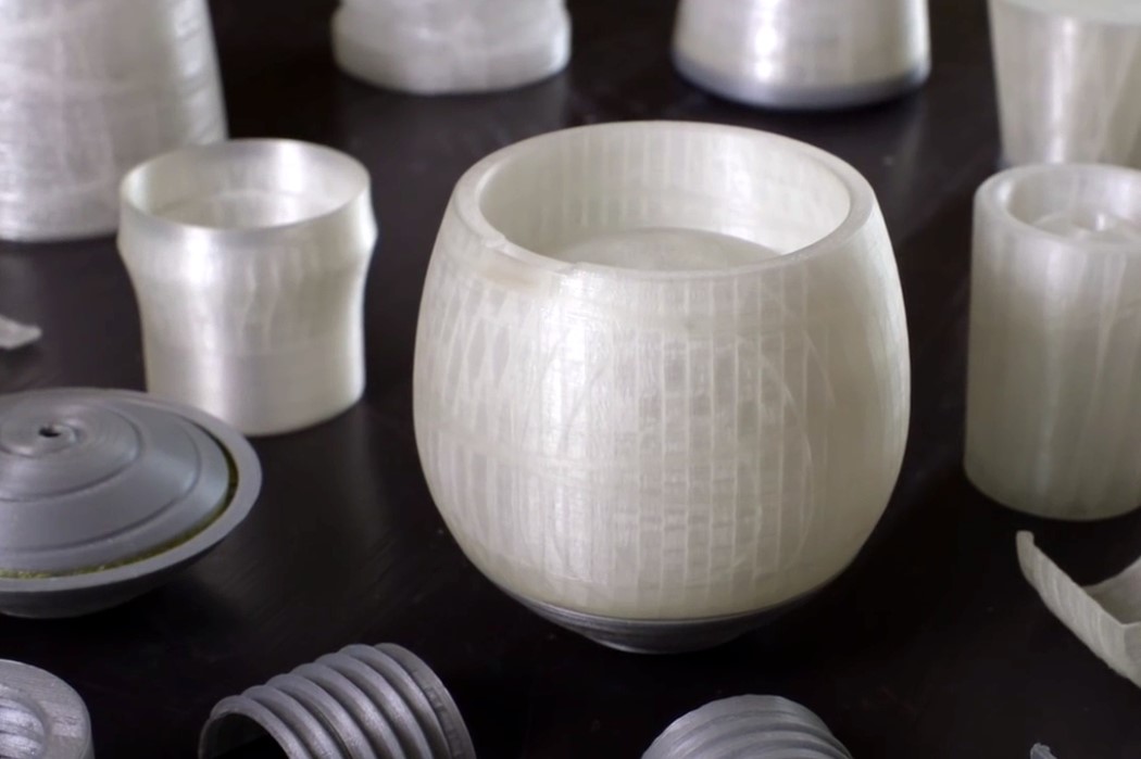
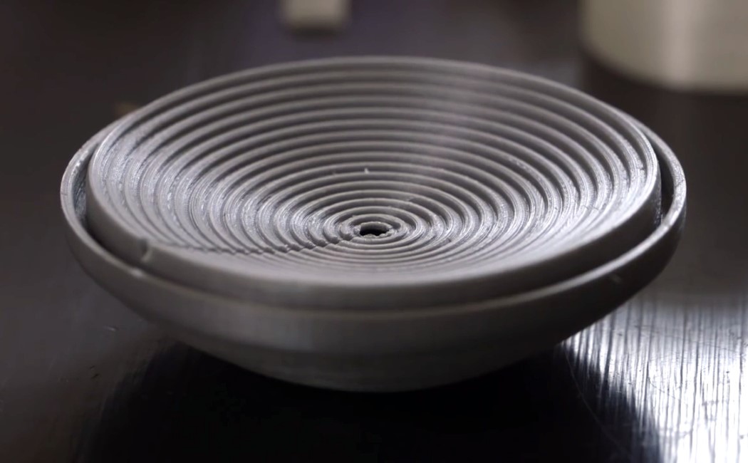
| How do you design for zero-gravity?? Posted: 16 Feb 2018 06:00 AM PST Industrial designers are required to fit themselves into a wide variety of scenarios so as to solve problems effectively. But how do you solve problems in a scenario that’s literally out of this world? This is the Ballantine’s Space Glass. Its purpose? Letting astronauts efficiently get tipsy in outer space! The Space Glass for Ballantine’s remains one of my most favorite case studies. It strikes all the right chords and showcases an incredibly detailed design process. “As a designer, you spend your whole life breaking your babies”, says James Parr of the Open Space Agency, the team that was approached by Ballantine’s to solve a rather unusually complex problem. It’s a layered feeling, rejecting concepts your brain tells you is right, only because it actually isn’t. You fall in love with your creations multiple times and the nature of your profession is to make sure your creation survives… and performs. So a lot of times, you need to break your creations. Designing for space is an extremely complex challenge not just because of zero gravity, but also because of the effects of zero gravity. A lot of things we take for granted get changed in space. Fluid dynamics change dramatically, there’s no air to oxidize the alcohol, so what you taste outside the Earth is a whole lot different from what you taste on Earth. Not to mention your body changes in space too. Your senses behave differently in the absence of gravity. So how do you design for a scenario as obscure and unrelatable as this? The video above shows how Parr and his team at OSA designed, tweaked, and validated their concept for a glass that could deploy alcohol in antigravity. The glass is entirely 3D printed, with a baseplate that allows the alcohol to stay within the glass. A helical channel allows you to create a vacuum and sip the alcohol from a gold mouthpiece that gives you the exact intended taste. Ballantine’s designed a special space blend scotch whisky, meant for drinking in outer-space, and what’s truly worth noticing is that even though the Space Glass is a marvel of engineering, it looks like a beautifully designed piece of glassware that could just as easily sit among the finest spirits on earth as it could on the International Space Station! Watch the advert for the glass below, and the case-study documentary on its design and testing above! Designer: Open Space Agency for Ballantine’s
|
| One Popsicle That’s Not For Licking Posted: 16 Feb 2018 04:52 AM PST
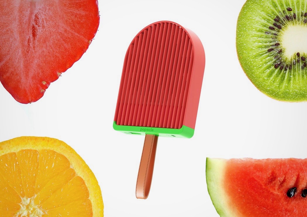
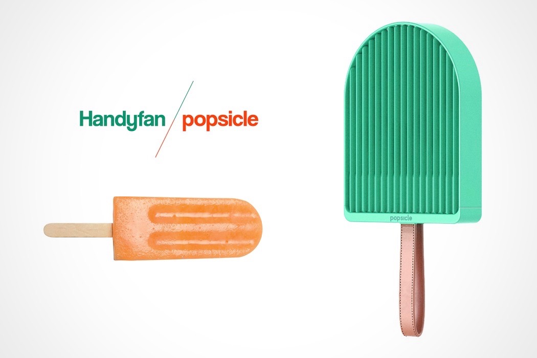
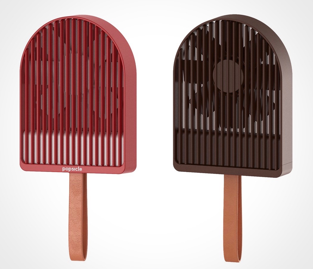
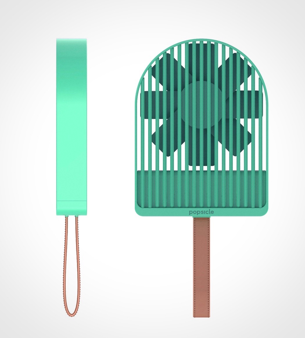
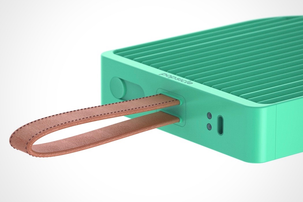
The Popsicle keeps you cool in an entirely different way that the name suggests! It’s a first-ever personal fan that actually looks pretty cool for once! I usually imagine the people using portable fans as the same who wear fanny packs. It’s usually the cherry on top of a touristy look. However, the Popsicle’s playful form is just plain adorable! It takes on the exaggerated form of a frozen treat and features a cute leather strap so you can attach it to your keychain or wrist. Just keep it recharged to enjoy a cooling breeze you can take anywhere. While it will be tempting for some to lick (people sticking their tongues in fans is a real obsession – Google it!), our advice is NOT to! Designer: 7 nepo
|
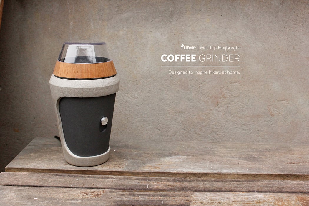
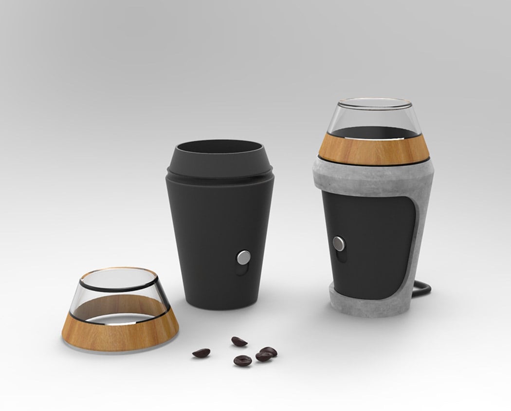
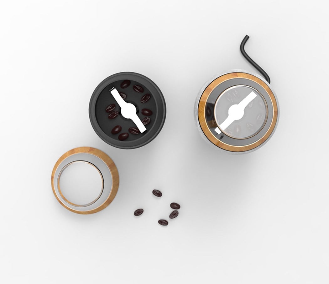
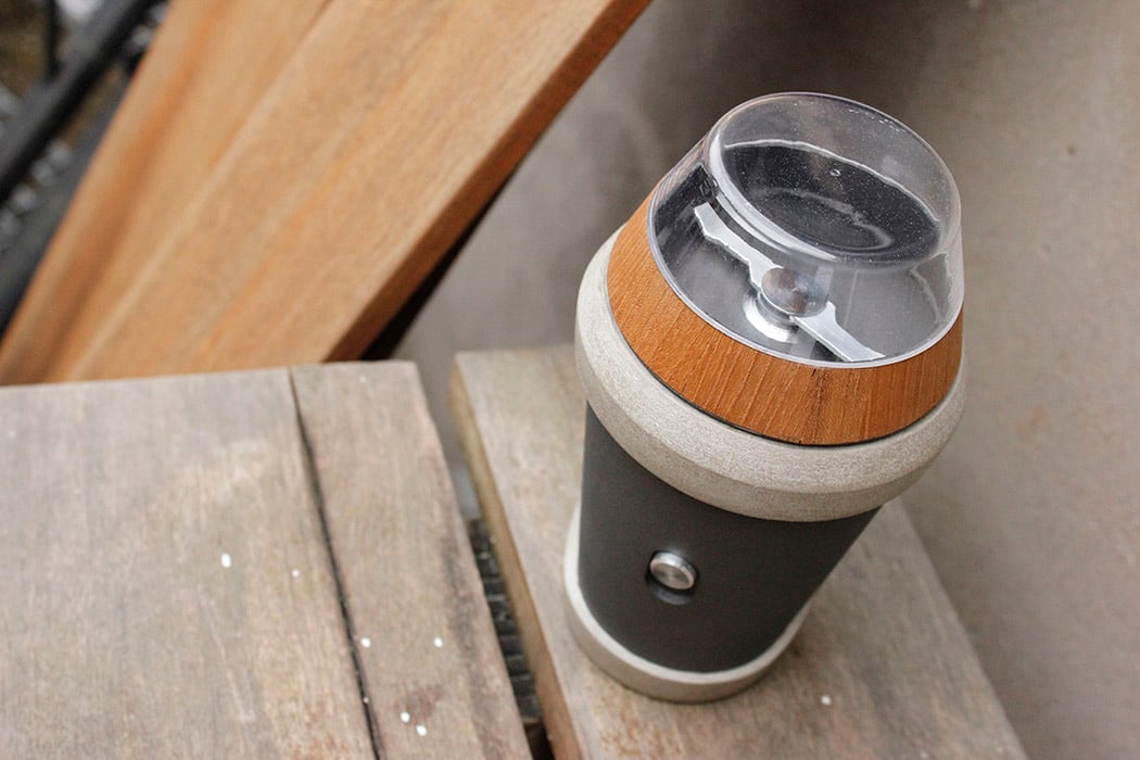
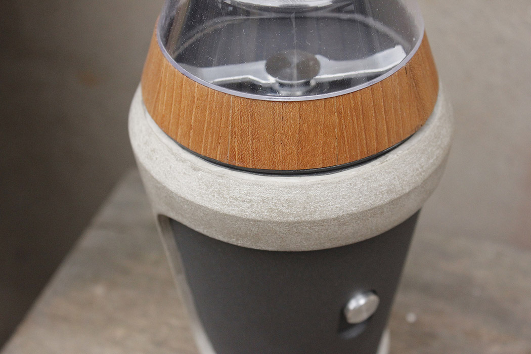
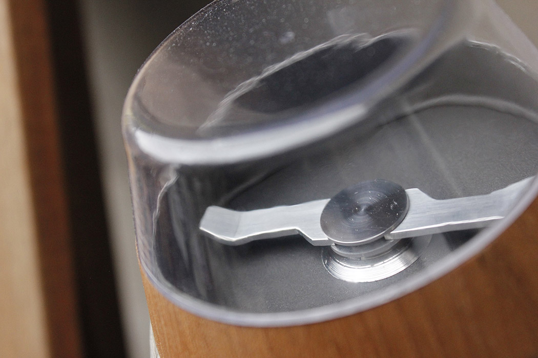
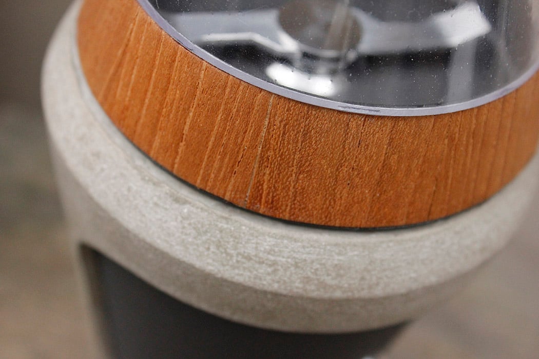
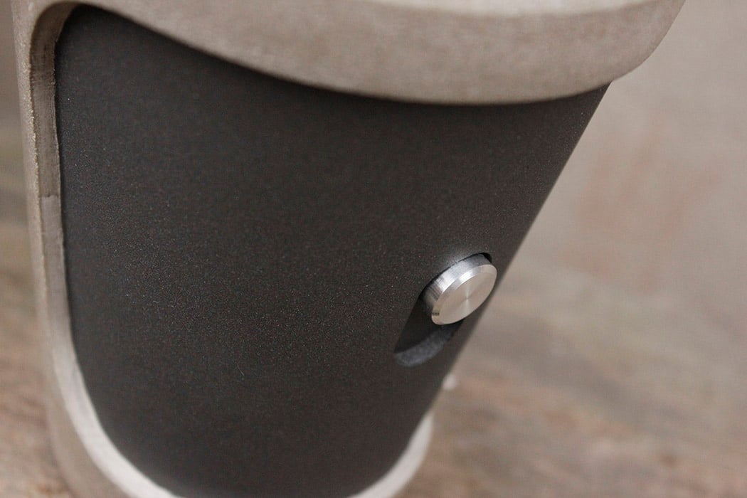
| The Outdoorsman’s Coffee Grinder Posted: 16 Feb 2018 02:00 AM PST Ever heard of memetic product design? It’s a pretty cool concept that explores designing for a specific group of individuals with a shared interest by subtly implementing memes or related elements identifiable by members of that group. In this case, designer Matthijs Huijbregts focused on a coffee grinder that was aimed at hikers. He incorporated familiar fragments in the form of material and shape that would consciously or subconsciously appeal to this unique subgroup of athletes. First, its shape looks to nature for a form that is at once modern and organic. Its exterior material composition includes wood and stone which also reminds one of familiar textures and matter they might see on a hike in the woods. Of course, the interior mechanics consist of durable plastic and steel necessary for grinding functionality. Even if you’re not an avid hiker, there’s no denying this is one handsome grinder! Designer: Matthijs Huijbregts
|
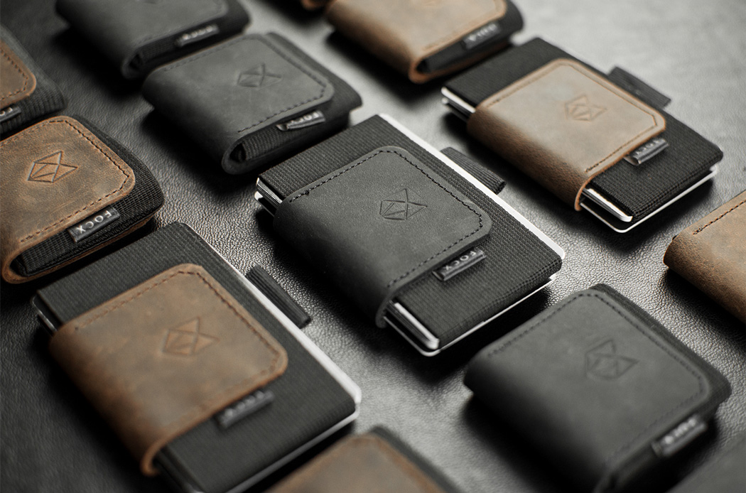
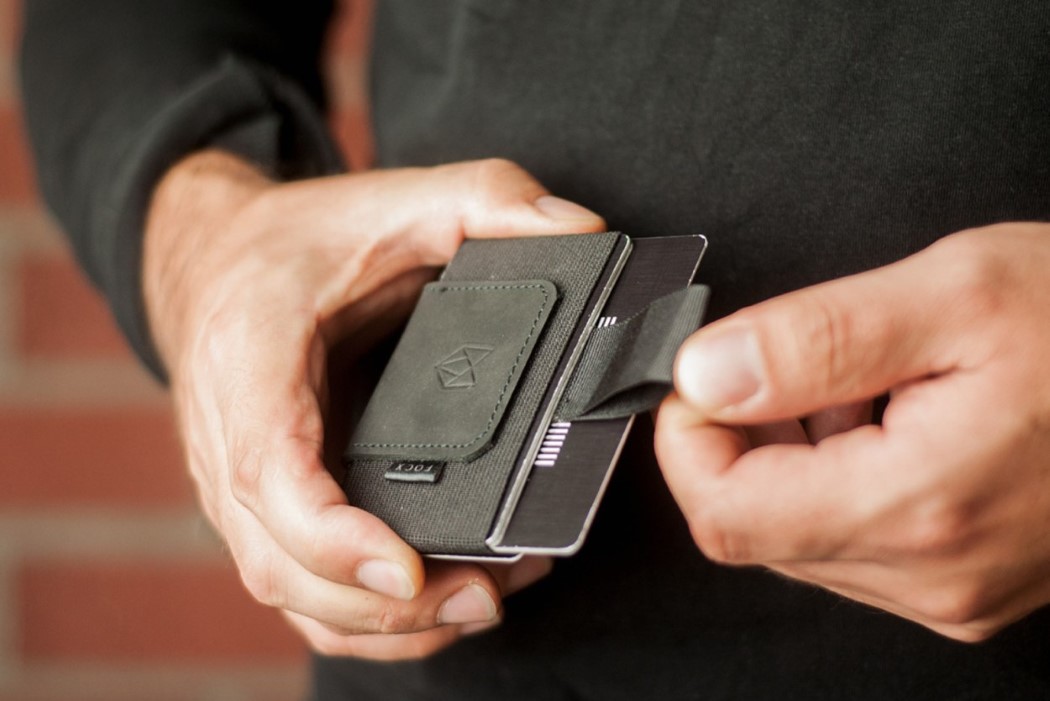
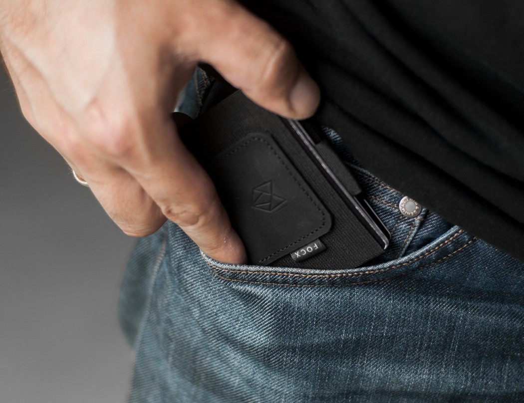
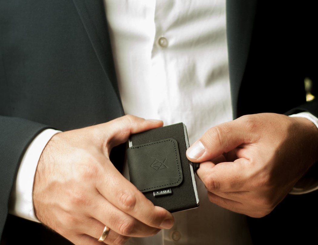
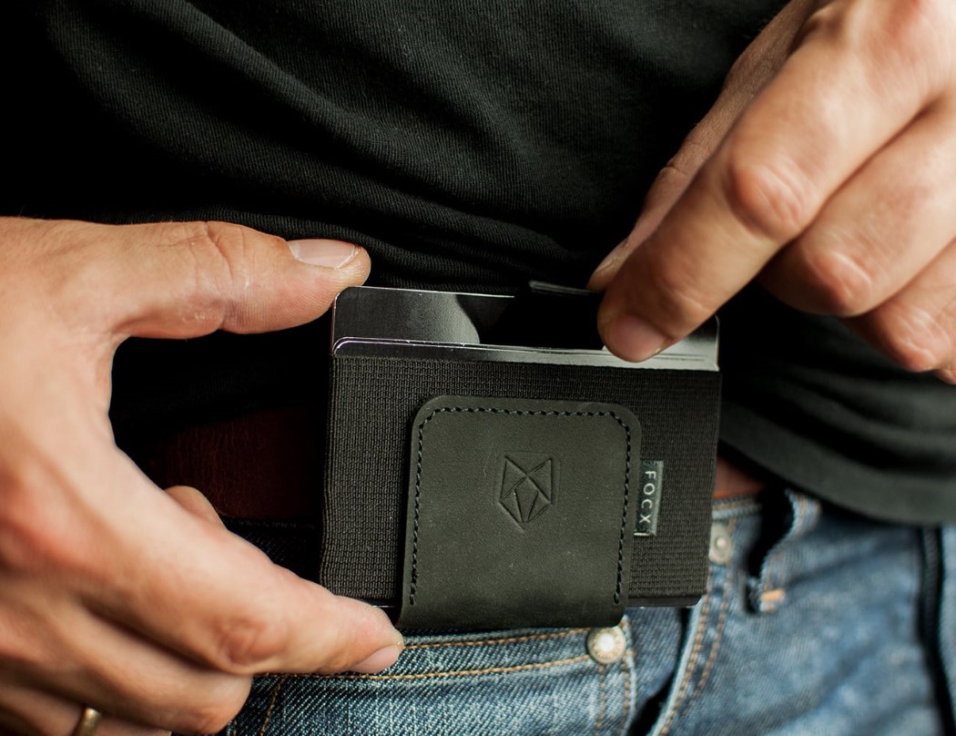
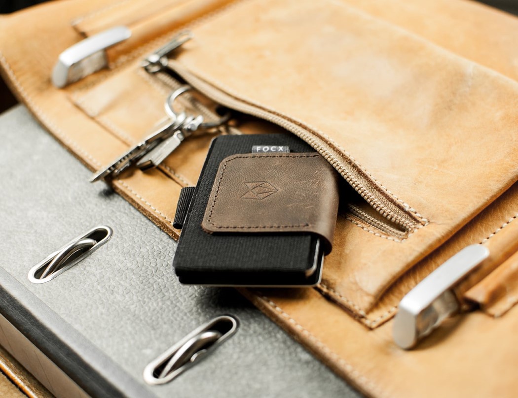
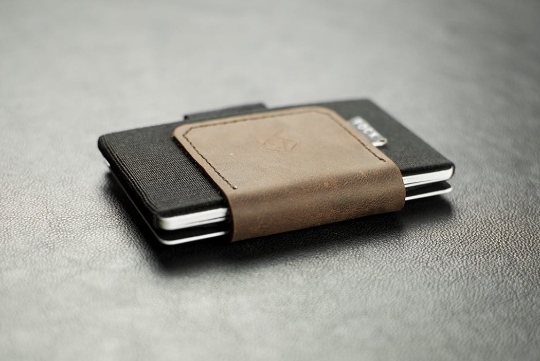
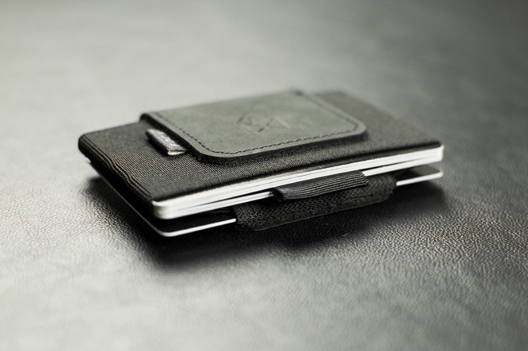
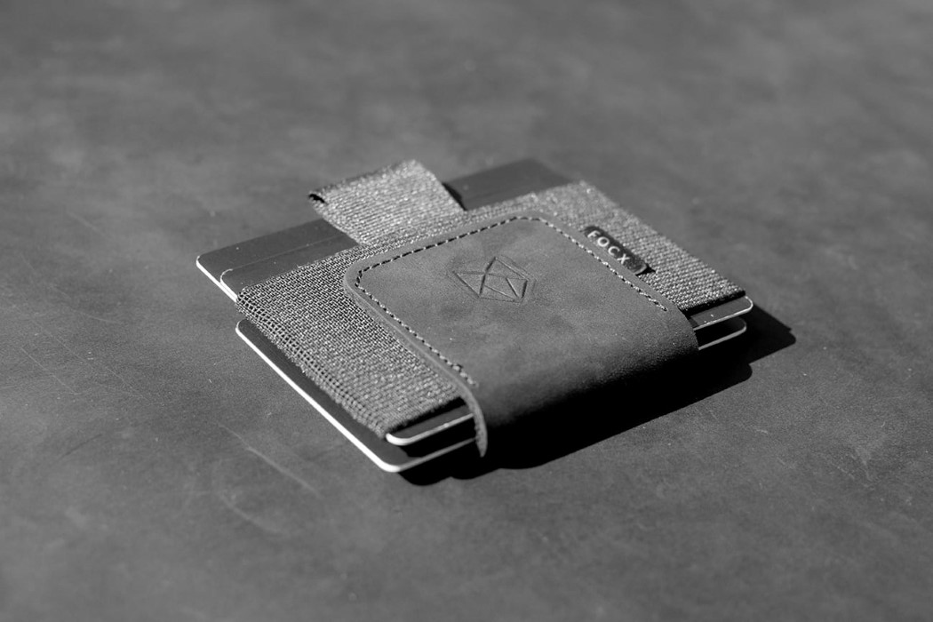
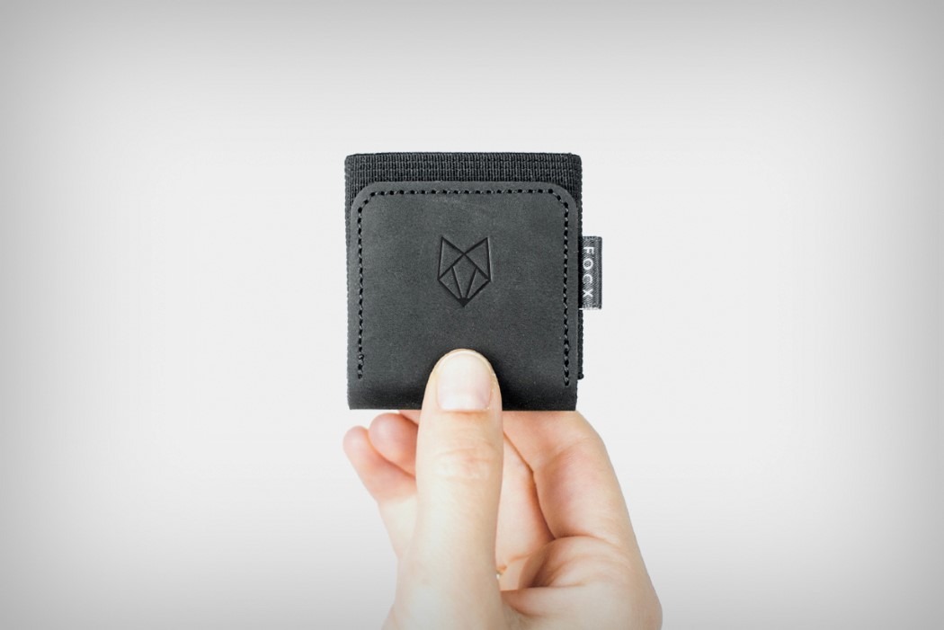
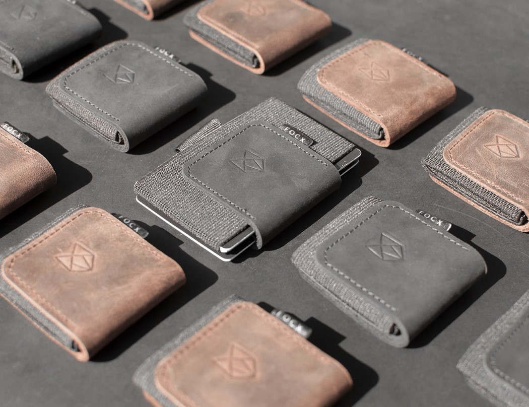
| The wallet that’s smaller than your cards! Posted: 15 Feb 2018 03:57 PM PST Great things come in small packages. That’s what they say… and they’re probably referring to the FOCX Smart Wallet. Simple, sensible, and small, the FOCX ticks all the correct boxes. Designed to be a tiny, square-shaped object when not in use (which means its packaging is smaller too), the FOCX smart wallet comes with an elastic band that expands to hold as many as 5 cards. You can easily access your card of preference by simply pulling up an elastic tab that lets your most-used card slide out from the pack. Put the card back and the elastic tab retracts too, back into the wallet’s slick form factor. The FOCX even has a clip on the side that can hold another 5 cards or cash, serving as not only a cardholder but a money-clip too. Made from a combination of Leather, Elastic, and Yarn, the FOCX feels natural as it employs only the materials fit for their purpose. Speaking of purpose, the FOCX, within its incredibly compact frame, even fits an NFC chip (with 540bytes of storage) that can be an incredibly handy feature, allowing you to store contact details, or work details, or even your business card. Simply tap your wallet on someone’s phone to share your website or your business card with them! For a wallet as small as the FOCX, it packs in a great deal, both in capacity and features. I’m a personal fan of the NFC technology that allows the wallet to hold an infinite variety of information. Who needs to have a slot to store business cards when your wallet is in itself, your virtual business card! Designer: Serkan Elbasan
|
| Posted: 15 Feb 2018 01:58 PM PST
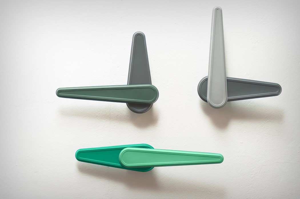
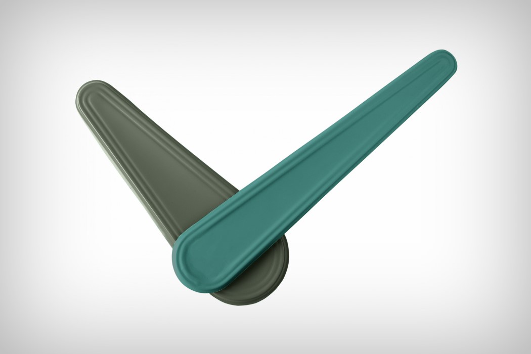
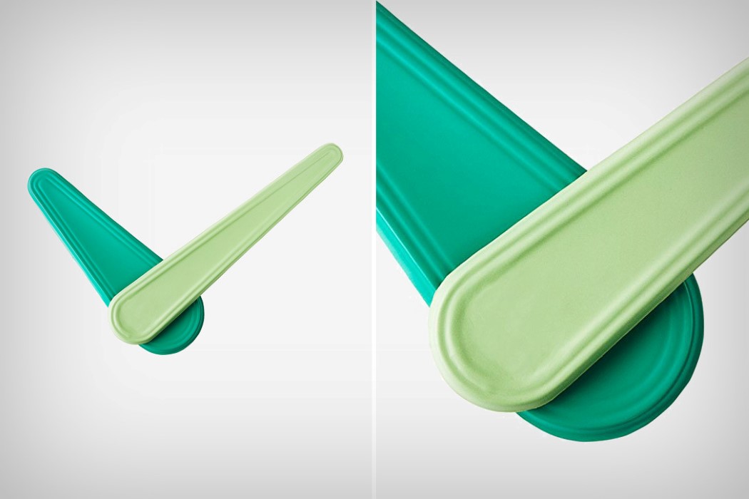
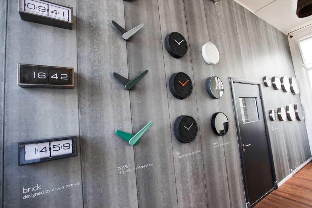
The idea behind the Wyzer wall clock by Reinhard Dienes was to make the wall a part of the clock. Using large plastic hands and a small clock mechanism, the Wyzer hides everything behind the colorful hands of the clock, so you’ve got a clock that’s literally all hands and no face. The lightweight plastic allows the hands to be large yet stable. The Wyzer feels less like a clock and more like a sculpture piece that tells time. Breaking away from the traditional approach which would require a clock-face and markings, the Wyzer leaves it to one’s imagination. The interesting bit is its ability to still tell the time pretty effectively, and look absolutely remarkable and decorative while doing so! Designer: Reinhard Dienes
|
| You are subscribed to email updates from Yanko Design. To stop receiving these emails, you may unsubscribe now. | Email delivery powered by Google |
| Google, 1600 Amphitheatre Parkway, Mountain View, CA 94043, United States | |
