Yanko Design - Form Beyond Function |  |
- Who knew cards could be this versatile?!
- A French Press Minus the Mess
- Greek architecture or underwater energy harvester?!
- The Wallet that’s Inspired by Architecture
- The Transformer of Trikes
- Samsung’s new TV uses algorithms to turn invisible!
- Nike’s shoe box turns pollution into solution
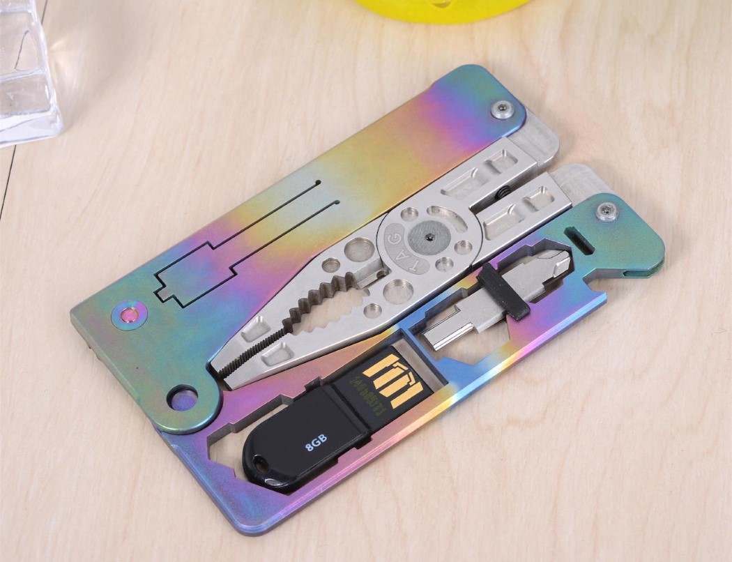
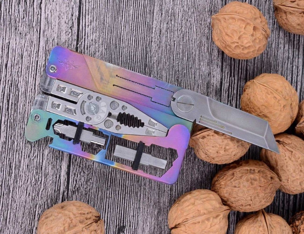
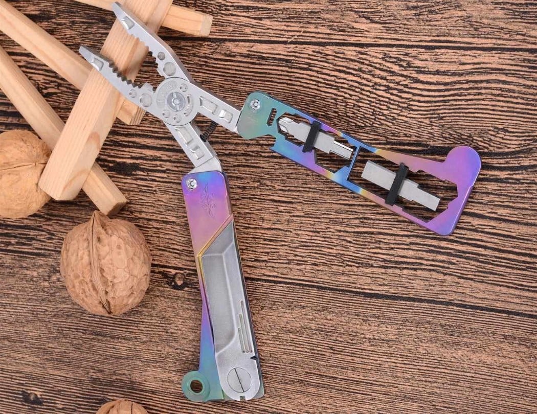
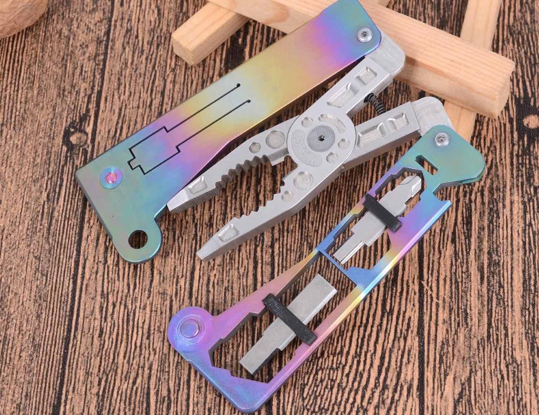
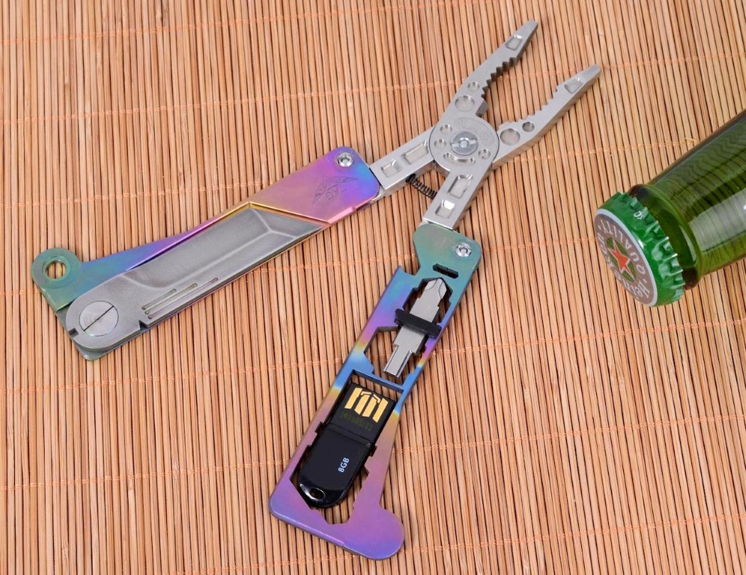
| Who knew cards could be this versatile?! Posted: 14 Mar 2018 12:00 PM PDT You don’t need to have your bicycle fall apart on the highway for you to realize you could do with a compact multi-tool on you. However, that moment sparked something in Alexander Barak. The result of it was the Tag Supra, a card-shaped, card-sized piece of metal that managed to fit as many as 14 tools into one singular form. Made out of titanium, the Supra manages to stay thin enough to fit into your wallet. When closed, it takes the shape of a card that you can slide into most wallets, and when opened, can be used as a plier. It even comes with its own stainless steel blade, wire cutter, bottle opener, five metric wrenches, Phillips/Allen/Hex head screwdrivers, and to bring a touch of modernity to it all, a USB drive too! Its titanium construction allows it to be incredibly thin and surprisingly light (weighing just close to 60gms), letting you carry it anywhere without even realizing you’ve got a toolbox on you. Plus, I’m just absolutely digging that insane petroleum rainbow finish! Designer: Alexander Barak |
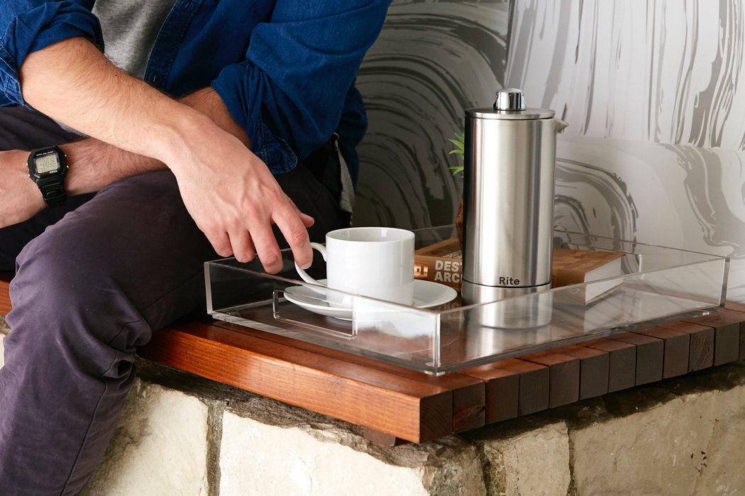
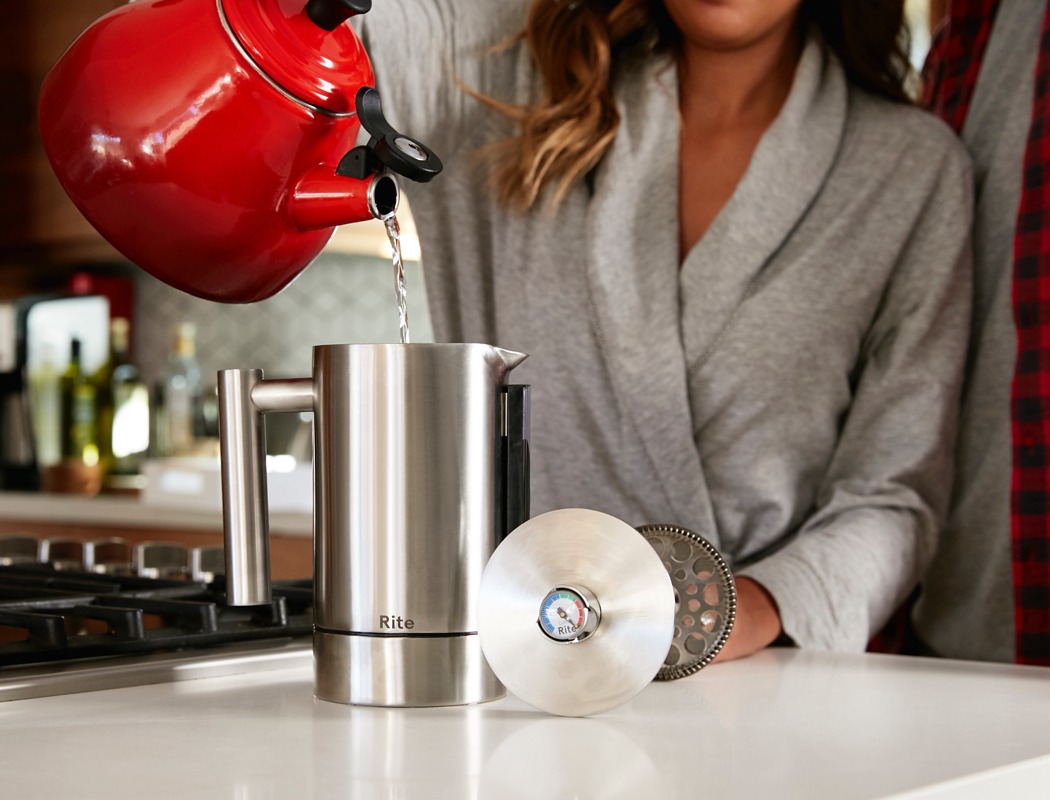
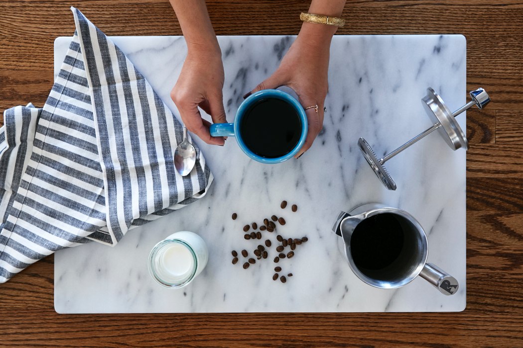
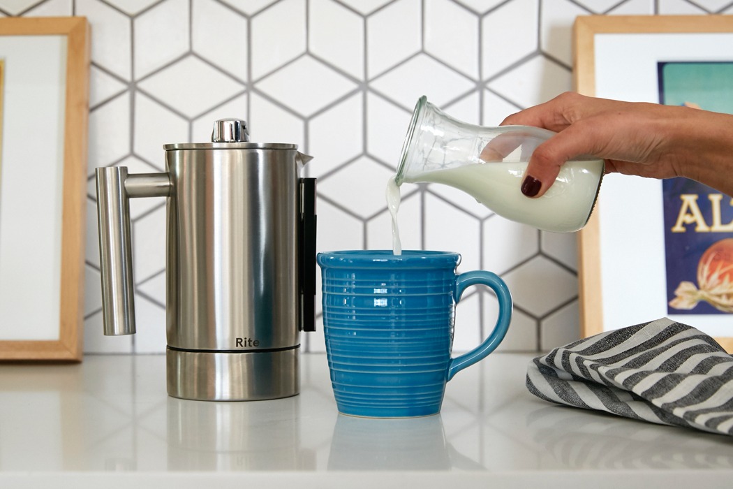
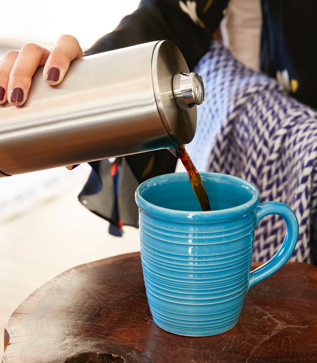
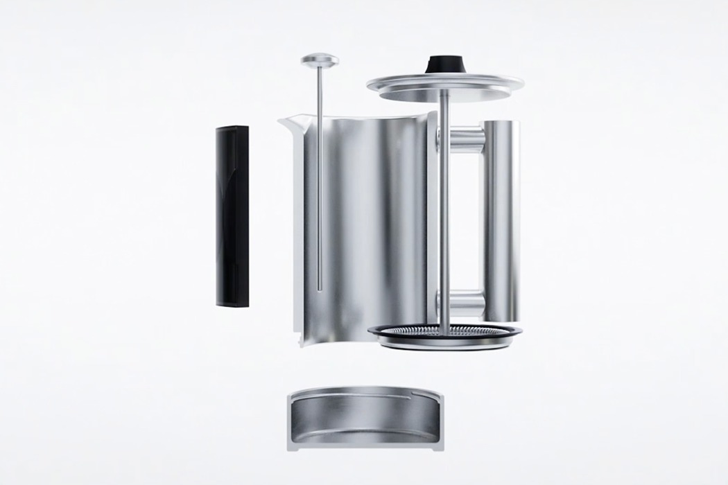
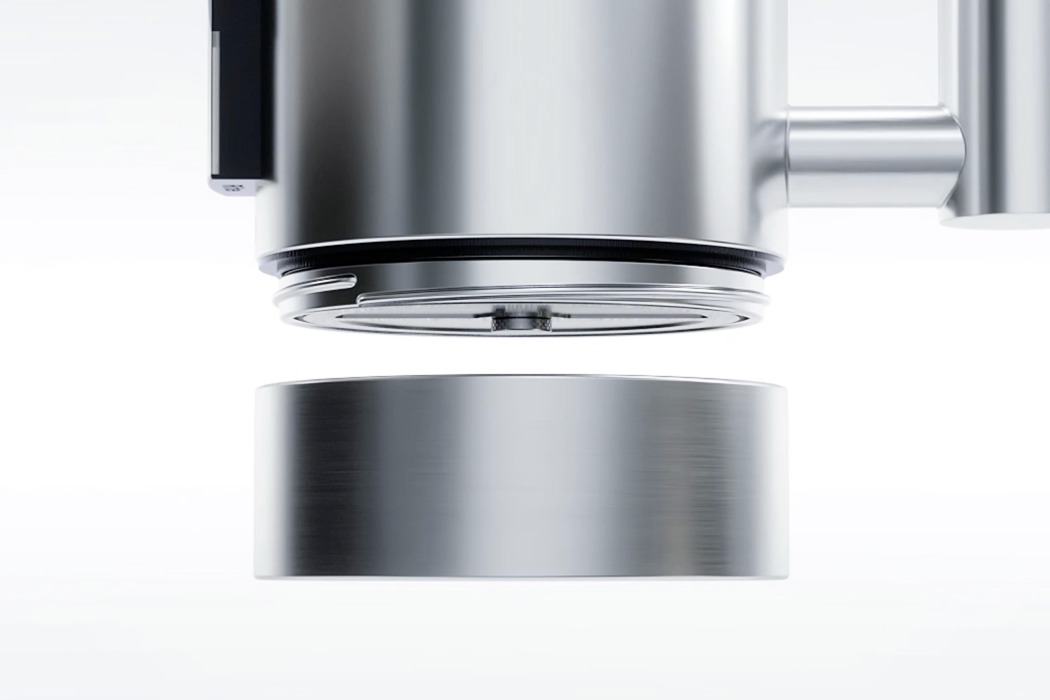
| Posted: 14 Mar 2018 10:18 AM PDT Coffee is like gasoline for humans, only it costs about 5 times as much from coffee joints! That being said, it’s no wonder more people are heading back into their own kitchens for a good old-fashioned homebrew. If French press is your style, look no further than the Rite Press. While it functions just like a traditional French press, its design features a twist that makes it much easier to clean. While the standard press is annoying to clean, the Rite Press has a patented removable bottom section that twists off. After you’ve pushed down the grounds and enjoyed your coffee, simply untwist the bottom and rinse it out for minimal cleanup that takes less than a minute. Because timing is everything, the Rite Press also features a magnetic hourglass that counts down the perfect brewing duration so you get the perfect cup each time! Designer: Owen Read
Integrated Thermometer Custom designed and manufactured thermometer has a simple Blue, Green, Red scale. Blue is too cold and Red is too hot. The Green zone is centered at 200 degrees, which is the optimal temperature for a great cup of coffee. The Rite thermometer lives in the shaft of the filter so it’s easy to use and is always on hand.
Built-in Hourglass Timing is everything, especially in a coffee press. Both under- and over-brewing lead to bad-tasting coffee. Our built-in and simple to use hourglass is set for precisely 3 min and 30 seconds. When the sand is done flowing, it’s time to press down the plunger and enjoy an amazing cup. The Rite timer is magnetically attached to the Rite Press.
Patented Removable Bottom French Press cleanup is notoriously annoying. We’ve solved that issue with our patented removable bottom, allowing you to conserve energy, water, and time.
|
| Greek architecture or underwater energy harvester?! Posted: 14 Mar 2018 06:00 AM PDT
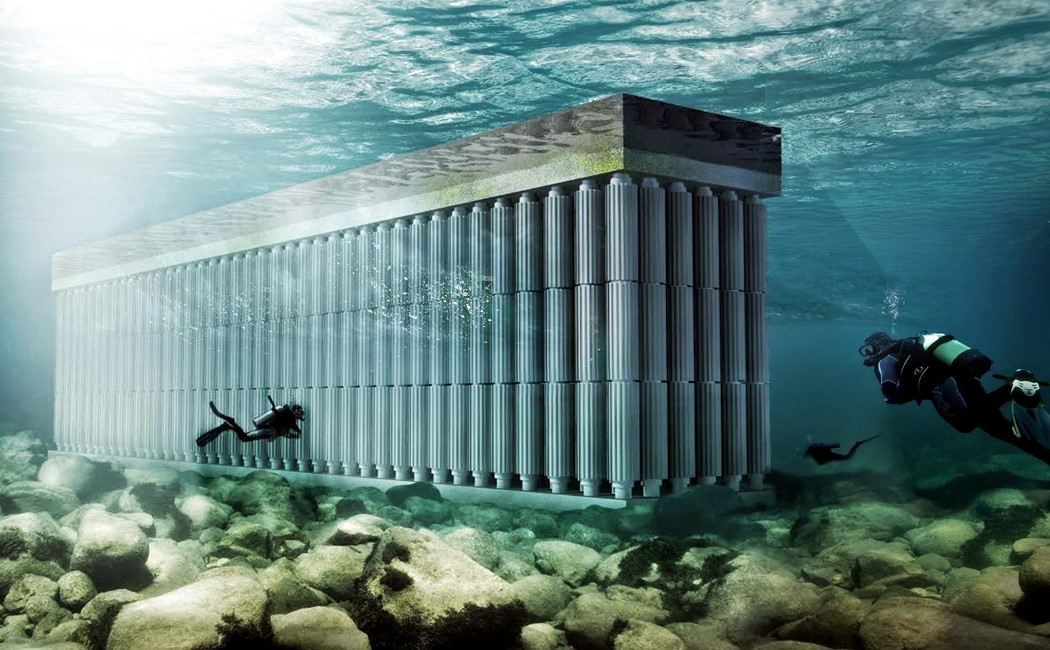
Neither have we discovered Atlantis, nor has the Parthenon sunk yet! This is the Parthenon Seawall, a structure designed by Waterstudio led by Netherlands based Architect Koen Olthius, inspired by classical Greek architecture. Designed to resemble the iconic temple of Athena, the Parthenon Seawall was created to harness tidal energy, turning water current into usable current (get it?)! It employs the familiar stacked pyramid structure with each pyramid being made to house three turbines (that rotate in alternate directions). The flow of water turns the turbines, and the energy generated is stored in its upper concrete platform. It’s alternate rotating pattern also helps it do something rather important. The Parthenon Seawall can also break currents, preventing large waves and tides from damaging coastlines. The alternate rotations disrupt the water flow, becoming a protective barrier against damage caused to vulnerable coastlines, harbors, or riverbanks. The Parthenon Seawall can be placed along coastlines to not only protect them but also harness energy in the process. Its upper surface can be used as a riverfront too, creating a space for greenery, and even human recreation! Ticks all the boxes, doesn’t it?! Designer: Koen Olthuis & Waterstudio
|
| The Wallet that’s Inspired by Architecture Posted: 14 Mar 2018 05:05 AM PDT UPDATE: less than 72 hours left, grab yours now! The beauty of art and design is their ability to inspire and spawn new creations born from old, like a phoenix rebirthing. Now if you ever thought that wallet design could take influences from architecture, it would sound outwardly absurd, but just look at the RIN Wallet and you’ll see how design influences carry seamlessly from one form/discipline to another. The wallet comes with a textured exterior who’s free-flowing organic patterns aren’t just great to hold, they even create a slight bit of friction in one’s pocket, allowing you to feel as the wallet slips in or out. The visual and tactile detail, therefore, adds not just to the beauty of the wallet, but also becomes a feature integral to safety. The organic pattern draws inspiration from textured walls often used in modern interiors and exteriors, creating a play of light that gives it a flavor of contemporary architecture, and in turn creates something absolutely new. Open the wallet and you’re greeted with a criss-cross of lines that give the wallet a third dimension. Looking like a two-point perspective grid, the lines are stamped into the leather, adding texture to the wallet that feels more real and unique than the grains of the leather. It gives the wallet a sense of depth as the human eyes perceive it as a three-dimensional plane. This one-of-a-kind aesthetic is achieved by melding together three types of leather and the craftsmanship behind them. The textured exterior comes made in EPI leather while the diagonal lines on the inside are heat pressed into supple calf leather. Binding these two together is the third, Italian Leather that lends a traditional touch to the wallet. On the inside, the RIN is lined with polyester and even comes with special RFID pockets for your cards. The bifold can hold 8 or more notes and cards, and stands at a sleek 1cm thick. Ensuring your wallet always remains sleek and light, the RIN even comes with a separate coin barrel that holds your metal currency. The barrel can be fastened to your belt hoop thanks to a carabiner clip, allowing you to have change ready when you need it, but without adding unnecessary bulk to your back pocket or slowly damaging the shape of the wallet. The RIN comes in four distinctive color combinations that add to its modern flavor. Designed to be not just useful, but also memorable, the RIN takes inspiration from an unusual place, but displays its execution with sheer ease, making it a wallet that looks absolutely a class apart, but only because it literally is! Designer: Chris Paragas Click here to Buy Now: $42.00 Each wallet is meticulously hand-painted with a special wax coating to prevent edges from fraying with long term use. Other bi-fold wallets accommodate more cards by stacking layers of leather, thus making the wallet unnecessarily bulky. By integrating a card slot to the main leather panel, we are able to cut down the use of leather by 70%, while still allowing the user to organize and hold just as much cards as any traditional bi-fold design. With the RIN bi-fold, we combined 3 distinct leathers: the classic and natural finish of imported Italian leather, the free-flowing contoured design of epi-leather and the geometric heat-pressed calfskin to conceive the perfect distribution of a minimalist, yet complex aesthetic. To protect your RFID enabled credit cards, we embedded a metal fabric within the outer leather panel of the wallet. Both compartments can be utilized to hold RFID enabled credit cards, movie tickets, receipts or any other personal belongings. Click here to Buy Now: $42.00 |
| Posted: 14 Mar 2018 12:00 AM PDT
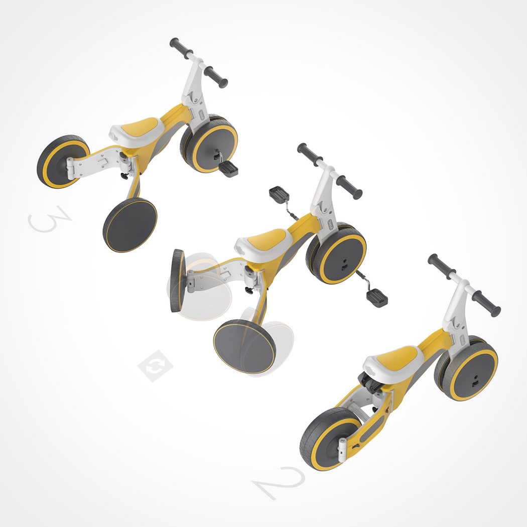
Is it a bike? A trike? A scooter? The TF1 is actually all three! This transforming kids trike/bike hybrid instantly transitions from a three-wheeled design that’s perfect for training into a two wheel bike. Its pedals can also be removed so it becomes a push scooter little ones can ride. Not only does it adapt as children’s skill evolve, it grows with them thanks to an adjustable saddle and handlebars. For added safety during training, its rear wheels rotate inward and outward to lock it in place and keep it from rolling uncontrollably. Designer: 700Kids
|
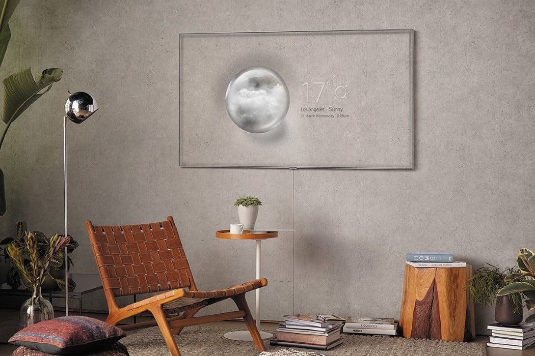
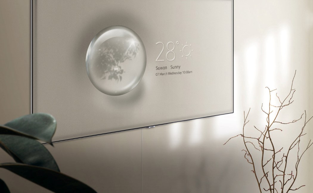
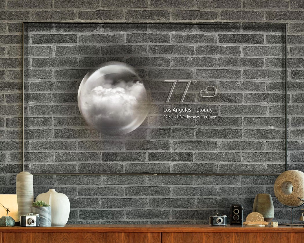
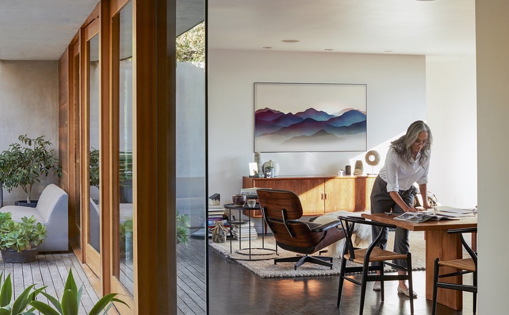
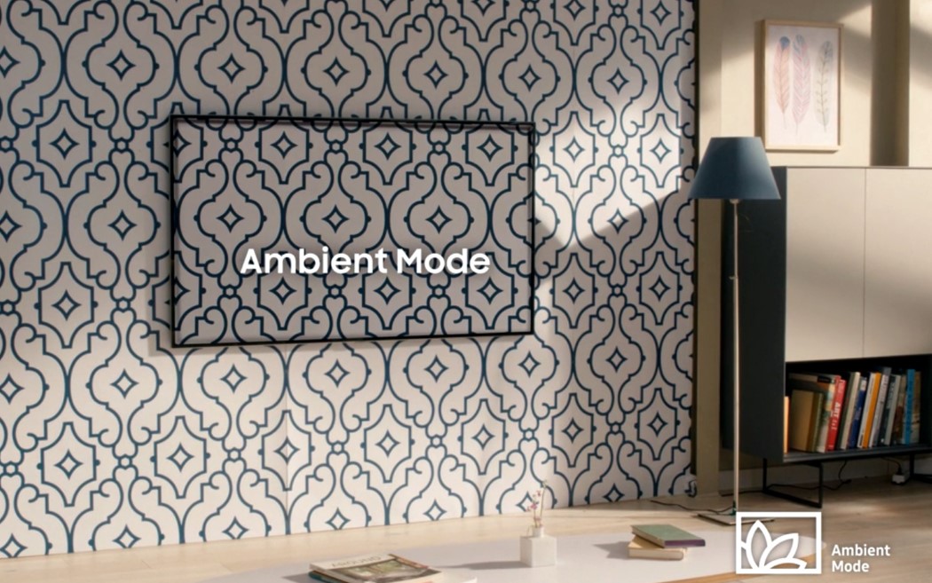
| Samsung’s new TV uses algorithms to turn invisible! Posted: 13 Mar 2018 04:00 PM PDT Samsung’s been all about making the television pretty both when switched on as well as off. 2016’s Serif TV may have kickstarted the movement, and I’ve been pretty vocal about how much I hated it (a subjective opinion), but what Samsung does now, two years later, is nothing short of remarkable. Its latest series of QLED TVs come with what’s known as an ambient mode, that through the power of image capturing and incredible algorithms, turns the TV invisible, barring the beautiful thin bezel that you barely notice! The Samsung TV’s Ambient mode is pretty marvelous since it does a rather believable job of making your television seem like glass. Relying on the QLEDs to produce near-real-life color reproduction, the TV can replicate the color of the wall behind, and it even comes with a weather indicator and clock that seem to float off the surface of the wall (cleverly even applying a calculated drop shadow effect on the visuals as well as the TV’s bezel, taking into account the tv’s thickness). What you’re left with is a TV that literally looks like a black-bordered piece of glass. Have a patterned/textured wall behind your TV? Never mind! Samsung’s Smart Things app allows you to click a picture of your television and its background with your phone and the television’s AI runs algorithms to generate a map that calculates AND aligns the pattern behind the TV. It’s just magical how the TV’s colors and even brightness match real-life to make it seem like the screen you’re looking at isn’t a cluster of pixels, but a transparent material. You’ve got the option to choose between weather and time displays, a seemingly transparent landscape painting, and the option to display your photos as a collage of wall-mounted pictures. The results in the video look incredible for sure, and that algorithm is nothing short of magical. I especially love the designers’ attention to detail by adding shadows behind the bezel too, uplifting the experience and completing the illusion. I’ll be waiting to see the TV for myself though, although on the basis of the images I have to say it’s miles ahead of that hideous Serif-esque monstrosity they called a television! Designer: Samsung
|
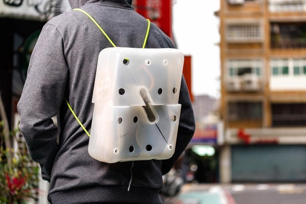
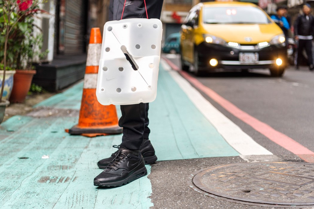
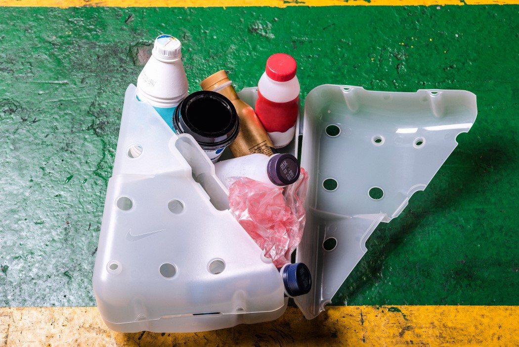
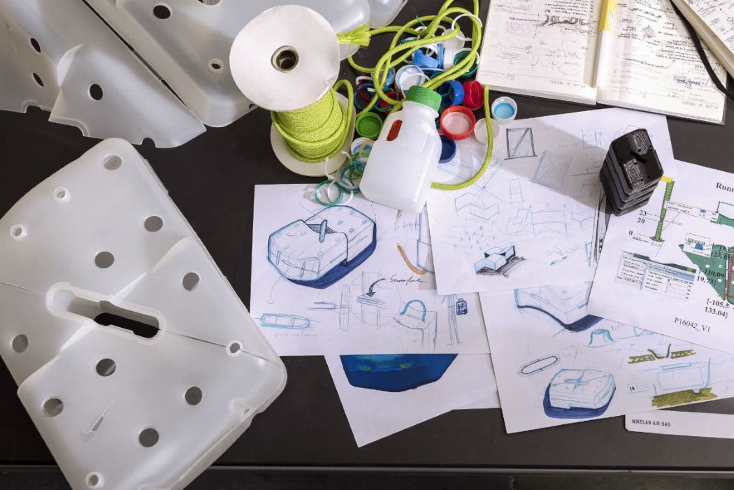
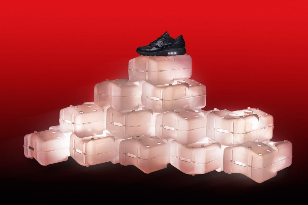
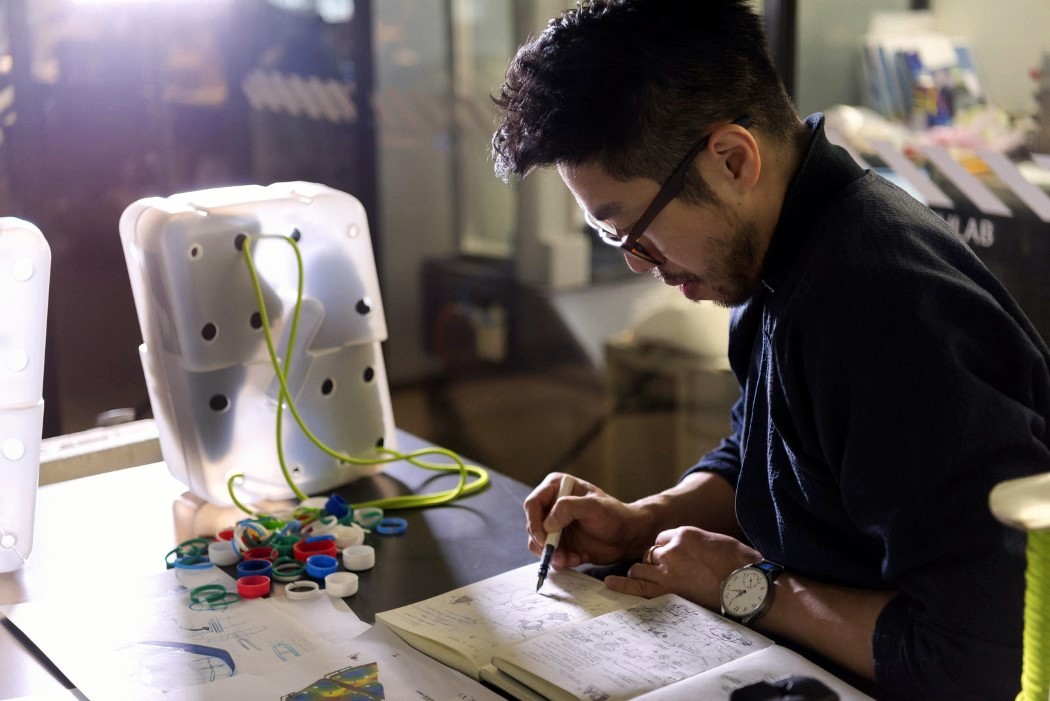
| Nike’s shoe box turns pollution into solution Posted: 13 Mar 2018 02:15 PM PDT Nike collaborated with Taiwanese architect and engineer Arthur Huang to redesign the Air Max shoe-box, making it sustainable and responsible. For Arthur, the Nike Air demonstrates a perfect balance between performance and sustainability. “It cushions while at the same time reducing material usage.” Reflecting the need to work with material very cleverly and judiciously, Arthur’s new shoe box design for the Air Max turns “pollution into solution” by being recycled completely out of milk containers and coffee lids. The HDPE box comes with a stackable structure and is much more memorable and reusable than the traditional cardboard box. It comes with a dual lid structure that lets you store both shoes independently. Holes in the packaging allow you to get a glimpse of the product before purchase, and even can be used to turn the box into a backpack or a handbag by simply introducing ropes. The new shoe-box in many ways pays tribute to Nike’s no-wastage Flyknit technology by heavily minimizing its own footprint. Additionally, it’s designed specifically for the NikeLab Air Max 1 Royal which too is made from recycled materials. Designer: Arthur Huang (Miniwiz) for NikeLab
|
| You are subscribed to email updates from Yanko Design. To stop receiving these emails, you may unsubscribe now. | Email delivery powered by Google |
| Google, 1600 Amphitheatre Parkway, Mountain View, CA 94043, United States | |
