Yanko Design - Form Beyond Function |  |
- Lighter better faster stronger!
- This Smart Surface Is The Last Touchpad You’ll Need
- How this Adidas concept shoe redefines design-for-performance
- This Ain’t Your Mama’s Pressure Cooker
- A Stool with a Headdress
- The Airpods. Now classier than ever!
- This router looks like it’s invading earth
| Lighter better faster stronger! Posted: 21 Mar 2018 12:13 PM PDT
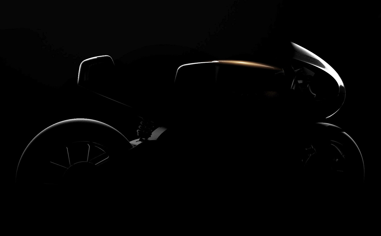
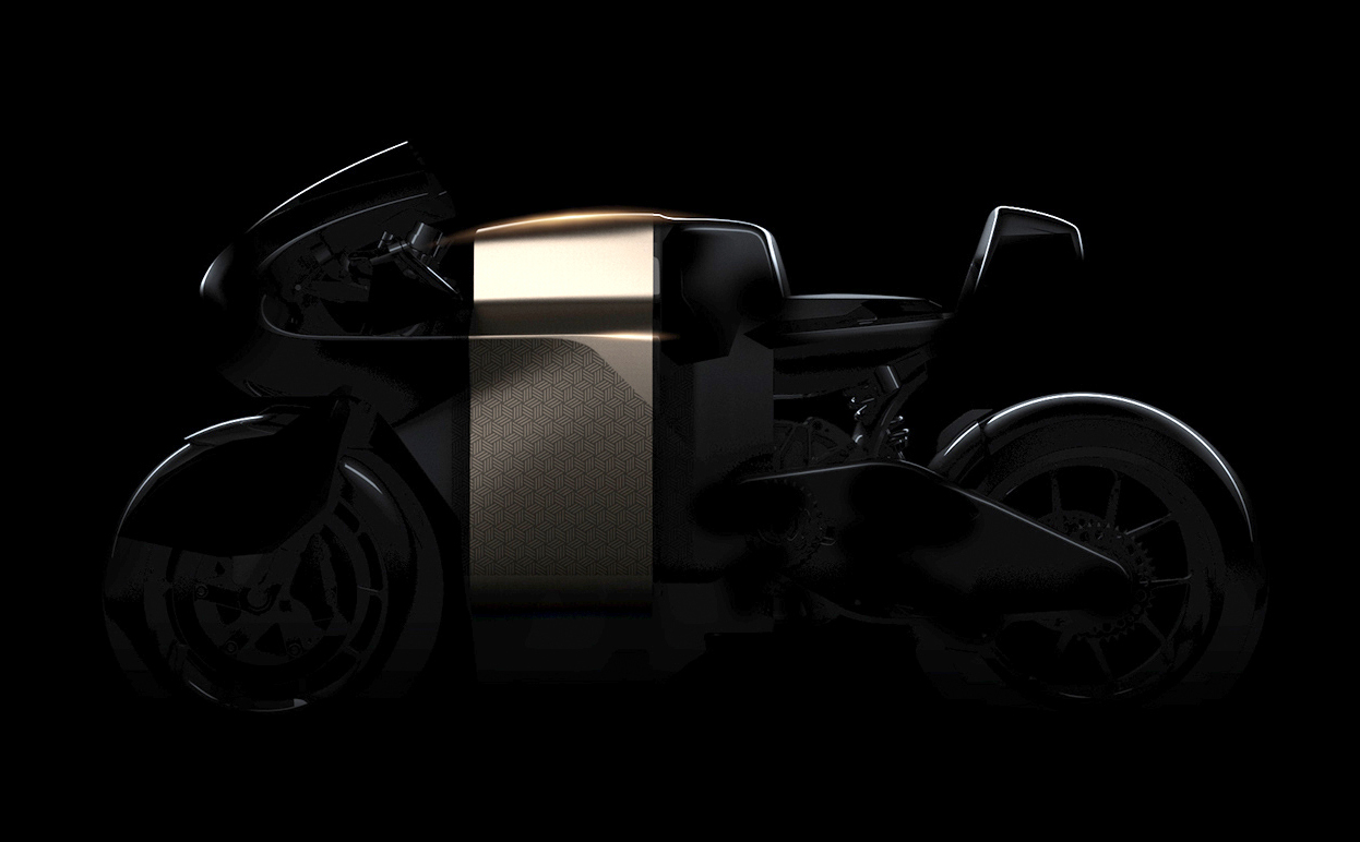
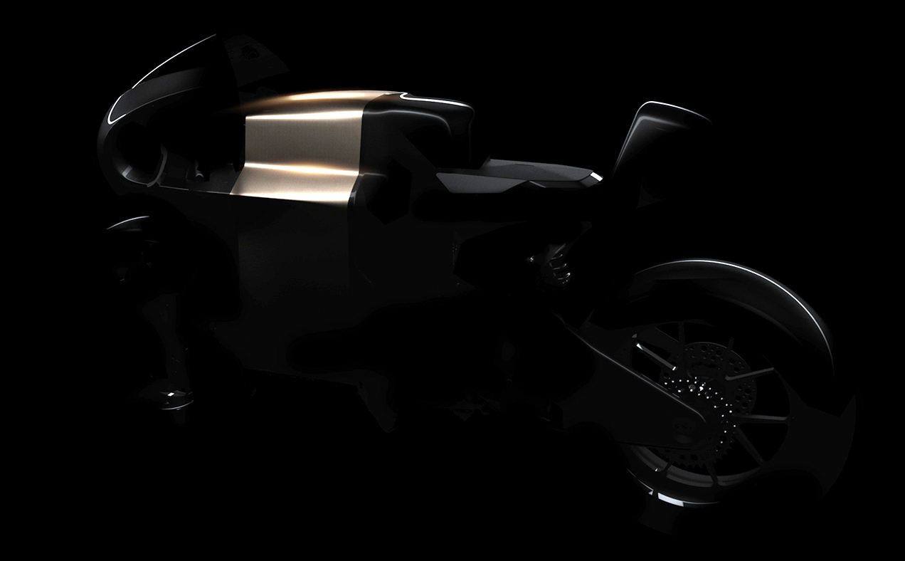
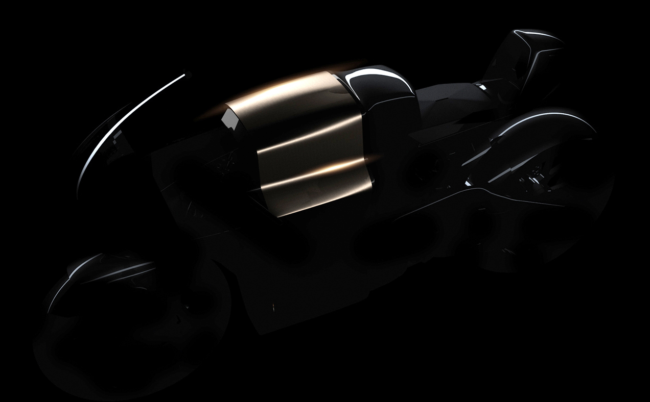
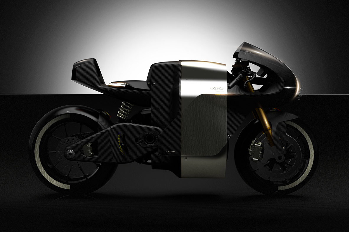
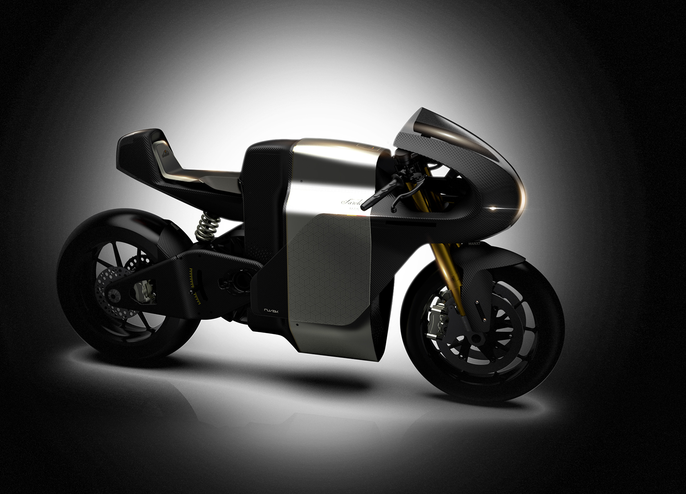
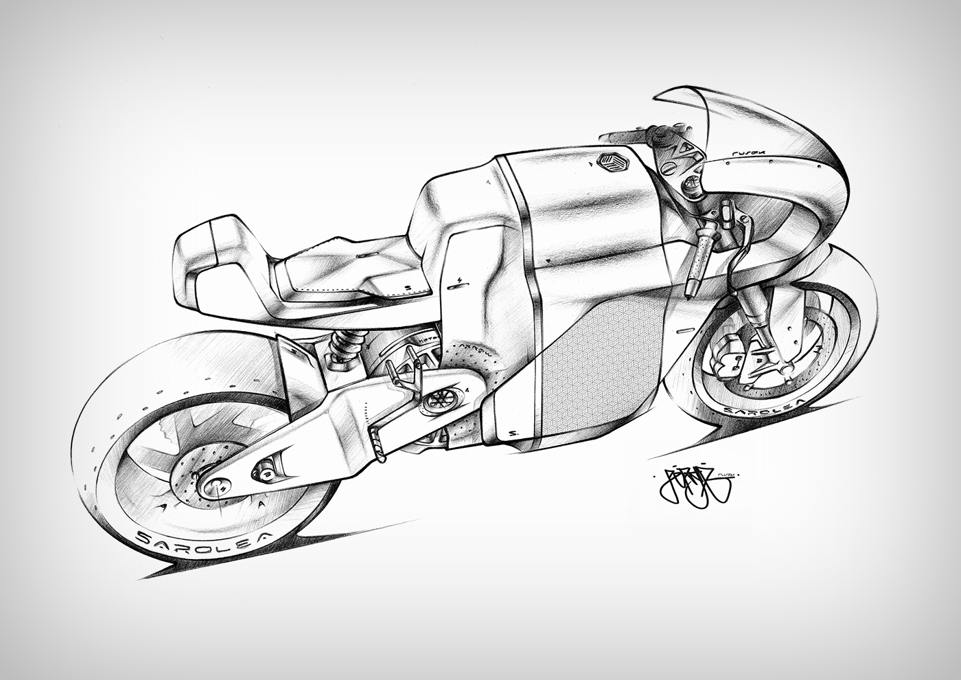
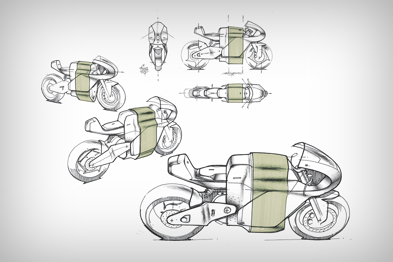
No, I’m not singing a song composed by iconic French electronic duo Daft Punk, I’m describing the Saroléa ManX 7, designed by France-based Tryptik Studio and Serge Rosak. The ManX 7, for Saroléa aims to be what the brand describes as an “electricon”, or a symbol of electric motorbike perfection. The ManX 7’s design was made to push boundaries in performance as well as cater to Saroléa’s obsession with having the highest performance to weight ratio. The resulting bike boasts of carbon-fiber fairings, a Plexiglas body, and even weight-cutting by using lightweight titanium and aluminum screws and bolts. Even the wheels come in a carbon fiber variant! The Belgian manufacturer says, “Saroléa’s advanced electric drivetrain delivers exhilarating performance. Unlike a gasoline internal combustion engine with hundreds of moving parts, Saroléa electric motors have only one moving piece: the rotor. As a result, Saroléa MANX7 acceleration is instantaneous, silent and smooth: Twist the throttle and in as little as 3.0 seconds it’s traveling at 100 km per hour, without hesitation, and without a drop of gasoline.” The aesthetic of the 204 horsepower electric beast may seem bulky, given the way the body clads the bike, but it uses color distribution to cut the weight. Look at the renders above and below, at the way the bike shows off only its highlights to appear incredibly sleek, streamlined and desirable. Scroll further down to view the body, that looks stunning in black, and even comes with a golden belt, that breaks the bike’s mass into three groups. The choice of color, the vertical “straightforward” division of mass, and its slick look make you take the bike seriously, because the ManX 7, like its name suggests, isn’t for boys… Designer: Serge Rosak and Tryptik Design for Saroléa
|
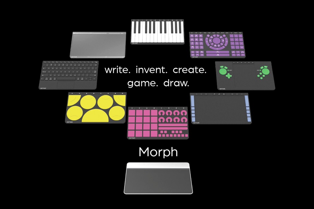
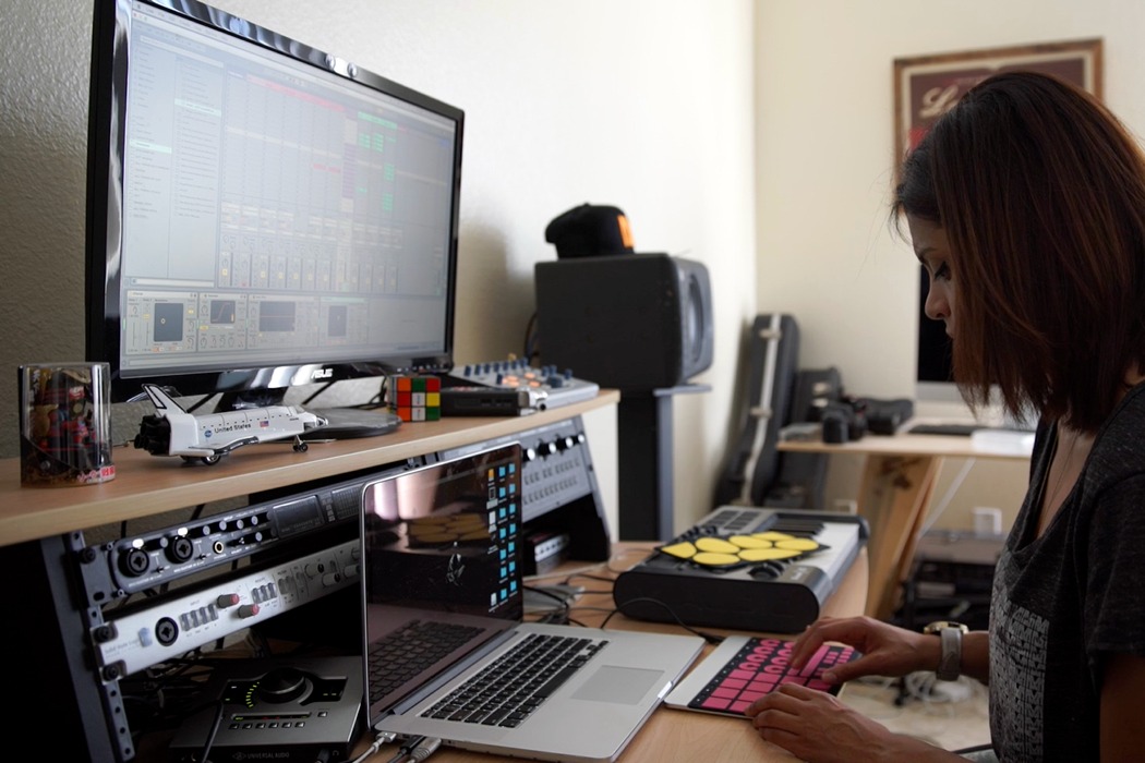
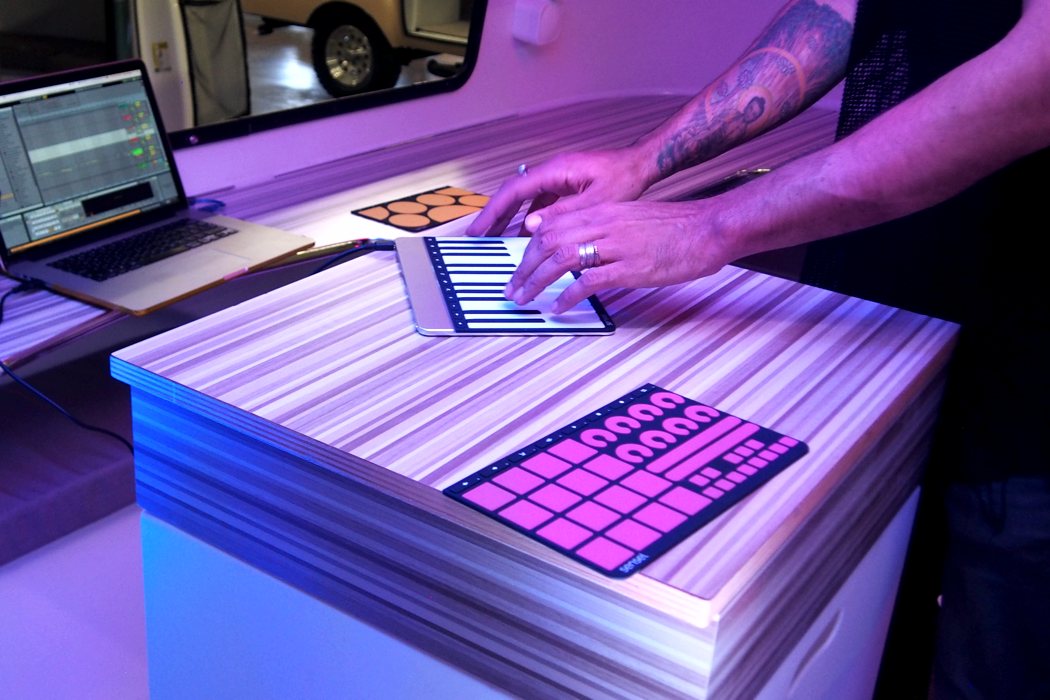
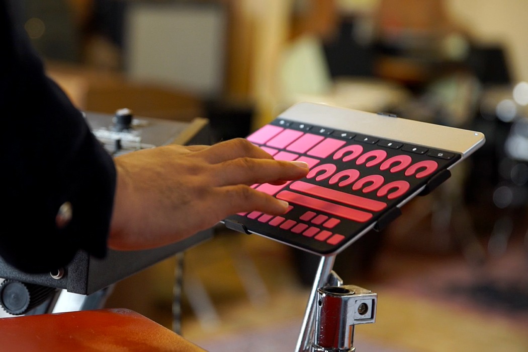
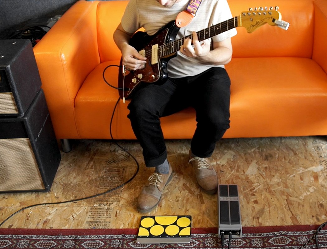
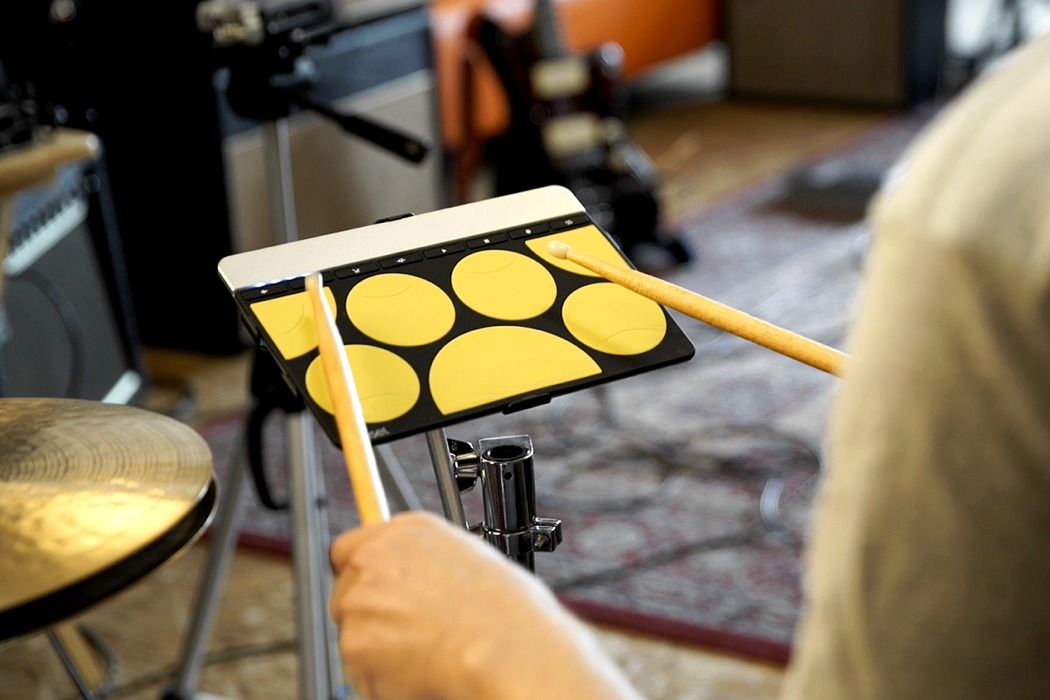
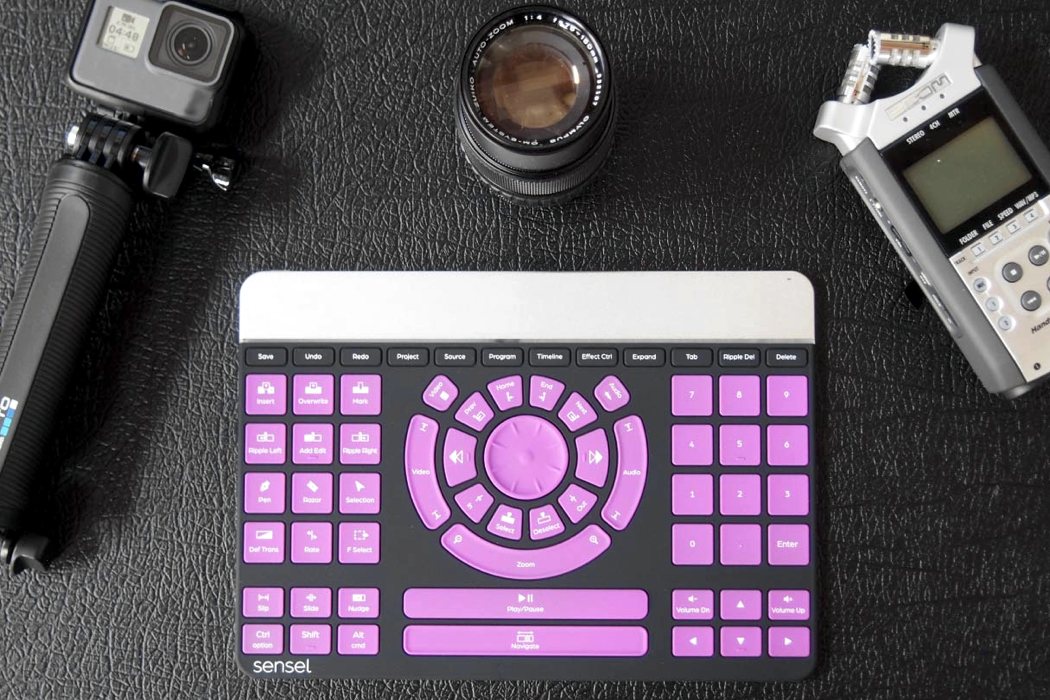
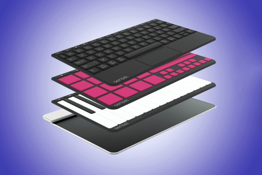
| This Smart Surface Is The Last Touchpad You’ll Need Posted: 21 Mar 2018 06:30 AM PDT Very rarely do you see one auxiliary device be so universal. A MIDI keyboard? That’s for music. A DJ controller? That’s for deejaying. A Wacom, that’s for artists. Aside from a desktop/laptop or a tablet, there’s no one single device that’s universally used by all the aforementioned professions… and the Sensel Morph is here to show us an alternative path. A path where one device can serve multiple masters with the efficiency that makes it a jack of all trades. A problem I’ve faced myself as a designer, writer, and a meddling musician, is the lack of appropriate tools. I’ve always wanted to dabble with deejaying but I couldn’t get myself to fork out a grand for a controller. I’ve even liked the idea of messing with virtual instruments, but playing drums on a QWERTY keyboard seems like killing the art. That’s exactly what the Sensel Morph was designed to encourage. To experiment as an artist without shelling the big bucks for the appropriate gear, or perform as a professional without needing ten sets of tools for the ten different jobs you do. Humans tend to multi-task and the Sensel Morph, like humans, knows how to too. At the heart of the Morph is a touch surface with over 20,000 pressure points. Incredibly accurate and extremely sensitive, the pad can track X and Y, sliding/gliding movements, pressure, and velocity. However, more than just a regular touch surface, the Morph comes with a series of snappable templates that attach to the touch surface via magnets. These templates turn the Morph into various things from your everyday qwerty keyboard, to a piano, drum-pad, MIDI controller, drawing tablet, multimedia controller to even a game controller for when you’re too tired of work and you want to play. The Morph immediately recognizes the templates that snap onto it (via the magnet layout), instantly transforming your gear while making sure you only really need one piece of tech on your workspace to do pretty much anything. It even comes with a blank “Inventor” template that lets you craft your own controller. The touch surface, while incredibly sensitive, is also just as rugged. From finger taps and slides to being beaten by drumsticks, the Morph can take it all while giving you precision and performance you’d expect from professional gear. It pairs with a companion desktop app that lets you adjust/tweak certain features and set your own controls. Made to be incredibly slim, the Morph can slip into any backpack and be carried around… and designed to break borders, the gadget can be used with a MicroUSB cable or even wirelessly via Bluetooth! What I really love about the Sensel Morph is the place it comes from. It encourages an aspect of creatives that not many gadgets do… our need to explore. While every single specialist professional tech gadget encourages you to master one craft, the Morph lets you either master a craft or experiment with many. It’s ideal for a professional who wants functionality and precision, and for the broad-minded, cross-disciplinary creative, who loves honing more than one skill… and then when you’re done with work, you could bust out the game-pad template for a round of PUBG! Designers: Sensel & Frog Design Click here to Buy Now: $299.00 Musicians Don’t press play, play with pressure. Make music naturally with the Morph. Melodies, rhythm, and dynamic control. Portable and powerful: perfect on the go, on the stage, or in the studio. Every Morph comes with a free copy of Arturia Analog Lite. With 17 synthesizers and 500 presets, you’ll be ready to start making the minute you start using the Morph. Artists Grab a pen, pencil, or finger paint like you’re five. With thousands of sensors and thousands of levels of pressure on every contact, you can trace, draw and paint to discover new ways of digital painting and drawing. Writers Still the king of input, the writing overlays keep you in touch. True to Morph’s spirit, you have options. Traditionalist can grab the QWERTY overlay. Want to type faster? Try out the DVORAK overlay. Francophiles, drop on the AZERTY overlay. Video and Audio Editors There’s more to telling your story than pointing a camera: give your videos a professional edge with a proper tool. Plenty of keys and macros with a slick jog wheel cut your edit time down and make your videos shine. Adaptable for audio and photo edits too. Click here to Buy Now: $299.00 |
| How this Adidas concept shoe redefines design-for-performance Posted: 21 Mar 2018 06:08 AM PDT
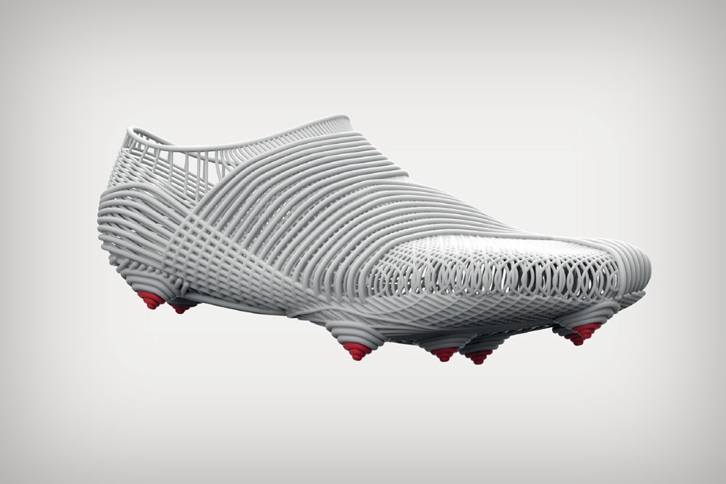
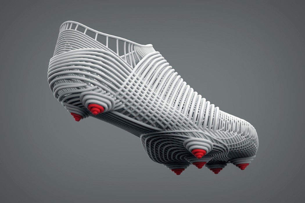
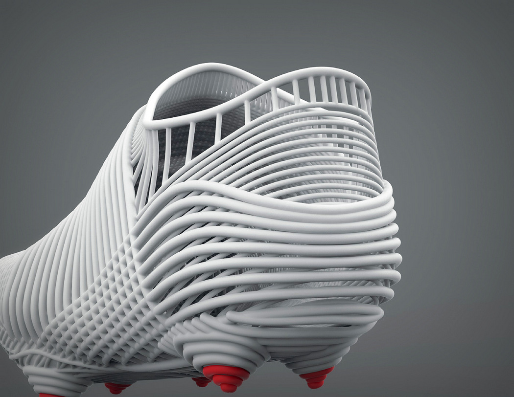
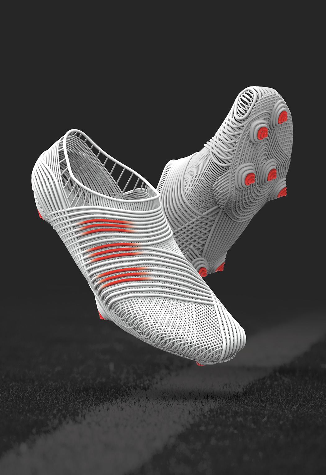
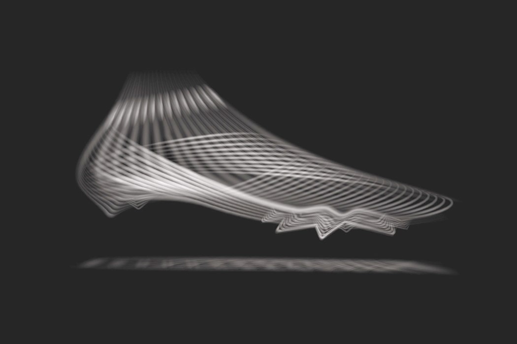
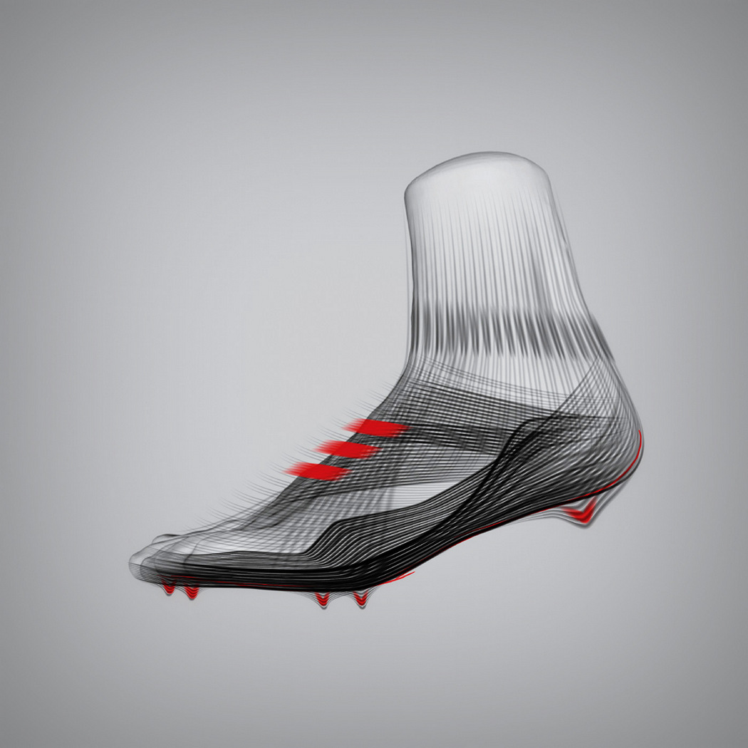
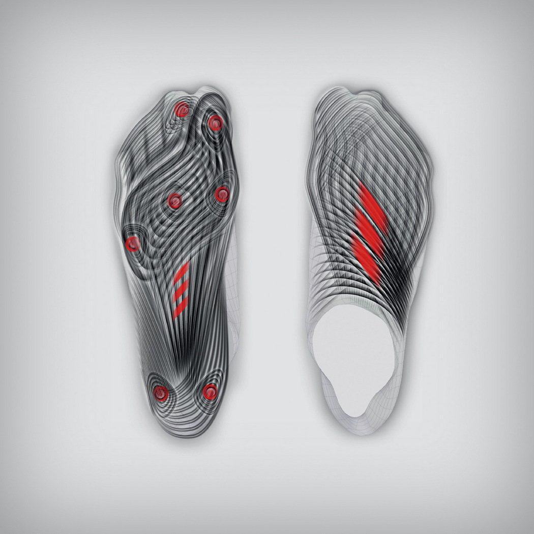
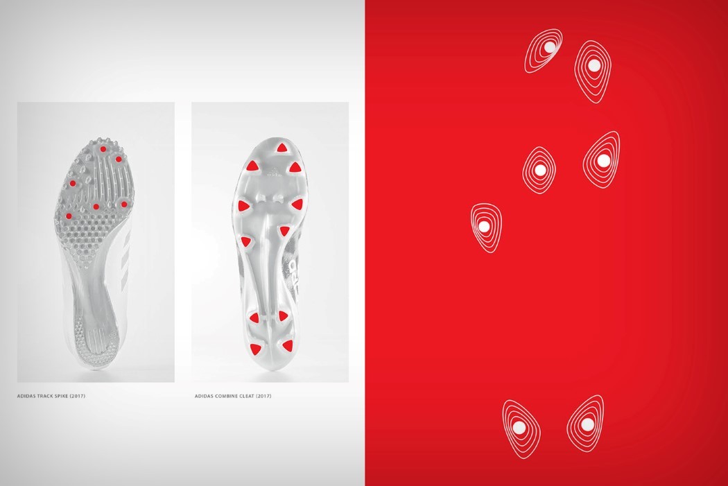
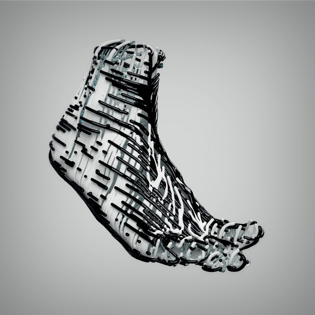
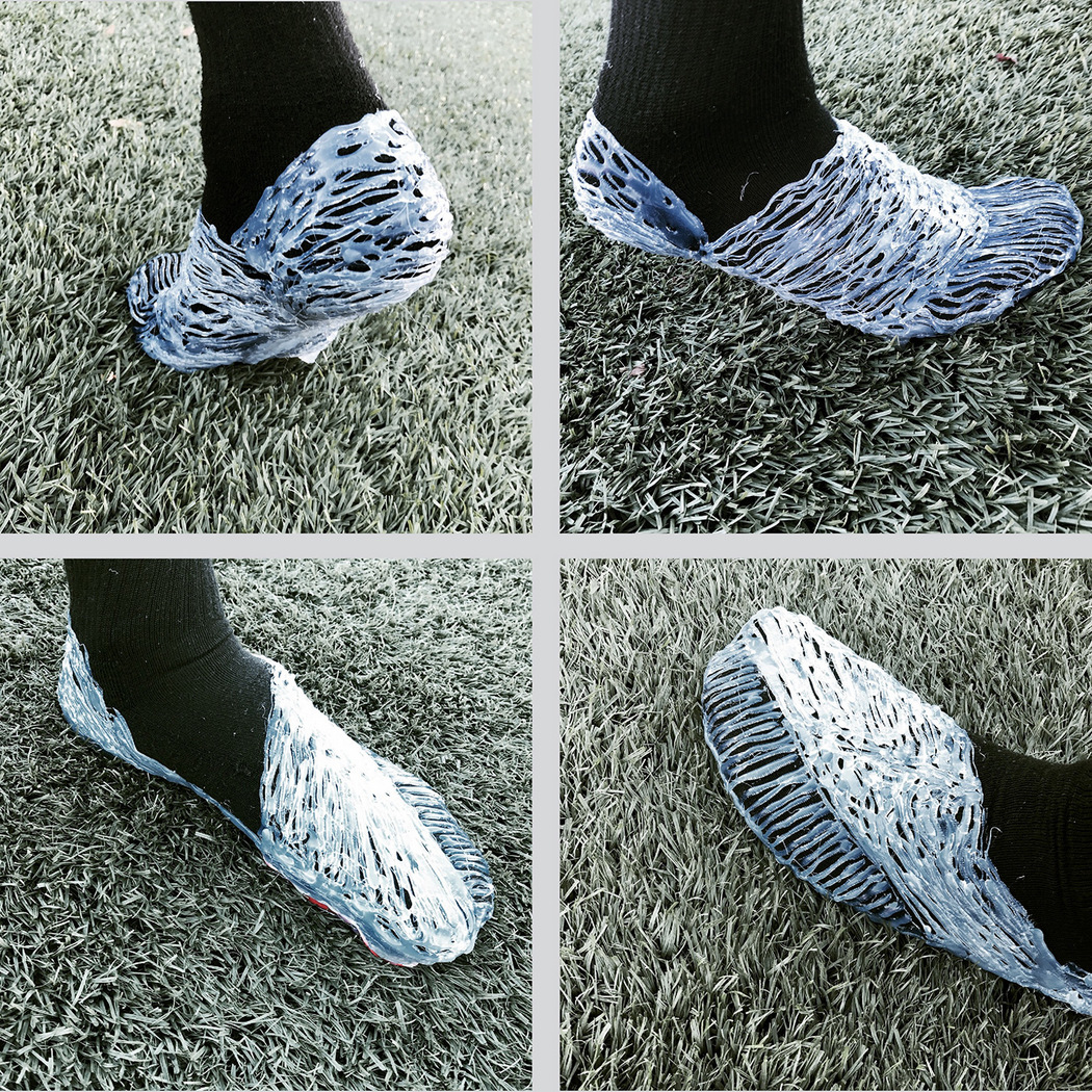
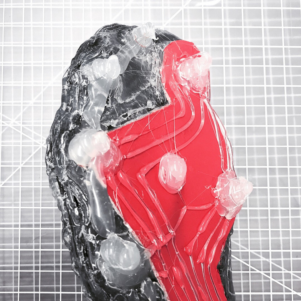
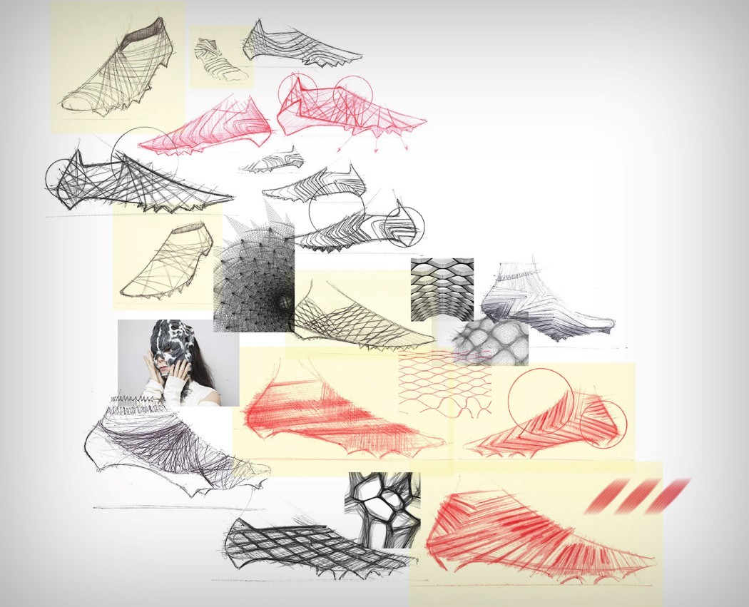
What looks like an incomplete wireframe may just be the most efficiently designed and unique looking running shoe yet. Made for the 40-yard dash, Daniel Coric’s shoe is completely bespoke, fits like a glove (for your foot), and focuses on delivering on performance by wrapping around your shoe, augmenting its abilities. Taking spike positioning details from Adidas’ Track Spike and Combine Cleat, and taking into account wind flow analysis around the foot, Daniel developed the conceptual Adidas ONE/1. The ONE/1 wraps around your shoe like a second skin, but doesn’t look like one. Designed to be made out of interconnected cylindrical channels, the ONE/1’s design looks like a loosely woven mesh that’s breathable and effective. In fact the cylindrical wraparound makes up the entire shoe. It stretches with ease, guides air around the foot efficiently while minimizing drag, and provides a secure yet spring-like quality, adding to the foot’s performance, making it better. The ONE/1 also looks nothing short of incredible. The aesthetic it explores isn’t just new and unique, it also looks incredibly hard to replicate. Designed around your foot’s 3D scans, and wrapping around them in its spectacular fashion, the ONE/1 may boost your performance, but it’ll definitely boost your confidence! Designer: Daniel Coric
|
| This Ain’t Your Mama’s Pressure Cooker Posted: 21 Mar 2018 05:52 AM PDT
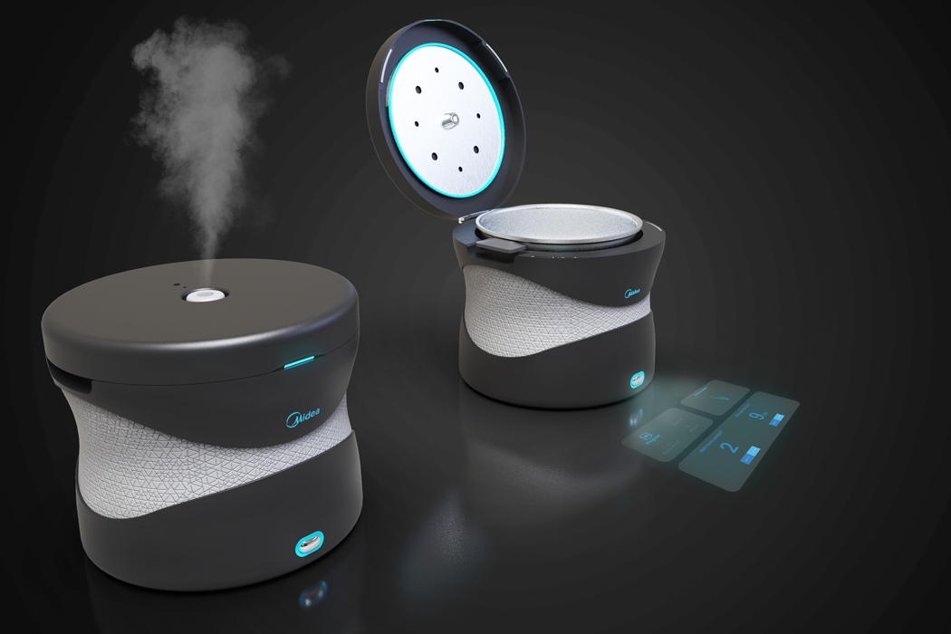
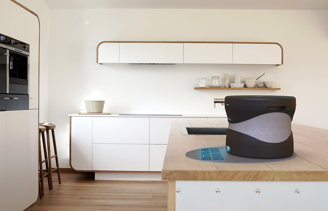
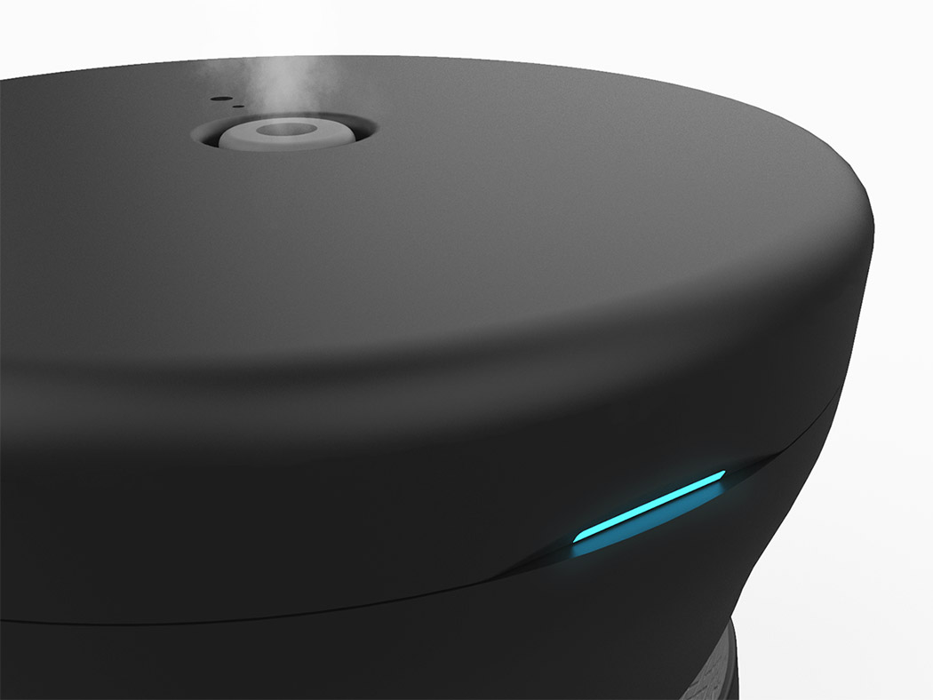
Its reduction leaves little room for a large user interface, so it’s equipped with a holographic UI that displays on any countertop. Here, users can access interactive recipes and controls using simple gestures. What’s more is, you can pressure cook on the run thanks to its modern wireless charging tech that keeps it piping hot even when it’s not directly connected to a power supply! It’s perfect for potluck dinners! Designers: Siri Sofie Andrea & Saurabh Hejib for Midea
A major element in the simplicity of the product is the lack of a traditional locking mechanism found in all the electric pressure cookers of today. Instead, ARKTIS uses electro magnets to keep the lid locked while it’s cooking. Controlled through firewall protected programming, it is safer than any physical locking mechanism. The other features such as the steam vent and safety valves are also controlled electronically, making the product safer and more reliable than ever.
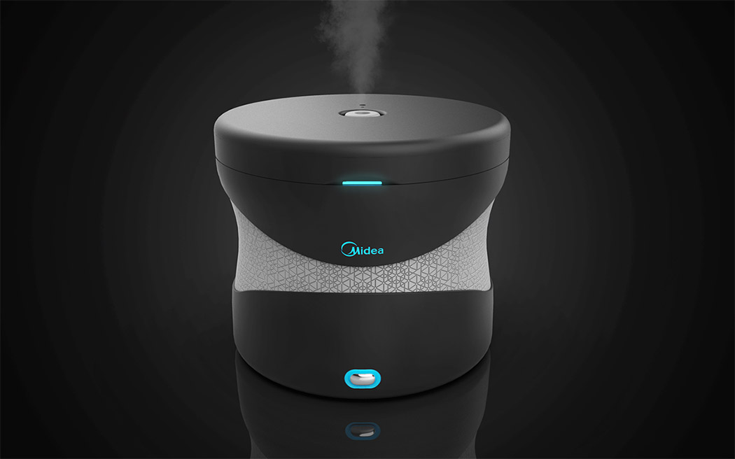
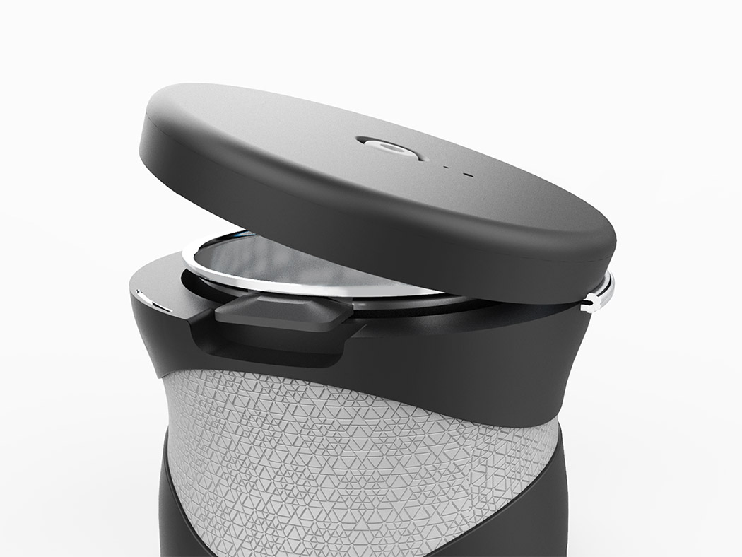
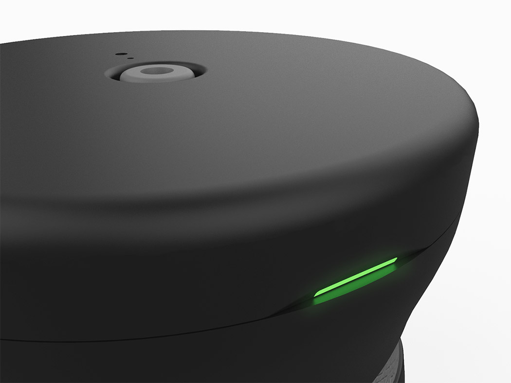
When ARKTIS is in use, the led strip is “Midea blue”, and once the food is cooked, the led strip becomes green, indicating that the food is ready. Then with a simple wave of the hand in front of the led strip, the lid opens up. This happens through the proximity sensors embedded in the strip. The hinge has hydraulic capabilities that allow the lid to pop up.
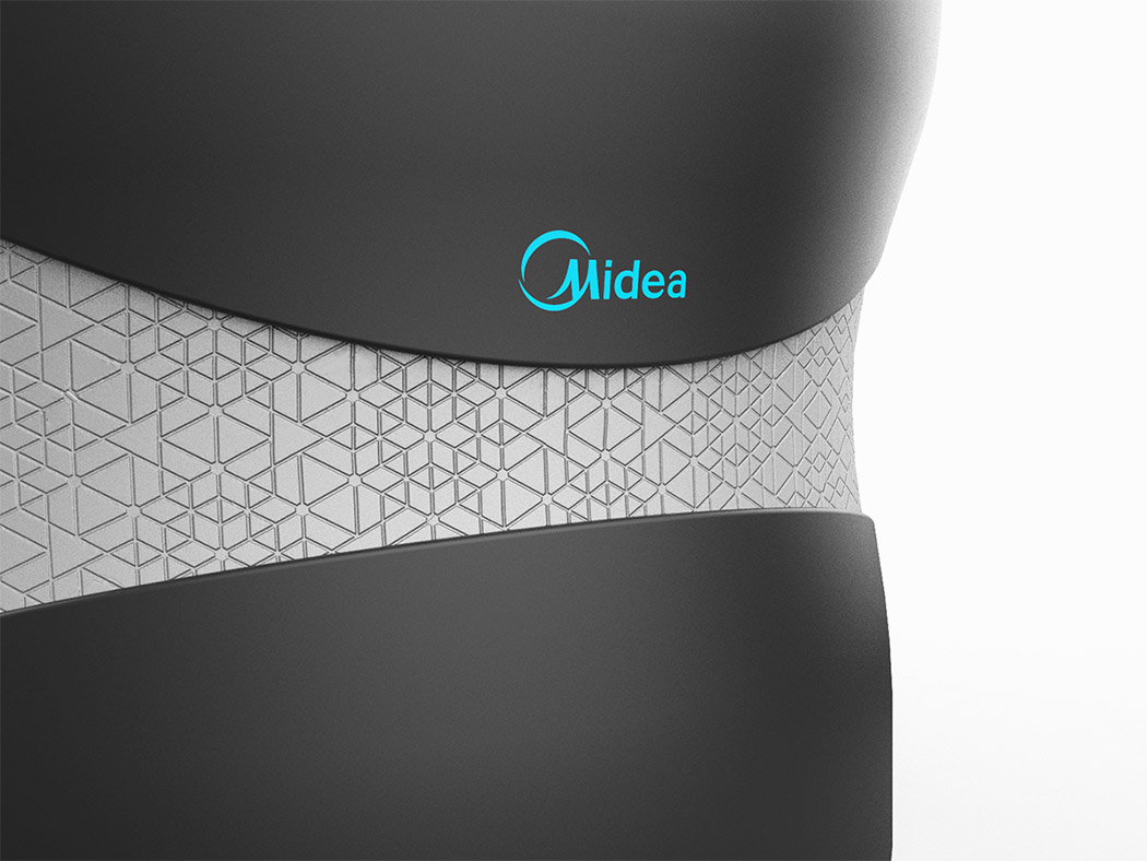
It’s meant to be moved around so you can eat where you want. It has a flushed body design and ergonomic curves and there are no wires as ARKTIS works on wireless electricity which will be standard in the future. The product can be easily carried without the necessity of handles thanks to its embedded rubber grip with a geometric pattern combining elements of the future and the past. |
| Posted: 21 Mar 2018 12:00 AM PDT
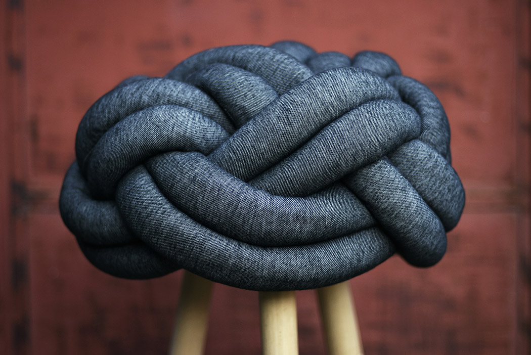
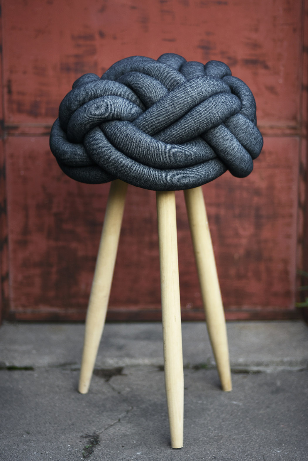
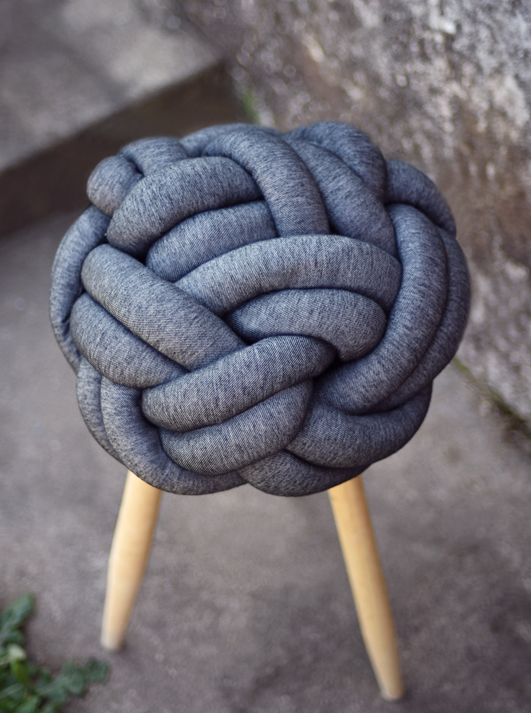
The Turk Head Stool marries a minimal material combination with seemingly complex construction. It takes inspiration from the decorative Turk’s head knot in which a variable number of interwoven strands form a closed loop. While its resemblance is just as artistic, the knot makes for a functional, tight seat with a tad of cushion for comfort! It’s paired with a simplistic, raw wood base consisting of 3 legs for support. This peculiar piece is sure to be a conversation starter in any room. Designer: Mauricio Ercoli
|
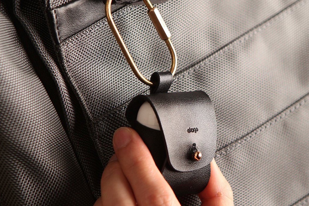
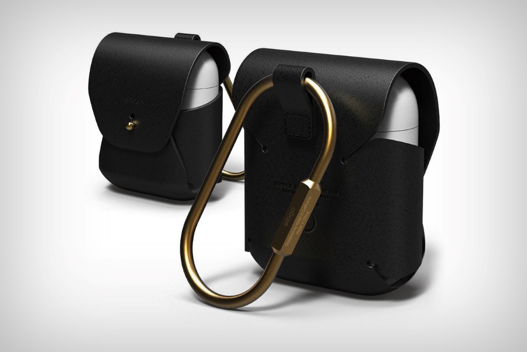
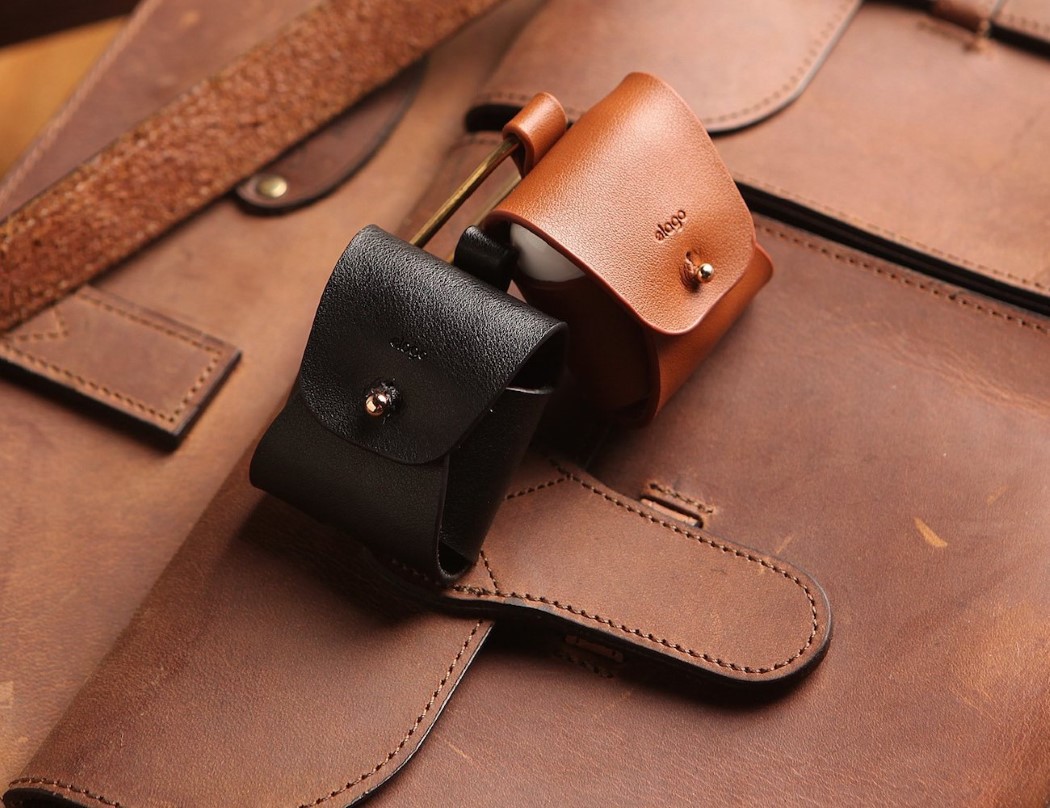
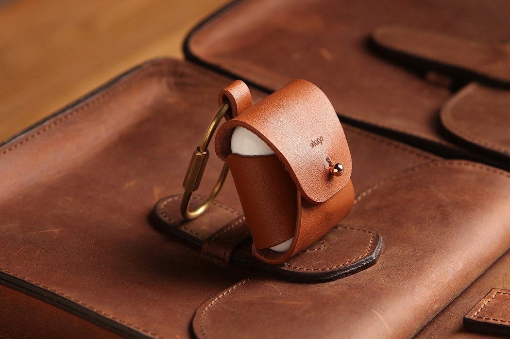
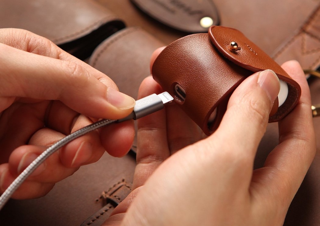
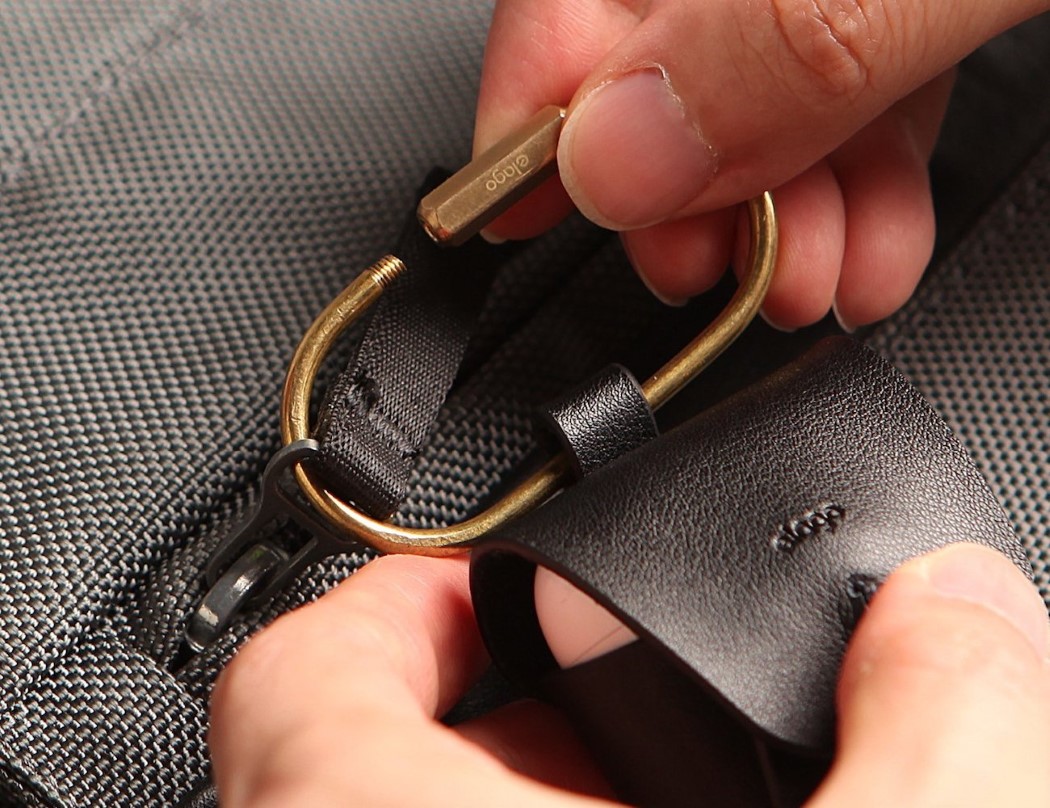
| The Airpods. Now classier than ever! Posted: 20 Mar 2018 05:07 PM PDT Perhaps you’ve been enamored by one of those beautiful leather cases for your iPhone, and now cover your piece of premium smartphone technology in lovely veggie-tanned leather. But what of the Airpods that come with it, I say? The Airpods are designed with a flossing-kit aesthetic, looking as simple as the iPhone looks premium, so if you’re going to cover anything with leather, it better be that white plastic case. Elago’s leather Airpods case has a divine design. It wraps the case in high-quality natural cow-hide leather, available in both brown and black. The case is secured by a brass fastener, which gives it a beautiful retro feel (if you’re into that sort of vibe), and comes with a brass carabiner, allowing you to hang the case from your bag or anywhere else. It even comes with a cutout at the base to let you charge your Airpods without having to take them out of the beautiful leather housing. Designer: Elago |
| This router looks like it’s invading earth Posted: 20 Mar 2018 02:00 PM PDT
You could just paste this router somewhere in the Imperial Army’s space fleet in the latest Star Wars movie and no one would know the difference. It’s absolutely wicked looking and will probably scare malware away with its cold and calculating design. Named the King-kong Router (I’m not sure why), this concept has 8 antennas that fold underneath the router, making it look like an 8-legged alien creature that you just don’t want to mess with. Flip it over to take a look at the triangular vents through which this beast breathes, and look at its front to find six steely blue/red eyes looking at you as you browse the internet… searching for ways to defeat aliens that attack you in your sleep. Designer: Lyle Yang
|
| You are subscribed to email updates from Yanko Design. To stop receiving these emails, you may unsubscribe now. | Email delivery powered by Google |
| Google, 1600 Amphitheatre Parkway, Mountain View, CA 94043, United States | |
