Yanko Design - Form Beyond Function |  |
- The New and Improved Multi-tool
- Enough with the Plastic Already!
- The Slap Bracelet of Door Stoppers
- Why do phones and calculators have different numpads?
- The Norwegian hotel that’s saving planet earth
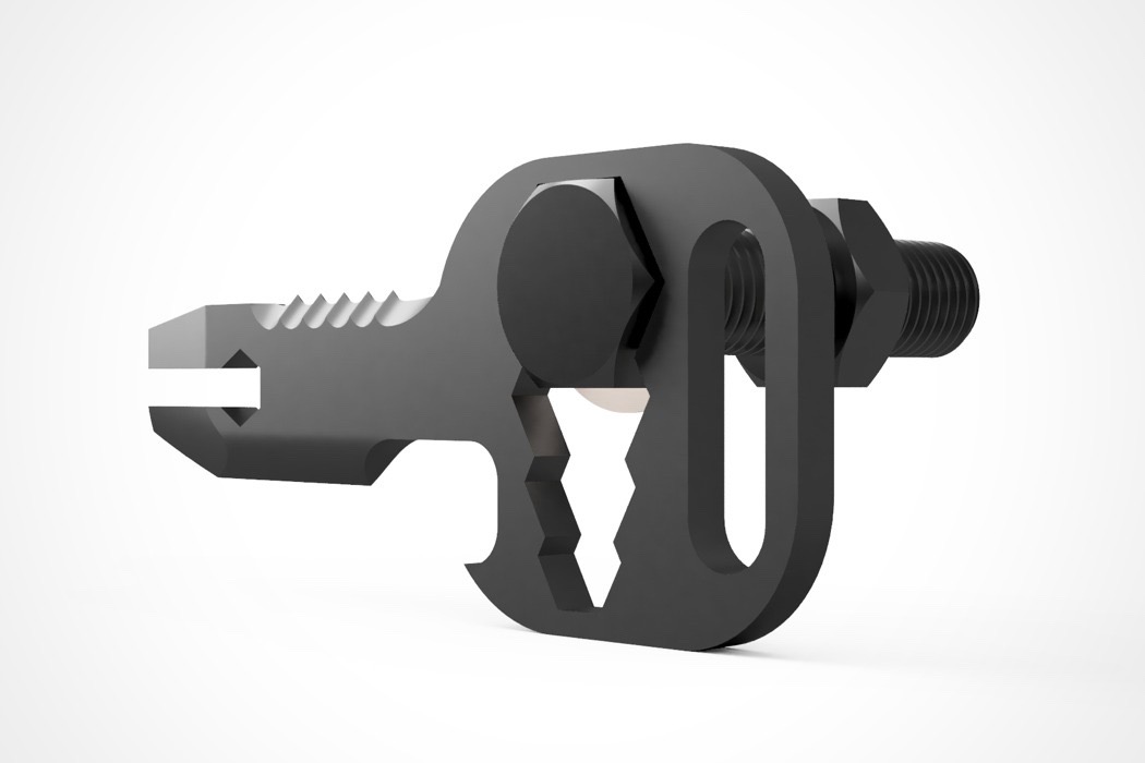
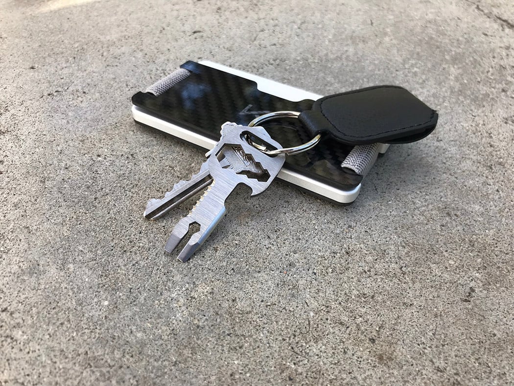
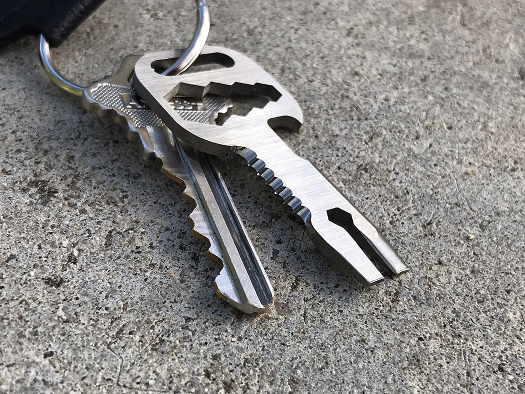
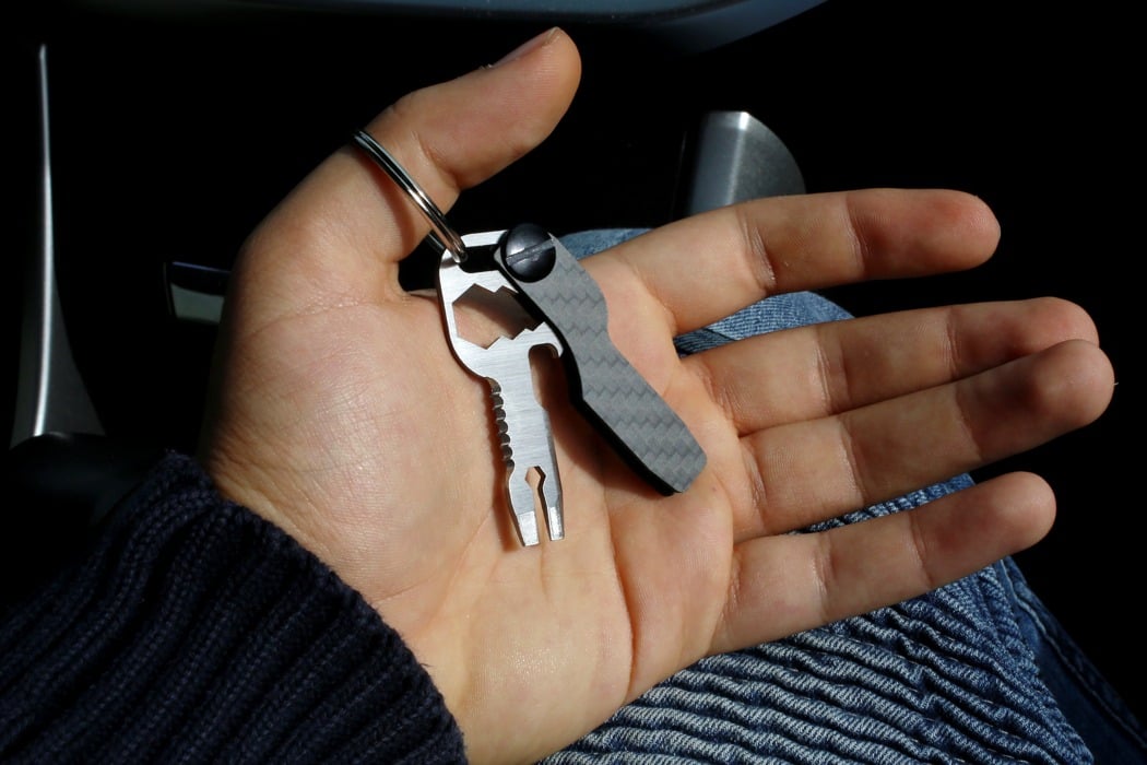
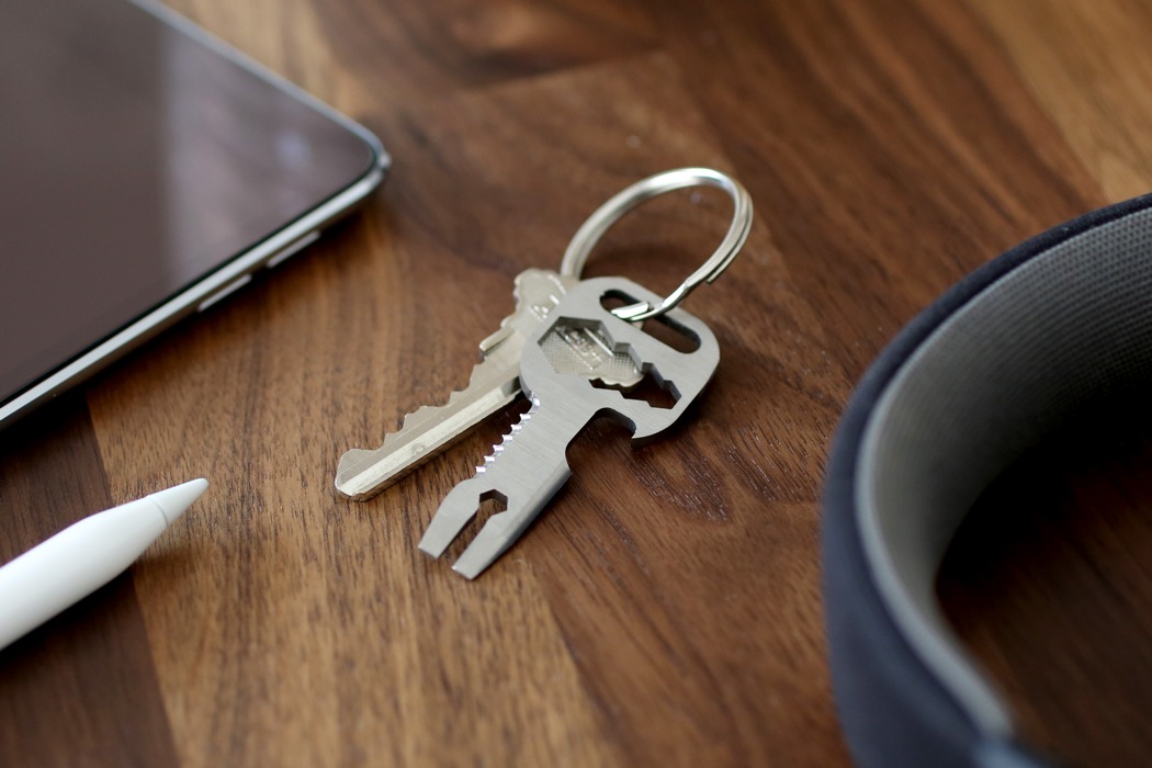
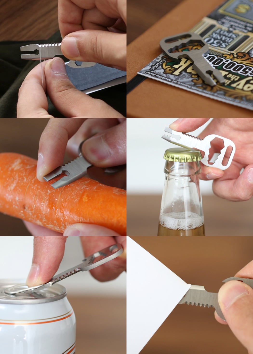
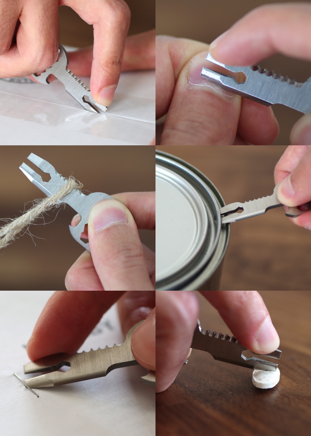
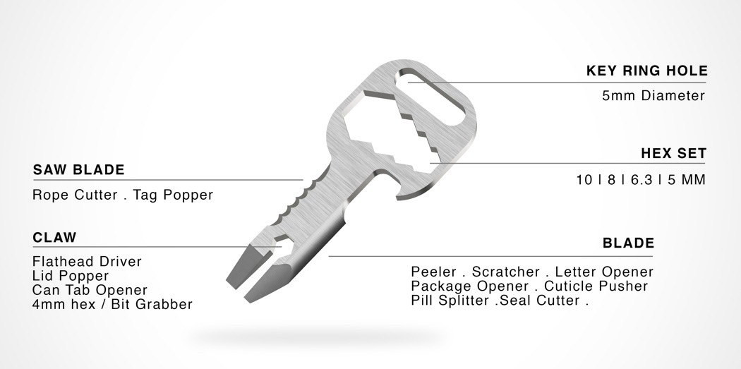
| The New and Improved Multi-tool Posted: 23 Mar 2018 09:34 AM PDT The MyKee 2.0 is the latest all-in-one, utilitarian tool by Narbeh Khoygani. It sports over 20 unique functionalities built into one compact unit you can take with you just about anywhere. You can literally throw out an entire toolbox in exchange for one tiny, titanium key! Made of Grade 5 titanium, it’s built to last and can withstand impact and even exposure to water. No larger than a standard key, it’s right at home on your chain in either a blasted or brushed finish. It includes a bottle opener, saw blade, prybar, file, screwdriver, hex bit driver and much much more. You can saw, clip, slice, scratch, peel, push, split, drive, pop, cut, screw, open… phew! Designer: Narbeh Khoygani
|
| Enough with the Plastic Already! Posted: 23 Mar 2018 06:37 AM PDT Google “turtle straw”… I dare you. This was the video that encouraged me to stop using straws and other avoidable plastics. If you’ve seen it or are already limiting your own usage for other reasons, here’s a design you’ll appreciate. One of the easiest things people who pack their lunch can do to reduce plastic waste is to invest in a good set of reusable utensils. However, many continue to use plastic knives and forks because it’s difficult to keep portable utensils clean and sanitary. Designed with this in mind, the EcoDining set consists of a fork, spoon and knife as well as chopsticks that can be carried in a cleverly designed case. After being used, individuals can rinse off the different pieces and pack them back in the case. An integrated UV light and heating system sanitizes, disinfects and dries the utensils, ensuring they’re prepped for use the next time you need them! The durable case is compact so you can throw in a bag or purse and durable enough to toss around until it’s time to eat. Designer: Zhao Xiong
|
| The Slap Bracelet of Door Stoppers Posted: 23 Mar 2018 12:00 AM PDT
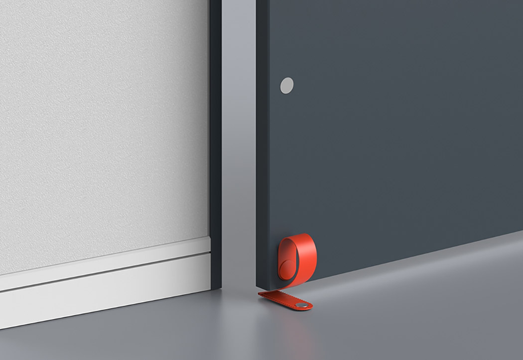
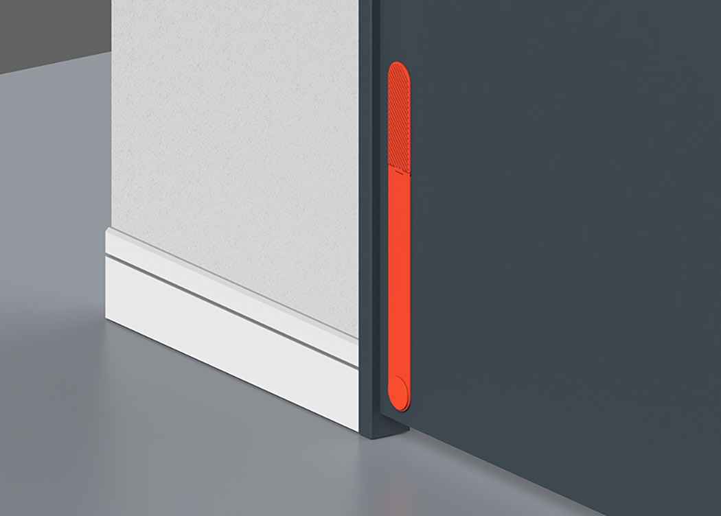
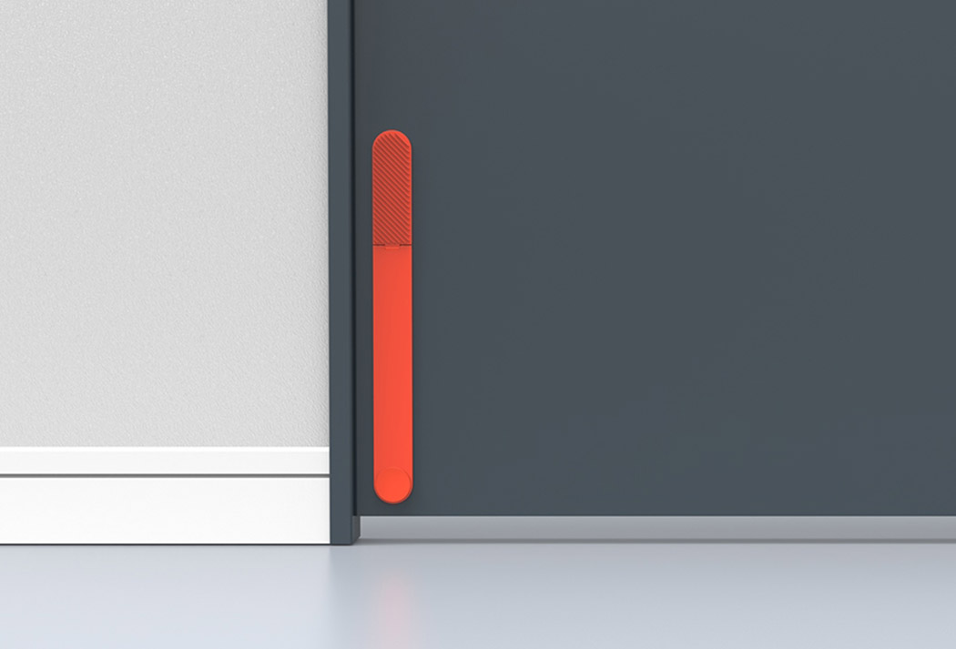
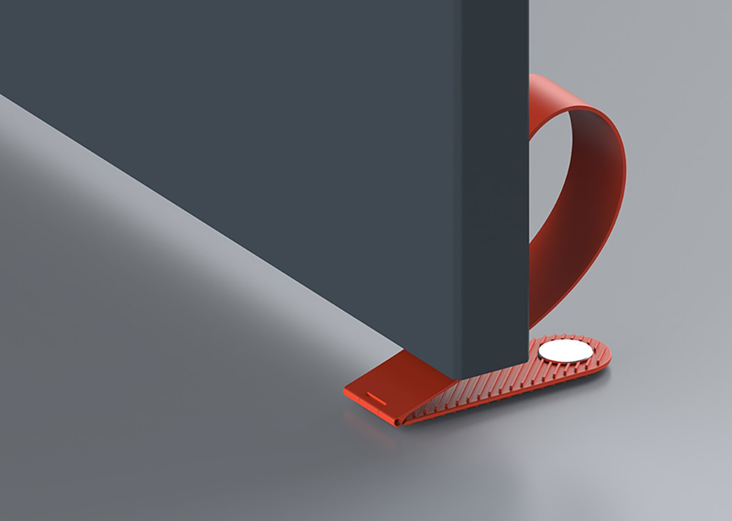
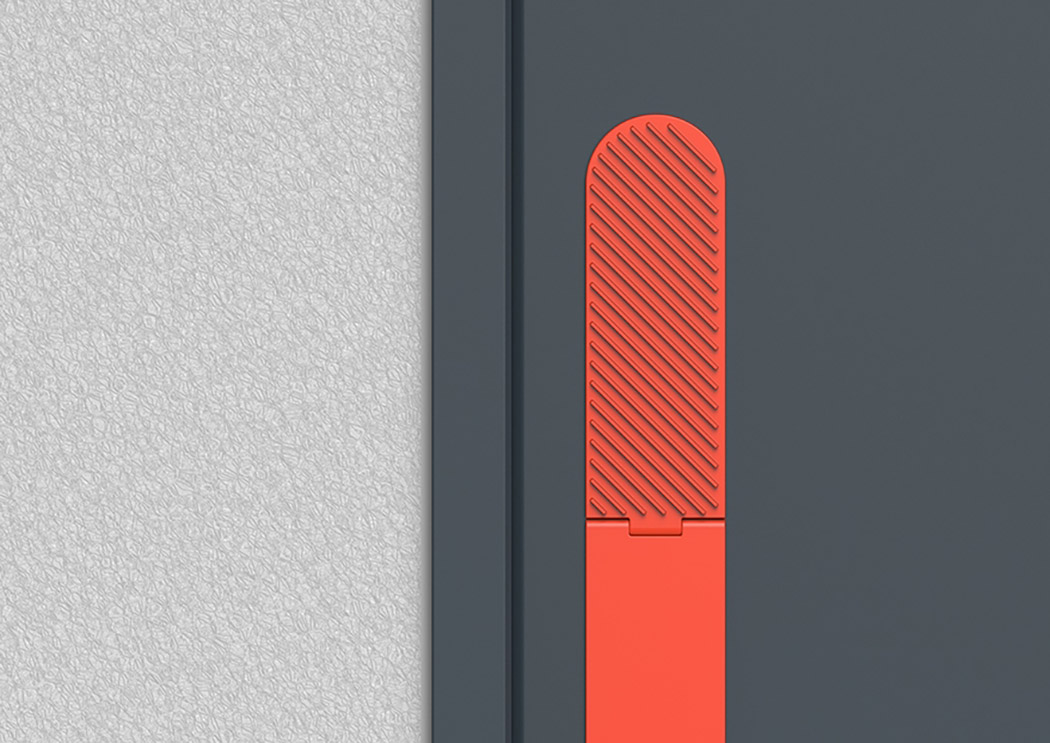
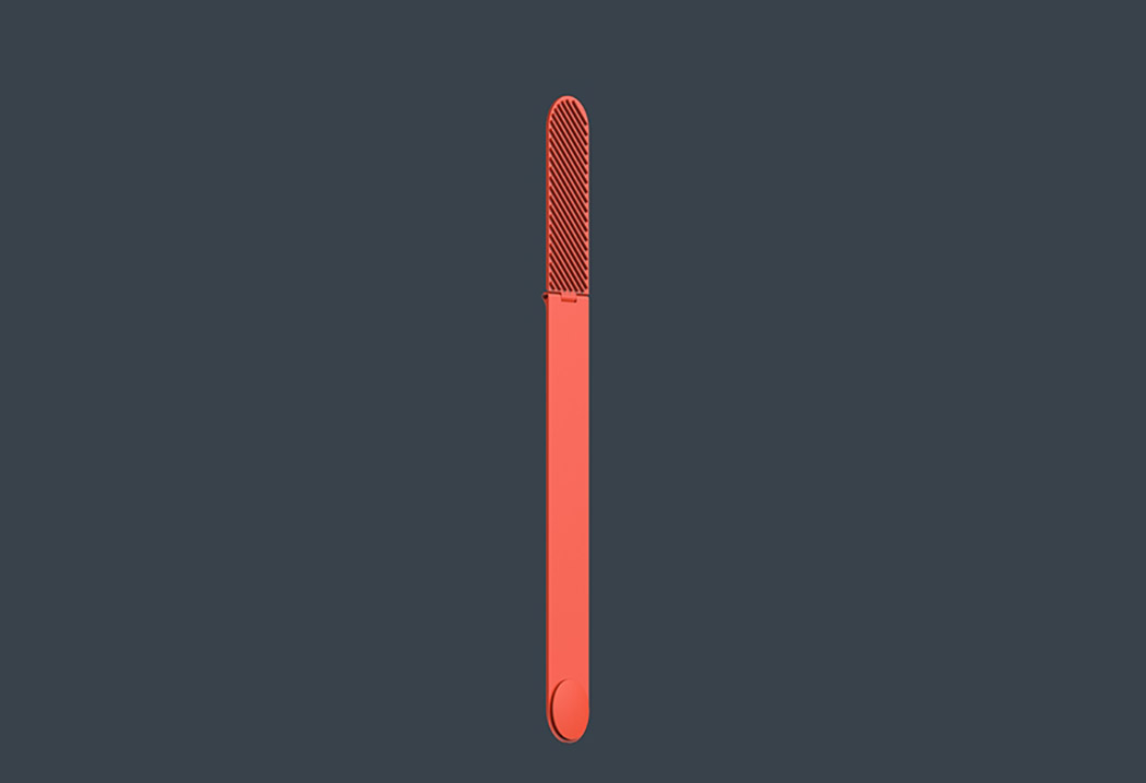
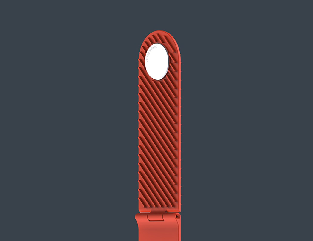
The 2oor Stopper is a twist on the door stopper unlike any other. The flexible band lays flat against the surface of the door to ensure it’s out of the way when not being used. To activate the stopper, one must simply unsnap it from the door. The flexed design will automatically snap into place to secure the door in position by gripping the floor. Its arch will also prevent the door from slamming against and damaging walls. Minimalistic yet vibrant, it’s also a stylish detail that provides a pop of color to any office, bedroom or other space. Designer: Sai Kann
|
| Why do phones and calculators have different numpads? Posted: 22 Mar 2018 05:00 PM PDT
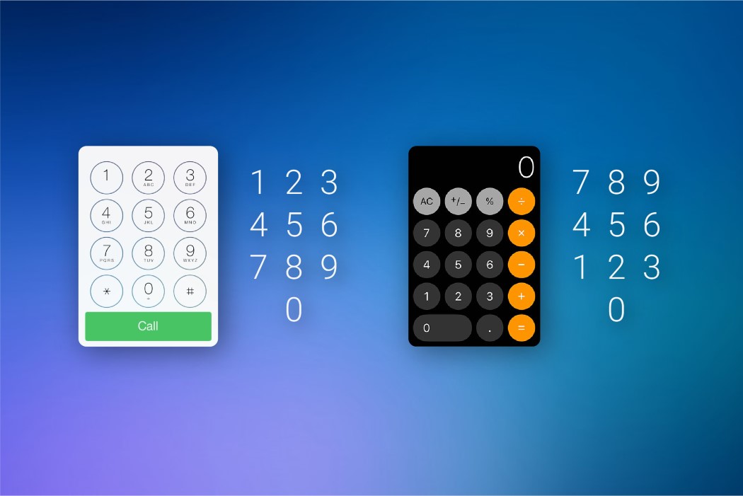
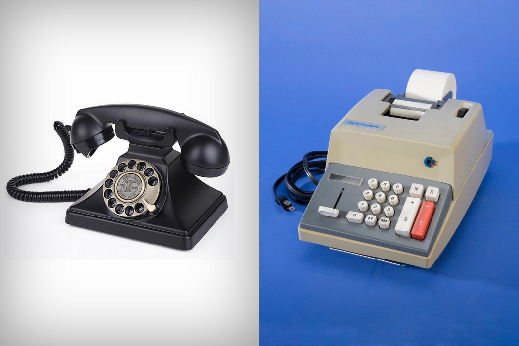
Take into account all the places that utilize the number pad and you’ll notice a disparity that’s quite odd but humanity seems to have made peace with. The number pad. You see it everywhere, from your dialer, to your calculator, to your PIN bypass on the phone unlock screen. You’ll see it on the right of your keyboard on your computer (if you’ve got a numpad), and you’ll see it in your ATM machines, cash registers, card readers, security systems, and if you’ve still got one, your landline phone. The numbers, for obvious reasons, are the same… but the layouts aren’t. Phone dialers and ATM machines have it starting at the top with 1, going down to 9 and ending with a 0 at the base, sitting between the asterisk and the hashtag; but you look at the calculator, the cash register, or the computer’s number pad and it’s the other way around. The zero or the lowest value sits at the bottom and it increments moving upwards, ending with nine right at the top. It’s always bewildered me that we’ve had these two separate systems for separate machines, even today. There’s no fixed reason for the difference in layout, but there seem to be a few interesting theories to define exactly how we arrived at this bizarre predicament. My favorite theory takes us on a time-traveling trip. The reason the two keypads have different layouts today is because they were two completely different products, using different technologies, for different purposes. Long before the modern day touch-tone phone, we were used to the rotary phone, which arranged the numbers from 1 to 0 on a circular dial that you’d rotate (the zero was actually treated as a 10. I explain why a little later*). With the advent of touch-tone hardware in the 50s, companies decided to stick roughly to the current layout, having the 1 at the starting, and the 9 and 0 (or ten, as they called it) at the end. They followed the calculator’s 3×3 matrix for the 1 to 9 (arranged from left to right), putting the 0 at the bottom, between the * and #. The calculator, on the other hand, had been designed long before the modern phone, and used a format with 789 at the top. The design of the calculator was based on that of the cash register. The keypad’s layout wasn’t an evolutionary one like the telephone, but a functional one. The 0 was placed intentionally at the bottom of cash registers because with the currencies that were used, the 0 was pressed much more often than any key, so it made sense to keep it within hands reach. Having currencies with the denominations 1, 2, 5, 10, 20, 50, 100 etc, it also made more sense to keep these lower numbers towards the base too. So the 1 and 2 were placed immediately above the 0, making the cash register easier to operate. The calculator simply followed this functional format.
*In the days of rotary dials the pulse signaling system was known as ‘loop-disconnect’. Each digit dialed produced a series of quick disconnections in the ‘loop’ just milliseconds long. Dialing a 1 creating one disconnection, dialing 2 created two disconnections in the loop. The telephone exchange (or the central office) could detect these disconnections and step the electro-magnetic mechanical switches that then connected you to the number you dialed. Dialing a 0 would create 10 disconnections in the loop, so what looked like a 0 was actually a 10, if you count the number of disconnections in the loop. The second theory also seems interesting because it talks about creating two separate counter-intuitive, reversed layouts on purpose. The calculator was invented long before the touch-tone telephone and was used for data-entry. Data-entry professionals using these calculators had gotten into the habit of crunching numbers at incredible speeds. The touch-tone phone, however, couldn’t operate at those speeds and oftentimes would end up missing a number or two. Phone companies then decided to reverse the layout to “confuse” people, allowing them to take more time to dial the number correctly, giving the telephone enough time to register the number dialed. Marvelous, isn’t it?! It’s a shame that none of these theories can be claimed as the one-true reason we have different keypads. It’s worth also noticing how in the phone, the 0 falls after the 9 since it’s actually considered to be a 10, and how on the calculator the 0 falls before the 1 because it’s treated as a 0 or a number with no value. In both their formats, the 0 finds itself at its appropriate place, according to the value assigned to it! I still find it silly that we’ve held onto this strange past all these years, but the history lesson (and its share of speculative theories) that comes with it definitely makes me look at this strange duality with awe! |
| The Norwegian hotel that’s saving planet earth Posted: 22 Mar 2018 02:20 PM PDT
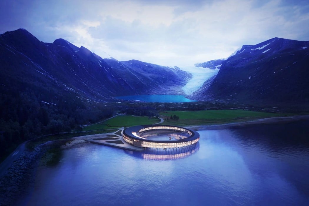
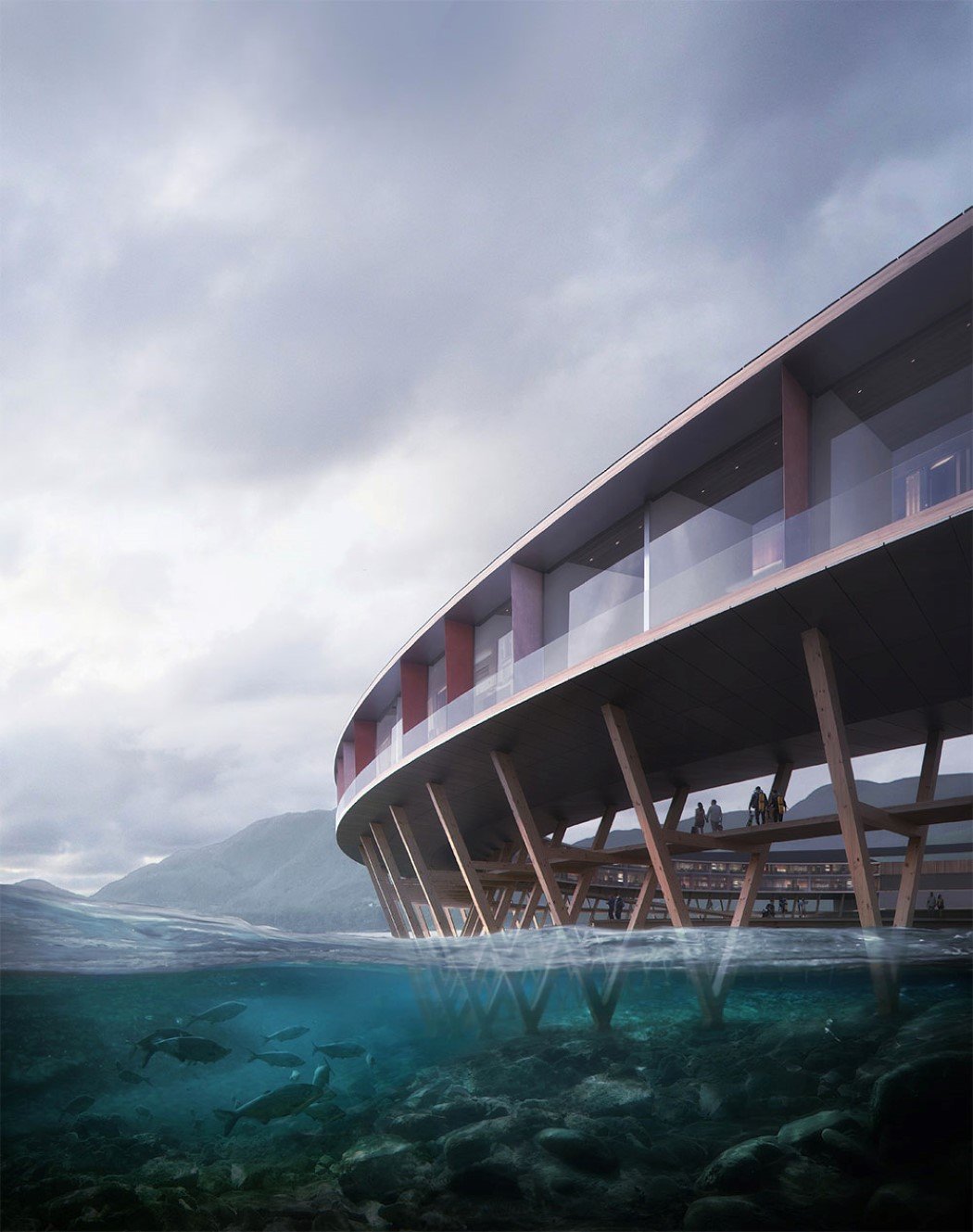
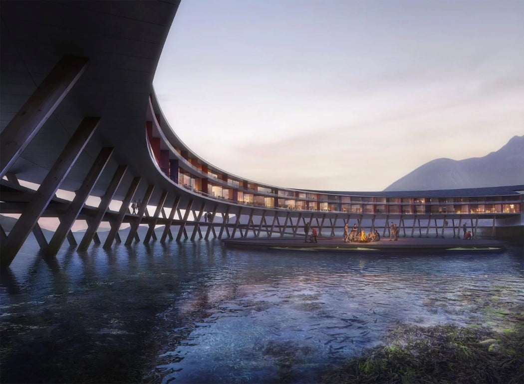
While we try to minimize our carbon footprint on the earth, Norwegian hotel Svart doesn’t really worry about its own carbon footprint of energy because it doesn’t generate one. The Svart actually generates more energy than it consumes, making it a powerhouse for sustainable energy. “Svart is the first building to be built after the energy positive Powerhouse standard in a Northern climate. Not only does this new hotel reduce its yearly energy consumption by approximately 85% compared to a modern hotel, but it also produces its own energy” says the architectural firm Snøhetta. The design and materials for the Svart are inspired by traditional Norwegian rorbu (a seasonal house found in fishing villages). The hotel stands on wooden poles, just like a house close to riverbanks would. This allows the building to reduce its footprint and prevents the need for constructing directly on the land and impacting the flora around. The hotel generates its own electricity using solar panels and geothermal wells, making it 85 percent more energy efficient than traditional hotels. Guests who visit the Svart will get a stunning 360° view of the land around, only to be highlighted further by northern lights that will punctuate the sky at night. Additionally, since the Svart sits on top of a water body, guests get the privilege of even seeing a second set of northern lights in the reflection on the water right below the hotel! Designer: Snøhetta and Powerhouse for Arctic Adventure of Norway.
|
| You are subscribed to email updates from Yanko Design. To stop receiving these emails, you may unsubscribe now. | Email delivery powered by Google |
| Google, 1600 Amphitheatre Parkway, Mountain View, CA 94043, United States | |
 ‘
‘