Yanko Design - Form Beyond Function |  |
- A sleeker, simpler, smarter spoon!
- The Backpack You’ve Been Dreaming Of
- Augmented Reality for All
- A True ‘King’ of Fidget Spinners!
- Is this the Uber of the future?
- Killing the Bezel means killing the Smartphone
| A sleeker, simpler, smarter spoon! Posted: 26 Mar 2018 12:07 PM PDT
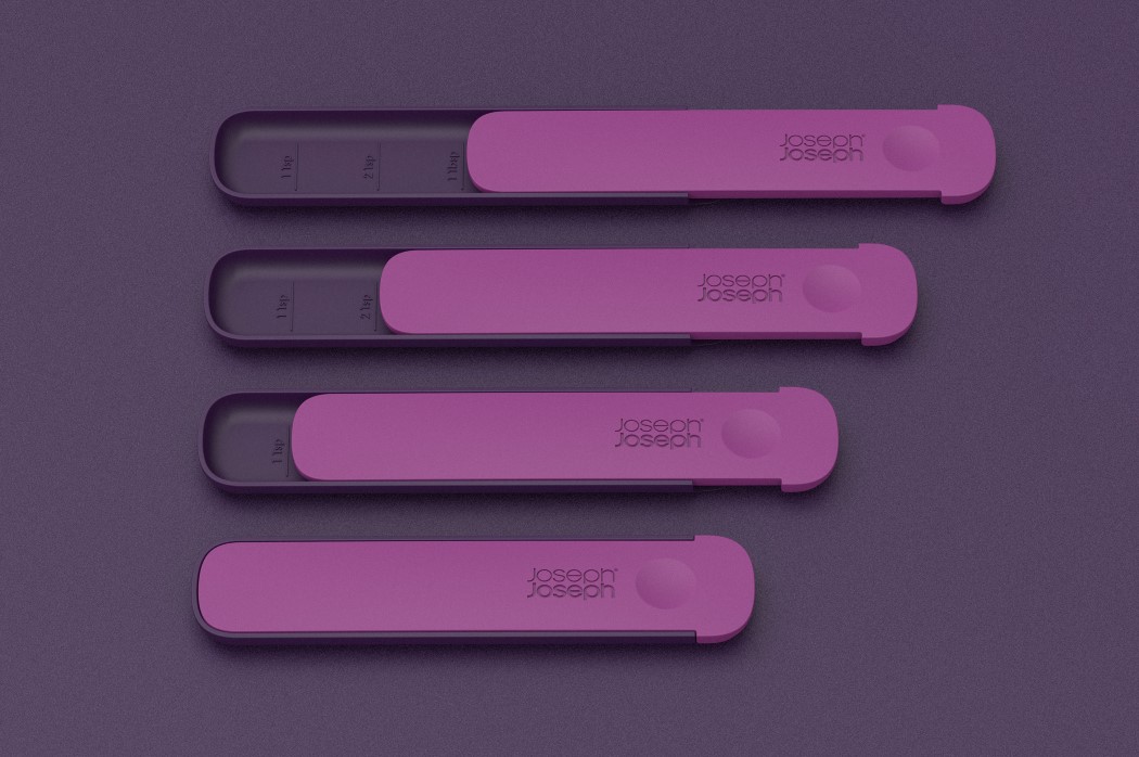
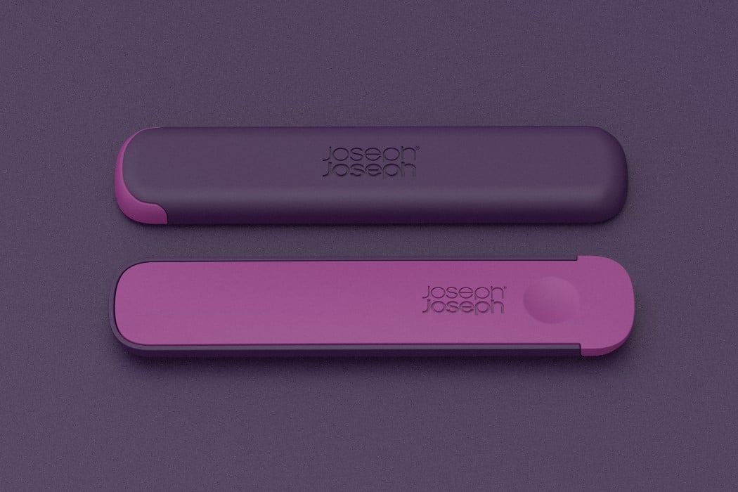
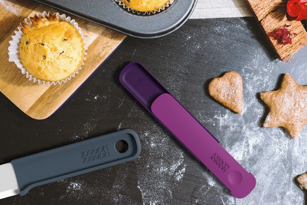
If there’s one thing that’s been constant through all our lives, it’s been the spoon. Joseph Joseph’s Slide Spoon changes that, with a design that tackles two areas where design intervention may be necessary. The Slide Spoon comes in a compact shape that stays closed when not in use. Open it up and the spoon provides a nice scooped concavity for measuring ingredients. The scoop of the spoon comes with markings that act as measuring units, letting you measure out teaspoonfuls of ingredients. The upper part acts as a leveling unit, allowing you to level the amount you scoop out so that your spoonfuls are accurately measured. Once you’re done, close the spoon and store it in your drawer along with the rest of your kitchenware! Designer: Rich Clough (Formative Studio) for Joseph Joseph
|
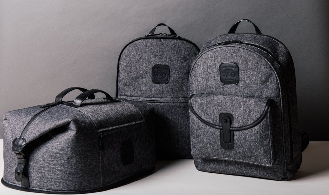
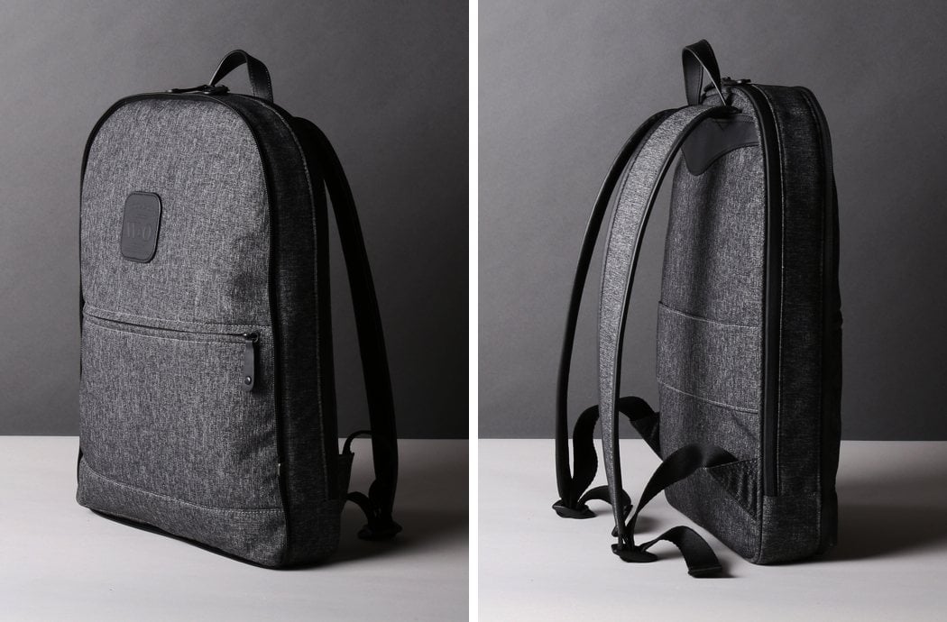
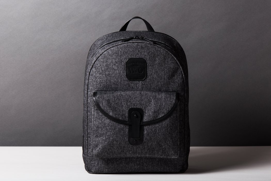
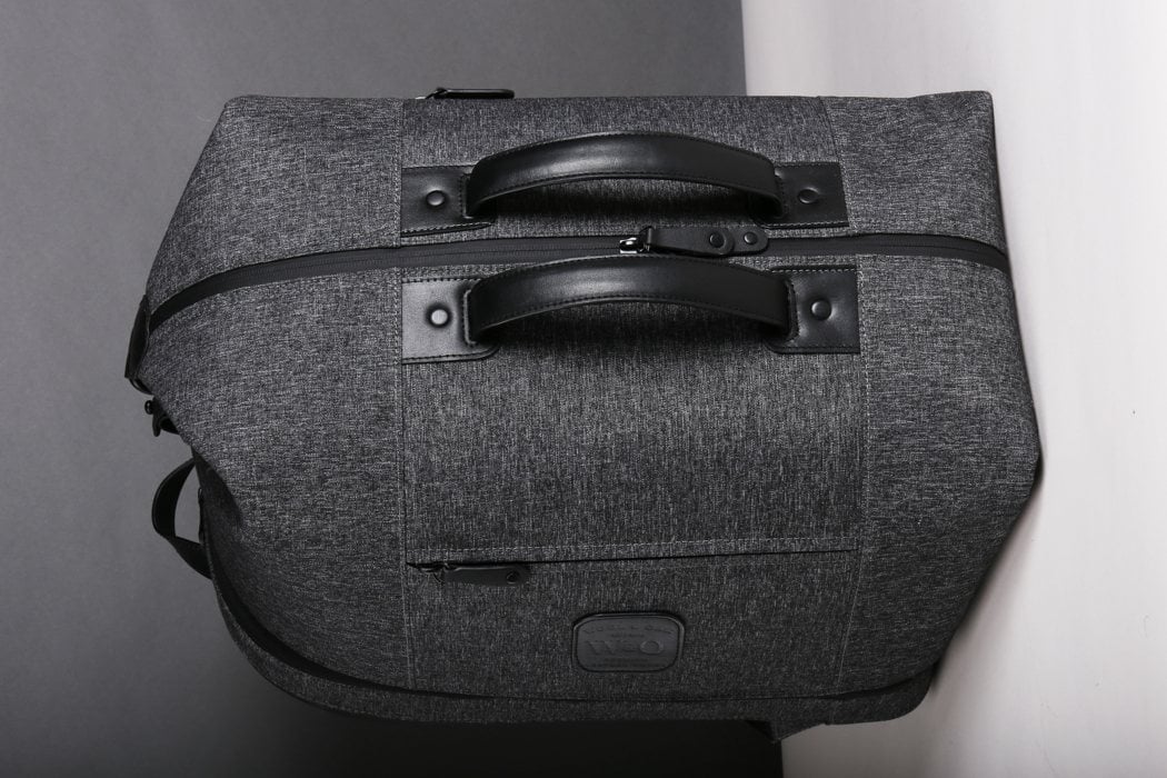
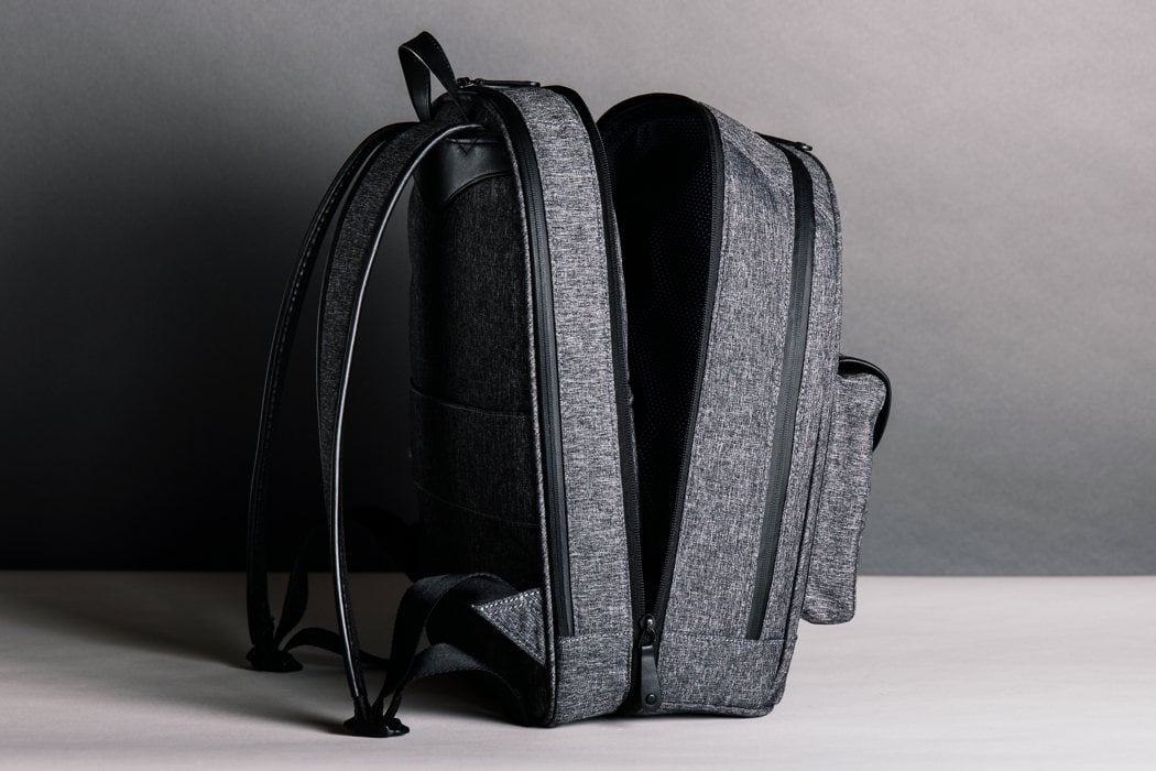
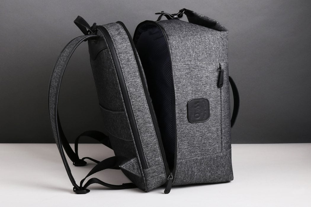
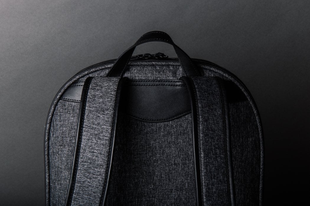
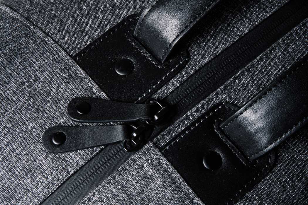
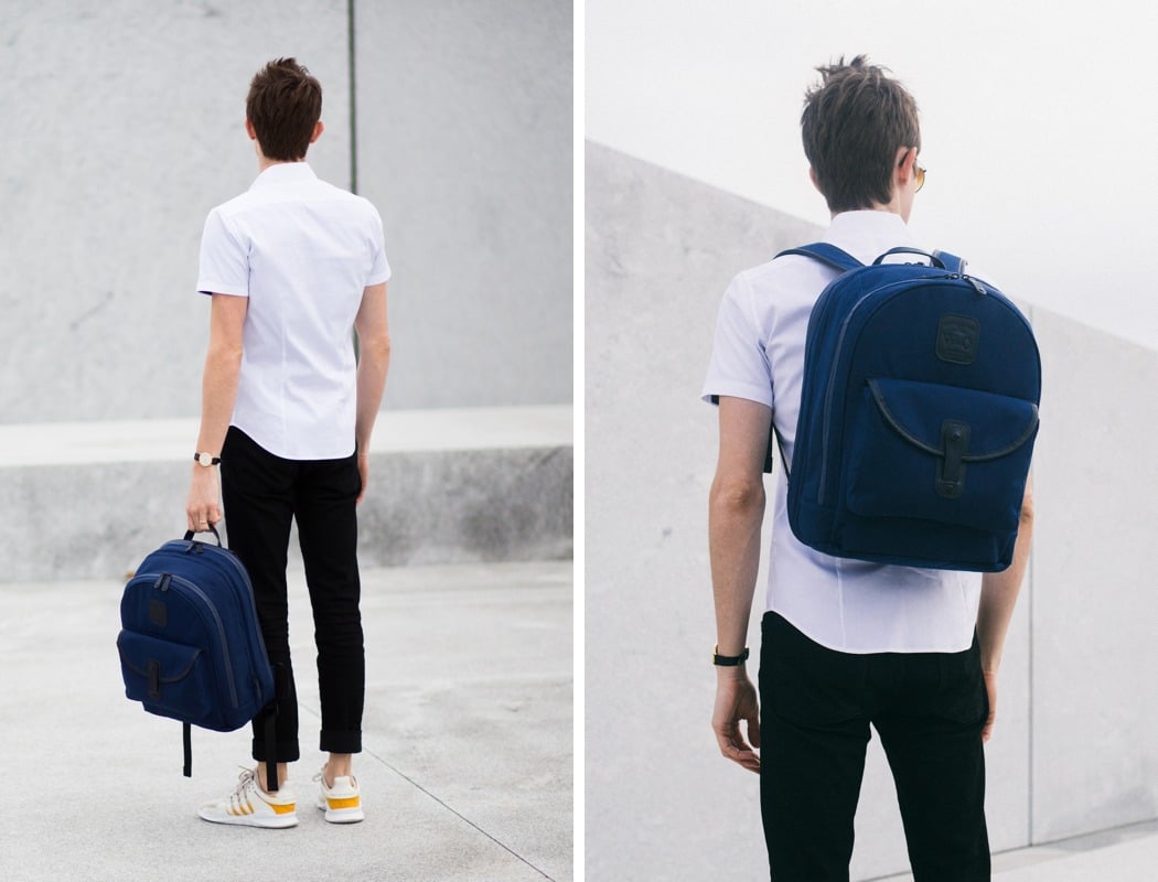
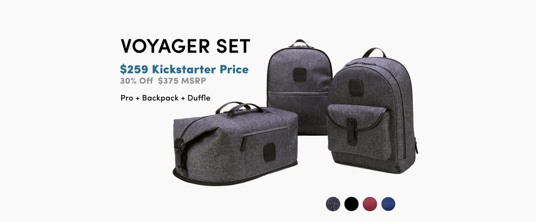
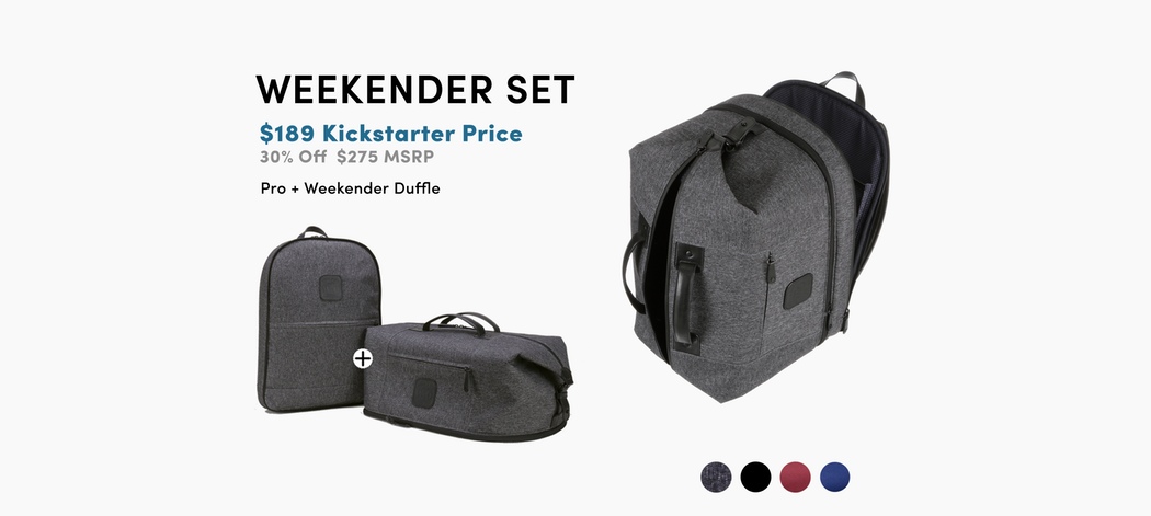
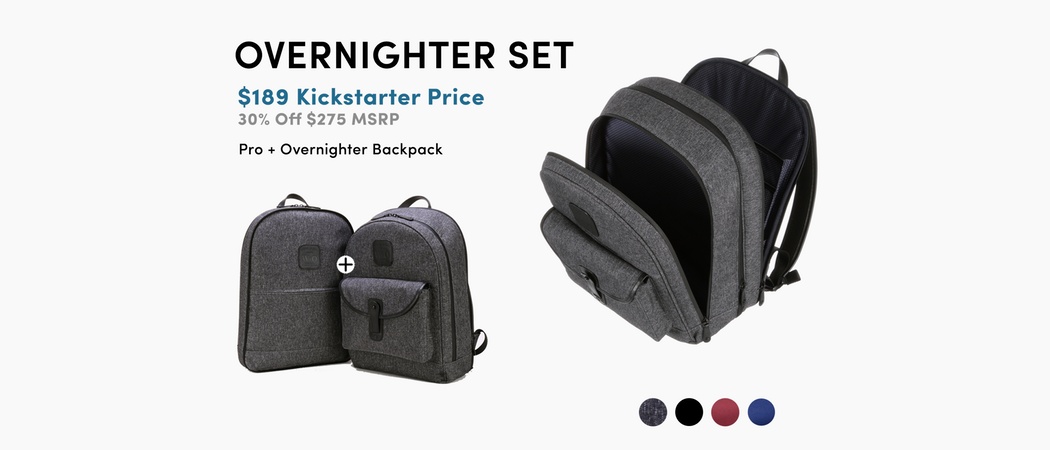
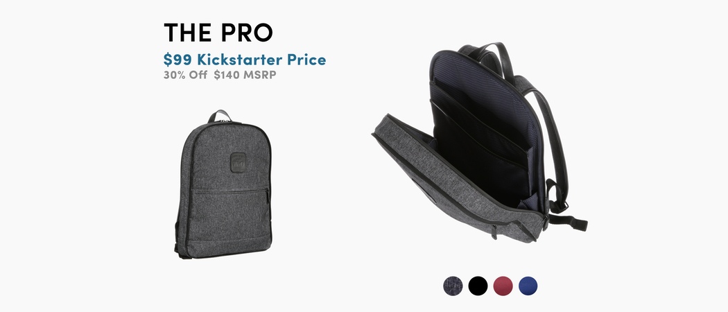
| The Backpack You’ve Been Dreaming Of Posted: 26 Mar 2018 09:30 AM PDT UPDATE: Less than 72 hours left, grab yours now! It’s only natural for a designer to constantly refine their creations, making the newer iterations better than the previous ones. I honestly didn’t think there was much you could do to improve the backpack of our dreams, but the designers at Wool & Oak are back with the Duffle Sport, a backpack that’s as hardcore a wanderlust as you are. Taking the same incredible modularity concept from the original Duffle, the Duffle Sport comes in a weather-proof, water-proof fabric shell. The Duffle Sport, just like the legacy Duffle still probably remains the only bag that can conveniently pack your items for anywhere from half a day to 7 days worth of activities. Its proprietary slip-zip-clip method allows you to carry a slim backpack with just work essentials, to an overnight pack, to a weekend-getaway pack, to even a week’s worth of packing. Duffle Sport achieves this through modularity. Available in three different bags that can be used individually or attached together to form a holiday-superkit (in six different configurations), the Duffle Sport deviates from the leather construction for something hardier and more weather resistant. The hydrophobic fabric comes in a variety of colors, adding a splash of vibrancy to the Duffle Sport while also allowing it to be almost half the price of the leather model from last year. The Duffle Sport is available in a variety of formats. People who just want the convenience of a slim, weather-resistant bag can opt for the Pro, while others looking to make use of Duffle Sport’s modularity can opt for the Overnight, Weekender, or Voyager kits. Each bag and kit is specifically designed keeping segregation in mind. The Pro is ideal for notebooks and laptops, while the zip-on modules are great for travel essentials, clothes, shoes, etc., with even dedicated hidden-yet-easy-to-access slots for your passport, boarding pass, or mobile phone. If you were charmed by the Duffle Backpack last year but wanted something more versatile, durable, and reasonable… Lo, and behold! The gods of travel gear have listened to your prayers! Designer: Johnathan Webster Click here to Buy Now: $259.00 The Voyager Set (Pro + Backpack + Duffle) The Pro Bag The Backpack The Duffle Click here to Buy Now: $259.00 |
| Posted: 26 Mar 2018 08:40 AM PDT
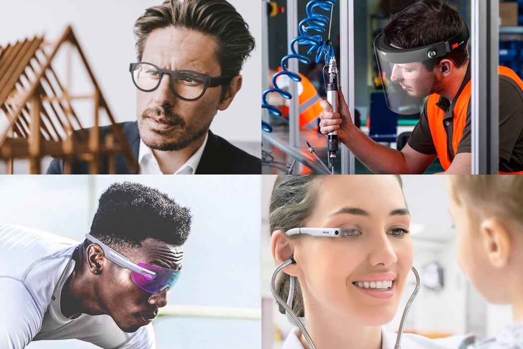
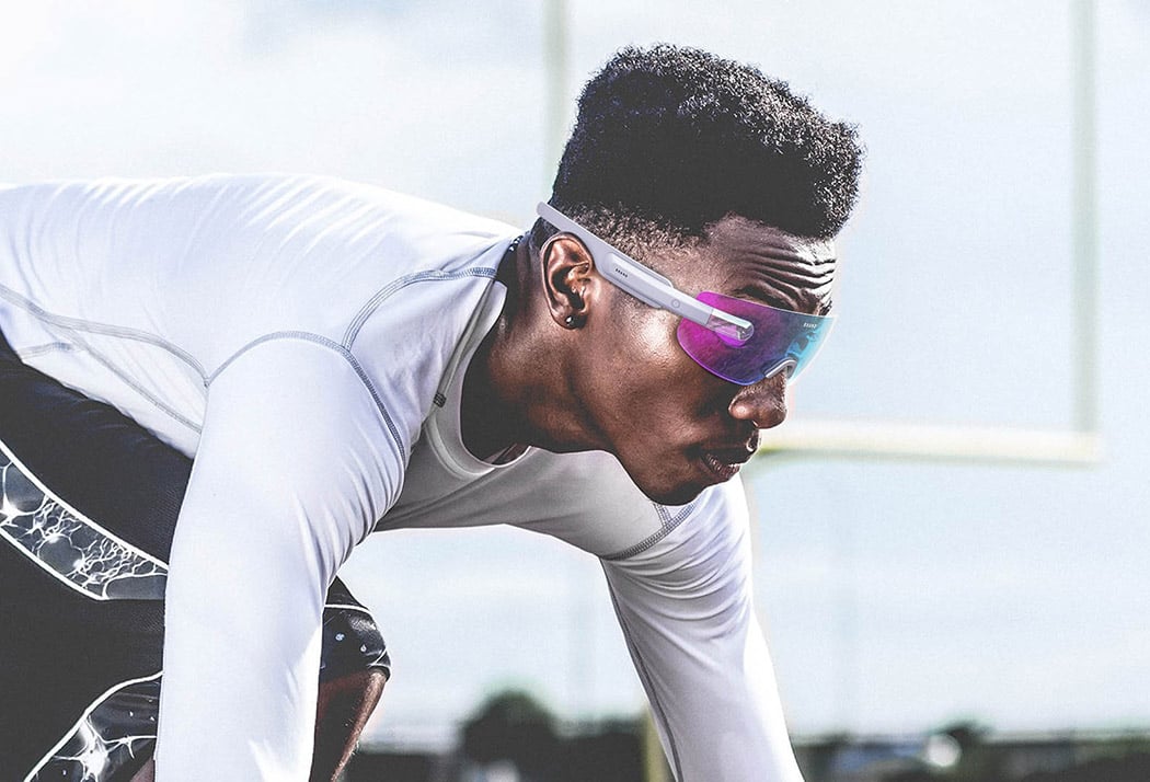
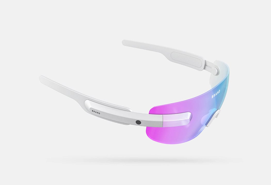
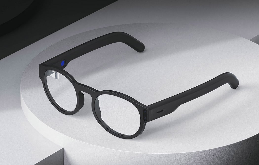
Swift Creatives looks to take full ownership of the augmented reality space with the development of 4 distinct products and applications for everyday use. The common denominator across all the designs is integration into gear already being used in each scenario. Whether it’s in the lab or on the Tour de France, there’s a wearable AR device to help you hack your performance no matter what you’re doing! Designer: Swift Creatives Sport AR goggles: Wearable AR for sport, fitness and active lifestyles where sunglasses are a standard part of the equipment. Helps to enhance performance and improve abilities by better tracking and monitoring an individual’s activity.
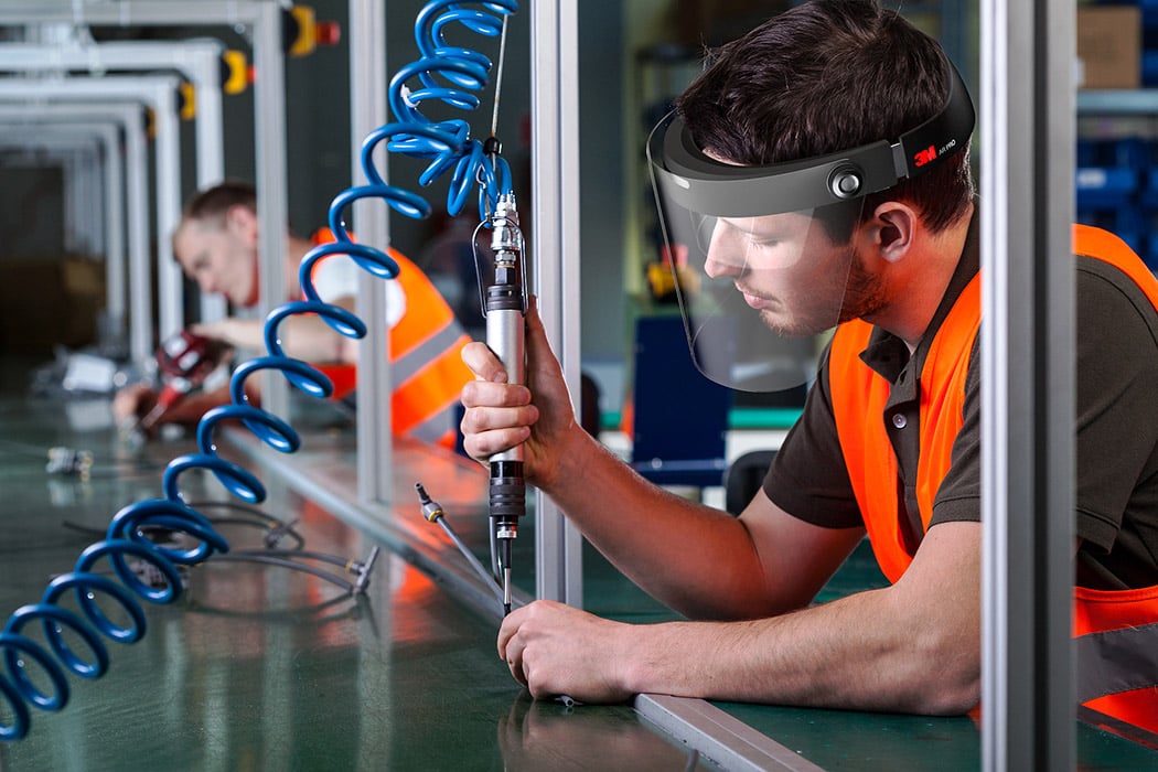
Enterprise AR Visor: A holographic headset designed for lab and manufacturing environments that enhances quality insurance and optimizes workflow. A natural extension of safety glasses, the Enterprise AR Visor displays important information to improve efficiency and quality insurance.
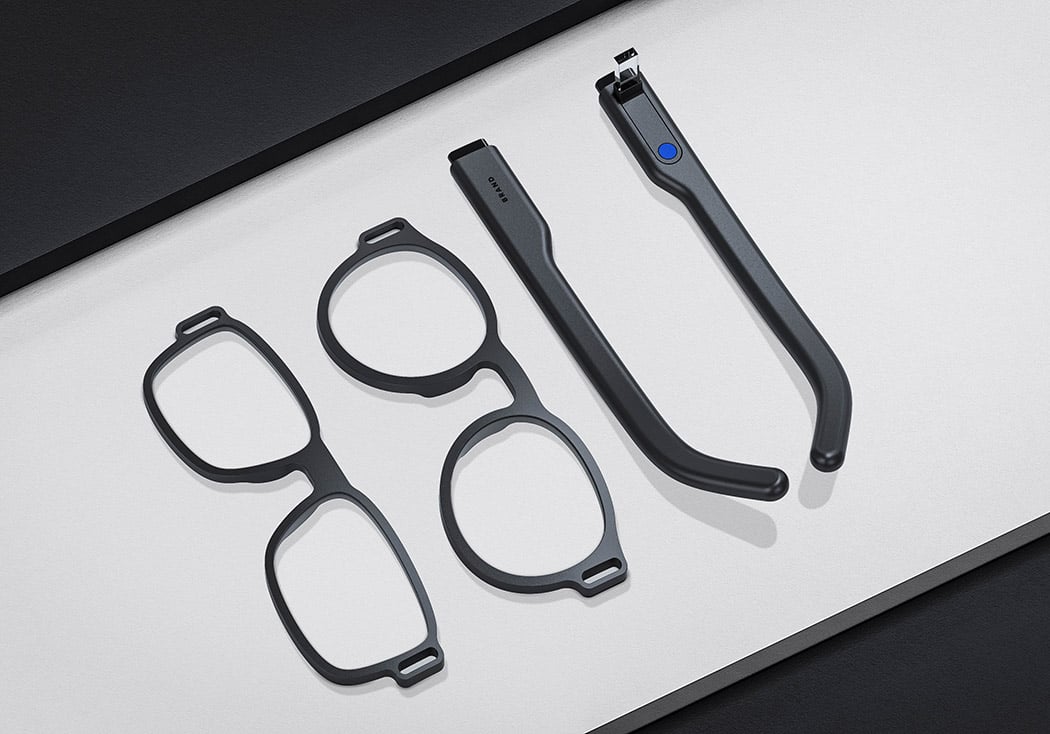
Discreet Modular: Wearable AR that enhances the design process by helping architects and designers to visualize their ideas. This concept acknowledges that glasses are an important part of personal style by incorporating the technology into more stylish, fashion-led forms.
AR Neckband: A new way of utilizing AR possibilities by concealing the technology inside a discreet, elegant neckband. Versatile and comfortable with a sleek design to provide quick and easy access to large datasets.
|
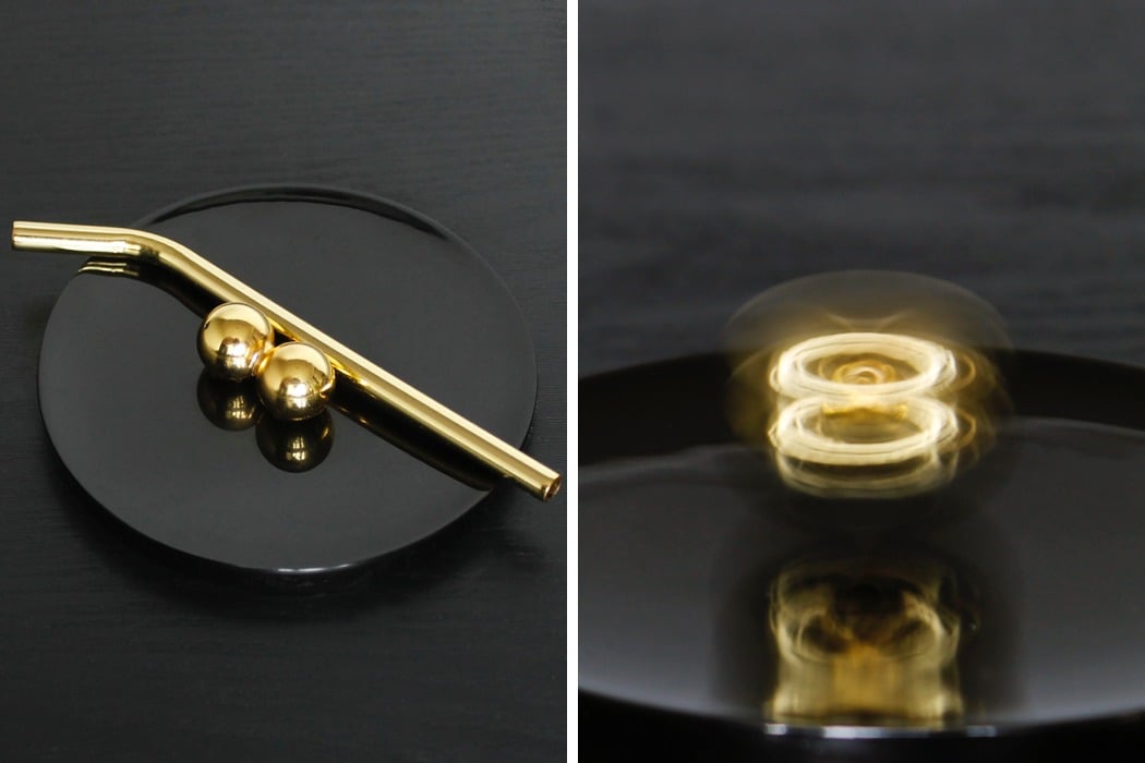
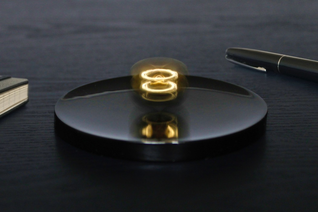
| A True ‘King’ of Fidget Spinners! Posted: 26 Mar 2018 06:56 AM PDT Designed to spin at a break-neck 3600 RPM, plated with real gold, and with not one, but two halos, the Halospheres isn’t some lowly fidget toy. Designed to look positively heavenly, the Halospheres has a premium touch, making it fit for a CEO or Senior Executive’s work desk, replacing the Newton’s Cradle most desks usually have. The Halospheres comprises two gold-plated spheres that rest against a smooth, non-scratch platform. Spin the Halospheres with your hand, and accelerate them further with the metal straw provided, and you notice something unusual. One metal ball lifts upwards, spinning in midair. At the kinds of speeds the spheres spin at, it’s virtually impossible to see the two spheres, but what you do see is a swirl of reflections off the metal balls… and since one of them is in mid-air, you see two distinct halos (swirls of light) appear pretty much out of nowhere. The Halospheres isn’t just a spinning toy. It demonstrates a physical phenomenon called the Magnus effect (visible when a football curves when kicked, or a baseball takes a curved trajectory when launched). When both spheres spin together, one of them lifts off the surface, spinning in mid-air. When the two incredibly smooth and shiny balls spin on two different vertical plains, they create halos caused by the lights in the room shining on them. The fact that both spheres spin on different plains at speeds of 3600 RPM creates these halos since the human eye can’t really track the spinning sphere anymore and all they see are blurs of light. The Halospheres box set comes with the spinning platform, two gold-plated metal spheres, the spinning platform, and the metal straw. Designed to move 10 times faster and look a 100 times better than a fidget spinner, the Halospheres make for great breaks between work, and look absolutely hypnotic both when static and spinning… and with two golden halos that characterize it, it wouldn’t be too far-fetched to call it the king of fidget spinners! Designer: Hedra Concepts Spin. Blow. Light. Materials. The Halospheres are first cast from stainless steel and then polished to a mirror finish. After which, they are plated with real gold for that characteristic halo hue. The spinning plate is hand cast in concave form from black resin and then highly polished, resulting in a perfect pairing for both performance and aesthetics. How does it work? As it spins on its centre axis on the concave plate, it also rolls like a wheel, which generates a lift force on one sphere raising it into the air – much like forces at play on a curveball. This is known as the Magnus effect. This reduced friction together with its high relative mass and angular momentum, allows the Halospheres to accelerate to extreme velocities. The halo effects themselves are a result of its spherical shape. Each sphere creates a pinpoint light reflection in its mirrored finish from any significant light source in the room – be it light from windows, lamps or flashlights. As it spins at great speed, the pinpoint reflections blend together to our eye, creating its characteristic halo effects. |
| Is this the Uber of the future? Posted: 26 Mar 2018 02:00 AM PDT
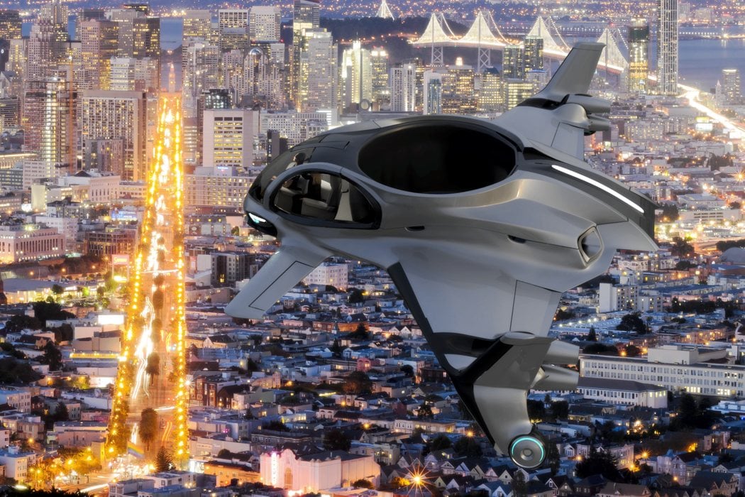
The recent release of renderings for Bermuda-based Airis Aerospace’s AirisOne vehicle brings us one step closer to zero-emissions personal aircraft of the future. This all-electric, quad-winged aircraft will carry you and 4 friends in complete comfort on short trips between and within close cities… all without a pilot! Equipped with advanced avionics systems capable of autonomous navigation (hopefully more reliable and safe than Uber’s), dual co-axial lift fans for vertical take-off/landing and a series of eight articulating thrusters, it’s capable of traveling 175 mph up to 200 miles with simple destination inputs from passengers. To show just how serious they are about getting this thing off the ground, Airis co-founder and CEO John Narraway points out that design touches like hidden rotors have been purposefully hidden to calm the nerves of anxious riders. Designed with safety and accessibility in mind, it would also be one of the world’s only wheelchair accessible aircraft. Designer: Ray Mattison of Airis Aerospace
|
| Killing the Bezel means killing the Smartphone Posted: 25 Mar 2018 05:00 PM PDT
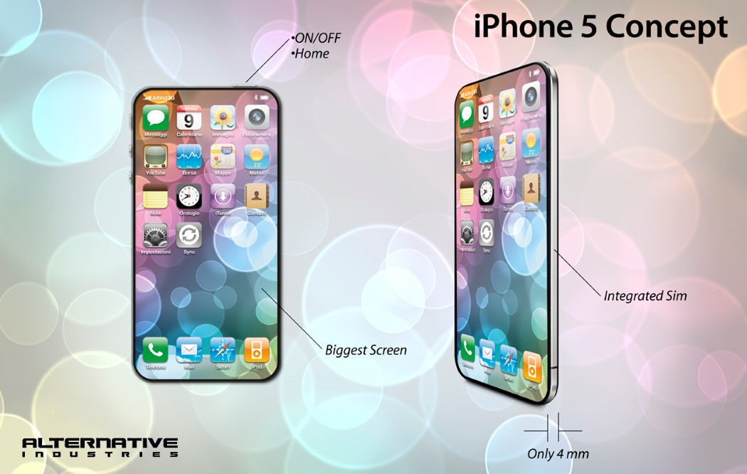
Mobile phones, and this is irrefutable, have always been about screens. Ever since the first hand-held phone sported a screen, it became singlehandedly the most integral part of the phone. Adding the camera to the mobile phone just catalyzed the screen race… and well, honestly, the race is close to its end… and with it, the golden age of smartphones. BEZEL = PUBLIC ENEMY NO.1It’s important, however, to understand how we began hating the bezel. I don’t know who started this movement, but I assume it began somewhere in the corners of Behance when some half-baked designer made a “Concept iPhone” which was literally all screen (I’ve been seeing this since 2012). The movement saw its first milestone when Samsung (pretty much the manufacturer of every smartphone screen) launched their Edge range of phones that curved the screen to the side in a way that opened up new doors for mobile interaction. This got everyone thinking of how this flexible display technology could create a phone that was “all screen”. When mobile phone makers were convinced that their screens were hi-res enough, with pixels barely being visible to the human eye, the Kill-bezel movement truly gained speed. The first to go were the bezels on the side. The upper and lower ones remained for the cameras, sensors, earpieces, and the home-button… until Philippe Starck threw them under the bus with the Xiaomi Mi Mix, followed by Tim Cook exactly a year later, who stepped onto the stage at the Steve Jobs Theater, unveiling before the world, the iPhone X. A phone that was poised to become the benchmark of what new phones should look like.
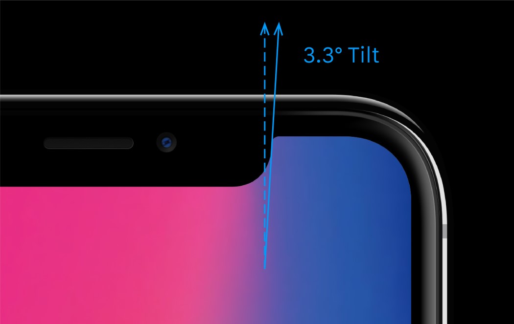
THE NOTCH HOTCHPOTCH – ACT 1MKBHD makes some pretty astute points in his “The State of Bezels” video. The gist of it is that everyone wants to get to the promised land of a 100% screen to body ratio on the phone’s front. Everyone’s had different ways of overcoming the same obstacles. There are a couple of components that the front of every phone usually has by default. The display, earpiece, proximity sensor, light sensor (controls screen brightness depending on external light), the front-facing camera, and lastly, in the case of a few phones, the home button/fingerprint sensor. The proximity and light sensors are incredibly small components and usually hide somewhere on the top. The earpiece is a tricky bit, and most phones have made them incredibly streamlined, fitting them in the gap between the glass and the phone. Android’s had the luxury of having killed the home button a long time ago, which made pushing the fingertip sensor onto the back a rather easy decision… but TouchID and that iconic circle below your screen have always been a part of Apple’s image. Pushing that to the back of the phone would present a pretty unique design challenge of visually balancing out Apple’s logo on the back with the TouchID button. Since turning the logo itself into a fingerprint sensor was out of the question (the apple’s non-circular shape wouldn’t read your entire fingerprint, and it would be incredibly tacky), Apple’s design team ditched the button completely for their latest offering, the FaceID… and with it came the infamous notch.
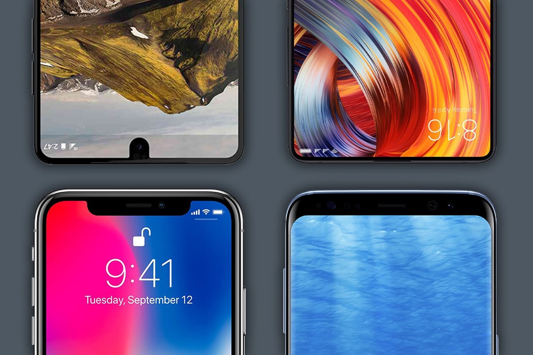
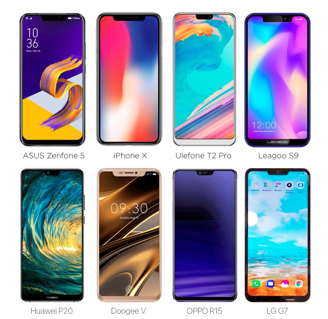
THE NOTCH HOTCHPOTCH – ACT 2The notch, as much as I detest it, is quite remarkable. Not only does it house a rather incredible, impregnable facial tracking system, it’s proven something else. Apple has a bunch of loyal followers… not in the people who buy the phone, but in companies that look to Apple to set trends. Here’s a look at the new wave of phones that were showcased at the Mobile World Congress in Barcelona this year.
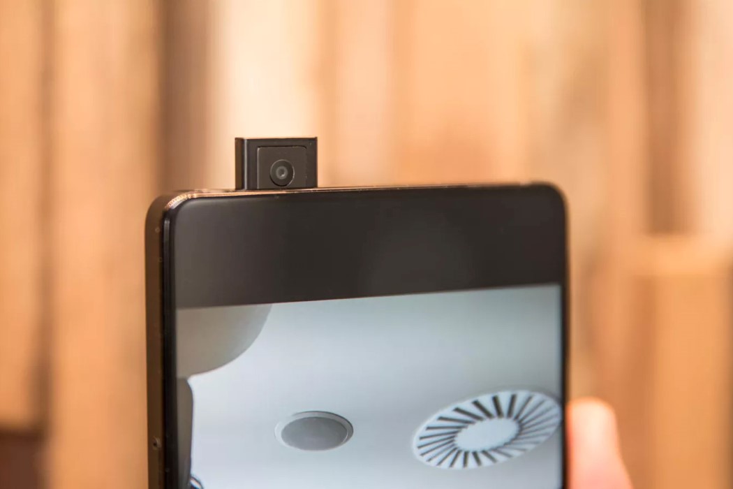
Look at the image above and you’ll realize we’re very soon moving to a future (or we’re stuck in a present) where phones are going to start looking eerily similar. Ten years ago, phones had bezels big enough to even sport the company’s branding, but now all they can afford the space for, is a front-facing camera, and probably an earpiece. MKBHD states that the notch itself is an intermediary phase, while manufacturers and designers figure how to attain the full-screen look. Each company treats it differently, with Samsung ditching the notch for a slick bracket shaped design, and the Essential phone having that little tongue, or like the Xiaomi Mi Mix that actually puts the camera on a bezel at the bottom, leaving the top completely bezel-less. My point is that no matter how marginally different phones look today, each and every brand is looking at the exact same future. One where all you see on the front is a display… But we’ve still got to do something about that front-facing camera. SO… THAT FRONT FACING CAMERA NOWI’d like to think that nothing truly is impossible with phone design. Apple tried long and hard to integrate the TouchID into their displays, letting your screen read the fingerprint, but they failed to do so, hence the FaceID (which numbers indicate turned out to be a resounding success). Later in the year, Chinese manufacturer VIVO showed that having an in-screen display was possible with the X20 Plus UD, which debuted at CES 2018 (a CMOS sensor sits under the display, virtually invisible when your screen is on)… and at the Mobile World Congress, showcased a prototype of a concept they were working on, the Apex, the first phone to have nothing except screen on the front. It used VIVO’s in-screen fingerprint technology, and the front-facing camera sat on a component that slid out the top of the screen (a lot like the in-built flash on a DSLR), and back in when you closed the camera app.
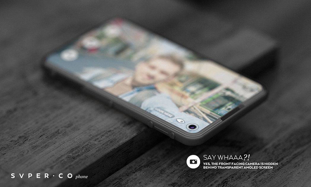
Now, this isn’t really the definition of practical. Yes, it means your camera isn’t snooping on you, but any tech person will tell you, moving parts are a BAD idea. They’re the first to fail with excessive usage. Look at laptops for instance. The first thing to break is almost always the hinge. The Apex concept however does boast of the highest screen to body ratio ever, and Spanish company Doogee has a similar concept phone in the pipeline. Interestingly enough, the SVPER phone concept popped up on our radar in 2015, and the designer does what I can only describe as the best way to integrate+hide the camera. The SVPER concept phone hides a front facing camera under a transparent AMOLED. When you want to click pictures, the part of the display directly above the camera switches off to reveal the lens. The camera, therefore, stays hidden from view in normal use, creating a stellar full-screen, no bezel experience. This is in a lot of ways much like what VIVO does with its in-screen fingerprint reader, so a future where the SVPER phone exists isn’t far off. Now let’s examine why this is such death-knoll for your smartphone. SMARTPHONE? OR SMARTCLONE?Let’s time-travel to the future. It’s 2019 and the all-screen phones are finally here. They feel great and everyone has one… but then it’s the end of 2019 and a new phone releases, but wait. It looks exactly the same as the one you already have. All that Jonathan Ive can say in the iPhone launch video is that the “new iPhone is the best we’ve built… because it’s now thinner.” A world where all phones have only a screen on the front would be like a world where all cars look exactly the same but just feel different on the inside. Brands would struggle to make their phones stand out, and customers would be truly baffled because all phones look the same. It begins a desperate feature war. The phone with longer battery life, the phone that bends, the phone that reintroduces the headphone jack (a transparent phone is never going to happen so forget about it). Everything now is a gimmick because we’ve successfully homogenized the phone, so visually, there’s no reason two phones say within the same Android ecosystem would look any different. And THAT’s a BIG problem. We’ve tried the megapixel competition. The Nokia Lumia 1020 had a 41-megapixel camera and it absolutely tanked, but in the same year, Apple launched the Retina screen and it was a runaway hit. Screens have grown as big as they can and as clear and vivid as they can, so killing the bezel is the logical last step. And since phones now look the same with just minor feature variations, phone sales will take a dip as designers scratch their heads and go, “now what?”. Oh! Icing on the cake… your all-screen phone is going to have a disappointingly bad battery life because displays are notorious battery guzzlers. SO… WHAT’S NEXT?Experts have long predicted the downfall of the smartphone, with wearables being the future. As ominous as it may sound, your health and medical data are of immense value (to you as well as the medical industry), which wearables are poised to gather, aside from the data you contribute through your smartphone use and your browsing habits. There have been instances where these wearables have saved and improved the quality of lives (if you remember the heartwarming Apple Watch video from the September 2017 keynote), but it’s truly a fine line. Choosing to surrender your data for a better and hopefully longer life is a massive decision that everyone will have to take in the long run, and with the current state of affairs, I can only hope that data will be much more secure than others. Not that I mean to trash wearables, but the future is definitely in being able to provide an IoT experience that can help you live not just a more connected life, but rather a better and healthier life. Before that really kicks off, there’s enough reason to believe 2018 and 19 will be a glory era for visual interface and experience designers. The immediate homogenization of the smartphone will spark what I can only describe as a race to be different. If you’re a UI UX designer, bolster up because the mobile industry may just absolutely explode in a year or two. Stock OS for mobiles is sure to become less appealing to phone manufacturers who will want a ‘personal touch’ on their phone’s interface because physically each phone looks the same. I can’t really remember where I heard this, but the bezel isn’t the only thing that’s been dying. Silently, yet surely, companies have been killing off the keyboard too. Realizing that your voice is the best and most natural way to interact with your machines, the rise of Voice-powered AI has helped create a more human-like tech experience, as we move to a very Spike Jonze-ish future where we don’t type things out or touch icons on screens, but simply run services and programs by talking to our AI. Maybe the smartphone won’t suddenly lose purpose once it becomes the bezel-less device we’re seeing it turn into. Humans love looking at screens, but humans love companionship more, which is probably the only way to keep smartphones alive in the long term. The smartphone may just seamlessly transition from a piece of tech in your pocket to a digital assistant or friend that you talk and listen to in the long run. It’ll be interesting to see the transition from this visual-heavy experience to something that’s multi-sensory and feels more ‘real’ (and also to see how many brands make it this far as well as how they compete with one and another)… as for that phone? It won’t be a smartphone anymore. It’ll be so much more… but until then *points iPhone notch at my face* “Let me take a selfie”. |
| You are subscribed to email updates from Yanko Design. To stop receiving these emails, you may unsubscribe now. | Email delivery powered by Google |
| Google, 1600 Amphitheatre Parkway, Mountain View, CA 94043, United States | |
