Yanko Design - Form Beyond Function |  |
- When Fashion Meets Function
- The Best Tablet Accessory Yet
- Wake up to the smell of the seaside!
- A Modern Humidifier with Old Timey Inspiration
- 20 A’ Design Award winning buildings that make us drool!
- Theoretically a “cool” chair
| Posted: 30 Mar 2018 10:46 AM PDT
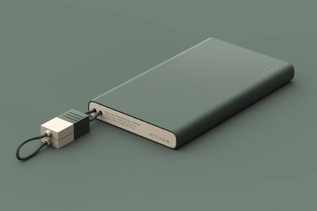
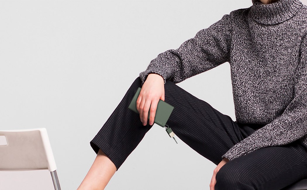
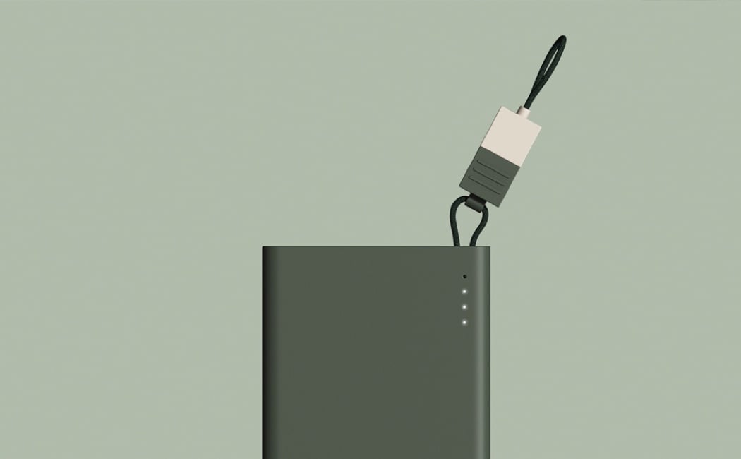
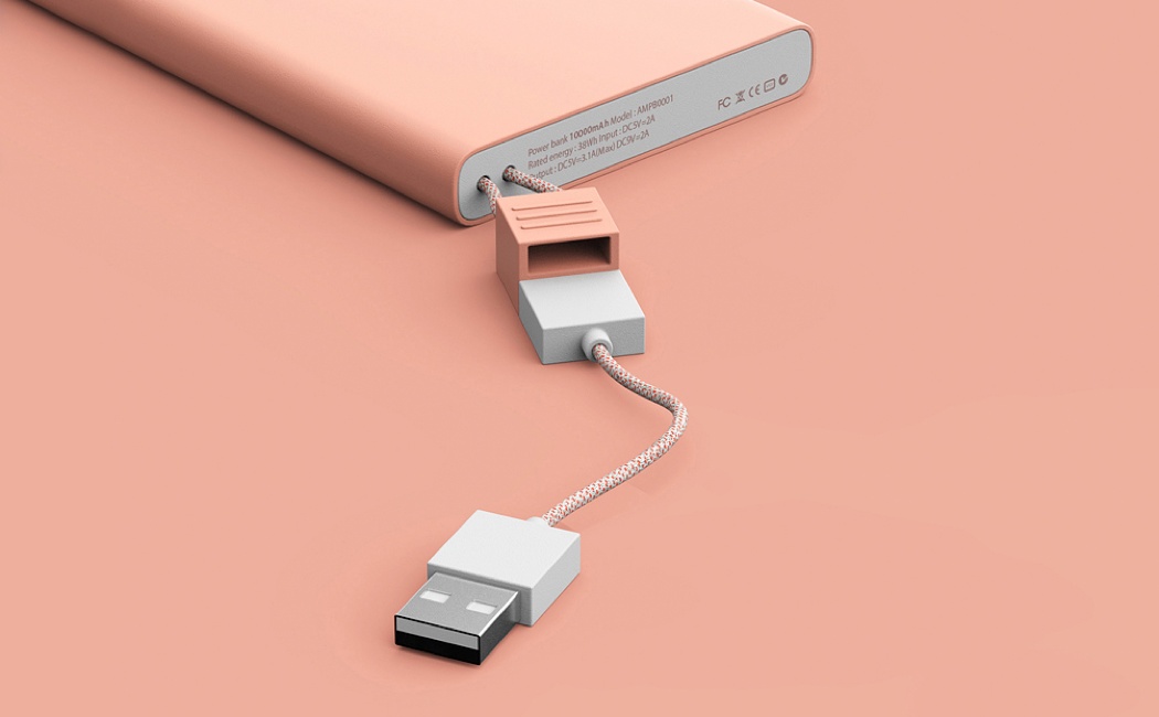
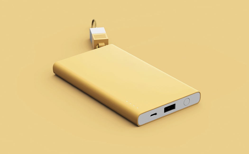
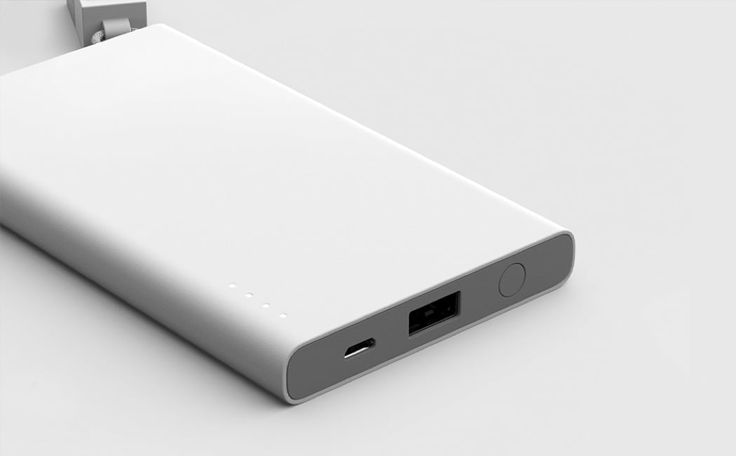
In an ideal world our devices would be able to make it through the day on a single charge and we wouldn’t be constantly on edge about being stranded with a lifeless device, or witnessing our disappointed and lost reflections in the blank screen of our, now useless, phones. Until this day comes we will have to make-do with carrying around powerbanks, but TASSEL may make this task slightly more bearable. Powerbanks often carry a rather utilitarian aesthetic and this may interfere with your clothing style or current trends; TASSEL combats this by featuring a sleek and minimal outer casing, where just four LEDs feature on its otherwise uninterrupted design. The cable, which is inspired by the tassels often found on women’s bags, means that the user needn’t worry about ever losing the cable, therefore they are still able to conveniently charge their device to ensure they are never left feeling lost without it. Designers: Hyunsoo Choi, Jeong Kim & Joongho Choi
|
| Posted: 30 Mar 2018 08:55 AM PDT
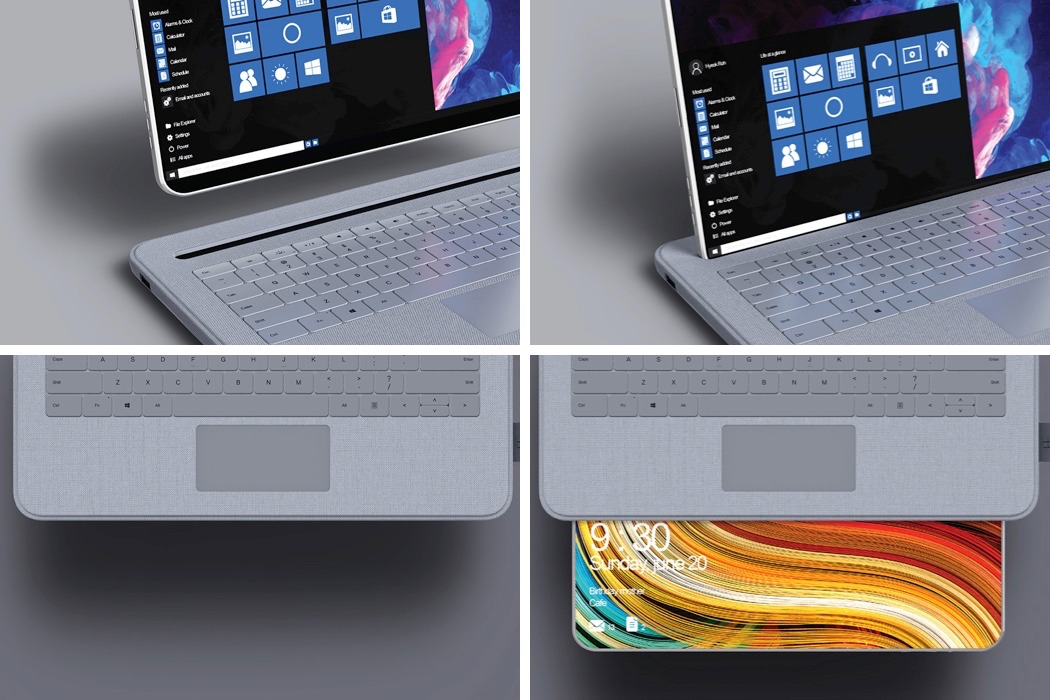
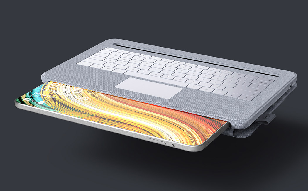
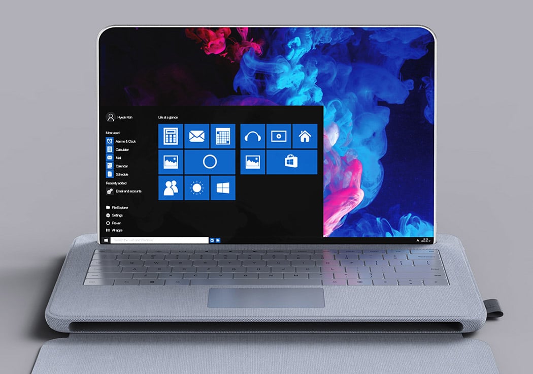
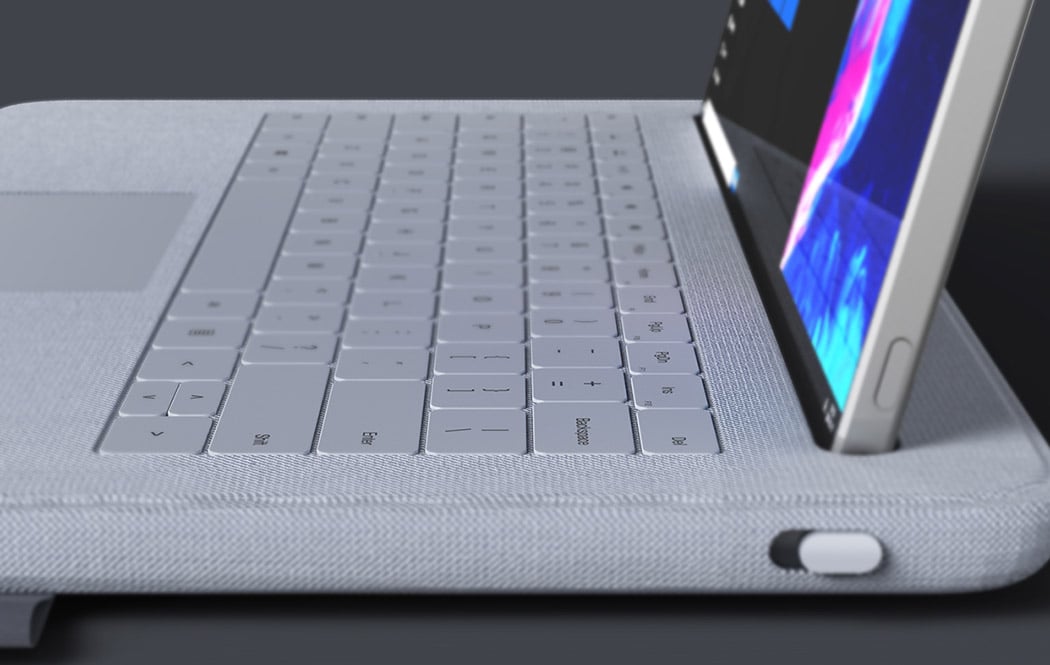
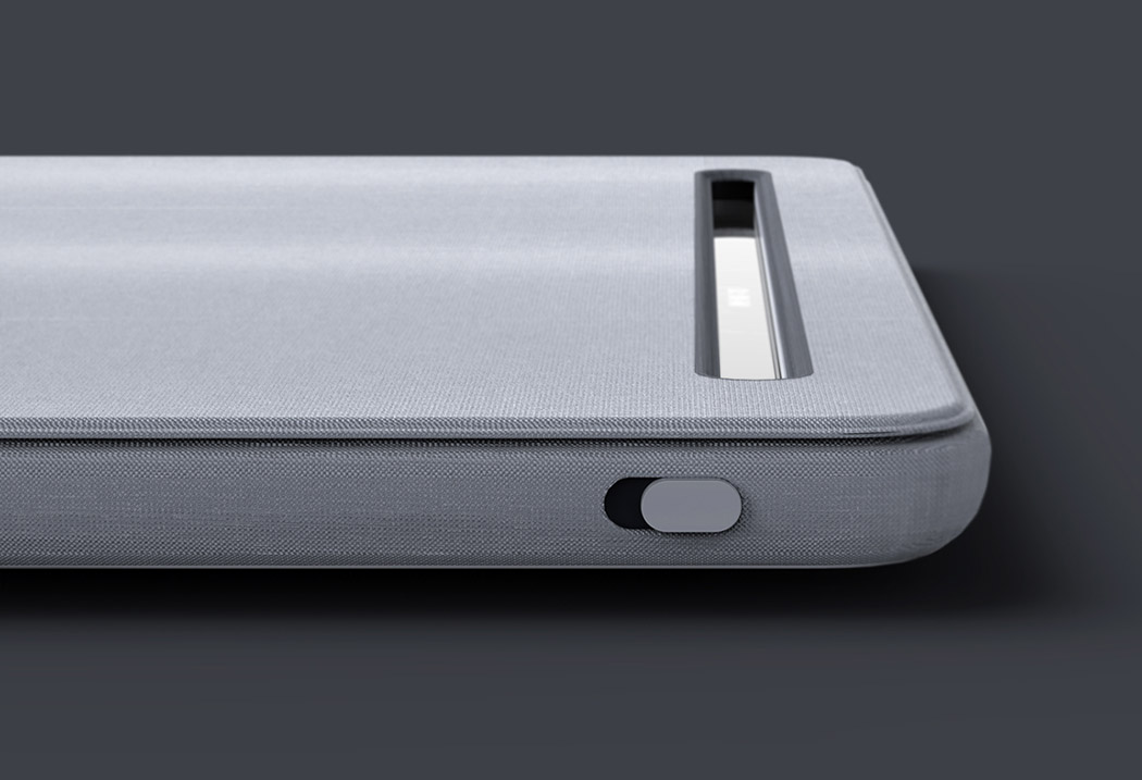
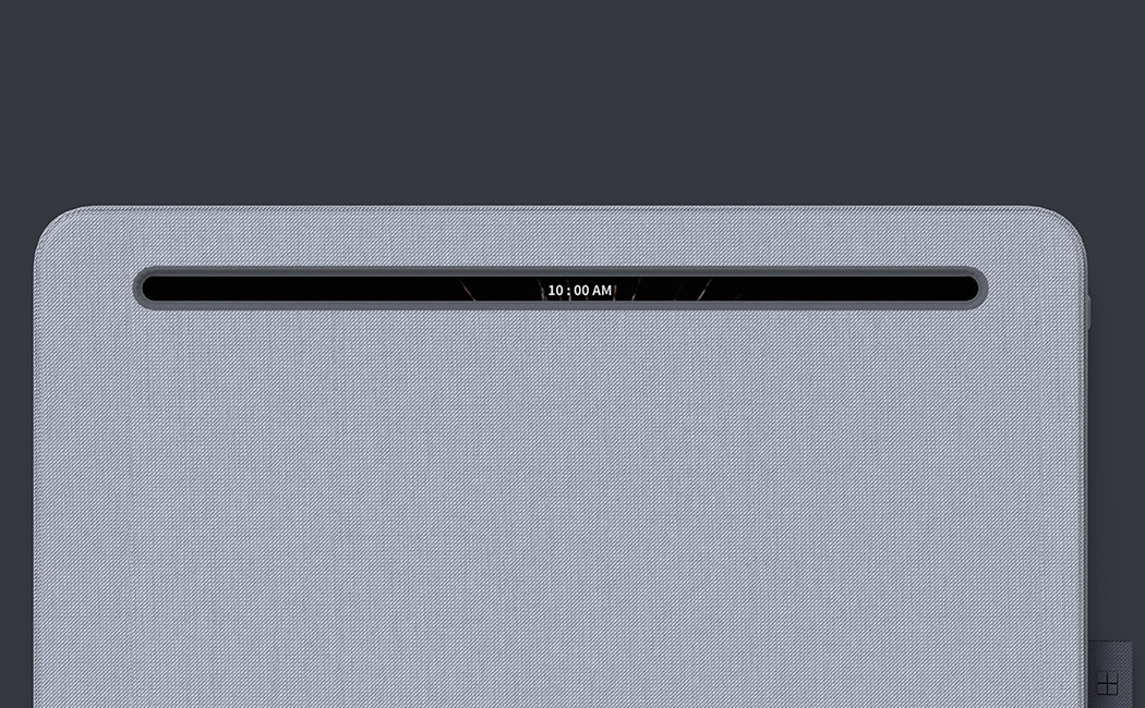
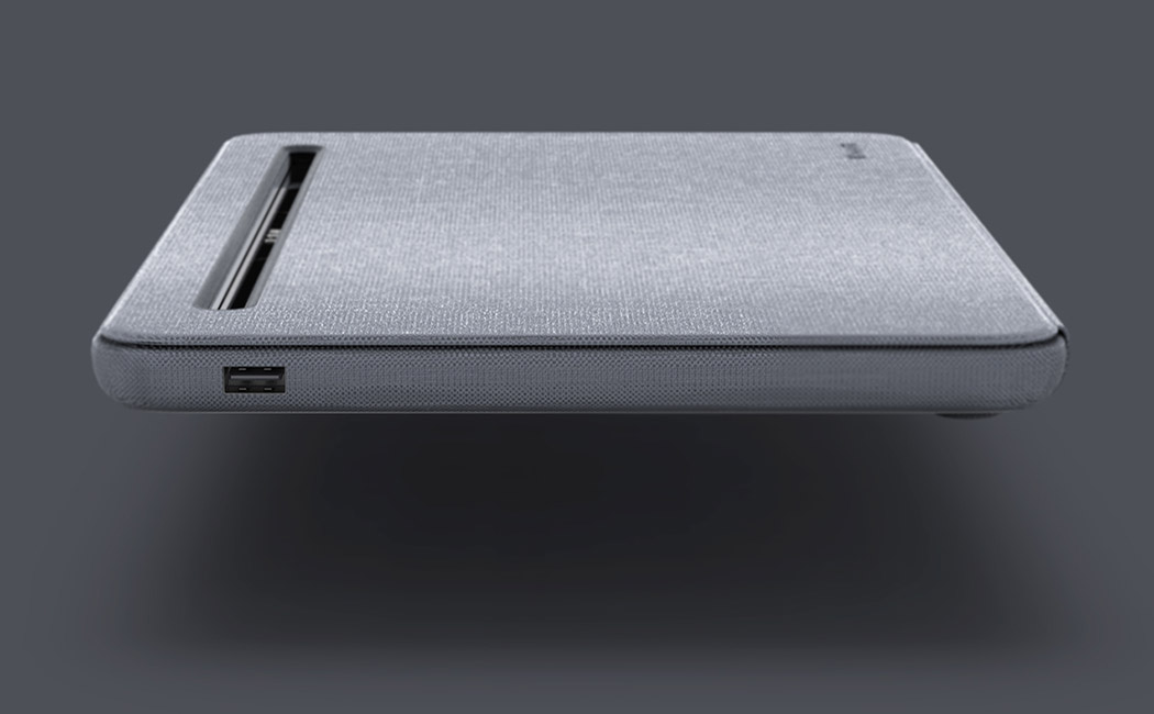
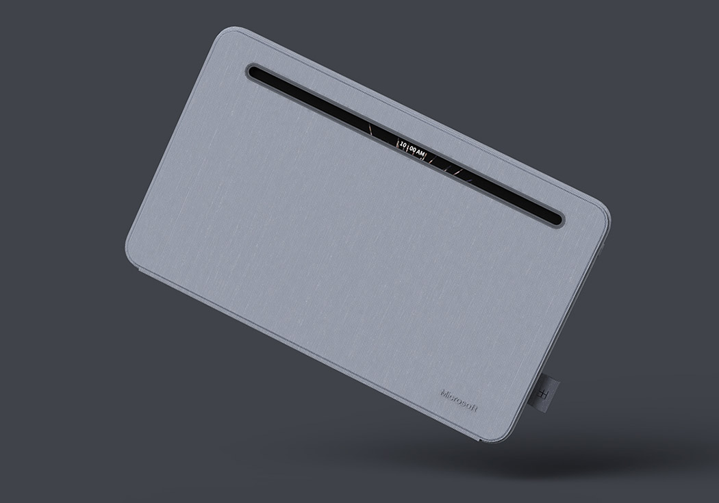
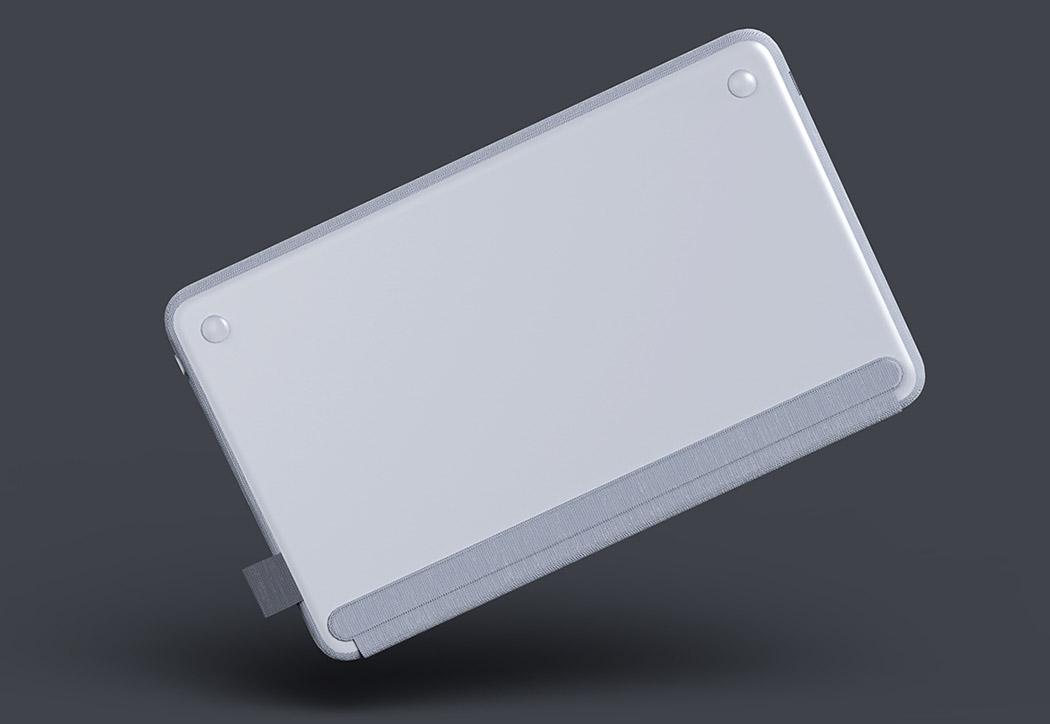
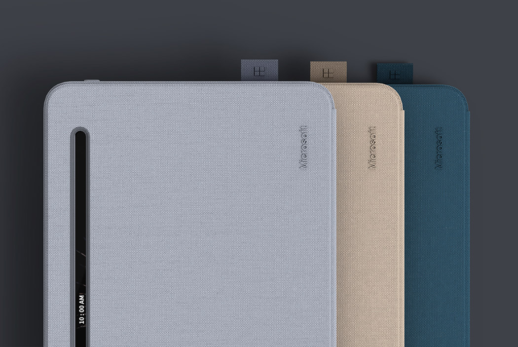
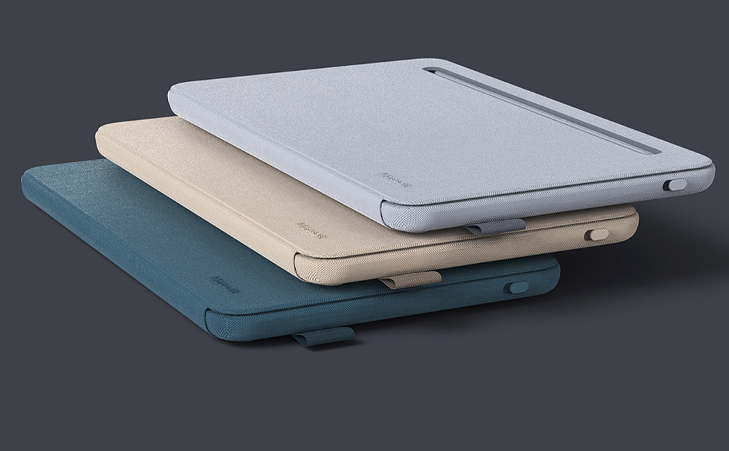
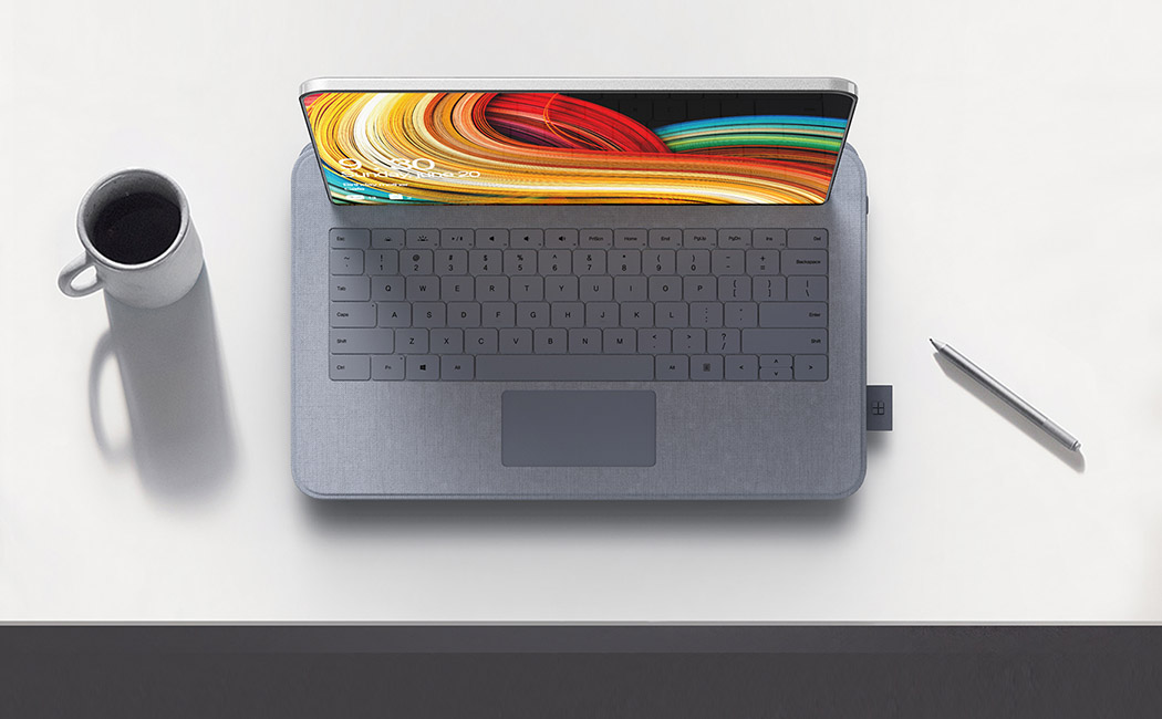
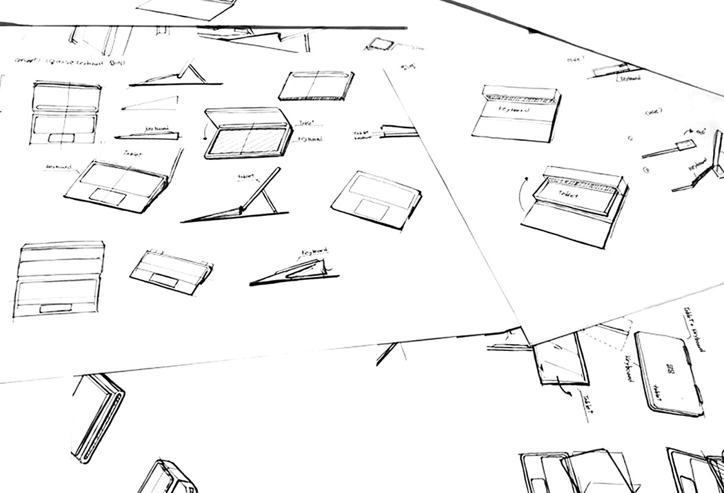
Sometimes the touchscreen on your tablet just doesn’t cut it. A Bluetooth keyboard can enhance your work but lugging two separate devices around isn’t ideal either. Designed with this in mind, the Cover Bluetooth Keyboard doubles as a place to safely store your tablet. Simply slide the device into the hollow-bodied shell to keep it secure during transport. Release it with the press of a button and slide it out to automatically pair with your tablet. Then, place it on the slot holder and get to work! Designers: Hyeok Noh & PDF Haus
|
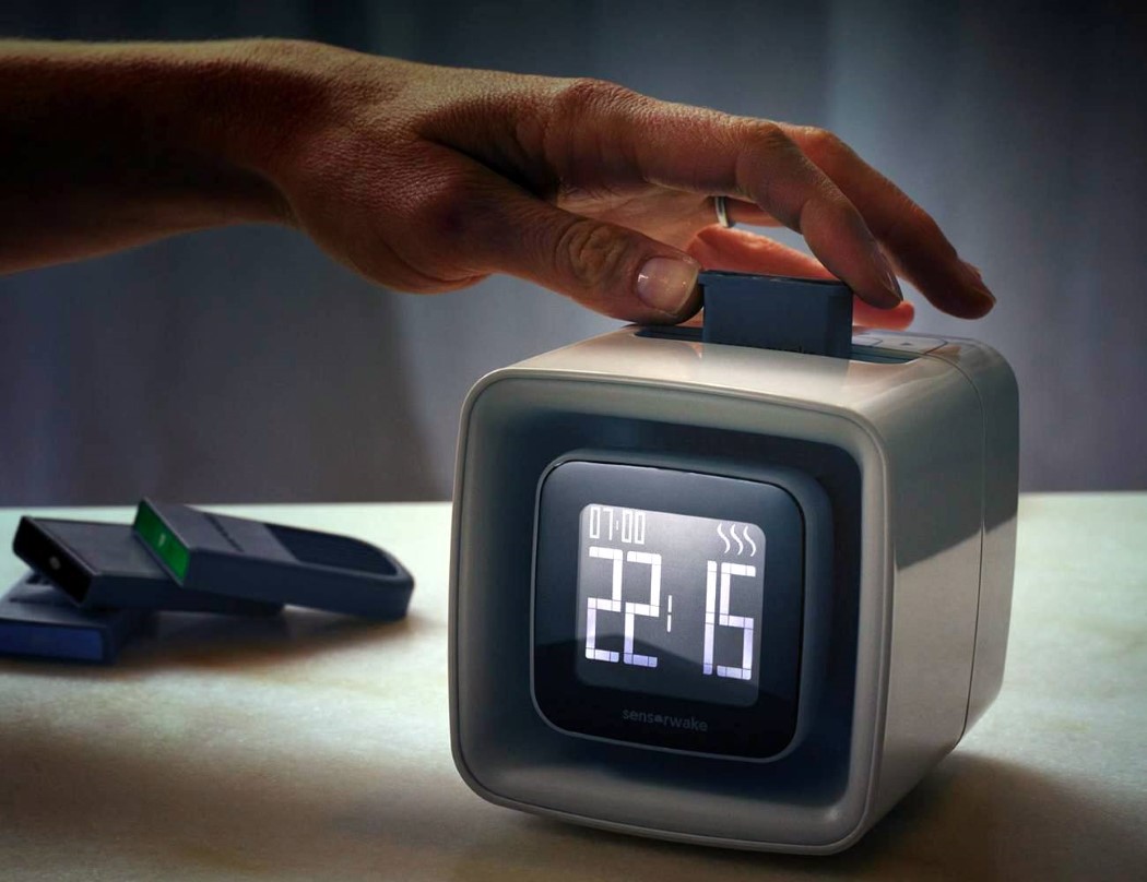
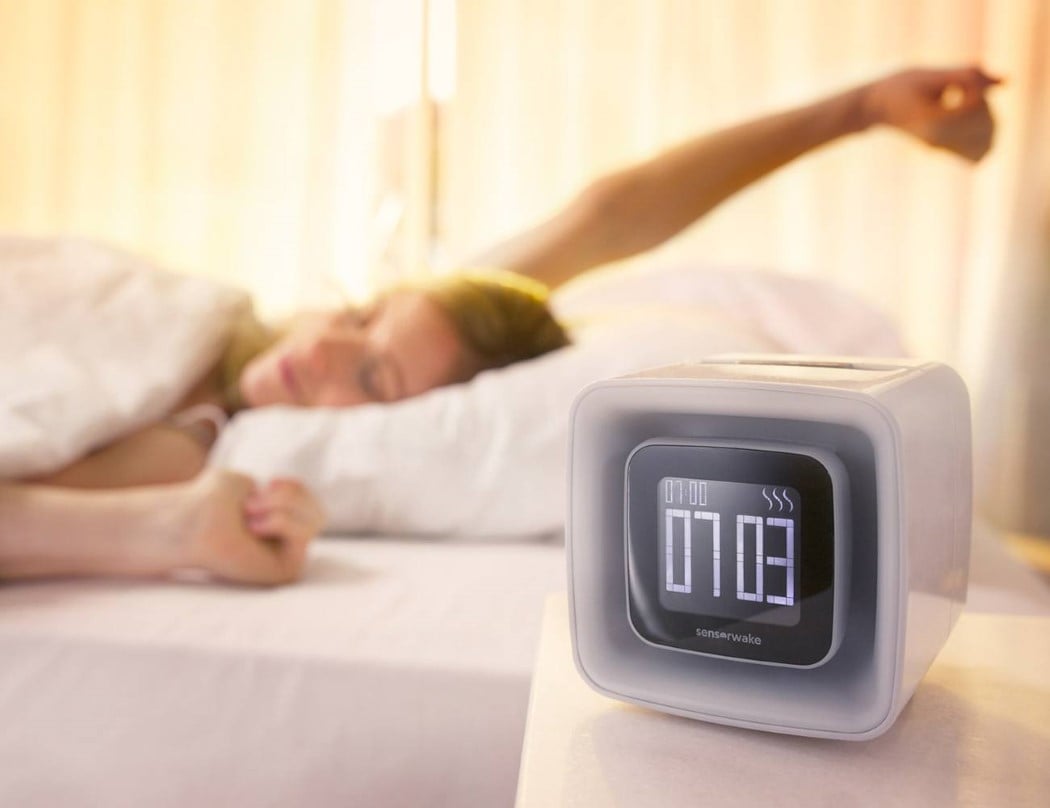
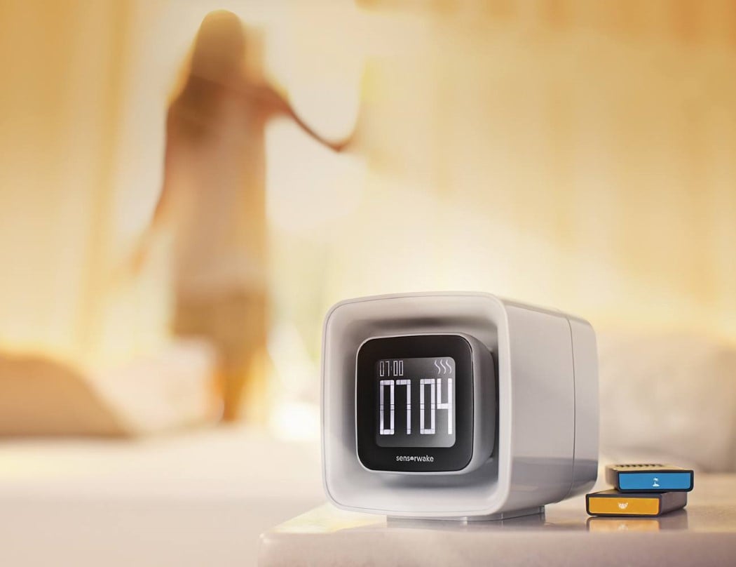
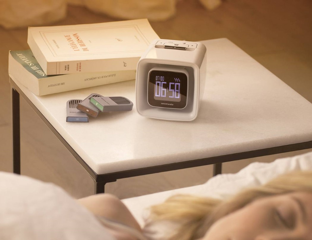
| Wake up to the smell of the seaside! Posted: 30 Mar 2018 05:59 AM PDT There’s something about scent that’s more efficient at waking someone up than anything else. Having the sun shining in your eye or an alarm clock ringing can jolt you into wakefulness but you’re still bound to be groggy. Smell a nice hot cup of coffee or the ocean breeze and your body and your mind both wake up at the same time! The Sensorwake employs light, sound, and aroma to wake you in under 2 minutes. Using proprietary aroma cartridges that last for over a month, the Sensorwake can get you out of bed by wafting fragrances in the room. Aside from the regular espresso coffee, the Sensorwake even comes with aromas like Apple-Cinnamon, Peppermint, Fresh Cut Grass, the Seaside and more. Simply slide the cartridge in and set your alarm timer and the Sensorwake gently blinks a light while playing soothing music along with filling the room with fragrances that immediately get you out of bed… although with fragrances like chocolate or espresso, you’re going to wake up with quite the appetite! Designer: Guillaume Rolland |
| A Modern Humidifier with Old Timey Inspiration Posted: 30 Mar 2018 12:00 AM PDT
In the olden days before electricity, lanterns were the only way to light your path. You’d have to march your way to the oil supply and refill it to keep things aglow. Inspired by this experience, the Lantern Humidifier adopts a similar functionality for refilling the reservoir. Unlike most designs which feature a cumbersome, removable tank, the LH is designed to ease the refill process with a handled design you can take anywhere. Simply lift the lid and run under any faucet to refill. Better yet, take it with you from room to room to ease your breathing with moisture-rich air. An ode to its unique inspiration, it’s also equipped with a light that illuminates your bedside or workspace with a subtle, comforting glow. Designer: Ninety Studio
|
| 20 A’ Design Award winning buildings that make us drool! Posted: 29 Mar 2018 06:13 PM PDT Goethe’s words “I call architecture frozen music” couldn’t ring more true for these 20 structural marvels. If architecture truly is frozen music, this article is a mixtape of 2017’s greatest songs. A part of A’ Design Award and Competition‘s winner list, these buildings are awarded for the uniqueness of the project, social impacts, environment friendliness, energy utilization, and other project-specific criteria. Ranging from conceptual designs to residential units, to spas, offices, museums, and retail spaces, the A’ Design Award covers architecture in its entirety, aside from a wide roster of other categories. Not only does winning an A’ Design Award look great on an architect’s resume, it also brings a lot of repute and focus to the work, uplifting its value! Architecture remains one of the most popular categories at the A’ Design Awards, receiving entries by the thousands each year. Here are a few favorites that we wish we had enough money to afford! If you’re an architect looking to participate in the A’ Design Awards this year, click here to register. Hurry, the deadline is March 30th! 01. Hotel Pino Nature by Studio ZEC Built on a mountain, the Pino Nature Hotel’s shape also makes it look like amountain range! Made to suit a snowy environment, its steep roofs make sure they never collect snow, while the front glass facade allows visitors to admire the impeccable view! 02. Manshausen Wellness Spa by Snorre Stinessen You don’t require much therapy at the Manshausen Wellness Spa by Snorre Stinessen. It cantilevers over a precipice, giving you an unconditionally beautiful balcony view of the vast and calming sea. That’s pretty much all the therapy you’d need! 03. Punjab Kesari Headquarters by Amit Gupta: Britta Knobel Gupta Built for one of India’s leading state-level newspapers, the Punjab Kesari’s new headquarters looks absolutely like a work of art. The use of a ‘jali’ facade helps bring a cultural touch to the otherwise modern architecture, indicative of the newspaper, which is seamlessly blends culture and future. 04. Horosho! Shopping Mall by Iq Architecture Studio You’re likely to get lost in this shopping mall because you’re busy admiring its hypnotic architecture. Designed on a site that’s filled with otherwise drab looking residential buildings from the 80s, the Horosho! shopping mall tries to look dynamic… by literally looking dynamic! Designed with no two floors looking the same, the building sports an interestingly organic design that looks like pages of a book being turned. 05. White Church by Jingye Li Clean on the outside and on the inside, and beautiful throughout, the White Church is everything a church should be. I especially love how the walkway has a gothic door/window shaped outline thanks to the metal column that travel from the floor to the ceilings. What a wonderful place this would be to get married at! 06. Keiun Building by Kensuke Aisaka
07. Fuyi River Sales Center by Kevin Chang Taking inspiration from the seashell, the Fuyi Rive Sales Center stands out in its neighborhood by differentiating itself from the rest of the architecture in the area. The curved elements come made from white metallic sheets that shift both in width and pitch with a nonlinear rhythm to provide sunlight for the interior space as well as to give the building an iconic appearance from both inside and out. 08. Damavand House by Hossein Shirazian Irregular, dynamic, and unique, the Damavand House cuts itself with vertical, horizontal, as well as diagonal lines. The white lopsided frame makes the house stand out from afar, while we personally love the way the designer made use of different colored woods to give the otherwise regular parts of the building some pizzazz too! 09. Chongqing Wanda Velodrome by Wanda CPRI & GDAD The Chongqing Wanda Velodrome takes inspiration from oriental culture, citing the Chinese lamp as direct inspiration for its aesthetic. Designed to be a cycling stadium that can also be used for other sporting activities, the entire stadium actually lights up like a lantern too, with different colors every time there’s a different sport played inside! 10. Urban Canvas Facade Installation by Hyunje Joo, Munhyung Lee Perhaps the most unusual building to make it to this list, the Urban Canvas Facade is completely lined with translucent shopping baskets from top to bottom. I’m not really sure whether to react positively or negatively, but the building has my attention! Looking like it’s wrapped in bubble-wrap, the building has this texture that is sure to make passers-by take second and third glances. I can say with some surety that it surely looks interesting at night when the lights inside go on! 11. The Bad Cafe by Nuru Karim – Nudes From one strange facade to another, the Bad Cafe’s most characteristic wall sports a strange undulating pattern created by individual pipelike projections coming out from translucent white tiling. Designed to look like the undulating microtexture of the skin, complete with pores, the Bad Cafe is a rejuvenation cafe that combines health food and yoga to cleanse one’s skin as well as one’s insides. What looks like a crazy pattern on the outside even translates to its inside, since the tiles are actually translucent, allowing you to see the shadows cast by the pipes at different times of the day! 12. Flexhouse Residential building by Evolution Design Architecture usually comprises multiple straight lines… the Flexhouse however features one singular curved line! Sitting somewhere in the vicinity of picturesque Lake Zurich in Switzerland, the Flexhouse is sure to add to the beauty of the neighborhood! 13. Pool House Residential by Priyanka Khanna Ah, this is truly the life! Priyanka Khanna’s Pool House is peak life goals! The inspiration for the design being “pebble in the grass”, the Pool House comes with a pebble-esque outline, with glass walls on the front and back. One end overlooks a grassy meadow, while the other, an incredibly inviting swimming pool! 14. Carmen Hotel Boutique Resort by sanzpont Marine life seems to be a dominating theme here, with the Carmen Hotel too taking inspiration from sea creatures. The hotel uses corals as its inspiration and ornaments itself with coral-like details. Situated right off the Caribbean Sea, I say it’s a perfect fit! 15. Lagos’s Wooden Tower by Hermann Kamte Using Nigerian culture to adorn the building, the Lagos’s Wooden Tower comes with a clad that has deep roots in the cultures of the Edo, Yoruba and Hausa people of Nigeria. Along with the designs on the facade, the building comes with its share of flora, not only adding greenery to the atmos, but also a certain freshness and coolness to it. 16. Three cubes in the forest by Kotoaki Asano & Makoto Kosuda Designed to look like cubes embedded into the soft ground, this movable pavilion is actually an interactive playing area for children. Built with benches on the inside, they’re perfect for children or even adults to play around in. Besides, they can easily be moved around, rearranged, or relocated by simply lifting them and moving them around! 17. Noor Island Park Park by 3deluxe architecture 18. Crab Houses Multifunctional complex by Dagmara Oliwa & Anita Luniak
These quirky buildings take inspiration from crustaceans and their overall shape. Designed to exist above the ground plane, the Crab Houses were made to look like crabs entering the sea of grass. Strange? Definitely. Appealing? For sure! 19. The Wave Tower Waterfront Residences by Ar.Girish Pillai
20. Star Seafood Restaurant by Saber Sajadi Our final pick for the architecture round-up is yet another marine-life inspiration. Somewhat following the statement “You are what you eat”, the Star Seafood Restaurant creates a new proverb… “You are WHERE you eat”. The seafood restaurant with its five-pronged design looks exactly like a massive 3D starfish from the top… and why shouldn’t it, right?! Impressed? Inspired? Well then, go ahead and grab a spot for your own designs at the A’ Design Award and Competition. Don’t wait up! You’ve got till the 30th of March! Go take the leap, and we’ll see you on the other side! |
| Posted: 29 Mar 2018 12:10 PM PDT
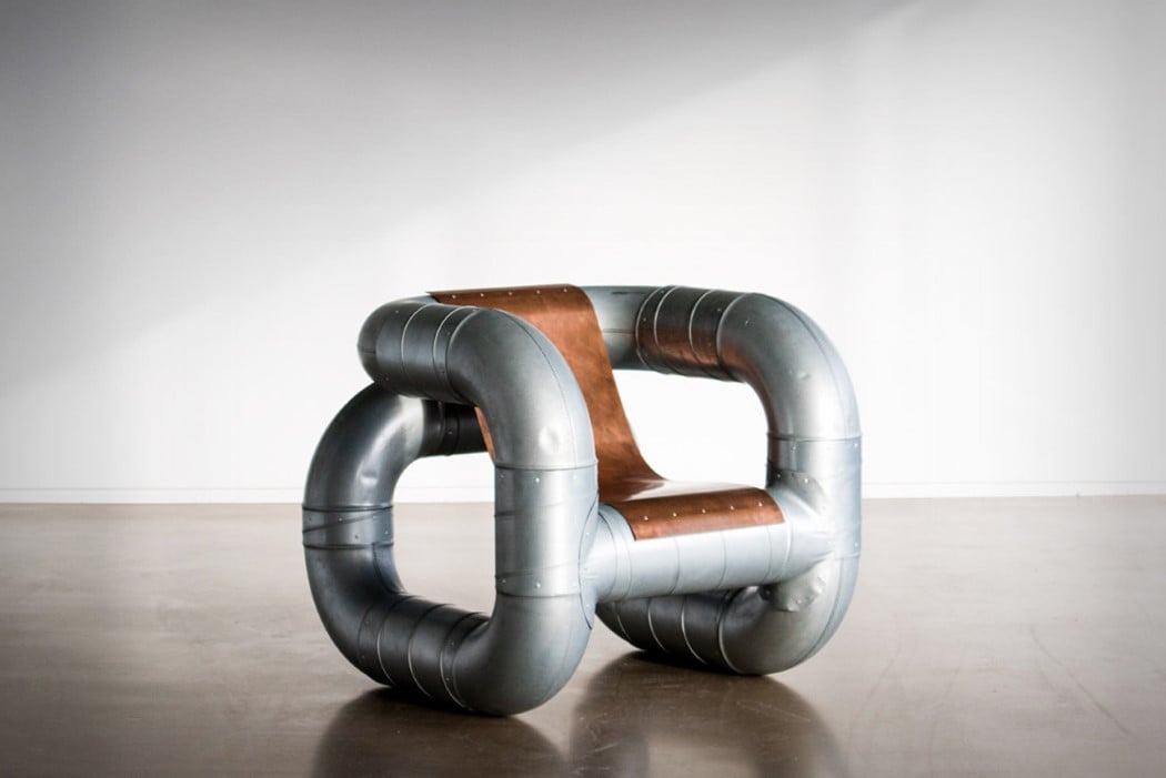
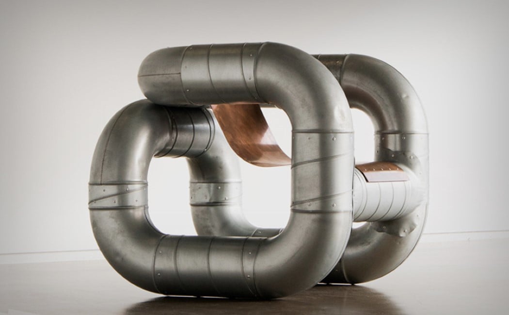
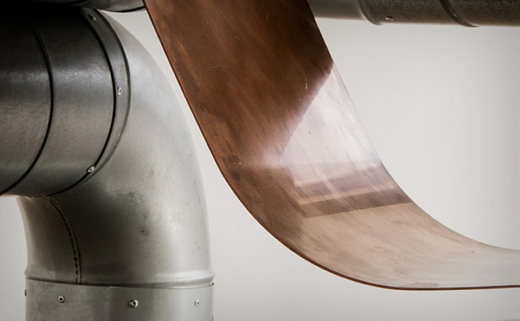
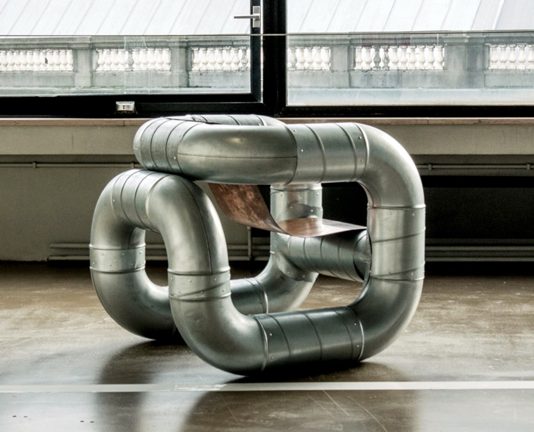
Made from ventilation/cooling pipes, the Tubular Armchair by Lucas Munoz may theoretically be the coolest chair ever. Designed as a part of his collection ‘Objects From Interstitial Space’, Munoz hopes to bring the background to the foreground, by using materials and elements that usually are hidden from sight behind drywalls or above false ceilings, and play more of a functional role than an aesthetic one. In their new avatar, these objects that are normally hidden from visible architecture suddenly become show-stealers. Using steel piping and elbow joints, Munoz created the curvaceous body of the chair, before using a copper panel that he shaped by hand for the seat. The entire seat is held together using aluminum rivets that help retain the raw feel of what is in fact, a beautiful, finished product! Designer: Lucas Munoz
|
| You are subscribed to email updates from Yanko Design. To stop receiving these emails, you may unsubscribe now. | Email delivery powered by Google |
| Google, 1600 Amphitheatre Parkway, Mountain View, CA 94043, United States | |
