Yanko Design - Form Beyond Function |  |
- This Television Rocks!
- A Lifetime of Design
- Headlights of the Geneva Motor Show 2018
- From Nest to Toolbox
- Hoverboard? Segway? Both?
- GPS-enabled shoelaces. Yay or Nay?
| Posted: 10 Apr 2018 10:36 AM PDT
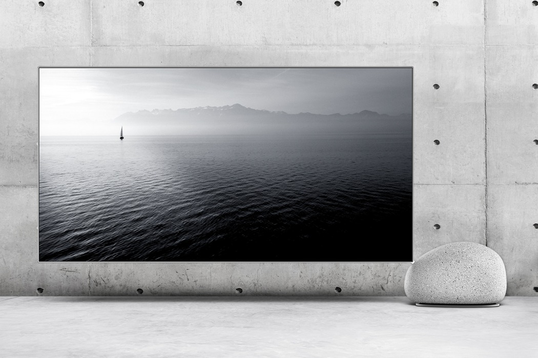
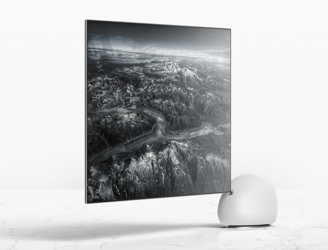
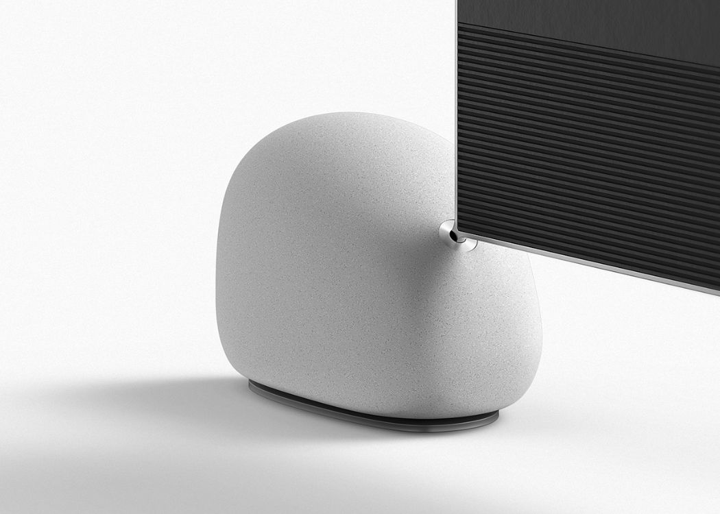
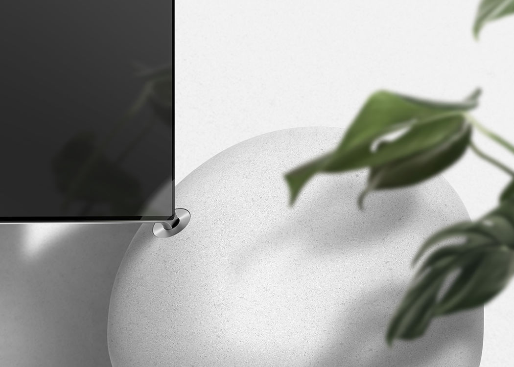
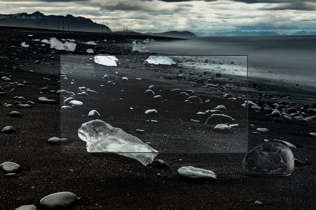
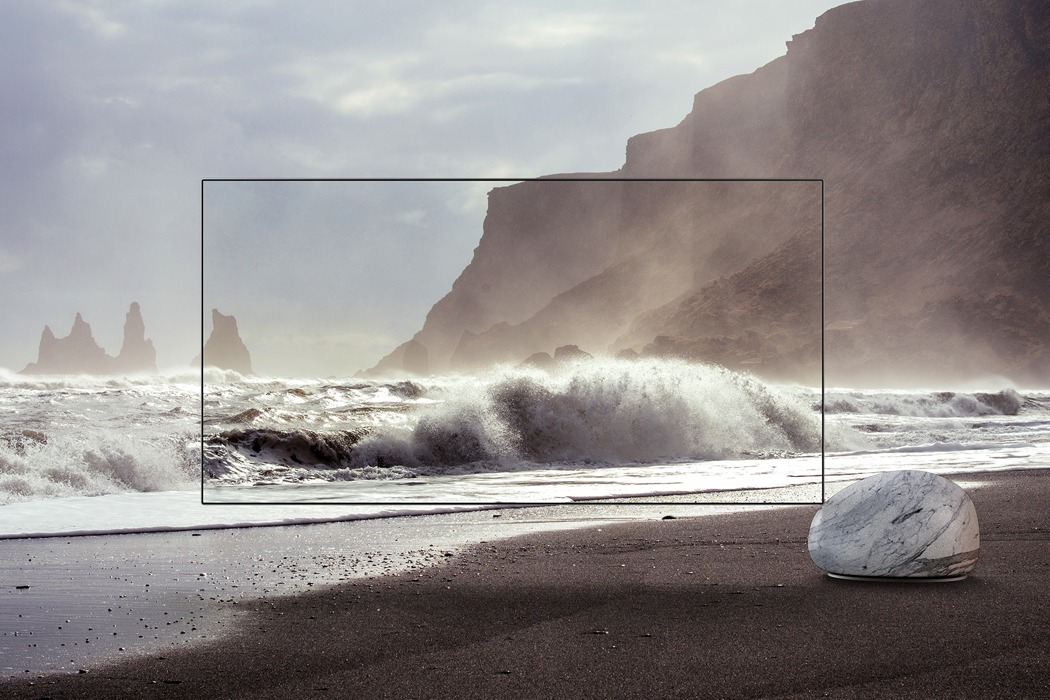
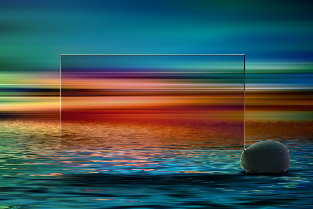
Over the last decade or so televisions have become seemingly-less deigned; all that’s appeared to have changed is their depth due to the advancing technology, and the only thing distinguishing between the many brands is the logo on the front. Designed to get the user more involved by removing all unwanted elements, ARTE sets out to break the mould of TV design. The conventional television stand has been replaced with a large stone that is positioned off-centre, this adds an interesting element of suspense to the design. Hidden within the stone is an acoustic lens to ensure a superior listening experience for the user and this further engages them. With such a unique and distinct design ARTE is more than just a television, it’s a piece of art; its able to draw just as much attention when the television is off than when it is on! Designer: Euikyun Koh
The stone which supports the frame of the TV set is the center of gravity, and also the speaker of the TV. The sound that spreads in all directions through the Acoustic Lens on the bottom lets the user hear superior sound wherever he/she is.
|
| Posted: 10 Apr 2018 08:55 AM PDT
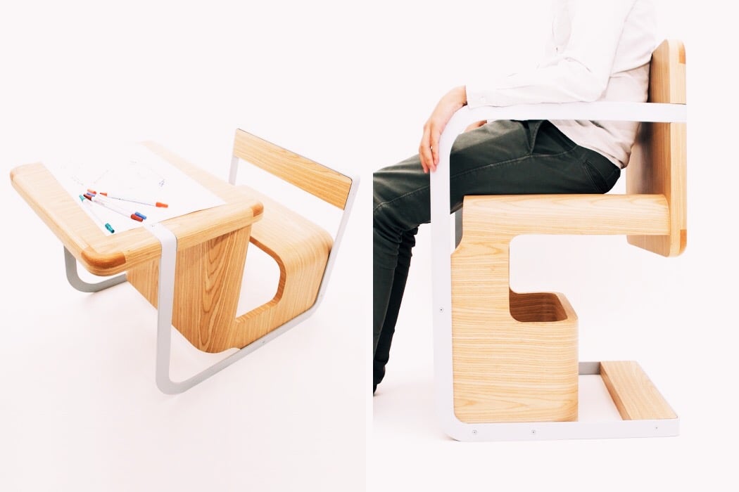
As people become more aware of the environmental impact their design decisions have, so does the need for lifespan-focused furniture. The Wonder Chair by Lee Wen De is a perfect example of a design that takes into account the changing needs of the user to extend its usability. All you have to do is flip it! By setting the orientation in one direction, it can be used as a kid’s chair for eating or a child’s desk for drawing or writing. Flip it over, however, and it becomes a full-size chair for any adolescent or adult. With a simple turn, it can actually grow up with you! Designer: Lee Wen De
|
| Headlights of the Geneva Motor Show 2018 Posted: 10 Apr 2018 06:07 AM PDT
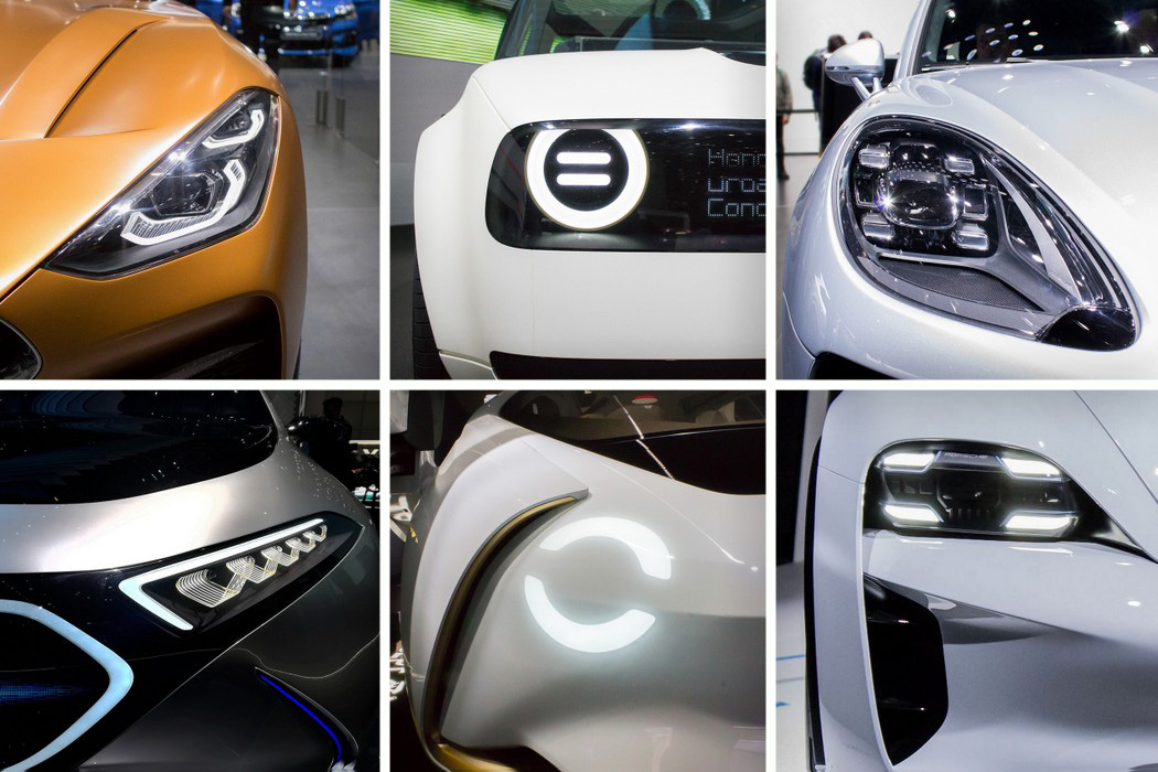
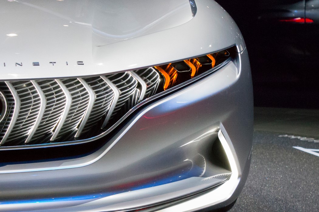
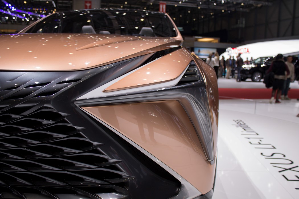
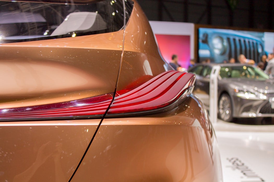
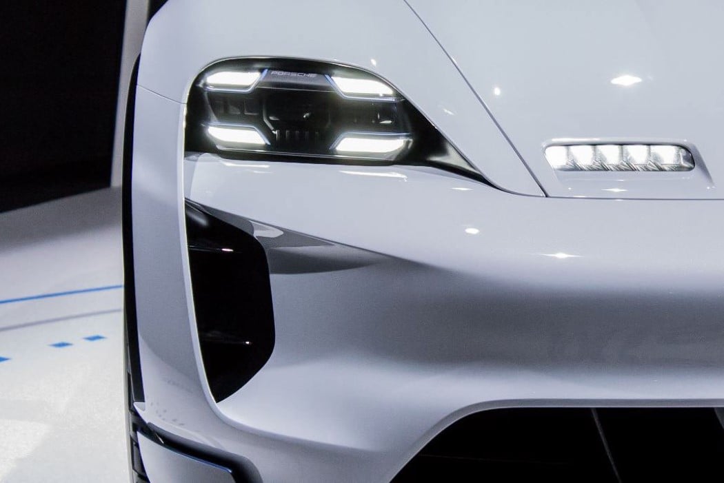
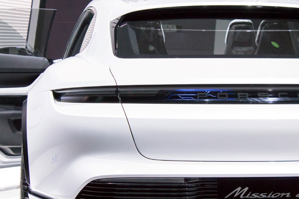
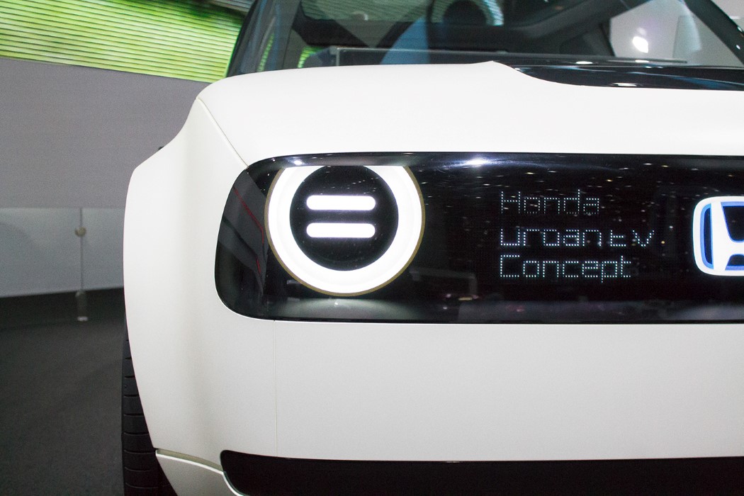
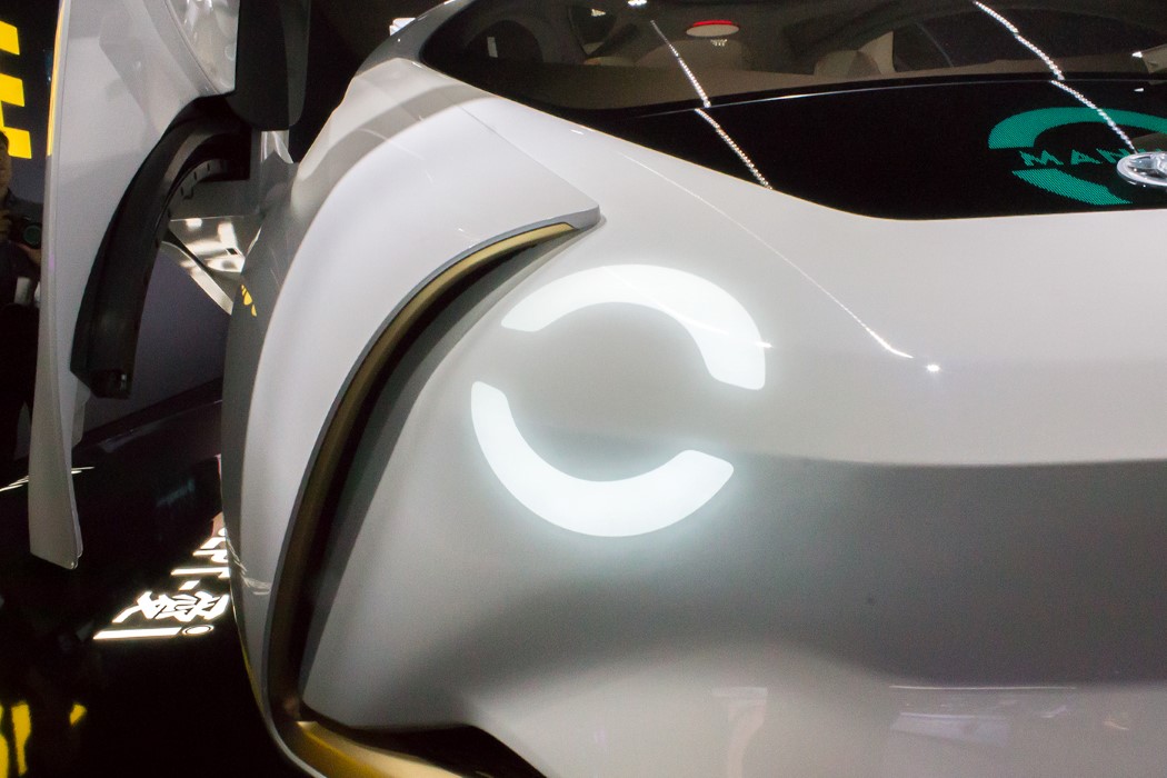
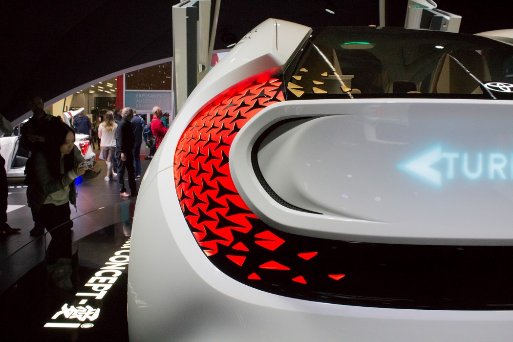
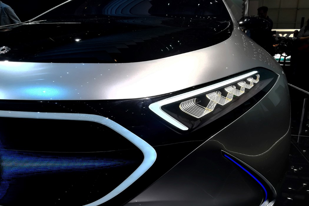
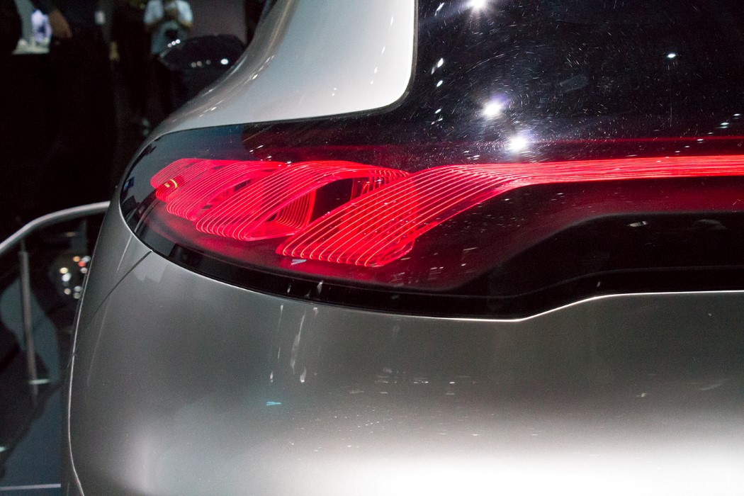
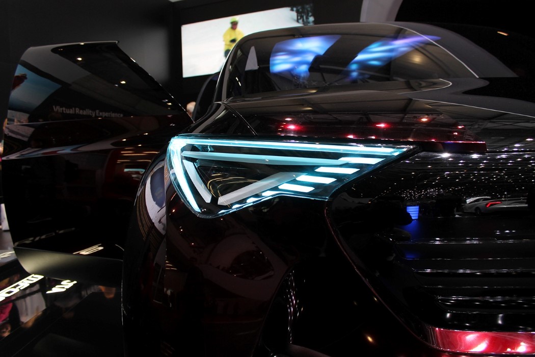
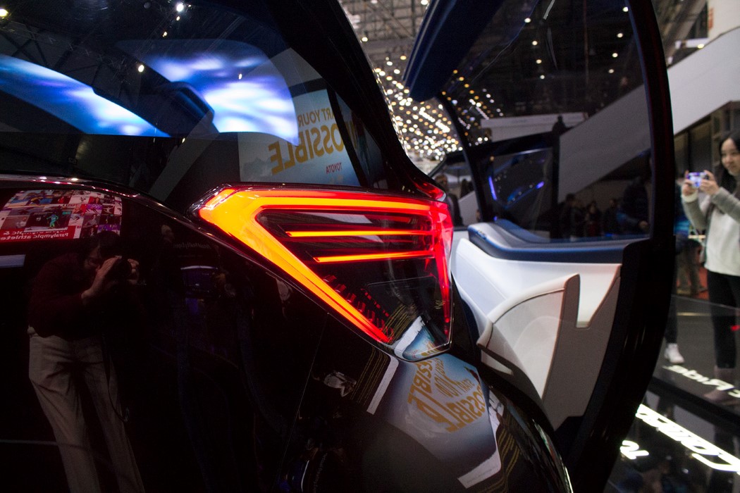
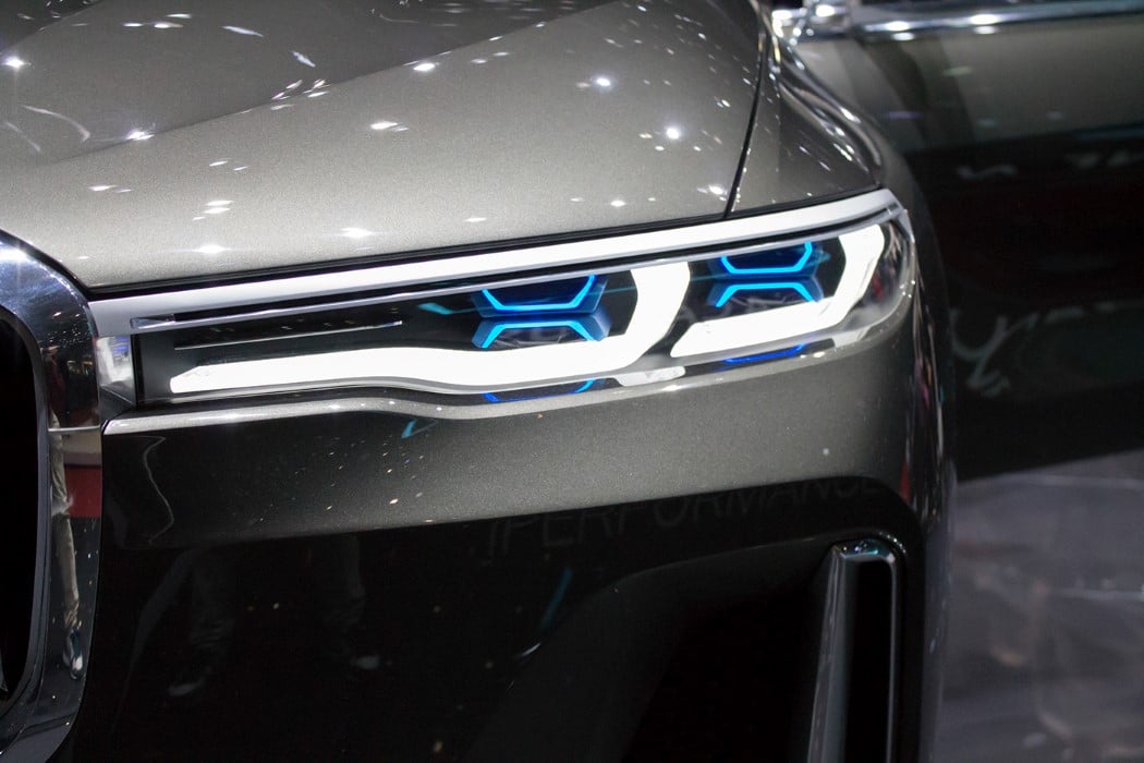
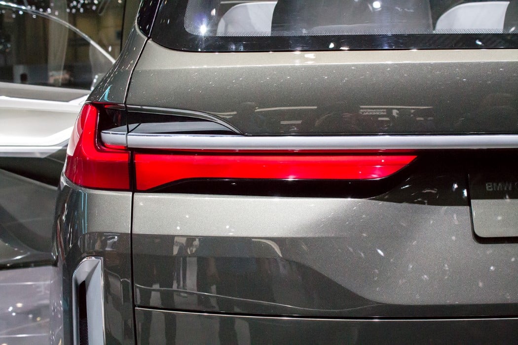
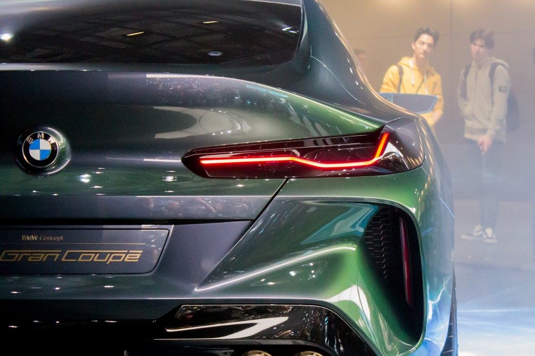
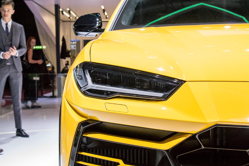
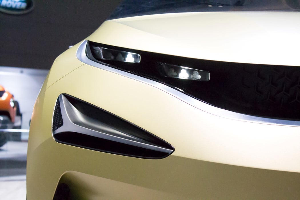
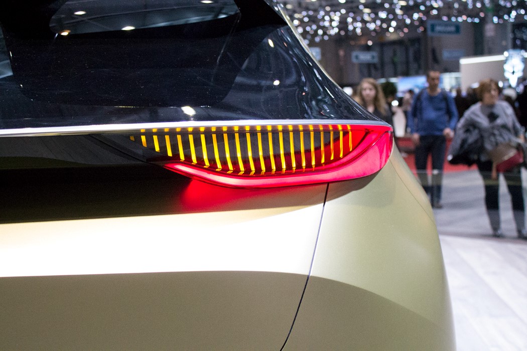
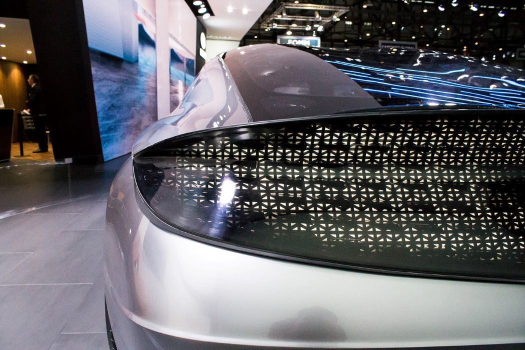
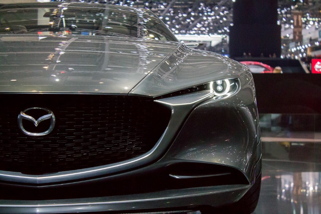
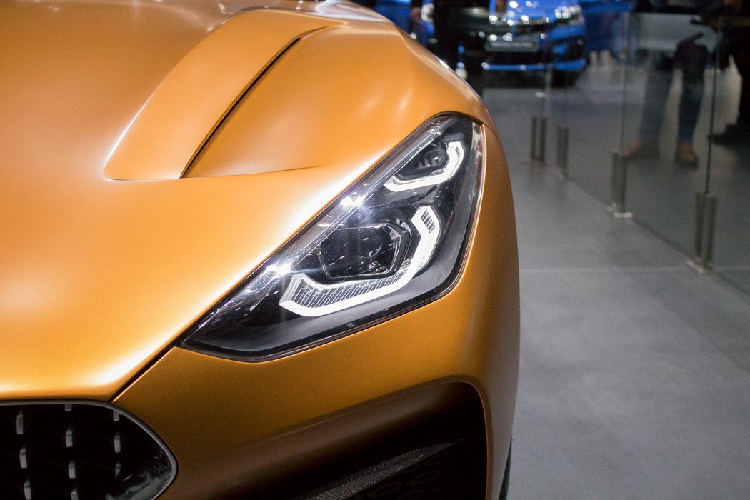
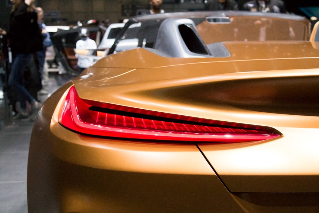
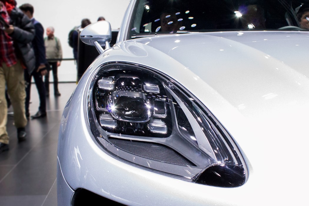
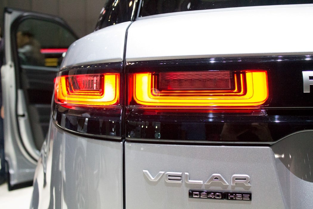
This absolutely exhaustive collection of headlights and taillights from the Geneva Motor Show 2018 paints a pretty accurate picture of how we’ve moved on from traditional lighting to designs that are much more expressive and state-of-the-art… because that’s what cars are moving towards. Being entities of transportation with a personality that isn’t just visual, but intangibly humane too. These cars come with high-end AI integration, allowing you to interact with the car as you would with a human. The expressive headlights almost look eye-like in some cases, allowing the car to look anywhere from friendly to superior. While the headlights take the expression of the eye, it’s up to the taillight to convey a sense of aerodynamics and speed. Taillights are usually dominated by horizontal or slanted lines, giving the car a sense of direction and speed, almost looking like a motion blur of red. A lot of the cars explore edge-lighting to give you a slim headlamp/taillamp with an almost logo-esque, iconic, defined look. Gone are the days of the circular headlight, or the one with the traditional bulb+reflector setup. The headlights of 2018 seem to be on the verge of becoming just an ornamental feature with no proper use (we’re even seeing an increased adoption of blue lighting over white), as cars move towards a self-driving future where the driver doesn’t need to see what’s a 100 feet ahead of him/her. The cars that DO retain the circular headlight (like the Honda EV and the Toyota I-Concept) do so to allow the car to look friendly and approachable… a personality-type usually reserved for the experimental car-sharing system. Screens/pixels also start to make their appearances on the front of the car (Honda EV Concept, the Mercedes EQ Concept, and the incredibly futuristic Toyota I-Concept), giving the vehicle emotional depth and a little more dynamism. Picture Credits: Pablo Doldán
|
| Posted: 10 Apr 2018 12:00 AM PDT
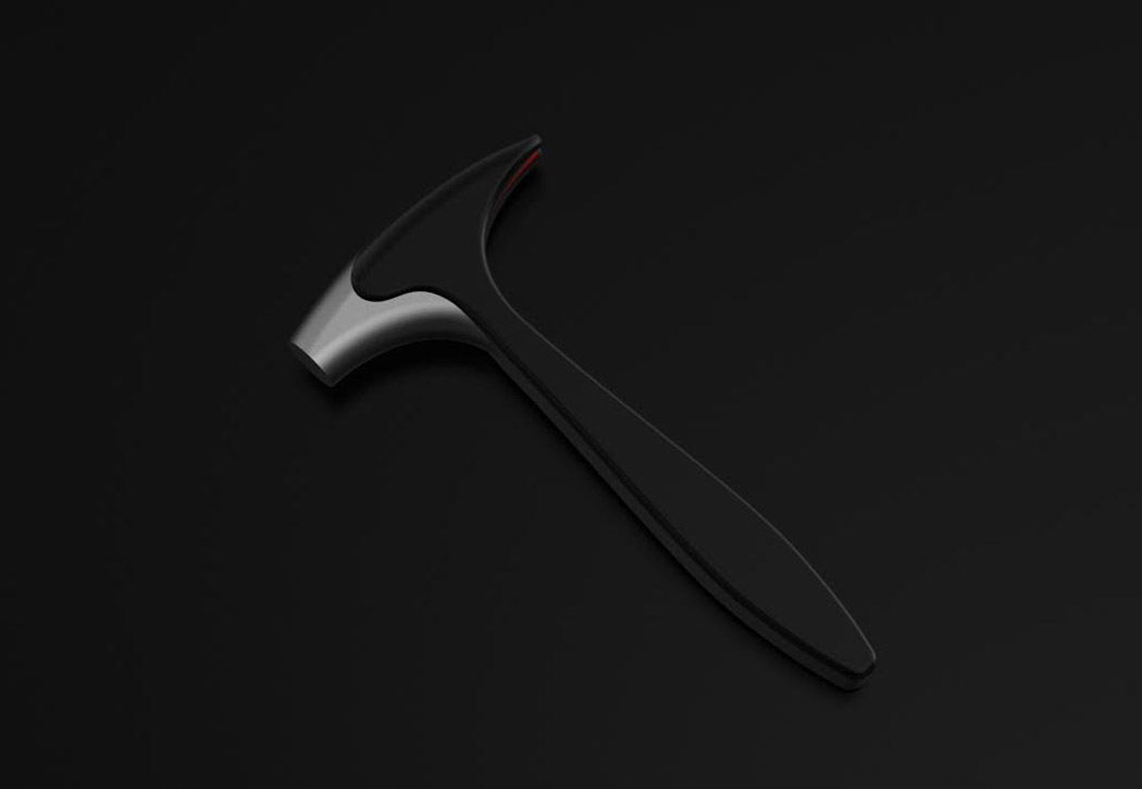
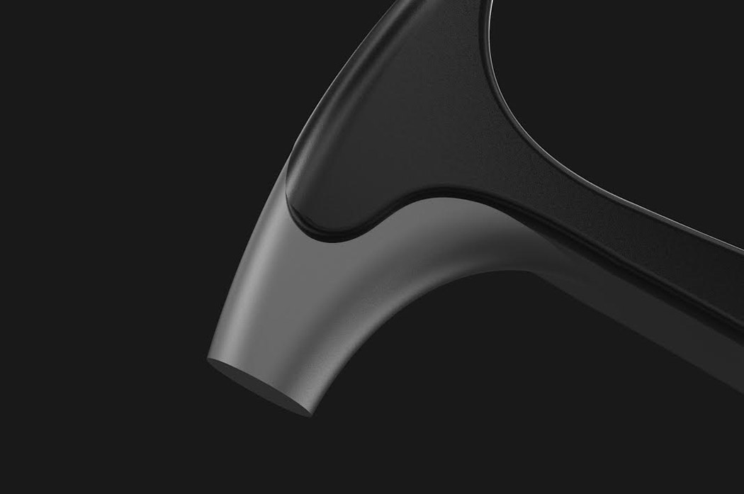
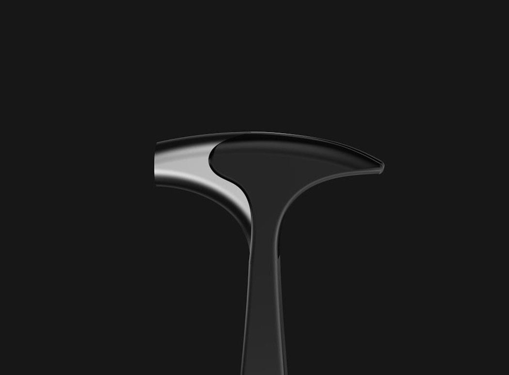
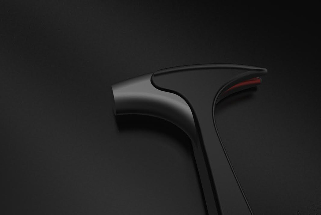
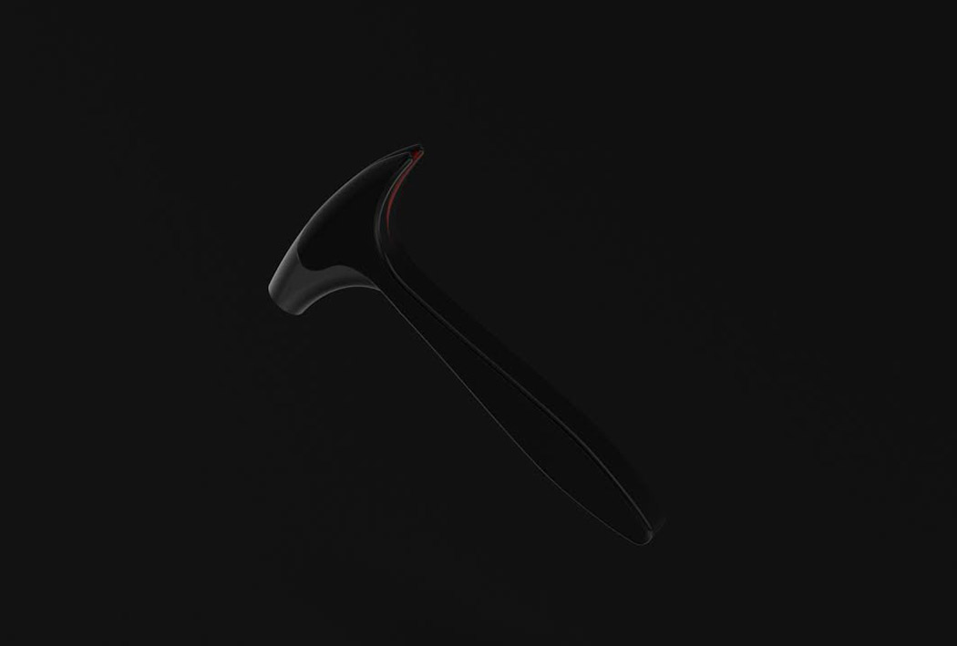
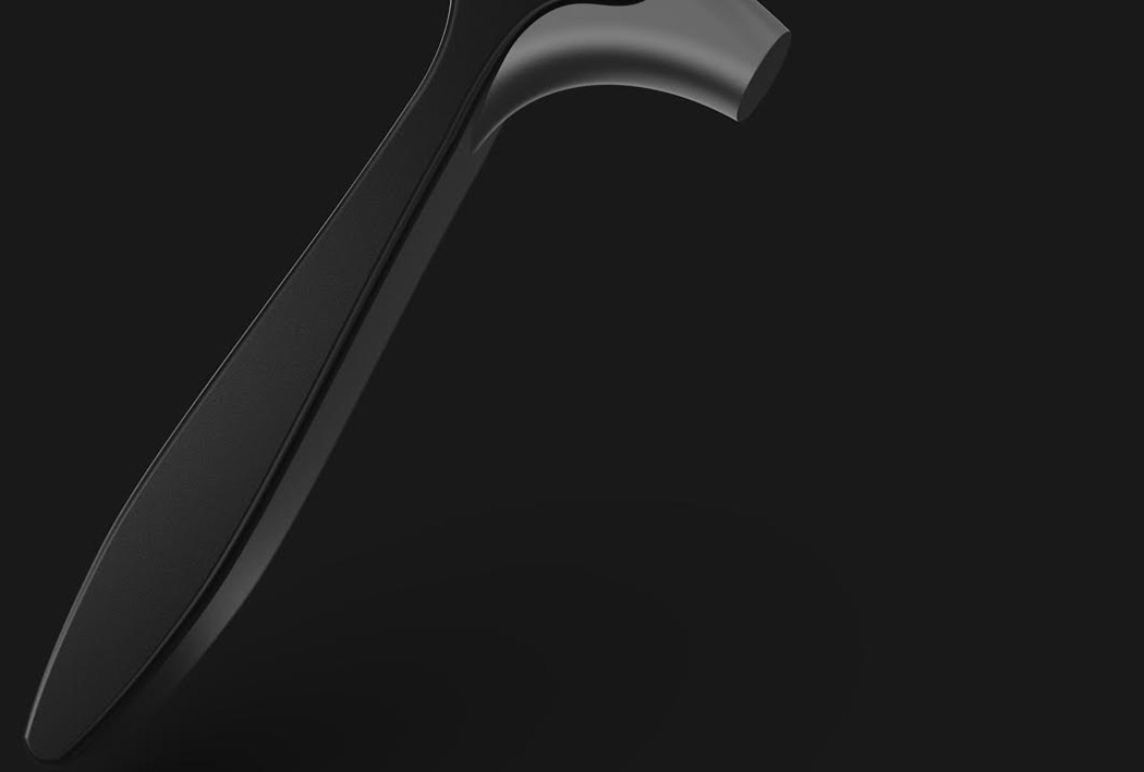
If you live in North America, the Pileatus Claw Hammer might look familiar… and not because you saw it in your dad’s garage growing up! Rather, it takes avian inspiration from your own backyard and is inspired by the bird of the same name – the pileated woodpecker known for the colorful crest that adorns the top of its head. The hammer adopts a similar form with a sleek, swept-back style that looks both aerodynamic and tough as nails. With a single white side and flaming red details on the claw, even the colors mimic the shading of the feathers. It’s an unusual inspiration of biomimicry but stunning nonetheless! Designer: Shivangi Vasudeva
|
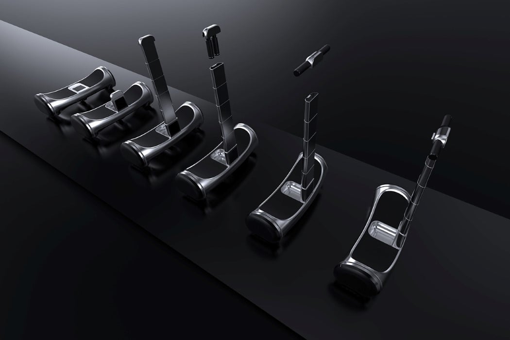
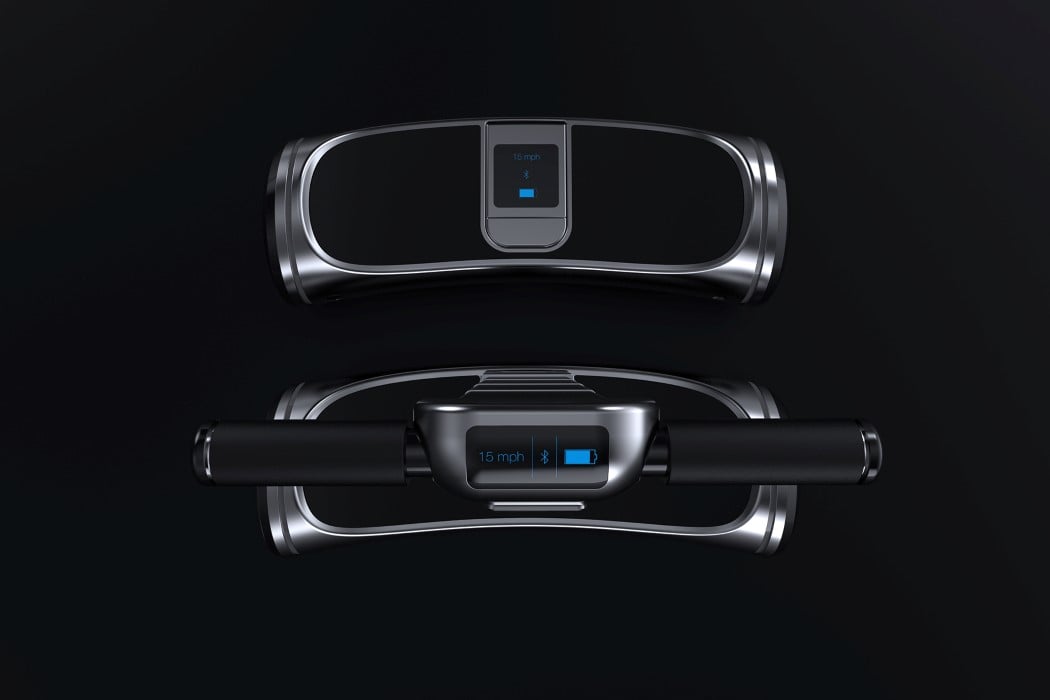
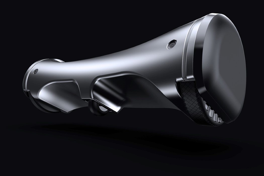
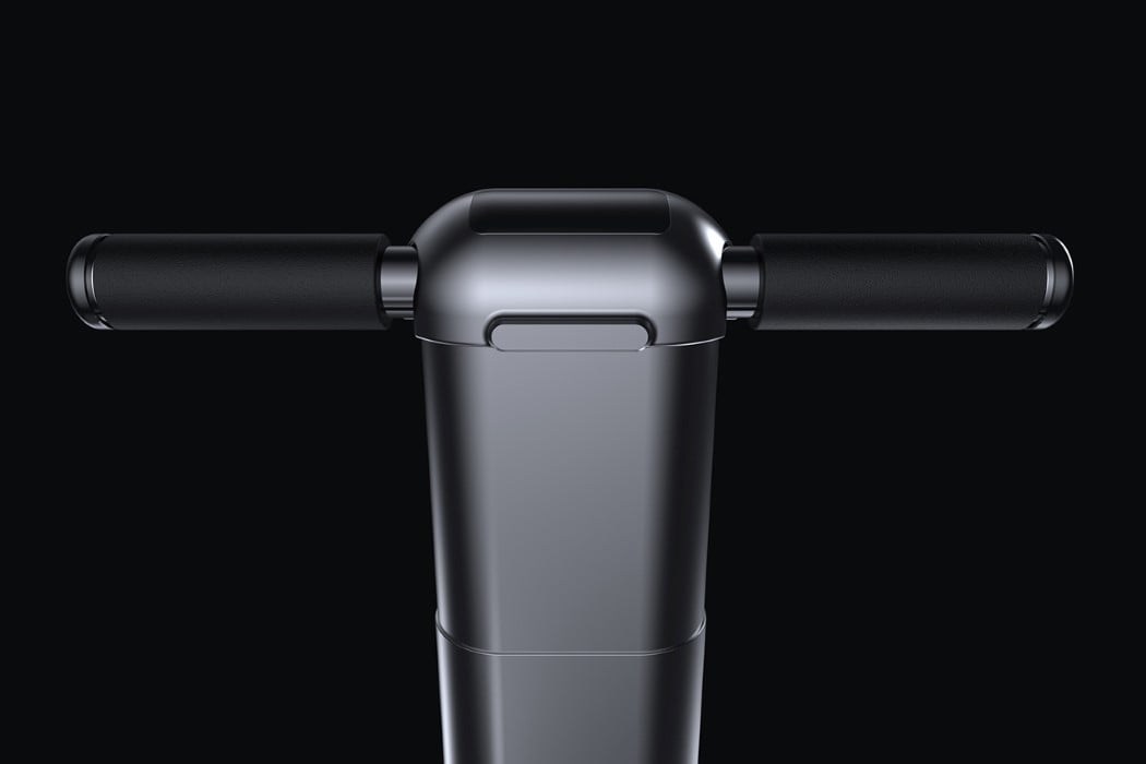
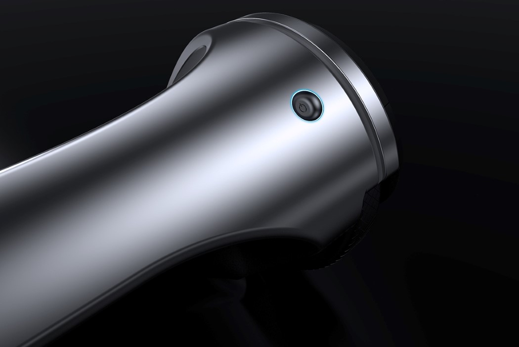
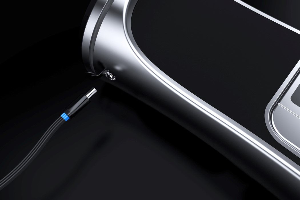
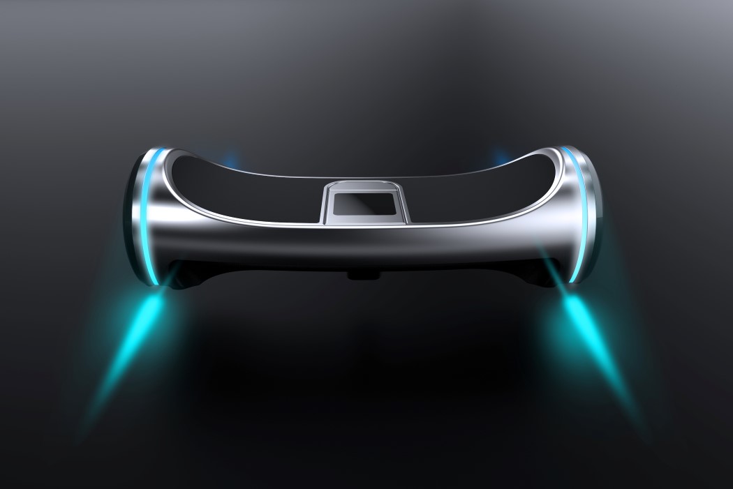
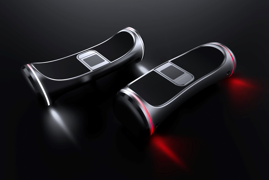
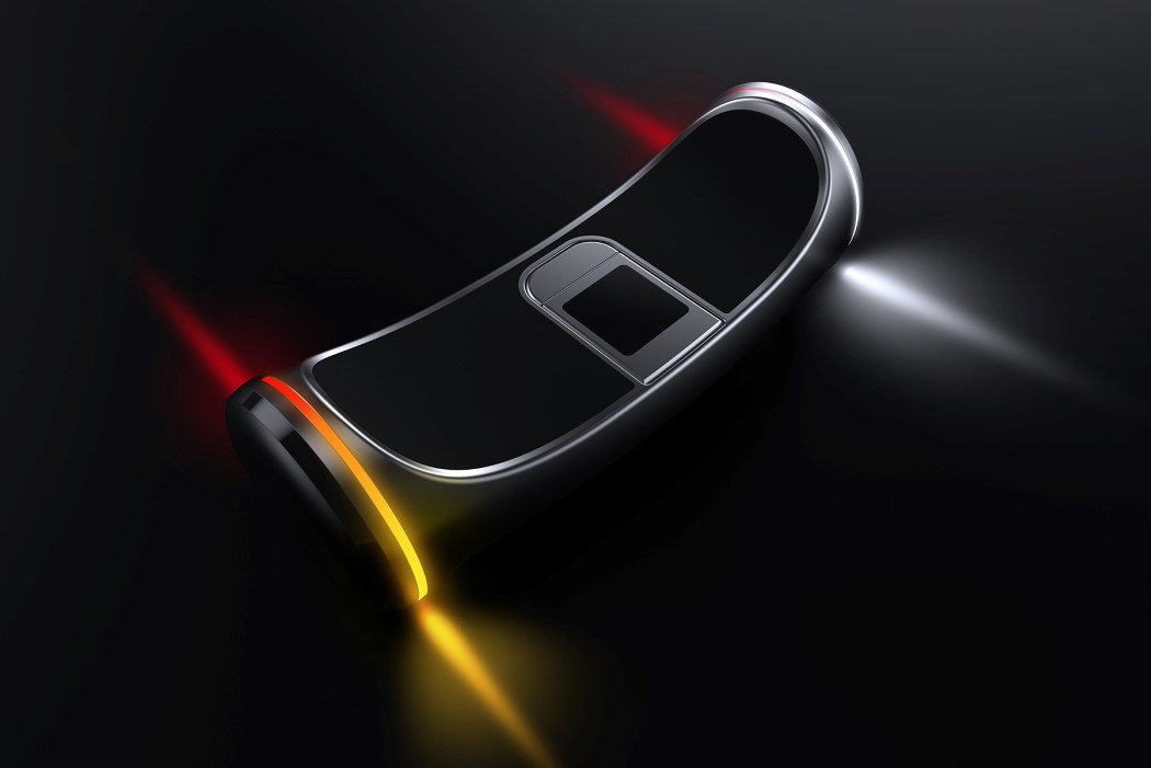
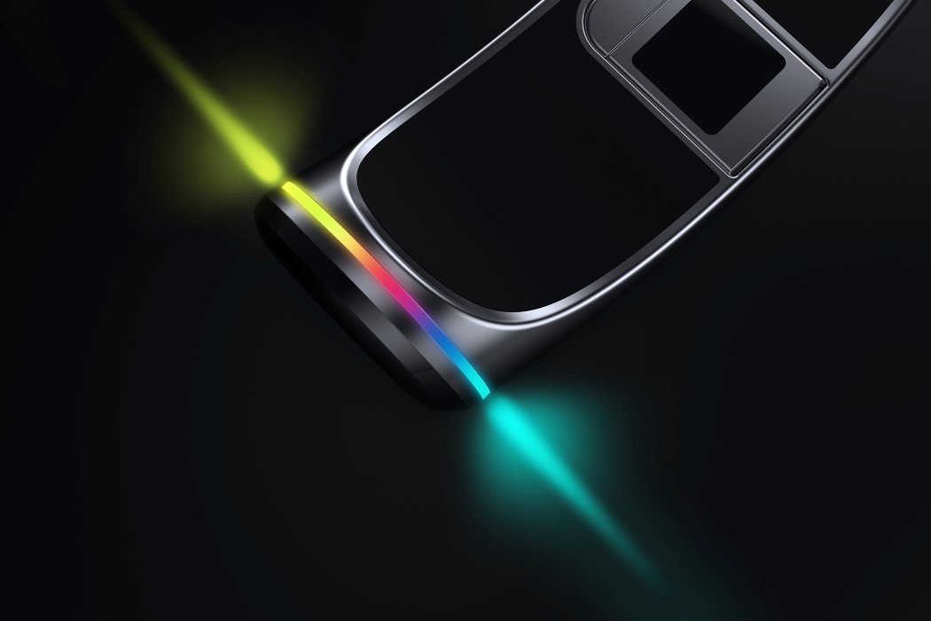
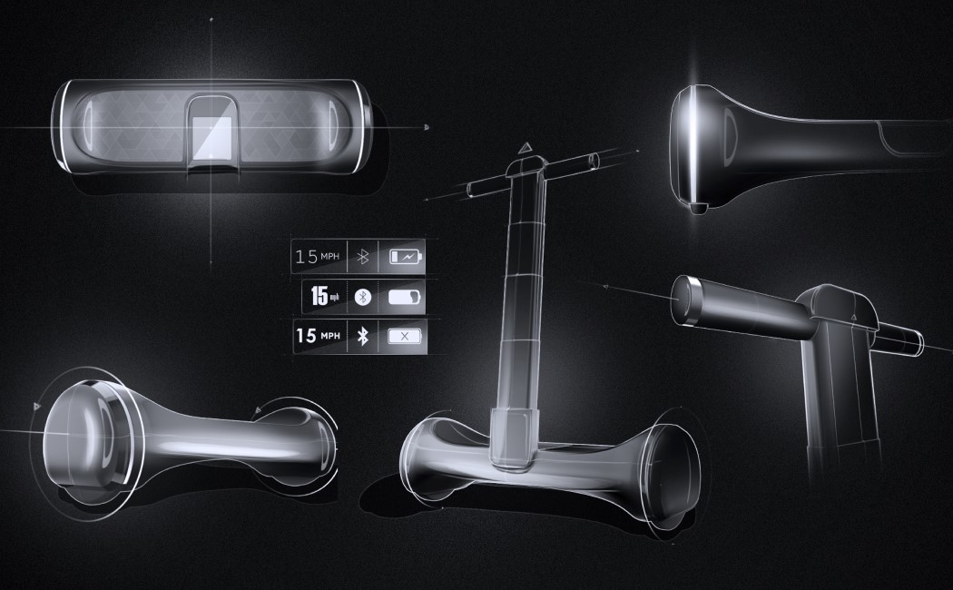
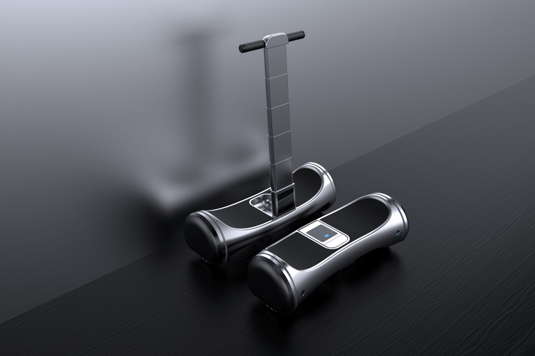
| Posted: 09 Apr 2018 03:57 PM PDT The Hoverboard 2.0 is practically a stroke of genius. Designed to be an intuitive, functional, and user-friendly device, the Hoverboard 2.0 can switch between being a regular hoverboard and a Segway, thanks to its telescopic handle system that occupies an incredibly small footprint when folded down. It’s so small, it fits right into the hoverboard itself. Open it out, take the upper hub and pull the handles outwards before docking it back in and you’ve got yourself a Segway. In either format, you’ve got yourself a screen right under your nose that gives you a brief overview of things like battery life, speed, Bluetooth connectivity, etc. The Hoverboard comes with three wheels, a charging port on one side, and a recessed power button on the other. The side-most wheels have LED rings around them that not only light up when the Hoverboard is operational but also act as indicators/taillights, making the Hoverboard 2.0 a true, all-round mobility solution for the future! Designers: Nikhil Kapoor, Ujwal I.K. & Pragya Charu Manihar.
|
| GPS-enabled shoelaces. Yay or Nay? Posted: 09 Apr 2018 02:00 PM PDT
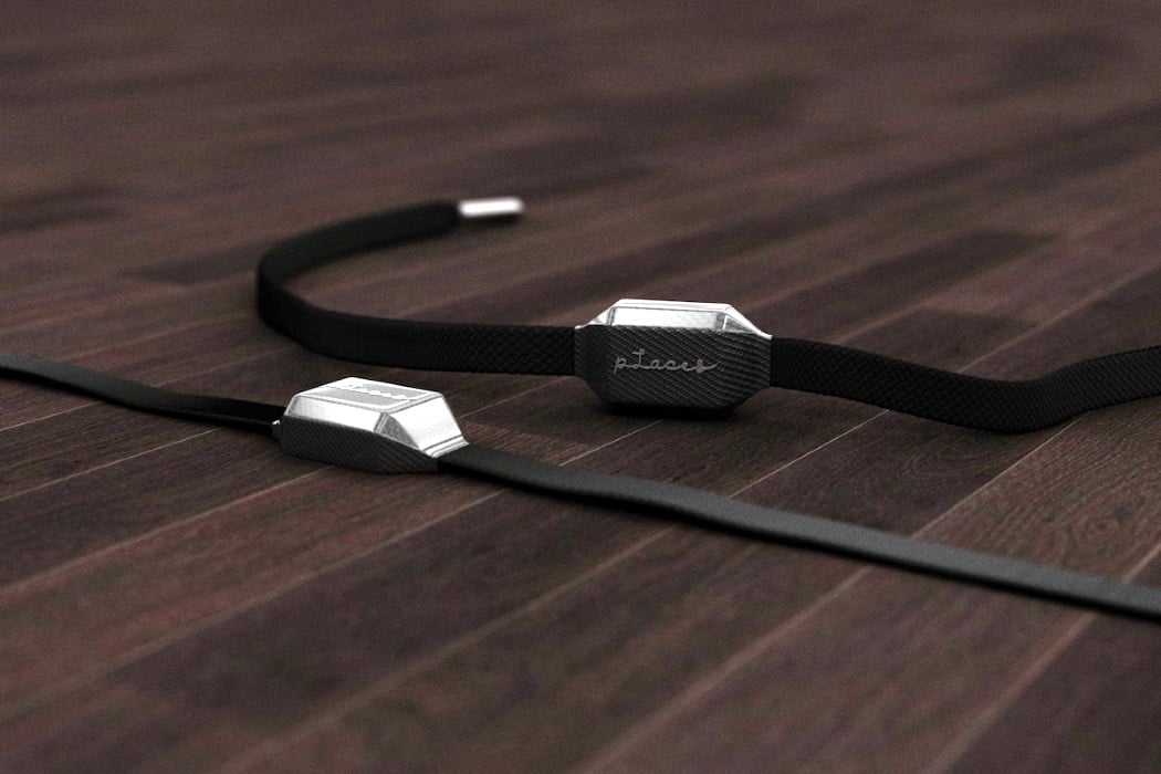
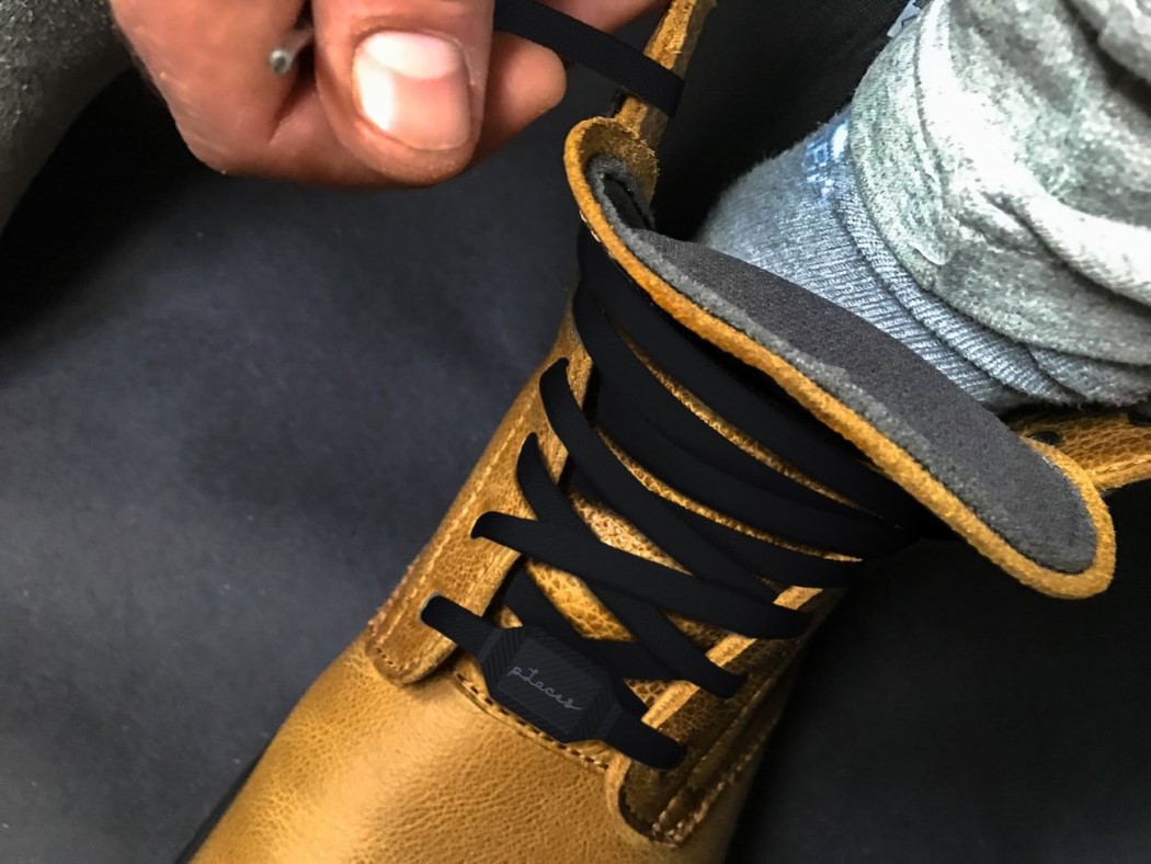
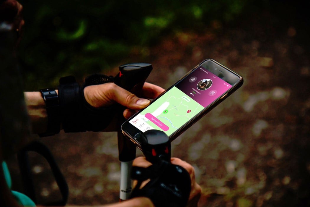
Any privacy-intruding piece of technology can be pretty controversial because it can be used for good as well as bad (take the entire Facebook clusterf*** as the biggest example). The pLaces (clever name alert) are shoe-laces with a GPS tracker embedded in them. Aside from helping you find your shoes if you’re the kind to lose them, the laces were created to help you get away from the addictive world of technology… but not wander to a point of no-return. The pLaces come with a kevlar and carbon-fiber construction. Designed to be absolutely unbreakable, the shoelaces are the perfect partner on one of those crazy off-the-grid treks or trails. The GPS chip inside pairs with your phone and connects to the pLaces application, allowing you to track or bookmark your travels or share your route/location with others. The GPS-enabled laces can charge wirelessly via the pLaces clip charger, and works with any shoe. It also comes with a 4-week battery life. The fact that you, the wearer, send your location to others makes it less of a privacy-breach-nightmare. With the ability to track the laces across 166 countries (practically the entire world), the pLaces can be a literal life-saver, allowing people to reach you if something untoward were to happen. Now if only they had an SOS function too… Designer: Honza, Oxana, Goran Kruhonja & Salman Abdulnabi.
|
| You are subscribed to email updates from Yanko Design. To stop receiving these emails, you may unsubscribe now. | Email delivery powered by Google |
| Google, 1600 Amphitheatre Parkway, Mountain View, CA 94043, United States | |
