Yanko Design - Form Beyond Function |  |
- The shoe that turns recycled chewing-gum into rubber outsoles
- The Smart Scale Tackle’s a Designer’s Worst Nightmare: Human Error
- Run ‘with’ Friends
- The OI lamp looks familiar yet unique
- It’s time Apple made a MacBook X
- Turning one of the most iconic album artwork into furniture
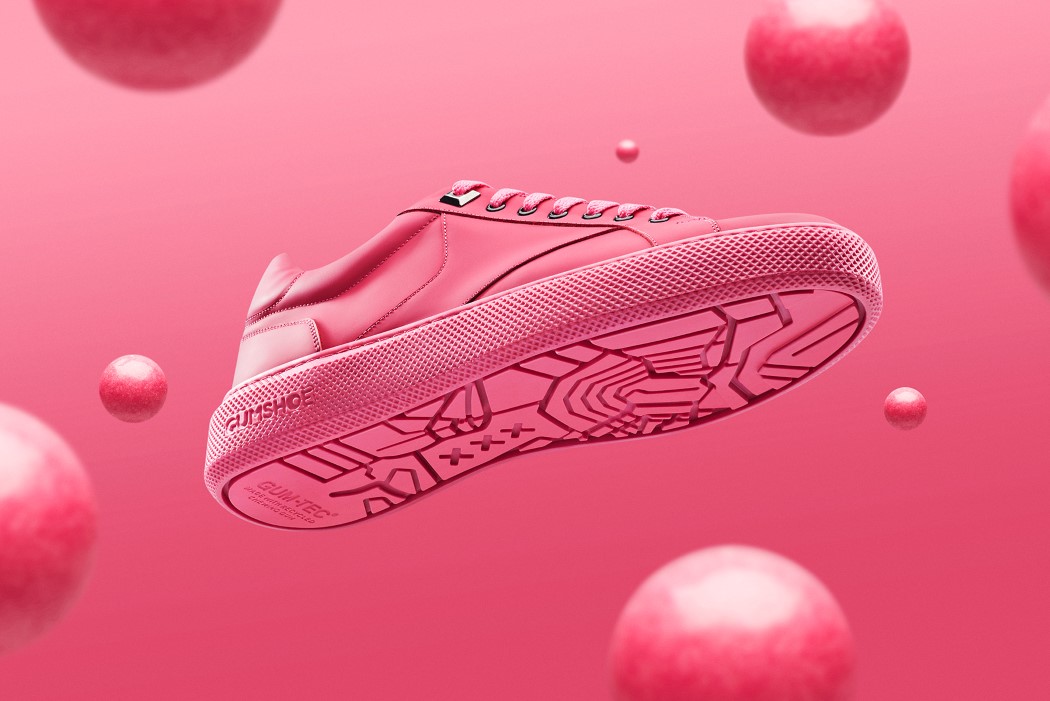
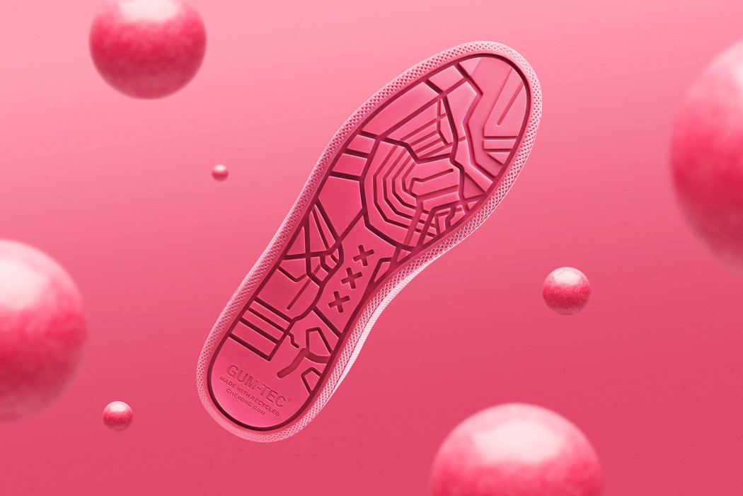
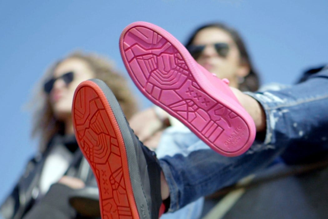
| The shoe that turns recycled chewing-gum into rubber outsoles Posted: 24 Apr 2018 12:00 PM PDT Instead of having bubblegum stick to the underside of your shoe, one day the sole of your shoe could be made of the very same piece of bubblegum. Gum-Tec, a recycled compound developed by sustainability company Gumdrop, will be at the heart and ‘sole’ of their new shoe, the Gumshoe… and Gum-Tec is, by composition, 20% recycled chewing gum. Chewing gum poses an incredibly serious ecological problem because it comes made from synthetic plastics that do not biodegrade. It’s also the second most common form of roadside litter, after cigarette butts. Gumdrop plans to collect discarded gum from the streets of Amsterdam, a city where an incredible 3.3 million pounds of gum are incorrectly disposed on the sidewalks each year, clean them, and convert them into Gum-Tec, the material that forms the base of the shoe. A little over a pound of chewing gum can be used in two pairs of sneakers. “We discovered gum is made from a synthetic rubber. And by breaking down these properties, we were able to create a new type of rubber,” said Anna Bullus, managing director and designer at Gumdrop. The sneakers are designed by Explicit Wear and Gumdrop and marketed by Iamsterdam. Available in red and pink (possibly the only fitting colors for a shoe of this nature), the shoes come with the proprietary Gum-Tec sole (featuring Amsterdam’s signature XXX logo) and a leather upper body. Just as good as any sneaker with a rubber sole, the Gumshoes help get chewing gum off our streets and give it a grave-to-cradle re-think that helps keep the dangerously non-biodegradable substance out of our eco-system. Oh, and they faintly smell of bubblegum too! Designers: Explicit Wear, Gumdrop.
|
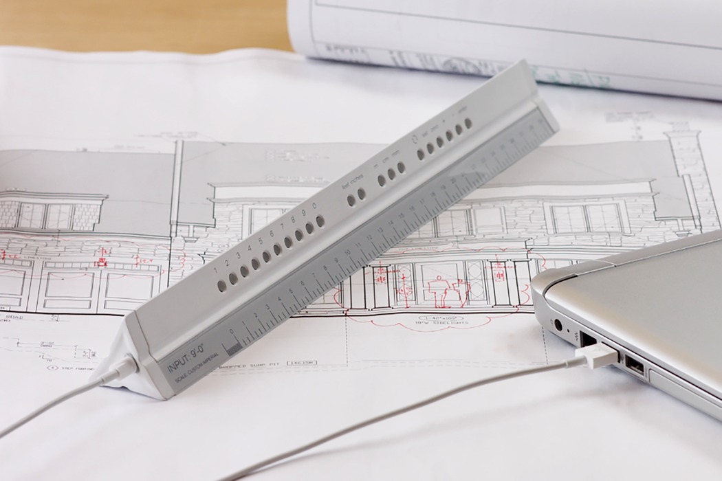
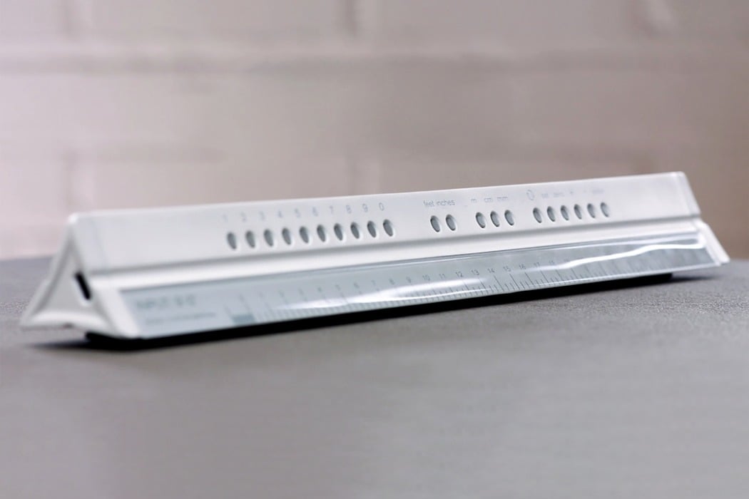
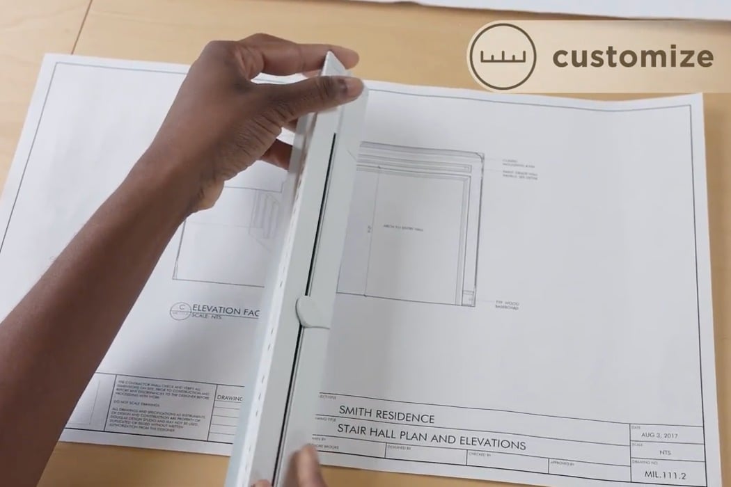
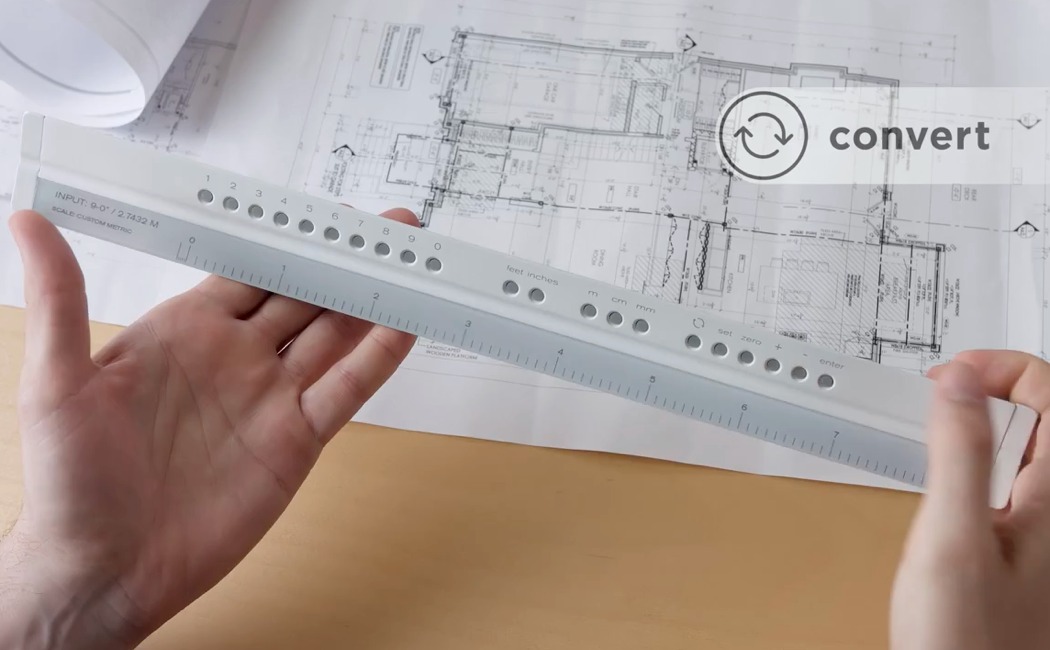
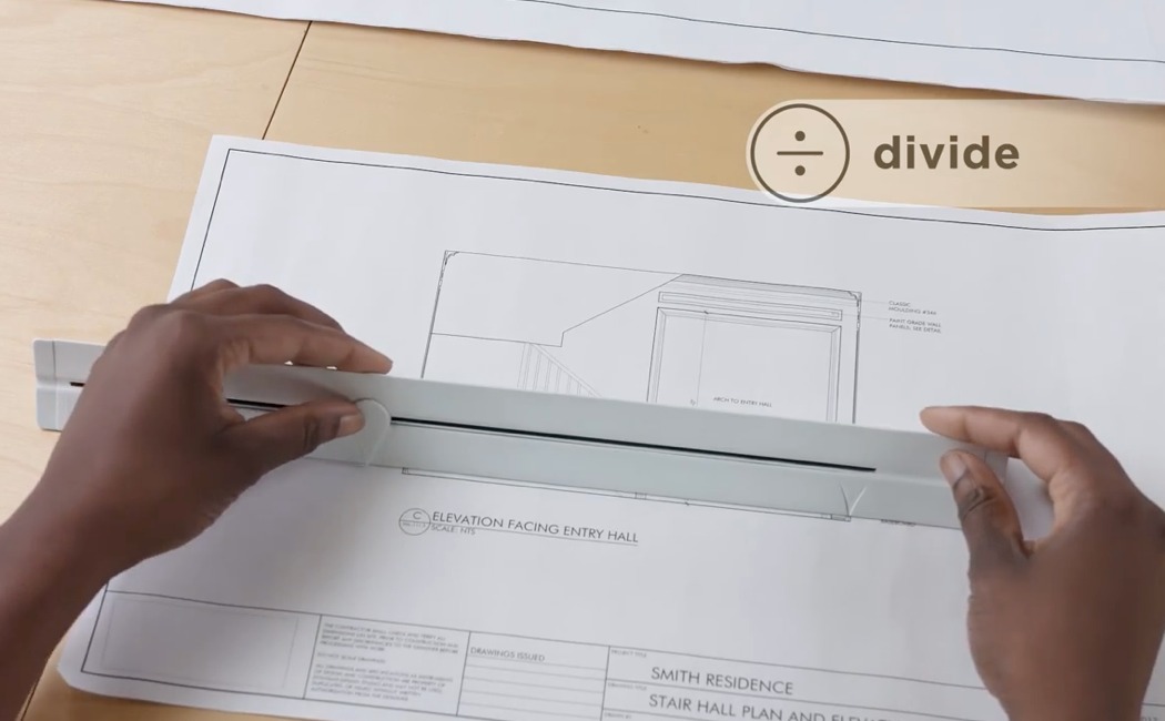
| The Smart Scale Tackle’s a Designer’s Worst Nightmare: Human Error Posted: 24 Apr 2018 06:57 AM PDT The year is 1999, the month, September. There’s panic at the NASA headquarters because they’ve just lost contact with their Mars Climate Orbiter. The orbiter entered the Martian atmosphere, but the thrusters fired too late, resulting in a crash with a loss estimated at $125 million. The problem? NASA was working in conjunction with England-based Lockheed Martin. Lockheed sent over navigational commands for the thrusters to NASA in imperial units (pounds of force), and NASA’s software inputted that information assuming it was in metric units (Newtons). Singlehandedly the biggest dimensioning unit related blunder, the Mars Climate Mission is an example of how frustrating it is working with different units across different systems that are prevalent in different countries. Inventor Joanne Swisterski has had her share of problems too. Often working with clients across the world, she’s had to work with data that was sometimes imperial or metric, or even worse, not to scale (I sympathize too; a client sent me blueprints that he said were to scale, but he happened to click on the “fit to page” option while printing, resulting in a small yet significant difference in output, resulting in a loss of time, material, and eventually money). Dimensioning is such a major part of what we designers do, and accuracy is everything as far as it’s concerned, so why are we still battling such primitive problems? This pushed Joanne to design the Smart Scale, a scale with a screen and the smarts to help resize, convert, and divide, allowing you to work with alien data, but a system that you’re more familiar with. The Smart Scale works in three ways making your life as a designer, architect, engineer, or plotter INFINITELY easier while working with measuring units that you may be unfamiliar with, or may be of a different scale. Designed to look just like the triangular scales we’ve worked with in the past, the Smart Scale comes with a slender, horizontal screen where you’d see the measurements, and a row of buttons on top. Switch it on, and its 12-inch e-ink display powers up showing you a scale in a measuring unit of your choice. Cycling between inches and millimeters is as easy as pushing a button… however, here’s where things get better. The Smart Scale allows you to create a custom scale depending on what you’re measuring. If you’re working with a scaled down set of prints, the Smart Scale allows you to input one reference measurement using a slider on the back, and it creates a brand new scale using that reference, allowing you to measure scaled up or scaled down models in their native unit without having to sit with a calculator, multiplying or dividing away to get accurate data. A simple convert button allows you to cycle between imperial and metric measurements, depending on a system you use, or your client uses, allowing you to collaborate with countries with varying national standards without having your own version of the Mars Climate Orbiter crisis. A third and rather interesting function is its ability to work as a divider. The slider on the back allows you to measure a given area, then simply use the keypad to choose how many divisions you want it in and the screen divides the given length into the inputted amount of divisions… while always presenting you with the data you need on the left-hand side of the screen, telling you exactly what unit you’re measuring in, etc. The Smart Scale notices a problem we’ve never really worked on solving effectively. Looking and behaving exactly like the scales we’ve used in the past, it’s the equivalent of a digital vernier, albeit much smarter and definitely more useful. The screen on the Smart Scale comes with a beautiful contrast, and a high resolution making it accurate and legible, while its aluminum body keeps things classy and protects the electronics inside. The Smart Scale comes with a MicroUSB port for easy charging and an incredibly long battery life, given the e-ink display’s minimal energy footprint. Speaking from personal experience, the Smart Scale is probably the most innovative step we’ve taken in the recent past in making sure our tools for problem-solving ‘don’t have any problems themselves’. The Smart Scale saves time, energy, material, and eventually money too, making work for designers, engineers, and architects much more efficient, whether you’re working across borders, or with someone who’s used to a different unit system than you. An absolute must-have for everyone who uses linear measurements in their day-to-day lives, the Smart Scale eliminates chances of human error, making you as a professional much more effective, efficient, and valuable! Designer: Joanne Swisterski Click here to Buy Now: $149.00 This function allows you to take a drawing that was printed out of scale and measure it as though it was perfectly to scale. This is made possible by using the sliding pointer. Line up the start of a known dimension (point A) with the fixed pointer. Move the slider to the end of the dimension (point B). Input the distance it represents, your desired units and hit enter. The screen will regenerate itself to the new custom scale. This function allows you to convert the screen between metric and imperial. For example, if you’ve received a drawing in imperial, and you’re more comfortable with metric, tap the convert button and the long screen regenerates to the metric version of whatever was on the screen previously, or vice versa. This function is applicable when you need to divide a space into a number of equal sections. For example, if you have to make 4 equally spaced lines on a drawing, instead of working out the math separately you simply follow the same steps as the with the custom scale section above. Move the sliding pointer across the distance that requires dividing. Input 4 on the number pad and the ruler will display 4 equally spaced notches on the screen. Click here to Buy Now: $149.00 |
| Posted: 24 Apr 2018 01:50 AM PDT
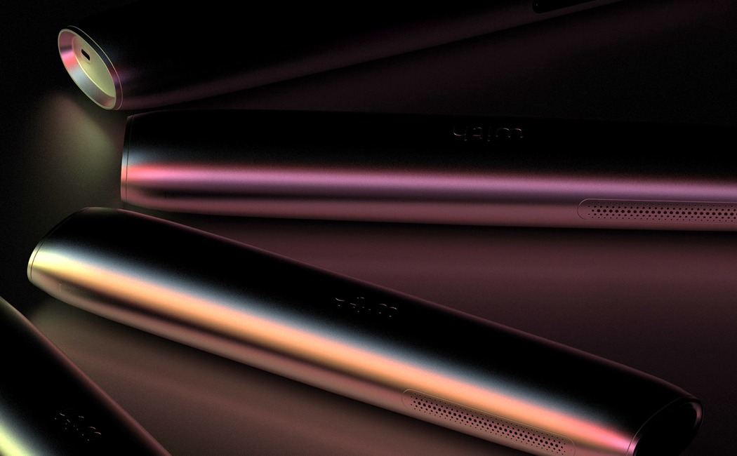
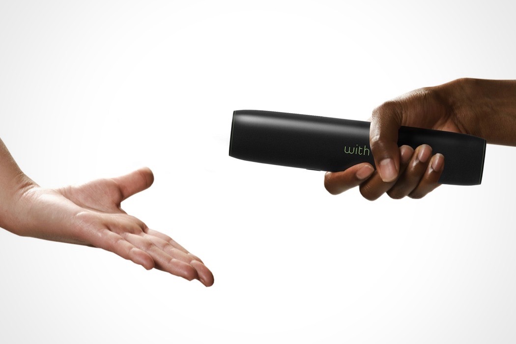
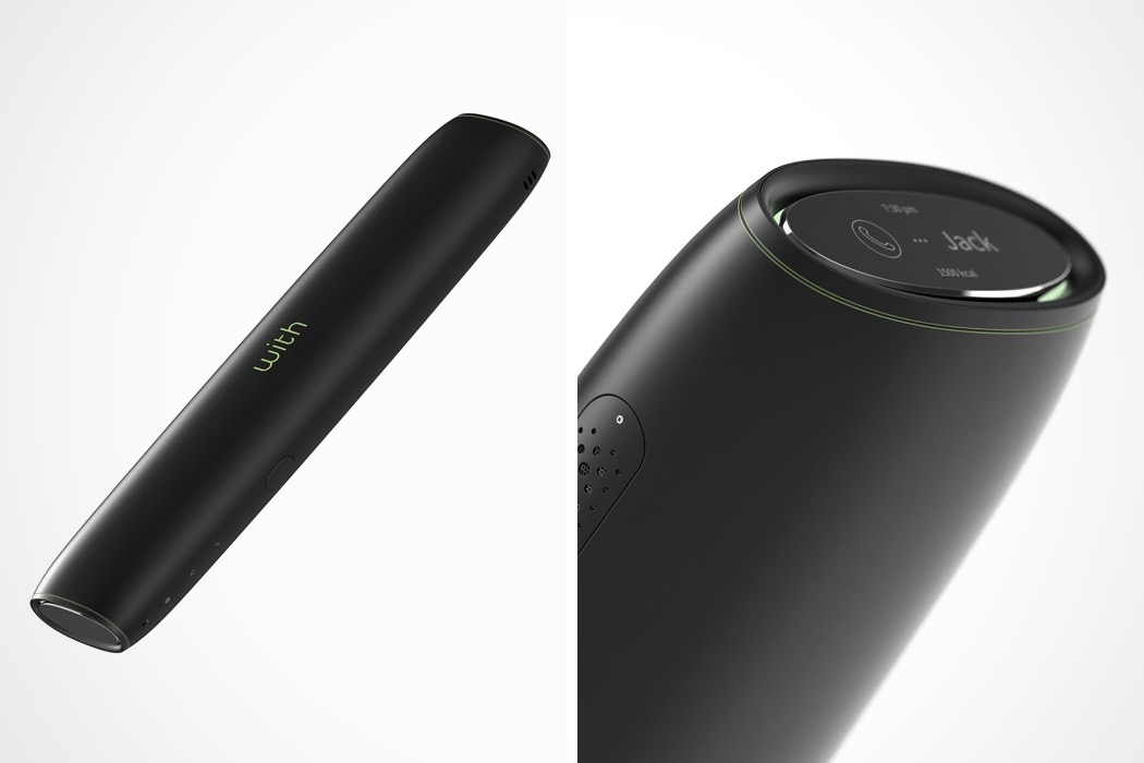
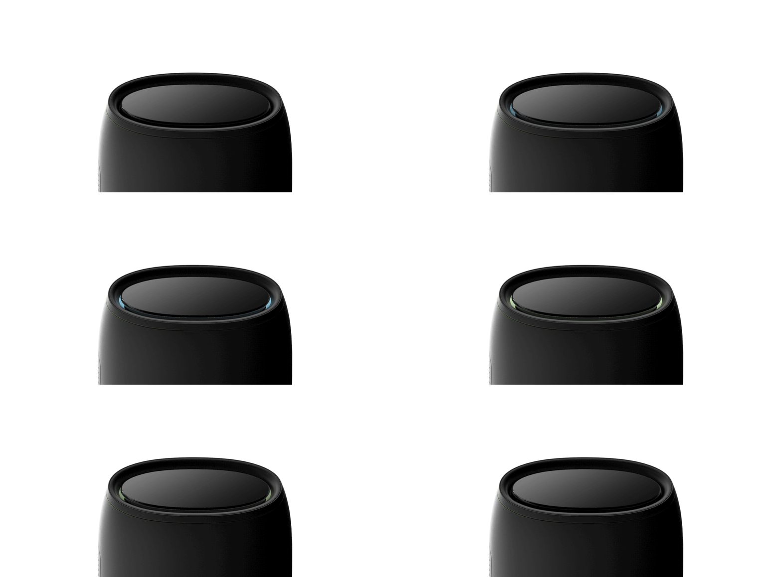
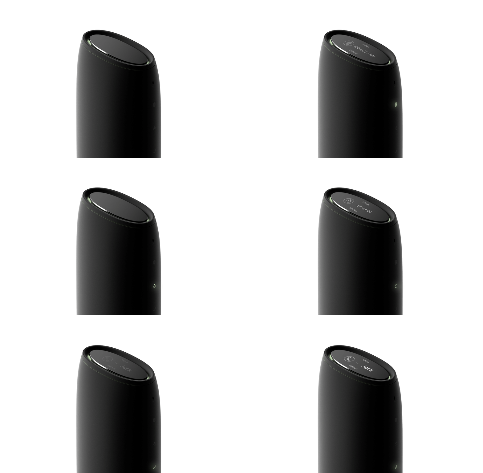
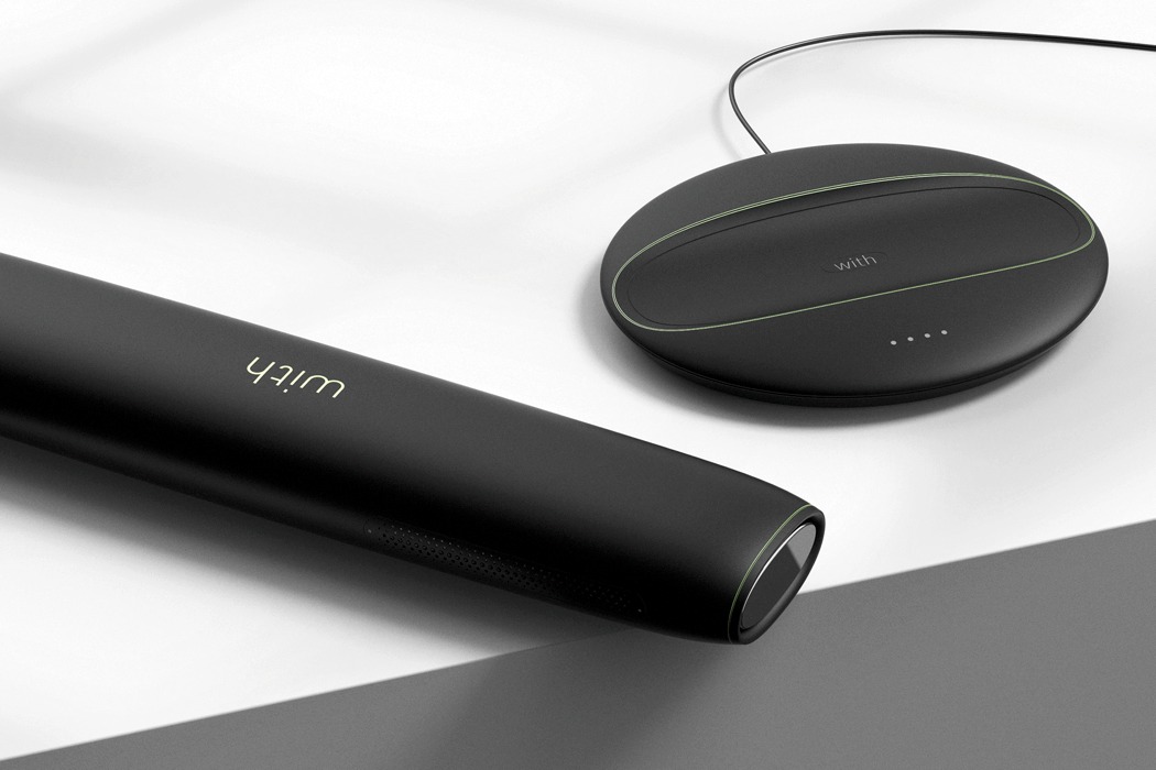
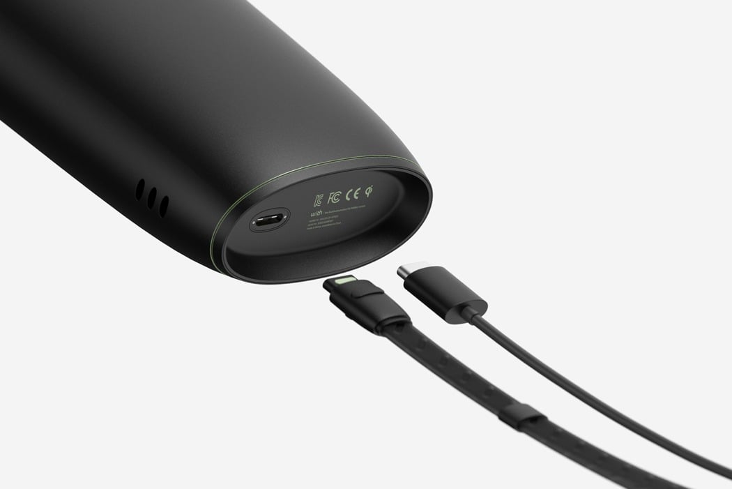
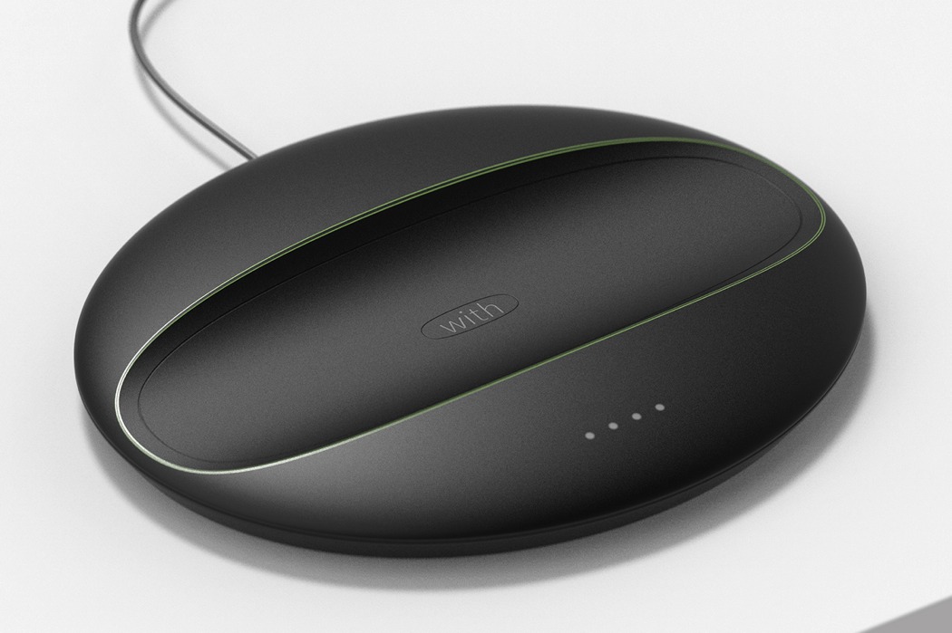
Running is one of them activities which is easy to start, but even easier to give up! ‘With’ is a running accessory that aims to stop this from happening by encouraging the user to share their goal distance with a partner. Running with a friend can help a person feel more energetic and make their goals more achievable. When their partner begins their run their device will begin to flicker, this flicker will turn to a blue light if they begin to race, really turning up the competition! The ergonomic and sleek form offers a physical benefit to the user; gripping the device in their hand as they run can increase both their endurance and concentration levels. Integrated into the device is a ‘voice call’ function to help them stay connected with their partner and give the sense that they are running right there, next to them. Designer: Minki Kim
|
| The OI lamp looks familiar yet unique Posted: 23 Apr 2018 05:00 PM PDT
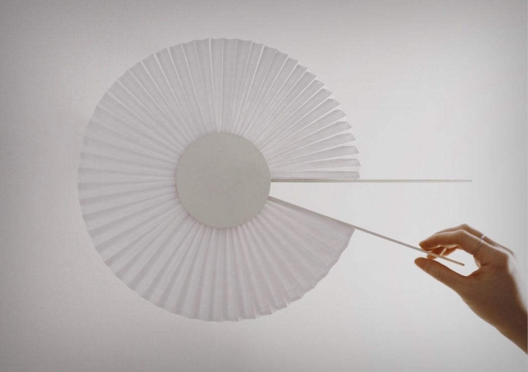
The OI lamp explores duality with shapes, materials, and even concepts. A literal amalgamation of the shapes O and I, the OI is a lamp that folds open much like Japanese fans, and comes with a backlight, allowing it to illuminate your wall. Made from Tyvek an aluminum, the OI lamp the OI explores tradition and modernity, with its combined use of traditional and modern materials, as well as that of merging a fan together with a modern lighting device. Using the OI is simple and pleasing. It stays mounted on the wall in its closed position. To switch the lamp on, simply unfold the fan. Unfolding the fan even acts as a regulator of sorts, allowing you to control the brightness of the light… open the lamp fully for a complete halo, or just a tiny bit, for a small wedge of light. Quite clever, quite calming! Designer: Hayoung Kim
|
| It’s time Apple made a MacBook X Posted: 23 Apr 2018 03:00 PM PDT
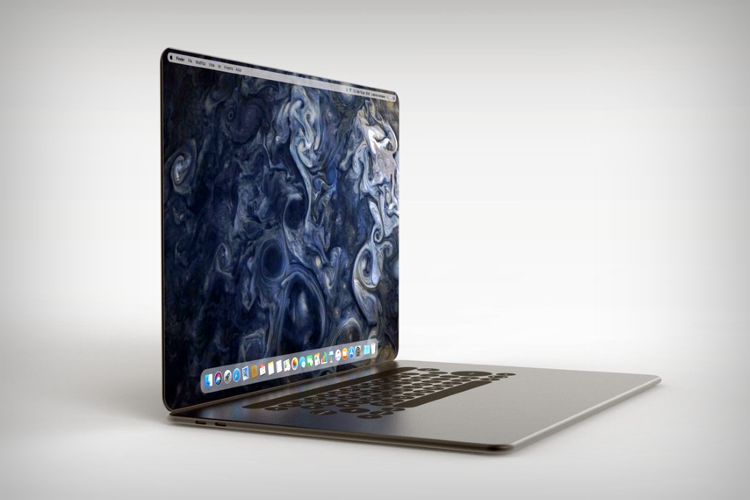
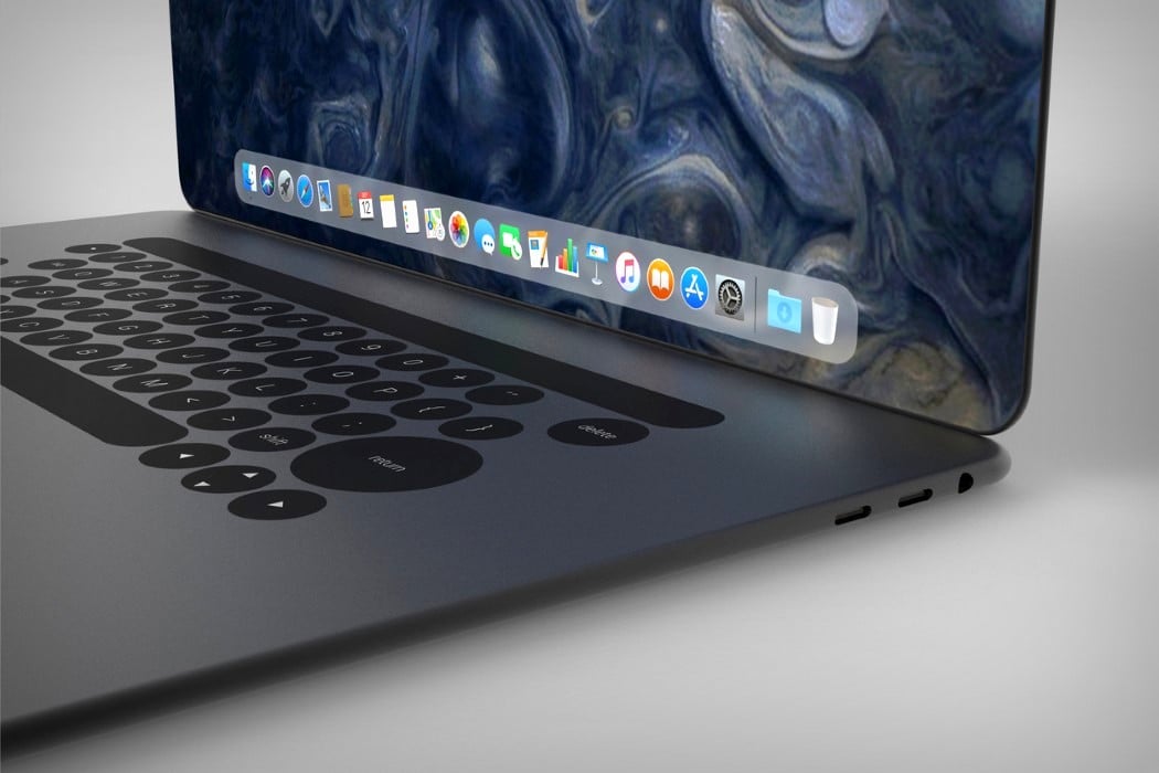
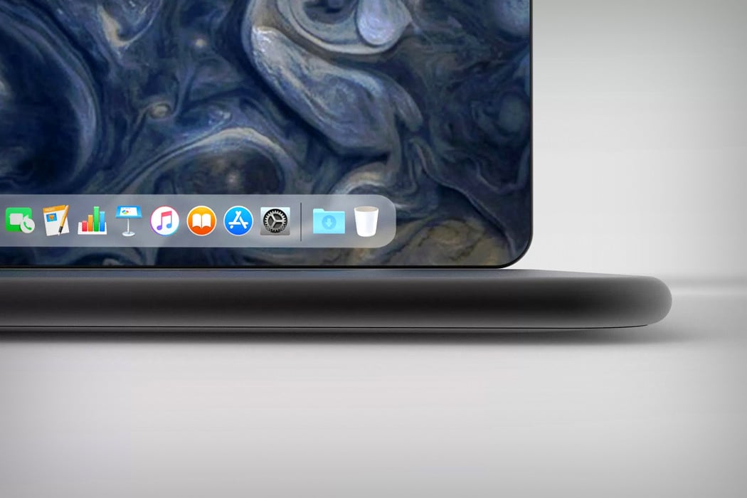
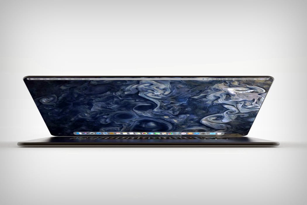
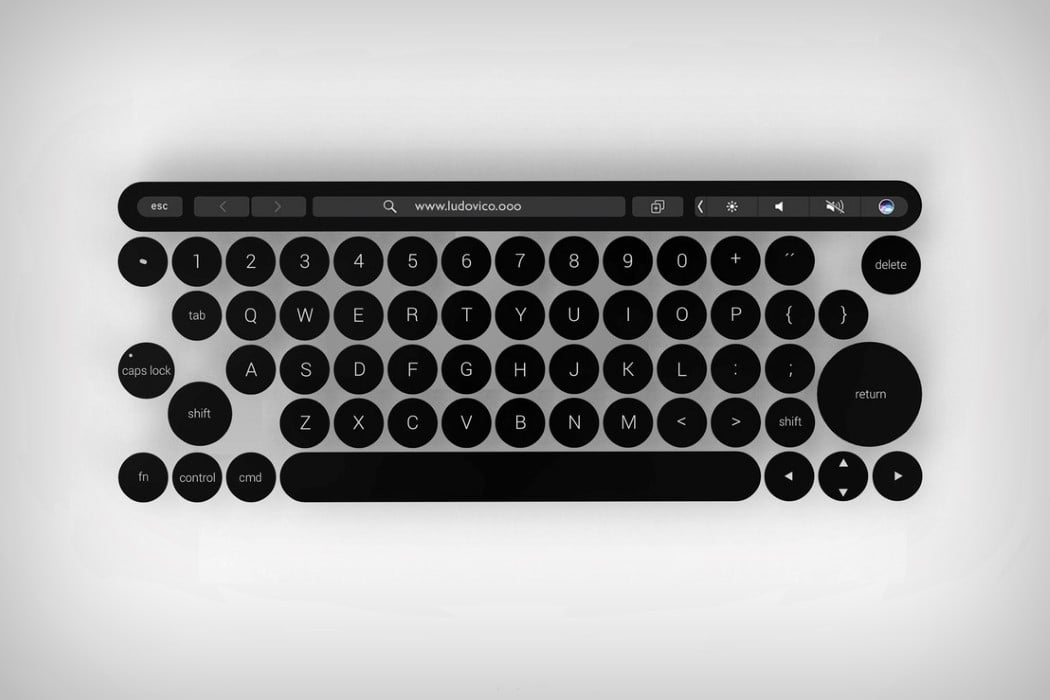
Aside from the addition of a touch bar, the removal of a whole bunch of ports, and the omission of our favorite light-up logo, the MacBook hasn’t seen much visual change in the past decade or so. Unlike the more popular iPhone, the MacBook has siletly gotten thinner and more powerful, while overall looking the same, and designer Ludovico Campana thinks that the laptop desperately needs a redesign. His reference point? The iPhone X. The iPhone X makes a great reference for a redesign, because that’s exactly what it was. An overhaul of sorts that focused on new features, the removal of the rather iconic home button, and the introduction of the bezel-less display barring the one notch. Ludovico’s MacBook redesign takes similar routes, and rather appropriately christens itself the MacBook X. Featuring a body that’s curved, rather than wedged, the MacBook X does a hat-tip to the iPhone, and looks less susceptible to horrible denting given the lack of a sharp edge. It also explores a more expansive display that has those incredible curved edges and absolutely no bezels. The absence of a notch means there’s no webcam on the MacBook X, which does raise questions, but none too serious, considering this is purely conceptual. Look down at the bottom half and you’ll see the touch-bar is still there, sitting above what I can only say is a keyboard that feels much too different. Deviating from the regular square-keyed board, Campana’s MacBook concept takes on a circular key design, much like lofree’s Four Seasons keyboard, which I honestly have conflicting opinions about, but then again, conflicting opinions are all too common in the domain of consumer electronics… aren’t they? Designer: Ludovico Campana
|
| Turning one of the most iconic album artwork into furniture Posted: 23 Apr 2018 01:00 PM PDT
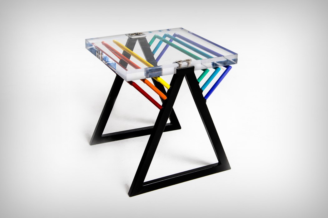
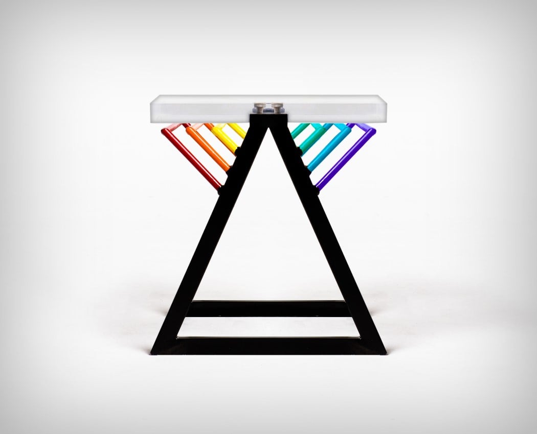
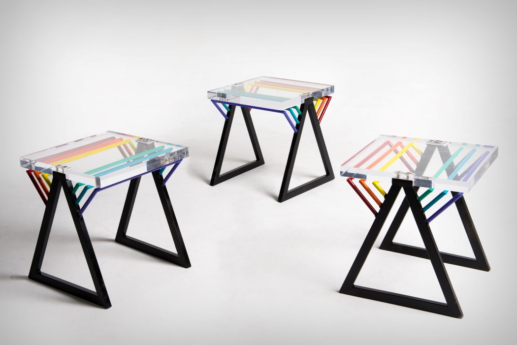
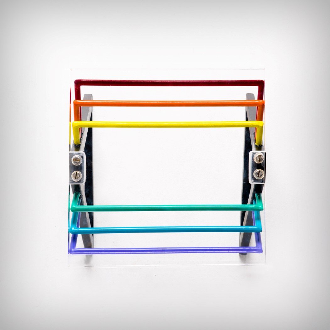
Looking at the Darkside Stool/Side-Table, it isn’t particularly challenging trying to figure out where they took their inspiration from. Designed clearly by fans of Pink Floyd, the Darkside pays tribute to easily the most influential album of its time, The Dark Side of the Moon. The Darkside Stool aims at deconstructing it, taking the elements apart, and rearranging them in a manner that seems like an aesthetic remembrance of an album that was “totally rock and roll”. Made from Stainless Steel and Acrylic, the stool has all the visual elements from the background. The triangular prism finds itself at the base of the stool, made of stainless steel and colored black, while the prismatic material forms the acrylic seat on top. Lastly, the seven colors of the spectrum form supports for the acrylic seat (although there are only six here, to give the seating bilateral symmetry). The fact that, without mentioning the music album, the stool makes such a strong and singular statement seems beautiful… and frankly, worth the A’ Design Award it managed to win! The Darkside Stool is a winner of the A’ Design Award for the year 2018. Designer: Romulo Teixeira & Cintia Miyahira.
|
| You are subscribed to email updates from Yanko Design. To stop receiving these emails, you may unsubscribe now. | Email delivery powered by Google |
| Google, 1600 Amphitheatre Parkway, Mountain View, CA 94043, United States | |
