Yanko Design - Form Beyond Function |  |
- The Skroll is a fun, pocket-sized embossing machine!
- A Prettier Projector, Period
- Distraction-free Working
- These phone cases send a chilling warning against texting while driving
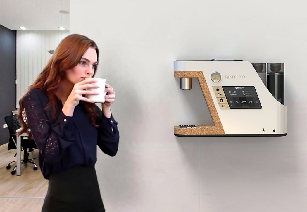
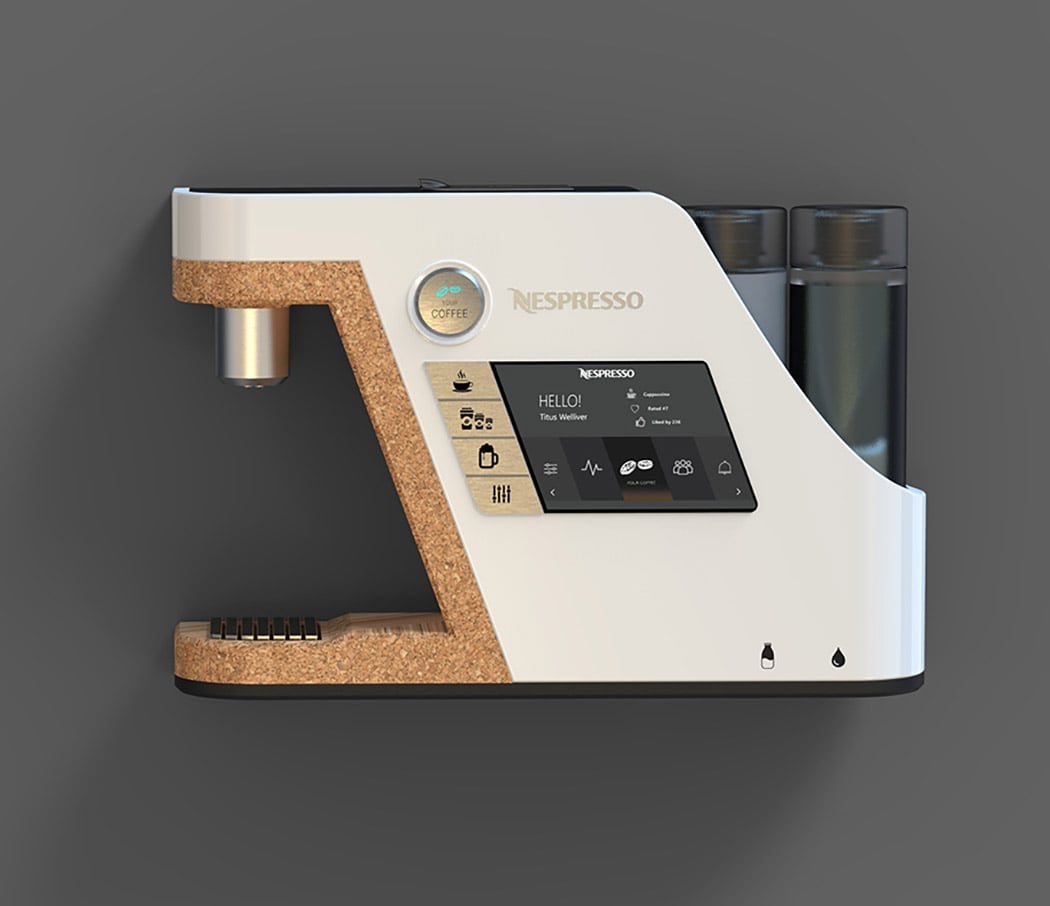
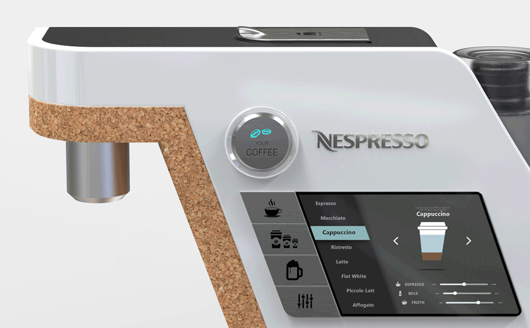
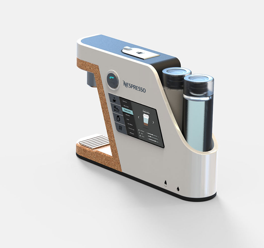
- A Nespresso that Knows You
- YD Spotlight: In conversation with concept phone designer, Jonas Daehnert
- Magic of Mag Cable
- For an instant, measured dose of caffeine!
| The Skroll is a fun, pocket-sized embossing machine! Posted: 25 Apr 2018 12:09 PM PDT
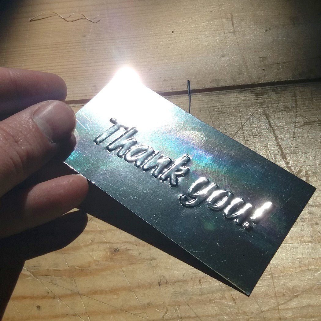
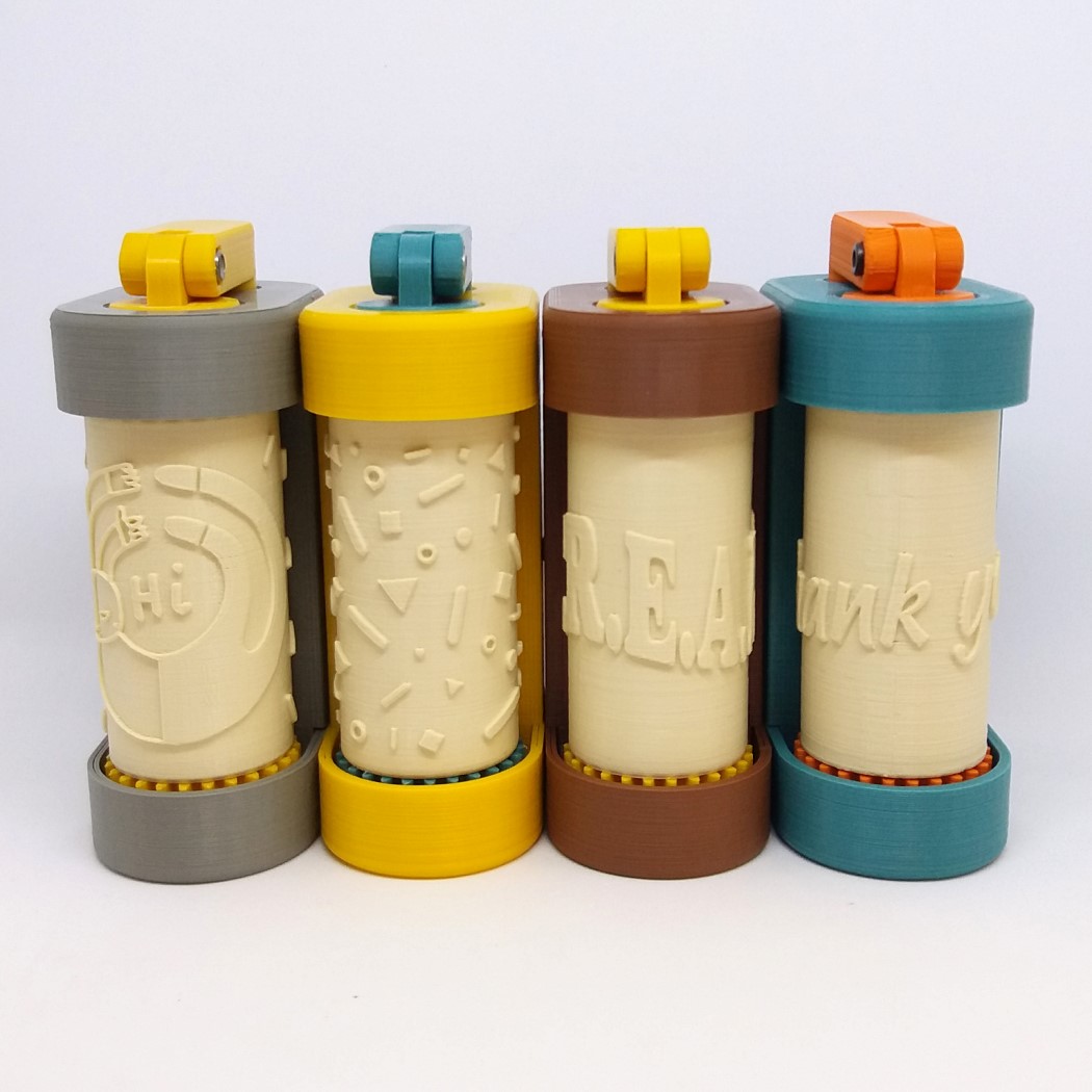
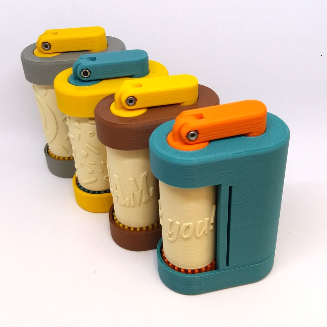
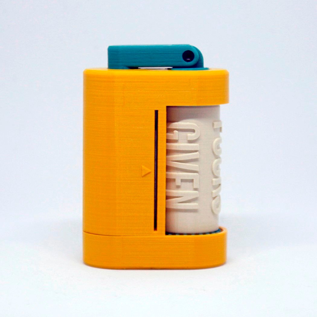
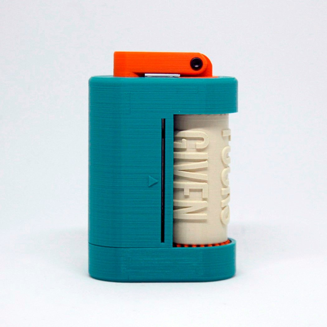
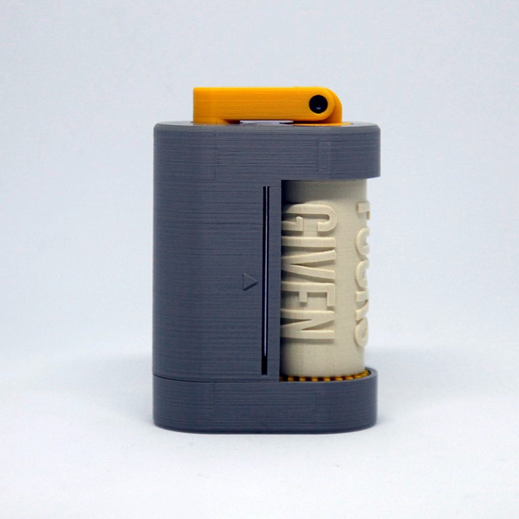
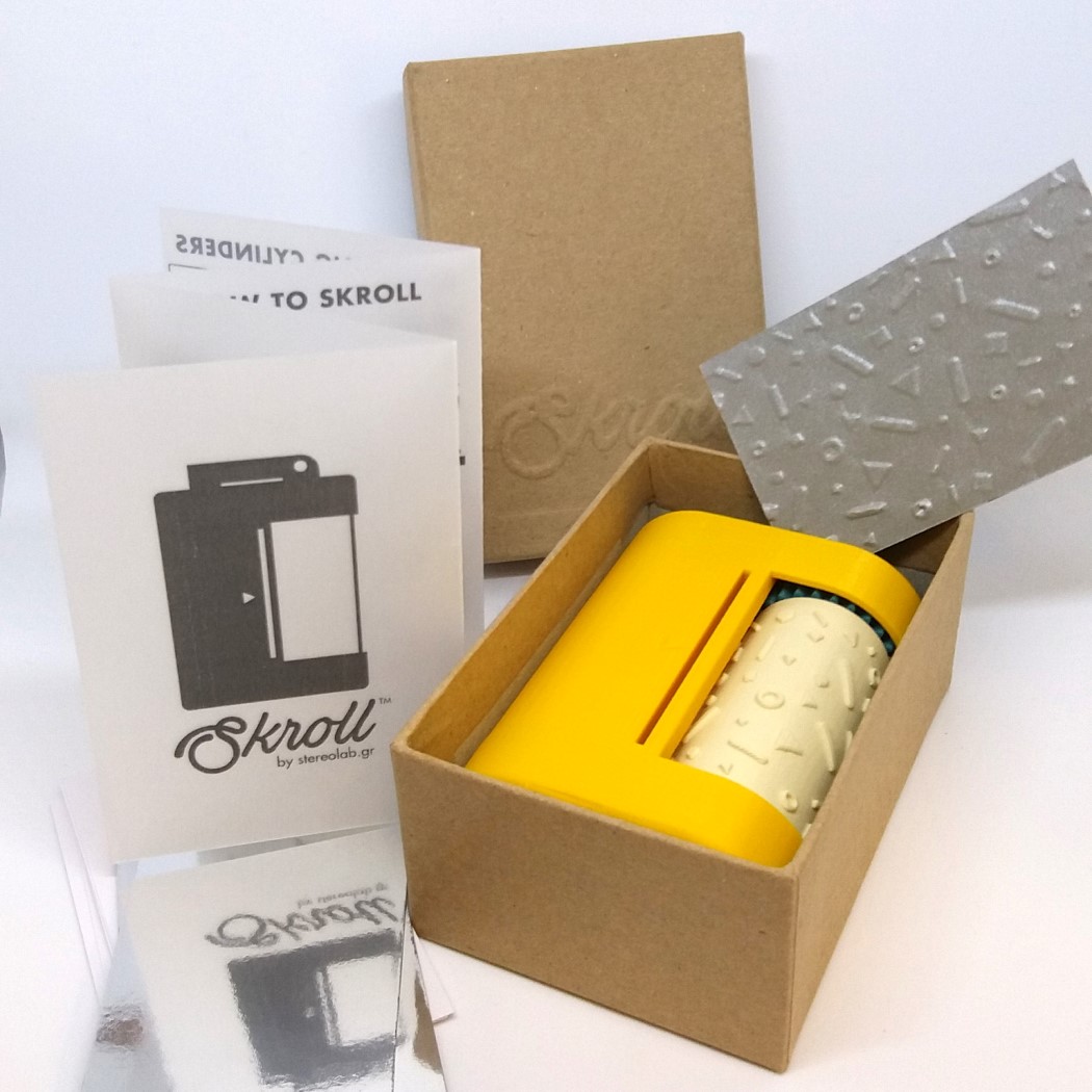
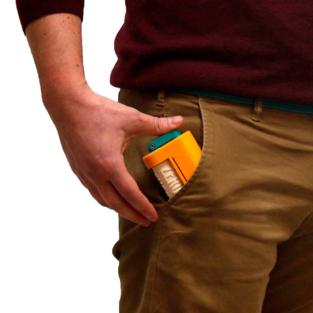
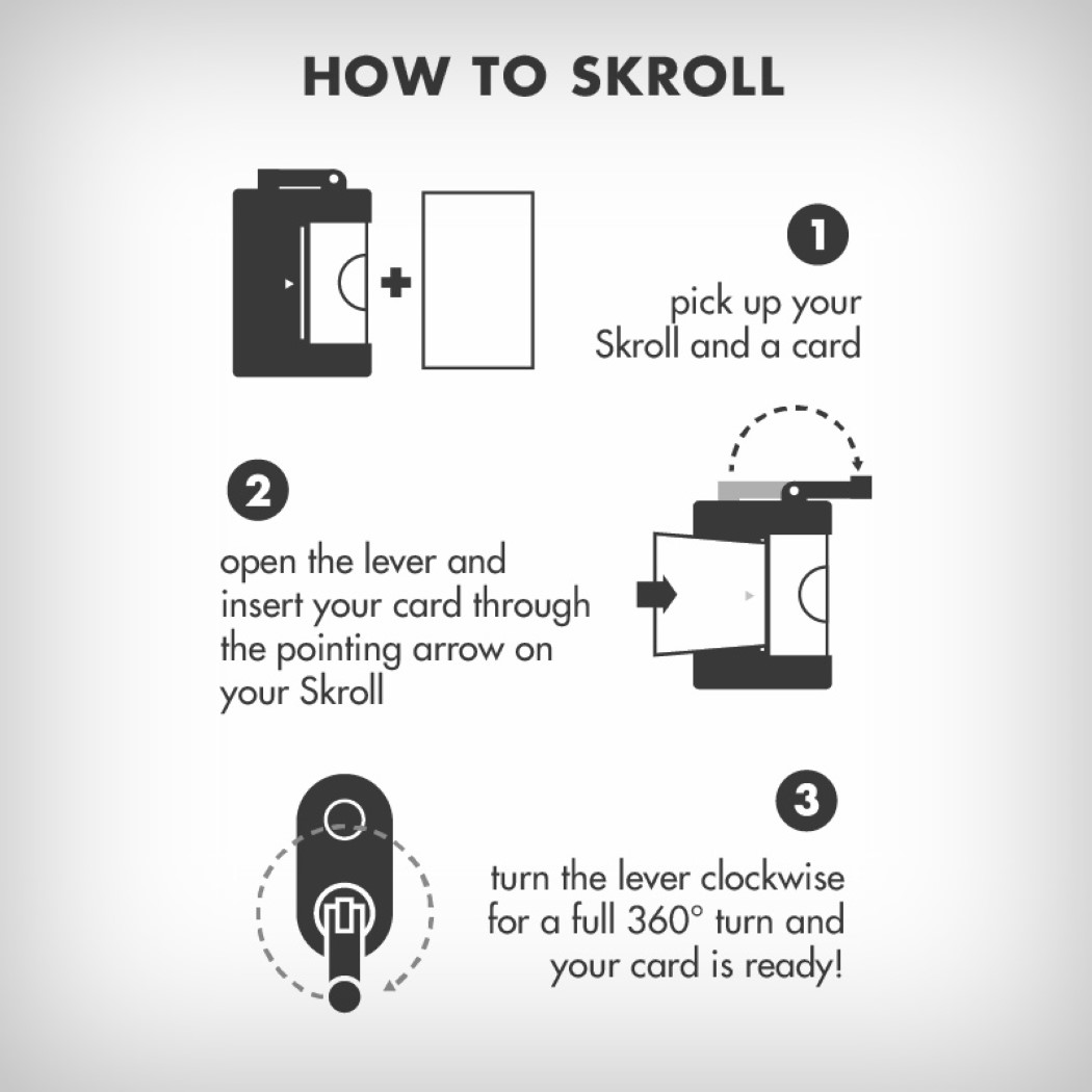
An infinitely fun way to make embossed prints or send embossed messages, or even carry around in your pocket to create instant, 3D business cards, the Skroll comes from Stereolab, a company devoted to 3D printers and 3D printing. Designed in-house, the Skroll is small and pocket-friendly, coming even with a hand-crank that folds inwards when not in use. Comprising two inter-changeable rollers, the Skroll lets you emboss (or deboss) patterns, images, or text onto pieces of paper, or even metal. The two rollers contain a positive and a negative of your artwork and are 3D printed, as is the Skroll’s entire assembly. Just simply insert the paper or metal (sheet metal from drinking cans work rather well) into the slot and crank the handle. The material slides into the rollers, being pressed into the shape that’s on the rollers, and finally coming out with a nice three-dimensional piece of art embossed into them. The Skroll comes along with usage instructions in a plain box with the product name embossed on it too! Clever! Aside from teaching us designers a nifty lesson in embossing techniques, the Skroll is quite fun to use and play with. Not to mention being able to simply stamp your contact details or website/portfolio URL on random pieces of paper or even sheet metal! Designer: Hlias for Stereolab |
| Posted: 25 Apr 2018 10:30 AM PDT
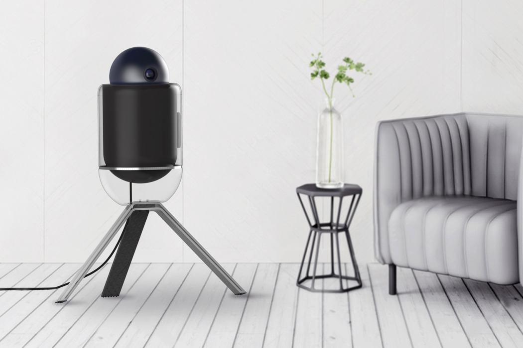
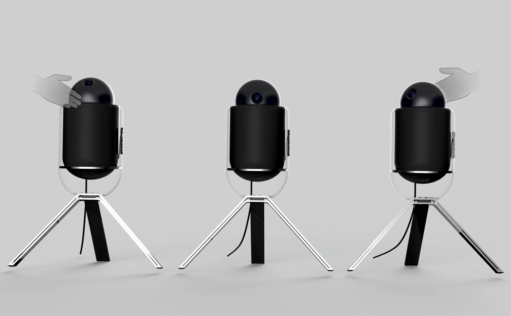
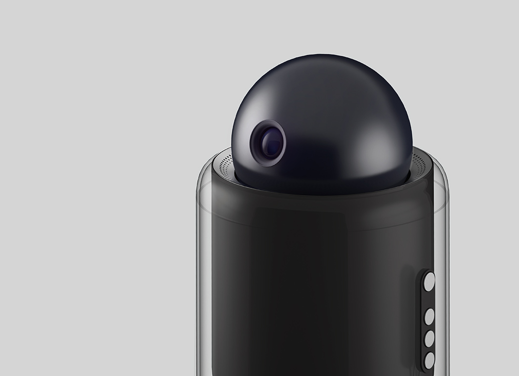
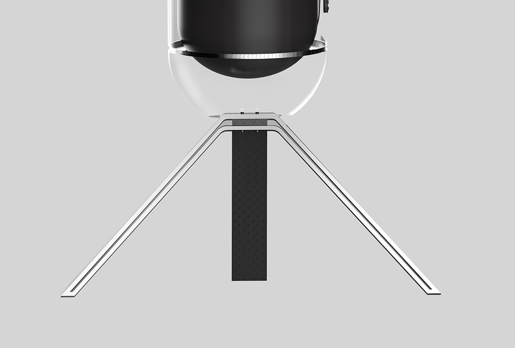
Before I decided to ditch having a TV altogether, I started exploring projector options thinking I could at least avoid having a giant screen in my living room. On my search, I inquired as to why each unit was surprisingly bulky and the salesman explained that the inner workings and largely unchanged projection tech simply didn’t allow for a slim, unobtrusive form. I sighed and left empty handed. If I had seen the Rollin projector, however, I might be telling a different story. It’s thoughtfully designed around the existing tech and doesn’t try to unrealistically squeeze all the necessary components into a slimmer body. Instead, it takes on a modern, almost robotic appearance that looks more sculptural than electronic. Even though it’s not any smaller than a standard projector (in fact, it’s probably larger), it’s certainly more welcome in my home than many of the current clunky designs! Designer: Angie Kim
|
| Posted: 25 Apr 2018 09:53 AM PDT
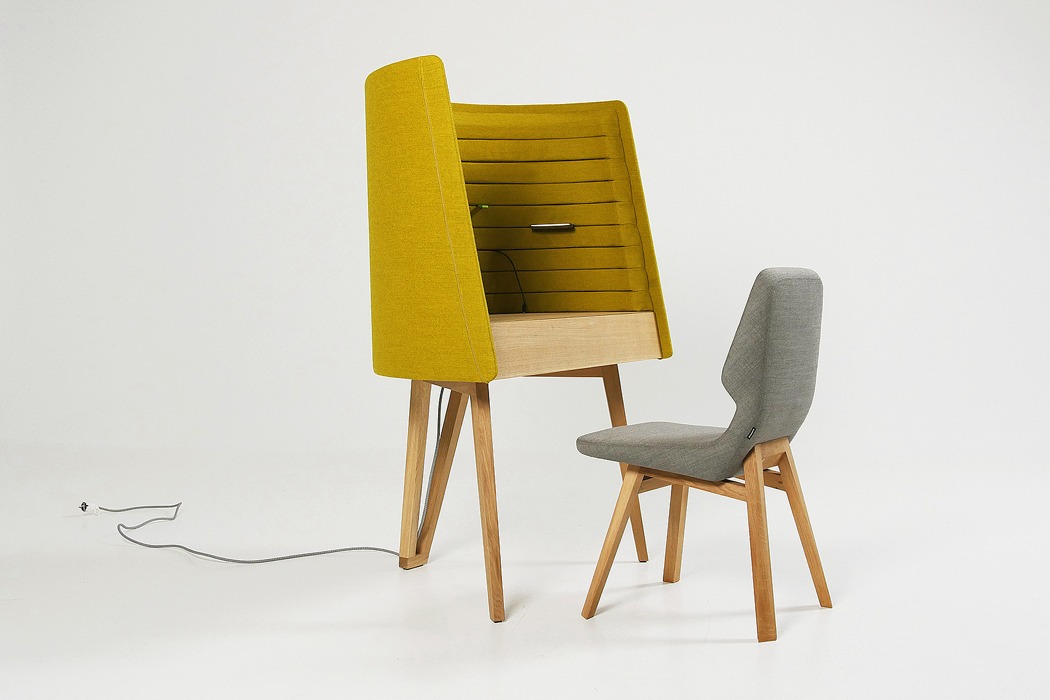
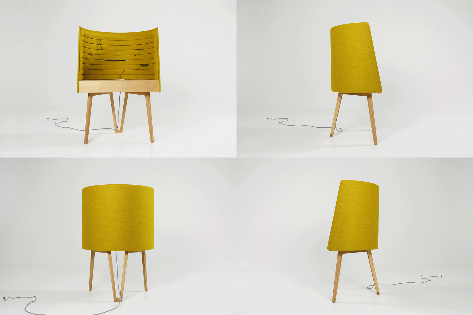
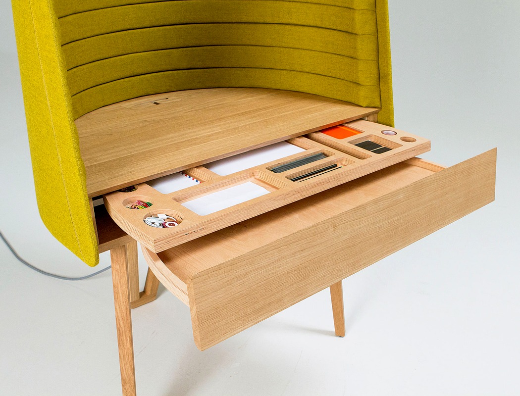
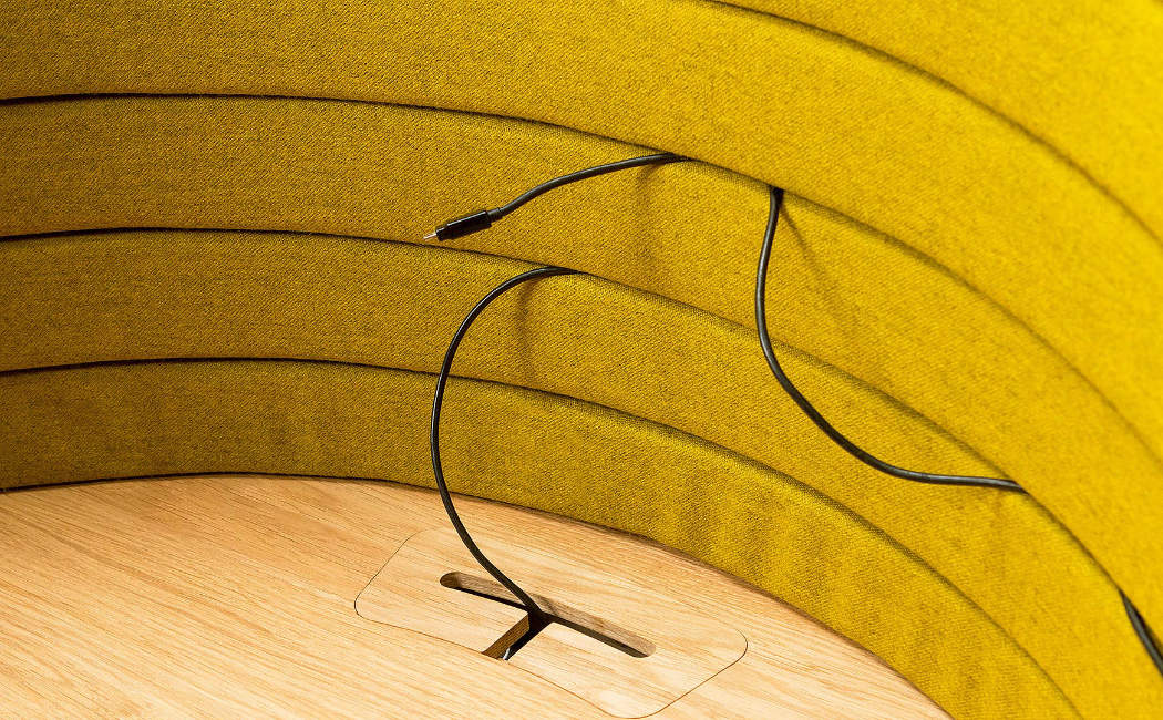
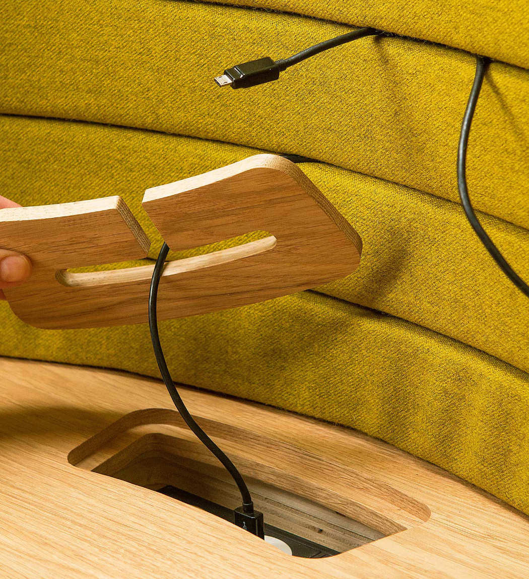
From time-to-time we all require an environment that is free from the distractions that may be present in the environment surrounding us, in order to allow us to concentrate on our work. The SecretArea is a faultless solution to this need and one which carries a visually interesting aesthetic. Integrated into the cocoon-like screen that surrounds the user is an intuitive and dynamic organizational system; pens, cables, phones, notepads and many more items can be stored easily by wedging them between the gaps in the cushioned surface. Hidden seamlessly in the front façade of the desk is a duo of draws, this keeps the desk clutter-free and pushes the possible distraction of a phone slightly further away. A workspace with a form as visually striking as this is always going to become a feature in the room, so the designer decided to amplify the aesthetics further by using a vibrant color. It certainly makes a statement! Designer- Ivan Goran Žunar
|
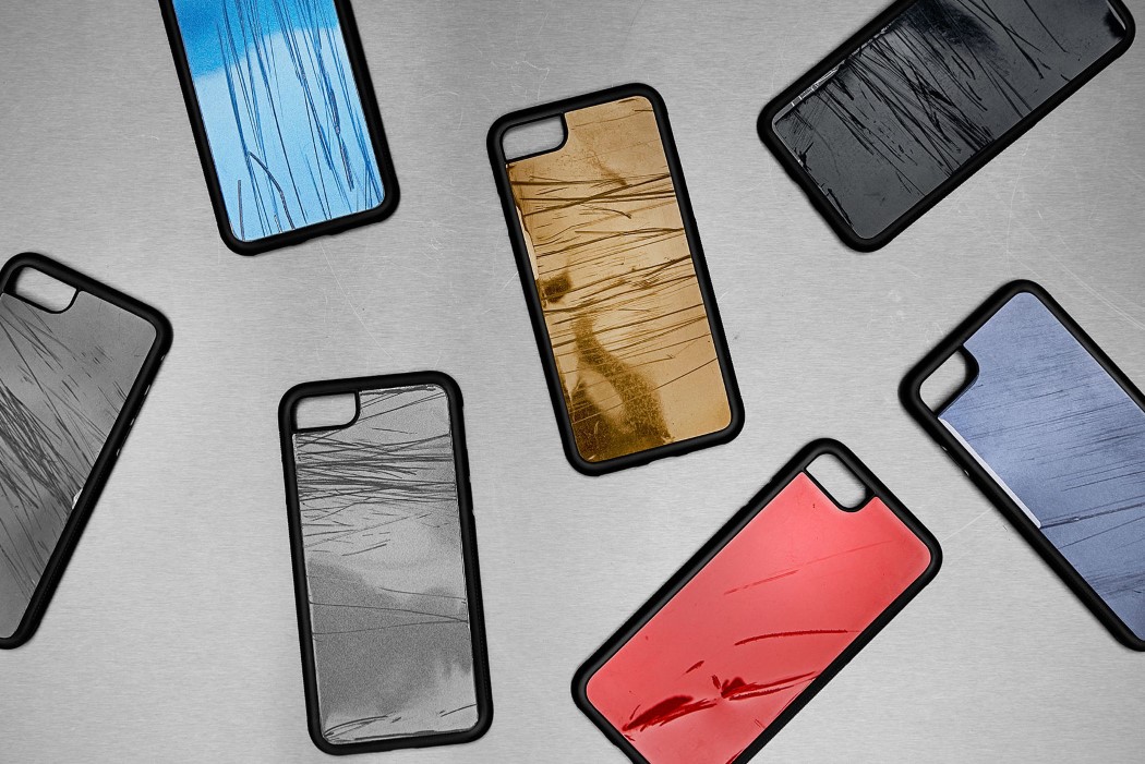
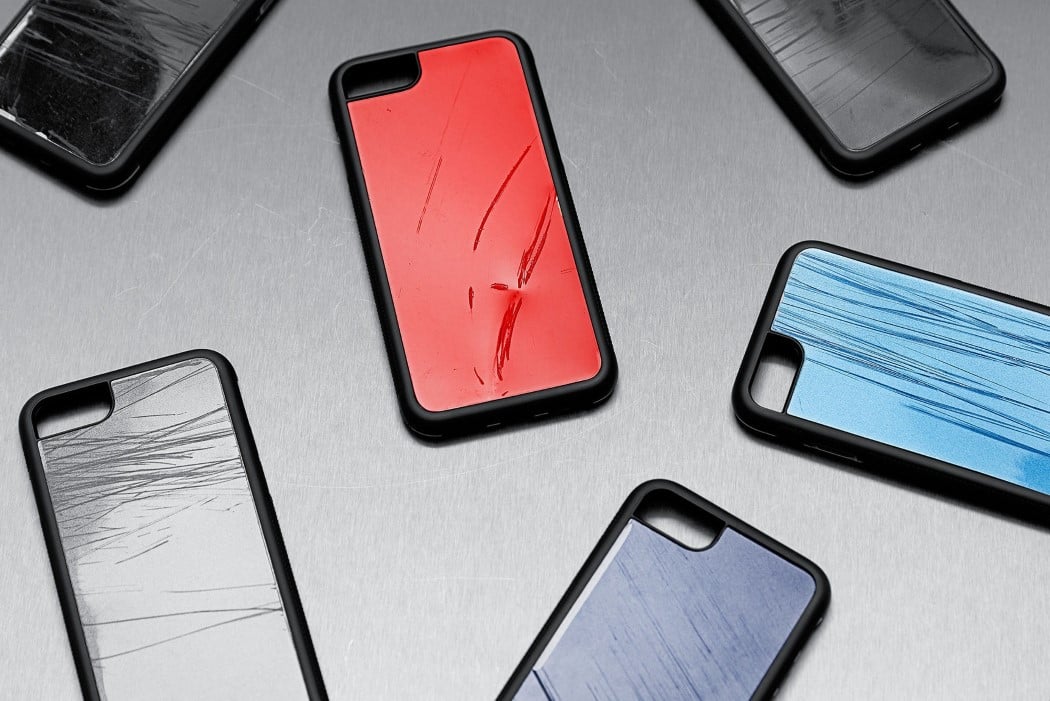
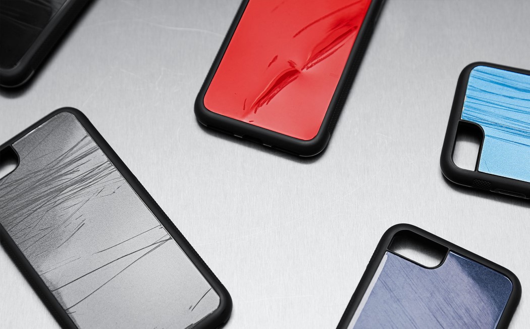
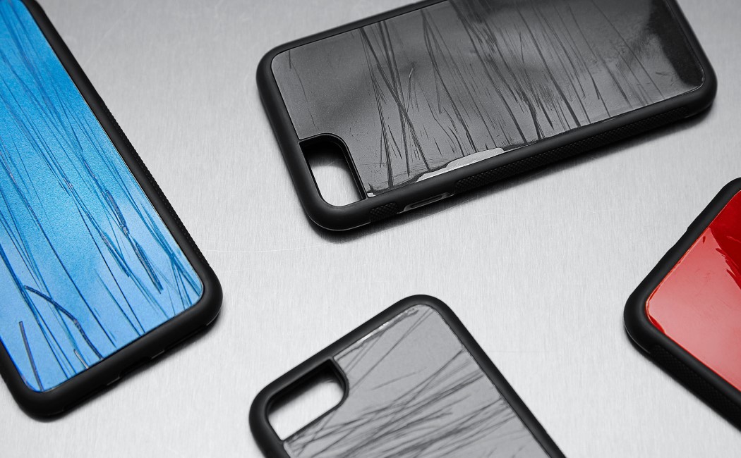
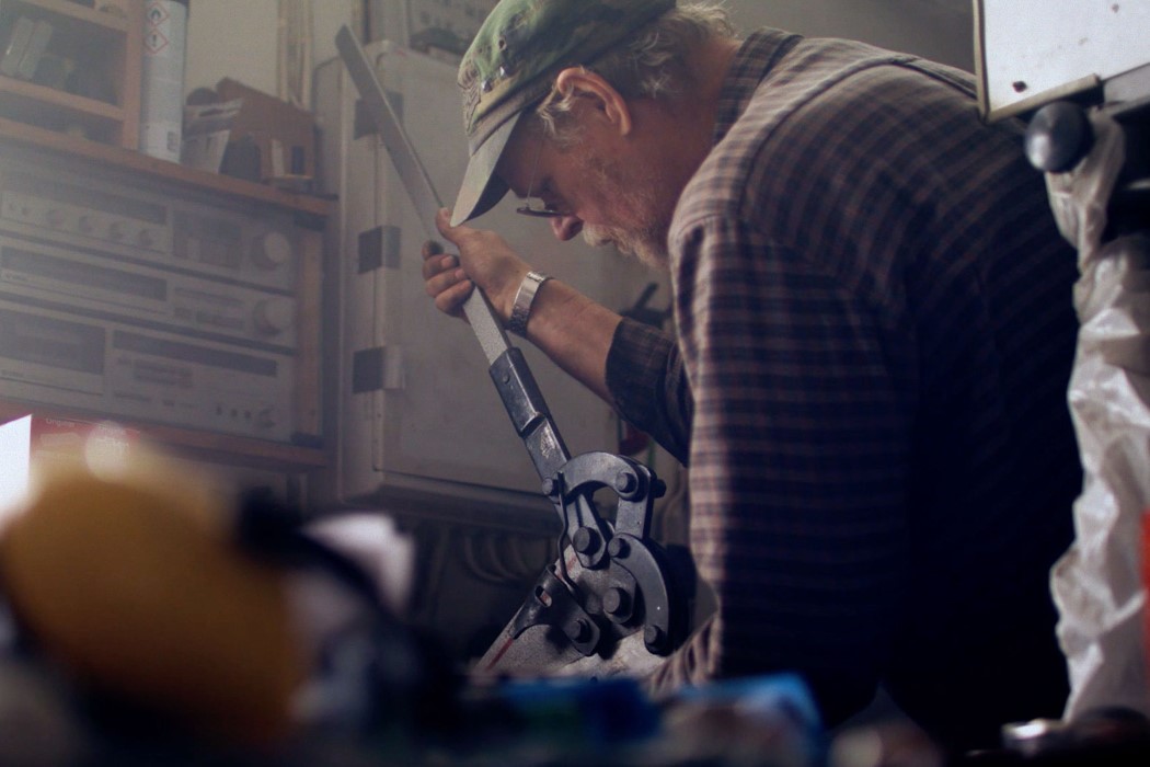
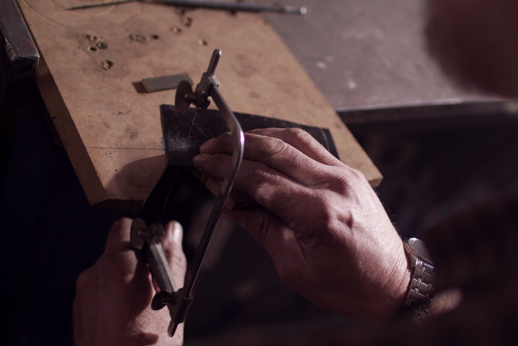
| These phone cases send a chilling warning against texting while driving Posted: 25 Apr 2018 06:00 AM PDT You don’t really think twice before glancing down at your phone while driving. It’s one of those illegal yet seemingly harmless things everyone seems to do. Uber drivers do it all the time, often toggling app and map functions WHILE driving. You’re 23 times more likely to crash your car while texting but people pay little notice to such warnings. Volkswagen Sweden and Nord DDB help bring to light the dangers of texting while driving with their series of crashed cases… cases made from metal repurposed from cars that met with accidents because their drivers were texting while driving. It serves as a chilling reminder, looking at the case of your phone to see actual scratch marks and dents from where the car collided. Teaming up with metal artist Lennart Wintermyr, 153 phone cases will be developed and sold, with all the profits going to Trafikskadefonden, which help with the rehabilitation of victims of traffic incidents and/or their families. If you do know someone who has a propensity to text while driving, you could consider buying them a case that helps give them a reality check any time they feel the need to engage with their phone while driving. Designer: Nord DDB, Lennart Wintermyr, Volkswagen.
|
| Posted: 25 Apr 2018 03:00 AM PDT
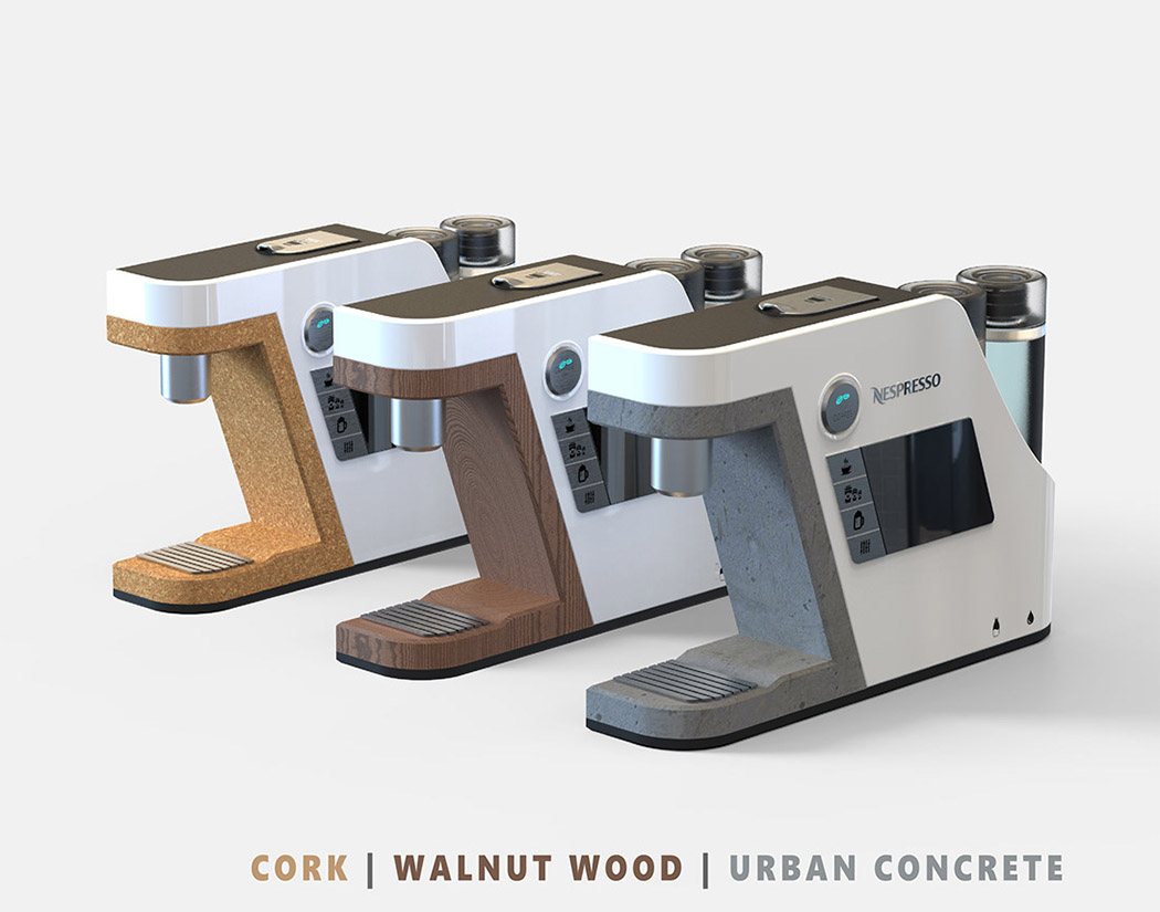
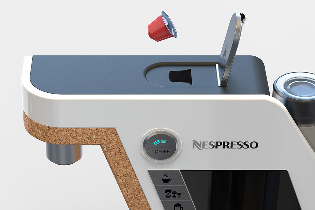
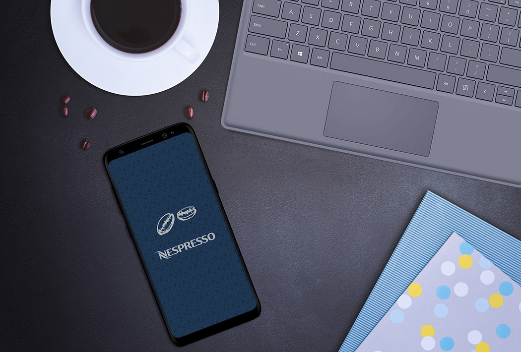
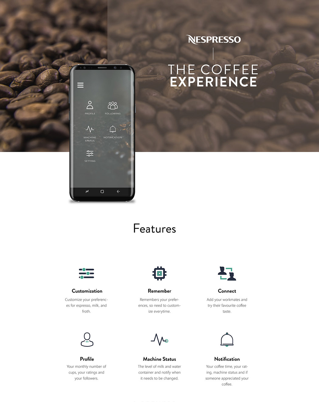
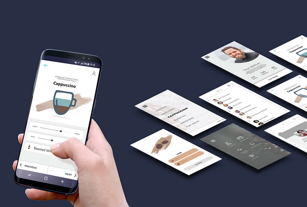
What do you do when you first get to work in the morning? For most of us, it’s not starting up our computers or looking at our meeting schedules, rather, we head straight for the company coffee machine. I know this is especially true for me. Don’t even LOOK at me unless I’ve had my first sip. Designed with this sentiment in mind, Marmik Patel’s Nespresso concept gets to know each and every individual in the office and tailor makes their perfect cuppa joe every day. It works in tandem with a smartphone app where users can input their favorite flavors and espresso styles. You can create a customized cup of coffee from the comfort of your desk or even when you’re on your way to work! Skip the line because, in seconds, a piping hot picker-upper will be waiting for you just the way you like it! Designer: Marmik Patel
|
| YD Spotlight: In conversation with concept phone designer, Jonas Daehnert Posted: 24 Apr 2018 05:48 PM PDT
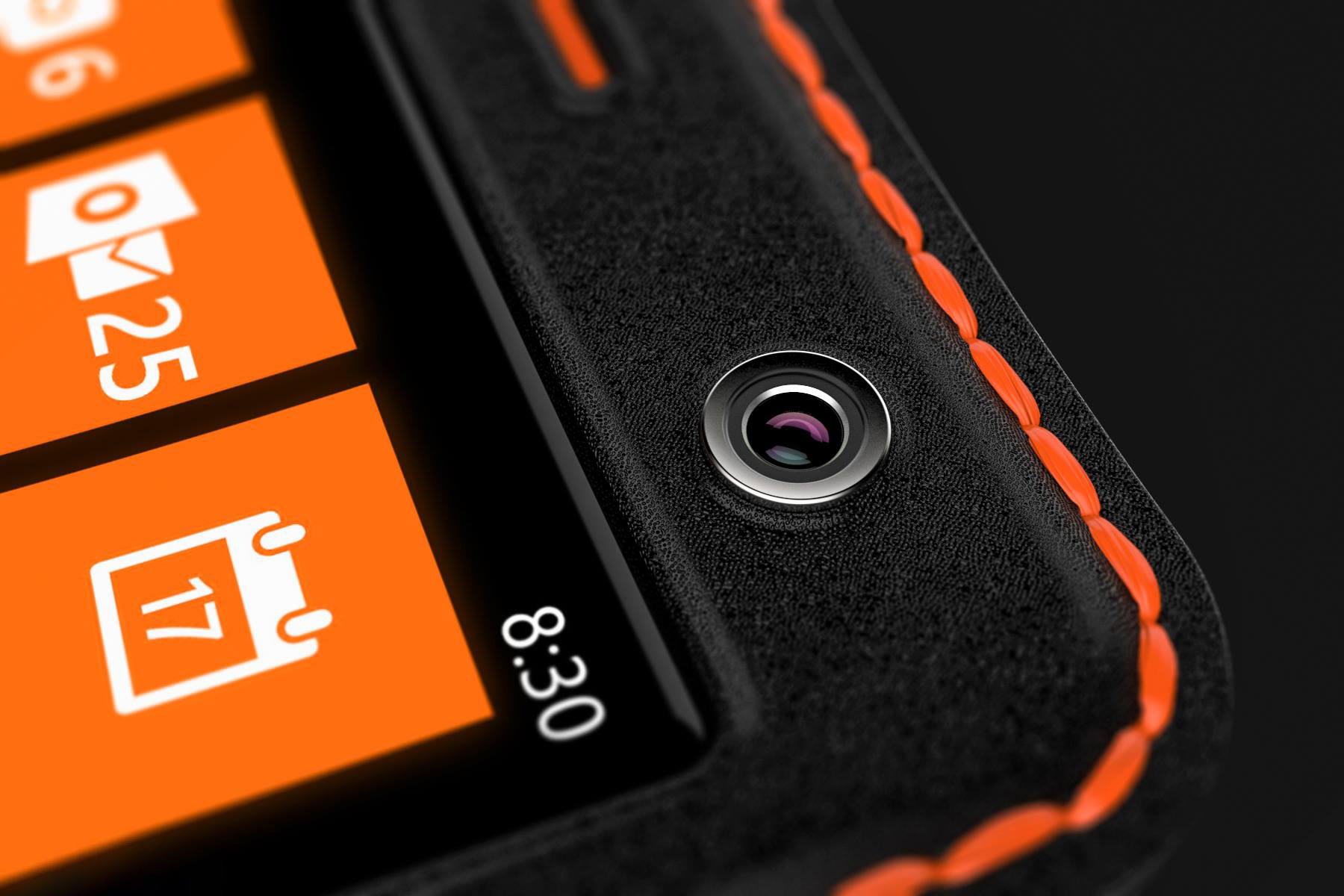
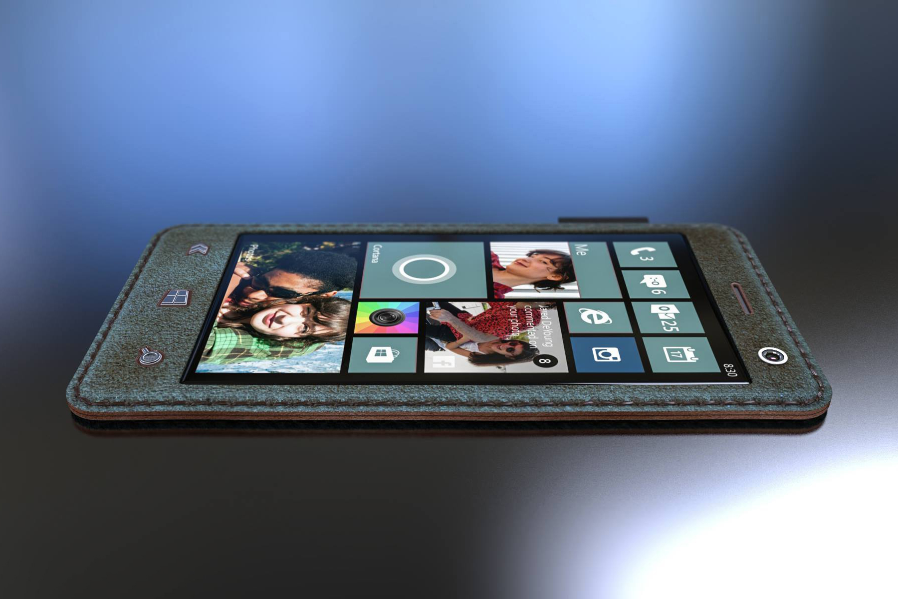
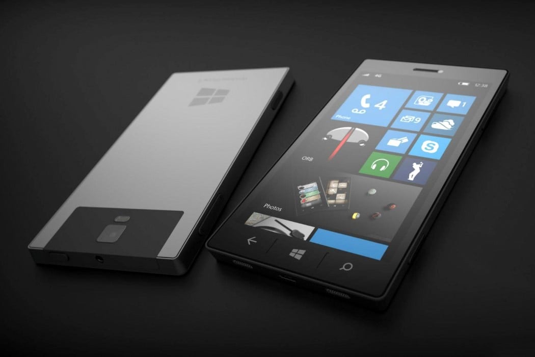
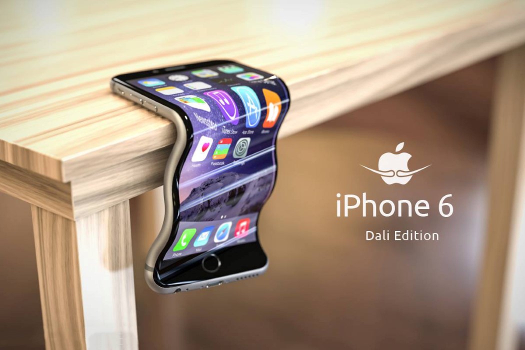
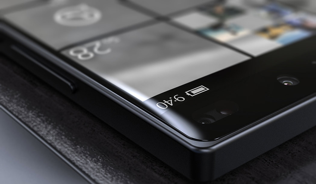
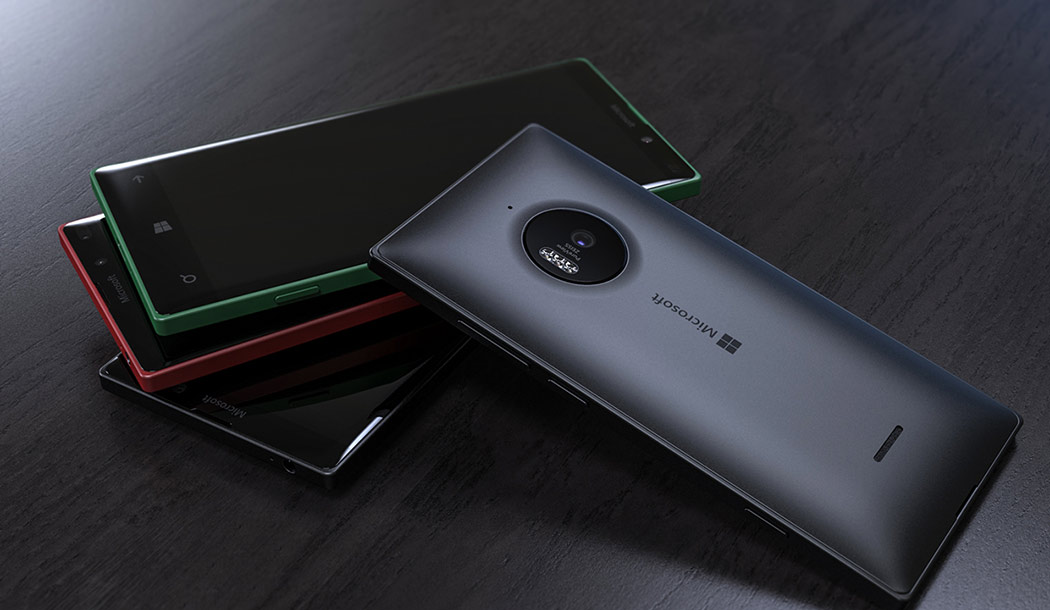
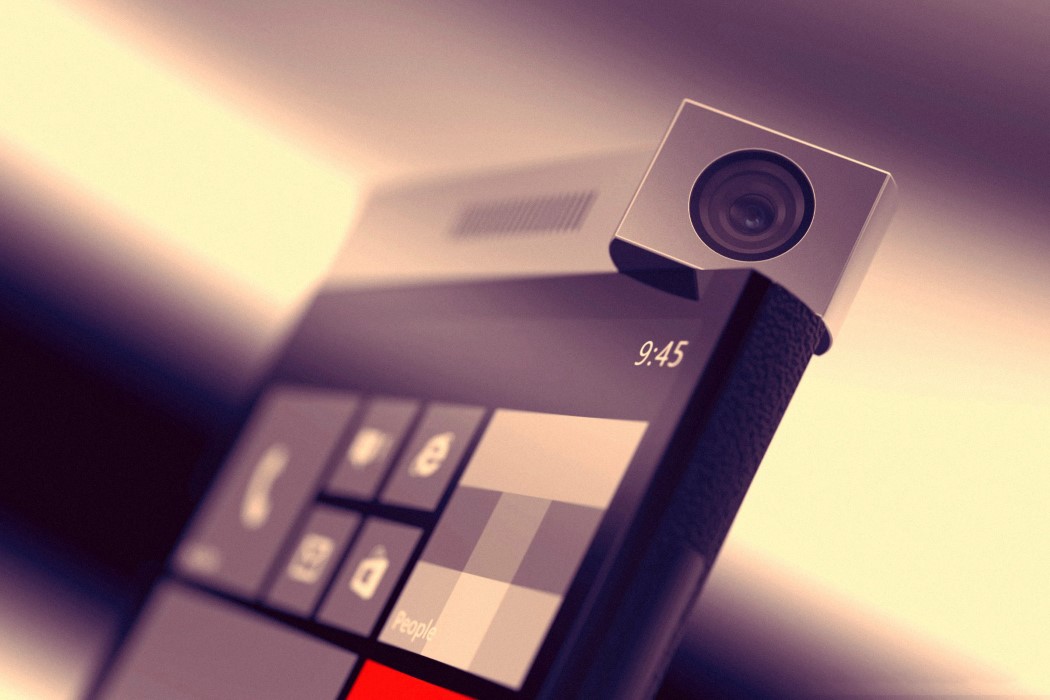
YD has always had a large focus on concepts. The only way to pave the future, I believe, is to conceptualize, and we’ve seen so many products develop only years after the concepts did. So as far as they go, conceptual designs pave the way for real-world products, and they’ll always have their place on YD. Having said that, there’s no observing conceptual designs without stumbling across those made by Jonas Daehnert, or as the internet calls him, Phone Designer. Jonas’ conceptual phones range from pretty-well-chalked-out to tongue-in-cheek… although some of his conceptual designs feature rather logical details based off rumors, brought to life by his photorealistic rendering skills. We had a chance to have a word with Jonas, delving into his process, passion for phones, and what he designs apart from them. We’ve even taken a look at some of his phones we’ve featured on YD. Yanko Design: Hey Jonas! Big fan! Tell us a little about yourself, your background, what you do… Jonas Daehnert: Hey! My name is Jonas Daehnert, I’m a 31-year-old designer from Germany. In 2007 I started studying product design at the Bauhaus University Weimar. During this time I learned how to develop and design products. But, of course, even out of school, learning continues.
YD: How and when did you venture into the “concept phone” domain? JD: In addition to studying, I founded a video game development studio with a friend, 9 years ago. He was, and still is, an excellent computer scientist and I was able to design the graphics, sounds and game mechanics. We did a good job. But even in 2010/11, it was hard to get attention, especially when you developed apps for Windows Phone 7. To increase our downloads we were looking for a way to advertise our apps more effectively. Then I came up with the idea to promote our apps on fictional devices. As chance would have it, Microsoft revealed their first Surface devices in June 2012. One week later we presented our games on the new fictional “Surface Phone”. I’m really proud of it, because it was my first phone concept and people really liked it. We got a lot of attention. It was also the birth of the Surface Phone myth. From that point on, I started developing phone concepts in my free time.
YD: Softwares! What do you use to model and render? JD: Like a lot of product designers I use Rhino 3D for modeling and Keyshot 7 Pro for rendering. Both applications are relatively lightweight, versatile, affordable, and easy to learn — but hard to master. They work perfectly together.
YD: How do you start with your concepts? Do you follow the rumor-mill? JD: My first concepts just followed the rumors and as a product designer it is always a good exercise to work on fictional things for companies you have never worked for. It’s like a role playing game. You analyze their design philosophy and create new products for them, without restrictions or limitations. It’s just a typical design process with a lot of research, sketching and failures.
YD: Share some of your tips for photo-realistic renders! JD: Of course for every render scene the quality of the 3D model, its details, textures and materials are important. But even more important is the arrangement of the 3D models, the camera and light settings. Many 3D artists make the mistake of using very low focal lengths and aggressive viewing angles in their camera settings. As a result, lots of renderings are distorted and the original character of the product is destroyed. Be more conservative in terms of camera settings and spend more time developing a sophisticated light setting to push the product characteristics. Having some knowledge about photography is really helpful, too.
YD: Favorite phone of all time? What phone do you own? JD: Definitely my first phone, a C35i by Siemens. It is an extremely durable phone with two weeks of battery life. And it still works, after 18 years. I’ve spent a long time with Windows Phone and I’m still a fan of the Lumia phones, especially its Fabula Design language. But Windows Phone is dead, so I switched to Android. Actually I use an old Moto G4 — it’s enough for my needs. I prefer purism and simplicity.
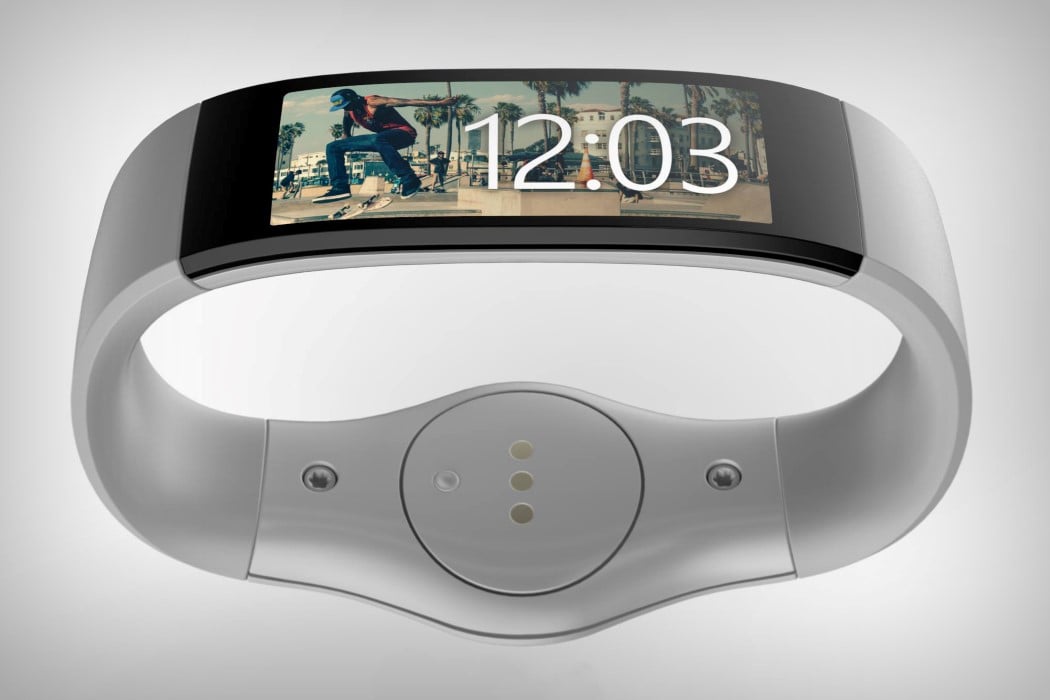
YD: Do you ever plan to make concept wearables like smartwatches or VR headsets, etc? JD: I already did. A couple of years ago I designed a wristband that could have been a product by Microsoft, before they launched their first Microsoft Band. The similarities were surprising. I also created a fictional VR headset, the Google Nexus Glasses.
YD: Lastly, one thing you really wish you could change about the smartphone industry. JD: There are over 3000 smartphone brands in the world. Each company should produce less devices per year and focus on durability, their software services and updates. Planned obsolescence generates the money. This is a problem. That’s why I really appreciate Google’s Project Treble, which tries to change the current situation. (I couldn’t agree with you more, Jonas…)
To check out more of Jonas’ work on YD, click here. |
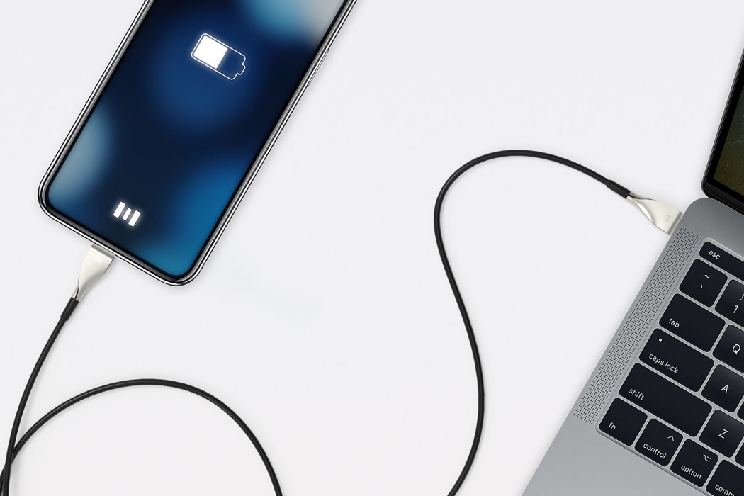
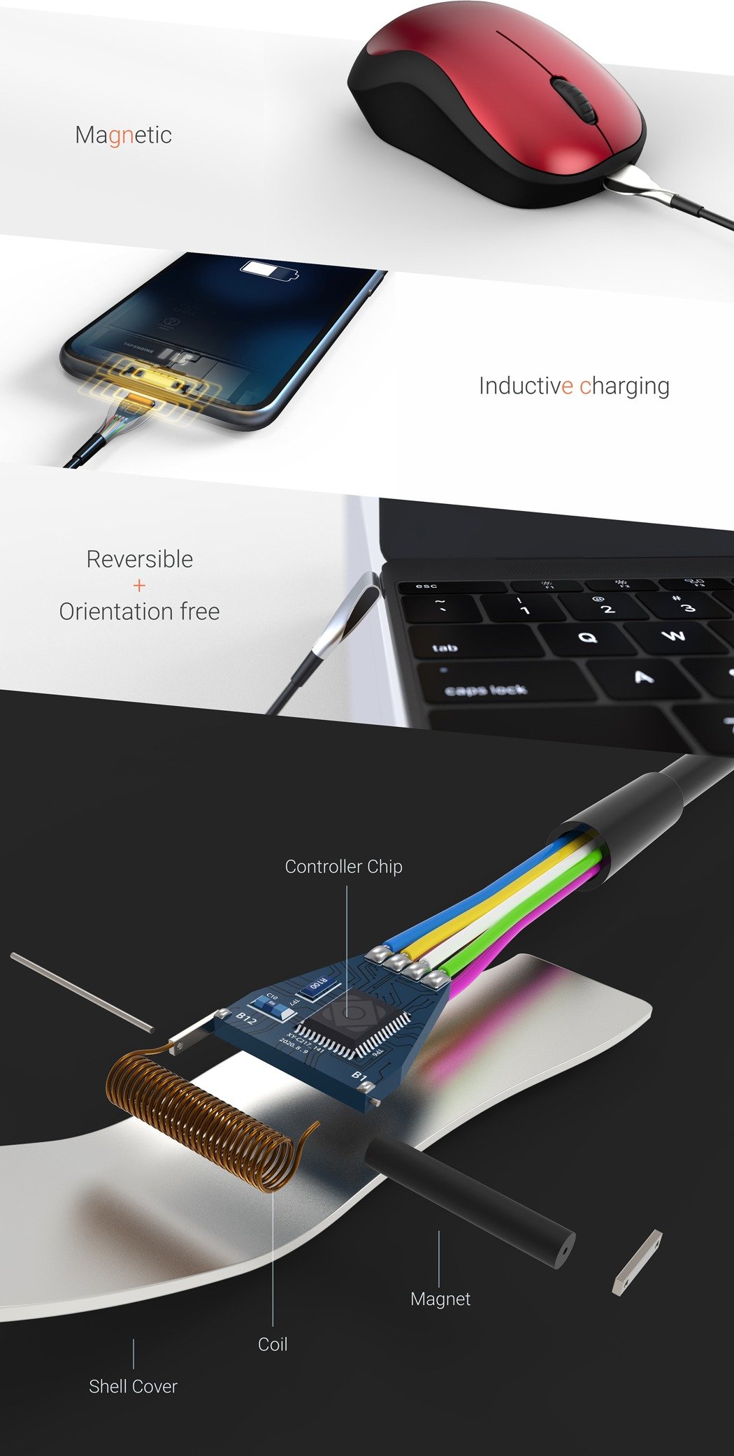
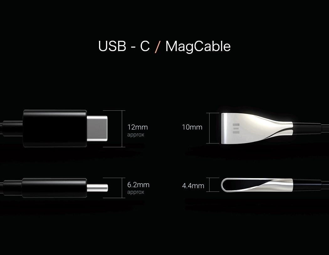
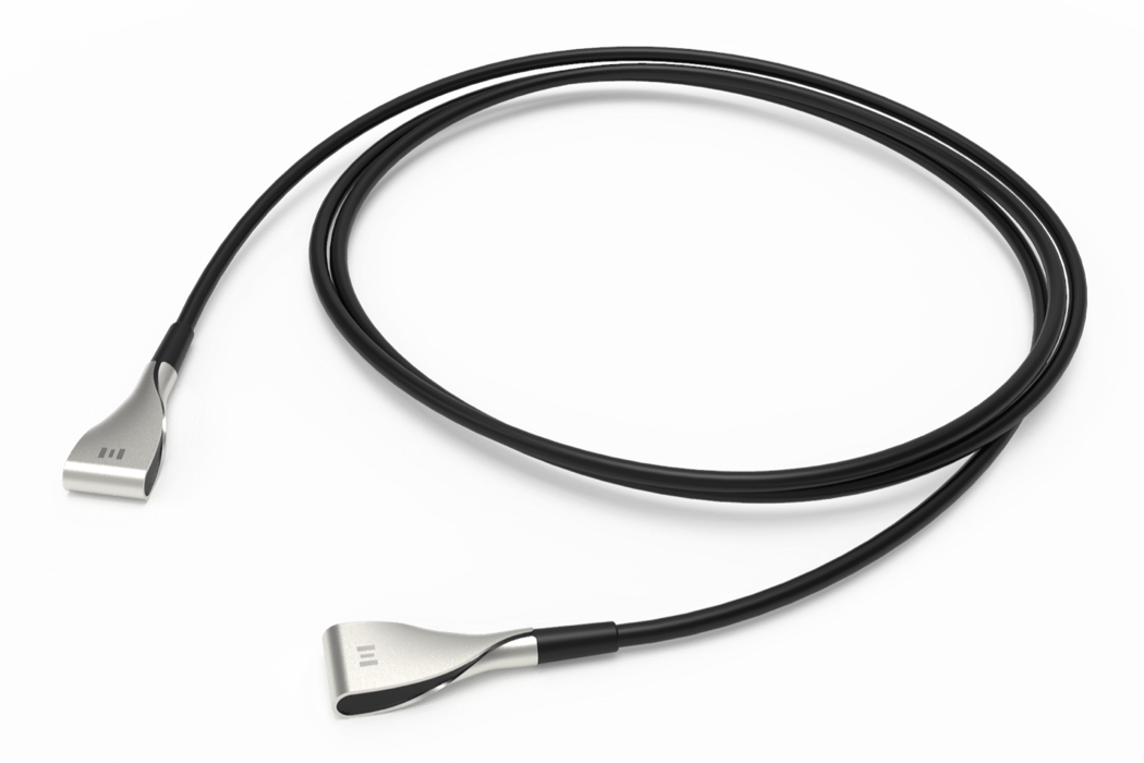
| Posted: 24 Apr 2018 03:00 PM PDT If the future of charging cables has to be defined, then the Mag Cable is a good benchmark to begin with. We all have had our fair share of cable snaps, USB connection issues and the works, it’s annoying and destroys a piece of your device. With this piece of innovation, the future foresees magnets and Qi connectivity having more power. The novel Mag Cable connects via magnets and is designed in a way that the metal terminal is not exposed and sports an intuitive look. The connector simply ‘touches’ your device and juices it up in a jiffy. The super cool part is that it hooks up any angle, making it convenient for you to interact with your device while charging it. Getting into the specifics, as described by designer Kizuku Kitada, the data is transferred through a coil placed inside the terminal while it charges the device via induction simultaneously. The cable works seamlessly with a keyboard and mouse as well as portable storage devices and smartphones. Although quite far from being in-market, this unique cable brings in a fresh approach to charging cables. Designer: Kizuku Kitada of SPECT DESIGN
|
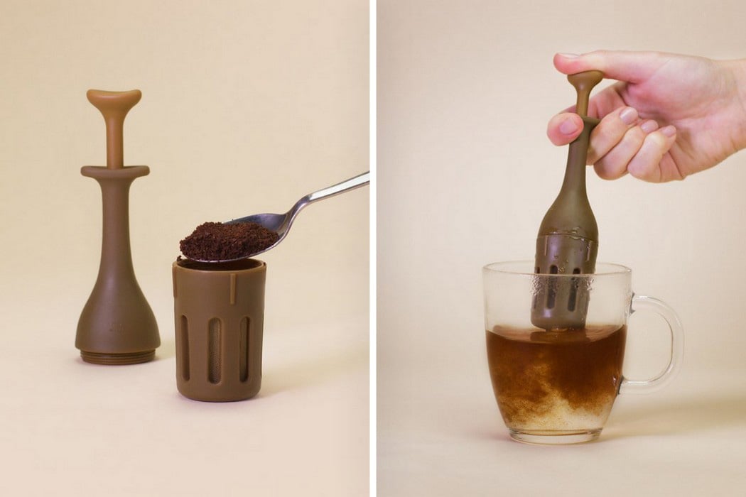
| For an instant, measured dose of caffeine! Posted: 24 Apr 2018 02:00 PM PDT Designed to look almost like an epi-pen for coffee, the Mini Coffee Press is impressively tiny, and works partly like a French Press, and partly like a tea-bag… but for coffee. Effectively the smallest coffee-press we’ve seen, the Mini Coffee Press comes with a base into which you fill your finely ground coffee, and a top with a plunger on it. Just fill the base to its brim with coffee powder and screw the top on before letting it rest in a cup of warm/hot water. After 4-5 minutes, press down on the plunger, letting the golden coffee pour through from inside the press. Repeat multiple times till you’re satisfied with the color and intensity of your brew. Once you’re done, simply rinse the Mini Coffee Brew and put it back in your pocket because it’s literally that small. Designer: Firebox |
| You are subscribed to email updates from Yanko Design. To stop receiving these emails, you may unsubscribe now. | Email delivery powered by Google |
| Google, 1600 Amphitheatre Parkway, Mountain View, CA 94043, United States | |

